An old post office became a welcoming country home with a smart open layout
A dilapidated rural post office is transformed into a luxurious home – tranquil grays and warm whites keep things calm
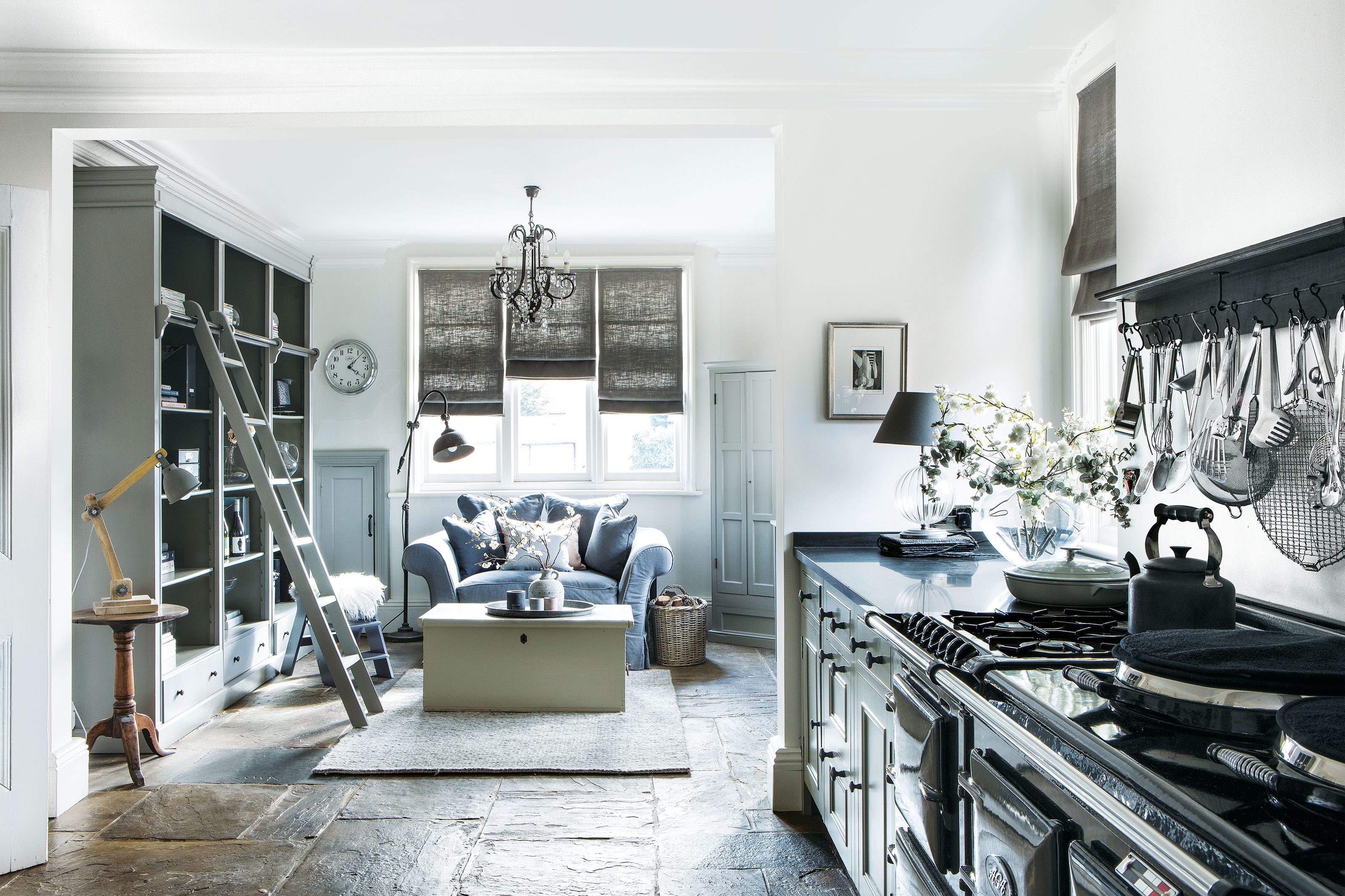
Looking at this elegantly renovated Edwardian home in rural Nottinghamshire, UK, you'd find it hard to believe it wasn't originally a house at all. It was a small village post office, built in 1905. It was no longer in use and was in a poor state of repair, its garden overgrown and neglected. Yet there was something very appealing about its redbrick exterior, well proportioned rooms, high ceilings and original features. And following a full-scale renovation, a reconfigured layout and two extensions, the house truly is one of the world's best homes.
With a practical open-plan layout, the house now celebrates its original features in style. A harmonious interior scheme of warm whites and soft grays, teamed with natural textures and luxurious furnishings, enhances the new look. There's an incredible sense of calm in this home, and we pick out our highlights below.
Open-plan kitchen
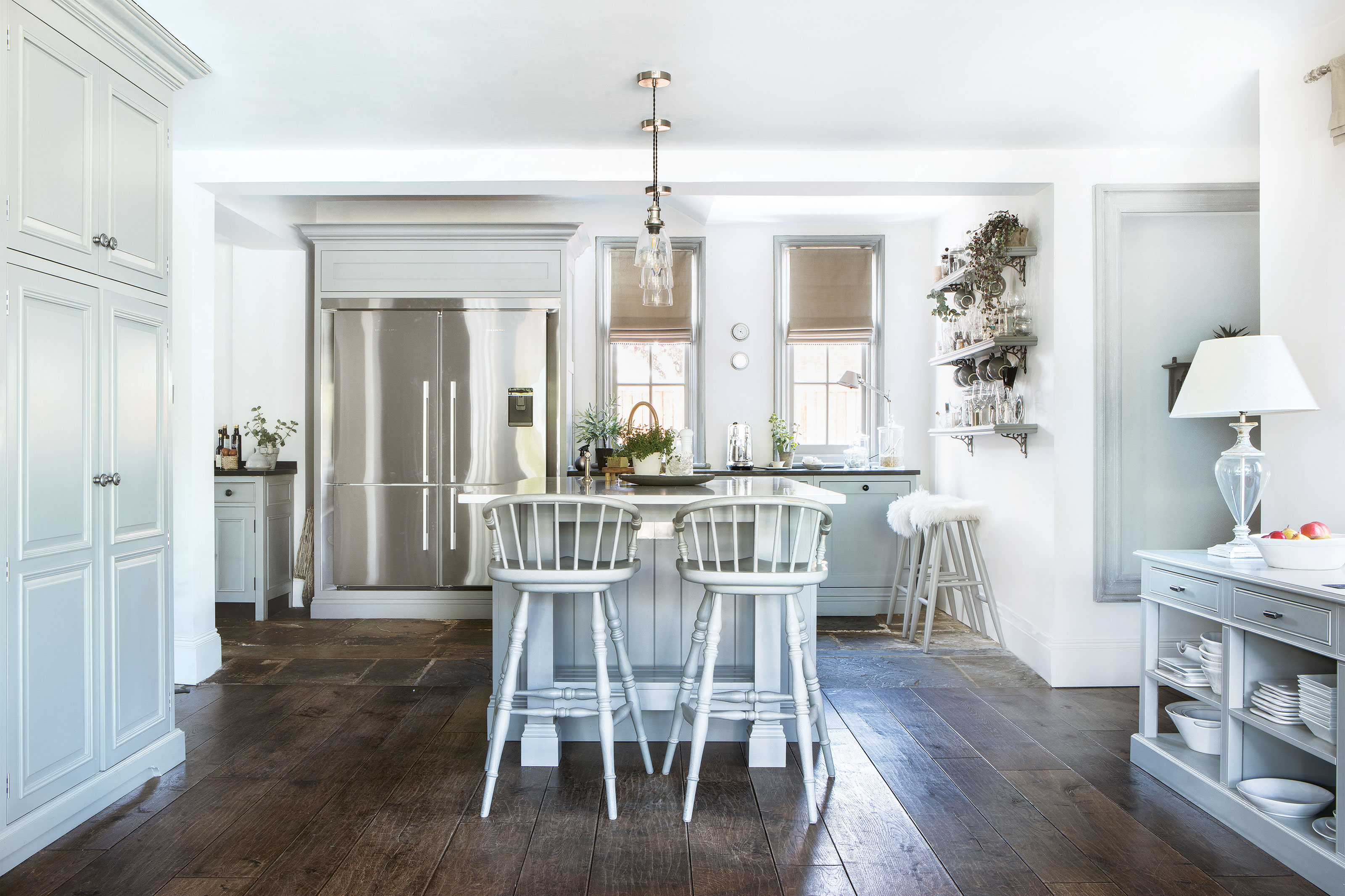
A new kitchen was created from the original building's three dark and disconnected rooms – the shop at the front, a middle room that served no purpose, leading to a tiny galley kitchen. Those three rooms have been combined into one long open-plan space, that included a sitting area and the kitchen. The new layout allows light through while the kitchen wraps around the back of the house to flow into the garden room. Kitchen ideas include the new central island and freestanding units to match the bespoke kitchen design. The beautiful flagstone floor was reclaimed from an old mill.
Smart monochrome details
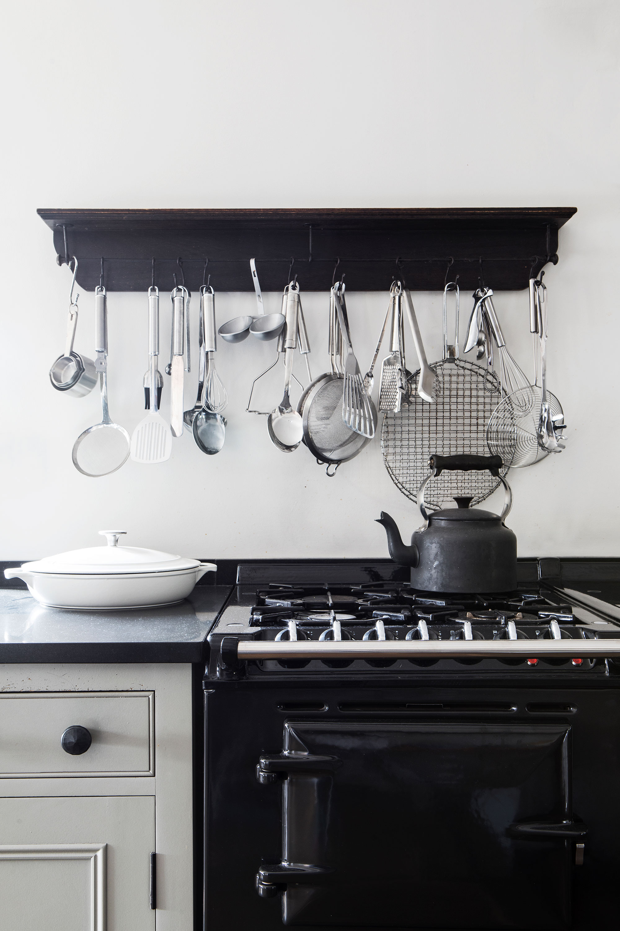
A traditional black Aga sets the tone in the new space, with black shelving and accessories contrasting against soft white walls.
Living room and reading nook
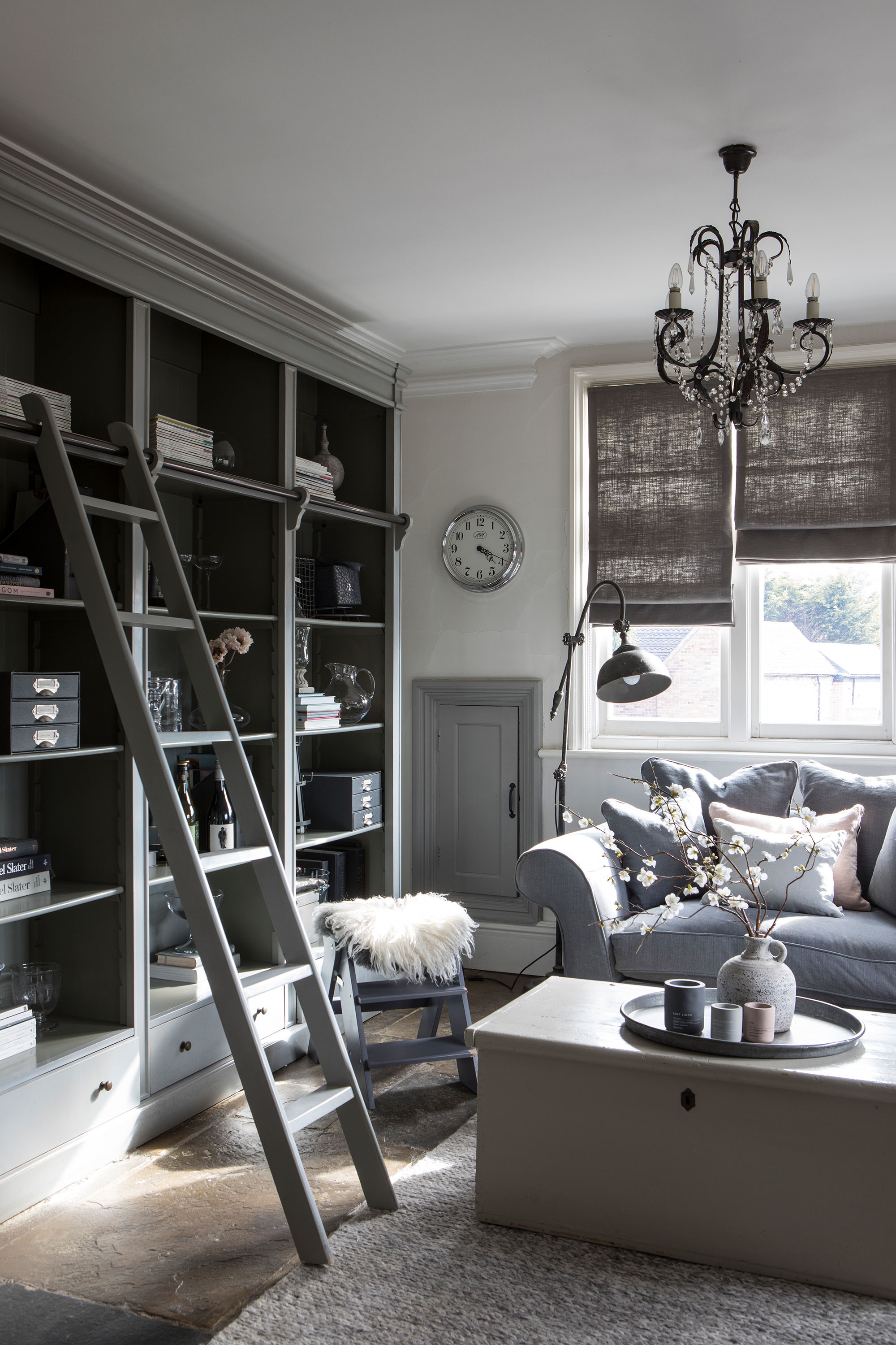
At the front of the house, this living area and reading nook in the new kitchen was once the post office shop. In the corner next to the window is the original cupboard that caught any mail posted through the post box at the front of the house. Anyone looking for reading nook ideas will find inspiration in this cozy space. A freestanding bookcase with a ladder, provides storage and display space, and finished with a sharp gray shade it tones with the gray blues used elsewhere in the room.
Cozy main living room
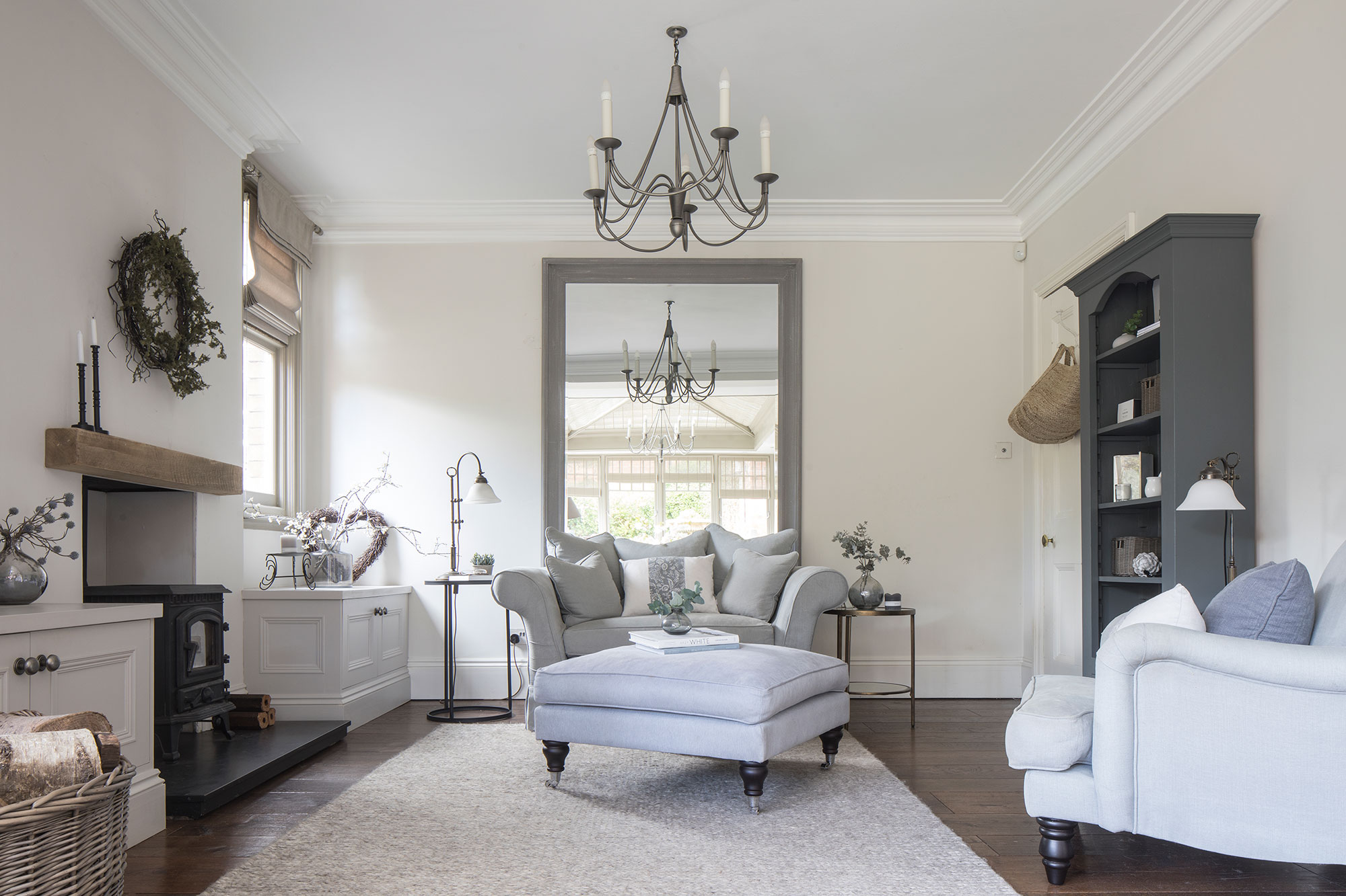
Living room ideas for the main seating area are serene and calm, with a continuation of those restful warm white and gray shades used elsewhere in the home. Keeping to a limited palette in this way creates a more relaxing backdrop and a harmonious flow from one room to another, with no visual shocks.
Garden room
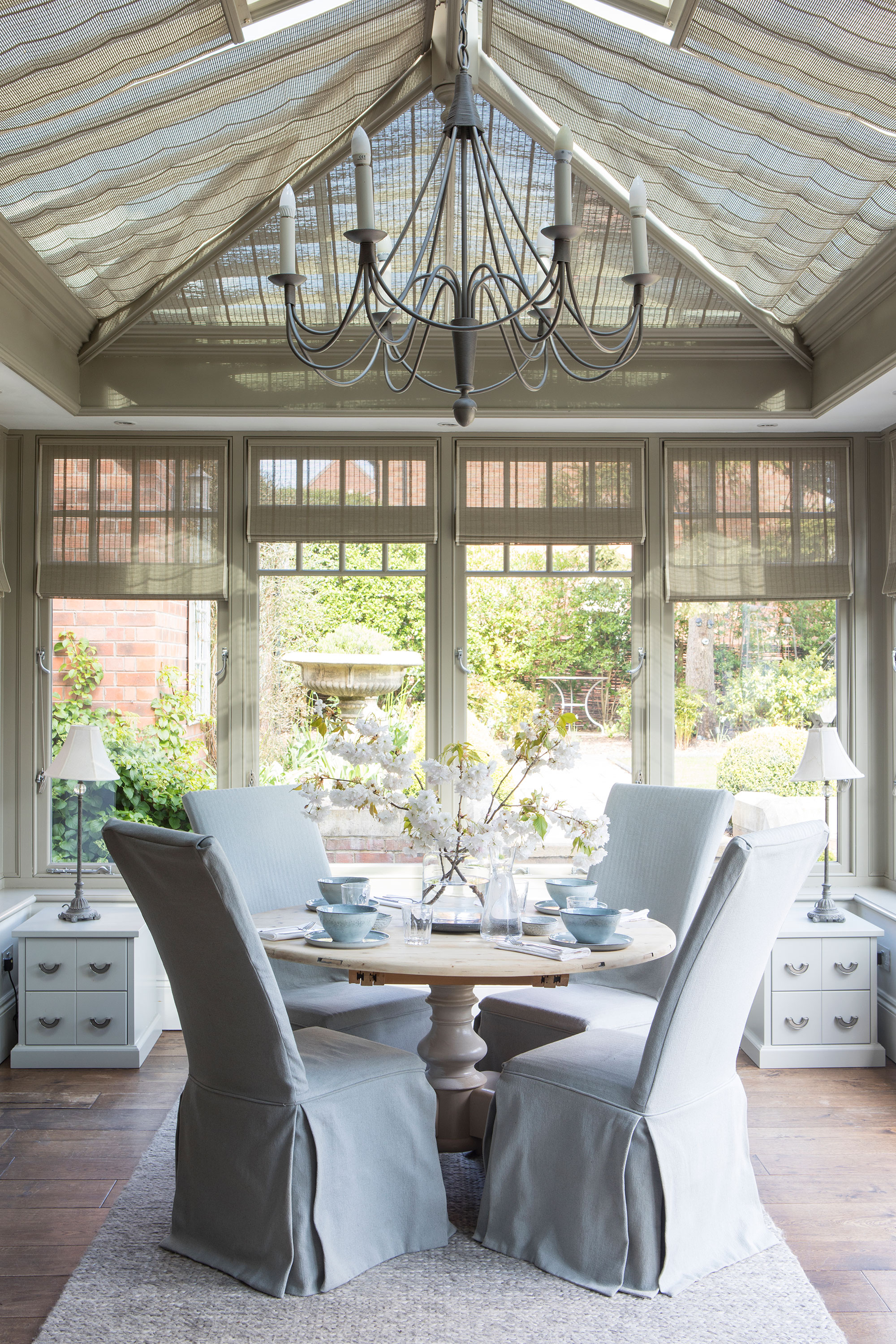
A garden room was added to the property as part of a second phase of building work. French doors lead to the landscaped garden. Garden room ideas include a a lantern roof with bespoke heat reflecting electric blinds. Engineered oak flooring in a warm shade is a good choice for a room with direct access to the garden, and can disguise the occasional muddy footprint and paw print!
Utility room
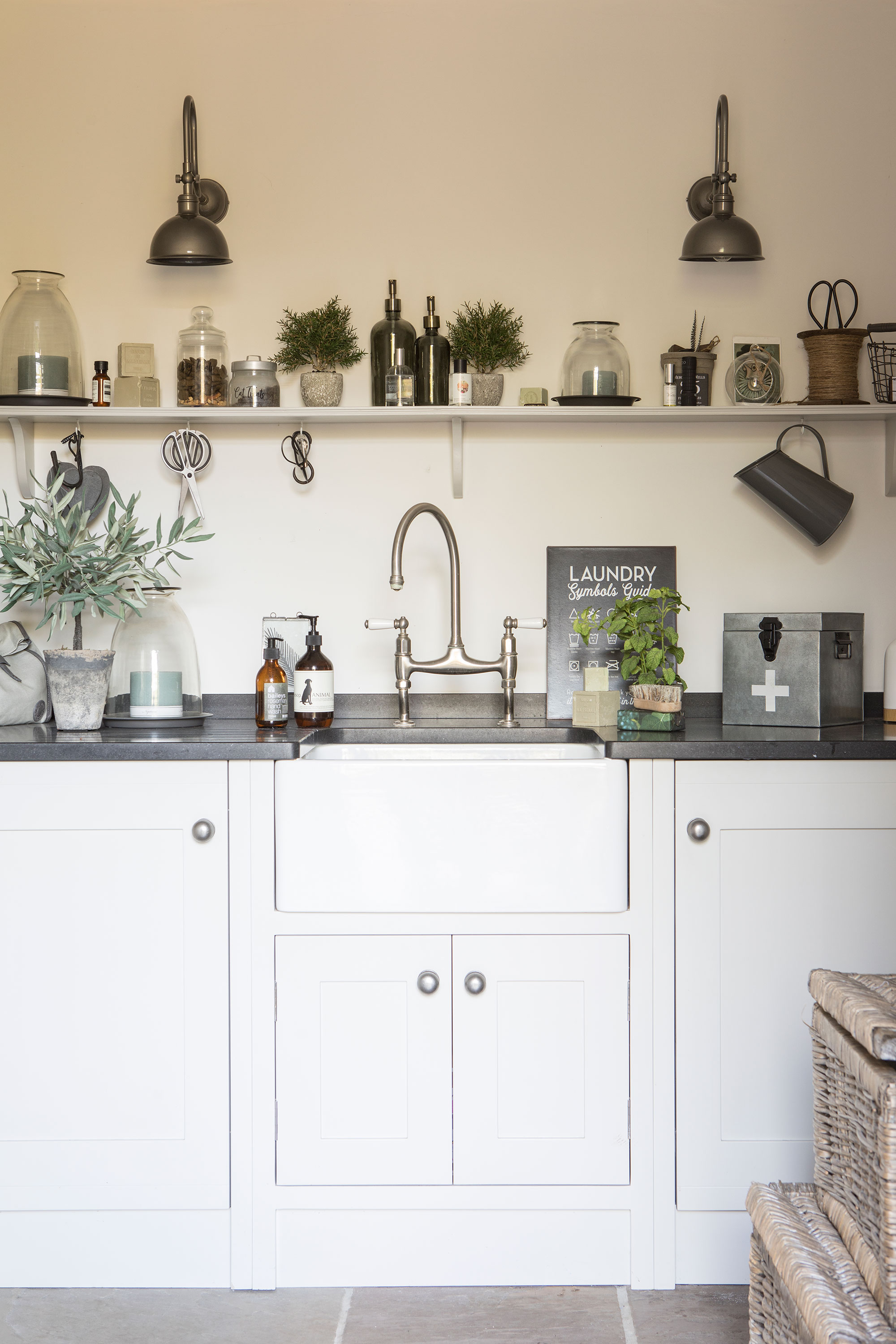
Talking of muddy paw prints, concealed in the under-sink cupboard of this simple utility room is a doggy shower, perfect for tackling exactly that problem! Other utility room ideas well worth a steal, include the no-nonsense cabinetry and wall shelf, beautiful brass wall lights, and smart faucet. Once a dilapidated and disused outbuilding, this space has been transformed and houses the washing machine, and a downstairs cloakroom.
Main bedroom
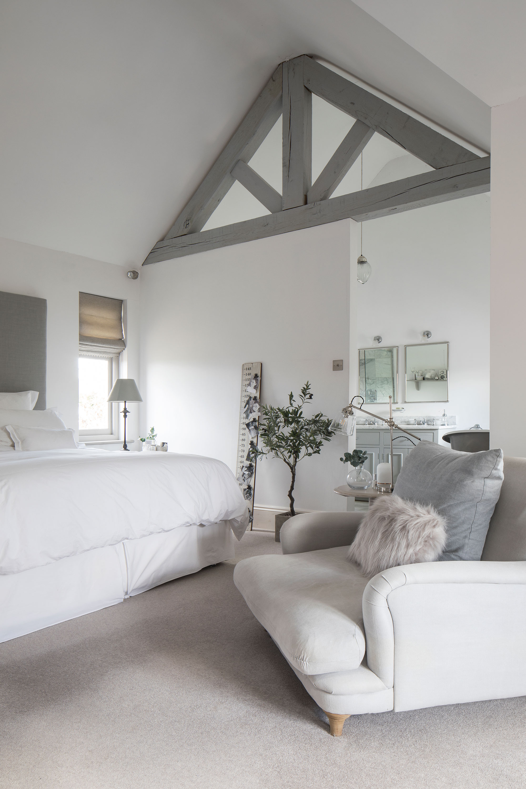
In the master suite, bedroom ideas focus on the grand vaulted ceiling. One of the most recent additions to the house, the room was designed to look as if it had been built into the loft to reveal the original rafters. It gives incredible scale and height to the room. Layers of sumptuous textiles and an inviting loveseat chair add to the luxurious look.
Ensuite bathroom
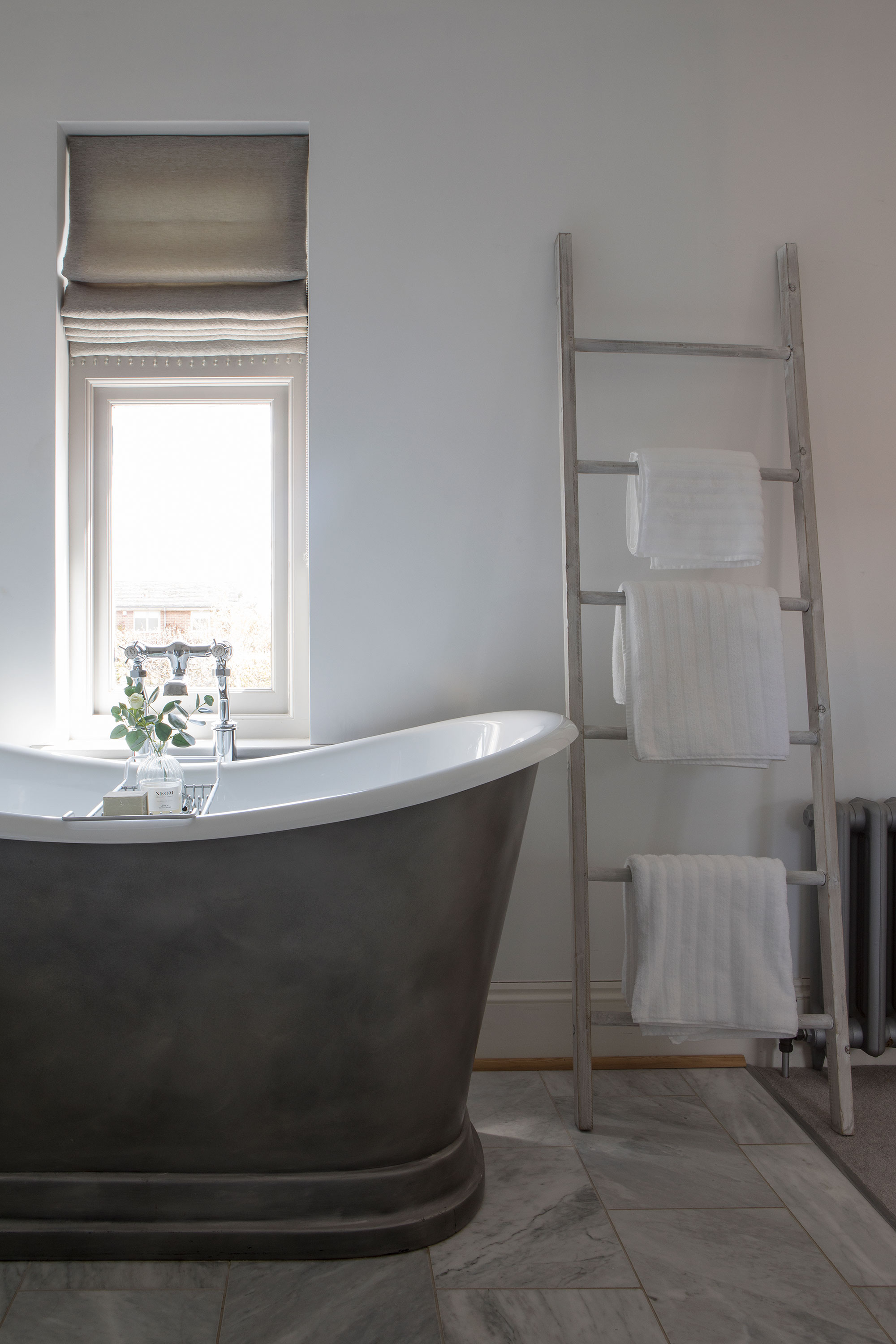
The ensuite bathroom is nestled behind a stud wall. Anyone looking for bathroom ideas should note the unusual burnished iron roll-top bath, and its enviable position under a window for bathtime views out across the trees.
Guest bedroom
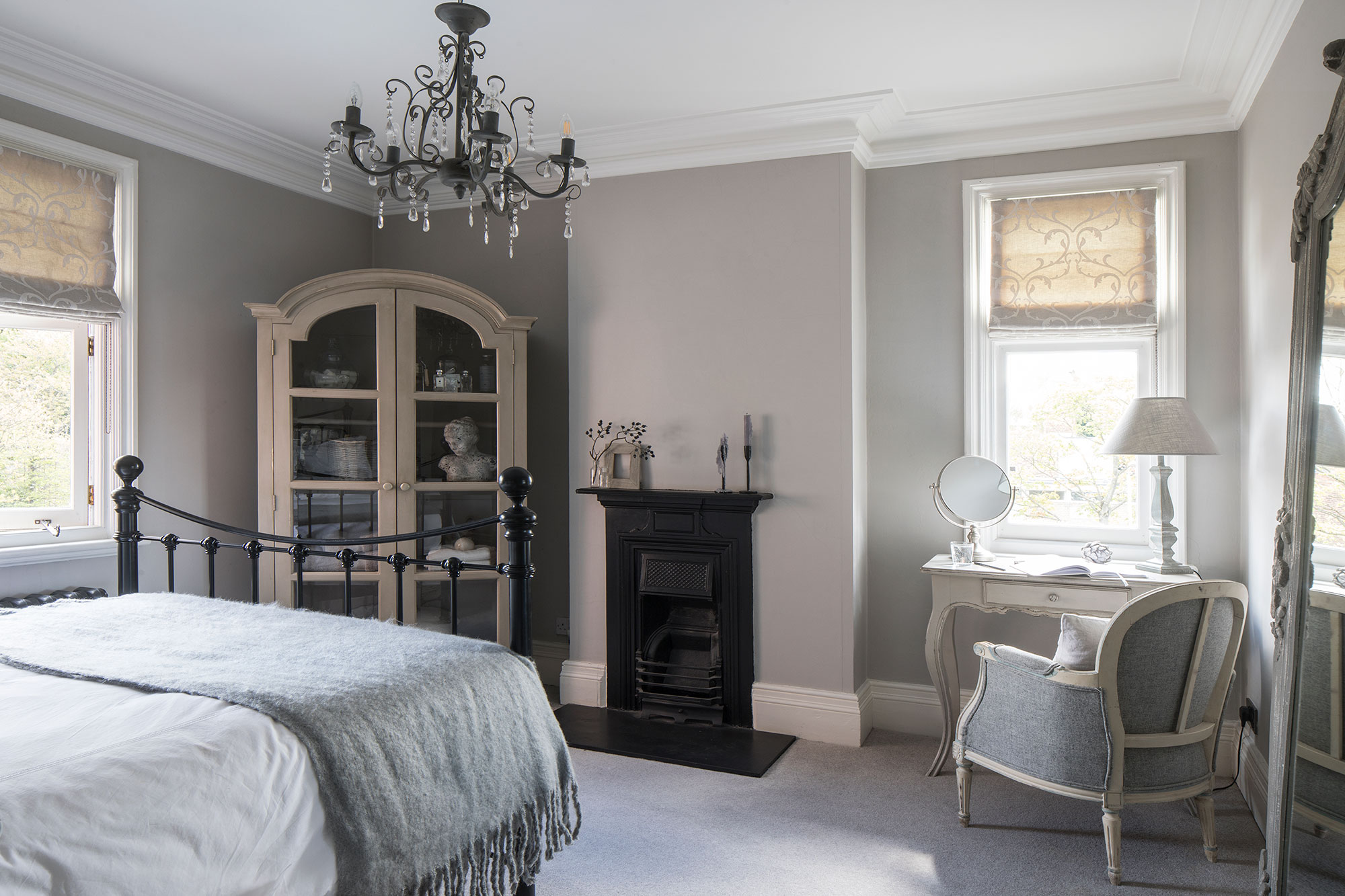
Overlooking the back of the house, the French-inspired guest room has a romantic look – with gentle curves and soft bed linen. An antique chair and floorstanding mirror are the perfect accessories, along with a French-style armoire display cabinet.
Main bathroom
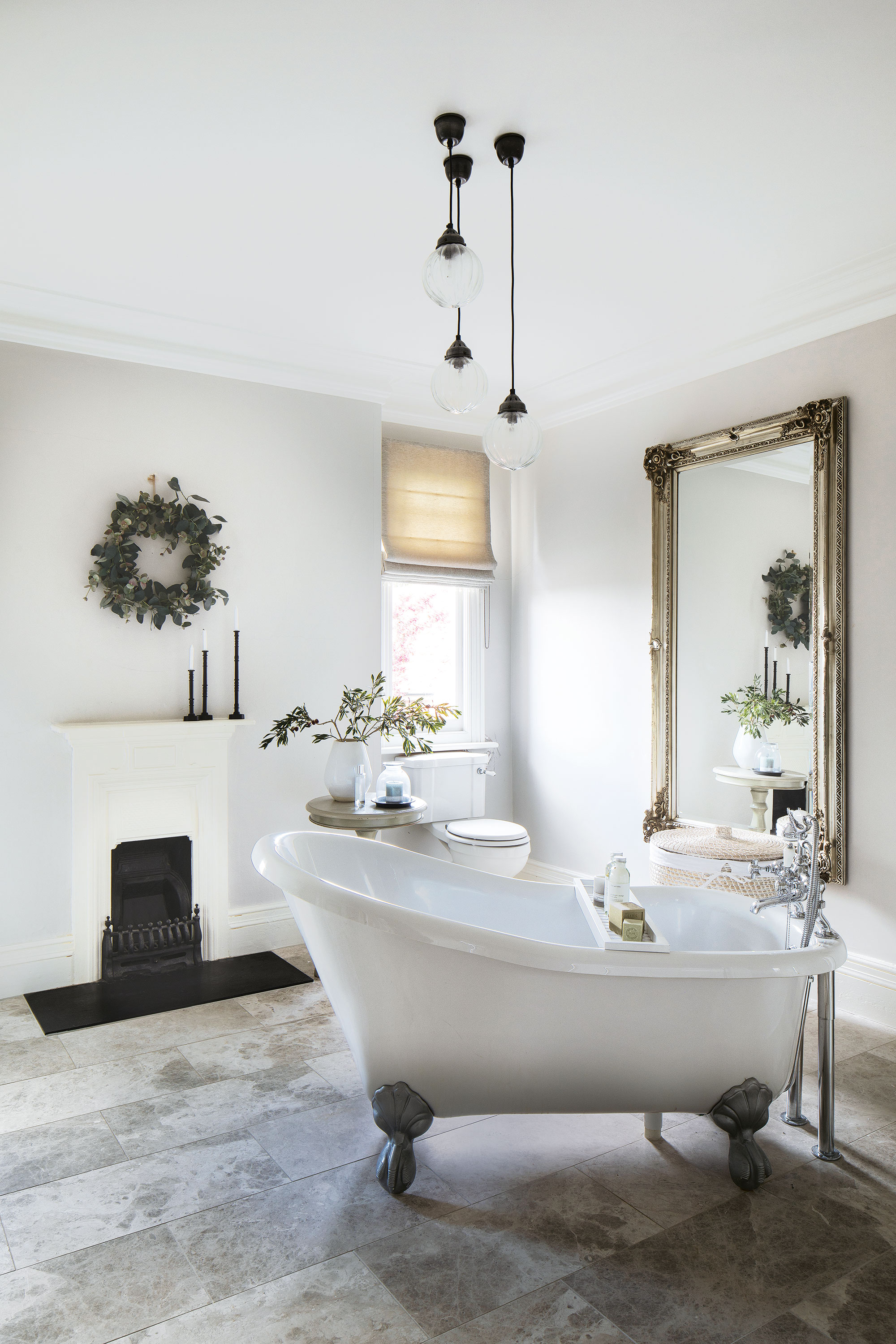
The main bathroom exudes luxury and decadence with its high ceilings, marble tiles, and jauntily placed slipper bath taking centre stage. Glass pendant lights and honed marble tiles complete the look.
From disused post office to a stylish and much-loved home, this is one inspiring transformation.
Original feature and styling: Marisha Taylor
Photographs: James French
Sign up to the Homes & Gardens newsletter
Design expertise in your inbox – from inspiring decorating ideas and beautiful celebrity homes to practical gardening advice and shopping round-ups.
Karen sources beautiful homes to feature on the Homes & Gardens website. She loves visiting historic houses in particular and working with photographers to capture all shapes and sizes of properties. Karen began her career as a sub-editor at Hi-Fi News and Record Review magazine. Her move to women’s magazines came soon after, in the shape of Living magazine, which covered cookery, fashion, beauty, homes and gardening. From Living Karen moved to Ideal Home magazine, where as deputy chief sub, then chief sub, she started to really take an interest in properties, architecture, interior design and gardening.
-
 This once-dated kitchen is now a timeless space with the coziest details – and its the classic color palette that's made it a chic, welcoming space
Warming colors and natural materials combine to create this enduringly classic kitchen scheme
By Molly Malsom Published
-
 How to grow crepe myrtle in pots – and transform even the smallest of yards with dazzling flowers this summer
Growing crepe myrtles in pots will inject splashes of brilliant color into your outside space
By Thomas Rutter Published