This Florida apartment oozes relaxed French coastal chic
This condo's fresh coastal look matches its dreamy ocean-front setting – rattan, pattern and nautical touches are key
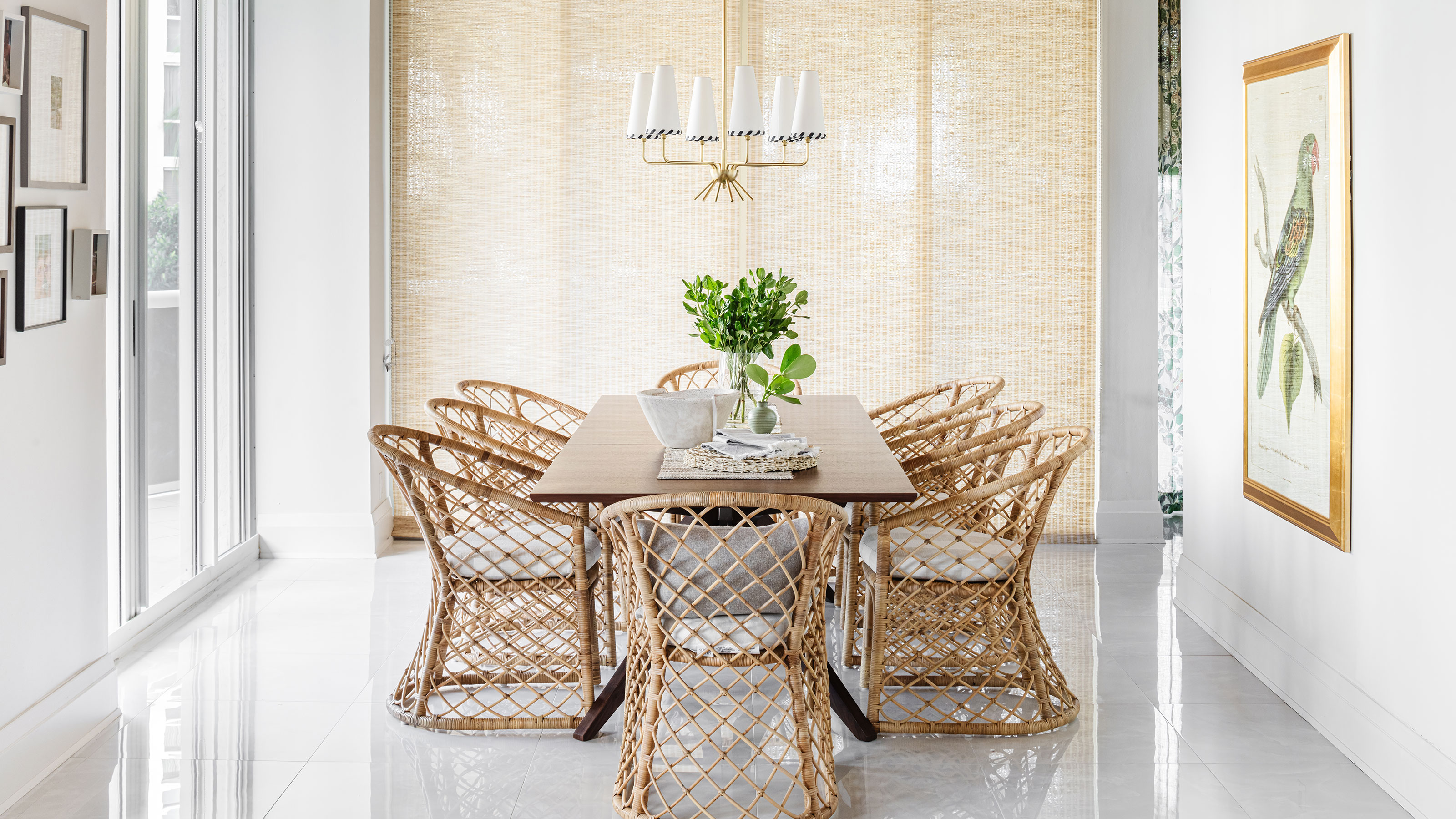

Despite its location, lapped by the North Atlantic in Florida's Fort Lauderdale, this stylish beach-front apartment owes more to the European shores of the Mediterranean for its style inspiration.
This two-bedroom condo, built in 1997, has had a major redesign which, along with the dramatic setting, makes it one of the world's best homes.
The designer responsible for the apartment's stunning new look is Toronto-based Sabrina Albanese who spent time getting to know her clients - and their home - to understand how to rework the space.
'The clients had owned the condo for quite a while, and it was extremely dated. It's likely they were the original finishes from when the condo was built. It was quite dated and needed a total refresh,' explains Sabrina. 'The clients wanted the space to feel more energetic and include great splashes of colour, pattern, beach hues, and a coastal vibe.'
With this in mind, designer Sabrina worked her magic in every corner of the home and picks out some of the highlights below.
Kitchen
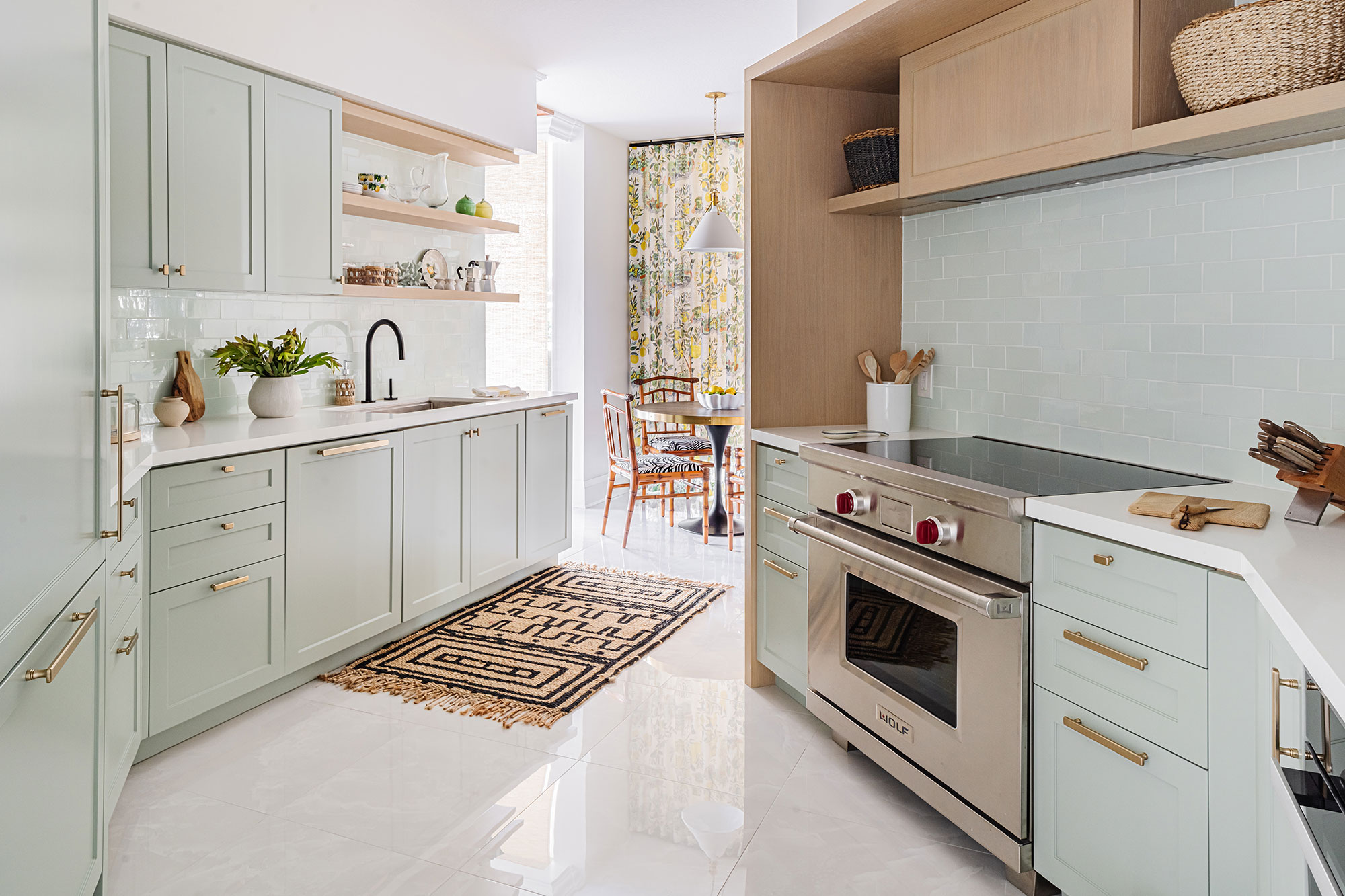
One of the most difficult rooms to tackle was also one of Sabrina's favorite spaces. 'The most challenging part of the design was the shape of the kitchen. There is a load bearing wall on a tight angle, so we needed to work with that shape,' she says.
And for anyone looking for an unusual source of kitchen ideas – how about this: 'The main inspiration came from the idea of vacationing in the 1970s in the south of France at St Tropez, so it's a bit more traditional in nature.'
Design expertise in your inbox – from inspiring decorating ideas and beautiful celebrity homes to practical gardening advice and shopping round-ups.
The goal, explains Sabrina, was to make it feel 'weightless' with light-reflecting glossy tiles, open shelving, and touches of open shelving in natural oak. The backsplash is a handmade crackle glazed tile from Waterworks in a beautiful mint which blends seamlessly with the millwork.
Living room
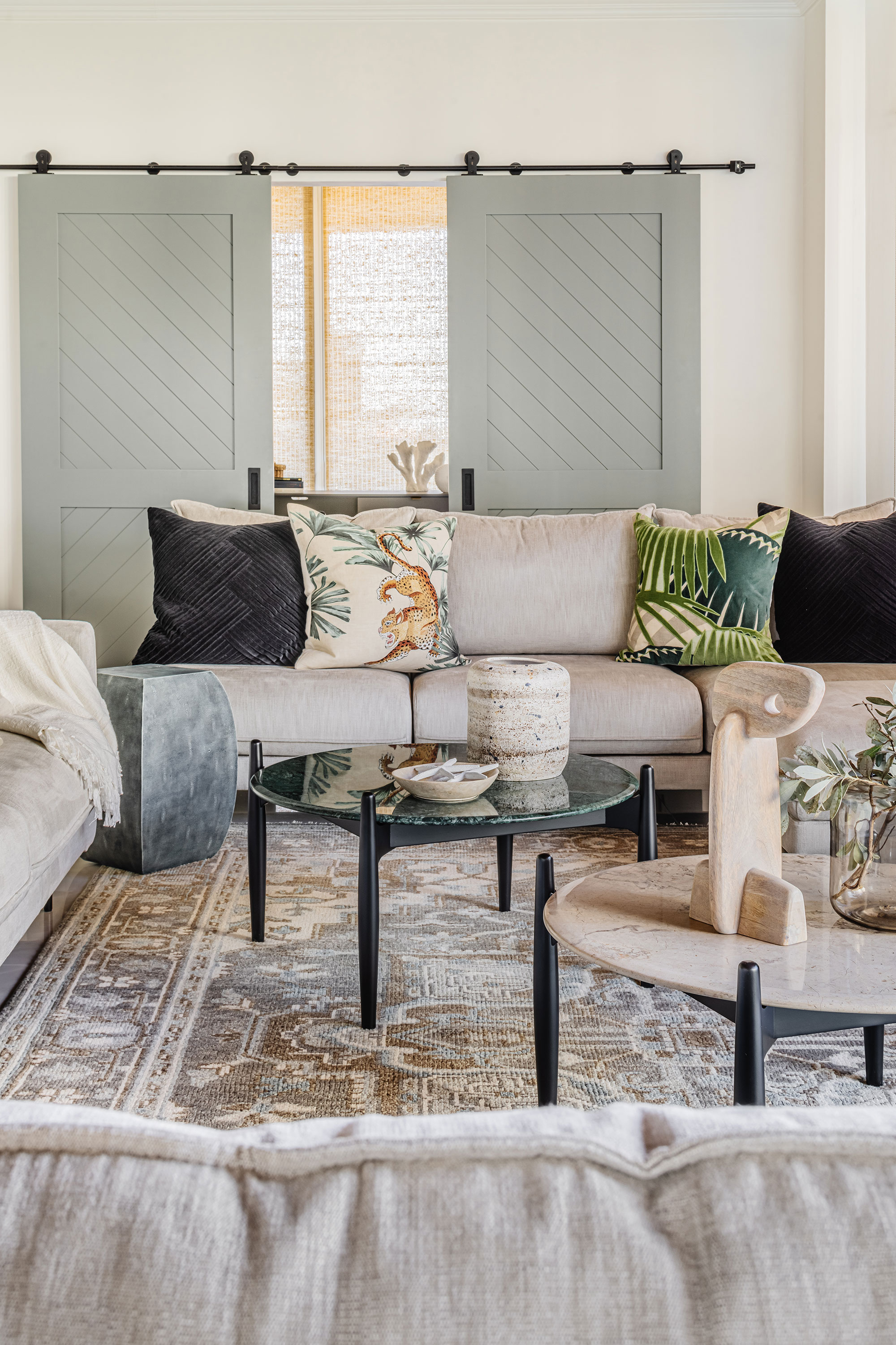
Living room ideas for the great room are meant to feel relaxed European, explains designer Sabrina, who mixes a modern sofa, Turkish flat-weave rug, and botanical textiles. 'The custom design double sliding barn doors are a traditional element made more contemporary with angular lines and recessed hardware,' she adds. We love this unusual mix of modern rustic and European styles, and the sliding barn doors are a total masterstroke.
Sofas and Caffe Low Tables by Ligne Roset.
Dining room
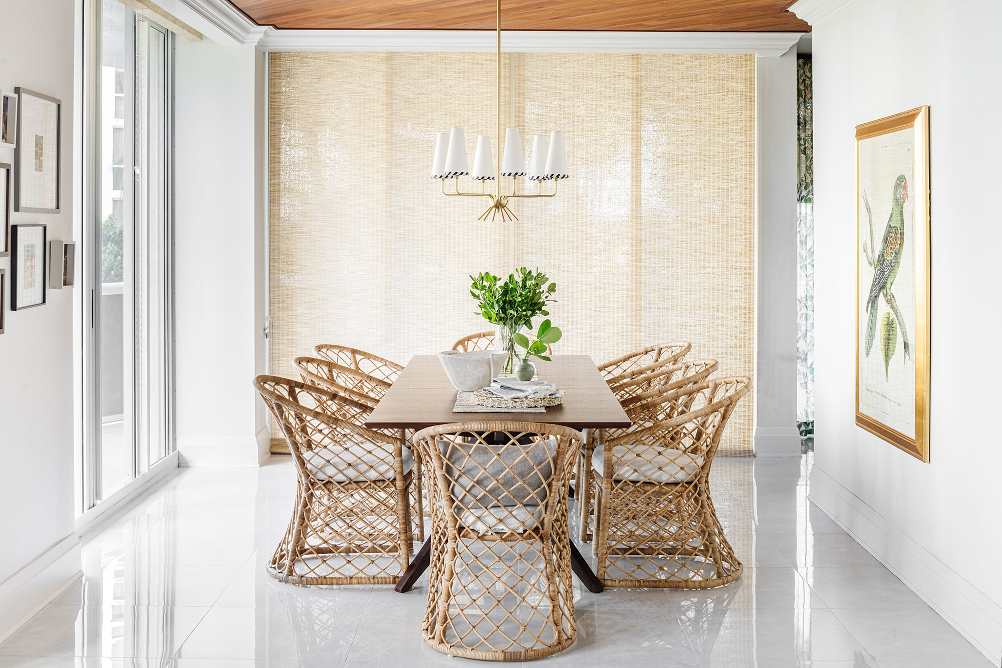
This sun-drenched room invited dining room ideas featuring warm, natural woods to complement the surrounding beach views from floor to ceiling windows. 'We wanted to mix wood textures from the sleek solid teak ceiling treatment, to smooth woven rattan seen on the dining chairs, and the raffia shades that still allow enough light to peak through,' says Sabrina. 'The teak ceiling is meant to send a nautical message, much like the teak accents on a 70s yacht.' We think 70s Saint Trop icon Brigitte Bardot would have approved – and so do we.
Avalon dining chair with beach stripe seat, Serena & Lily
Primary bedroom
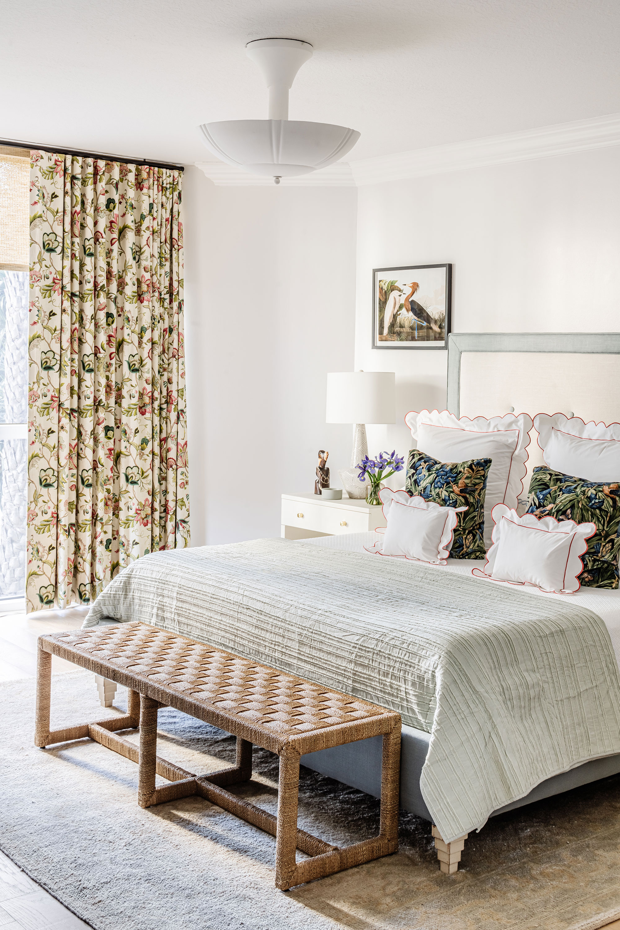
'The client was looking for a more traditional style bedroom, so our goals for this space were to blend comfort with chic,' says Sabrina.
Key bedroom ideas include a large, upholstered bed with stepped feet, that grounds the space with classic bedding and splashes of botanical prints.
Bed from Bunny Williams Curves no. 1; floor lamp, Hudson Valley, Toronto. Table lamps, Arteriors. Bianca Semi-Flushmount ceiling lamp, Currey & Co.
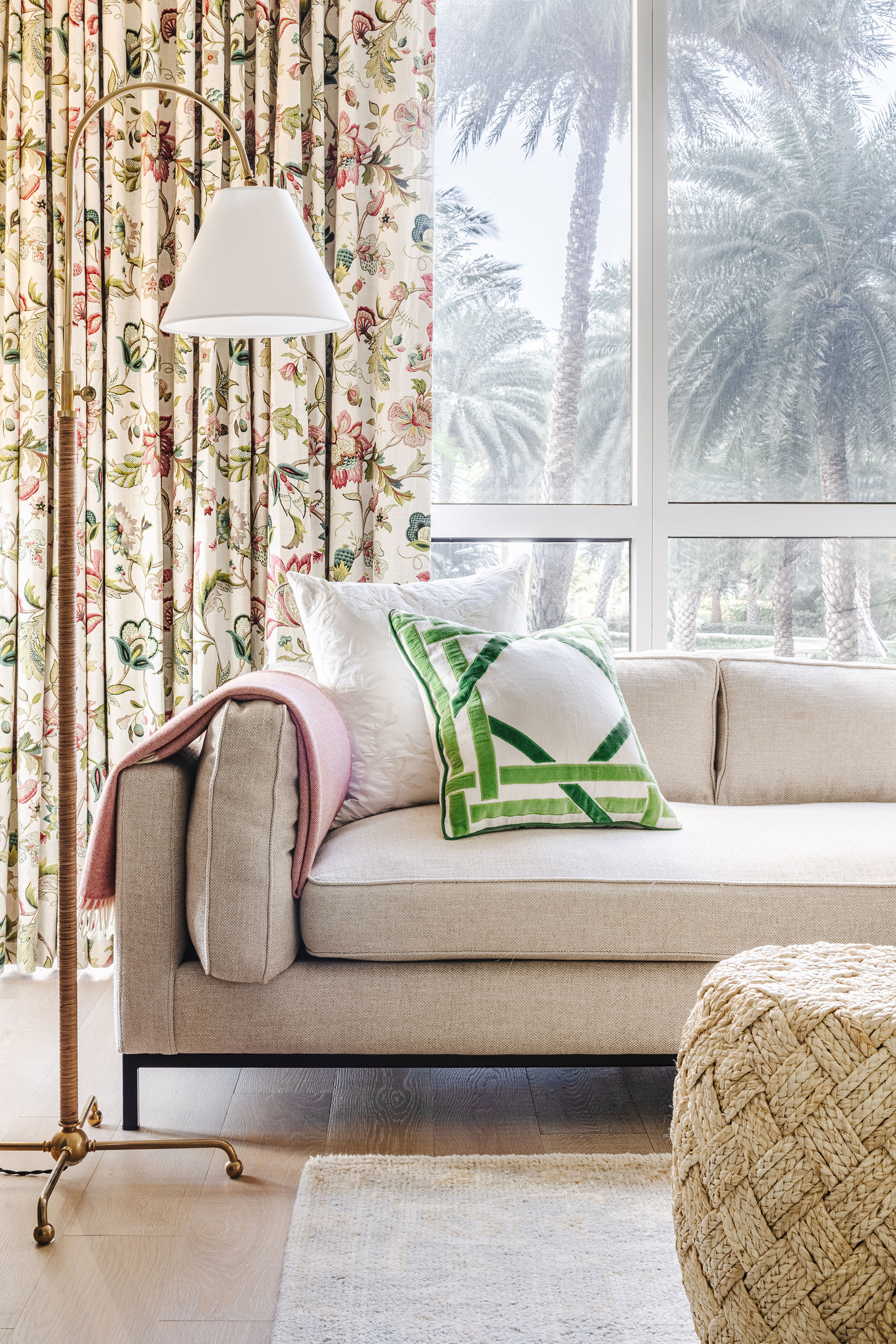
At the opposite side of the bedroom there's space for a comfortable sofa – the perfect spot for pre-bedtime reading.
Guest room
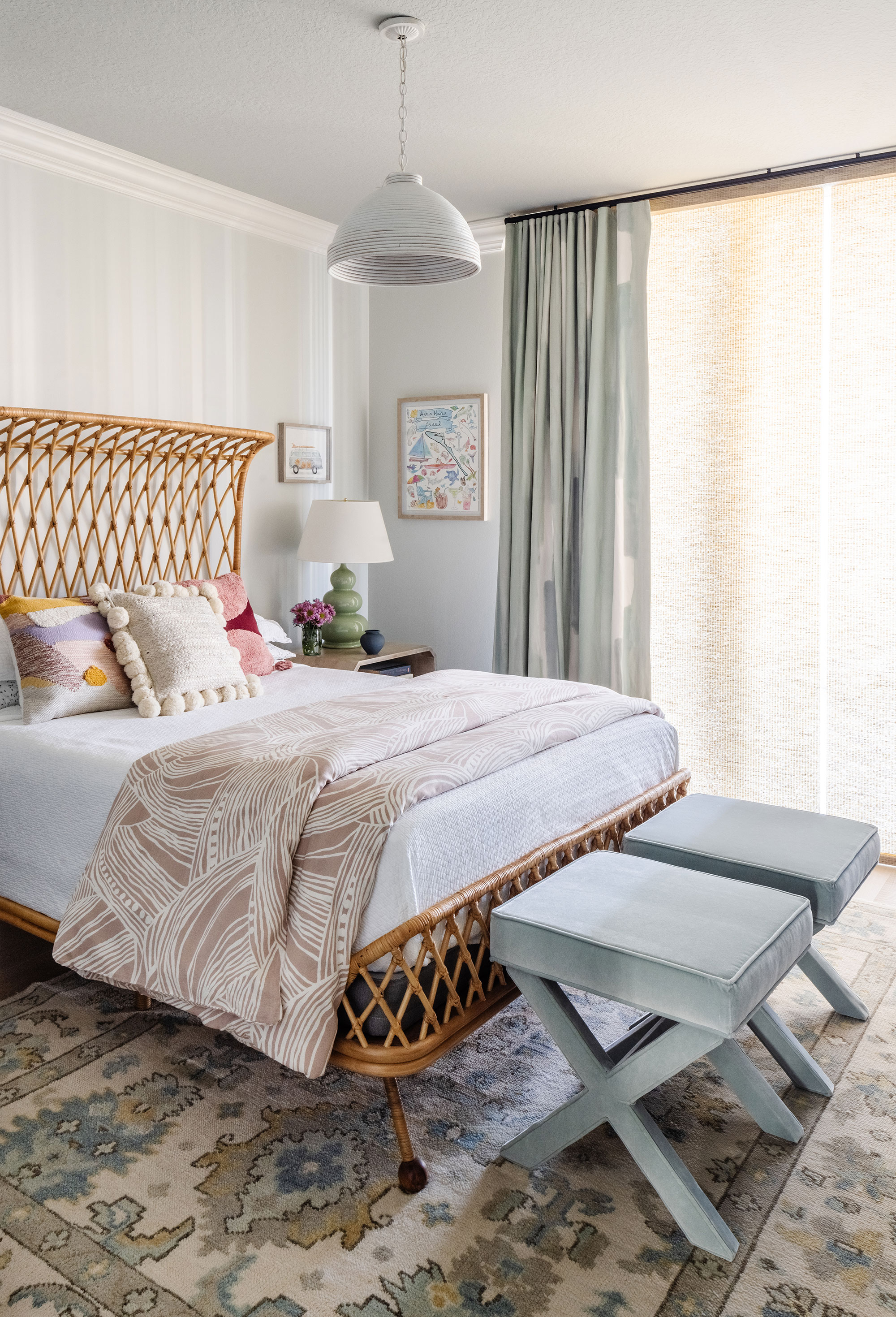
This bedroom doubles as a child's bedroom and guest room. 'The condominium is the owners' vacation retreat and the design for this room is heavily beach-inspired,' explains Sabrina. 'We've drawn on the varying hues of ocean blues, the lightness achieved with the rattan bed frame, and the youthful mix of textures.'
Curved Rattan Queen Bed, Anthropologie.
Bathroom
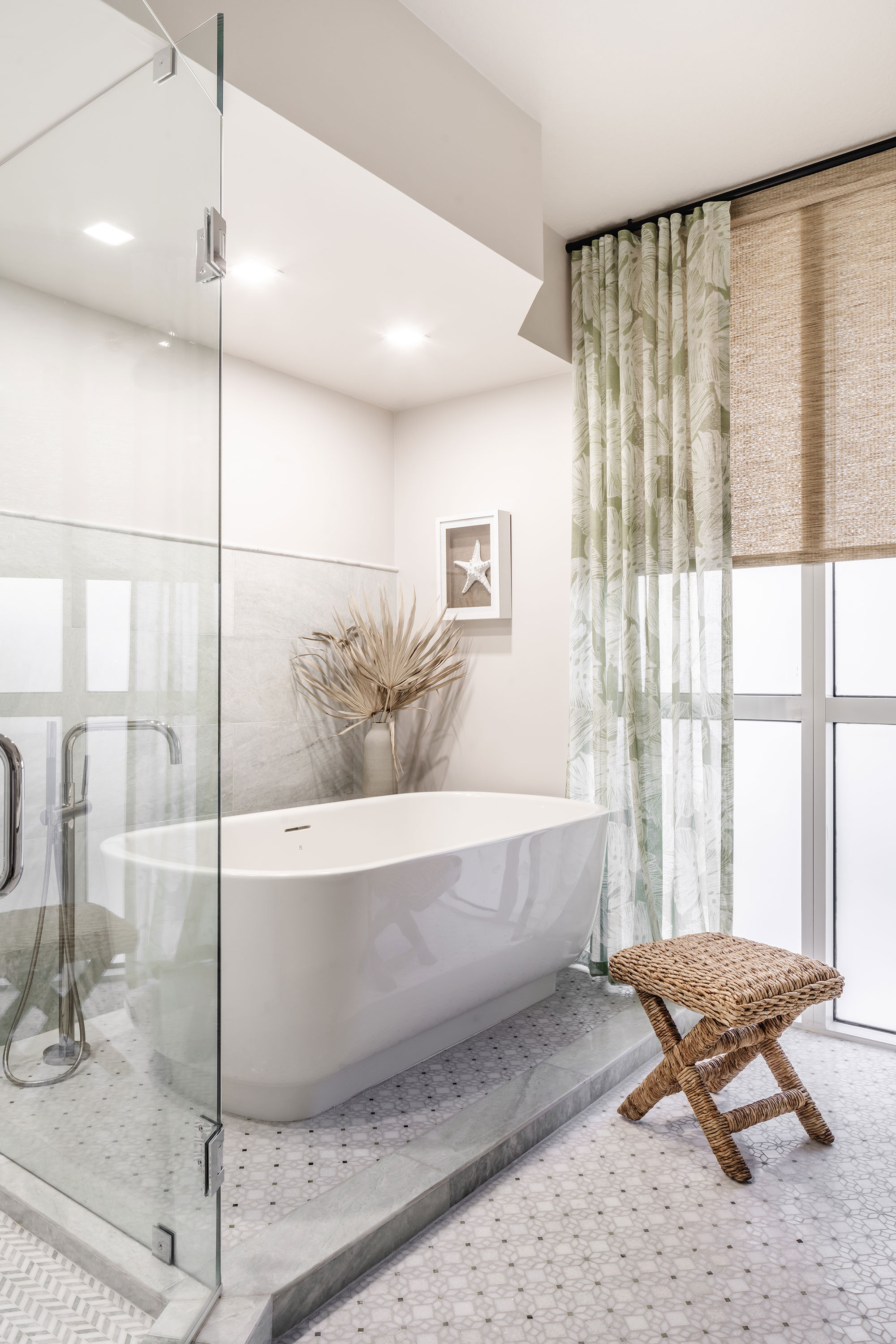
Bathroom ideas for the primary ensuite, involved placing the contemporary freestanding tub on a slightly elevated platform, tucked in its own nook with a view. 'Sheer drapes provide romanticism layered over the raffia shades,' says Sabrina. P
Stool, Serena & Lily; drapes, Schumacher.
Powder room
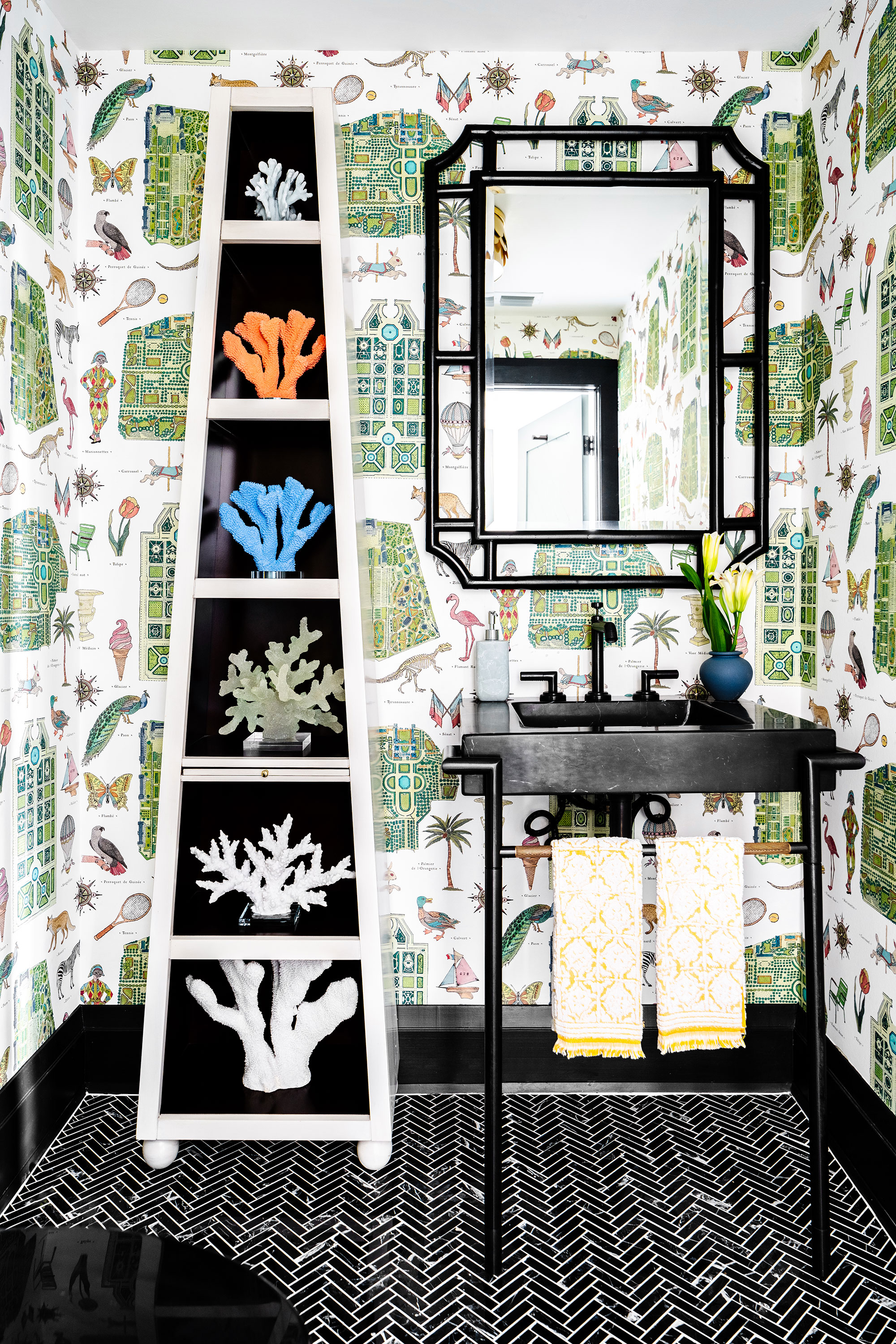
Talking about her powder room ideas, Sabrina says, 'We wanted the powder room to have a playful eccentricity – it’s the perfect place to go really bold since we don’t spend extended periods of time in these kinds of spaces.'
And we couldn't agree more. If you want to trial a daring new decorating idea, the powder room is a great place to start.
'The quirky wallpaper is painted with bird's eye views of Parisian gardens mixed with imagery of peacocks, dinosaurs, and ice cream cones – it’s amazing,' adds Sabrina. 'This contrasts with the black floor tile and vanity, which is sitting tall with ample negative space for a small room like this one.'
Ojal Mirror, Serena & Lily.
Karen sources beautiful homes to feature on the Homes & Gardens website. She loves visiting historic houses in particular and working with photographers to capture all shapes and sizes of properties. Karen began her career as a sub-editor at Hi-Fi News and Record Review magazine. Her move to women’s magazines came soon after, in the shape of Living magazine, which covered cookery, fashion, beauty, homes and gardening. From Living Karen moved to Ideal Home magazine, where as deputy chief sub, then chief sub, she started to really take an interest in properties, architecture, interior design and gardening.
