9 luxe ideas to take from this sumptuous London townhouse
Fiona Barratt-Campbell has woven her magic and transformed a property in the heart of Chelsea into a light and luxurious retreat
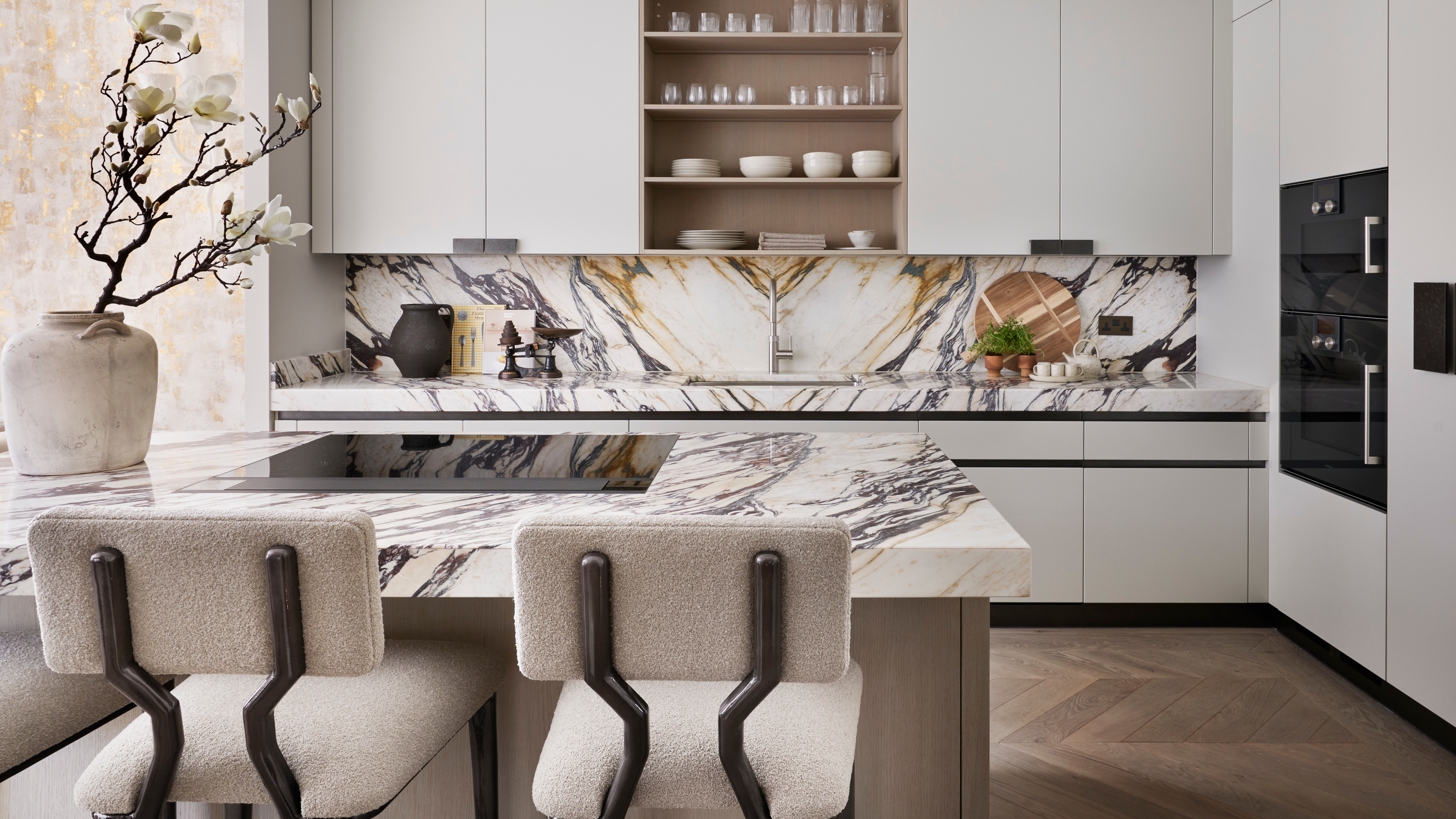

Take a period house that had been converted into a dentist's studio with apartments above, sprinkle with plenty of imagination, and hey presto, the result is an elegant five bedroom townhouse in Chelsea, London. Now restored into one of the world's best homes, it's a masterclass in how to create an opulent aesthetic.
The first redevelopment project undertaken by Fiona Barratt-Campbell and her husband Sol under their new business arm Fiona Barratt Projects, a luxurious look was key.
'The aim for the property was to carefully balance aesthetics with functionality, using luxurious artisan finishes to create a sumptuous and welcoming home,' says Fiona. 'We wanted to create a liveable feel throughout the house.'
Soothing neutrals evoke a serene and calming interior. 'I love the way in which the neutral palette we used throughout the house is offset by statement pieces. Texture, color and contrasting materials all combine into a signature style, adding depth and definition to the warm, neutral backdrop in most of the rooms.'
1. Use a textured wallpaper in a hall
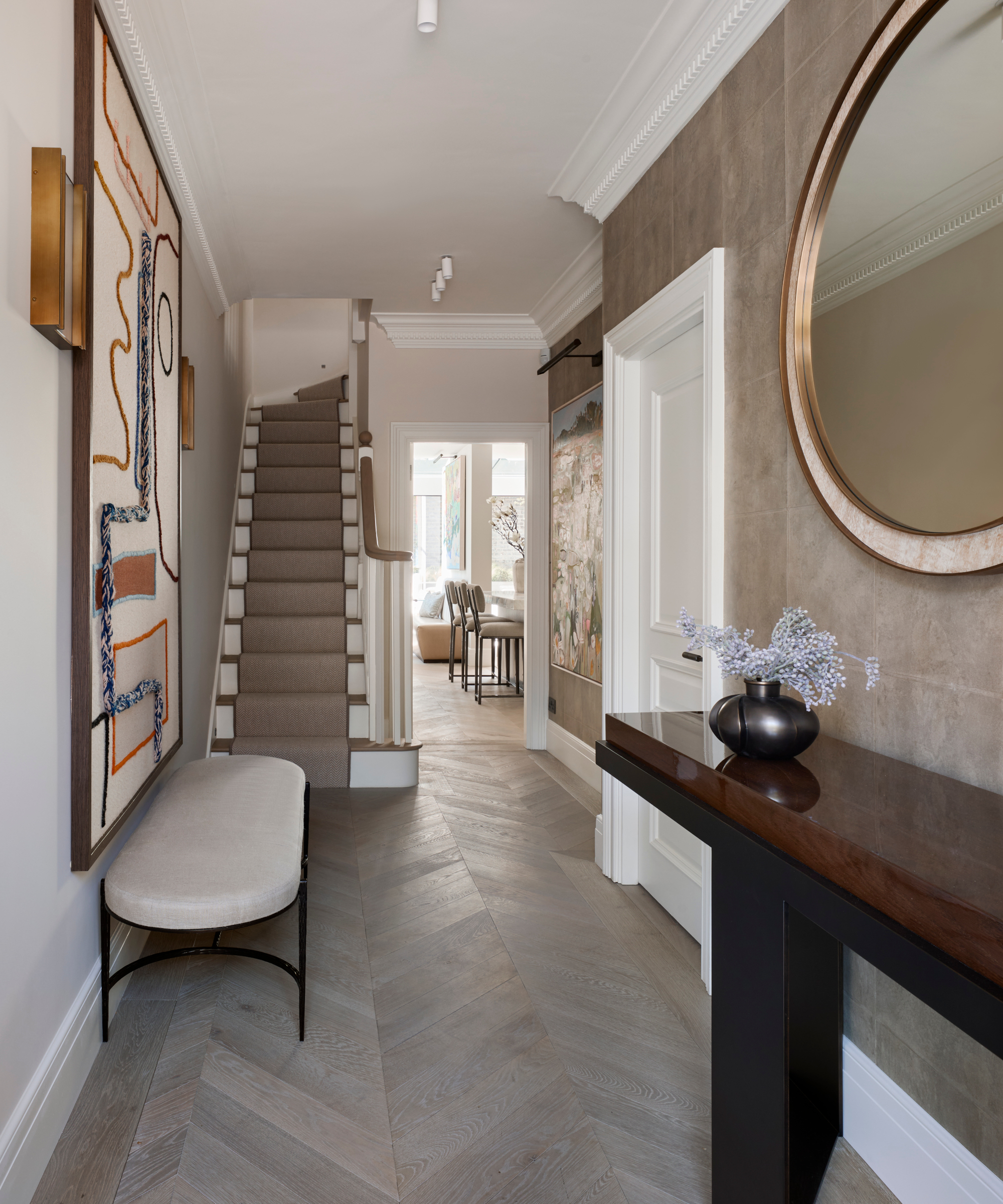
Structural work included reconfiguring much of the interior to maximise the space. The very narrow hallway, for instance, was widened to add a greater sense of arrival when entering the house.
One of the hallway ideas to create a luxe feel as soon as you enter the home was to incorporate a suede effect wallpaper. 'I wanted to add warmth in the hallway as it is the first room people see when they enter,' says Fiona. 'The suede textured wallpaper achieves this perfectly, enveloping guests as soon as they step through the door.'
2. Install a statement kitchen island
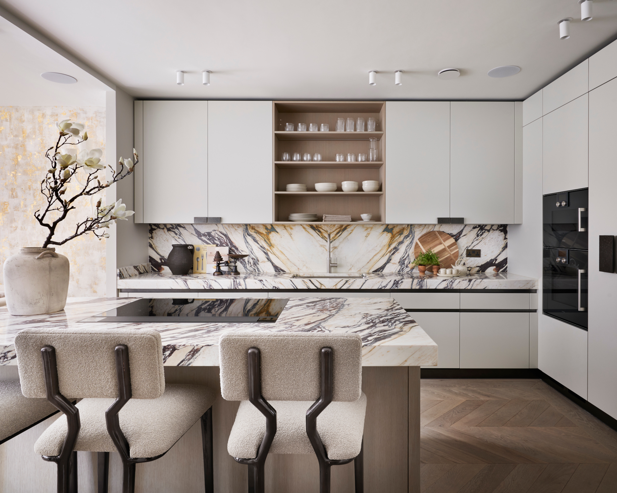
Fiona created a statement kitchen with bespoke cabinets by her brand, FBC London.
Among her kitchen ideas was installing an eyecatching central island to create an all important ‘kitchen triangle’.
'This instantly creates a social gathering point and centerpiece for the kitchen; the overhang of exquisite Italian Calacatta Viola marble creates additional seating suited to a range of uses from relaxed family breakfasts and afternoon coffee with a laptop, to evening drinks with friends,' Fiona says.
The marble’s variety of warm brown tones complements the tones of the cabinetry. 'The pattern of the marble really lifts and adds character to the matt lacquer and veneer cabinetry frontage, instantly creating a focal point for the space. We intentionally chose simplicity in the smaller details, including handleless cupboards and drawers for a cleaner look.'
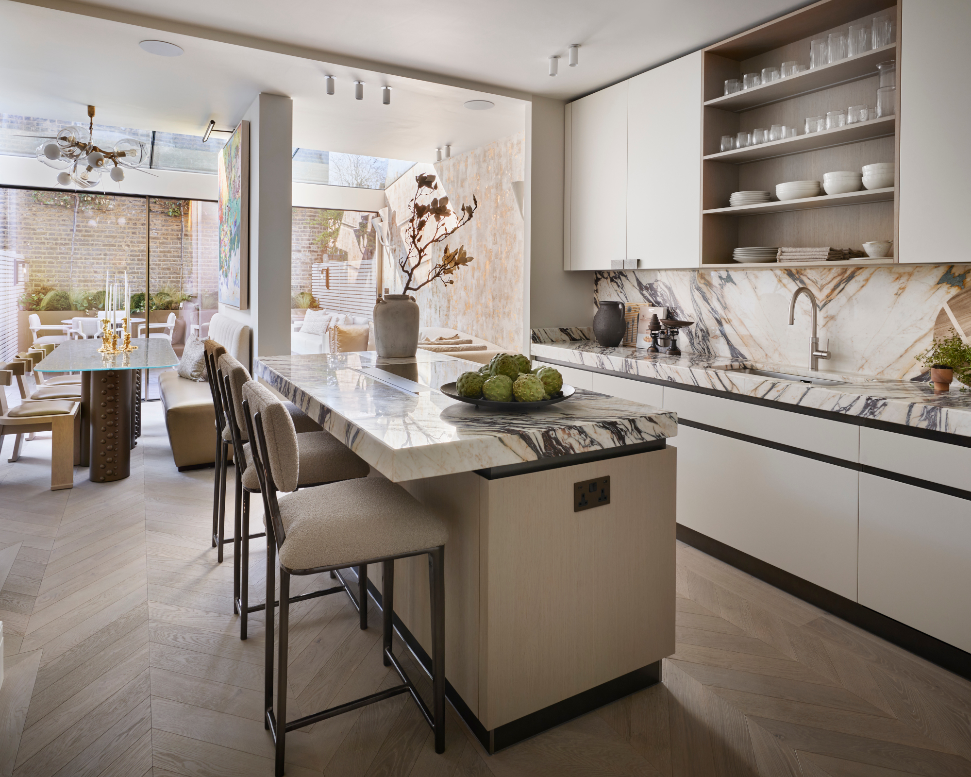
The starting point for the kitchen design was to create a large open plan space that incorporated the cosy television area and the dining area, while maintaining the functionality and identity of these individual spaces.
3. Create a showstopping dining space
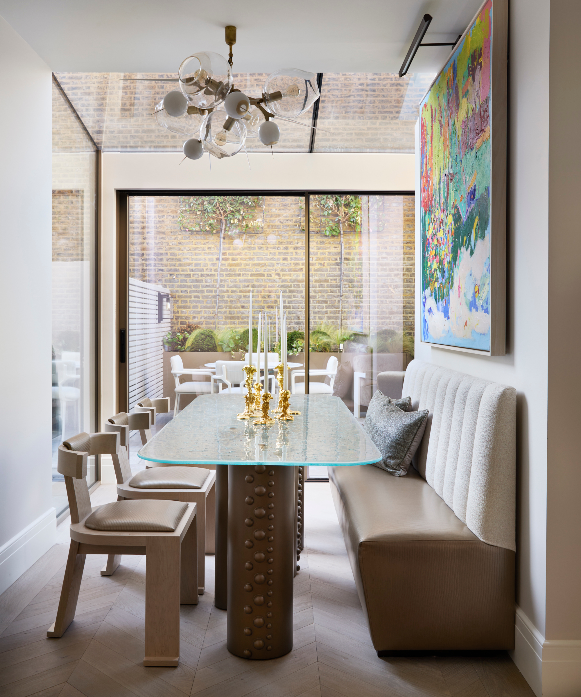
Despite the space being so narrow, Fiona has managed to create a sumptuous feel with carefully considered furniture.
One of Fiona's key dining room ideas was the hero dining table. 'The hammered glass top and industrial scale rivets on the columns below create a showstopping entertaining piece,' she says.
Because of the size of the space, Fiona incorporated a fixed banquette on one side and chairs on the other, so that seats could be easily moved and the area opened up, if needed.
4. Introduce gold leaf accents
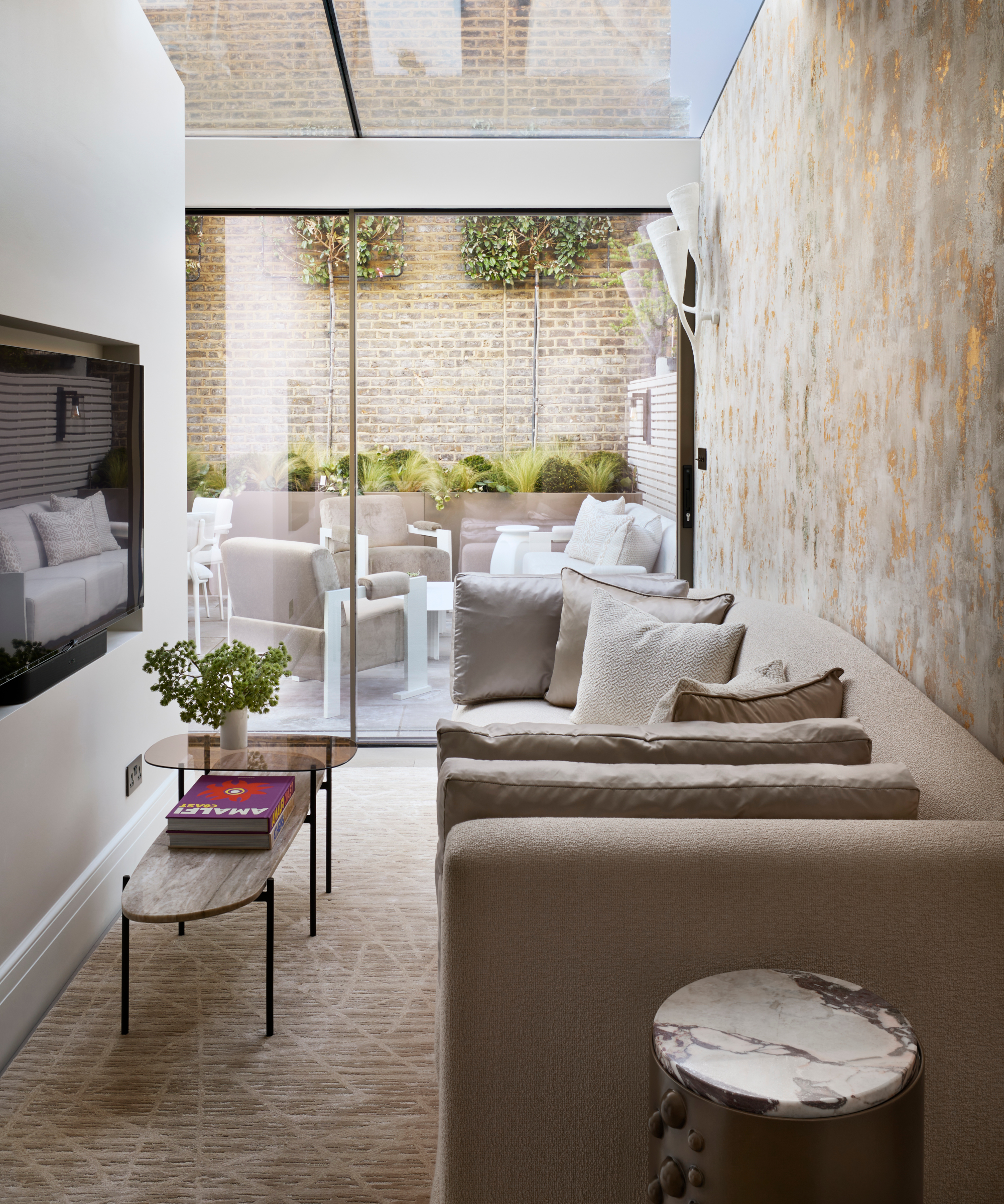
Fiona intentionally chose tones to complement the golden brickwork in the outdoor courtyard, to create one harmonious indoor-outdoor environment. 'The gold leaf accents in the wallpaper reflect the abundance of natural light to create a luminous and luxurious living space,' she says.
5. Choose opulent upholstery fabric
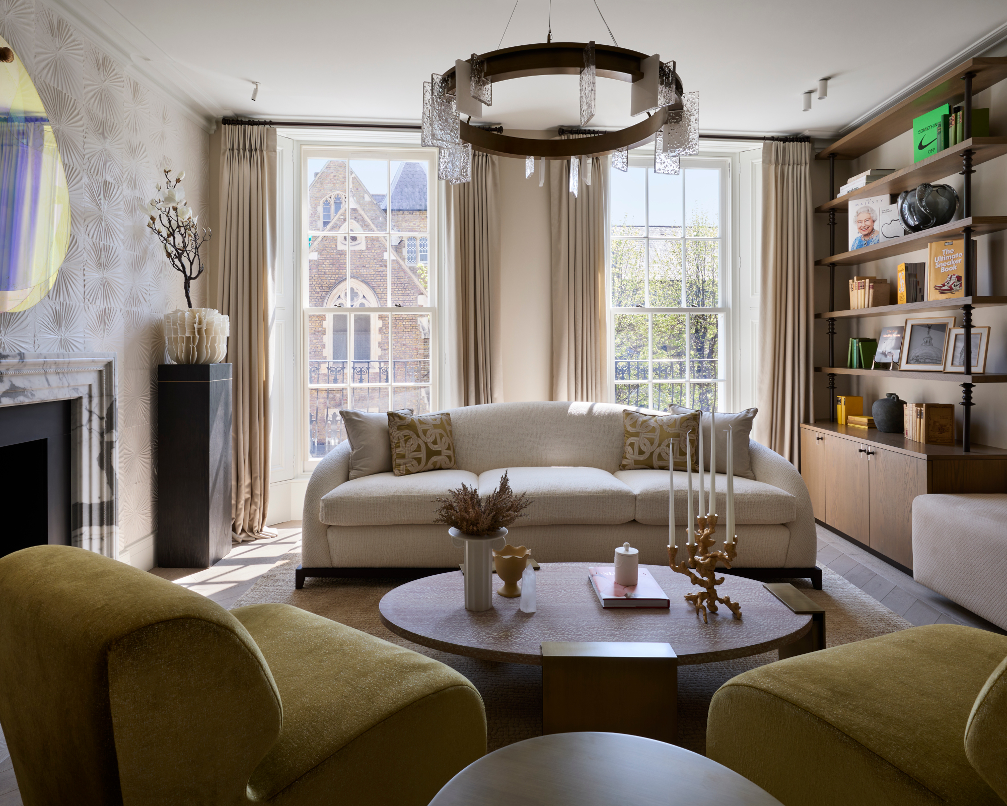
'The living room is one of my favorite rooms in the house and a real entertaining space with floor to ceiling sash windows,' says Fiona.
Furniture with smooth curved edges is key to the sophisticated feel. Fiona opted for statement FBC London Angelina armchairs, which have a detailed cast bronze foot. Opulent upholstery fabrics are among her living room ideas. 'I chose the fabric, which in person has a beautiful luminescent, almost golden appearance, as it sits so well against the more neutral tones of the other pieces in the room,' she says. 'We needed a moment of color and the two chairs really do pop and provide a focal point as soon as you enter the room.'
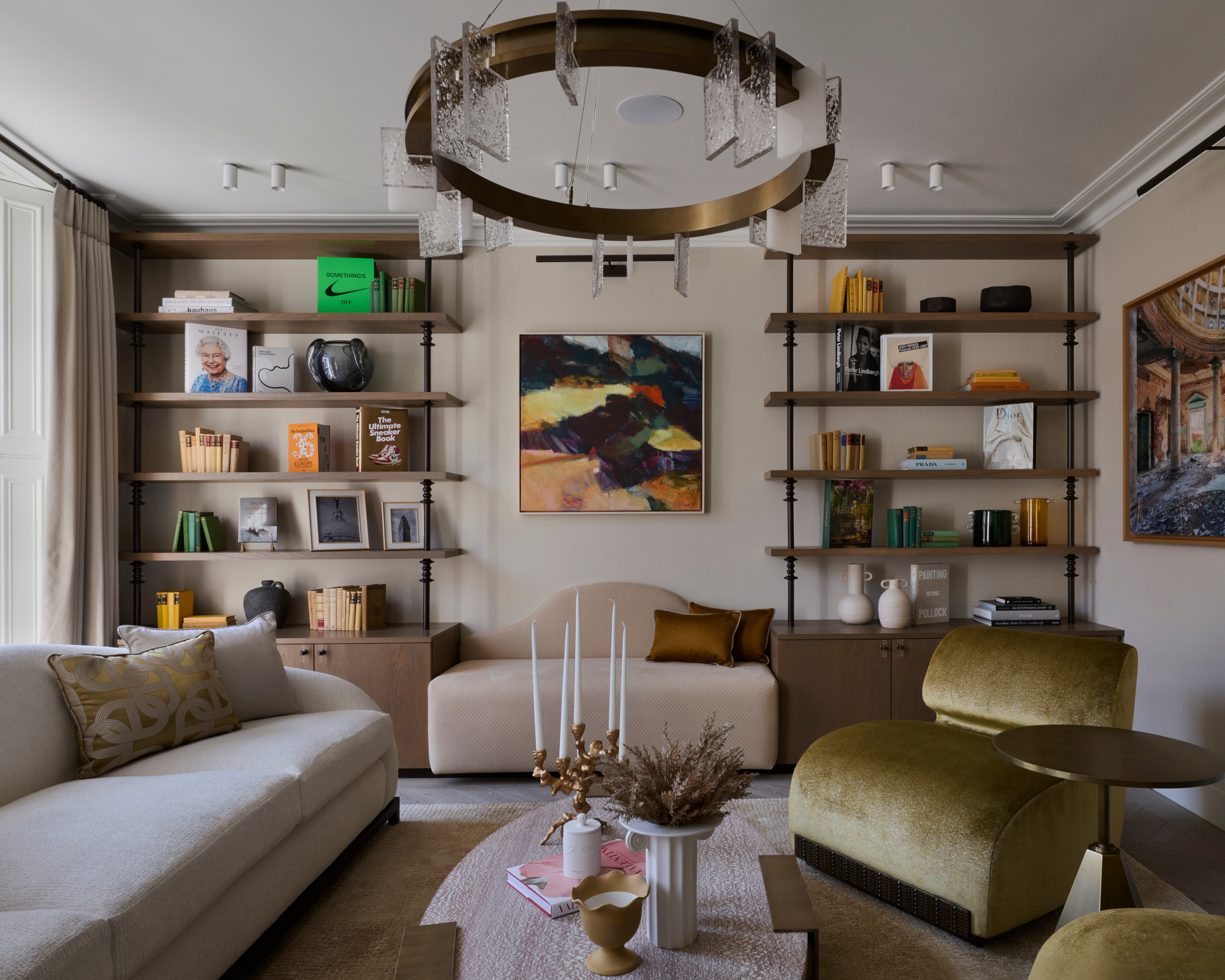
Bespoke joinery units provide elegant storage. 'This additional shelving allowed us to balance aesthetics with functionality, and the carefully curated art and antiques add contrasting accents and pops of color to the surrounding neutral background palette,' says Fiona.
6. Add interest with a shimmering paper
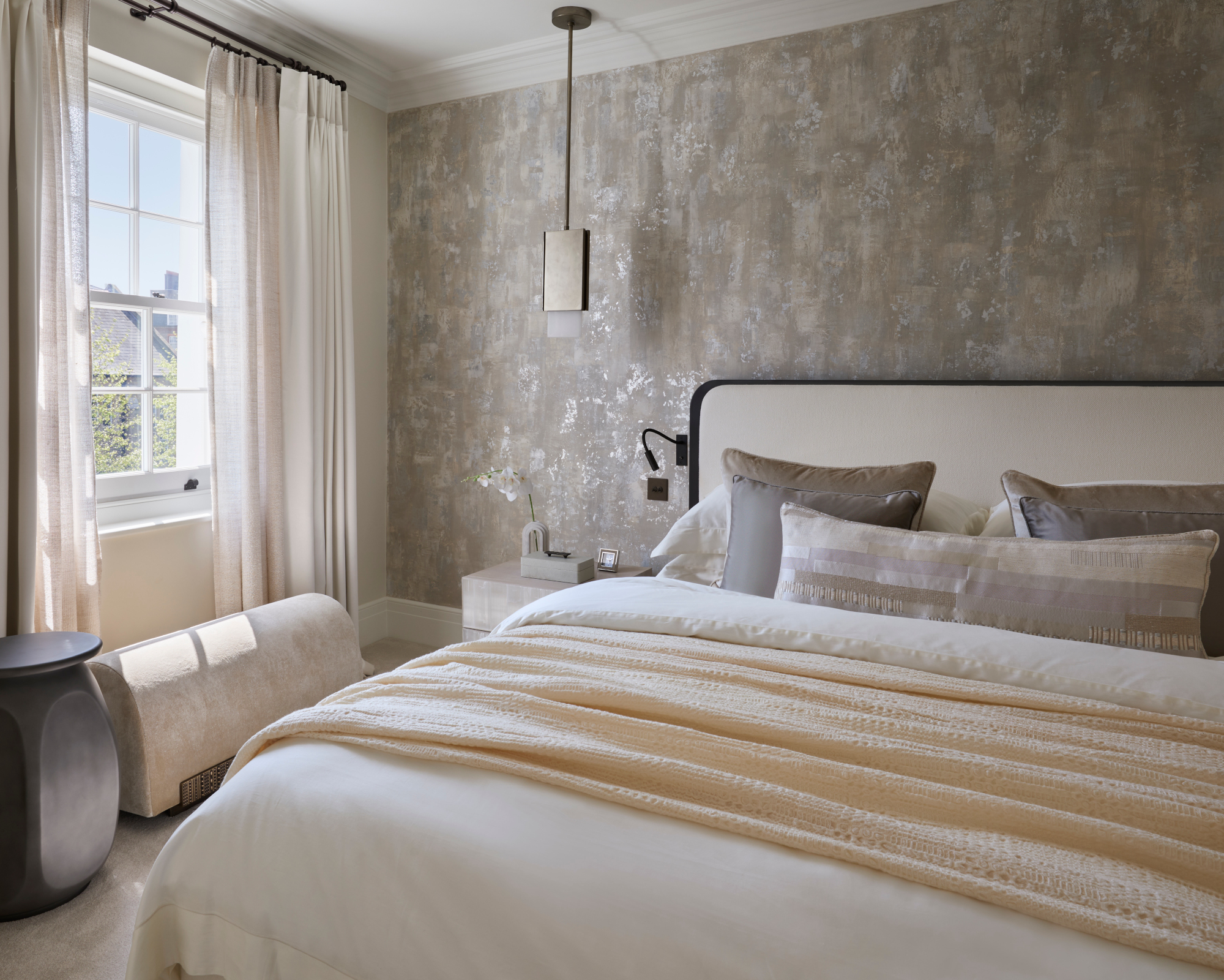
In the main bedroom, Fiona opted for a slightly warmer neutral base with luxurious artisan finishes to create a sumptuous and cocooning retreat. Central to her bedroom ideas was the bespoke wallpaper with its dappled shimmer effect, which draws the eye into the space.
7. Indulge with an oversized headboard
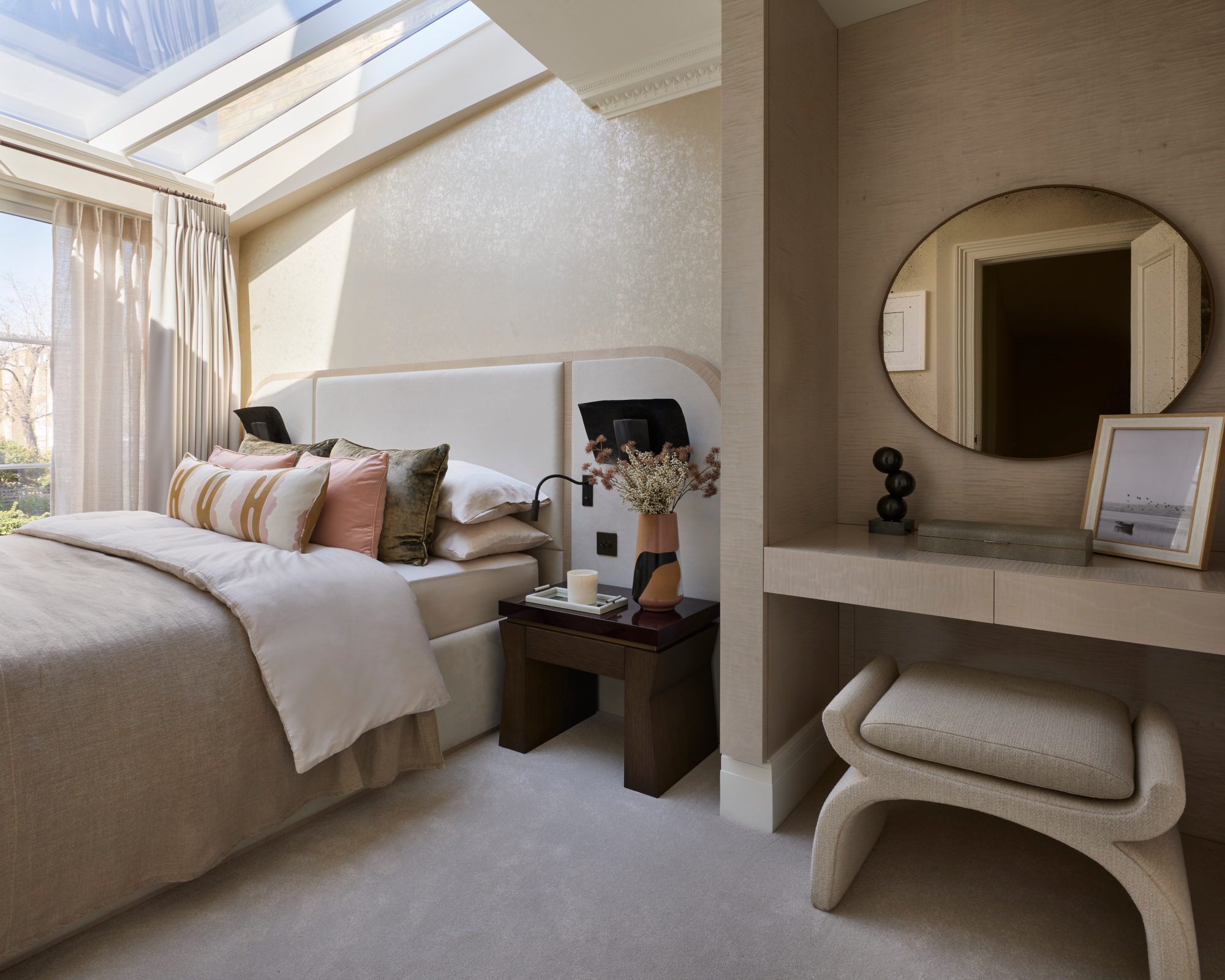
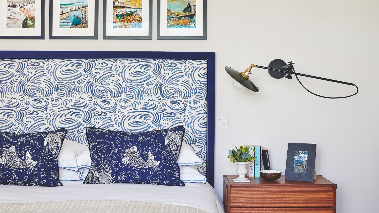
Fiona has made a statement in this bedroom with an oversized headboard that features soft, luxurious upholstery. She contrasted it, in terms of style and texture, with two mounted hammered metal sidelights. Shimmer effect wallpaper creates a luxe backdrop. The sky light was added to maximise natural light.
8. Layer textures in a bedroom
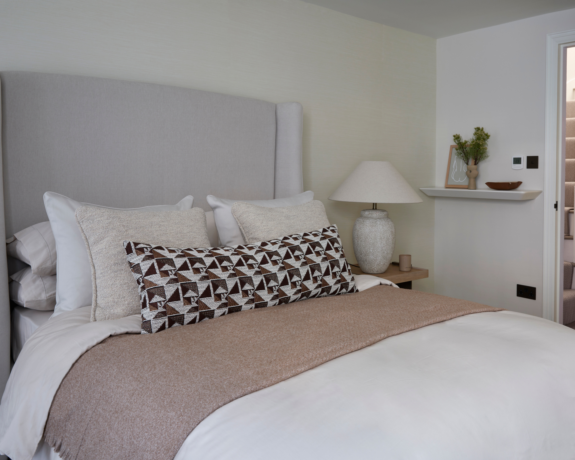
Fiona played on the juxtaposition of nature and materiality to create an elevated rustic aesthetic in this guest bedroom. The layering of texture and warm tones adds depth. 'To me, this is the essence of modern luxury in the home,' she says.
9. Opt for dramatic marble in a bathroom
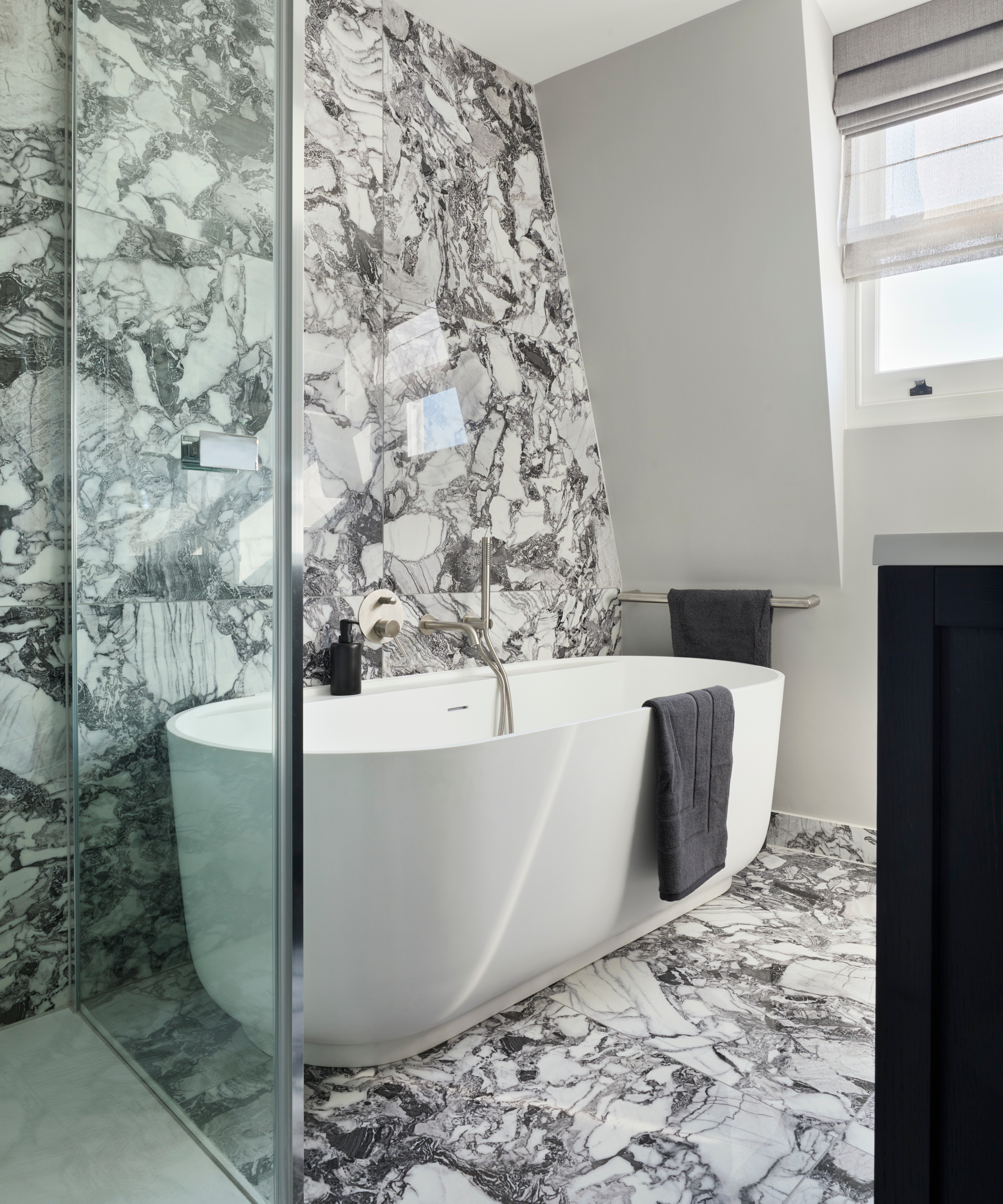
Fiona had a monochromatic vision for the bathroom. Among her bathroom ideas was a bold marble with strong veining in predominantly whites, black and greys to create a dramatic backdrop. Offsetting it with the soft, matt white tub and accessories avoids a heavy atmosphere.
Interior design/ Fiona Barratt Interiors
Photographs/ Fiona Barratt Projects
Sign up to the Homes & Gardens newsletter
Design expertise in your inbox – from inspiring decorating ideas and beautiful celebrity homes to practical gardening advice and shopping round-ups.

Interiors have always been Vivienne's passion – from bold and bright to Scandi white. After studying at Leeds University, she worked at the Financial Times, before moving to Radio Times. She did an interior design course and then worked for Homes & Gardens, Country Living and House Beautiful. Vivienne’s always enjoyed reader homes and loves to spot a house she knows is perfect for a magazine (she has even knocked on the doors of houses with curb appeal!), so she became a houses editor, commissioning reader homes, writing features and styling and art directing photo shoots. She worked on Country Homes & Interiors for 15 years, before returning to Homes & Gardens as houses editor four years ago.
-
 'Big results before you know it' – Experts urge you to use the ‘Take Away 10’ method for simple decluttering with zero decision fatigue
It can cut hundreds of items from your home in just a few weeks
By Ottilie Blackhall
-
 Kevin Bacon and Kyra Sedgwick's rustic kitchen island is stunning, but controversial – designers say you can get the look without the hassle
A popular material finds an unorthodox home in the couple's kitchen, but experts disagree on whether it should be used – here's how to do it instead
By Sophie Edwards