We're calling it – this extraordinary apartment is the most beautiful you'll see in 2023
A melting pot of ideas from near and far, this stunning Singapore apartment designed by Elizabeth Hay is an absolute treasure
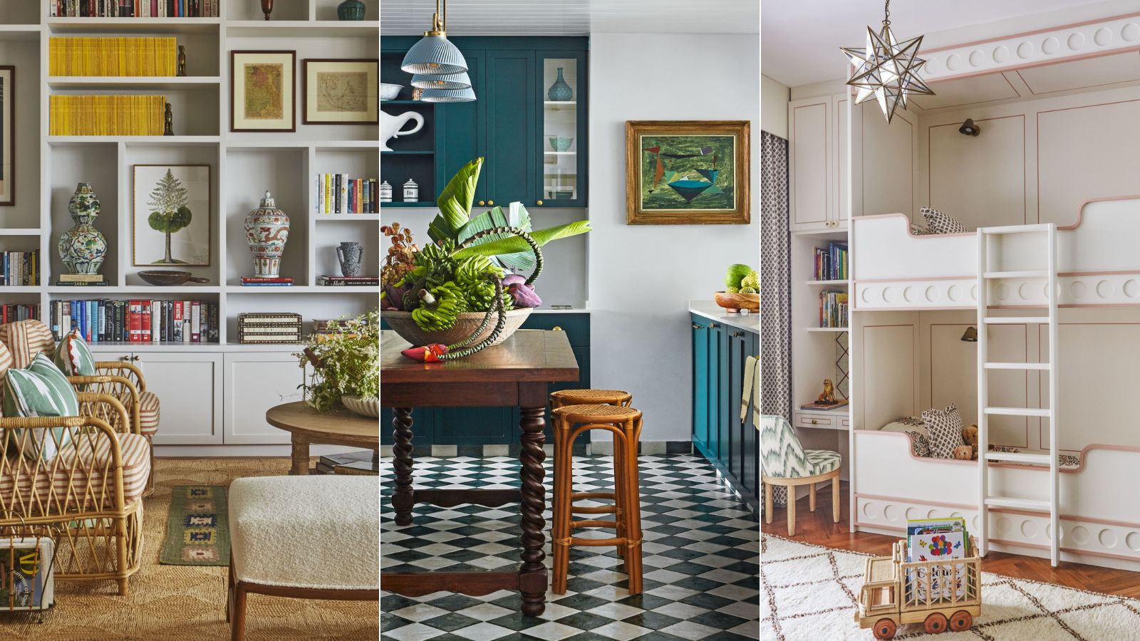
One outcome is guaranteed when design involves a combination of cultural and geographical influences: an unexpected, richly layered look. That’s certainly the case with the latest project by Elizabeth Hay – the renovation of a 15th-floor apartment in Singapore.
It's one of the most beautiful small homes we've featured – and it abounds with apartment decor ideas for anyone looking to introduce character, color and charm to their home.
Here, we take the tour. Be prepared to be delighted.
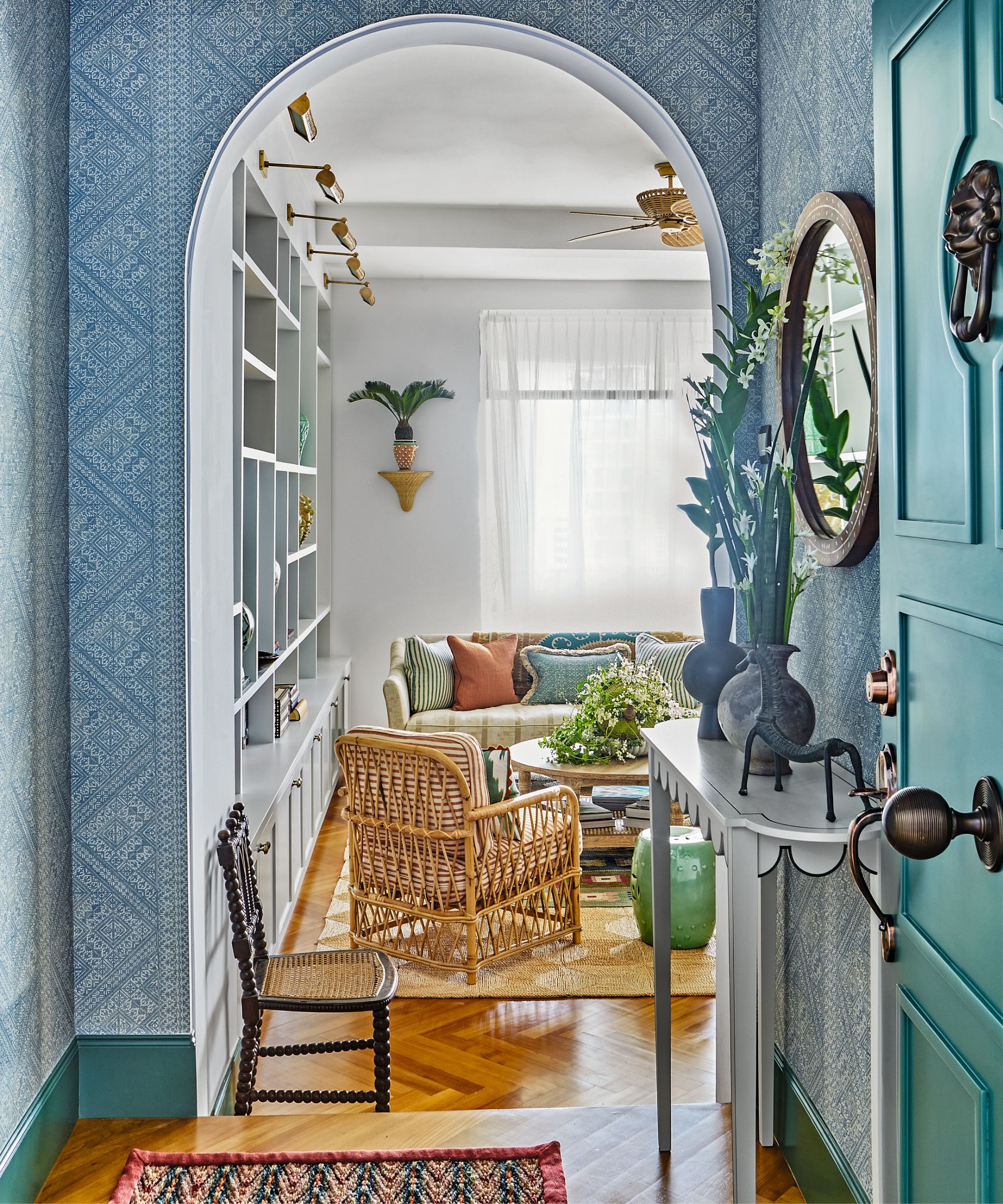
From the entryway, the softly patterned wallpaper and a generous archway leading to the living room create a welcoming feel. Sculptural shapes are the key to this eye-catching tableau, with its carefully edited trio of objects, spiky foliage and scalloped table edge
Elizabeth's clients, a couple with a young daughter, brought their Malay-British and German backgrounds to the drawing board, while Elizabeth – who trained under Colefax and Fowler and later Veere Grenney, and set up her studio in Singapore over a decade ago – added her own international stamp.
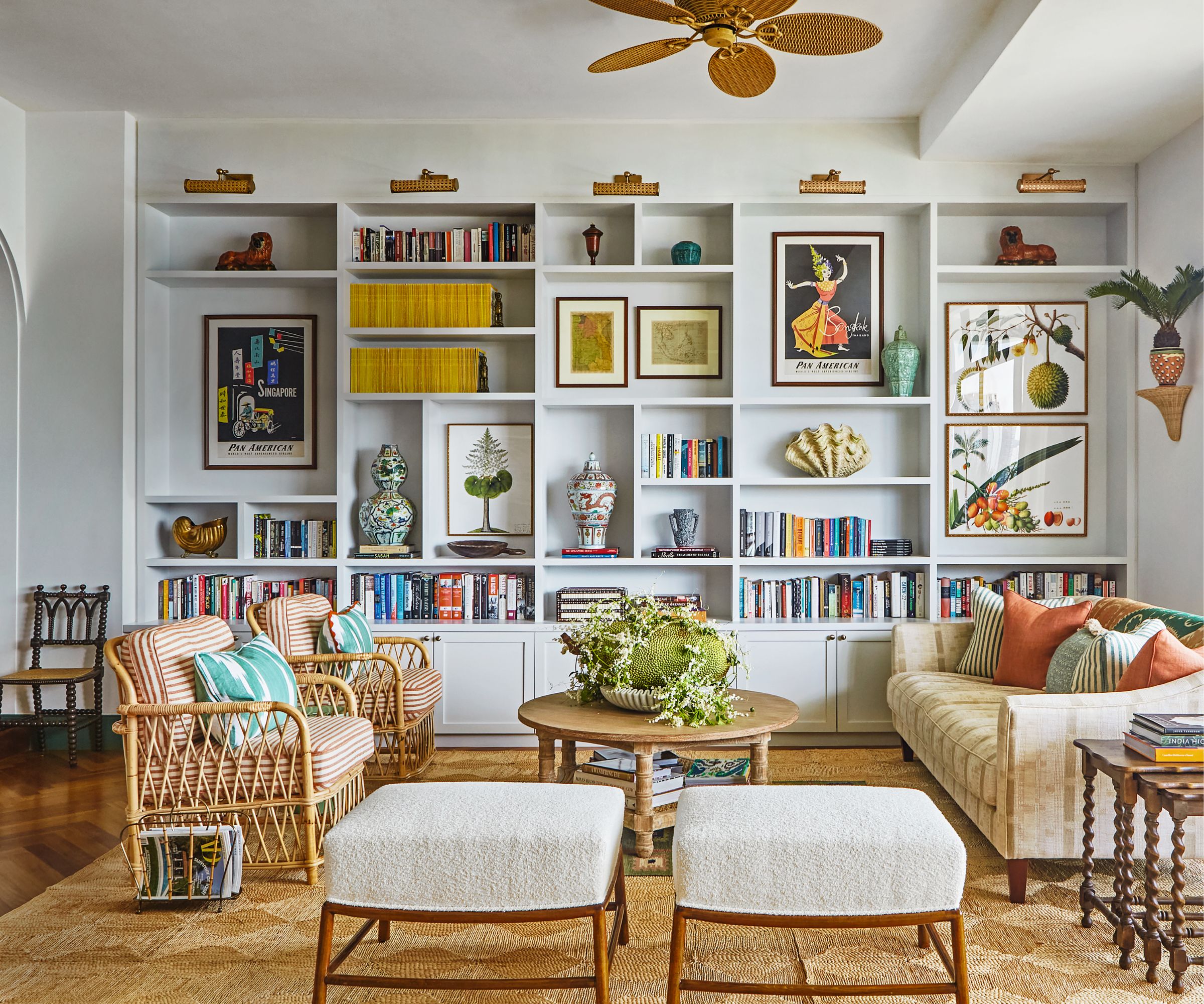
While a signature style of classic English prints blended with global elements softly underpins many of Elizabeth’s schemes, this couple desired a relaxed, layered aesthetic that felt crisp and clean, but at the same time dynamic.
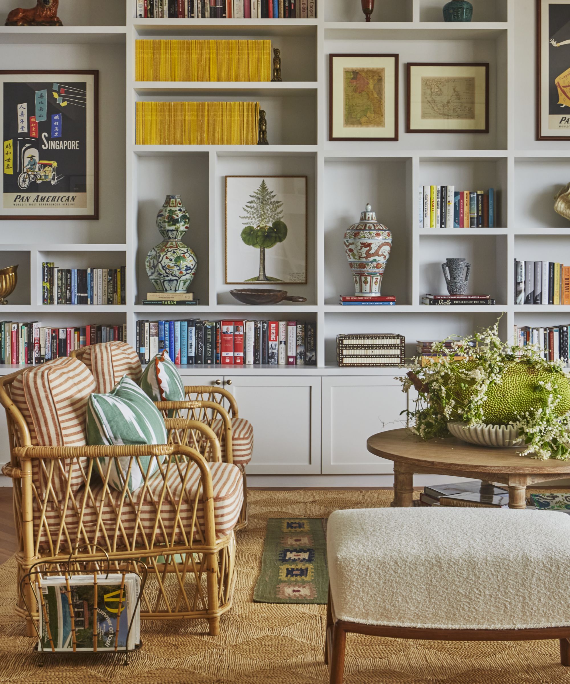
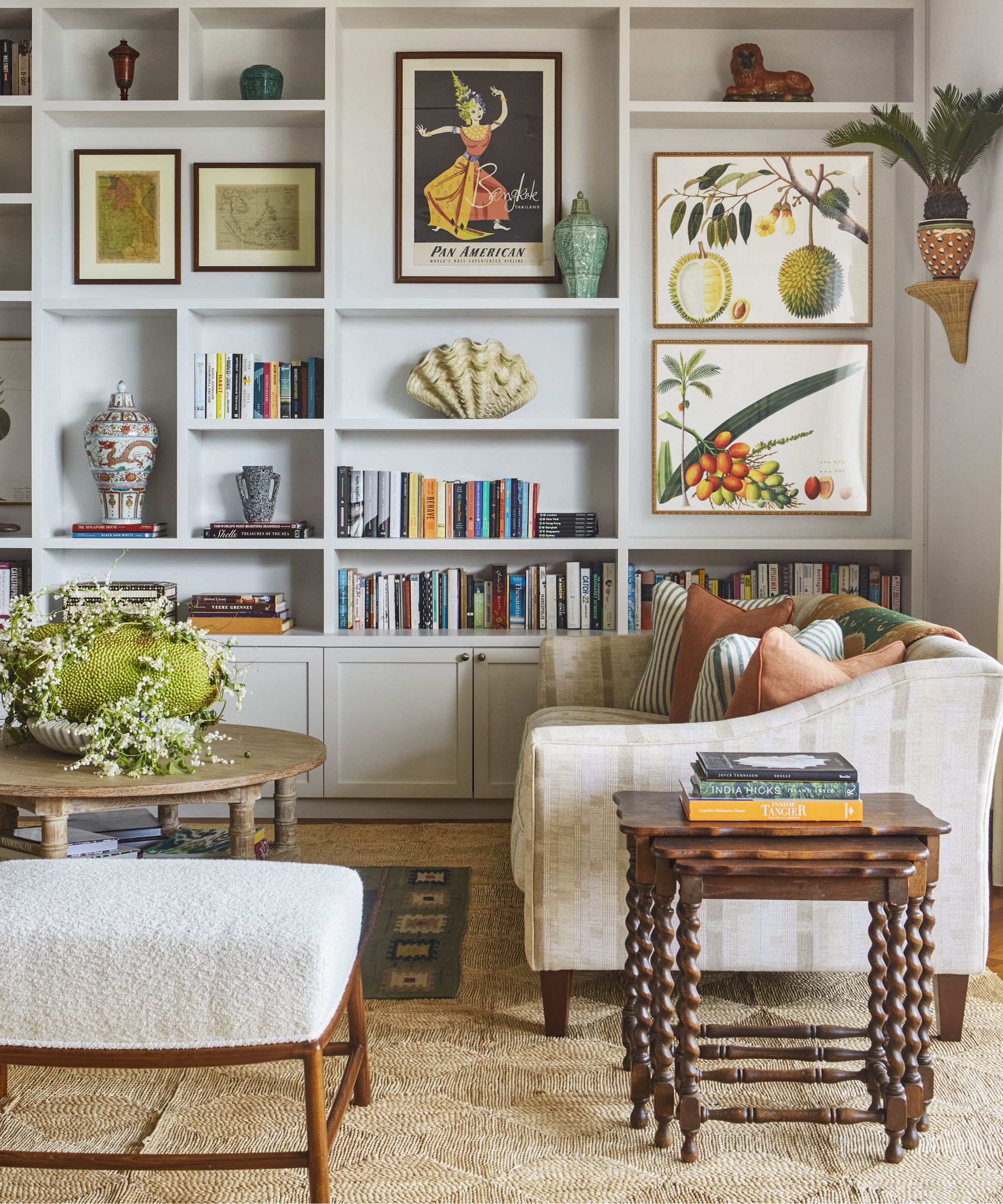
Simple built-in joinery allows books, artwork and ceramics to sing out in this space, where cane elements add a relaxed note.
‘To achieve this, I turned to textures, textiles and a slightly more restrained color palette than usual,’ says Elizabeth. It meant blending pared-back joinery with botanical artwork, cane and bamboo with teak, and vivid wall murals with terracotta floors.
But first, the bones had to be settled. Built in the 1980s, the apartment had high ceilings and relatively airy rooms, but its configuration catered to a time when kitchens were thought of as largely ‘back of house’. This (the kitchen, below) was the least appealing room to the couple, who disliked its lack of windows and diminutive layout.
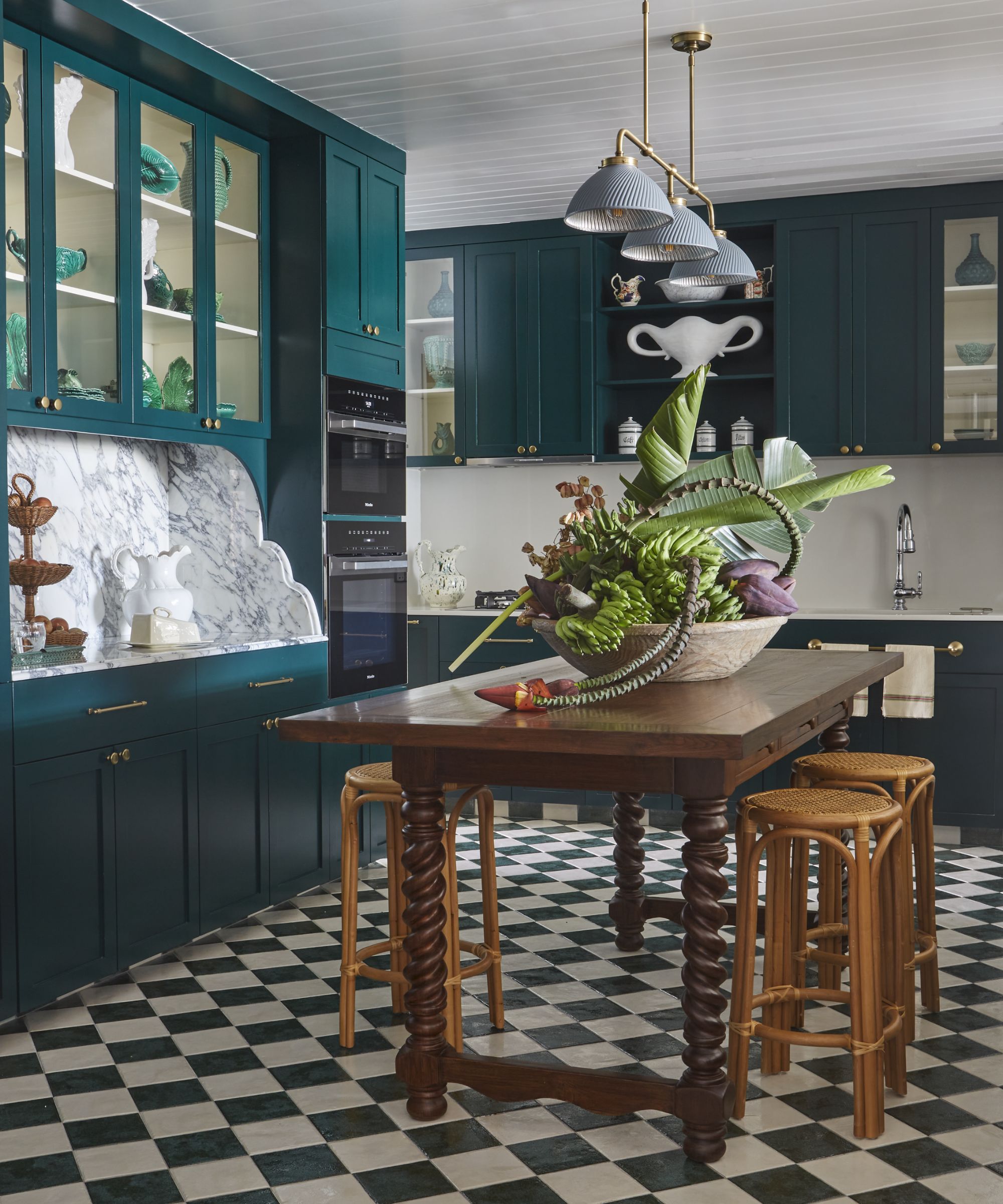
The designer’s deft mix-and-match approach abounds in the rich teal kitchen cabinetry juxtaposed with striking marble, the teak four-poster bed offset by relaxed cane furniture, and the easy placing of a classic lamp atop a bamboo console.
‘I guess that’s the essence of English design – it’s homely and comfortable yet pulled together. It’s an aesthetic that’s not afraid to borrow from multiple cultures.’
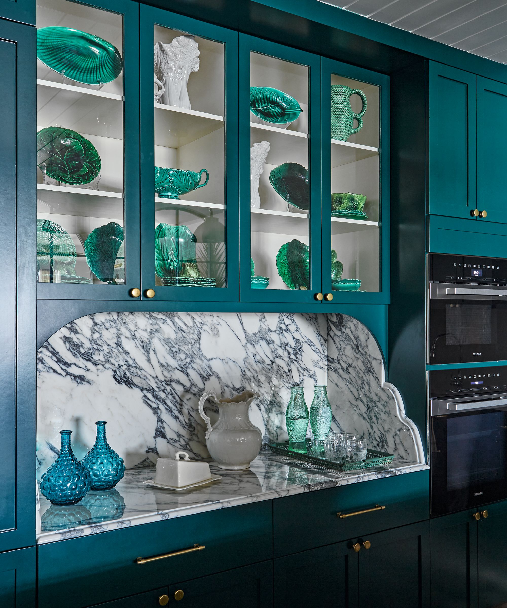
In the glazed cabinets, an artistically arranged collection of sculptural green and white ceramics creates a striking contrast with the densely veined marble surface below.
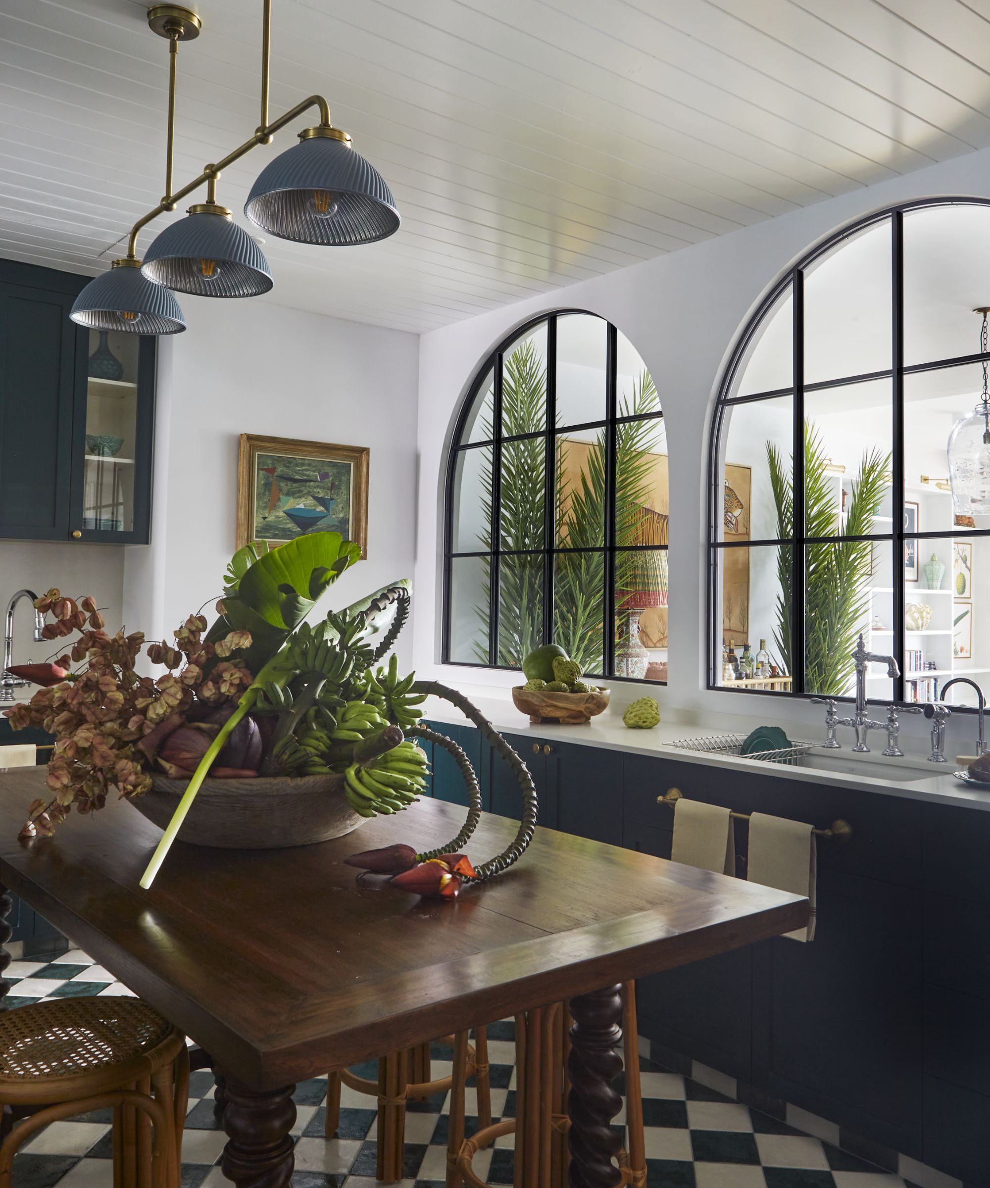
‘Reworking the kitchen was key to contemporizing this home,’ says Elizabeth, who enlarged its footprint by carving space from the laundry room and living room, adding arched, black metal-framed internal windows to channel in light.
Elizabeth also increased the size of the main bathroom and turned over a third bedroom to a study, with a hidden book-lined door accessing a storage closet.
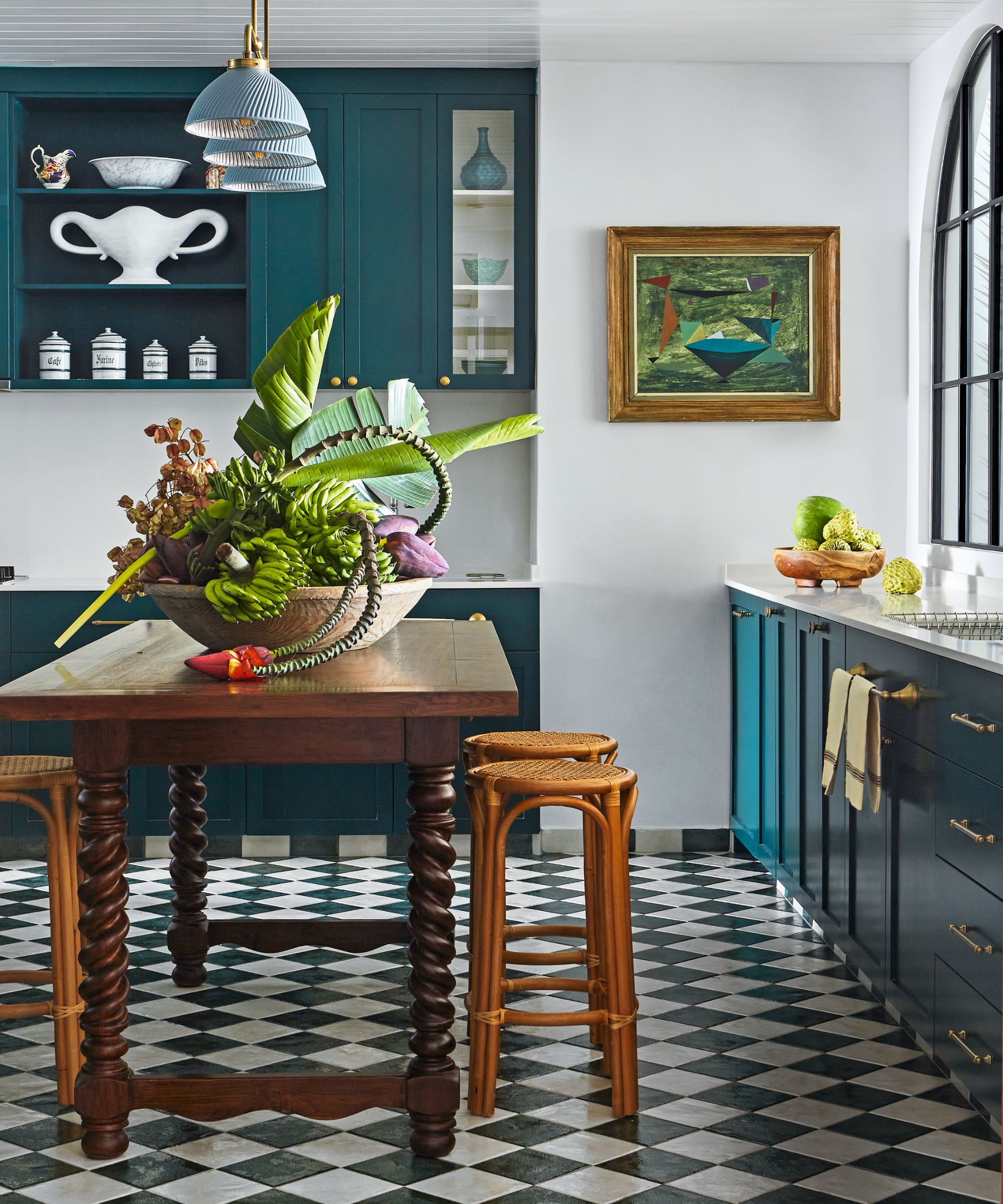
Chequerboard flooring, framed artwork, brass highlights and a stunning table centerpiece bring enlivening notes to the newly enlarged space
Once those changes were in place, Elizabeth set about adding informal layers.
‘We didn’t want the schemes to look overly designed,’ she explains. ‘Instead, the emphasis was on coziness combined with a sense of fun.'
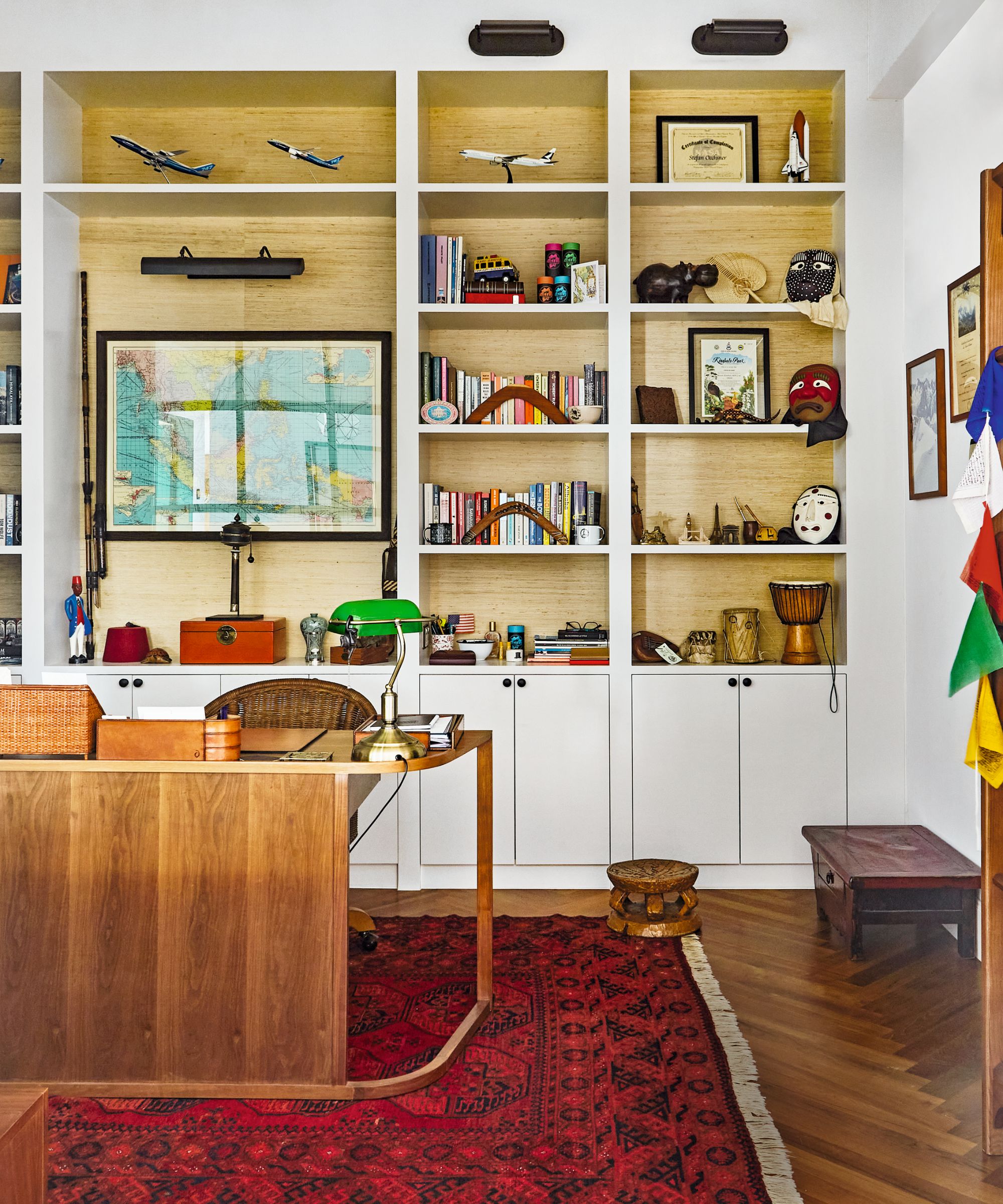
Elizabeth incorporated the couple’s existing desk into this scheme and added oak-backed joinery for depth and texture. A concealed jib door leads to a small store room
'I turned to textures, textiles and a more restrained color palette than usual to achieve a layered aesthetic that felt crisp and clean yet dynamic.'
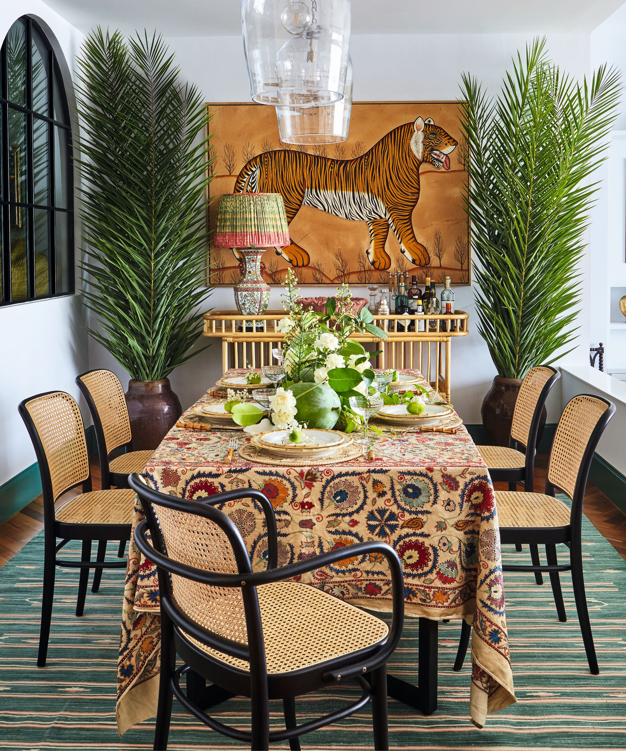
This space has an international sensibility with cane furniture typically found in Singapore, a Chinese vase turned into a lamp and a tiger artwork sourced in the UK.
Playful motifs can be seen throughout, from the built-in bunk beds with a smart pink trim in the daughter’s room to the scaled-up Chinoiserie wallpaper in the powder room.
Other details, such as fabric-backed cabinets in the main bedroom (below) and a generous pale green bath, bring touches of grown-up glamor.
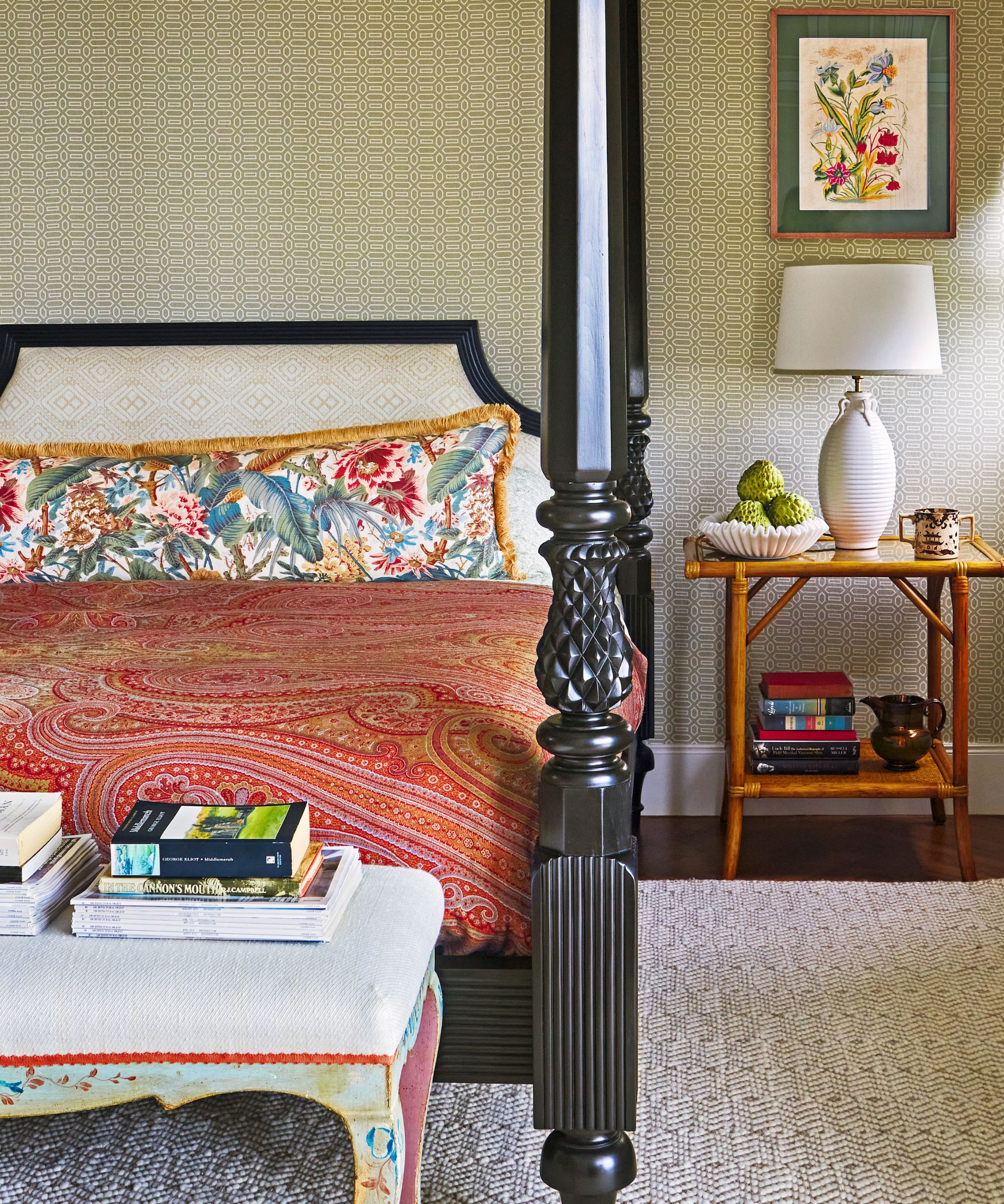
The bespoke teak bed was inspired by an antique Anglo-Indian version. ‘Leaving it unadorned and pairing it with bamboo tables lends a relaxed feel’
The clients’ Anglo-Indian artefacts, including an expansive armoire in their bathroom, sit comfortably in the rooms. The kitchen is now two-thirds bigger, and though space was taken from the sitting room ‘the relaxed, layered decoration makes it feel larger’.
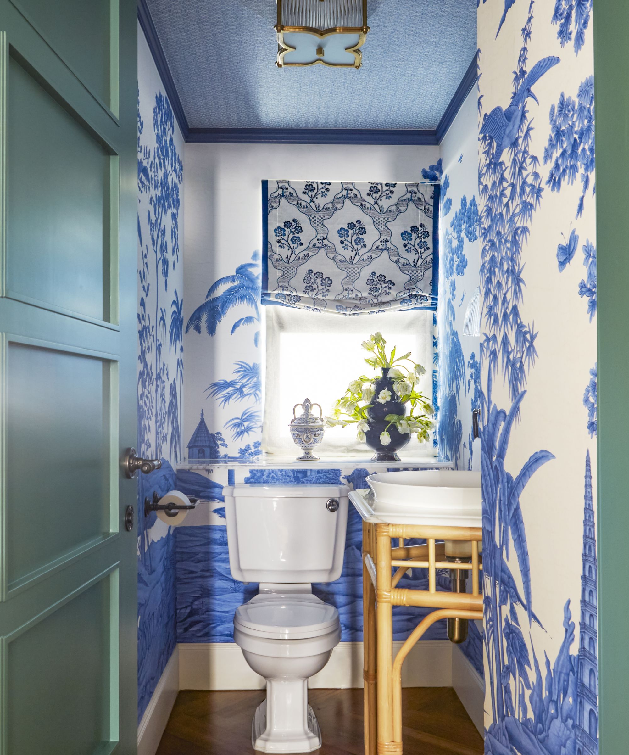
But the apartment’s biggest transformation has been in the marriage of cultural references: lush green fronds cascade down the kitchen table, while block-printed fabrics adorn the windows.
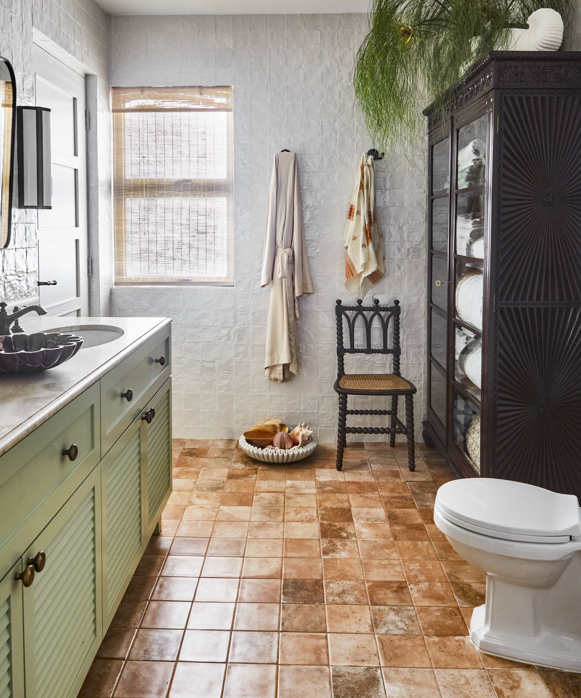
Symmetry, curves, soft textures and calming tones conjure a serene feel. The vanity was custom made, while the room was enlarged to fit a beloved armoire.
A chair in linen ticking sits on a dense Berber rug and encaustic tiles blend seamlessly with a bone inlay vanity unit. This melting pot of ideas has resulted in a collection of welcoming rooms, perfectly suited to a growing family with an international sensibility.
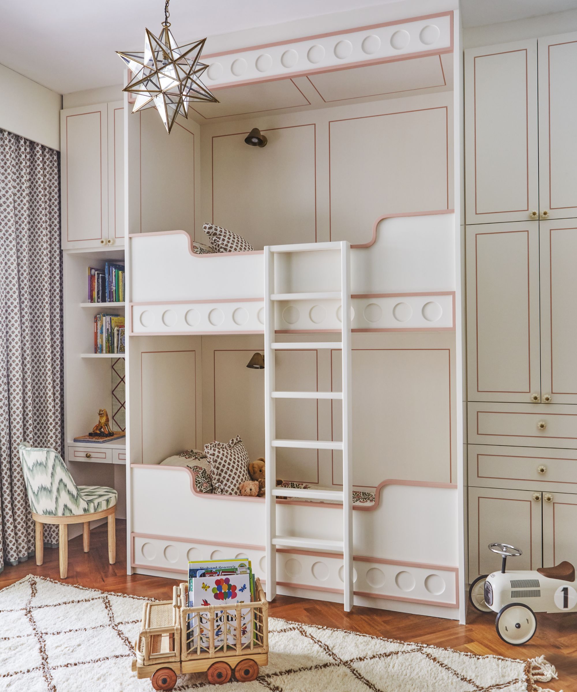
An elaborate mural forms a painterly backdrop (below) and gives the daughter's bedroom a sense of fantasy.
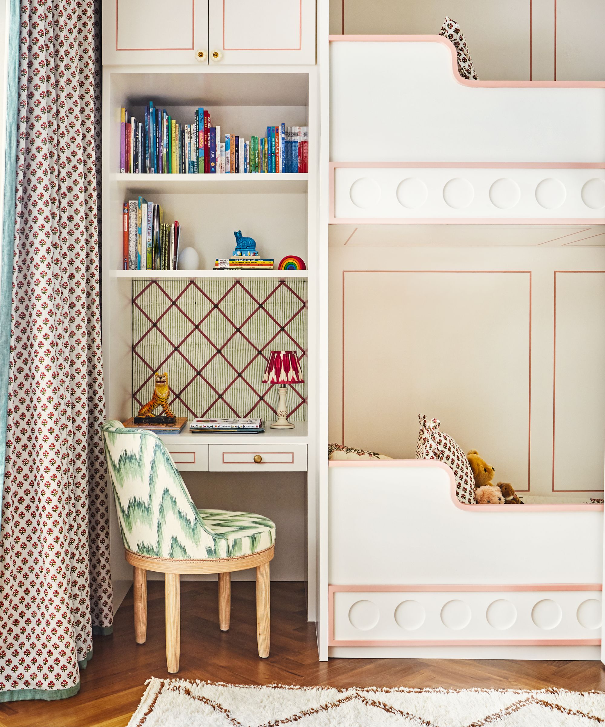
Loft beds (above) with a smart pink trim have been built into this space, which also includes a desk area. ‘We designed a scheme that she can grow into,’ Elizabeth says.
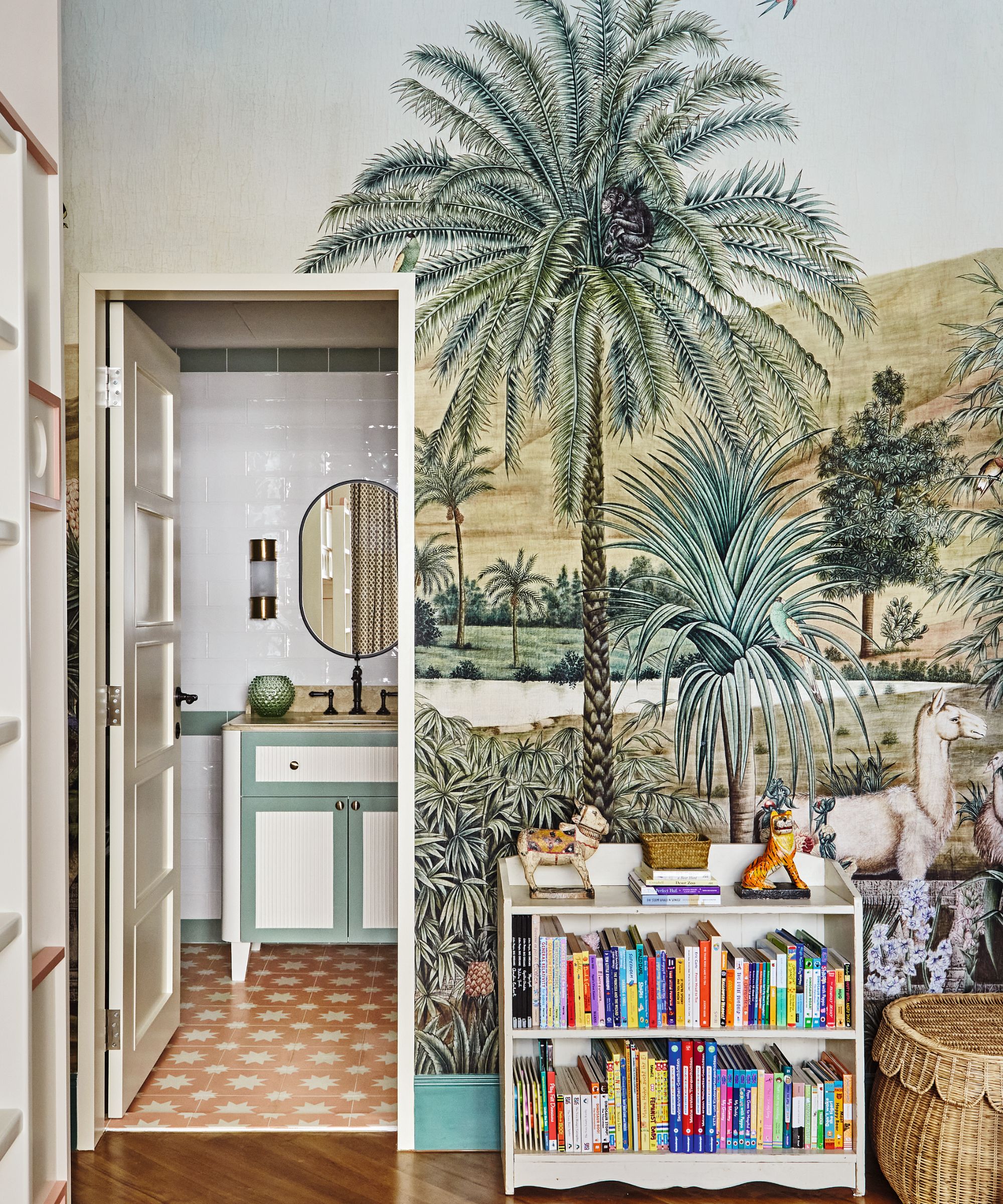
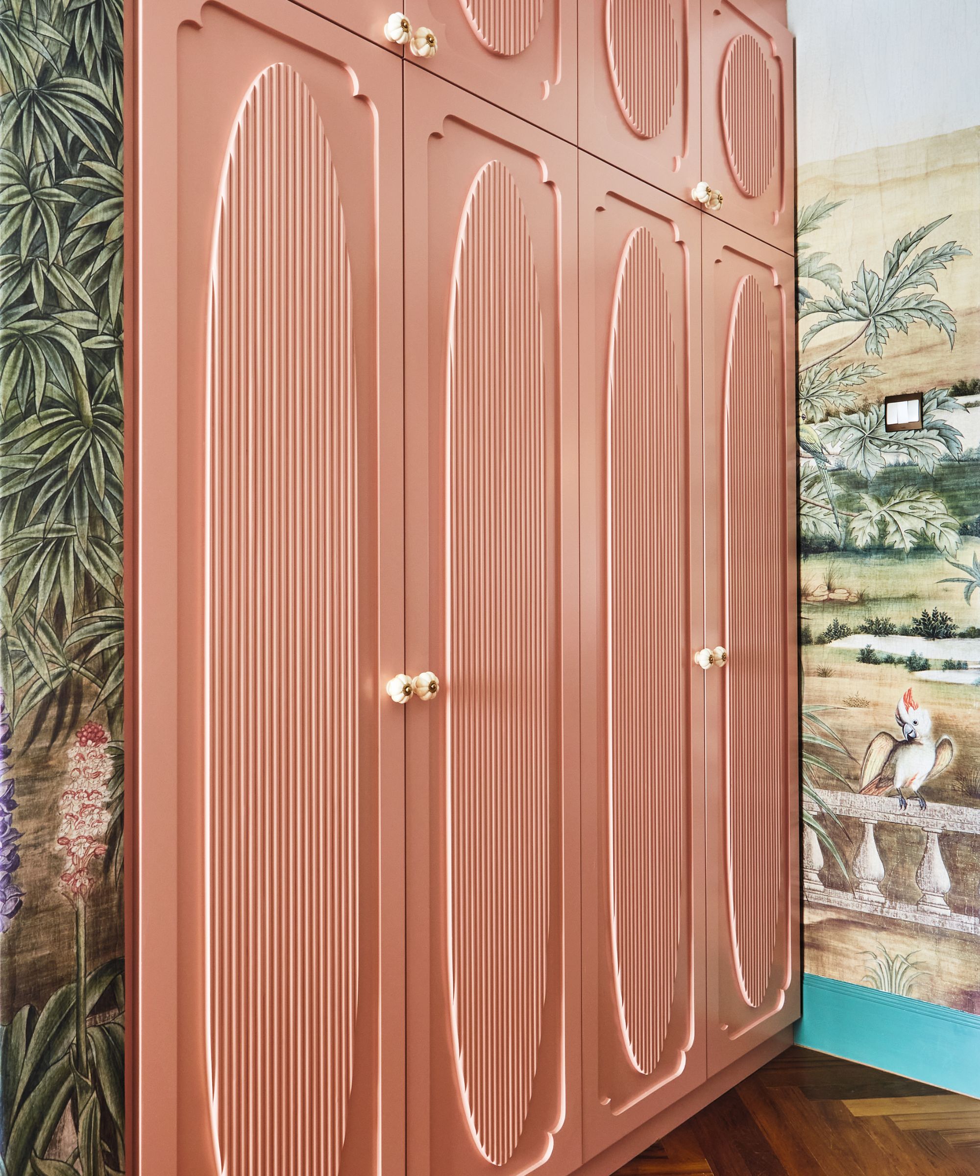
Ample storage has been worked in, including a four-door closet (below) and open shelving, while the mix of materials, textures and patterns comes together in Elizabeth’s signature layered look. The soft green and coral tones tie in with the bathroom for a cohesive feel
Interior design / Elizabeth Hay Design
Sign up to the Homes & Gardens newsletter
Design expertise in your inbox – from inspiring decorating ideas and beautiful celebrity homes to practical gardening advice and shopping round-ups.
-
 This is the single best upright vacuum we've ever tested – and it's on offer with $130 off at Shark for a limited time only
You won't want to miss this one
By Dan Fauzi
-
 Nate Berkus says slipcovered sofas are back on trend – and I just found a way to create this designer-approved laid-back look from just $86
This classic style is making a strong comeback, but did you know you don't have to buy a whole new couch to get this Nate-approved look?
By Eleanor Richardson