This Dutch farmhouse combines country charm with an eco outlook
Now a country idyll, this once crumbling farmhouse was transformed by a large-scale renovation that preserves the property's past as well as future proofing it

From the windows of David and Anouschka Rijks’ farmhouse, one of the world's best homes, the view is of a sleepy river drifting through meadows, slow-moving enough for lily pads to gather at its edge.
Across the fields and beyond a small wood are the outskirts of Amsterdam, a metropolis that seems implausibly close given the rural character of the region. Just on the city’s edge, the Gein Noord district is only a 20-minute metro ride away.
‘We were living in Amsterdam in a ground-floor flat with a small garden but after the birth of our second son we decided to move to somewhere we could have more space,’ David says.
The farmhouse was crumbling and decrepit, but David, being a kitchen cabinetmaker with his own firm, Designed by David, and Anouschka, being a photographer, had the appropriate skills and eye for detail to restore it.
‘To begin with, we renovated the rear of the house, which had been a stable. For 18 years we lived in this section planning a large-scale renovation and two years ago we finally completed it,’ David says.
With three sons, aged nine, 19 and 20, the newly claimed space couldn’t come soon enough. The investment the couple made is a long-term one. ‘This is our home for life. I can’t imagine us ever wanting to sell it,’ David says, which explains why new solid foundations were essential to their plans.
‘Holland is like a big swamp so the houses need to be built on poles. Our home was built in 1860 and the farmer didn’t have the funds to do that so slowly the house had sunk down, meaning we had to stabilise it,’ says David. ‘We dismantled it, leaving only the exterior walls, and created a new floor plan but we wanted to preserve as much detail as possible to retain its original charm.’
Hallway
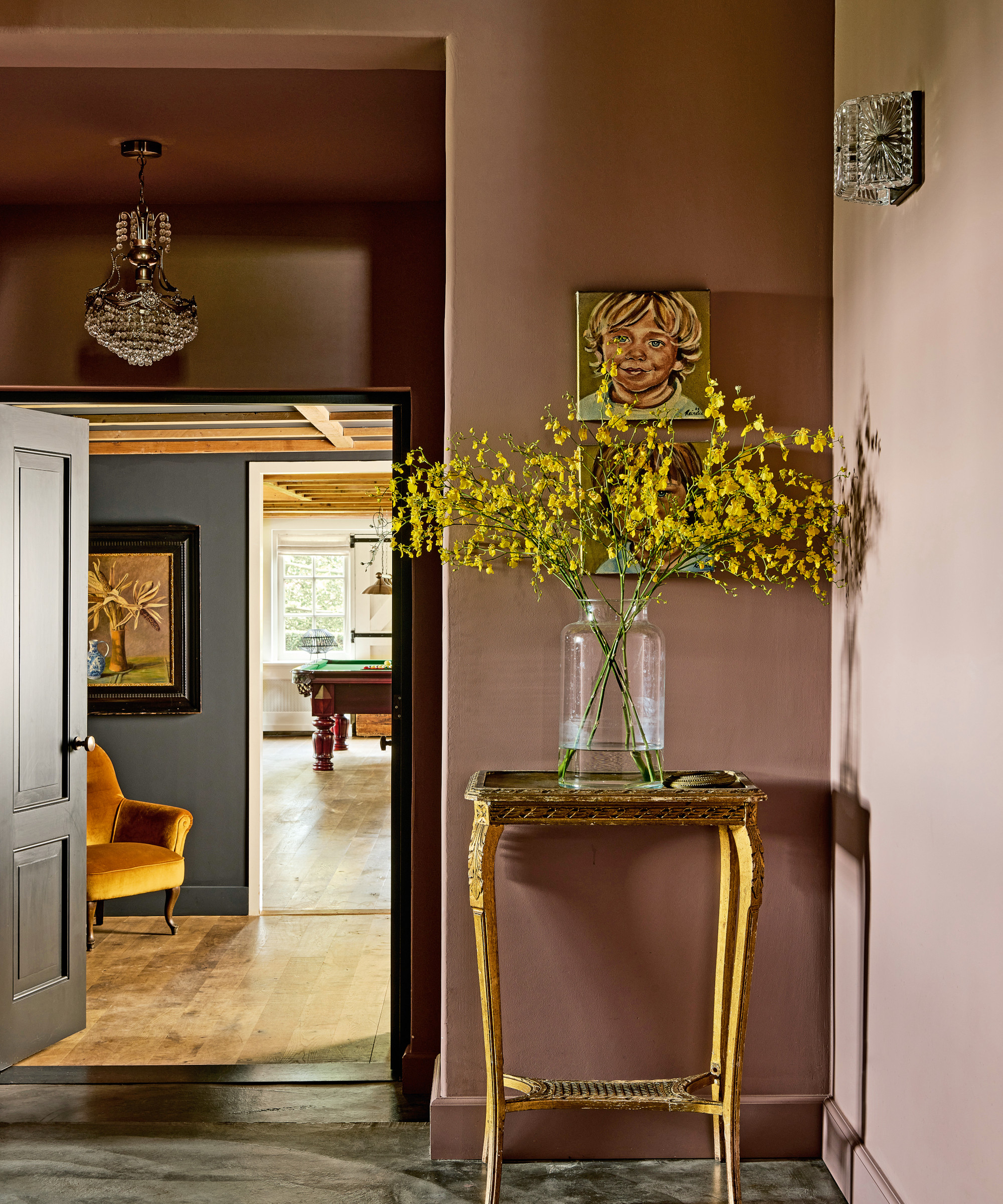
Among the hallway ideas are using more moody colors in the smaller spaces for a change of pace. Through the doors you can see the pool table in the games room.
Living room
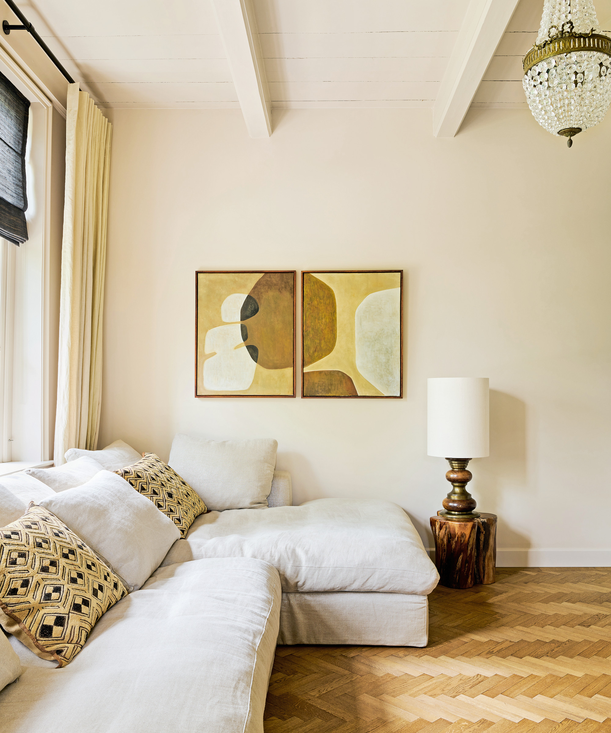
The paneled ceiling in the living room is a reminder of the farmhouse’s history. One of the living room ideas involved creating a contrast with modern art and minimalist decor.
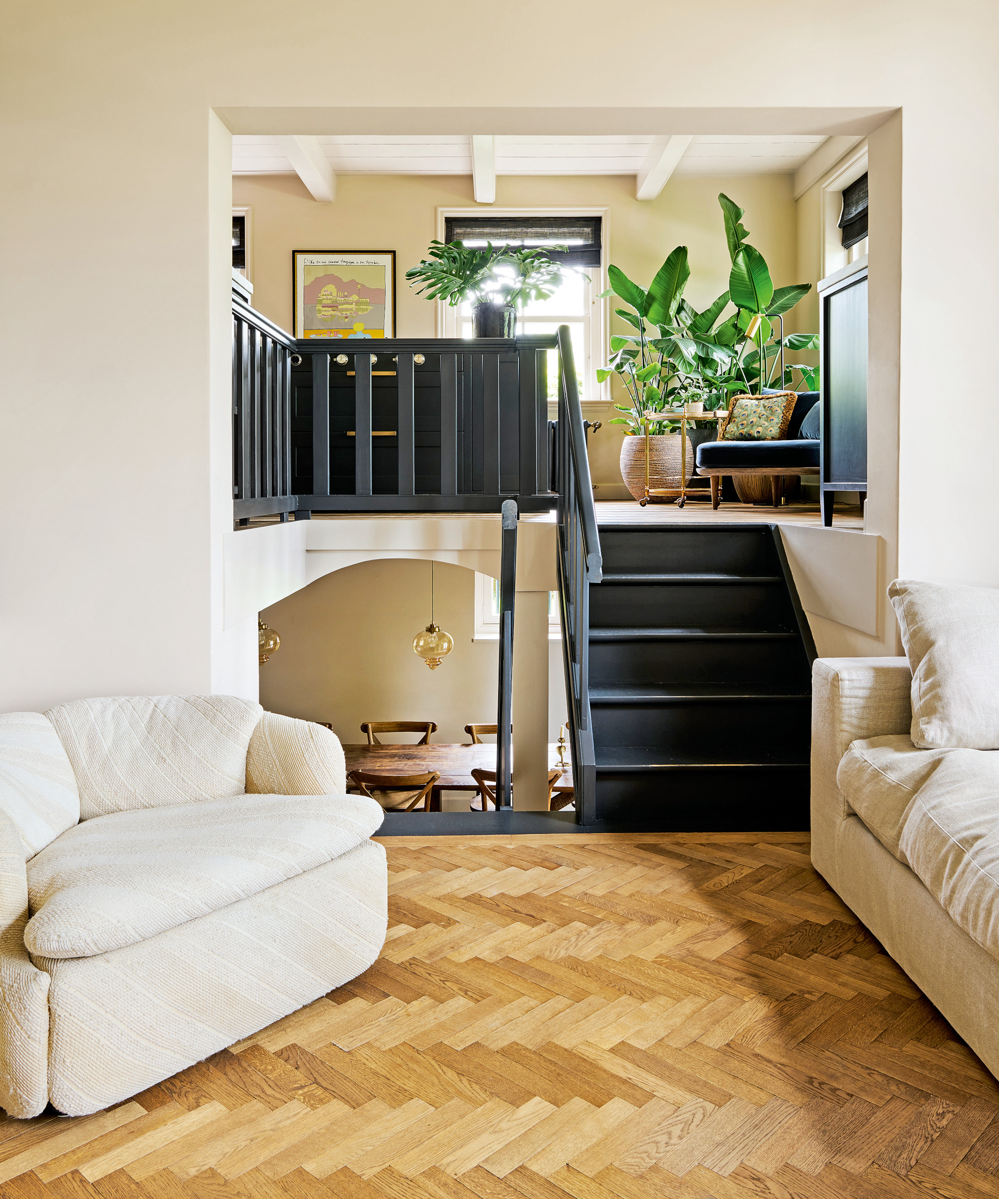
David opened up the front of the house, removing all the internal walls and reinventing the floor plan so that a flow was created between the new basement dining room, the living room on the mid-level and the kitchen a few steps up.
Kitchen
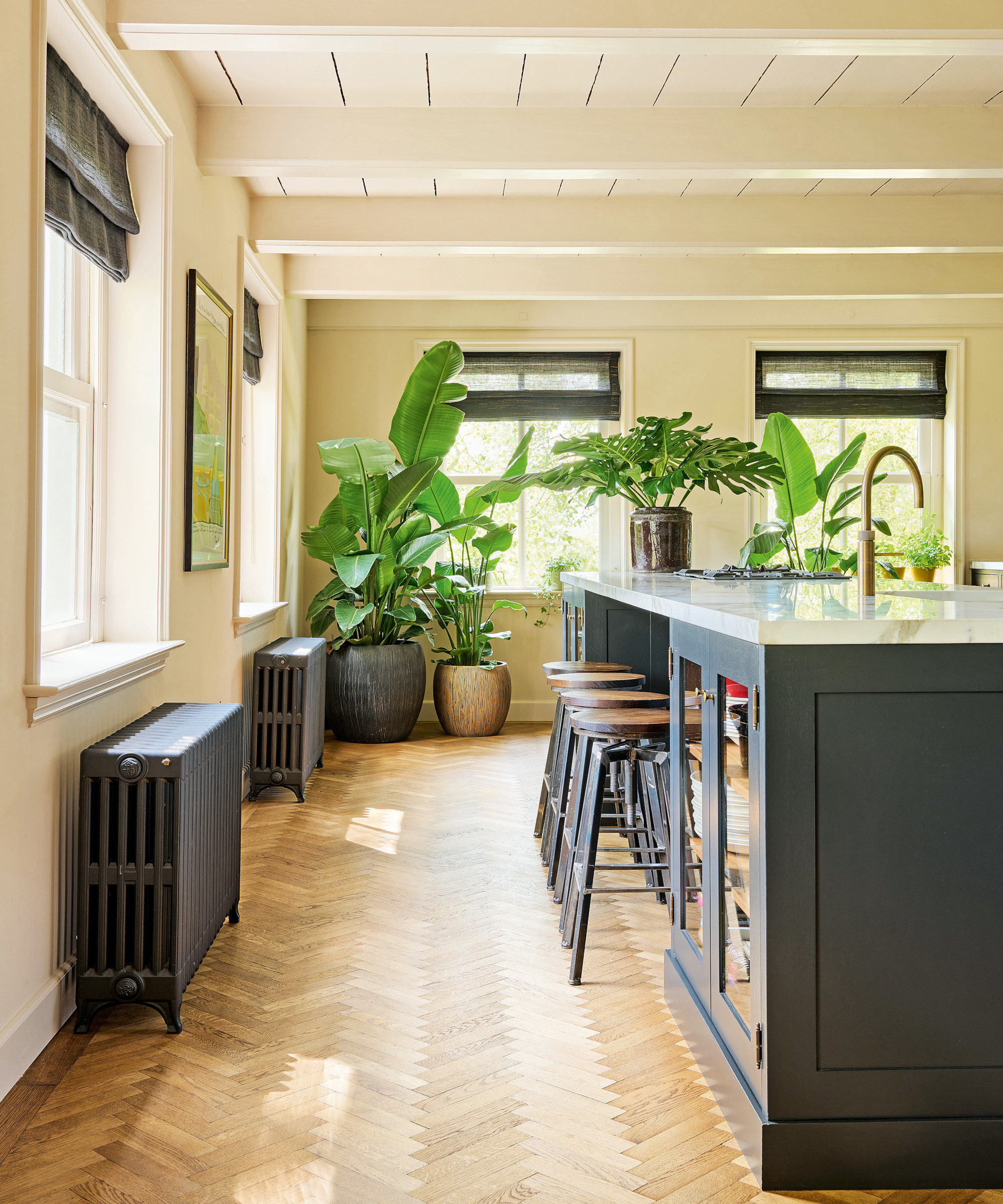
Kitchen ideas include black accents that punctuate the neutral scheme beautifully and introduce a contemporary edge.
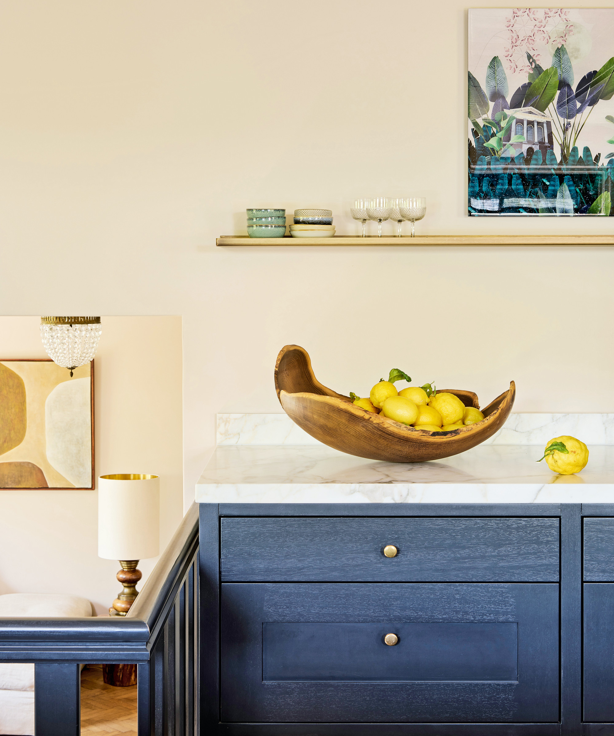
Handcrafted pieces throughout the farmhouse bring an artisan aesthetic.
Dining area
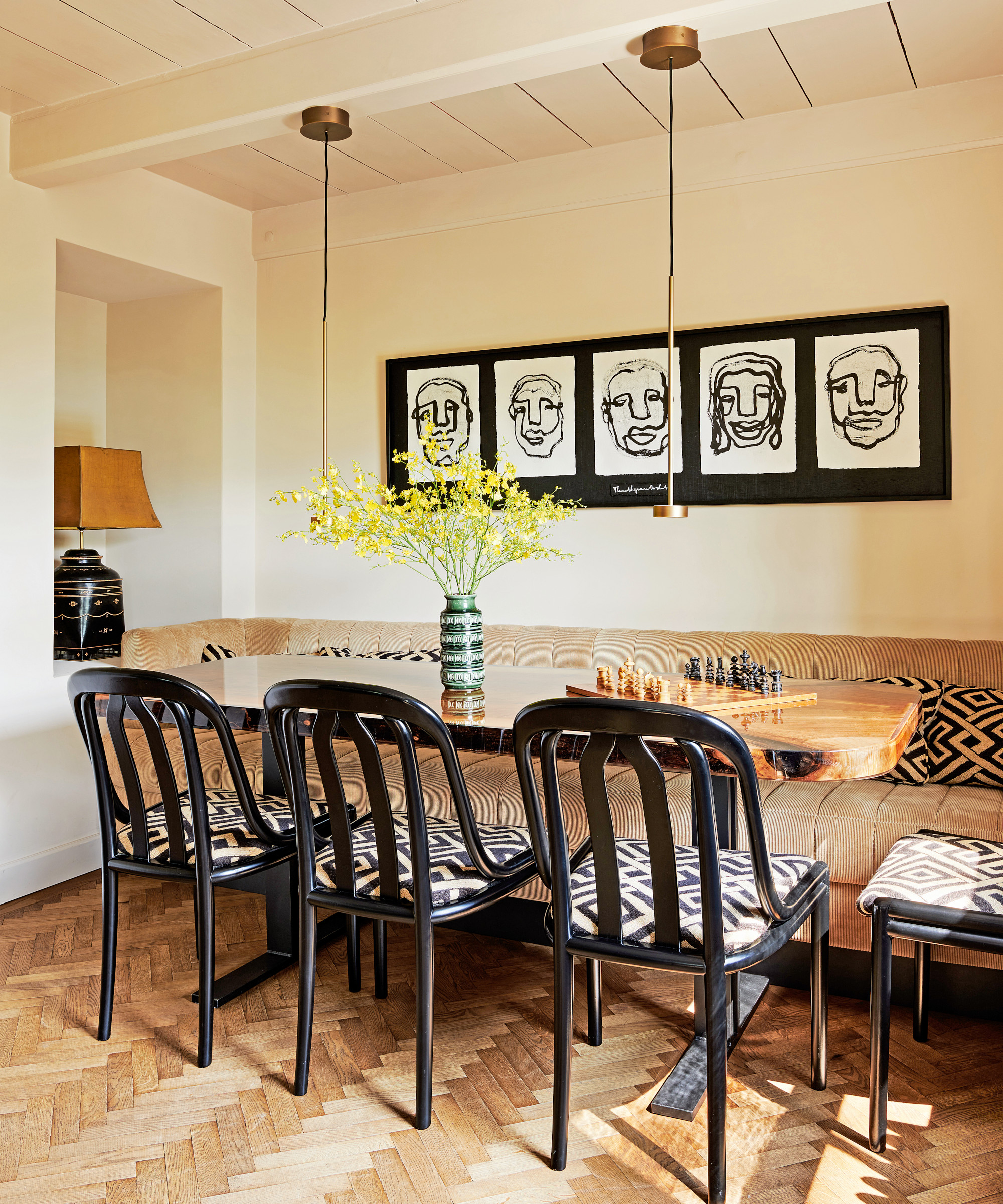
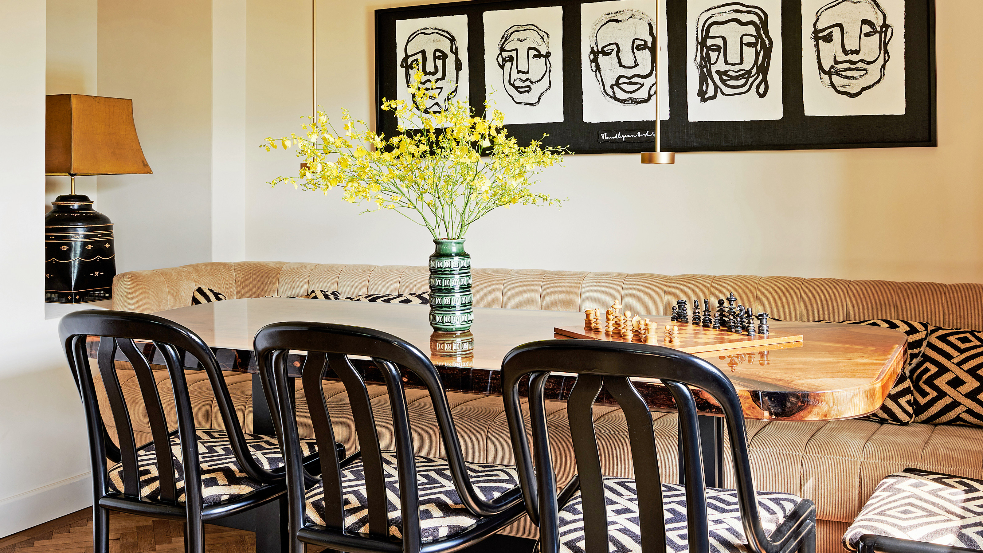
A low-profile corduroy banquette is one of the dining room ideas for creating an informal feel. The corduroy and batik upholstery enrich the space. A long monochromatic artwork follows the form of the low-profile banquette.
Home office
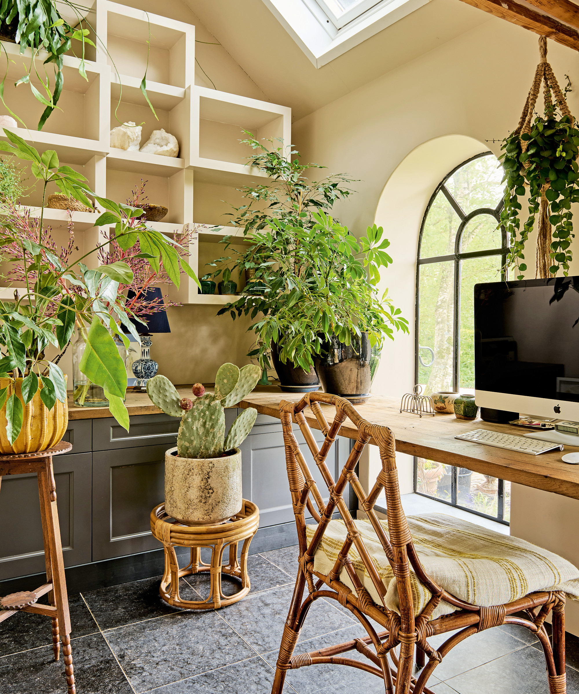
The light-filled space is awash with home office ideas, including handy storage shelves, cupboards and drawers. Bamboo furniture and a profusion of plants create a conservatory-like feel.
Bedroom
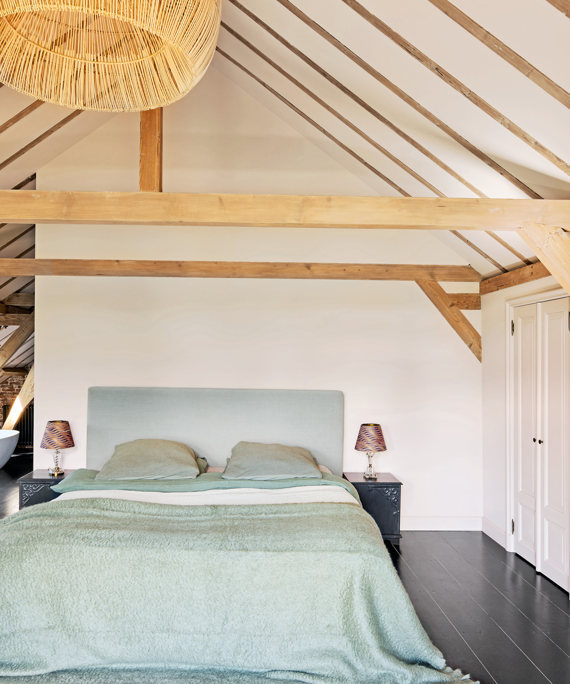
The couple’s bedroom takes up a vast loft, a three paned window providing a view of the foliage outside. Here, the beams of the roof create a cathedral-like grandeur.
Bedroom ideas include minimal furnishings and natural materials to allow the beauty of the architecture to become the focus.
Bathroom
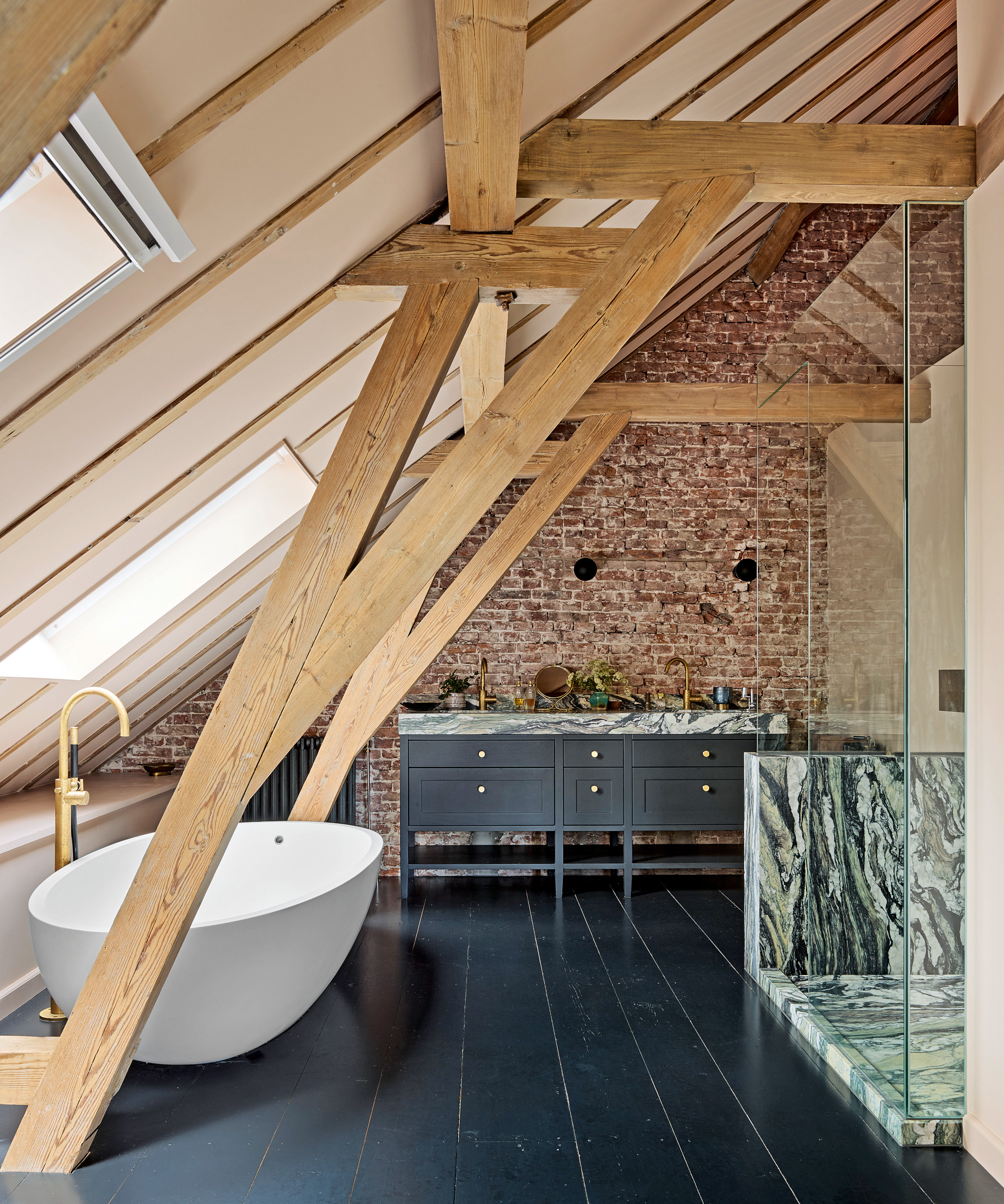
Among the bathroom ideas was chiselling away old plaster to make a focus of the original brickwork and incorporating highly unique Masi Quartzite marble from South America.
While preservation was at the heart of David’s endeavor, he combined it with a future forward environmental outlook. ‘The house will never have the best insulation as it’s so old, but we’ve installed a heat exchange pump and a system for collecting and filtering rainwater. I’m eager to put in solar panels, but I’m taking my time as I don’t want them to spoil the period look of the property,’ he says, adding that his ultimate goal is to live off grid.
The house has intelligent controls for optimum efficiency and ‘green’ concrete and sustainably sourced wood were used in the rebuild. Internally, the couple have ‘future-proofed’ with well-constructed, timeless-looking antiques and furniture, much of it made by David himself.
Perhaps the biggest draw beyond the robust rural architecture is the garden with its deep generous borders and tumbling wisteria. At its edge, the river tempts visitors in for cooling dips. ‘We always have plenty of friends over in the summer. There are barbecues and lots of swimming and boat trips. This is where Piet Mondrian painted his early landscapes,’ David reveals. A ringing endorsement for a thoroughly Dutch and remarkably picturesque home.
Interior design/ designedbydavid.nl; @dbd.interiors
Photographs/ Space Content Studio
Text/ Juliet Benning
Sign up to the Homes & Gardens newsletter
Design expertise in your inbox – from inspiring decorating ideas and beautiful celebrity homes to practical gardening advice and shopping round-ups.

Interiors have always been Vivienne's passion – from bold and bright to Scandi white. After studying at Leeds University, she worked at the Financial Times, before moving to Radio Times. She did an interior design course and then worked for Homes & Gardens, Country Living and House Beautiful. Vivienne’s always enjoyed reader homes and loves to spot a house she knows is perfect for a magazine (she has even knocked on the doors of houses with curb appeal!), so she became a houses editor, commissioning reader homes, writing features and styling and art directing photo shoots. She worked on Country Homes & Interiors for 15 years, before returning to Homes & Gardens as houses editor four years ago.
-
 Martha Stewart's smart laundry room shelving makes exceptional use of every inch of wall space – it will turn your smallest area into an ultra-functional space
'You can greatly expand the usability of your space by just installing some of these great shelving units': You can follow her technique for under $34
By Megan Slack Published
-
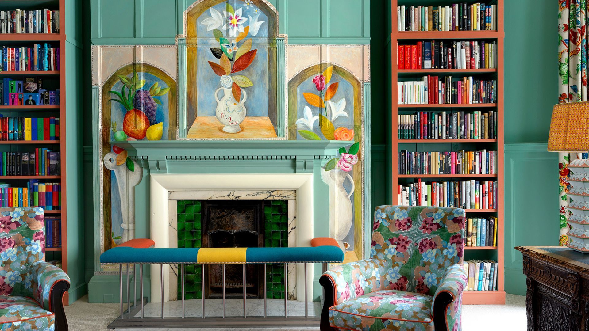 Sick of white walls? My journey from minimalist to maximalist, one paint stroke at a time
What do you do if you’re bored with plain walls? If you’re me, you go full muralscape
By Sophia Pouget de St Victor Published
-
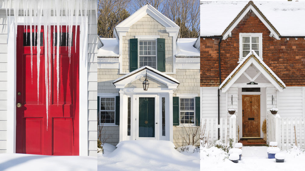 10 ways to winterize a house – get your home ready for winter
These simple ways to winterize a house will help you get your home ready for the inclement weather
By Holly Reaney Last updated
-
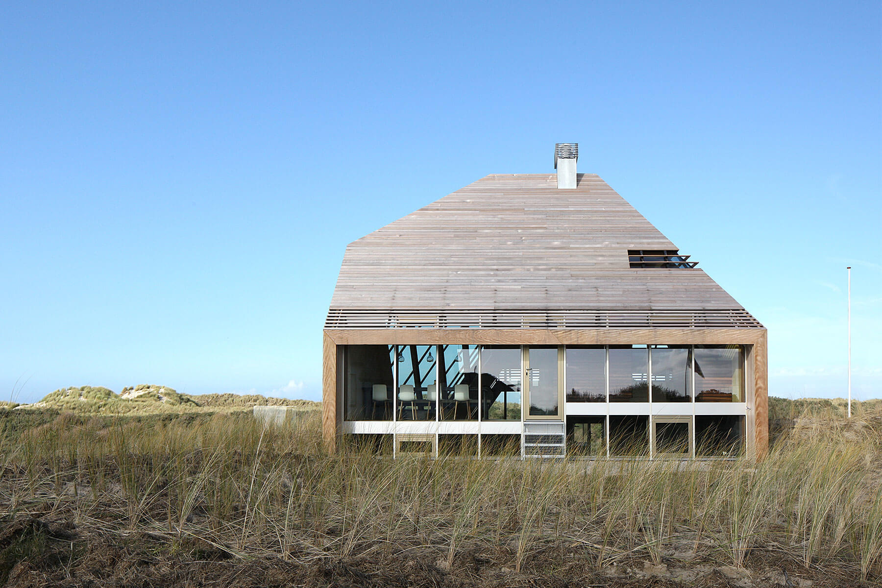 Eco-friendly building materials – discover the green options
Here are the products to look out for if you’re committed to using eco-friendly building materials in your remodel
By Sarah Warwick Published
-
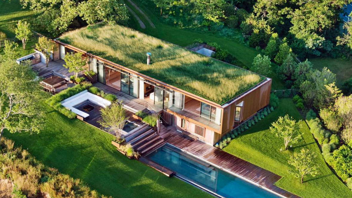 Eco houses – 7 most beautiful sustainable builds, from forest dwellings to city homes
These are some of the world's most coveted eco houses, beautiful homes designed by architects with their gaze firmly fixed on sustainability
By Lucy Searle Published
-
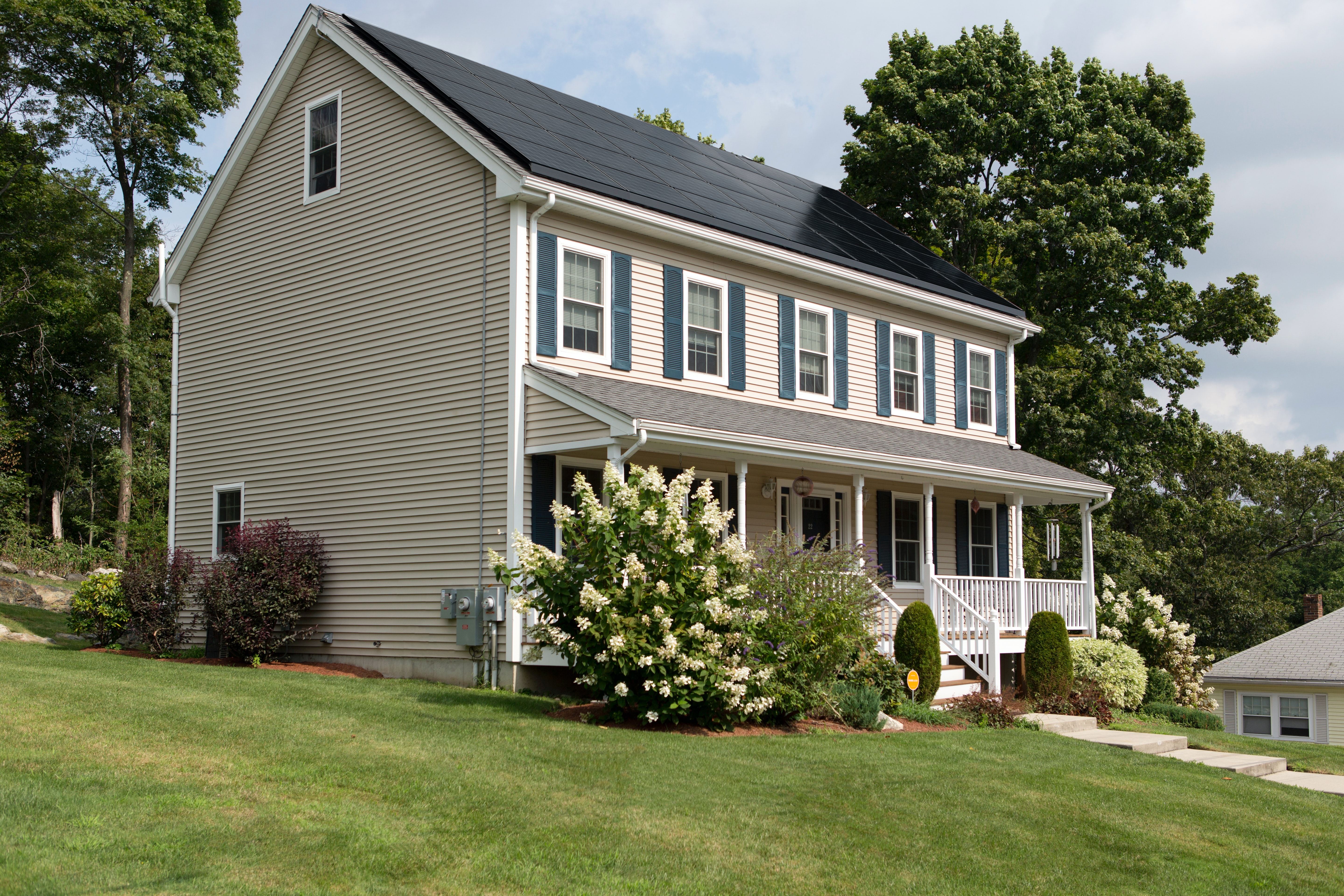 Solar panels: a complete guide to making your own home energy
Find out about the different solar panels – available and how they can save you energy as well as cash
By Sarah Warwick Published
-
 Eco cooling – sustainable air conditioning for your home
Discover eco cooling options – the greenest ways to keep your home from over-heating
By Sarah Warwick Published
-
 Eco home improvements: how to make your house greener
Discover heating, cooling and clean energy solutions for your home plus eco-friendly product choices
By Sarah Warwick Last updated
-
 Eco heating – from heat pumps to boilers and furnaces
Find out about the eco heating options that can make your home greener and reduce bills
By Sarah Warwick Last updated
-
 Are these Japanese-inspired, energy-efficient homes the future of homebuilding?
These new developments aim to prioritize green space, community and good design
By Jennifer Ebert Published