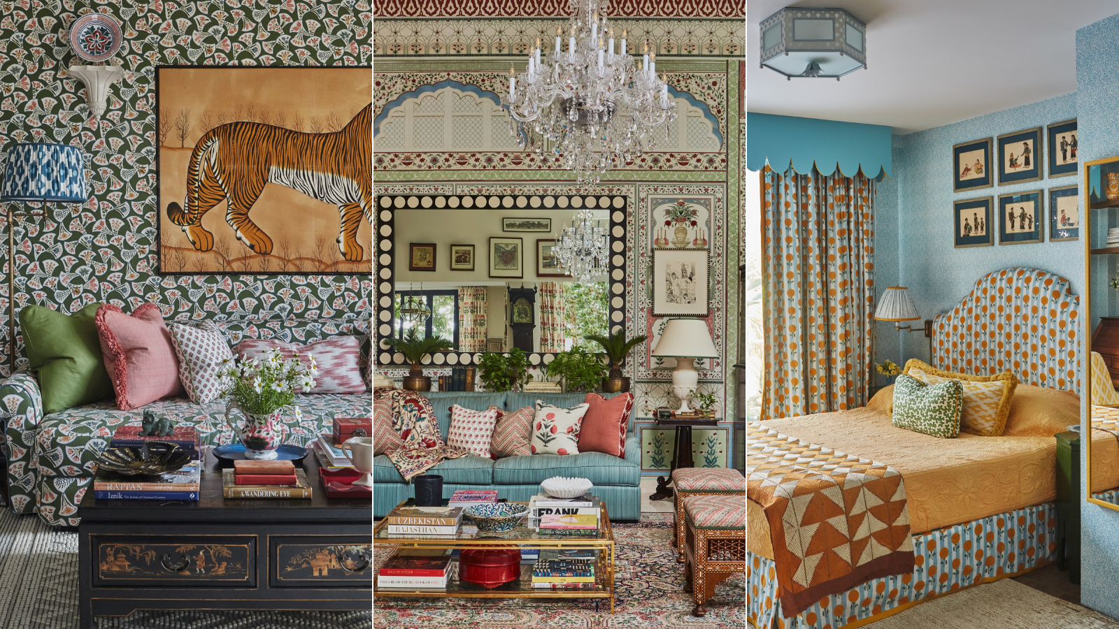
Designer Elizabeth Hay transformed this once purely 'functional' home into a treasure trove of color and pattern
A modern townhouse in Singapore feels like a home with history after Elizabeth Hay introduced a distinctive decorative style

Design expertise in your inbox – from inspiring decorating ideas and beautiful celebrity homes to practical gardening advice and shopping round-ups.
You are now subscribed
Your newsletter sign-up was successful
Want to add more newsletters?
Having spent her childhood growing up in a 14th-century cottage in Devon, English-born interior designer Elizabeth Hay moved and set up her eponymous house design firm in Singapore in 2013 and, for the past 10 years, has been developing her signature ‘quintessentially English and layered’ decorative style. It was this color and pattern-rich aesthetic that the owners – an Australian and Korean couple – sought for their modern townhouse in East Singapore.
Describing it as having ‘typical architecture’ of the 1980s and 1990s Singapore housing development, Elizabeth Hay says the property is ‘more functional rather than architecturally striking’. The owners had been following her work on Instagram for a while. ‘They travel a lot and they wanted to bring an international and multicultural feel, making it layered, bold and cozy.’

Cushions and antique Syrian ottoman in Kalamkari Chevron linen, Soane Britain. Antique sofa in Straub Twill, Claremont. Alba lamp, Vaughan.
The project is smaller in scale compared with those Elizabeth normally works on, however, tasked with only a few key areas to design and decorate, it offered an opportunity to focus solely on soft furnishings and decorative finishes. ‘This means that you can be creative and you get to see everything you’ve suggested come to life much sooner!’
Article continues belowThat creativity is certainly in full flow throughout the sitting room, as Elizabeth explains. ‘At the core of the project brief, the clients wanted the double-height sitting room to be a fun space to entertain in, and one that would make guests and visitors think “wow” when they first walked in.’ The statement Ikselwallpaper felt like the perfect answer.

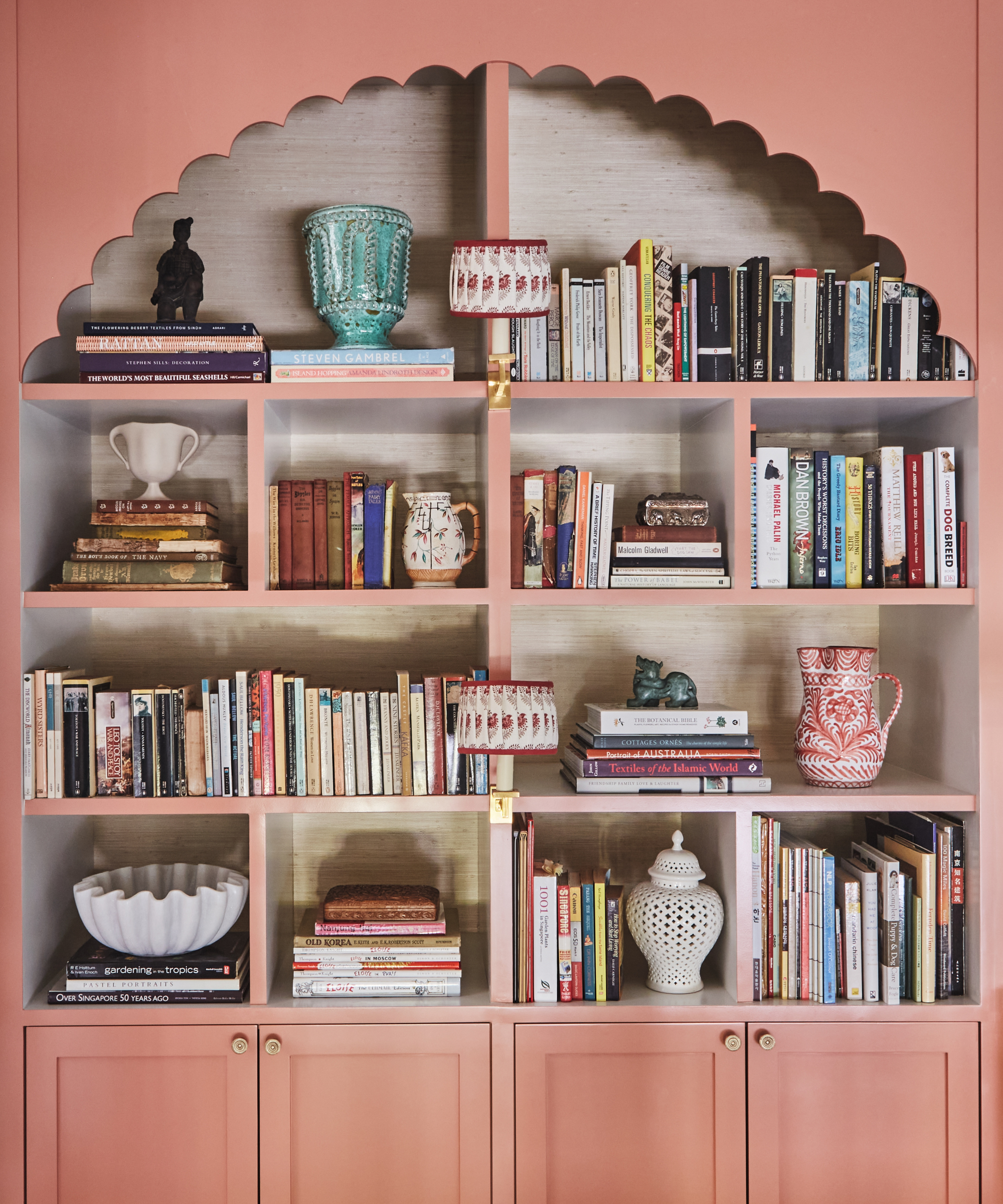
Library wall light in Brass, Vaughan. Lampshade, custom made in Valentine, Pukka Print. Woodwork in Queen Coral, Dulux.
‘It was quite a big commitment, so we did a 3D mock-up so the client could see what it would look like in the room – and they loved it. It looks incredible.’ It also brings a strong sense of decorative detail into the property. ‘Given the lack of internal architectural features, the Iksel paper gives the room structure and impact,’ Elizabeth continues.
Describing the result as breathtaking, she also points out that it doesn’t feel overpowering when you’re living here on a day-to-day basis. ‘This is because we kept the colors quite soft and the overall feeling is quite classic, and because it’s classic it has longevity and the house won’t feel dated.’

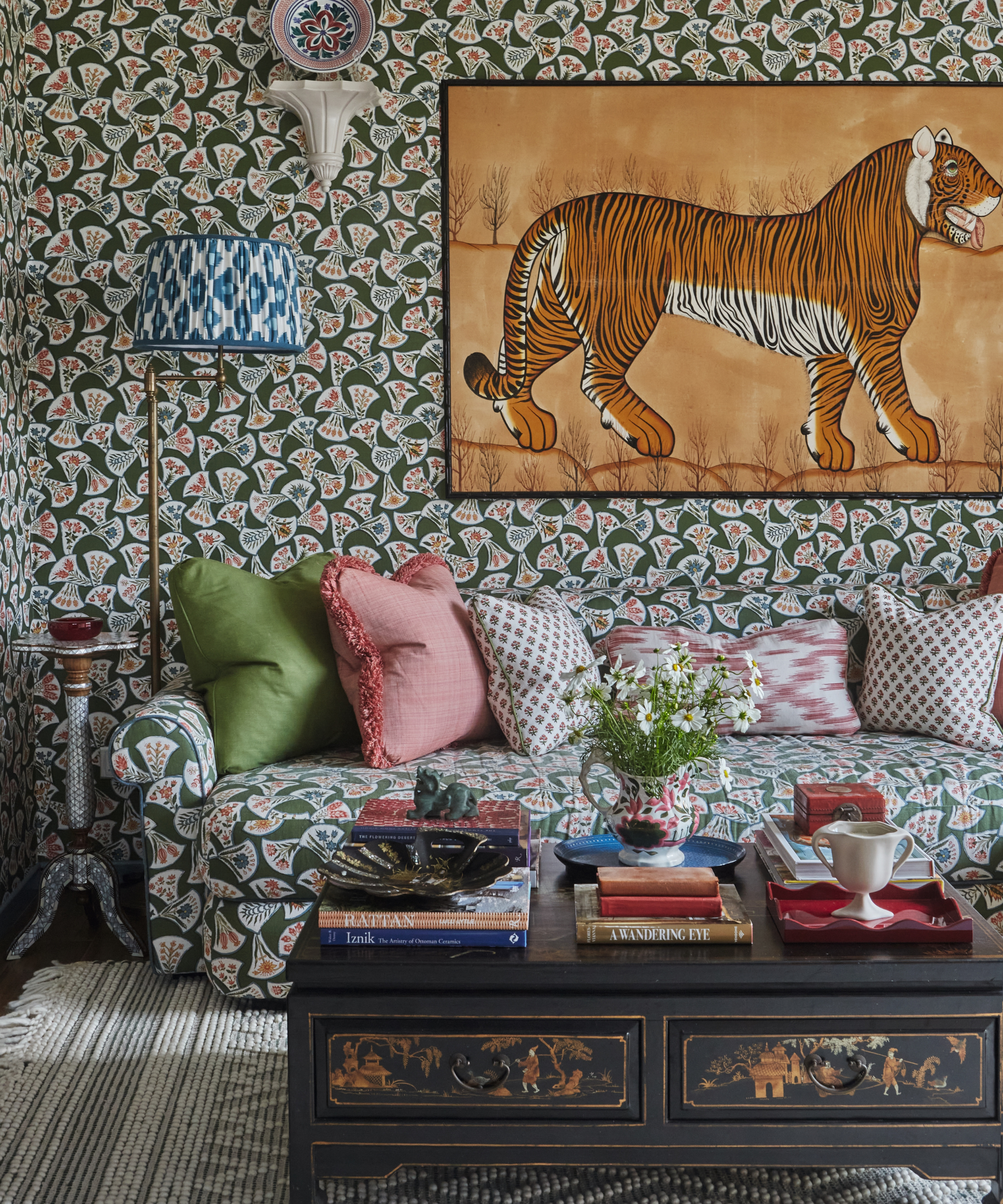
Walls and sofa in Monfaucon in Green, Christopher Moore. Cushions in Janavi Jaipur, Namay Samay; Montignac Operetta, Nicole Fabre Designs; and Roussillon in Russet, Guy Goodfellow Collection. Cabinetry in Balkan Sea Blue, Dulux. For similar wall art, try Tiger, late 19th-century, King & McGaw.
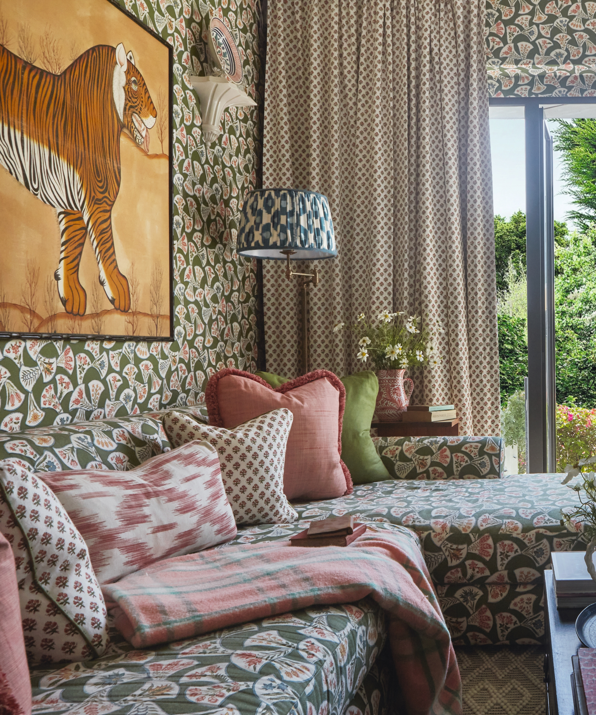
While the sitting room feels vast in scale, the snug, which has a view of the garden, is very different. The petite space has French doors and an L-shaped sofa upholstered in Christopher Moore Monfaucon fabric with matching wallpaper. ‘For this room, we wanted to curate something all-enveloping and cozy, hence the all-over pattern choice. When you are in the snug it feels just as it should – cocoon-like. The owners wanted to achieve this feeling as it’s where they relax in the evening when it’s just the two of them.’
Design expertise in your inbox – from inspiring decorating ideas and beautiful celebrity homes to practical gardening advice and shopping round-ups.

Walls and sofa in Monfaucon in Green, Christopher Moore. Cushions in Janavi Jaipur, Namay Samay; Montignac Operetta, Nicole Fabre Designs; and Roussillon in Russet, Guy Goodfellow Collection. Cabinetry in Balkan Sea Blue, Dulux. For similar wall art, try Tiger, late 19th-century, King & McGaw.
An indulgence in contrasting colors, the blue and yellow decor in the bedroom, featuring Peter Fasano’s Fiddlehead wallpaper and a curtain and headboard fabric from Bombay Sprout called Mughal Marigolds (now discontinued), mirrors the bright garden aspect and is styled with scatter cushions that Elizabeth had custom made.
Looking ahead, Elizabeth is about to complete two further projects in Singapore (one of which is the conservation of a historic shophouse) along with the design and decoration of a Georgian house in Buckinghamshire. ‘I am also doing up a home for my family in the UK, which is exciting.'

Avery flush-mount ceiling light, Coleen and Company. Fiddlehead wallpaper, Peter Fasano. Similar curtain and headboard fabric, Marigold linen, Molly Mahon.
MEET THE DESIGNER
Elizabeth Hay shares her style inspiration
What was the most indulgent part of this project?
The wallpaper in the sitting room.
Can you suggest one small change that has a huge impact?
Scatter cushions.
What's your go-to color?
Blue.
Who's your design hero?
What was the last thing you bought for your home?
Bhutanese antique textiles.
Can you reveal a lesser-known place we should know about?
Thow Kwang Pottery Jungle in Singapore.
What was the last exhibition you visited?
Forces of Nature at Blanton Museum of Art in Austin, Texas.
Who would be your ultimate dinner party guest?
Barack Obama.
What's your favorite Instagram account?
Rory Robertson has a long-standing history working across the interiors industry. Rory studied Interior Architecture at the University of Edinburgh, and later, Theatre Set Design and Architectural Illustration at The Rhode Island School of Design on America's East Coast. Rory's foray with the editorial world started a decade ago at Livingetc magazine, a title to which he regularly contributes today. Specializing with a deep-seated appreciation for historical homes and interiors, Rory often travels far and wide to be inspired by unique properties with a fascinating history.