Architecture, art, and mountain views vied for attention in this Las Vegas home, until a redesign brought balance
This redesigned home is now a joyful blend of colorful artworks and bold architecture in a stunning mountain setting
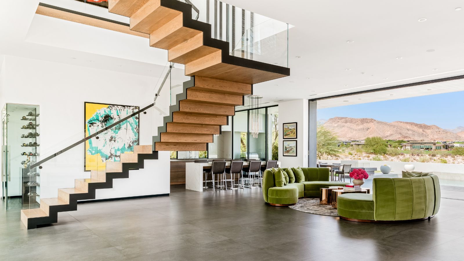
The owners of this light-filled home in the exclusive The Ridges neighborhood in Summerlin, Las Vegas, were looking to improve their space with some fresh interior design ideas. They wanted a home away from home that was unique and bold at the same time.
They turned to interior designer Daniella Villamil to come up with new schemes for the home's key areas. 'Their aim was to create a space filled with color and unique pieces that would elevate the design while becoming the ideal background for their impressive art collection,' the designer explains. 'Our team embarked on a two-year journey to furnish the home; sourcing vintage furniture, lighting, and accessories from Europe and South America.'
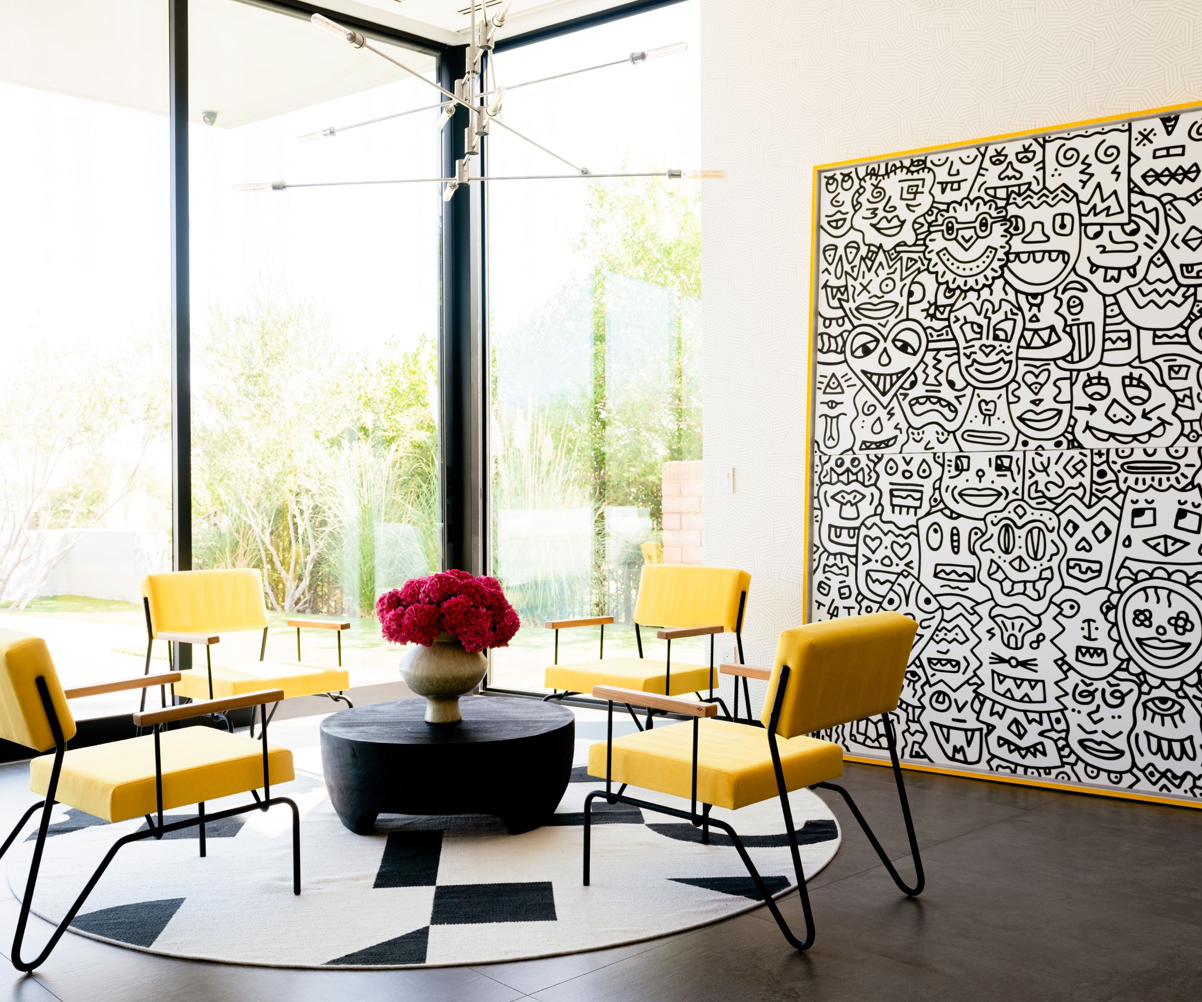
This striking space is the home's movie room, but it's just as much about viewing the spectacular show beyond the glass walls as what's on the screen, as designer Daniella Villamil explains. 'We incorporated the Sandra chairs by Brazilian architect Samuel Lamas, to create a sitting space for enjoying wine and the Red Rock vista from this room,' she says of the fantastic mountain setting. 'The chairs are upholstered in a canary yellow suede, a coffee table by Restoration Hardware and a rug from West Elm complete the vignette. To accentuate the walls and play with the art piece we used the Deconstructed wallpaper by Schumacher. The art piece is by Adam Pretty Done'
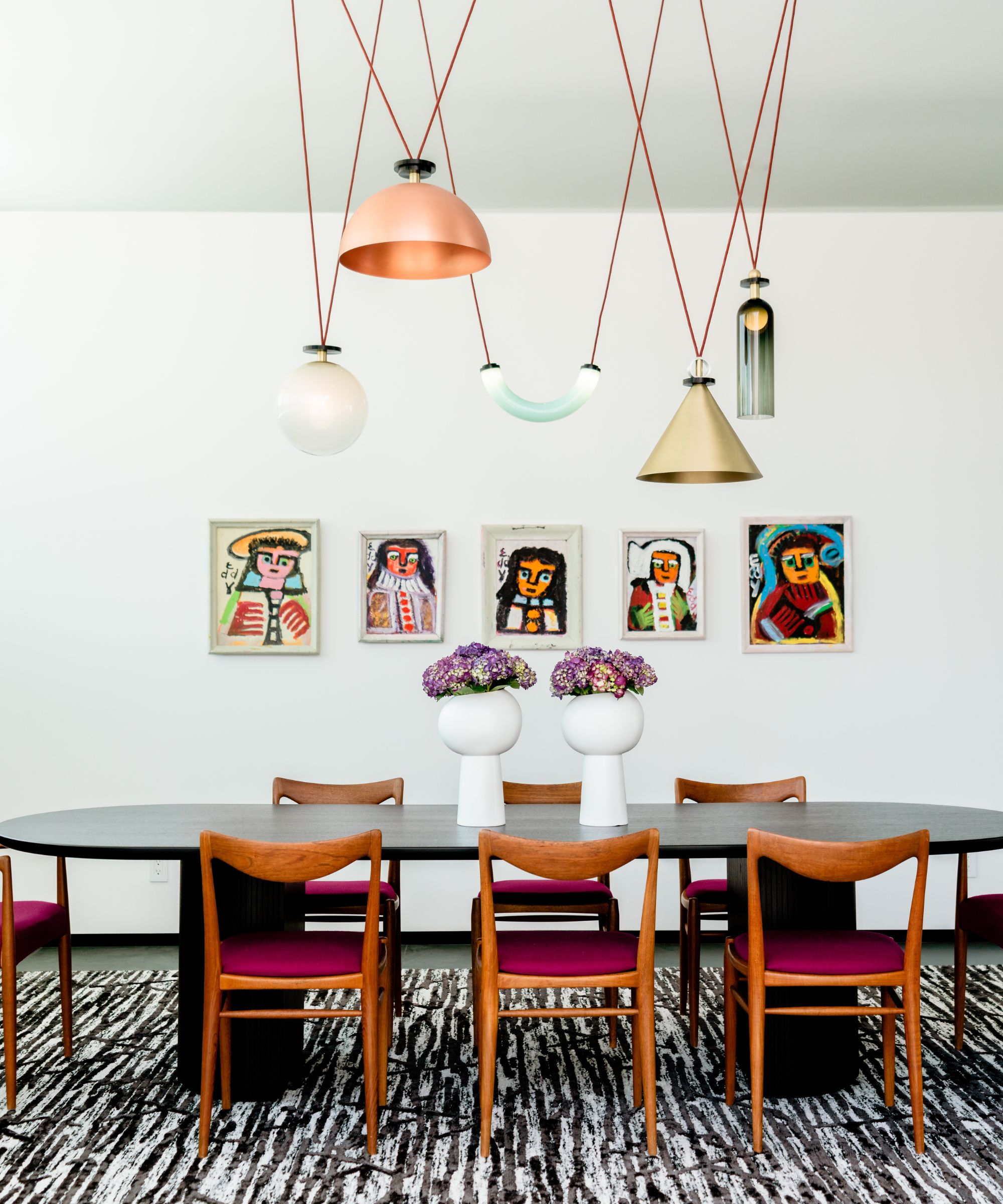
Talking through her dining room ideas for the new-look home, the designer says: 'We opted for the Shape Up chandelier by Ladies & Gentleman Studio that features different geometric shapes in fun colors and which creates an interesting moment in the room. Eddy Mumma artworks sit in the large wall in the back filling the space with more color.'
The dining chairs are iconic midcentury Rastad & Relling originals, upholstered in a berry wool fabric by Maharam.
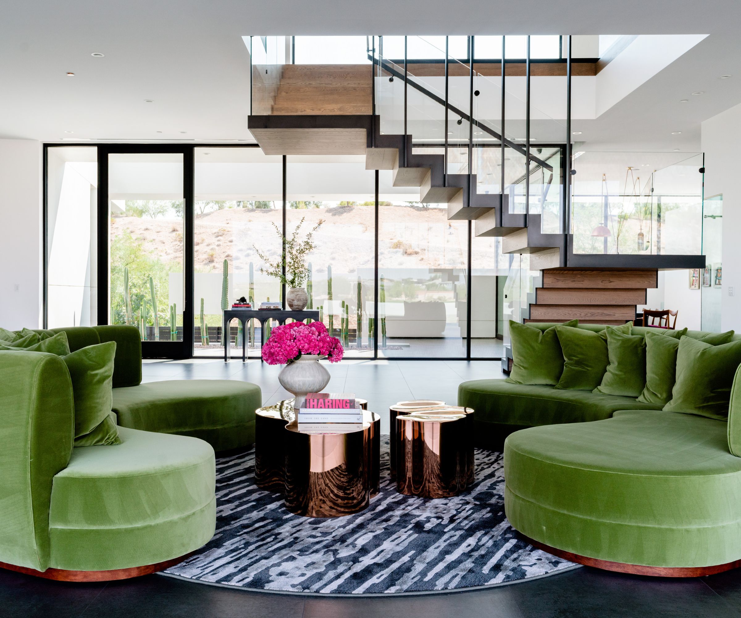
The main living space in this home is actually part of the striking entrance foyer, so hallway ideas and living room ideas have to fulfil both functions. With several full height glass walls to allow the spectacular outside scenery to play its part, this space is a wonderful place to wile away the hours.
'We designed a couple of kidney shaped green sofas upholstered in a Kravet velvet to keep the room grounded and also mimic some of the colors in the artworks in this room,' says Daniella Villamil, who chose a custom rug by Lapama and a couple of rose gold coffee tables by Statements by J to contrast with the strong colors and shapes in the room.
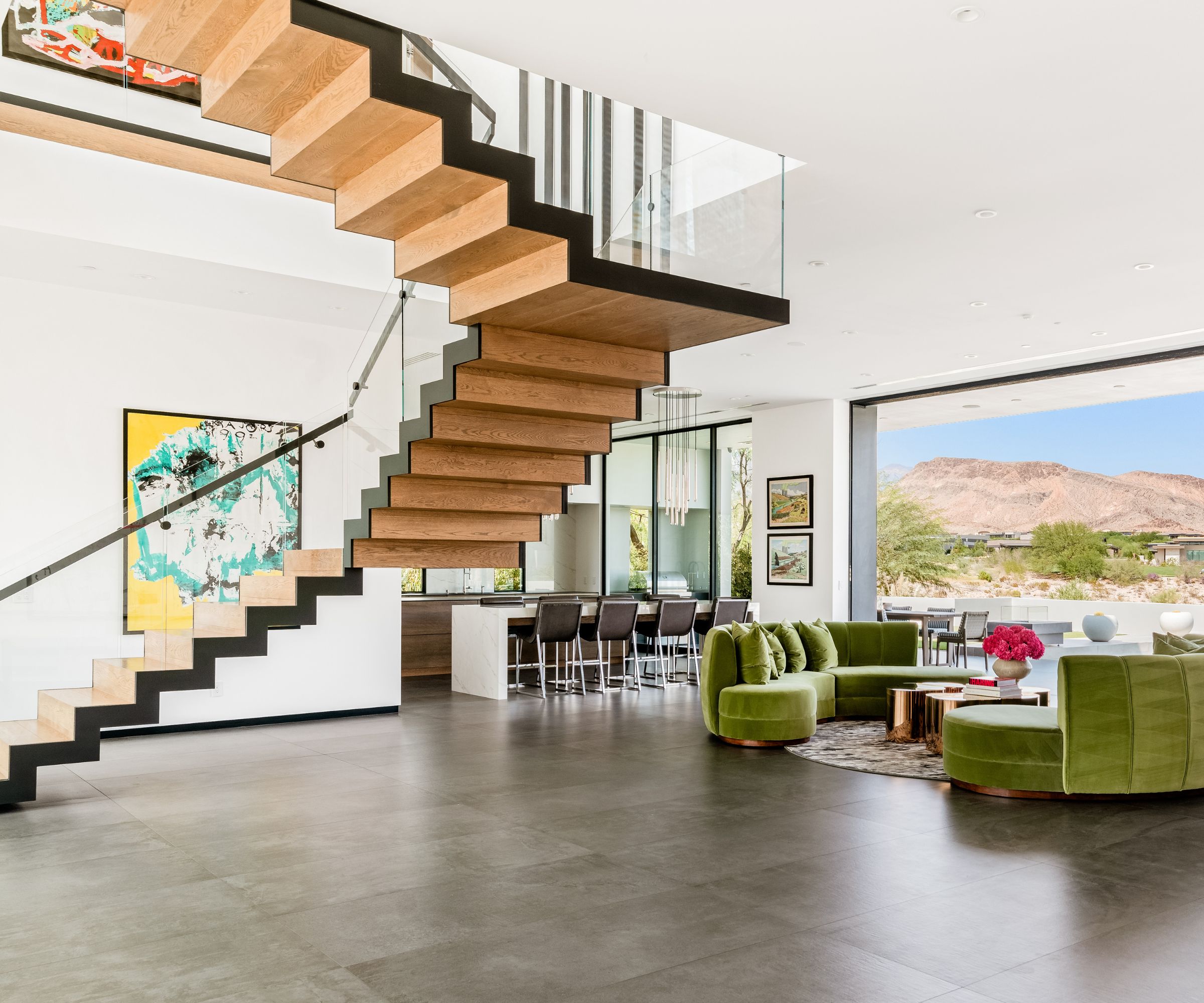
In this angle of the living space, the stairs, artwork and the view do the talking. The floating metal staircase with oak treads was designed by architect CJ Hoagland. The artwork is by Lou Majors.
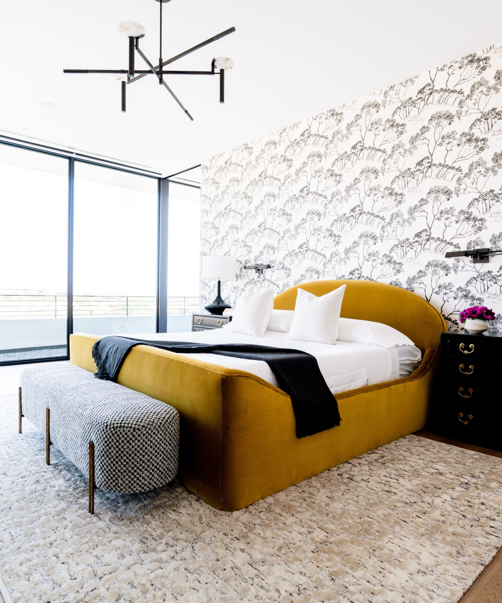
Understandably, there's a change of mood for the bedroom ideas, which are calmer, cozier rooms, while still remarkably stylish.
'In this master bedroom we created a comfortable space with the feel of a boutique hotel,' says designer Daniella. The bed was custom-designed in a rich velvet from Kravet, the bench is by Kelly Wearstler, upholstered in a Holland & Sherry fabric to contrast with the bed. 'In the ceiling we added a chandelier by Kelly Weastler that played with all the curves in the room, the nightstands are vintage and the lamps and sconces are from Circa. The black and white wallpaper by Schumacher creates an interesting background with its unique natural motif.'
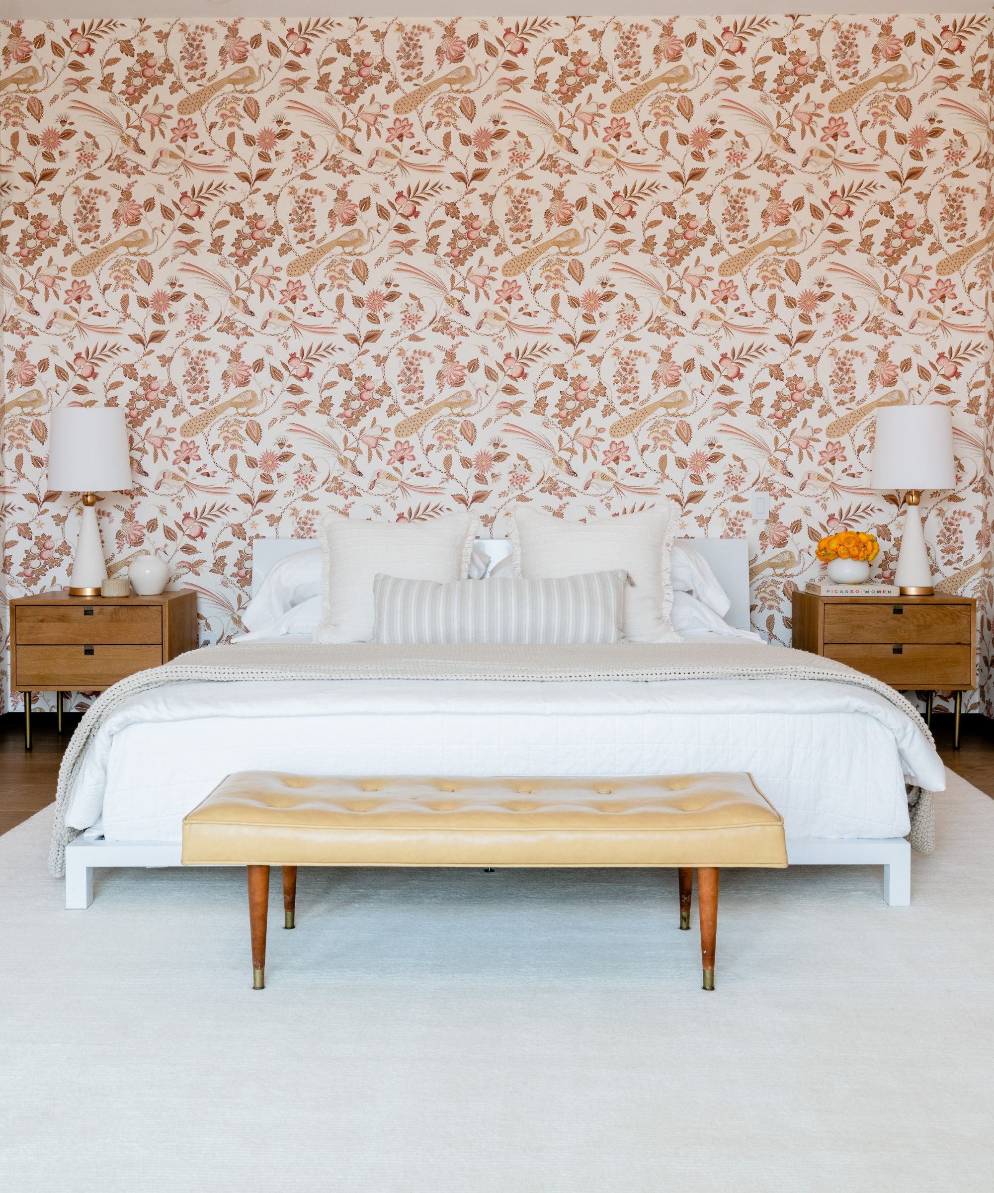
In the guest room, the pink floral wallpaper is another Schumacher design, the bed and bench are vintage pieces owned by the homeowners. The rug is from Surya, the nightstands are by Lulu and Georgia, and the table lamps are by Kathy Kuo Home.
The homeowners and the designer were thrilled with the finished look. 'Our design aesthetic is centered around color and pattern so it was a perfect match when we met the clients,' says Daniella Villamil. 'They weren't afraid of color and wanted to push the envelope. They also had an amazing art collection, and wanted me to design around it. It is fun to get to know clients and take them out of their comfort zones, but it is just as important to make sure that we stay true to the style that speaks to them, making sure that they feel comfortable and love the end result.'
Interior design: Daniella Villamil
Photographs: Edgar Lara
Sign up to the Homes & Gardens newsletter
Design expertise in your inbox – from inspiring decorating ideas and beautiful celebrity homes to practical gardening advice and shopping round-ups.
Karen sources beautiful homes to feature on the Homes & Gardens website. She loves visiting historic houses in particular and working with photographers to capture all shapes and sizes of properties. Karen began her career as a sub-editor at Hi-Fi News and Record Review magazine. Her move to women’s magazines came soon after, in the shape of Living magazine, which covered cookery, fashion, beauty, homes and gardening. From Living Karen moved to Ideal Home magazine, where as deputy chief sub, then chief sub, she started to really take an interest in properties, architecture, interior design and gardening.
-
 'Big results before you know it' – Experts urge you to use the ‘Take Away 10’ method for simple decluttering with zero decision fatigue
It can cut hundreds of items from your home in just a few weeks
By Ottilie Blackhall
-
 Kevin Bacon and Kyra Sedgwick's rustic kitchen island is stunning, but controversial – designers say you can get the look without the hassle
A popular material finds an unorthodox home in the couple's kitchen, but experts disagree on whether it should be used – here's how to do it instead
By Sophie Edwards