A 100-year-old home with modern interiors – here's how to get it right
Combining contemporary design updates with period details? This 100-year-old craftsman-style home shows how it's done
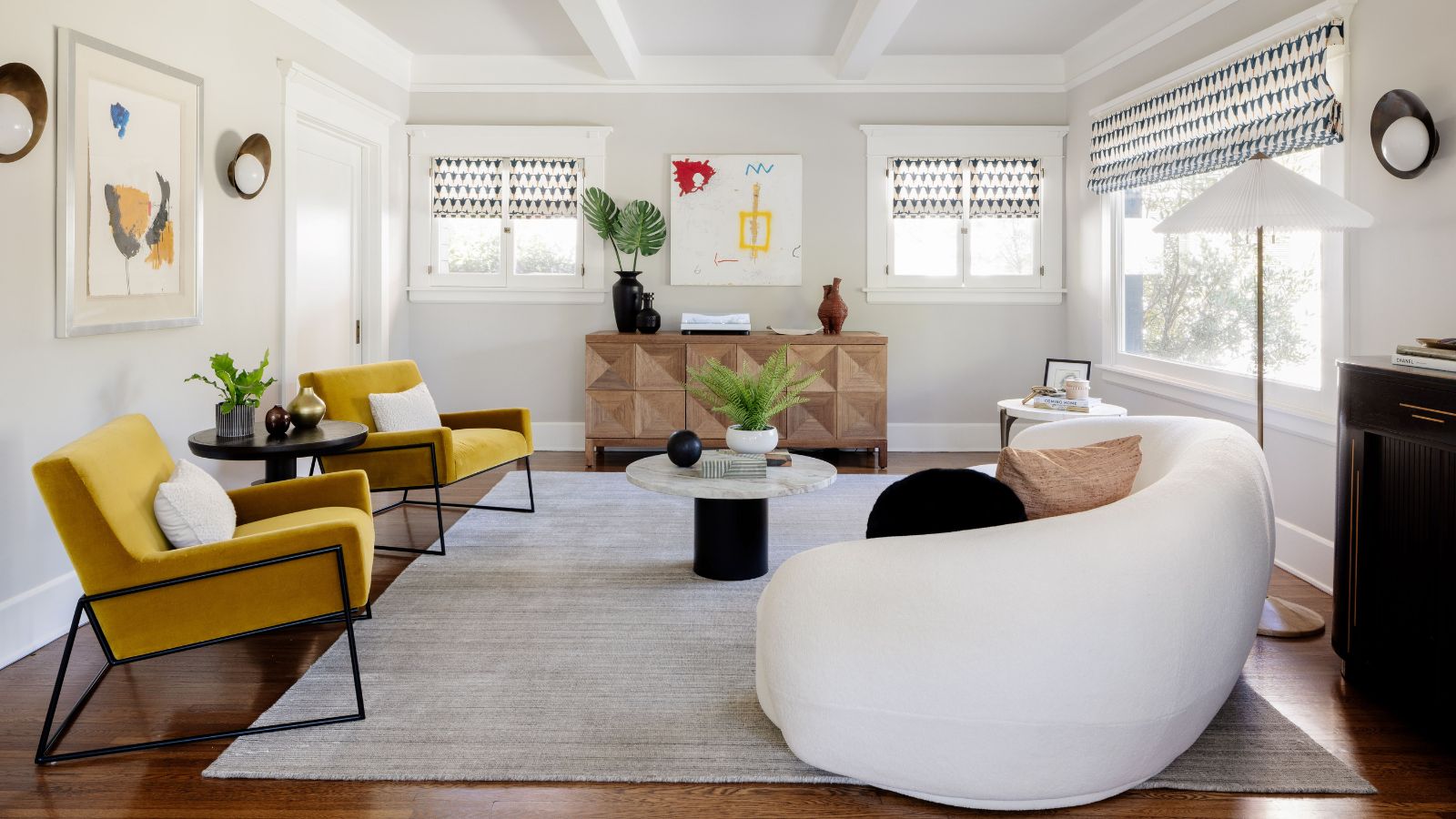
When the new owners of a Craftsman-style house in LA's smart Hancock Park neighborhood decided to renovate their home, they were looking to preserve its plentiful character and period detailing. However, they also wanted help and some ideas for updates that would enable them to put their personal stamp on their first family home.
That's where the team at Dmar Interiors came in. The firm's founder and lead designer Mollie Ranize and interior designers Kim Serani and Maria Aramburu, specialize in creating highly livable California Modern interiors for homes across Southern California. Listening to the owners' hopes for the new look, and using the property's architecture as their guide, Ranize and her team set about creating the home's stunning interiors. Take the tour to discover how the designers achieved the perfect balance between California Modern and this little piece of Californian history.
Interior designer Mollie Ranize was delighted to be working on this project. 'I love – LOVE – Craftsman style homes,' she says. 'They are rich with not only history but physical architectural detail. These homes celebrate moments, opportunities, and transitions, and I felt so fortunate to be able to add a layer to its history and story. To be able to listen to clients and honor a home is the greatest challenge we receive.'
There were many other challenges too, of course. 'This historic home had been handled for 107 years, so things weren’t necessarily in the best shape. Part of our job was to restore and refurbish as much of the millwork as possible. We also leaned into our client’s love of color, pattern and graphic sensibility and worked to integrate this in various ways.'
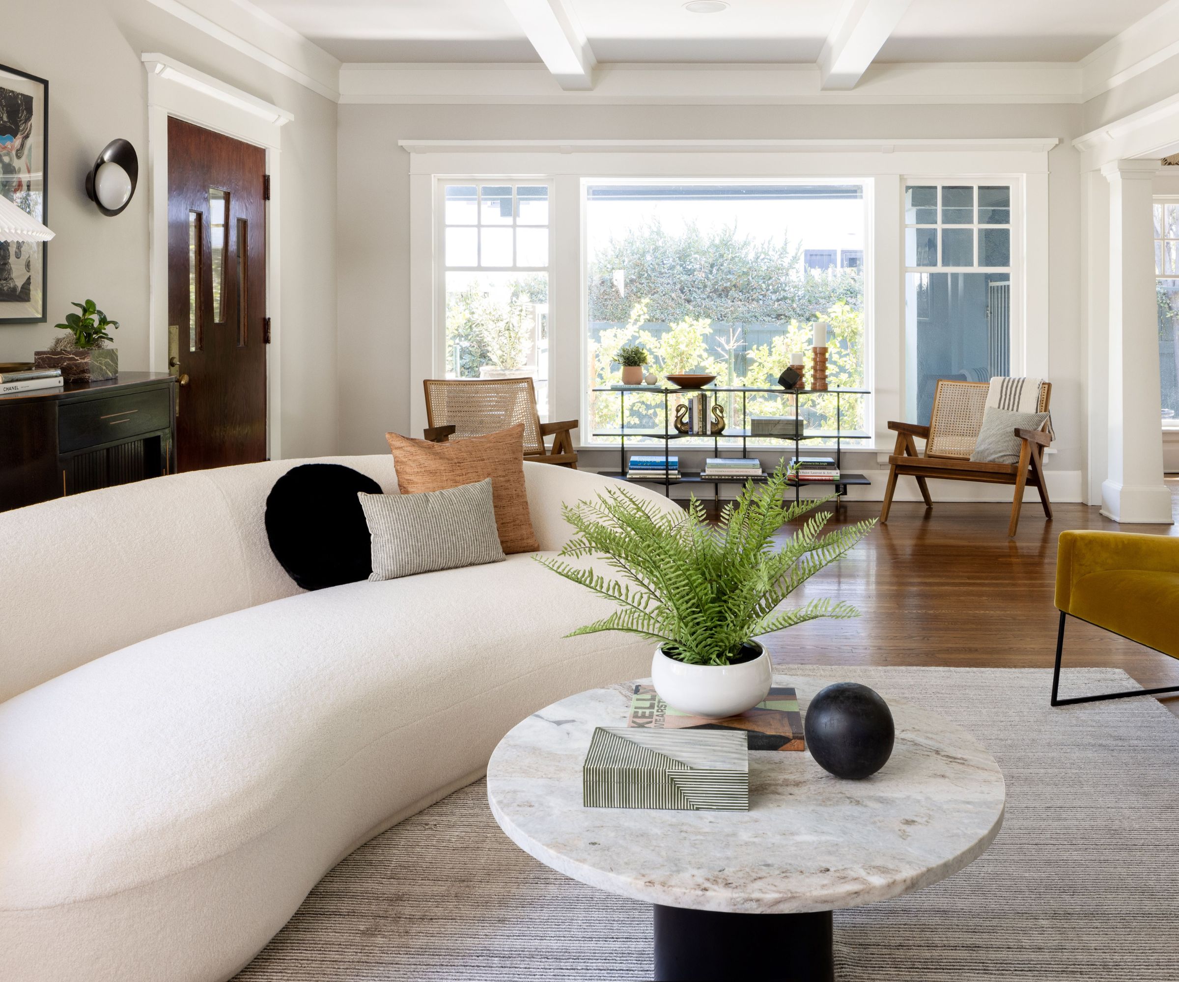
Since the main entrance to the home brings you directly into the open-plan formal living room, pictured above, living room ideas were all about ensuring the furniture layout was welcoming and interesting. 'It’s doing double duty as a hang-out space and the first impression, so the shape and color of the furniture in this room were key to the success of the space,' explains Ranize. 'The strongest piece is the curved Siena sofa from Jayson Home. We also lightened the walls and created slight contrast between the coffered ceiling beams to accentuate the height and woodwork. The end result is soft and welcoming.'
Key pieces include: the Keck Cocktail Table from Arteriors Home; Quadrant Sideboard in dark walnut from Noir Furniture LA, Tulip Hand Block Roman blind fabric from Schumacher; Agreeable Gray wall paint and Drift of Mist ceiling paint, both Sherwin Williams.
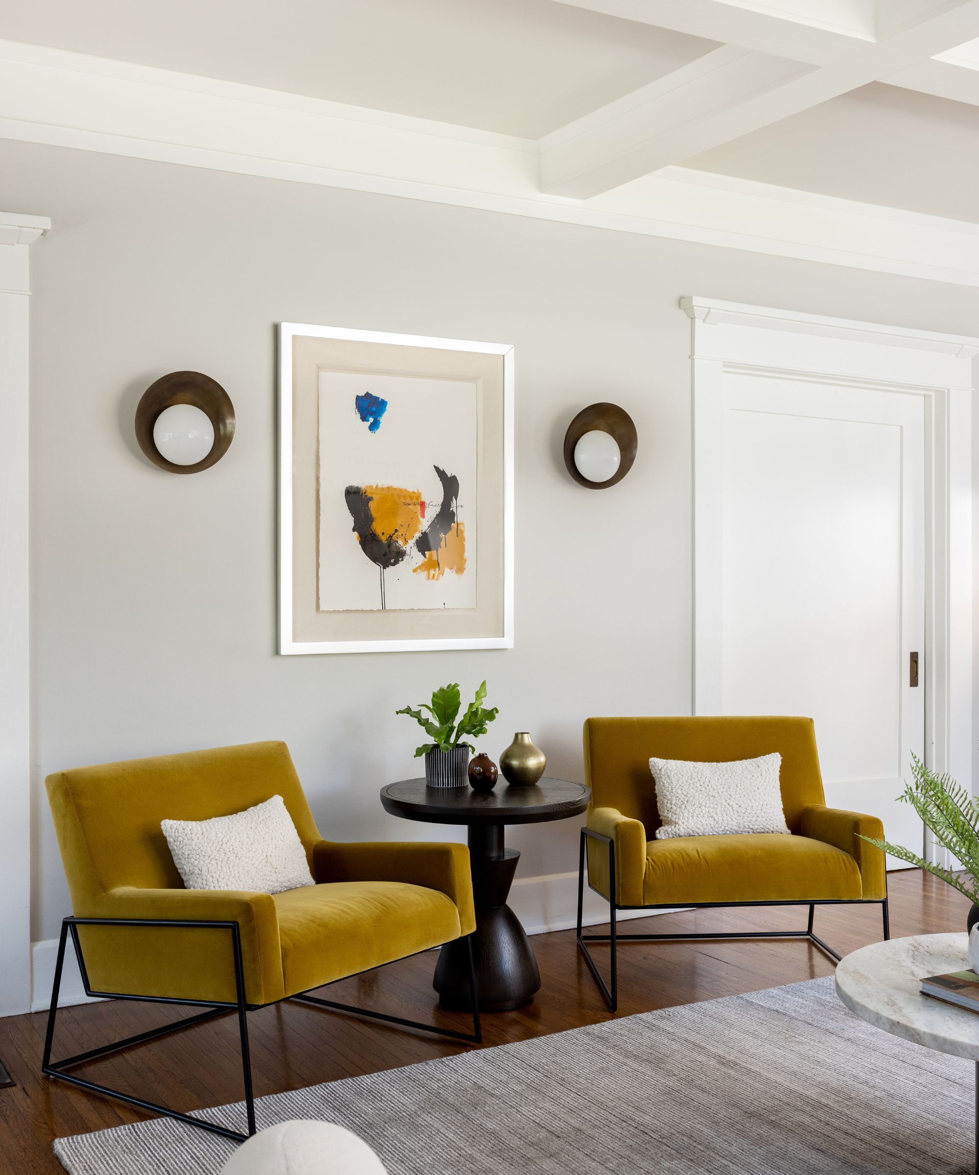
A pair of mustard yellow accent chairs, the Regis lounge chair from Article, add a highlight of color to the formal living room's soft gray scheme, echoing the artwork. Houseplants add further texture and interest to the scheme and keep the room looking lively and fresh.

Mollie Ranize, founder of Dmar Interiors, a design firm based in Los Angeles, is known for her California Modern style. She approaches each project with her 3-T Rule, keeping things Tasteful, Tailored and Timeless. She was delighted to be involved with the interior design for this 1915-built Craftsman-style home in LA's Hancock Park neighborhood.

Ranize's kitchen ideas had to find a way to make the existing cabinet color work with the overall design. 'We didn’t have the allowance in our target timeline to refinish them,' she explains. 'So, we painted the walls, changed the light fixtures and gave the breakfast nook its own color moment to delineate the spaces.'
Among the kitchen's key pieces are a vintage Turkish runner, sourced from Etsy; Akoya Pendant, from Shades of Light.
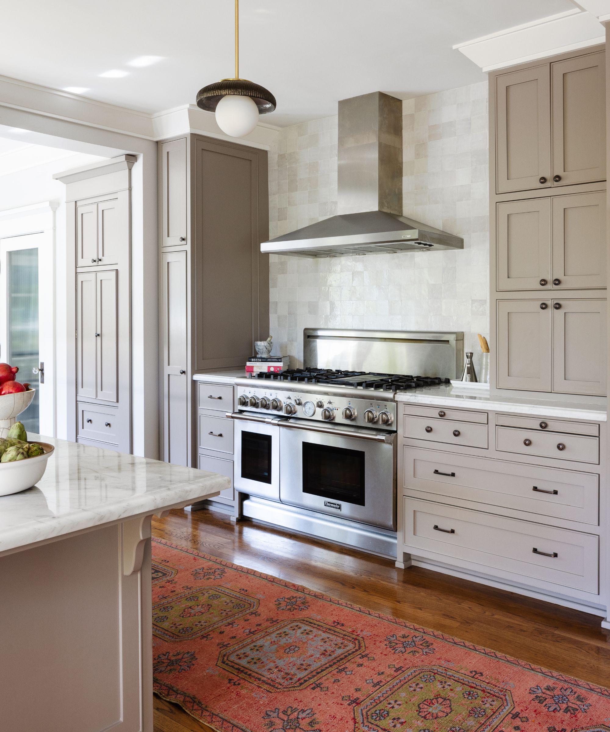
Keeping the existing, good quality, kitchen cabinetry saved time and money, but replacing the backsplash tiles, and adding the new rug and pendant lights, has given the whole space a refresh. The pure white Moroccan Zellige backsplash tiles are from Zia Tile. For more kitchen renovation inspiration, check our guide on how to update kitchen cabinets.
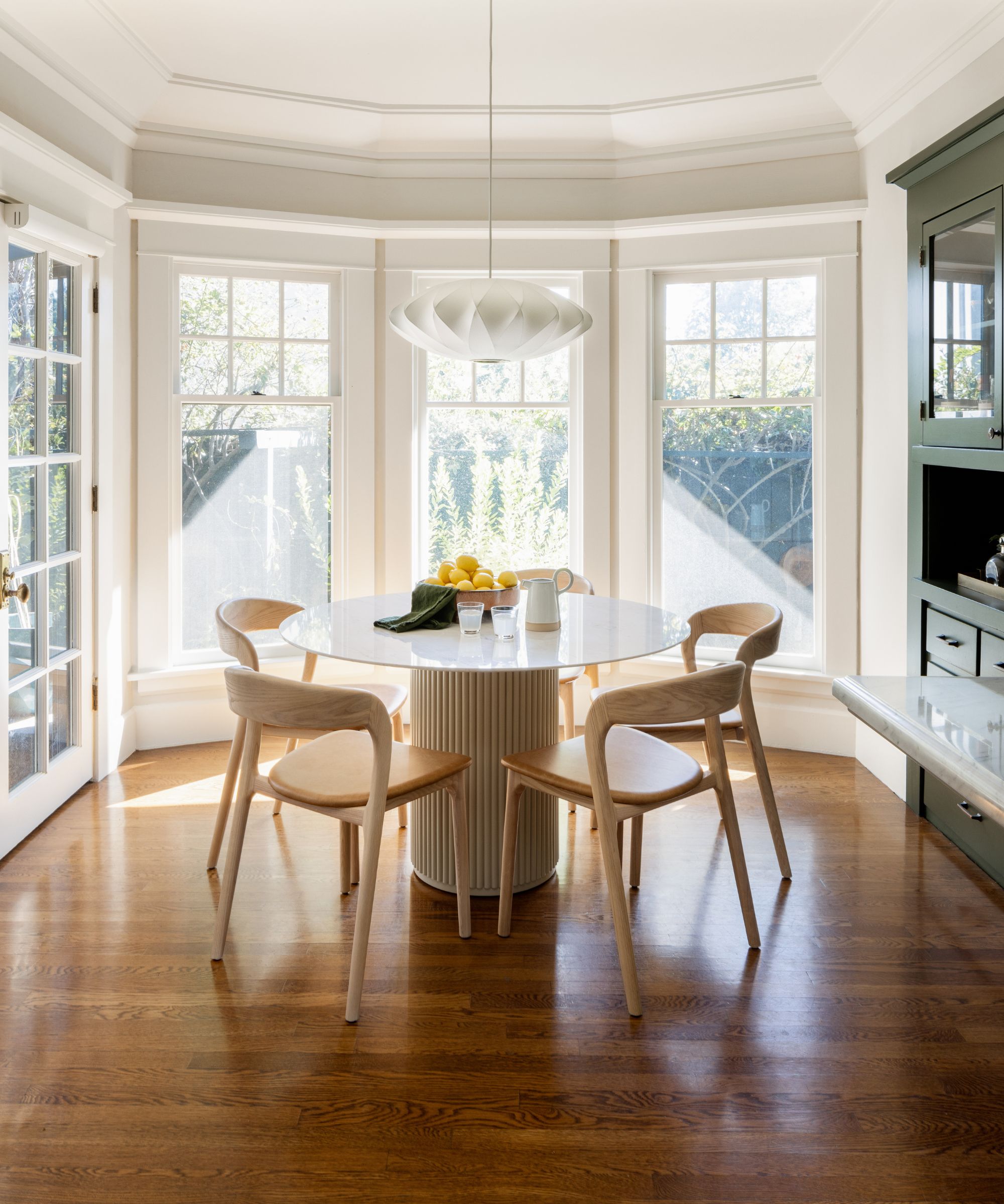
'In the breakfast nook we wanted to call out the historic built-in so we used Sherwin Williams Foxhall Green to give the piece its own moment, while brightening up the rest of the space with light finishes and furnishings,' says Ranize, explaining the thinking behind her eat-in kitchen ideas. 'A new pendant light and show-stopping table and chairs make this small space one of the stars of the home.'
Credit where credit's due, those charming original near-floor-to-ceiling windows also play their part in perfecting the aesthetic of this space.
Other standouts include the Athena round dining table in white Carrera marble and alabaster matte lacquer from Rove Concepts; Amare dining chairs, from Four Hands; Paper Moon hanging Shade in brass with rice paper shade from Circa Lighting.
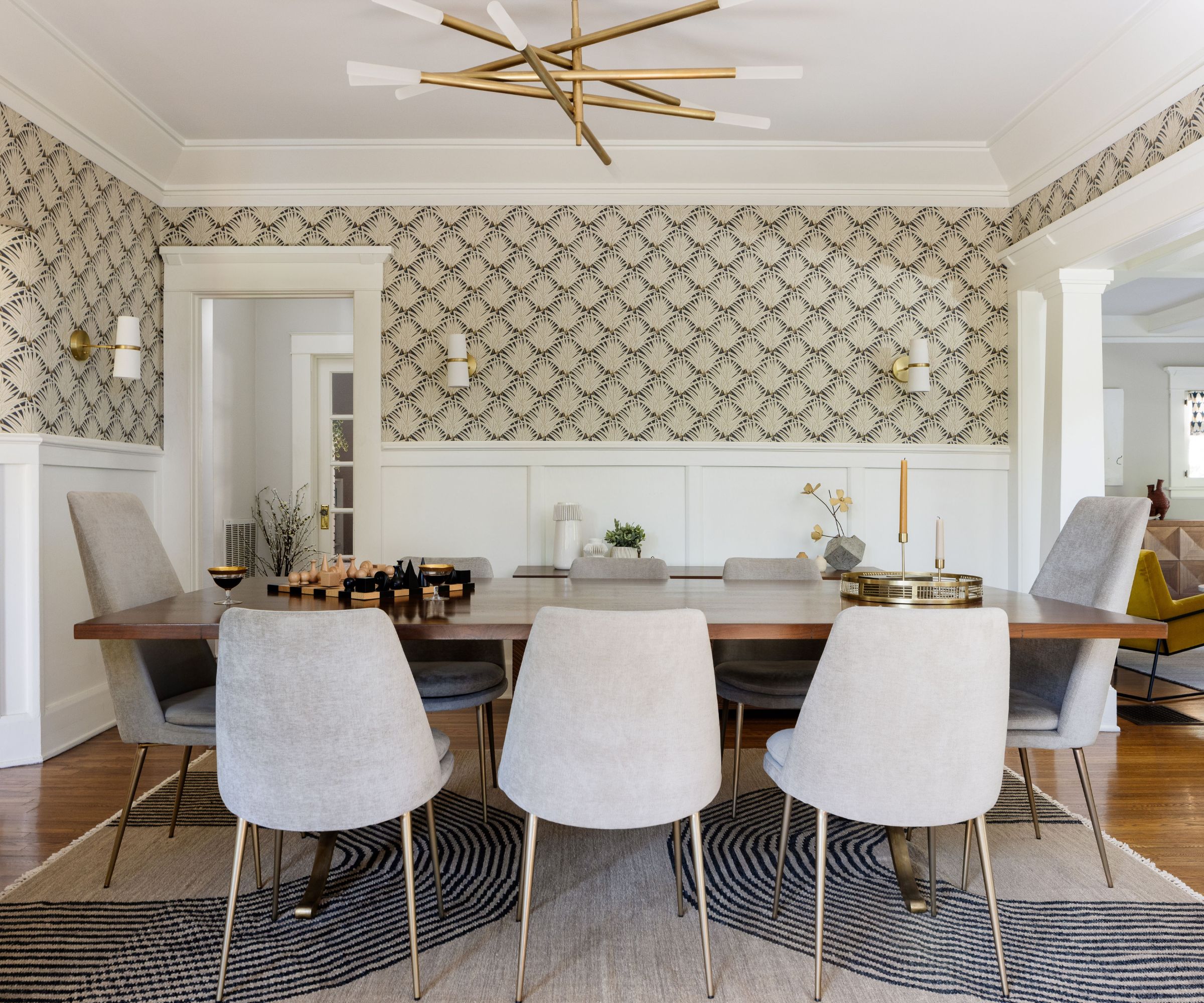
Moving on, Ranize explains her dining room ideas. 'This room had a lot going for it. The paneling was existing, but the space needed something to draw the eye up and around the room in order to appreciate the balance of past and present details,' she says. 'I love the way the new wallpaper (Zenada in Carbon from Schumacher) creates graphic interest in the room and brings a happy sophistication to the space. To me the wallpaper is the star of this room’s transformation.
Wishbone dining table and Finley upholstered chairs, both from West Elm
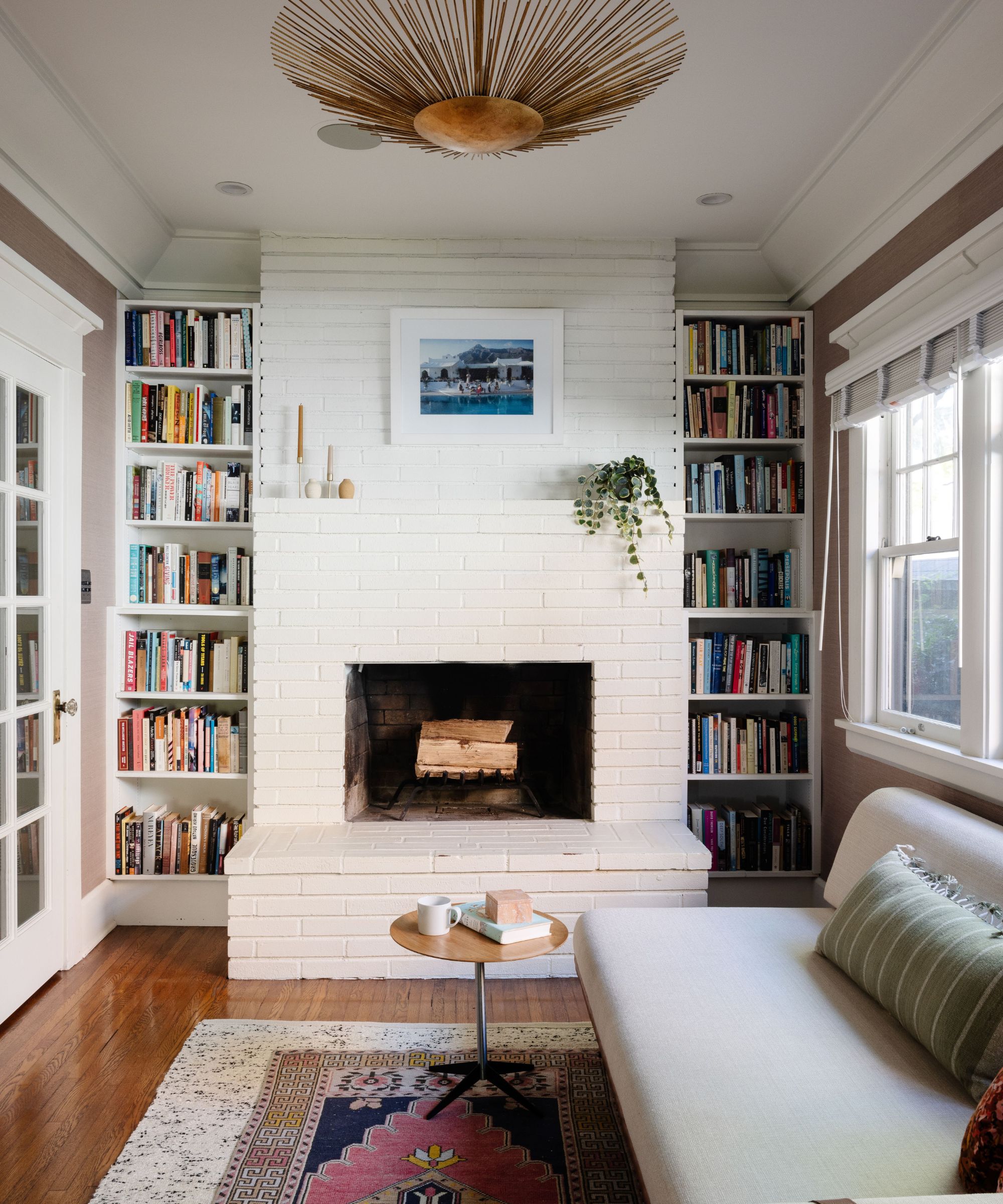
'This second living room is a small escape that needed little touches to bring it all together,' says Ranize. Small living room ideas that work well here include a new pinkish-purple grasscloth wallpaper, a brass statement light fixture, new sofa and a vintage rug, which all pulled the tiny space together to create an inviting reading nook.
The wallpaper (just seen) is the Haruki Sisal in Haze from Schumacher; Helios wide pendant light in antique gold, Circa Lighting.
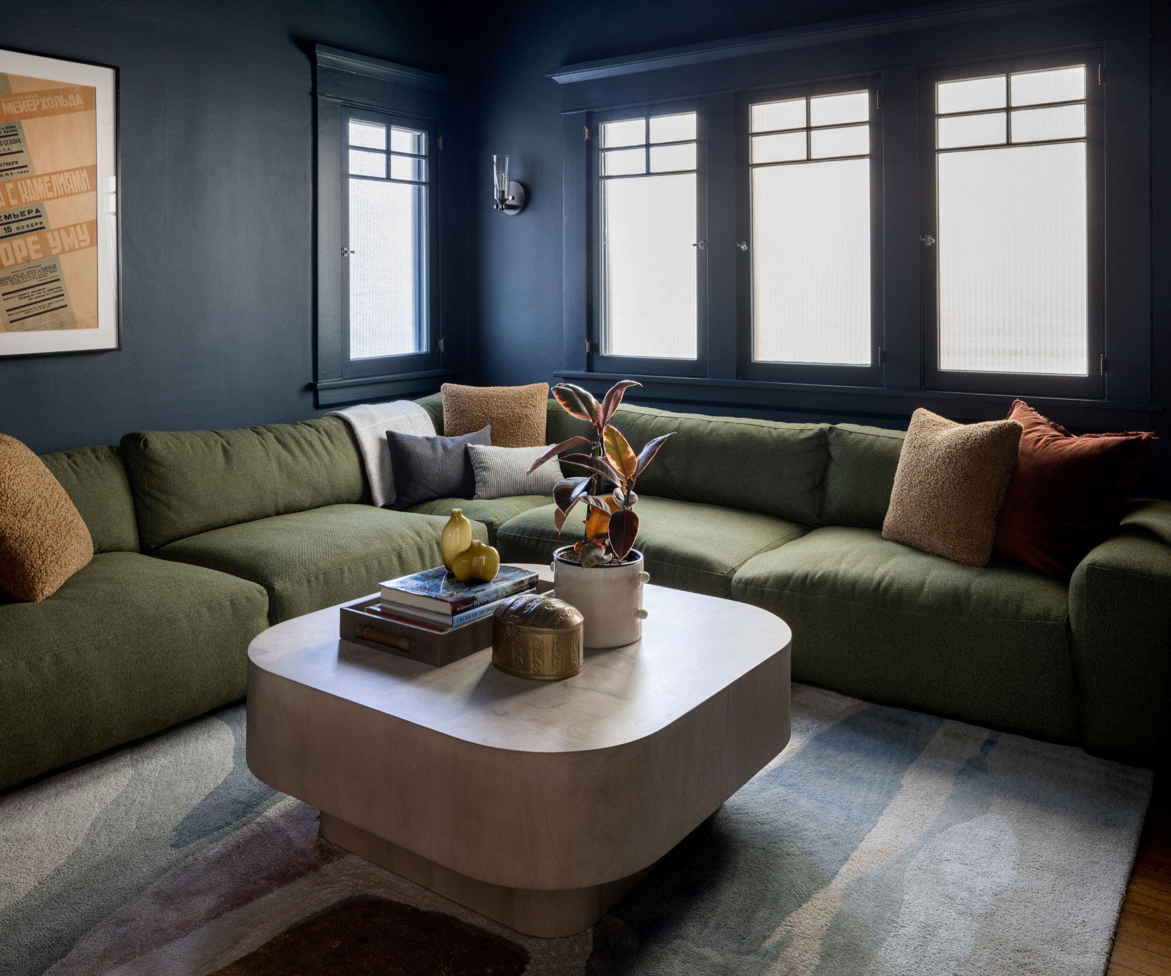
There's a real change of pace in the movie room, one which Ranize relishes. 'I love the contrast between the light and airy spaces and the dark and moody spaces in this home,' she says. 'There is a space for every activity and mood.'
'I love the way the movie room/den came together,' she adds. 'The walls were originally painted a dark, but loud shade of blue. We talked a lot about lightening the walls because the room wasn’t working the way it was.'
After much discussion to try and arrive at the best movie room ideas the decision was made to go even darker. 'I think the result speaks for itself,' says Ranize. 'The dark walls with the moody emerald sectional make this the perfect spot to watch a movie and block out the rest of the world. The room is a true escape.' Walls painted in Sherwin Williams Mount Etna; Fenton 3-piece sectional in Montford Emerald from and Blanco coffee table in Bleached Burl, both Four Hands; Nightscape Rug from West Elm.
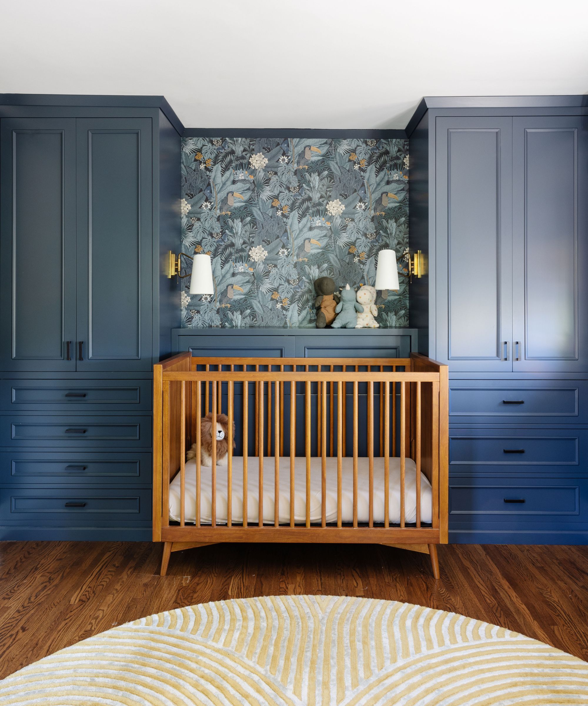
The owners bought the house as their first family home, with a baby on the way, so creating a stylish nursery was one of the most important parts of their brief to the design team.
Anyone looking for gender-neutral nursery ideas will find inspiration in this sophisticated space. Ranize explains its transformation. 'This room had great existing built-ins but they were in rough shape and were a shade of green I’ve only seen on candy,' she recalls. 'We repaired the built-ins and gave them a new, more saturated and livable color (Benjamin Moore Hale Navy). The client’s crib fits the space perfectly.
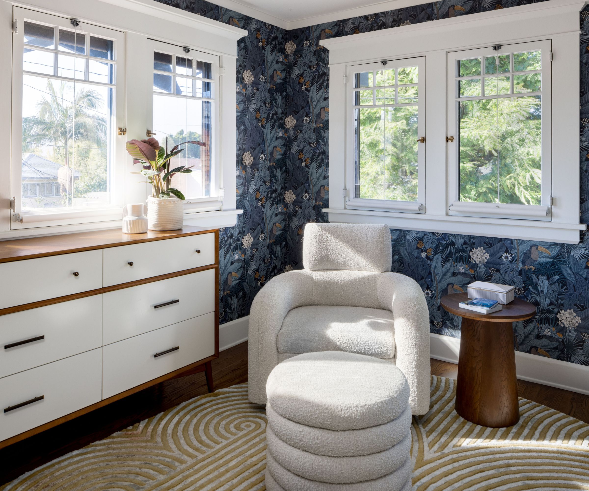
'We were allowed to go very bold with the Furada jungle vibe wallpaper, from Rebel Walls, which is another showstopper. Then we pulled it all together with a new oval shaped area rug, so important in a nursery, and maybe my favorite nursery glider/ottoman set I have ever seen.' Snoozer cream nursery glider chair and ottoman from Crate & Barrel; hand-tufted Andie rug in olive from Anthropologie.
With the main spaces finished, how does Ranize feel about how she and her design team met the owners' brief?
'Their number one must-have was to help the key spaces make sense without “re-doing” everything,' says Ranize. 'In other words, respecting some of the progress that had been made on the home – but making the home feel fresh, updated, personal and make the bones of the house feel more natural with the newer elements around them. In the end, the clients wanted the home to have a new life while still respecting its past.'
I think, as their near-neighbors in Hollywood might say, that's a wrap!
Sign up to the Homes & Gardens newsletter
Design expertise in your inbox – from inspiring decorating ideas and beautiful celebrity homes to practical gardening advice and shopping round-ups.
Karen sources beautiful homes to feature on the Homes & Gardens website. She loves visiting historic houses in particular and working with photographers to capture all shapes and sizes of properties. Karen began her career as a sub-editor at Hi-Fi News and Record Review magazine. Her move to women’s magazines came soon after, in the shape of Living magazine, which covered cookery, fashion, beauty, homes and gardening. From Living Karen moved to Ideal Home magazine, where as deputy chief sub, then chief sub, she started to really take an interest in properties, architecture, interior design and gardening.
-
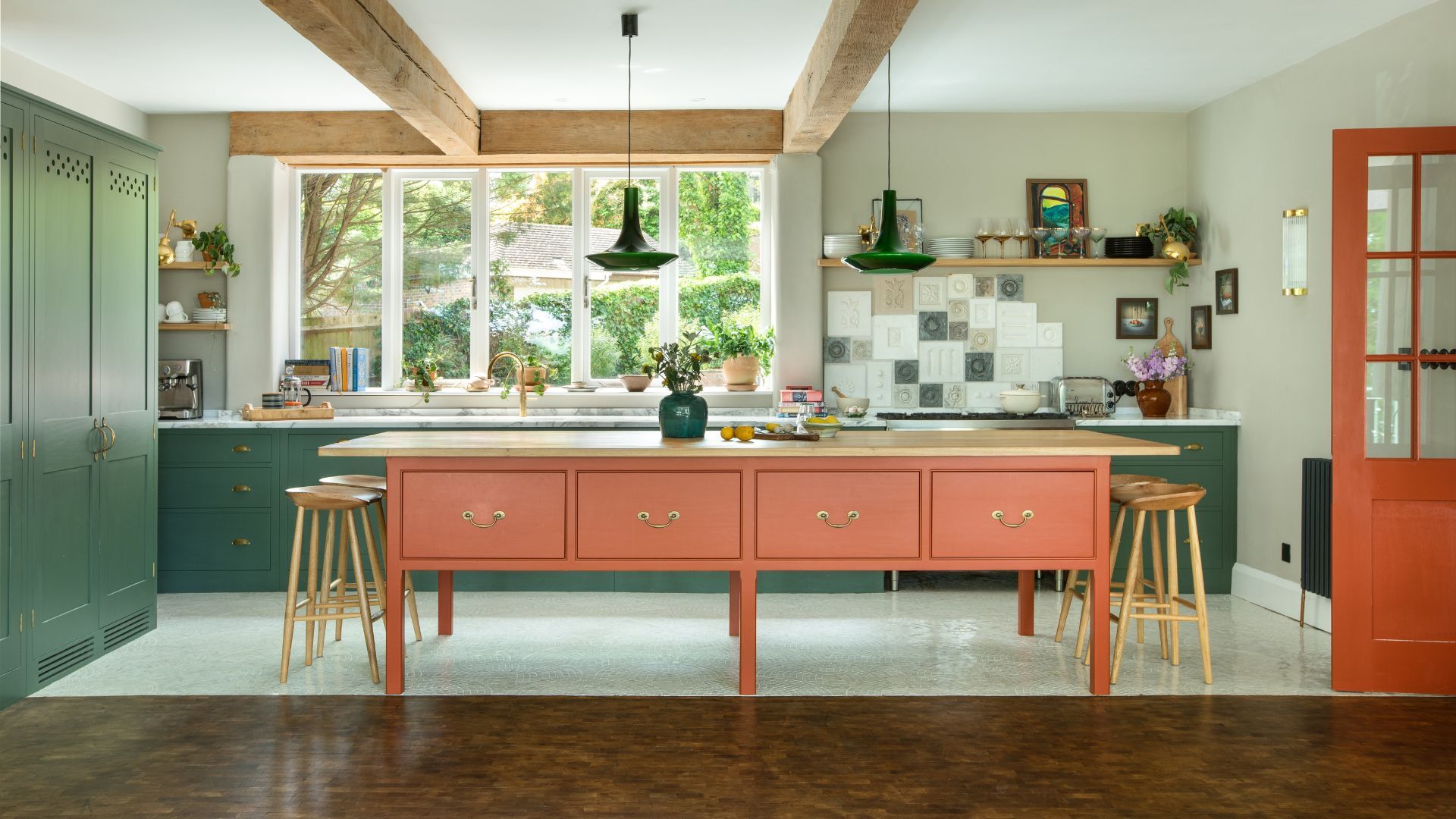 Orange and green is the bold color pairing quietly transforming homes in 2025 – here's 4 reasons why
Interior designers are making the orange and green combination work wonders – this is how you can too
By Sophia Pouget de St Victor Published
-
 This Michelle-Pfeiffer-approved chair is made of a forebodingly unusual material, opening the debate: Is it a rustic stunner, or a danger to sitters?
The actress took to Instagram with a chair made of a controversially sharp material – and fans are unsure of how they feel about it
By Sophie Edwards Published