Cortney Bishop's latest project masterfully mixes pattern play with soft sophistication
Calming blues and plaster walls are the perfect antidote to bold William Morris prints
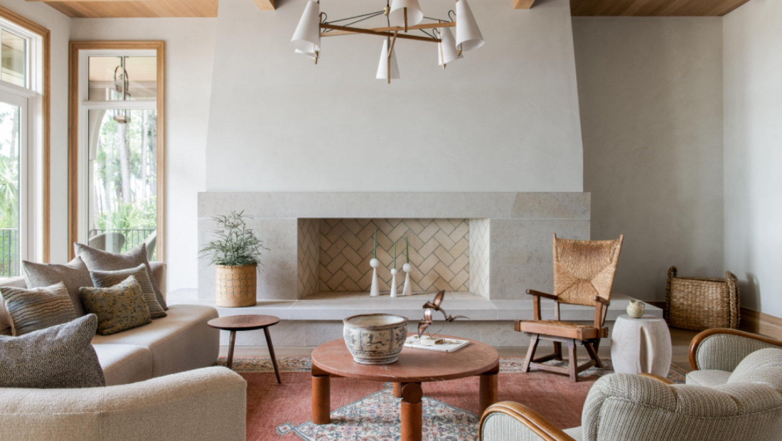
This beautiful new build in Kiawah Island, South Carolina showcases an elegant yet playful design.
It was a project for a couple looking for their forever home, and was carried out by Cumulus Architecture and Cortney Bishop.
The houses in the area have to be environmental in color, and can’t stand out from the landscaping, so the team chose a gunmetal colorway for the exterior windows, and carried that on the interior.
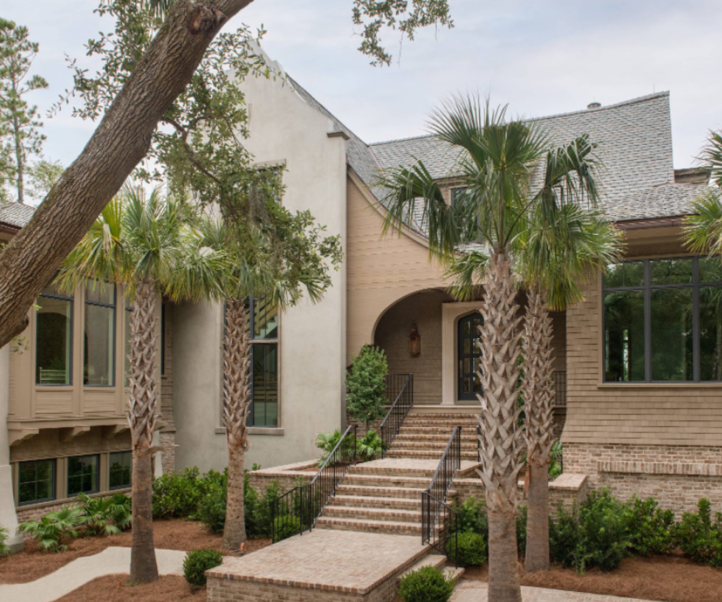
The owners were looking for a thoughtful and creative design, that was also sophisticated, with a little bit of fun thrown in.
Cortney says: 'I tend to choose two or three predominant colors to work on with the materiality so I chose the gunmetal, Farrow & Ball De Nimes blue and a bleached oak.'
She continues: 'Knowing that the home was an Arts and Crafts-style exterior facade with beautiful, curvy details on the interior, we wanted to stay in that kind of conversation. I would call it story book Arts and Crafts.
'I really love to use wallpaper patterns, and in this house specifically we did wallpapers in all of the guest rooms, and then we accented the wallpaper with a bold color trim, then add a very simple drapery treatment so that it was soothing.
'The house is located in a resort area, so soothing, peaceful and restful was the goal. There is a really interesting sense of pattern play on the fabrics and the wallpapers that create more of a layered feeling, while the patterns were calmed down with cream, mesh drapery.'
Take the tour below.
Kitchen
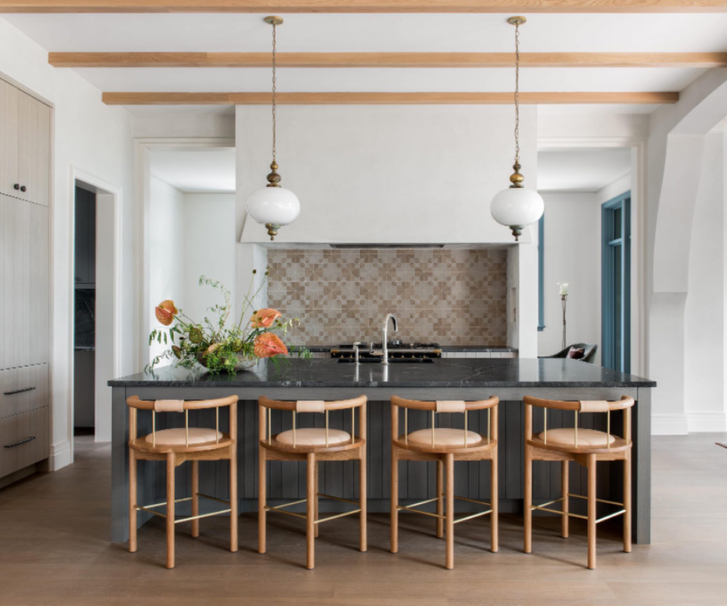
'The kitchen was really fun to design, and felt more like a lovely extension to the living room,' says Cortney.
'I think one of the main reasons we were able to achieve that is because we did this gorgeous hood detail and flanked the kitchen range hood in plaster in a very wide perspective, so that it not only elongated the space but it reflected the shape that we designed the fireplace across from it (see below). The range and the fireplace are the two flanking focal points.'
She adds: 'There's an ease of flow in the space, with no hard angles to walk around, so we also opted for curved back chairs at the kitchen island to reflect that.'
Living room
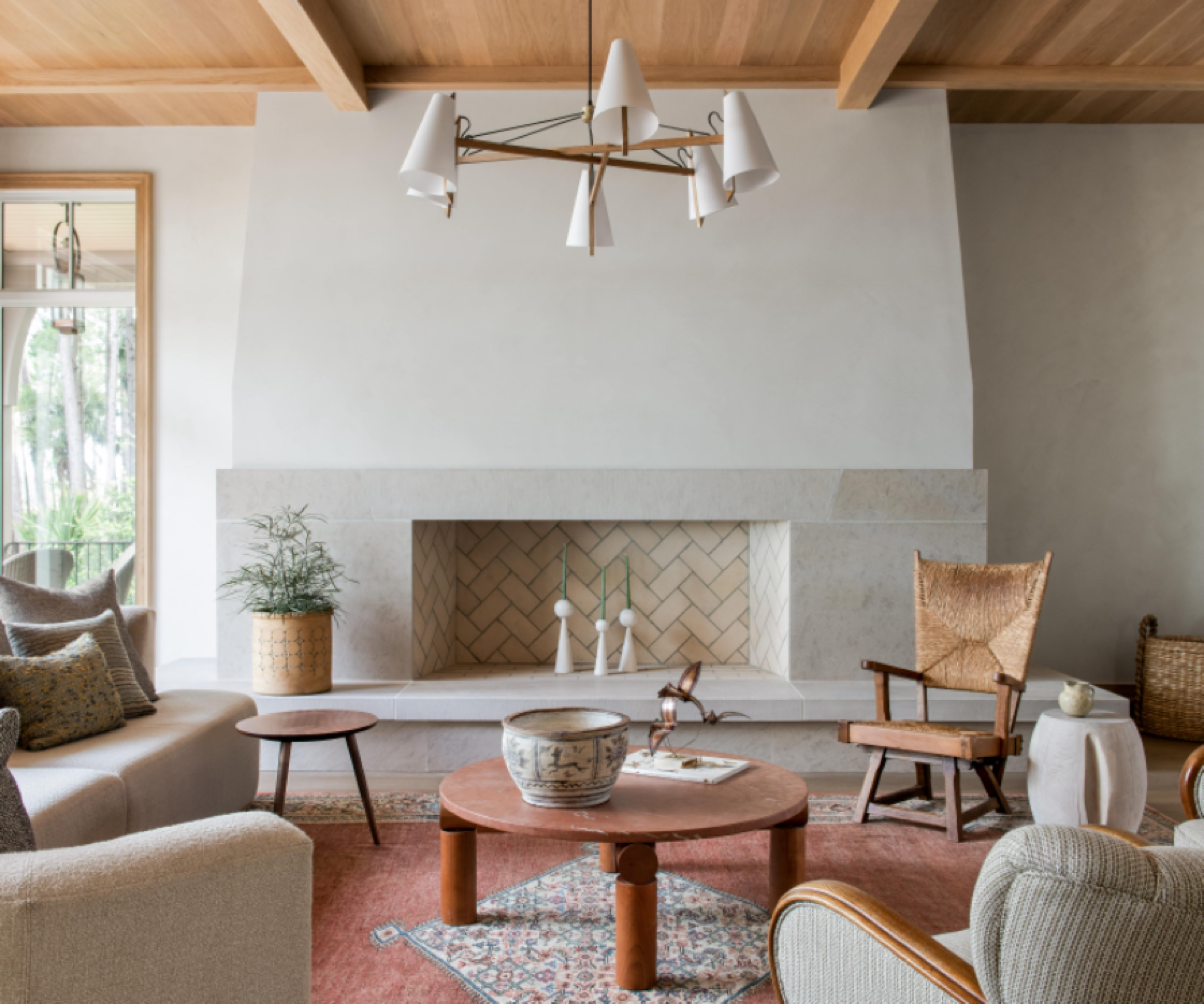
The rug was one of the first things Cortney found for the house.
She says: 'A pared-back feel felt right at the time. The fireplace is the focal point to me, and widening the fireplace was a big decision. We felt like the space could handle it and so that was what I wanted everyone to focus on.
'We chose a neutral scheme for serenity and peace of mind. The owners wanted a really calming space and I didn’t want to distract from the landscape and the view.
'The owners love birds and birdwatching, and there’s birds in a lot of the wallpapers in the guest bedrooms, so we wanted it to feel nature-inspired and organic in this space too.
'There’s birds and cardinals on some of the chair fabrics, which worked as a motif without getting gimmicky.
'Curved edges in the furniture is one of my little secrets on everything. I love curves, I love unique shapes – and I don’t like hard edges.'
Dining room
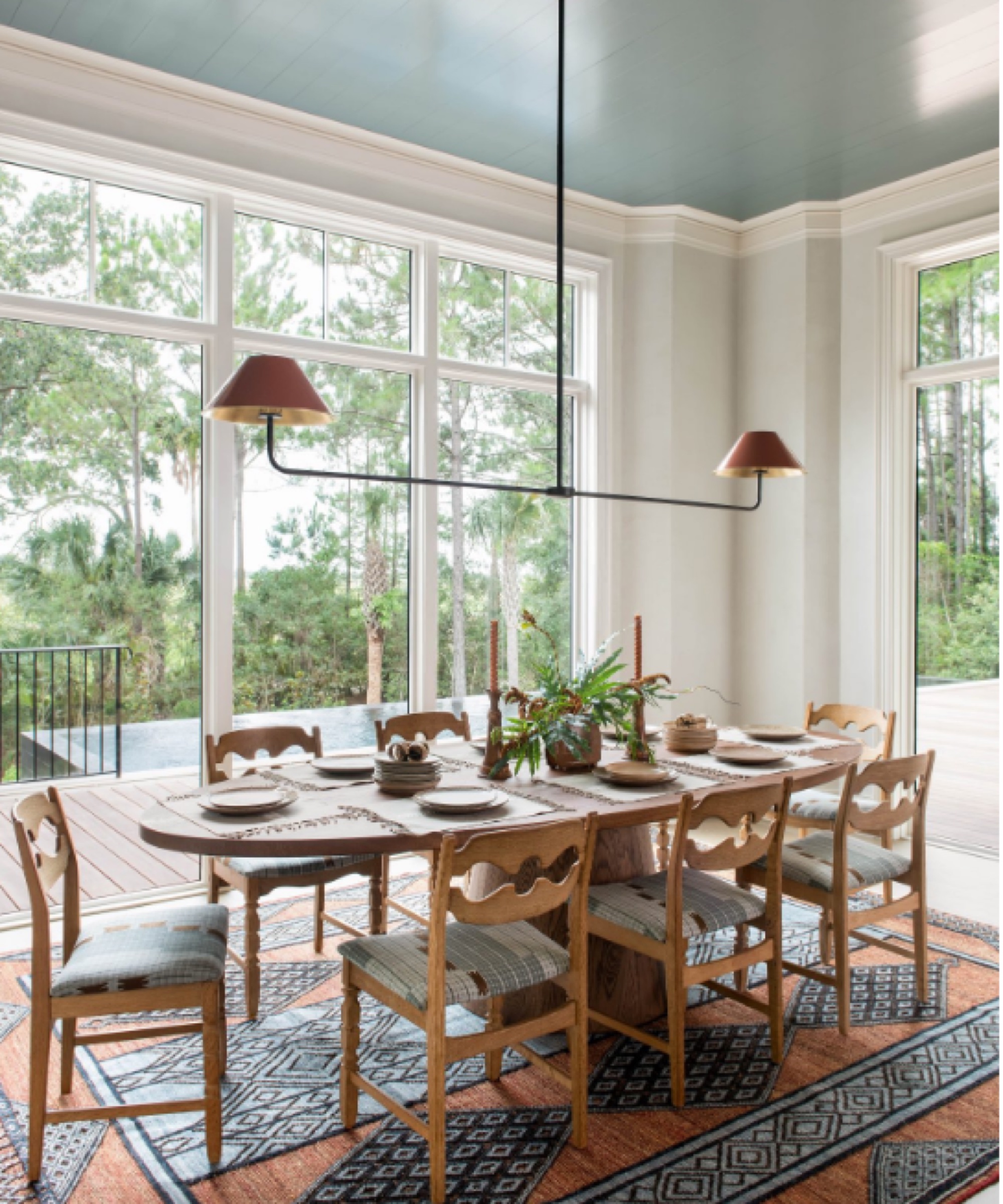
Cortney says: 'Adding Farrow & Ball De Nimes on the ceiling was a last minute call. We wanted to create some fun interest, pull your eye back to the dining room to help pull your eye out to the view, which is incredible, as the dining room boasts the best view from the house.
'The rug was great because we wanted to bring in another color in the fabrics and the rugs and rust just seemed to work beautifully. When we found that rug, rust became really a beautiful accent color; you can see it in the backsplash tile, and in some of the lighting accents.
'We had the dining table custom made and the dining chairs are antique chairs but they’ve got that whimsy, fairytale/storybook vibe.'
Home office
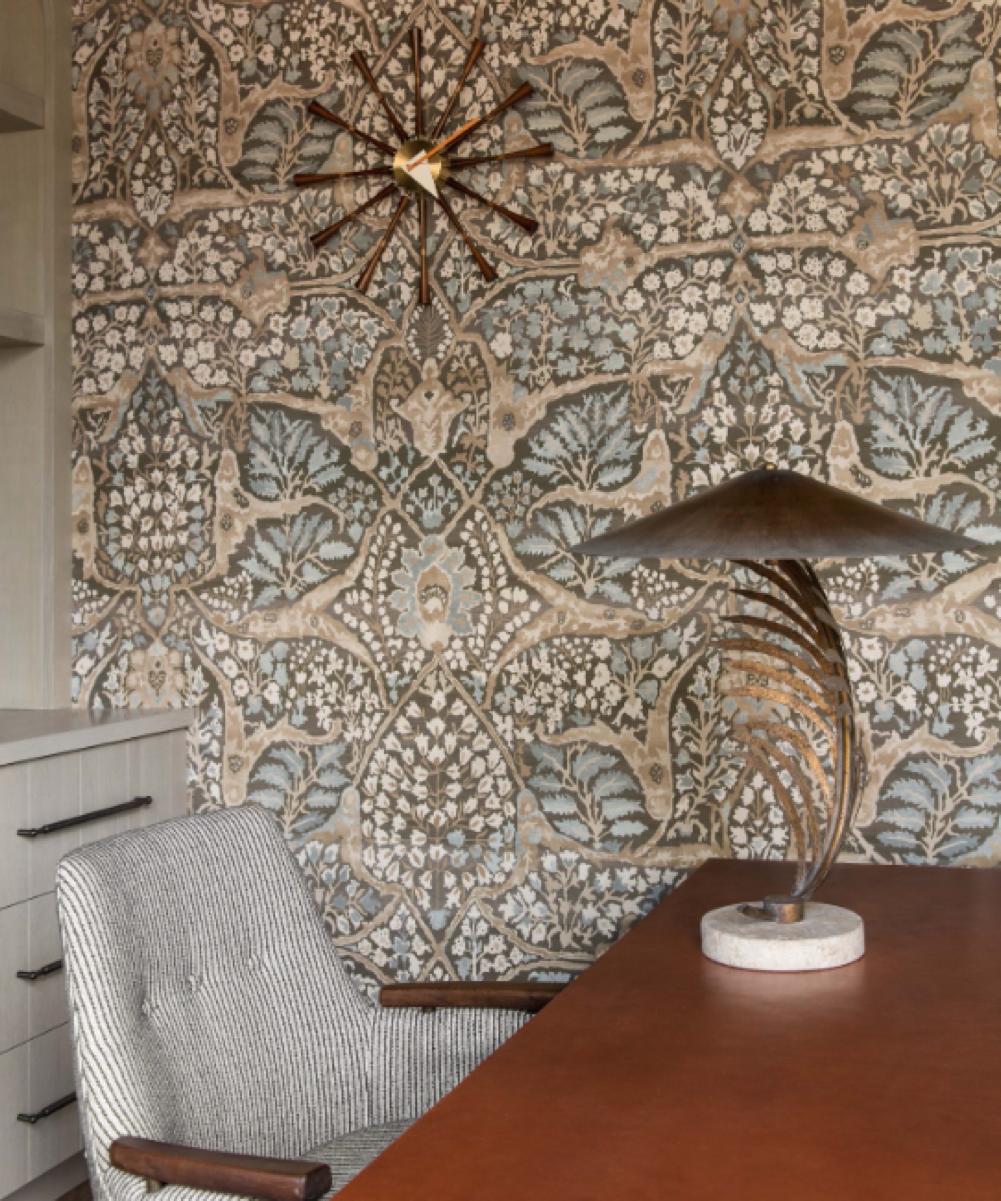
A wallpaper was used to complement the colors in the white oak cabinetry, and the leather-top table was custom made.
Cortney says: 'This is the cream mesh on the drapery that we used throughout the house, which is a trick of mine to calm down the wallpaper a bit and create an airy, light feel.'
Bedroom
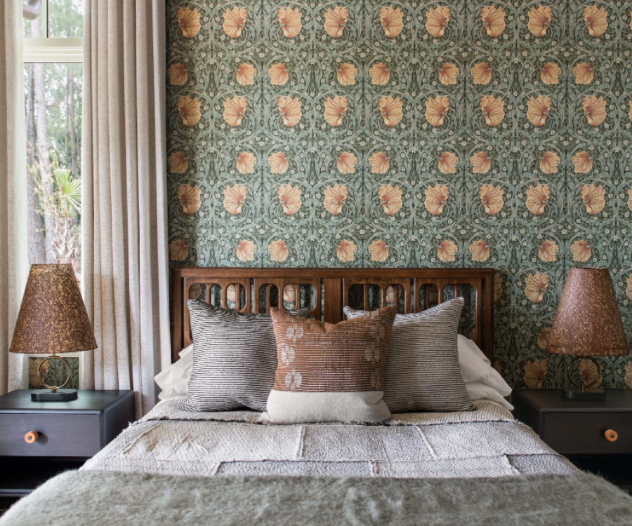
'We wanted to take this opportunity to go a little richer, a little darker, a little more masculine,' explains Cortney.
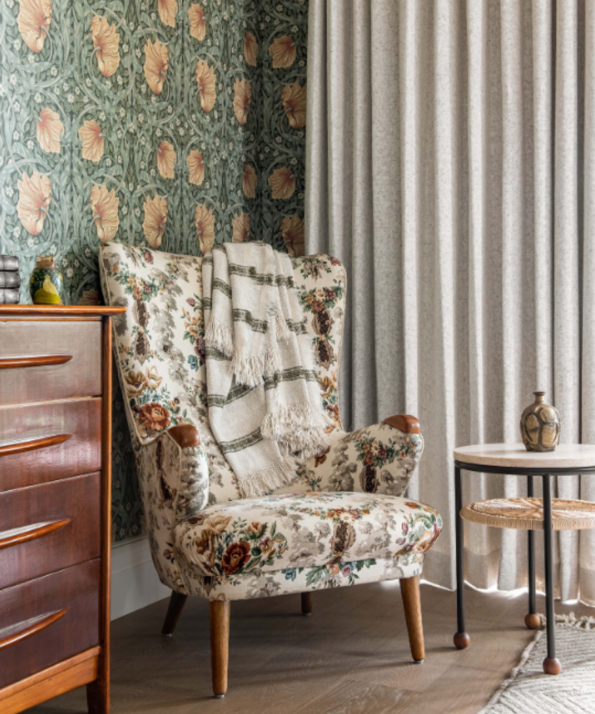
'It's a very Arts and Crafts bed, but it's new not vintage. We used the continuity of the same drapery in every room to really pull the house together.
'The green throw on the end of the bed adds another layer of comfort and color.'
Interior design / Cortney Bishop Interior Design
Sign up to the Homes & Gardens newsletter
Design expertise in your inbox – from inspiring decorating ideas and beautiful celebrity homes to practical gardening advice and shopping round-ups.
Ruth Doherty is an experienced digital writer and editor specializing in interiors, travel and lifestyle. With 20 years of writing for national sites under her belt, she’s worked for the likes of Livingetc.com, Standard, Ideal Home, Stylist and Marie Claire as well as Homes & Gardens.
-
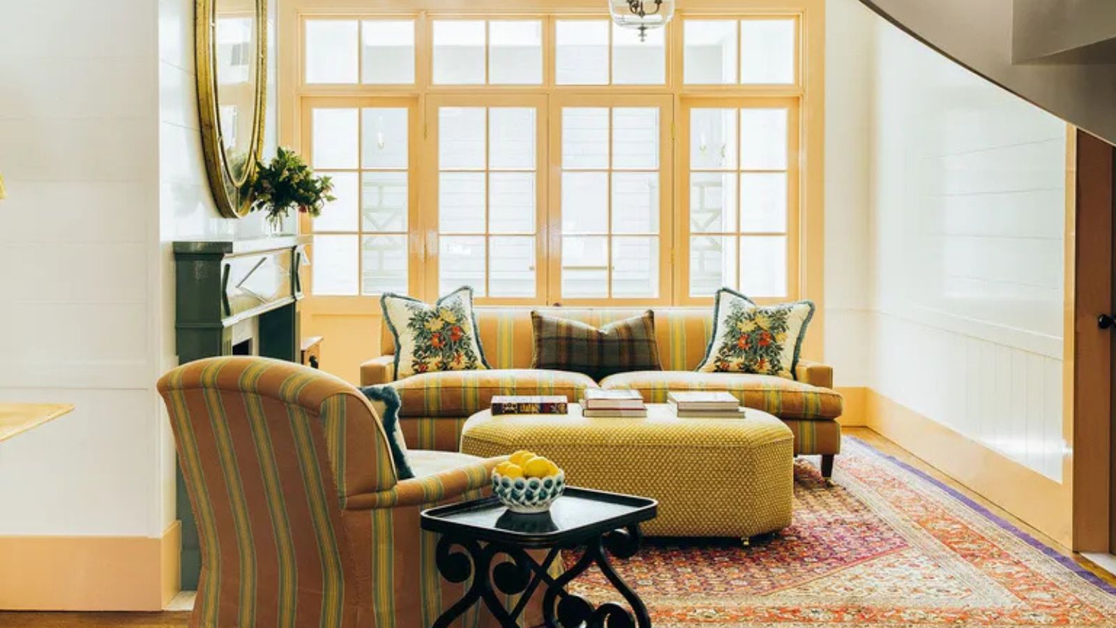 What the unexpected fashion trick the 'Sandwich Method' taught me about decorating with color in my home
I took a cue from my wardrobe and matched my ceiling to my skirtings – here's why it's my new favorite color trick
By Charlotte Olby
-
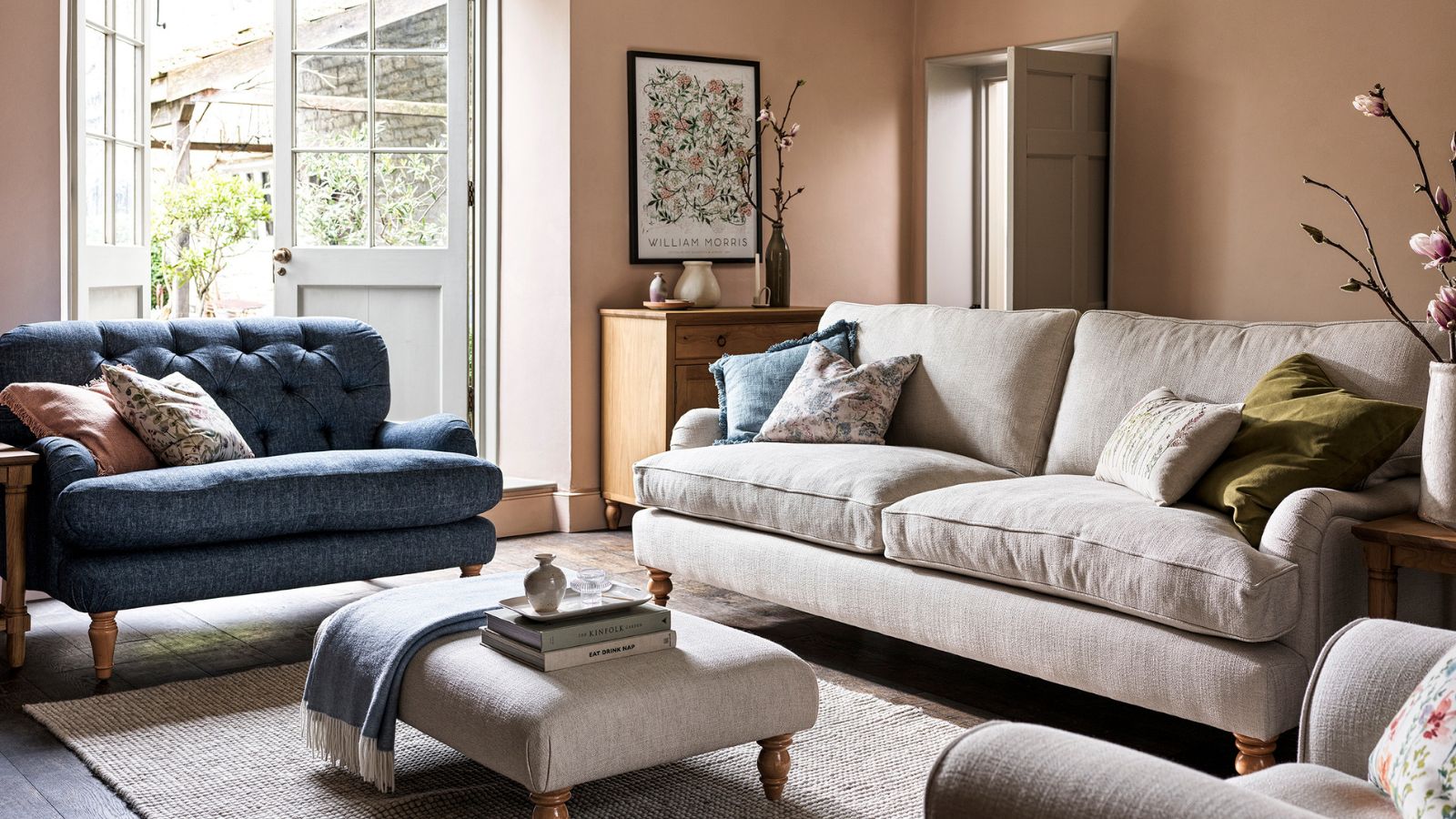 I used to be a lifeguard – this scanning method has stuck with me and instantly catches clutter before it becomes overwhelming
This life-saving tip now saves me from feeling overwhelmed
By Chiana Dickson