The lived-in look in this contemporary California home will make you rethink the way you layer texture
Soft fabrics, rustic tiles, and materials that patina over time – the thoughtful approach to design that just improves with age
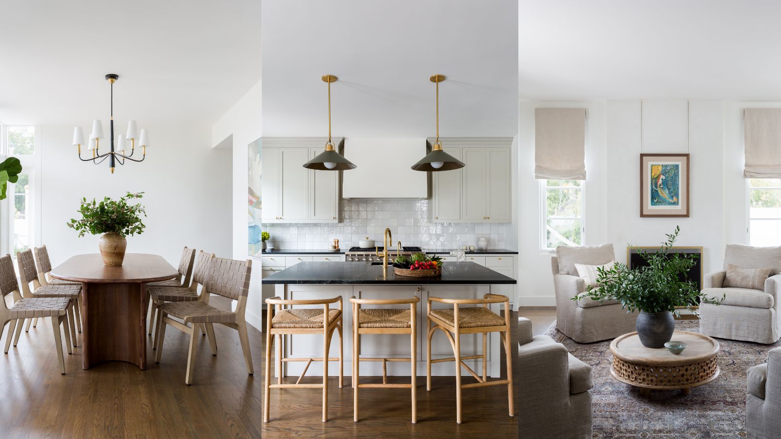
What started as a 'quick facelift' of a tired 1925 Spanish revival home in Los Angeles Westside soon gathered momentum and became a full interior renovation. The dated four-bedroom home was extended, refitted and transformed inside and out, and it now ranks among the world's best homes.
Using soft, natural furnishings, layers of textures, and materials that were designed to evolve over time to create a comfortable, lived-in look, the team at Jenn Feldman Designs filled this beautiful home with the firm's signature California contemporary style. Smart, uncluttered, and with clean lines, yet above all welcoming and relaxed. Take the tour to discover how they achieved that balance.
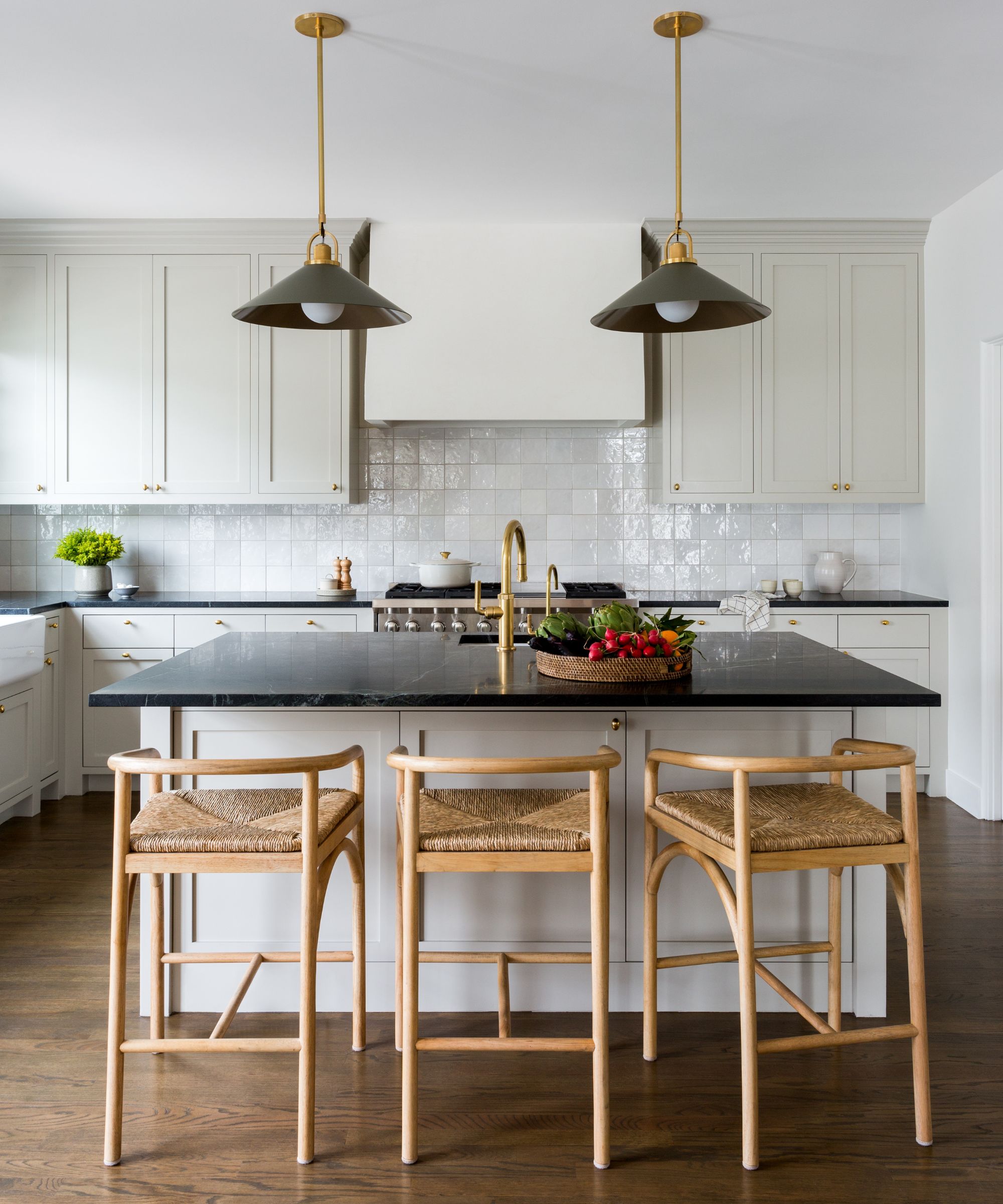
'I absolutely love the kitchen transformation – the overall mix of materials and the feeling of rich, layered luxury in a classic, new palette,' says designer Jenn Feldman. 'And with the satisfaction that we didn’t have to gut the space and start from scratch, we made thoughtful changes and upgrades where they mattered most. Everything just felt so harmonious and happy, just like the family who live here!'
Kitchen ideas included topping the existing cabinets with new soapstone countertops, glistening artisanal backsplash tiles and semi-custom pendant lights. 'Pops of brass and a rich but bright paint color really pulled the space together,' adds Jenn. 'This is California cool at its best.'
The backsplash tiles are from Bedrosians and hardware from Rejuvenation.
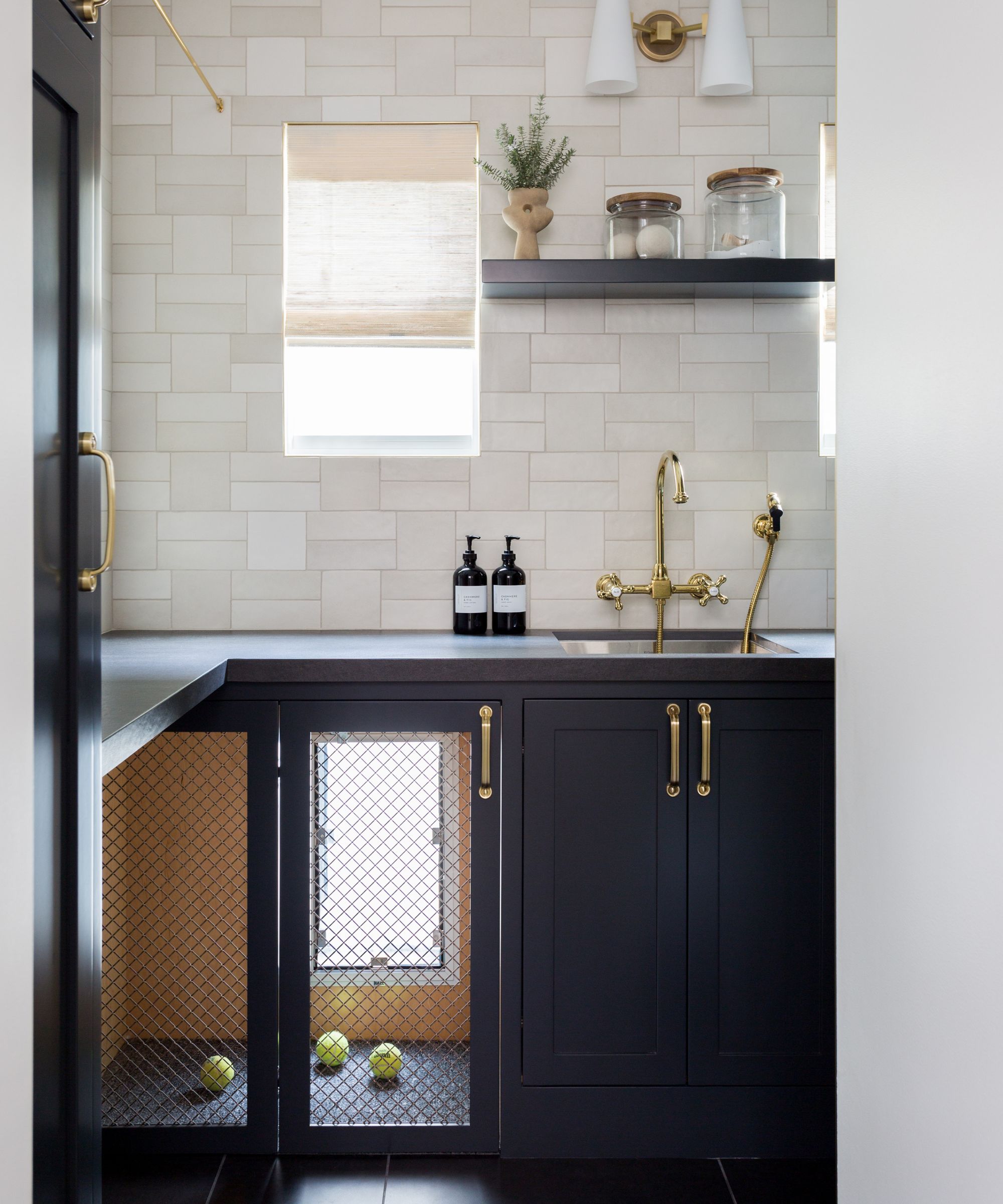
Dog owners take note: if you're designing a mudroom to suit your four-legged furry family member, this is the gold standard right here. The key feature in the small utility/mudroom is a bespoke, built-in doggy crate with a window on the world outside and inside the home. This dog really is living the California dream.
Designer Jenn Feldman adds, 'The utility room proved that size doesn’t matter. We packed in all the ingredients and space-saving tricks to keep their busy house of five well oiled, including the custom dog crate for the family’s beloved pooch.'
The wall tiles are from Hamilton Parker, arranged in a custom pattern. The sconce is by Jimmy Raiden.
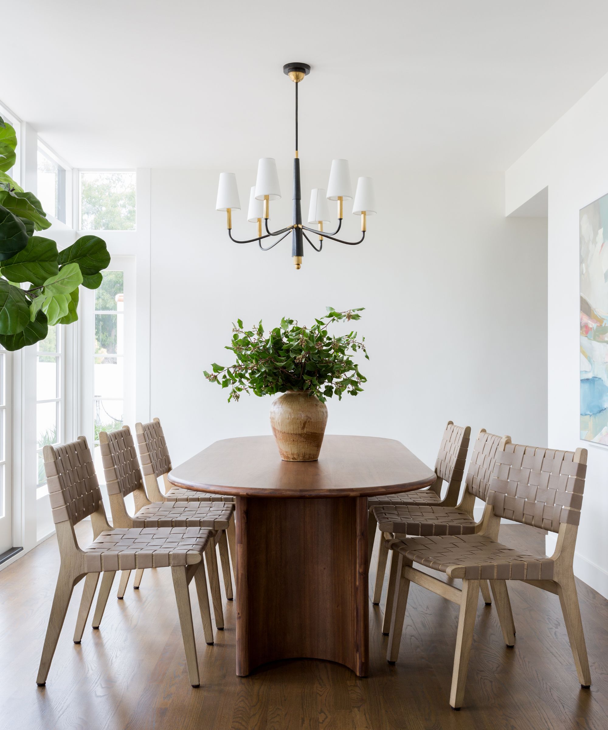
Explaining her dining room ideas, designer Jenn Feldman says: 'We went for simple elegance in the dining room; this space is open to the formal living room and is flooded with natural light.' Leafy plants and a contemporary artwork on the inside wall introduce a further layer of color to this calm, relaxed space. Full length windows and glass doors ensure that the garden is part of the décor too.
Chairs by Pottery Barn and table by Crate & Barrel. Chandelier from Visual Comfort.
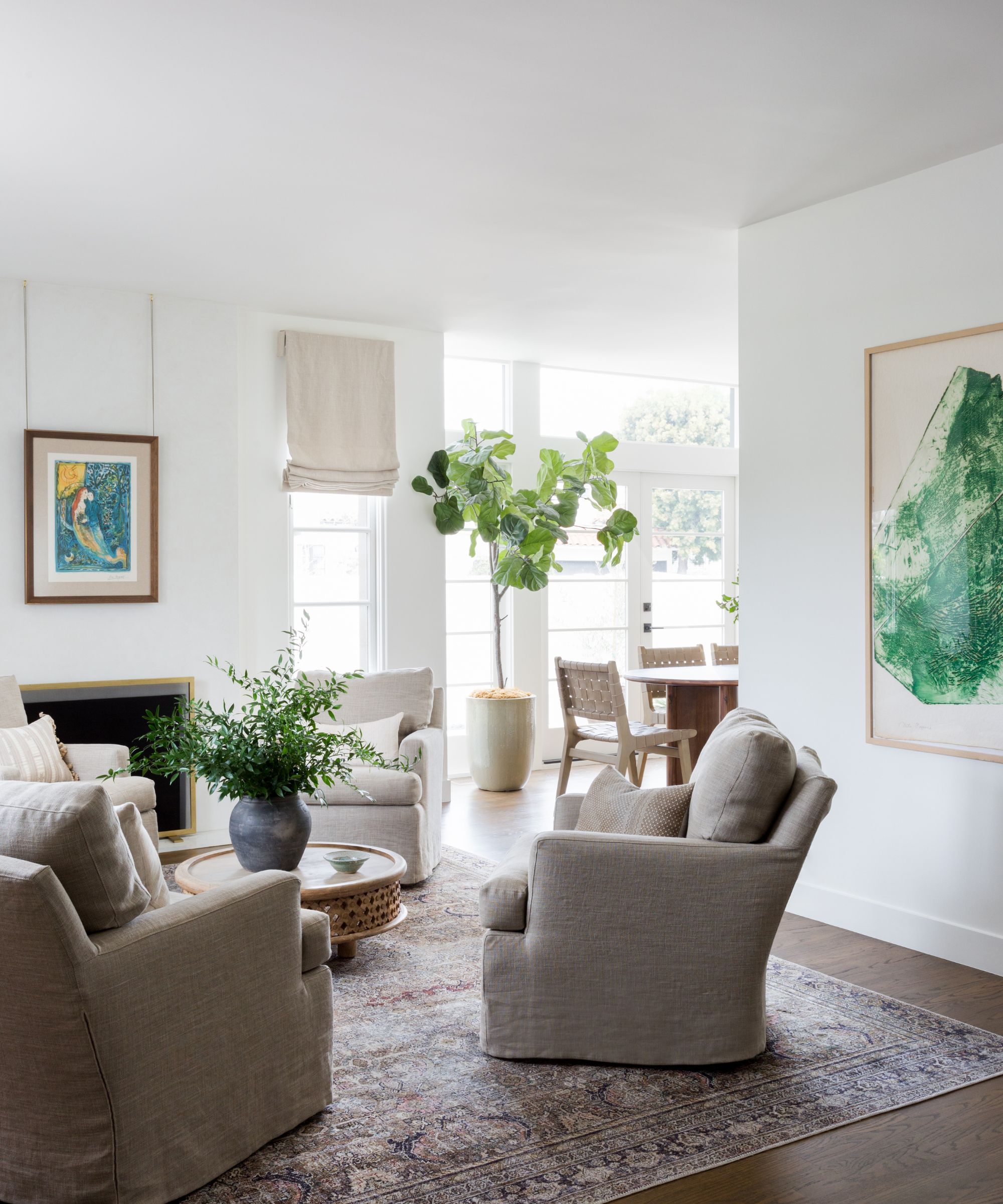
Living room ideas were designed to be tailored and approachable. 'We laid out the space with four comfy, custom swivel chairs for at-home piano concerts and easy entertaining,' the designer explains. Artworks in restful and uplifting natural greens and blues complete the look.
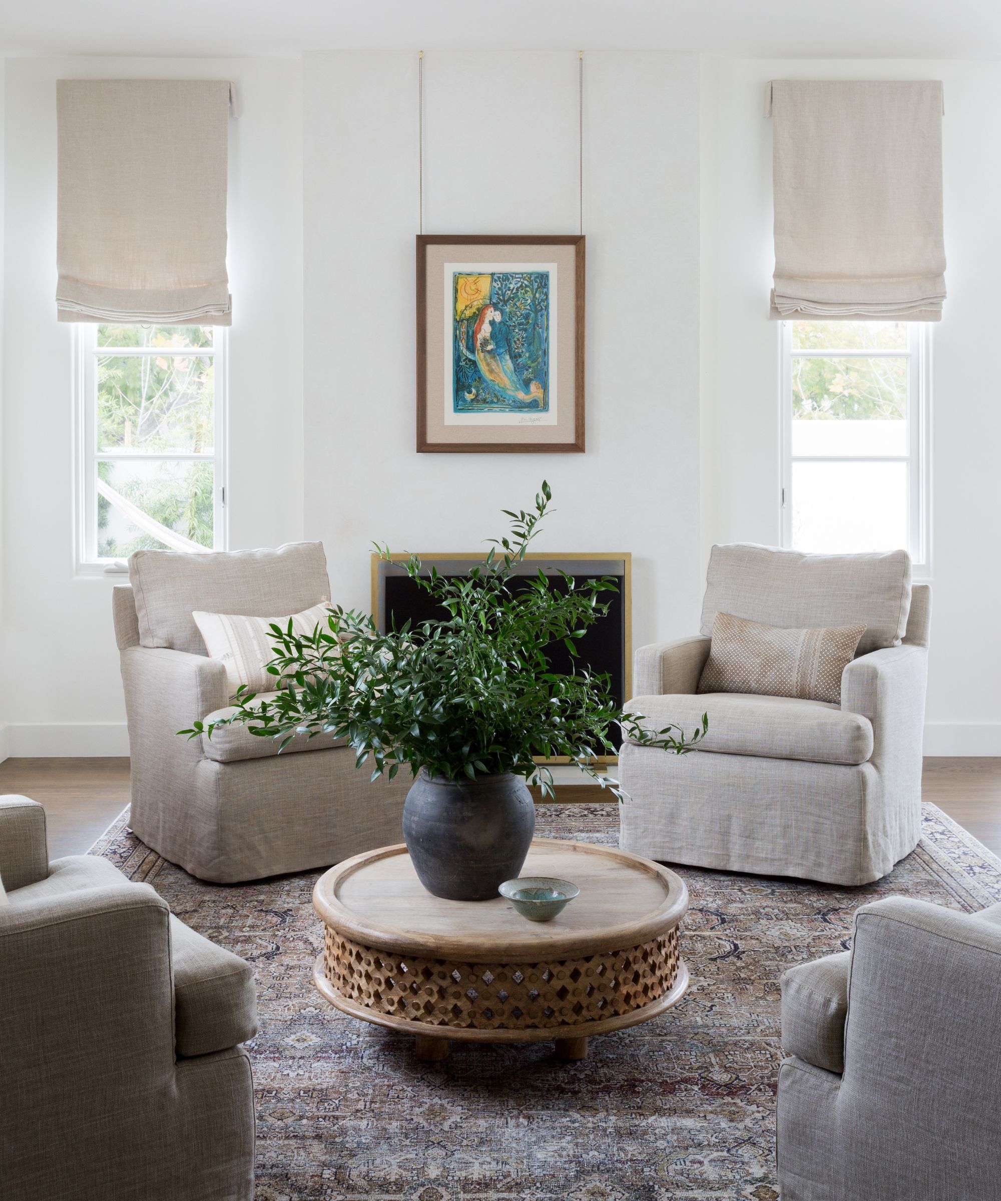
'The rug is an easy find from Loloi and the coffee table is very old West Elm one, repurposed from the first house!' says designer Jenn. Roman blinds in natural linen complement the covers on the armchairs, and keep the palette light.
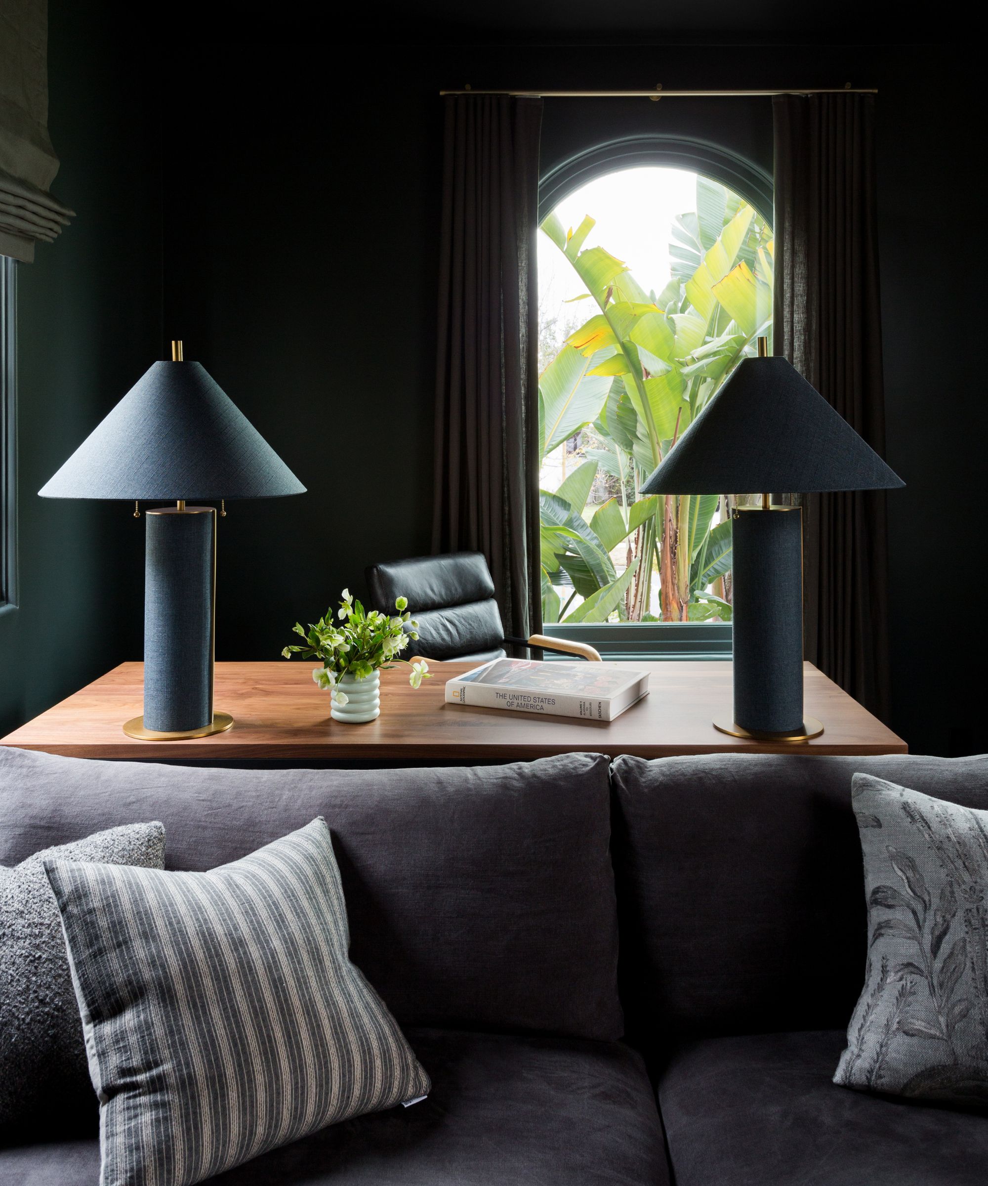
There's a complete change of mood in the combined den and office space, although the furniture and accessories are every bit as stylish as the rest of the house.
The starting point for these striking home office ideas was the decision to go dark in here, as designer Jenn Feldman explains: 'The space was drenched in a moody green-black, to add drama and contrast to the otherwise light-filled home. A large desk with oversized lamps is tucked in the back for our largely work-from-home clients, and a custom sofa designed by JFD makes the space cozy and inviting.'
We love the snapshot reminder of the leafy outside world through the typical Spanish revival-style arched window behind the desk.
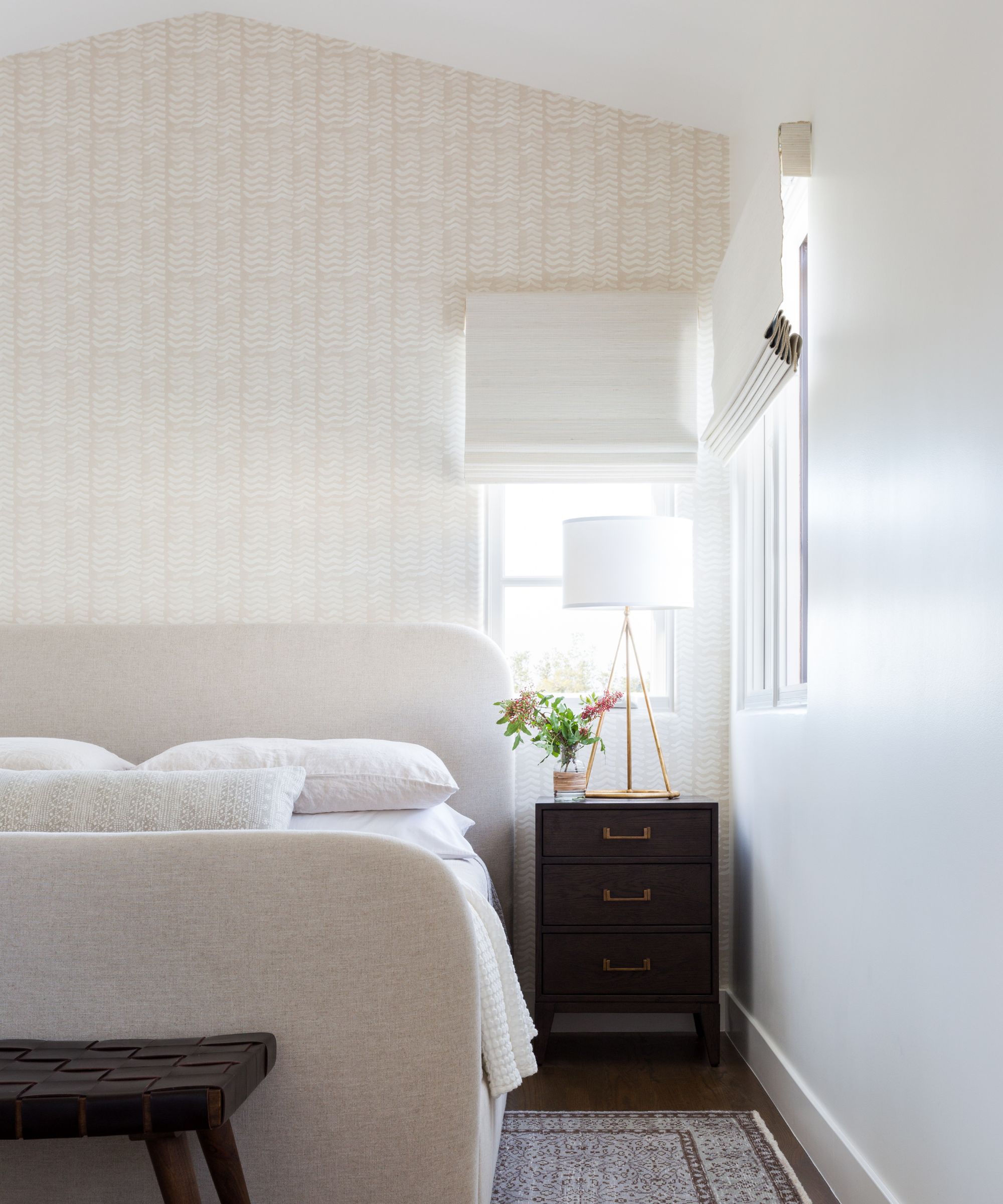
The main bedroom is a fairly compact space, but nonetheless a calm, relaxing room thanks to its high ceilings and tranquil color choices. Keeping the area around the bed clutter free is key when you're working with a smaller space. Anyone looking for bedroom ideas could take inspiration from the layers of soft whites and neutrals with darker woods used as a contrast.
'The room has vaulted ceilings, which we highlighted with an accent wall in a beautiful, serene Rebecca Atwood wallpaper,' says the designer. 'We designed a custom bed and infused the space with vintage elements – a bench at the foot of the bed for the pup, and a gorgeous vintage rug to soften the space.'
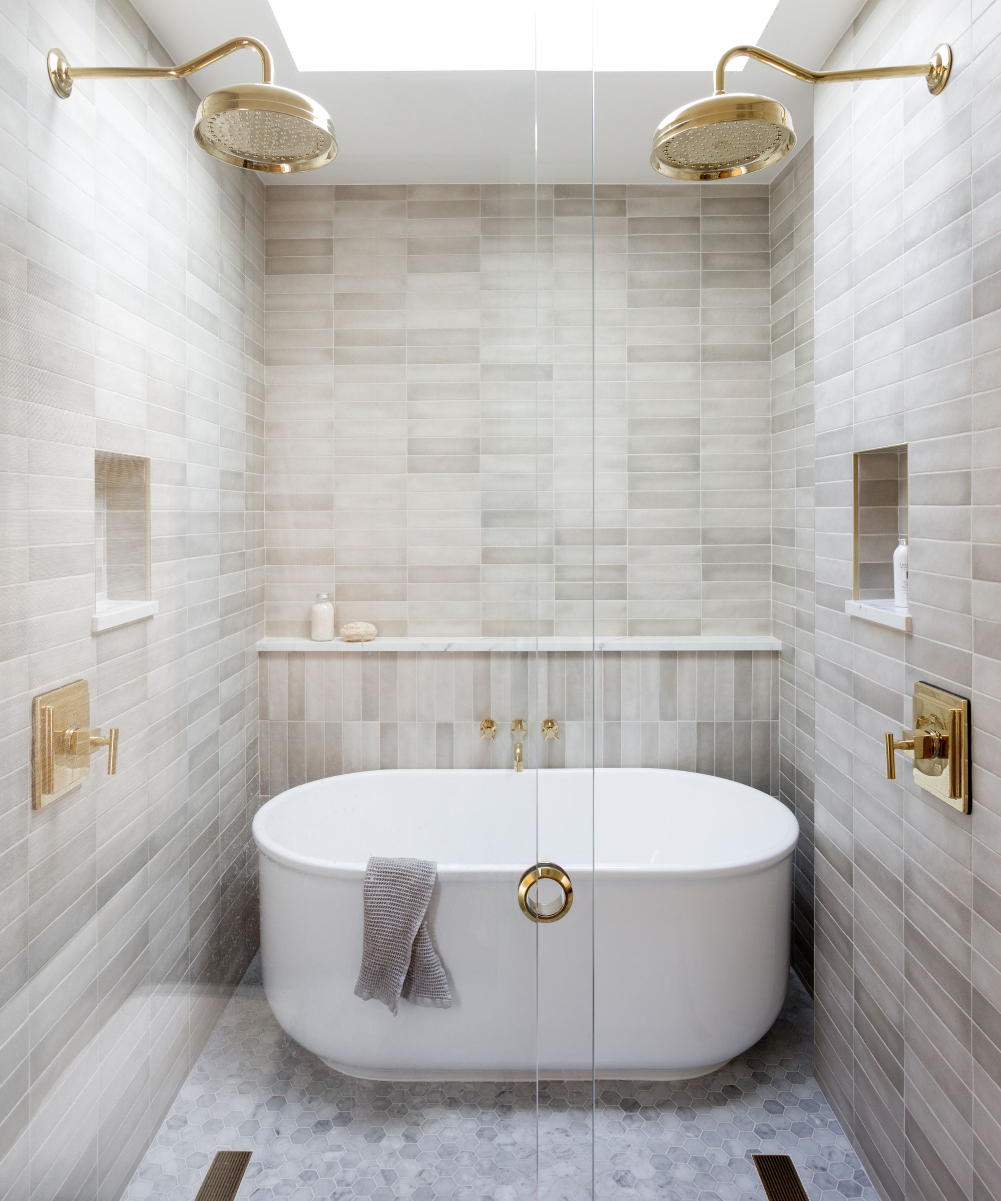
The en-suite to the main bedroom was completely remodeled, and although it's a small room it took some planning, as designer Jenn Feldman explains: 'The Primary bathroom tub/shower gave us a run for our money! We were down to inches trying to make everything work seamlessly; our client asked for a full tub and dual shower heads, into which we integrated small niches and sleek linear drains.'
The finished results are more than worth the extra time planning, and for anyone seeking inspiration for bathroom ideas, a real lesson in how to organize a compact space.
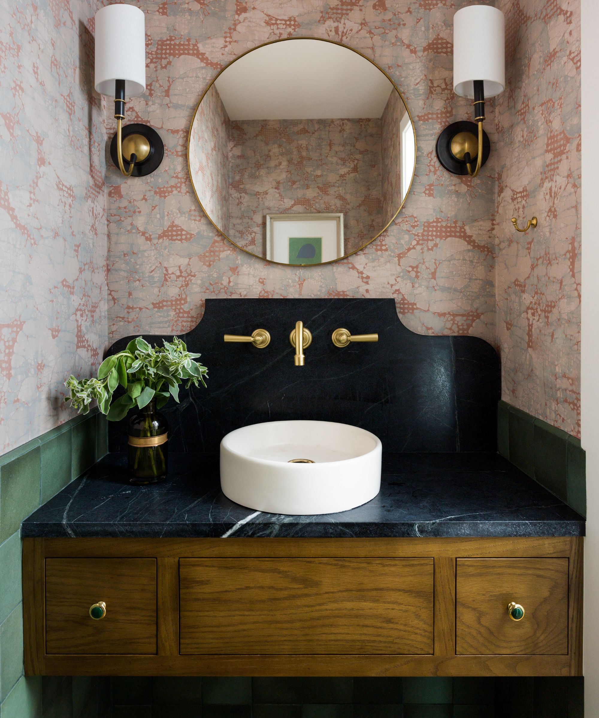
And there was more small space wizardry in the powder room, which designer Jenn Feldman describes as 'a jewel box space, layered with color, pattern, and texture'.
Powder room ideas showcase a wallpaper by Lee Jofa and a custom floating vanity (with vintage hardware!) designed by Jenn Feldman Designs.
The designer has a great money-saving tip to share here, too. 'We used leftover slab material from the kitchen instead of purchasing a full stone slab for the countertops,' she says.
The faucets are from Rejuvenation; wall tiles from Hamilton Parker; sconces from Visual Comfort.
Interior design: Founder Jenn Feldman and Senior Designer Deanna Jacoby McEachin at Jenn Feldman Designs
Photography: Amy Bartlam
Sign up to the Homes & Gardens newsletter
Design expertise in your inbox – from inspiring decorating ideas and beautiful celebrity homes to practical gardening advice and shopping round-ups.
Karen sources beautiful homes to feature on the Homes & Gardens website. She loves visiting historic houses in particular and working with photographers to capture all shapes and sizes of properties. Karen began her career as a sub-editor at Hi-Fi News and Record Review magazine. Her move to women’s magazines came soon after, in the shape of Living magazine, which covered cookery, fashion, beauty, homes and gardening. From Living Karen moved to Ideal Home magazine, where as deputy chief sub, then chief sub, she started to really take an interest in properties, architecture, interior design and gardening.
-
 This once-dated kitchen is now a timeless space with the coziest details – and its the classic color palette that's made it a chic, welcoming space
Warming colors and natural materials combine to create this enduringly classic kitchen scheme
By Molly Malsom Published
-
 How to grow crepe myrtle in pots – and transform even the smallest of yards with dazzling flowers this summer
Growing crepe myrtles in pots will inject splashes of brilliant color into your outside space
By Thomas Rutter Published