This Scandi-style house exploits big ideas in a small footprint – take the tour
This 100-year-old family home may be small but it's perfectly formed, with every inch of space working extra hard
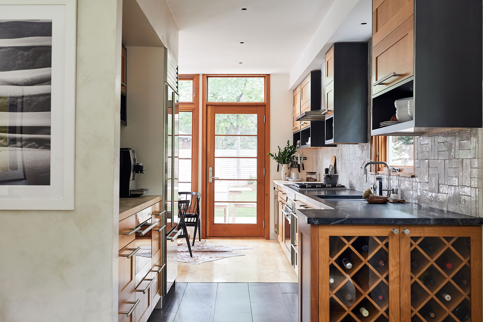

In a compact home with no option to make additions, every inch of space has to earn its keep. This family home in a historic parkway in Minneapolis, Minnesota, dates back to 1925, with a symmetrical foursquare floor plan – a room in each corner of the property, with a central hall and stairway.
One of the world's best homes, it was built to the classic cedar-shingled cape cod style, so is attractive inside and out. However, since the home is on a modest scale, the owners wanted to rethink the interiors to make them work better for themselves and their two young sons. The couple enlisted the help of Victoria Sass, principal and design director at Prospect Refuge Studio, to ensure they got the most out of the available space. 'We needed to design every square inch to function at the highest level,' says Victoria. 'We went through the home and made sure each floor and every room served a specific purpose – so that the whole home would be used and enjoyed.'
The results are a masterclass in space efficiency – and style. We asked design director Victoria Sass to show us how it's done.
Breakfast nook
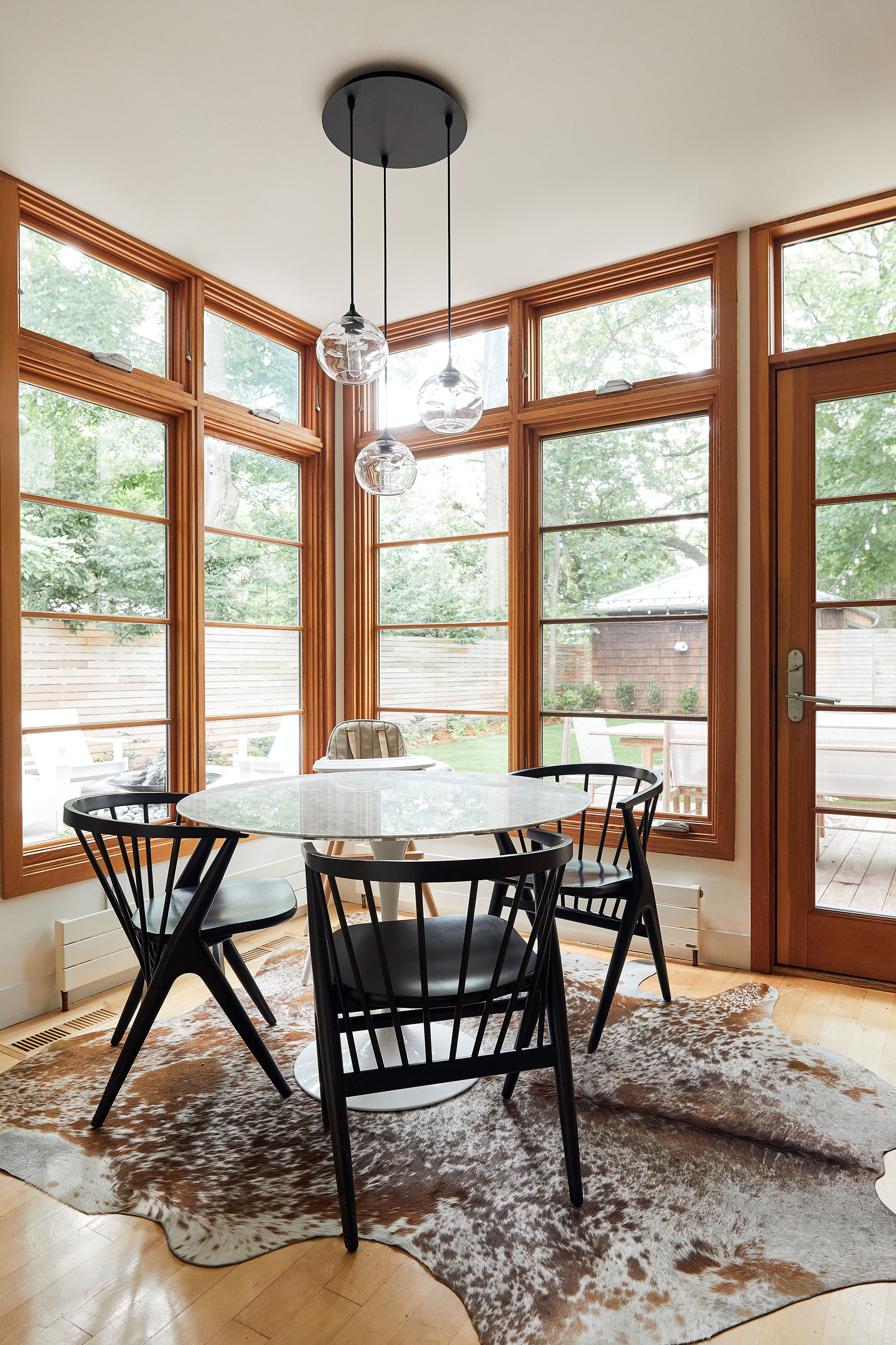
Making the most of one of the brightest corners of the house is this breakfast nook. It's actually at the heart of the kitchen, but two sides of windows define it as its own space. Choosing a round table as one of your eat-in kitchen ideas is a good spacesaver in any room, and here the dark lacquered wood chairs make a smart contrast with the light wood, and link in with the kitchen countertops behind.
Kitchen

Victoria's kitchen ideas for this hard-working space include a long galley-run of wooden cabinets topped with dark granite countertops. At each end of the run is a dining area, the small breakfast nook, at one end, and a larger and more formal entertaining space at the other. A false wall separates the two eating areas from one another, and provides an alcove for storage and food preparation.
Victoria describes the reworked interiors as having a 'scandi-modern mixed with California-bohemian' feel, and in the kitchen and dining spaces, we're certainly getting the scand-modern vibes.
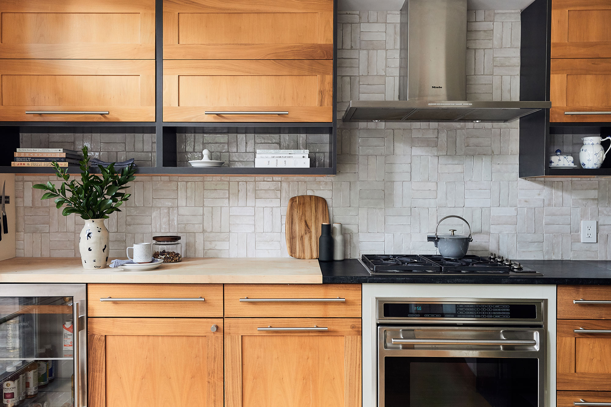
Though the kitchen look may be pared back, the details are full of interest – from the textured tile backsplash (from Cie), to the letterbox open shelves that break up the space below the wall cabinets. The kitchen is full of these smart design notes that are eminently practical too.
Design expertise in your inbox – from inspiring decorating ideas and beautiful celebrity homes to practical gardening advice and shopping round-ups.
Dining room
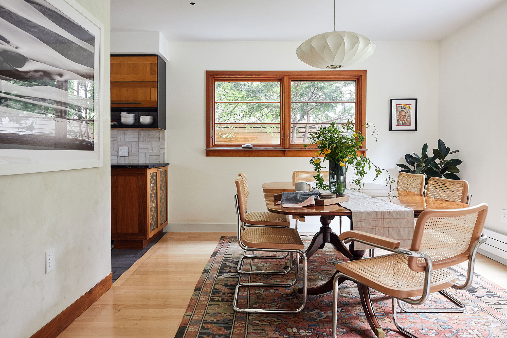
The formal dining space is open to the kitchen at one end, again a practical layout detail that serves a smaller home well.
Victoria and her team chose to reference the home's heritage in their dining room ideas, with a vintage oval-shaped pedestal dining table, mixed with midcentury modern tubular steel cane-seated dining chairs. The light wooden flooring is topped while a vintage rug, contemporary art print and midcentury inspired ceiling pendant add to the Californian-Bohemian look.
Living room
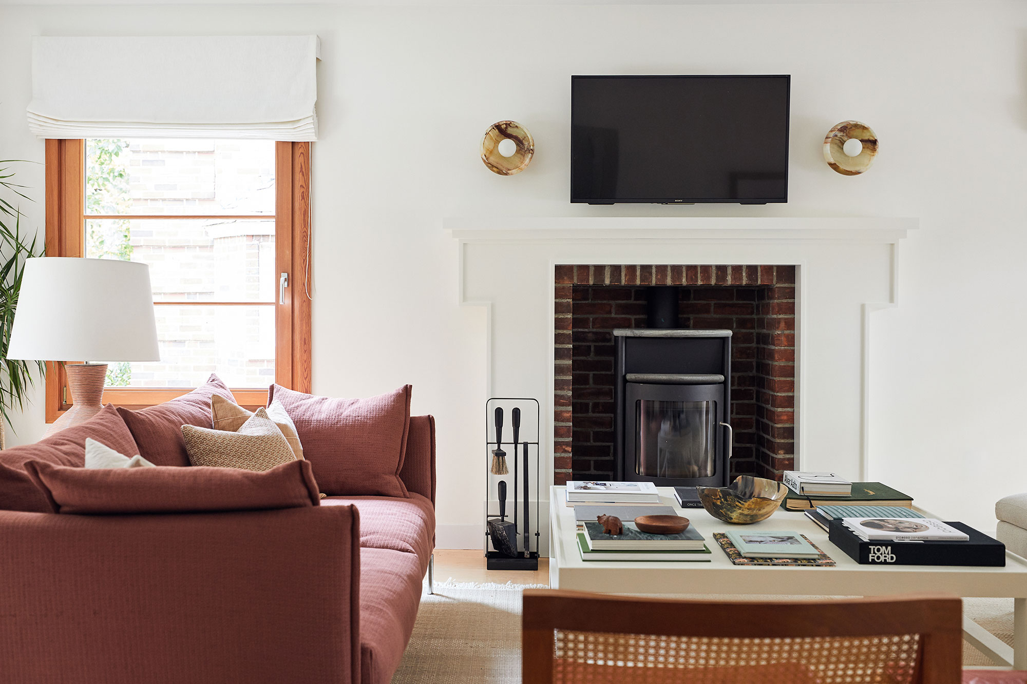
Living room ideas for the family's main living space are both comfortable and characterful.
'The room is home to a charming woodstove,' Victoria explains, 'and so we warmed up the palette to purples, rusts, mauves, and rosy tones – a little more saturated energy.'
She took inspiration for this space from the owners' family heirlooms: 'From antique tapestries to crystal decanters, books, and objects from travels. This sense of a space to collect one's life, reflect upon it, and add future memories was really what the living room was designed around.
'The coffee table is made to be piled with books, the cabinet can collect mementos, and all of this is designed for entertaining – because sharing space with loved ones is really what makes a home.'
The rust-coloured sofa is from Gentry by Moroso, the coffee table is from Four Hands, the sconces are from L’aviva Home and the rug from Nani Marquina.
Attic workspace
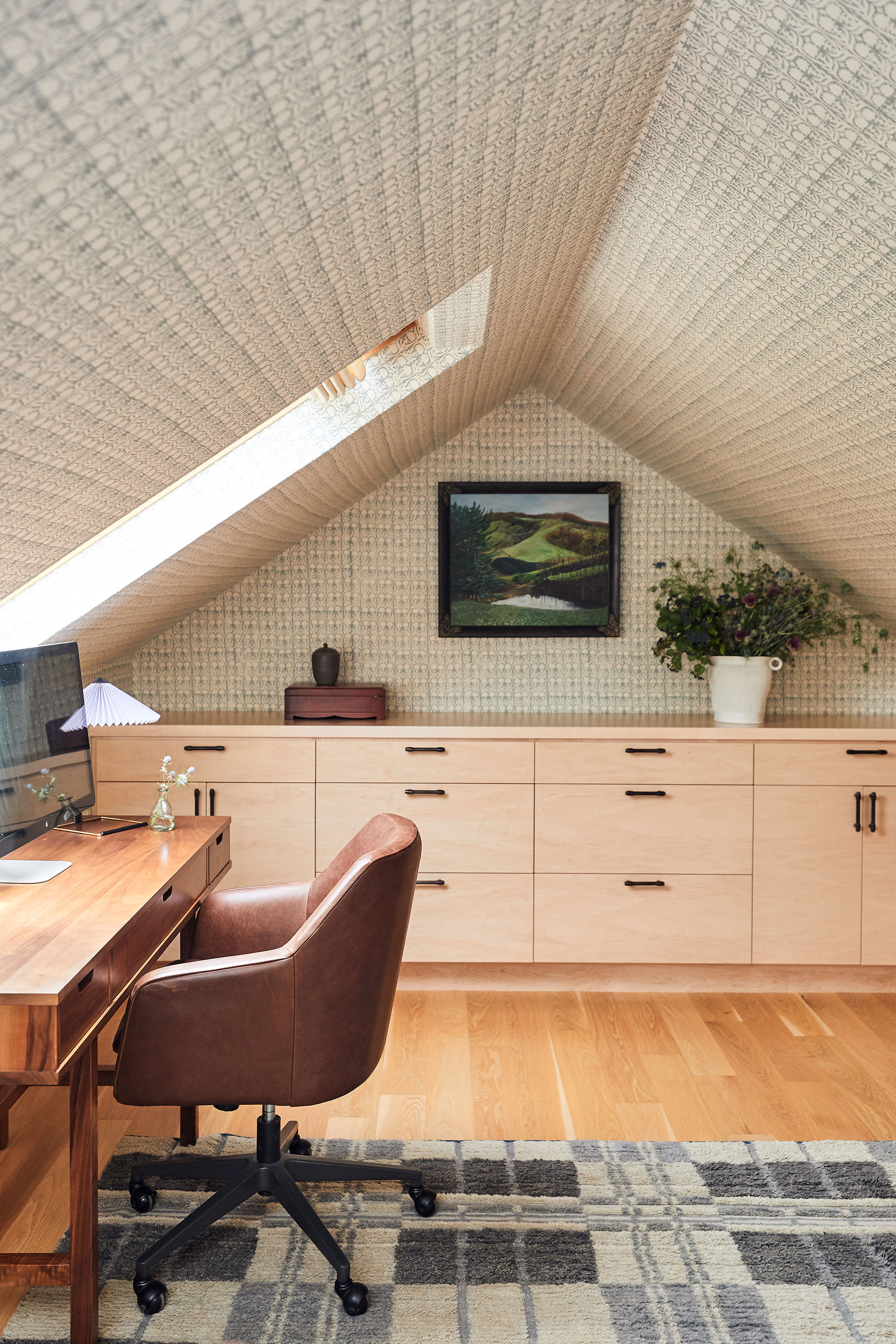
A second phase of interior works saw Victoria return with a moodboard of home office ideas for the huge open attic.
'The third floor is a single, open room with a sloped ceiling and skylights. We converted this space with bookcases and storage, a meditation space, and desks,' says Victoria.
The walls and ceiling are covered in Claremont fabric, which emphasises the attractive slope of the roof, and gives a textured, cocooned look to the space.
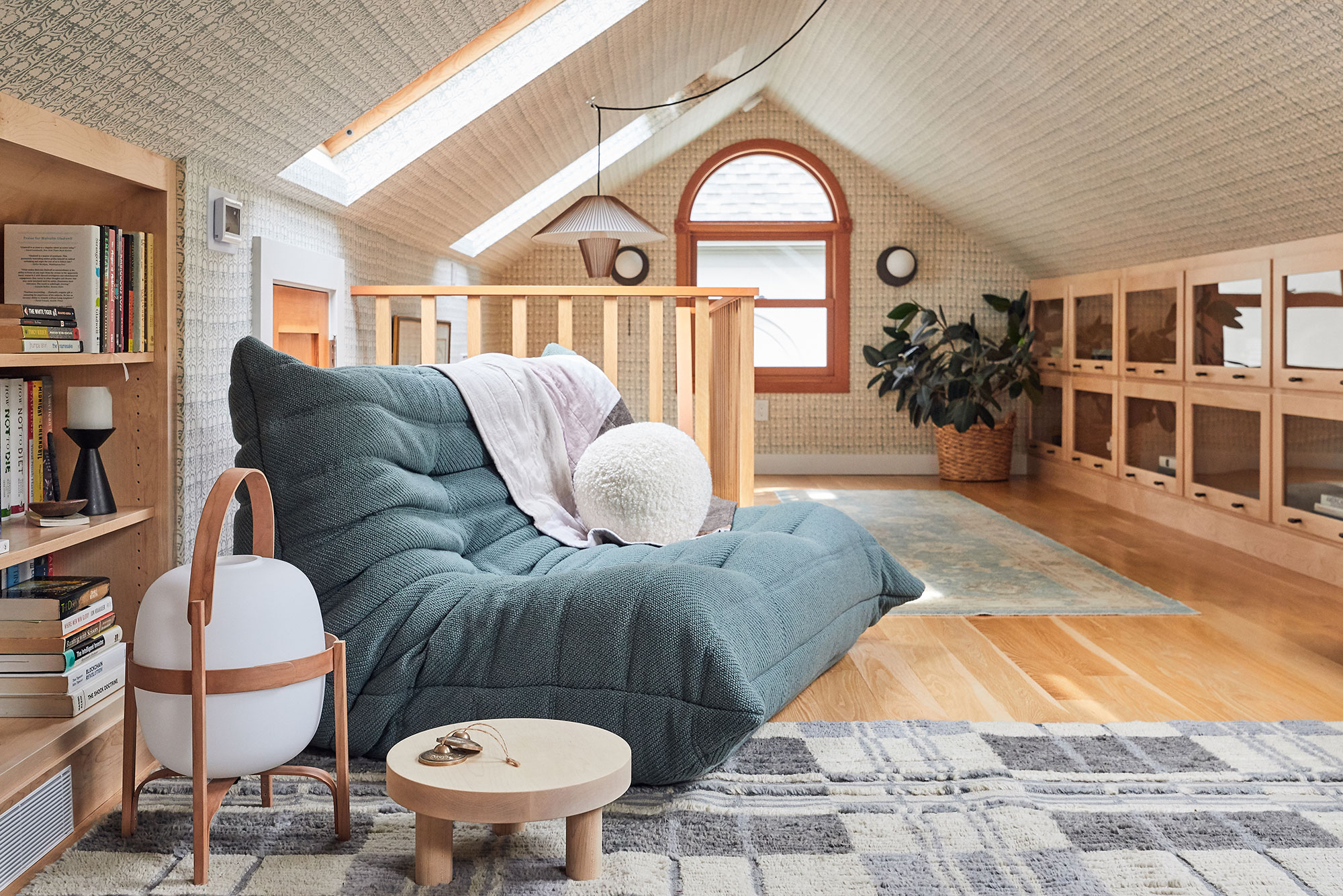
At the other side of the home office is a comfortable reading area, with the iconic Togo sofa from Ligne Roset, a rug from Commune and wall sconces from Workstead.
Child's room
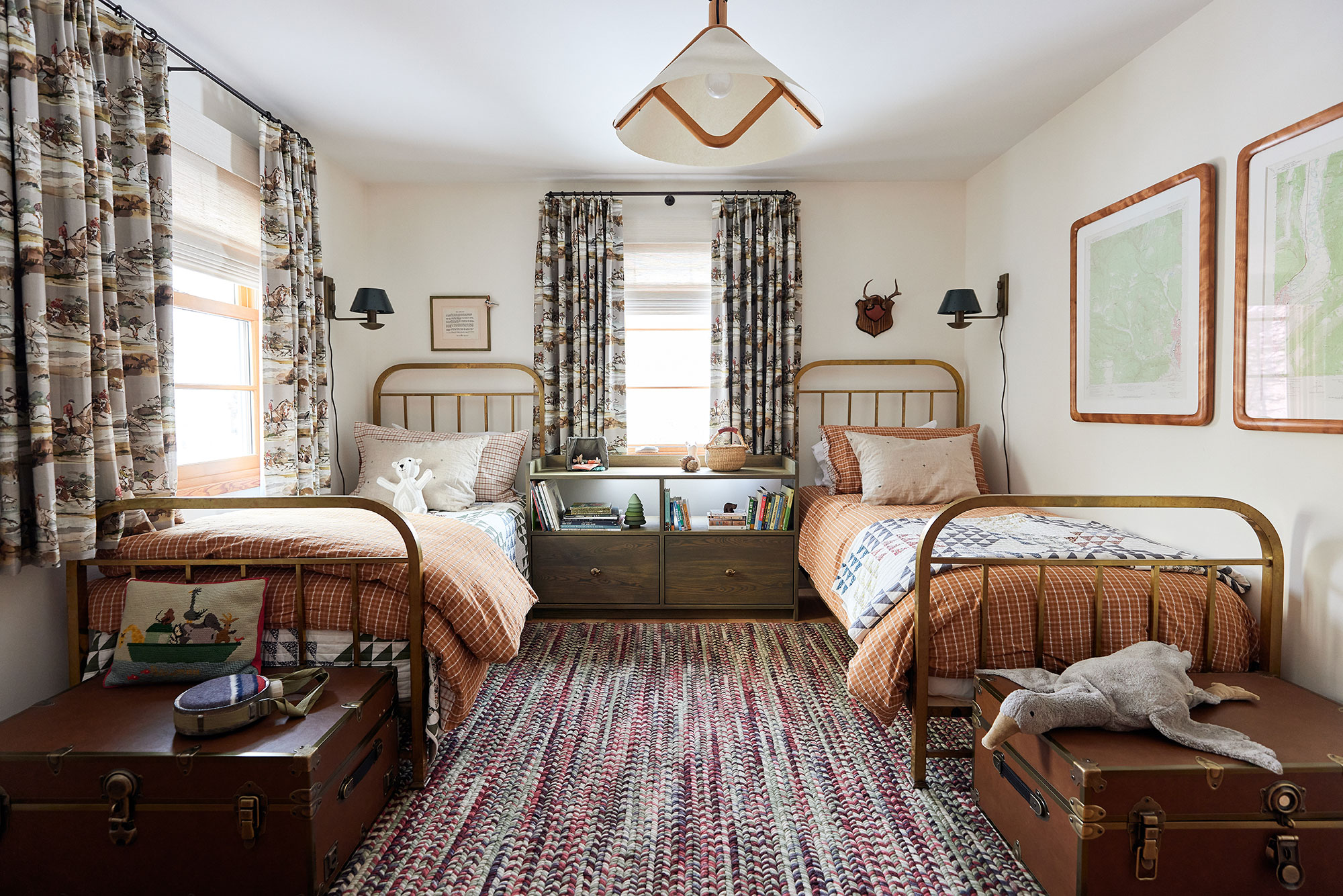
Besides creating the attic workspace, the second phase of works included furnishing the boy's room above, as baby number two was on the way. This cool space incorporates some inspired kids' room ideas and showcases some of the owners' treasured heirlooms. The beds are vintage 1930s French Art Deco brass bedsteads, dressed with plaid seersucker duvets and shams from from Zara, with a custom Bookshelf Nightstand from Rovan. At the foot of each bed is a Vegan Leather Standard Trunk from PBTeens, and between them is the Varese Red rug from Gan Rugs. The curtain fabric is Morning Gallop from Kravet. Lighting solutions include the Mazarine wall lights from Urban Electric, and a vintage 1960s Domus Pendant Light. The artworks have been in the family for many years.
Baby's nursery
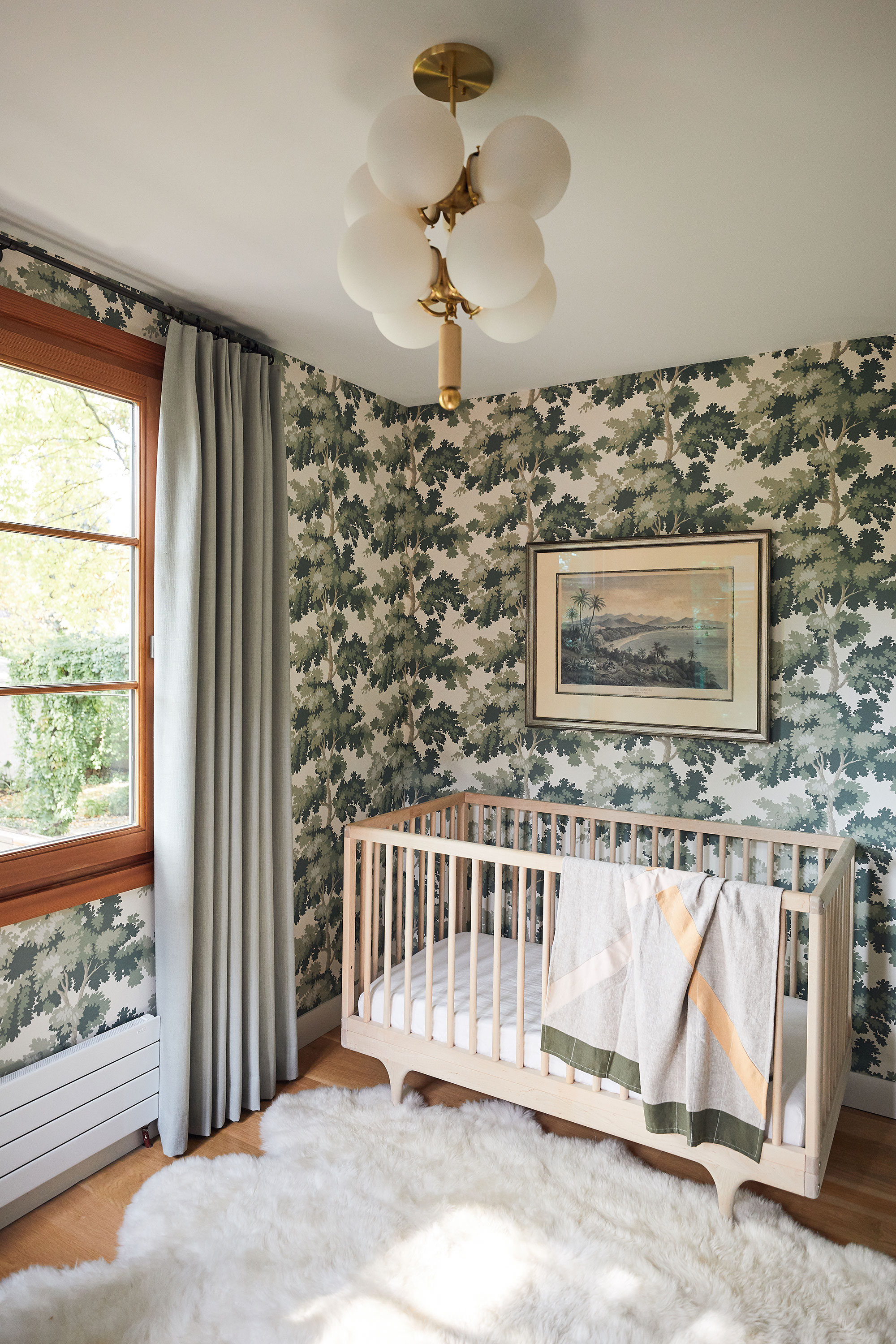
If you're looking for stylish nursery ideas, take your cue from this charming space. It makes perfect sense to decorate a nursery to appeal to the parents, as well as to the child as she/he grows. The leafy tree print wallpaper, in soft grey greens, and the natural wood and textiles, including the softest faux sheepskin on the floor, add up to a nursery that will grow with the child.
Double bedroom
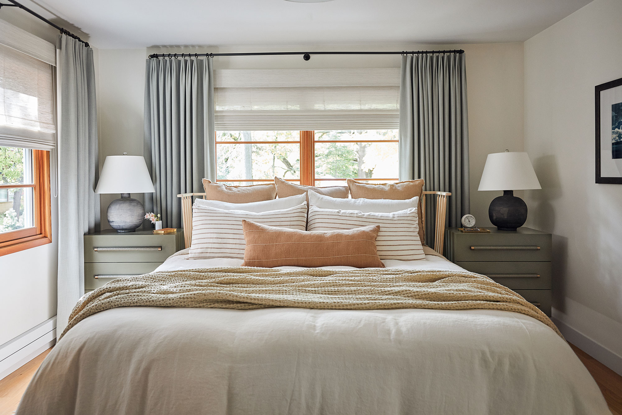
Bedroom ideas for the primary bedroom focused on creating a calm, uncluttered look, particularly as this is one of the smaller rooms in the house. Colors are soft and cool to promote a sense of rest and wellbeing. 'The bedroom level of the house is airier in palette,' says Victoria, 'its head is in the clouds a bit. We really wanted there to be a progression through the home as you moved from bottom to top, like geological and atmospheric layers.'
The 1925-built home is a cedar shingled Cape Cod style property and its reworked interiors are the perfect complement to the charm of the exterior. Prospect Refuge Studio has rejuvenated the indoor spaces, treading lightly and working with the simple authenticity of this heritage modern home.
Karen sources beautiful homes to feature on the Homes & Gardens website. She loves visiting historic houses in particular and working with photographers to capture all shapes and sizes of properties. Karen began her career as a sub-editor at Hi-Fi News and Record Review magazine. Her move to women’s magazines came soon after, in the shape of Living magazine, which covered cookery, fashion, beauty, homes and gardening. From Living Karen moved to Ideal Home magazine, where as deputy chief sub, then chief sub, she started to really take an interest in properties, architecture, interior design and gardening.
