A Victorian house is transformed by a designer who really shows how to embrace the unexpected
A modest terrace has been given a new lease of life with generous helpings of bold color, pattern and decorative flourishes
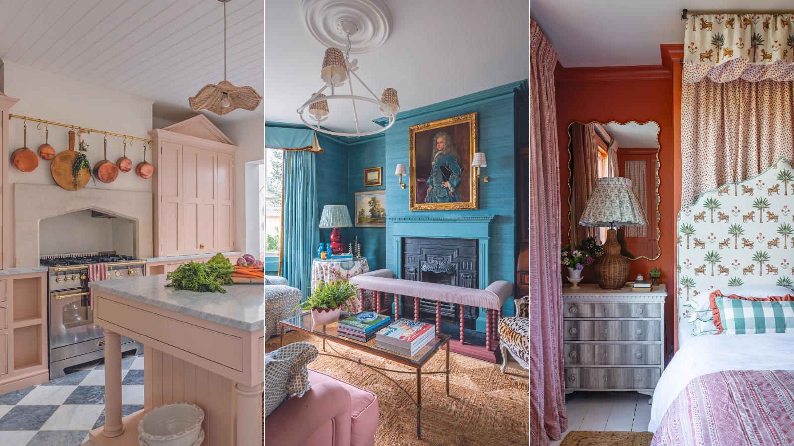

My mantra when it comes to house design is putting the unexpected together,’ says interior designer Sean Symington. ‘I love combining country or cute items with more contemporary lines, such as the scalloped banquette and tulip table in my kitchen diner. I love the contrast.’
Sean’s Victorian terrace in Bath is awash with the unexpected. Its light Bath-stone exterior belies the kaleidoscopic interior – a far cry from his first viewing when it was a dingy student house with a bed in virtually every room.

Bermuda Hemp grasscloth wallcovering in Tantalising Teal, Phillip Jeffries. Fireplace, cornice and woodwork in Sugar Bag Light, Farrow & Ball.
‘I knew it would scare people because it needed lots of work,’ Sean says. ‘It was all very closed – even the corridor had a door. I didn’t know the sitting room had a fireplace because there was a chest of drawers in front of it.’
Also offputting was a 1970s lean-to and a bathroom off the kitchen that the students shared. But Sean could see the house’s potential: ‘I knew I could open it up.’ His instinct, however, was to keep the sitting room separate, as he likes to have a defined formal living room.
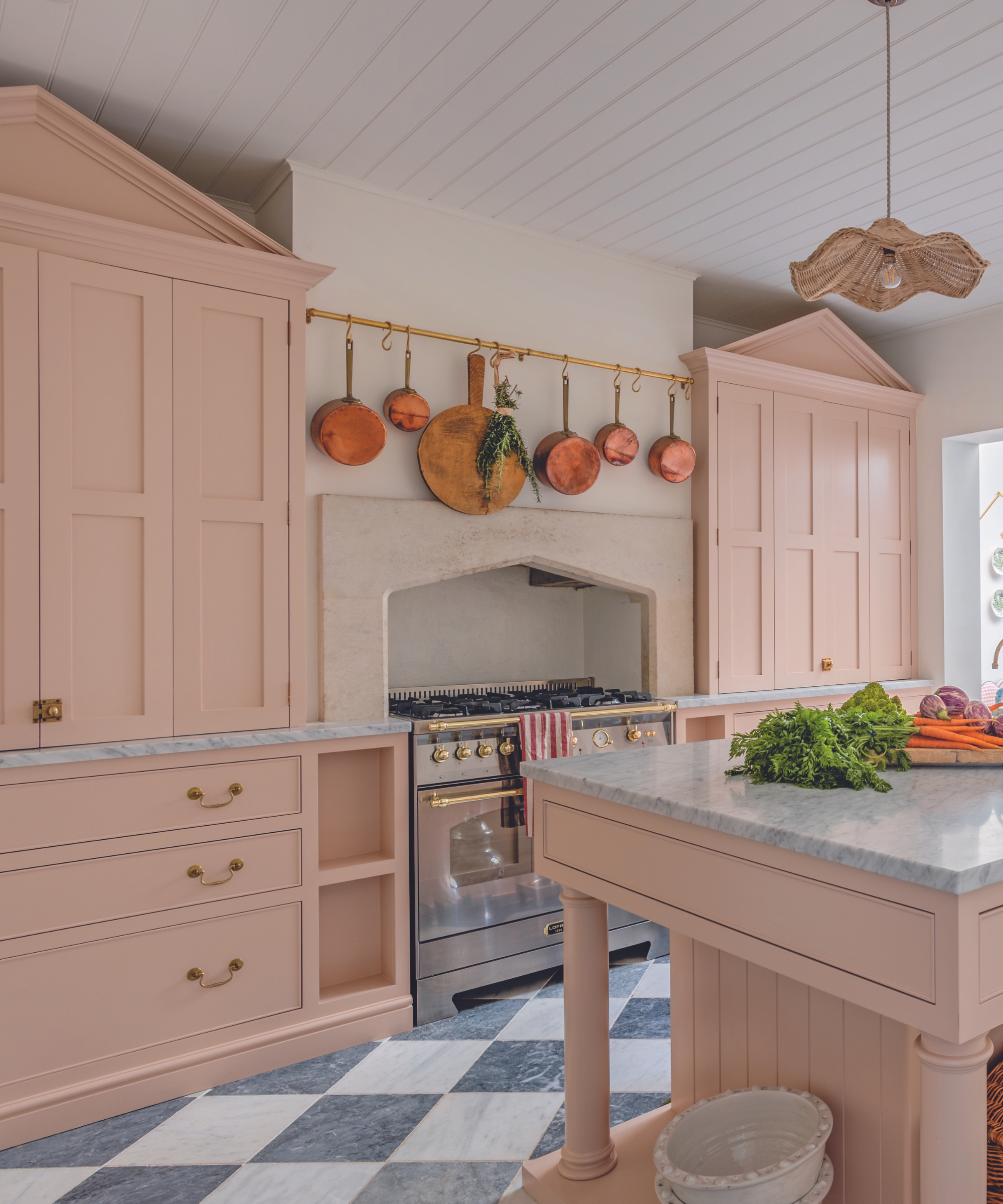
Custom cabinetry in Setting Plaster, Farrow & Ball. Marble flooring, Mandarin Stone. Range cooker, Lofra.
Making the most of the space was key. So the house was reconfigured with the bathroom on the ground floor replaced with a cloakroom and utility, while a bedroom upstairs was partitioned to create a new bathroom. ‘It allowed us to have more rooms but not compromise the space,’ Sean says.
The lean-to was replaced with an airy part glass-roofed extension which involved digging down to increase ceiling height, while a loft conversion provides a bright bedroom at the top of the house, with plenty of built-in storage.
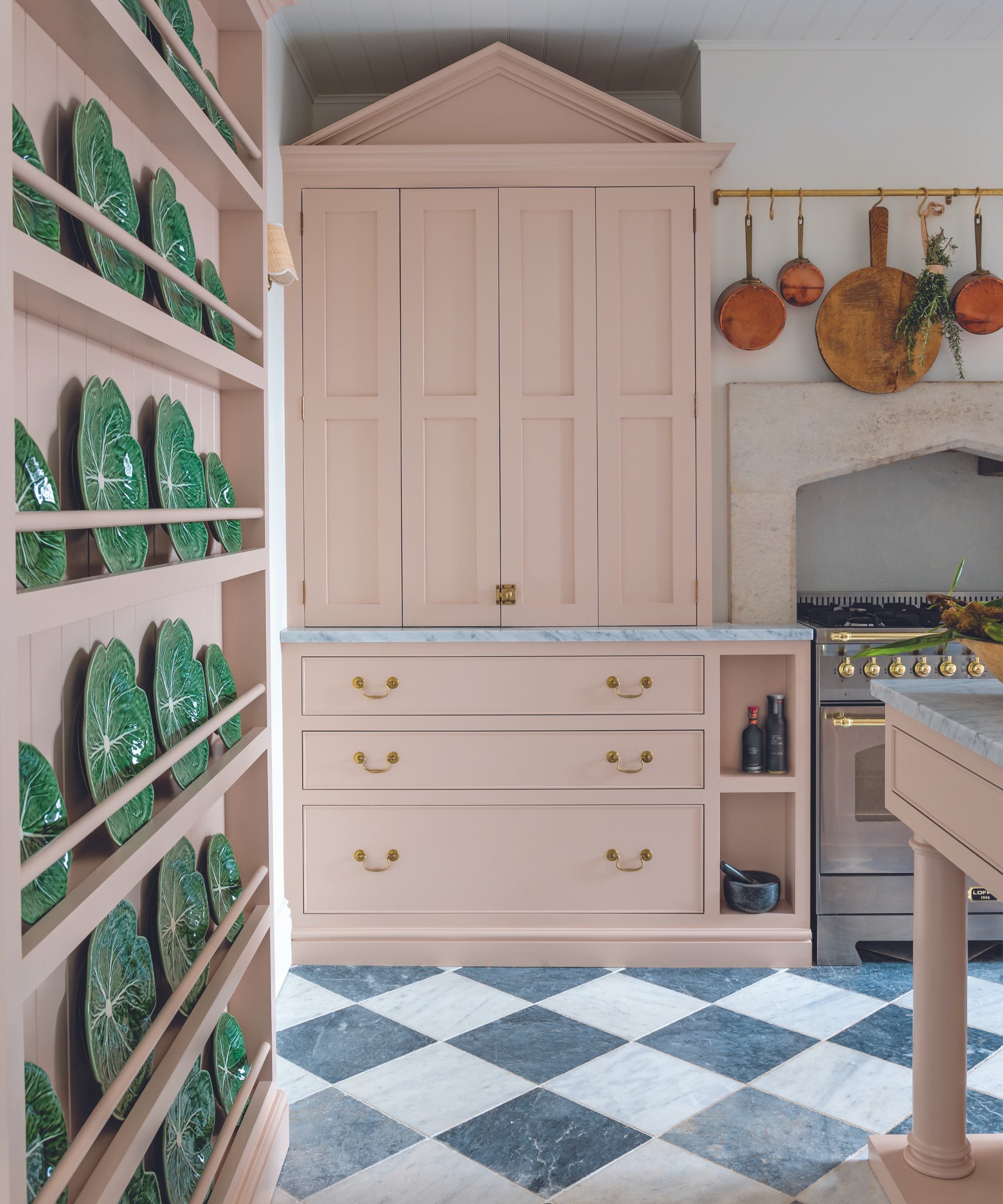
Custom cabinetry in Setting Plaster, Farrow & Ball. Marble flooring, Mandarin Stone. Range cooker, Lofra.
The main bedroom features a wall of wardrobes, but the layout of this room caused difficulties. Sean wanted to position the bed in front of the chimney breast, freeing up a wall for storage. ‘I like to walk into a bedroom and face the headboard, so we widened the chimney breast to accommodate a king-size bed.’
Design expertise in your inbox – from inspiring decorating ideas and beautiful celebrity homes to practical gardening advice and shopping round-ups.
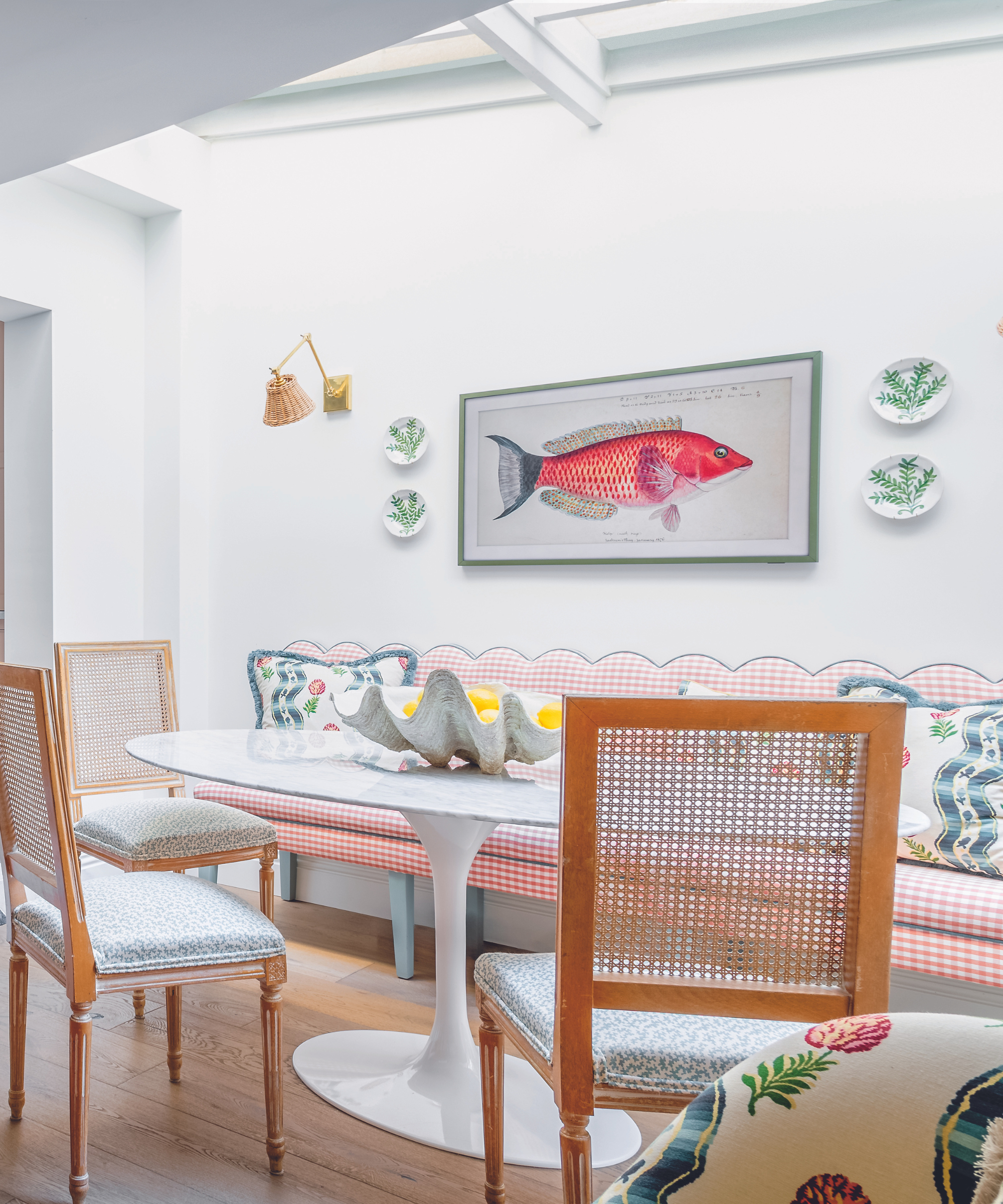
Fish art TV, Samsung. Wall light, Vaughan. Banquette in fabric by Romo. Table, Swivel. Vintage French cane chair seats in Squiggle, Sibyl Colefax & John Fowler.
The beating heart of the home is undoubtedly the kitchen-dining-living area. The Bath stone fire surround is a hero feature and frames the range, but it meant Sean was limited as to what he could do with the space. ‘We tried to pack in as much storage as possible and included a generous kitchen island.’
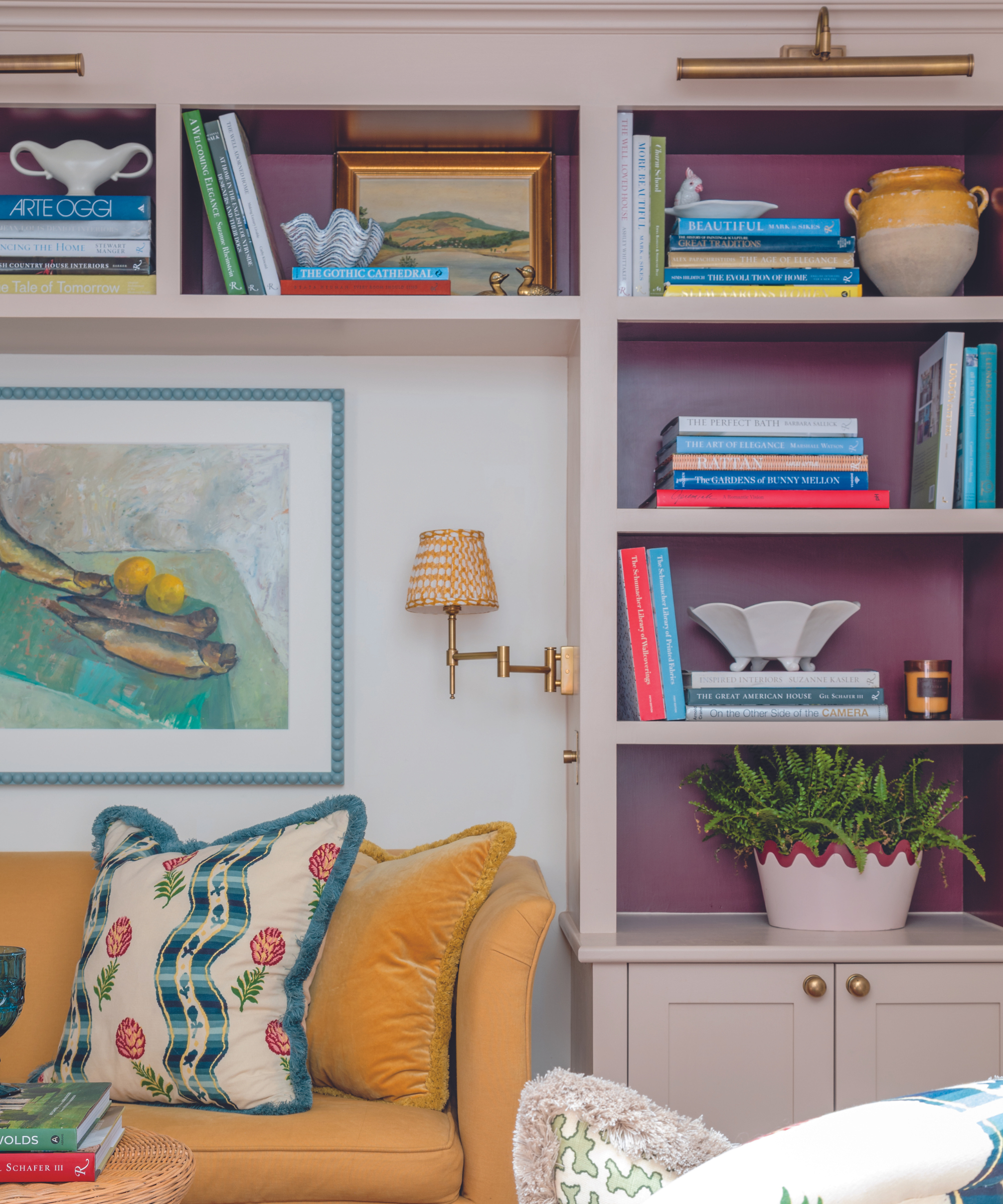
Sofa, Sofa.com. Chair and cushion in Pommes de Pin, Pierre Frey; fringing, Samuel & Sons. Wall light, Pooky. Shade, Fermoie.
Offering a worktop as well as drawers, the island also houses the dishwasher and sink. Alcove units on either side of the range, concealing a microwave and coffee station, open to another of Sean’s surprises. ‘I painted the interior a deep red to give it that punch of color when the doors are open. I like that unexpectedness.’

Walls in Red Earth, Farrow & Ball. Headboard and canopy in Tiger Palm, Schumacher; lined with fabric by GP & J Baker. Lamp, Oka. Shade, Alice Palmer & Co.
Colour and pattern are an integral part of Sean’s style and he was keen for the palettes to flow throughout. ‘The whole house is pinks, blues and greens,’ he notes. The sitting room exudes eclectic maximalism. Its modern twist on stately home style embraces a bold backdrop of blue walls, interspersed with pastel pinks and peppered with playful prints, all overseen by the portrait of a commanding Georgian gentleman.

Sofa, curtains and cushion in fabric by Pierre Frey. Walls in Lilac Pink, Edward Bulmer Natural Paint.
The extension, meanwhile, is a symphony of color and pattern that focuses on pinks and blues and features a striking chequerboard floor. The pattern-laden dining and sitting areas are offset with warm white walls, while an eye-catching fish artwork turns out to be a TV.
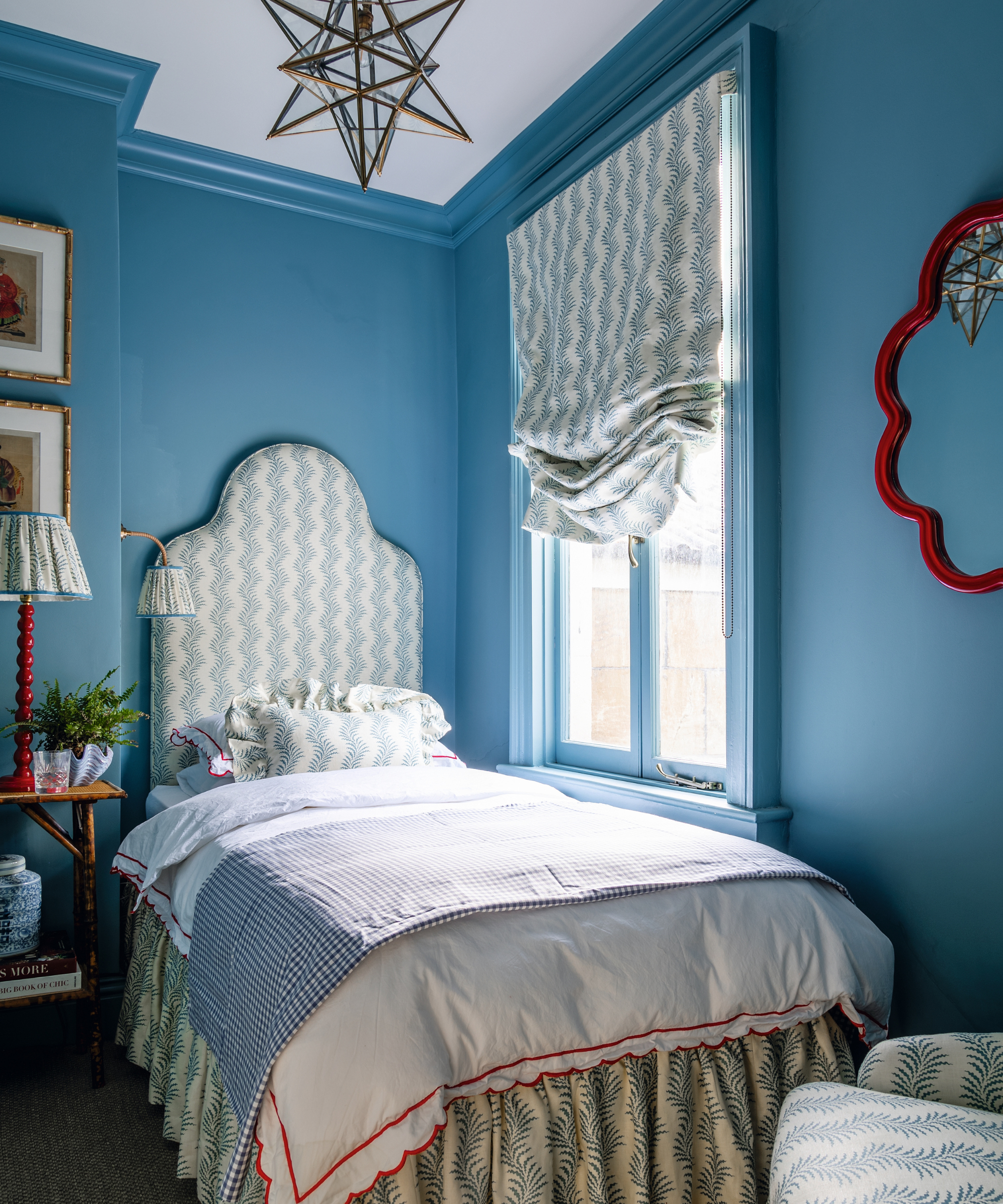
Headboard, valance, lampshade, blind and chair in Scrolling Fern Frond, Soane Britain. Lamp, Alfred Newall. Mirror, Pooky.
Sean has cleverly linked the hero Pierre Frey fabric motif through to the cloakroom where it is showcased as a statement wallpaper. This careful curation and skillful color and pattern blending have ensured the end result is a small but perfectly formed interior.

Wallpaper, Ottoline. Woodwork in Aquatic, Edward Bulmer Natural Paint. Tiles, Fired Earth.
Meet the designer
Sean Symington shares his style inspiration
What was the biggest indulgence?
We invested in window treatments and upholstery. I had fun playing with gorgeous textiles and fringes as they hold such an important part in the overall feel of the house.
Which part of the project do you consider your greatest success?
Renovating each individual room to make it a liveable space. The kitchen needed the most love as it was dark and cold – we were able to create one big open area.
Who is your design hero?
At the moment, I have a big design crush on the American designer Miles Redd.
Finish the sentence 'I know I'm a creative because...'
...I never stop designing. I was fortunate enough to turn my passion into my career and I am constantly drawing inspiration from every aspect of my life.
Can you reveal a secret address we should have on our radar?
I love shopping for antiques. My favorite shops include Lorfords and Brownrigg in Tetbury. What I love about Tetbury is that there is something to be found for everyone.
How should home make you feel?
Safe, warm, comfortable, happy… the list goes on!
Interiors have always been Vivienne's passion – from bold and bright to Scandi white. After studying at Leeds University, she worked at the Financial Times, before moving to Radio Times. She did an interior design course and then worked for Homes & Gardens, Country Living and House Beautiful. Vivienne’s always enjoyed reader homes and loves to spot a house she knows is perfect for a magazine (she has even knocked on the doors of houses with curb appeal!), so she became a houses editor, commissioning reader homes, writing features and styling and art directing photo shoots. She worked on Country Homes & Interiors for 15 years, before returning to Homes & Gardens as houses editor four years ago.