This Federal-style brownstone mixes historical features with layers of bold colors (including a lime green kitchen)
Designer Nine Farmer pairs antique finds with plenty of pattern, texture and a nod to British style in an elegant home with history
Design expertise in your inbox – from inspiring decorating ideas and beautiful celebrity homes to practical gardening advice and shopping round-ups.
You are now subscribed
Your newsletter sign-up was successful
Want to add more newsletters?
Designer Nina Farmer didn’t grow up in an old house. Her unique approach to house design, defined by richly layered interiors punctuated with antiques, evolved as she moved through periods in her life.
‘My parents built our first home from scratch. It was in the countryside in Connecticut and there was nothing remotely historic about it,’ she recalls. ‘But then I went to school in New Orleans, which felt very rich and patinaed, and I realized how much places that showed their age appealed to me. My parents met in London, so along with Venice and Paris, it has been a strong influence on my style.’
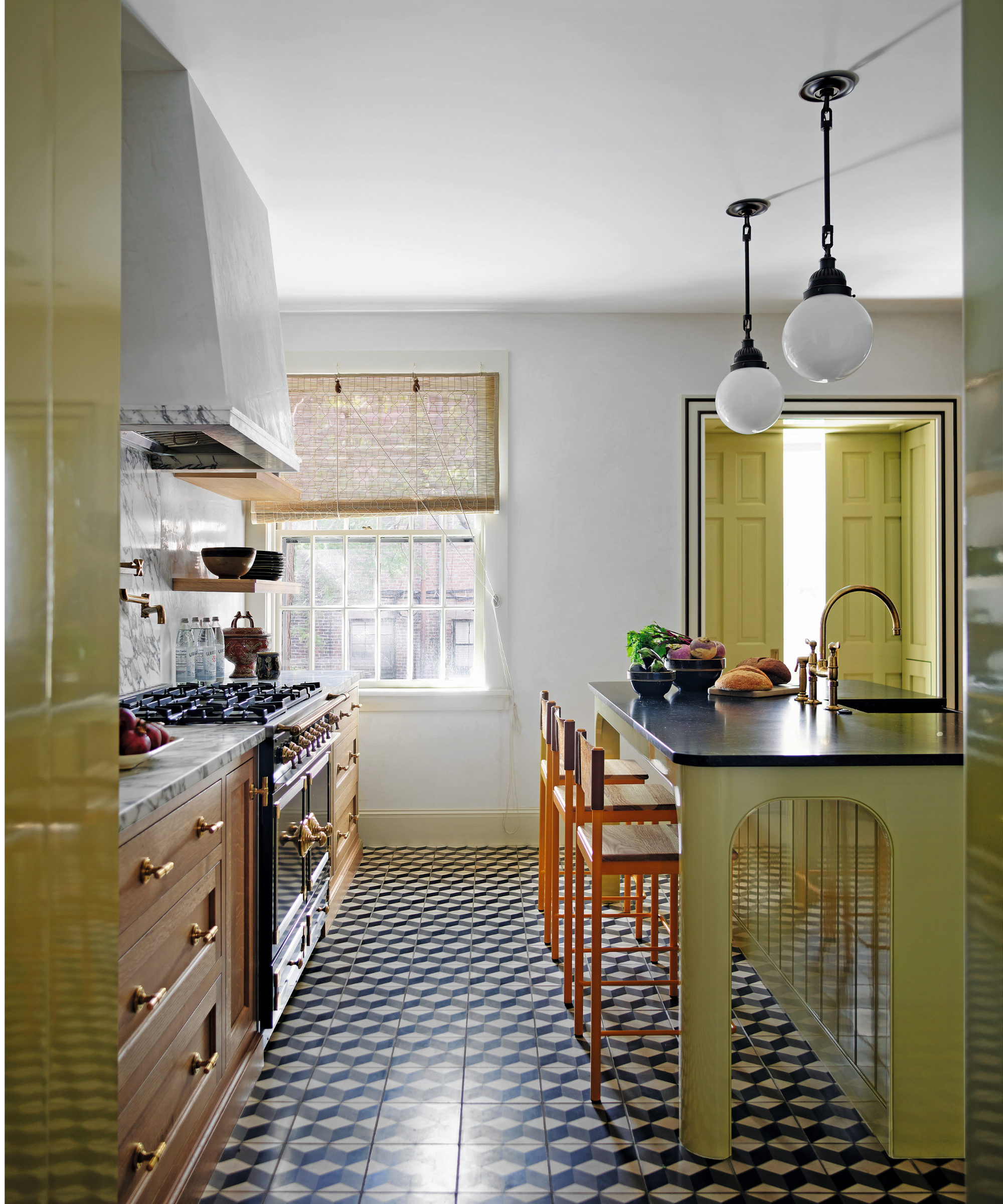
Cabinetry, Plain English. Custom island, Nina Farmer. Pendants, The Urban Electric Co. Cotto Cube tiles, Porcelain Superstore, are similar. Island in P10520, Fine Paints of Europe. Larder in Bancha, Farrow & Ball.
The Beacon Hill neighborhood of Boston that interior designer Nina Farmer has made her home, along with her husband and two daughters, is steeped in history. ‘We’ve been here for 15 years. I love the cobbled streets and old gas lamps. There’s a very charming British feel to the area,’ she says.
Article continues belowThe housing stock, made up of Federal-style and Victorian brick terrace houses dating from the 1850s, is protected, making them some of the best-preserved historic homes in the US.
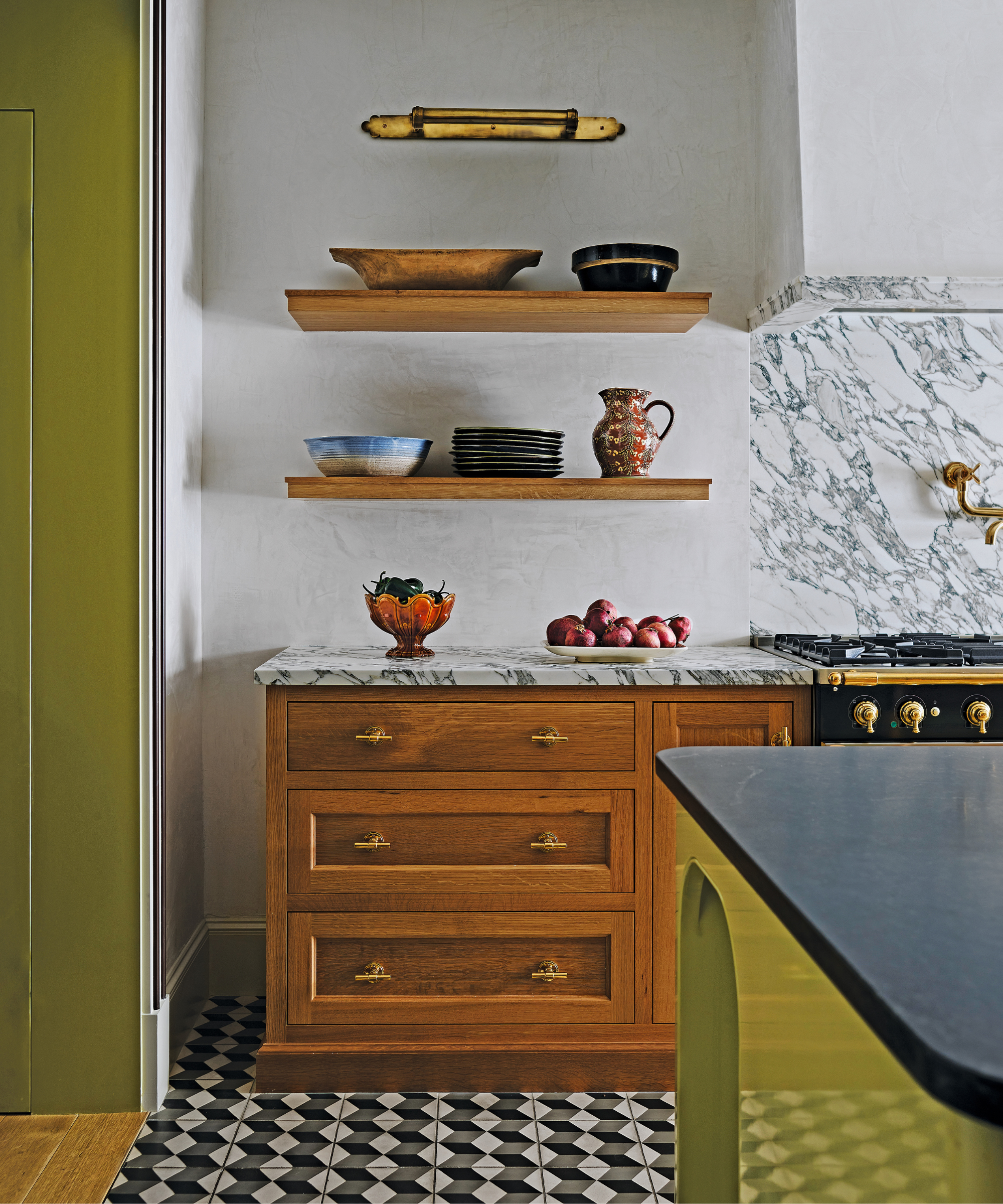
Cabinetry, Plain English. Custom island, Nina Farmer. Cotto Cube tiles, Porcelain Superstore, are similar. Island in P10520, Fine Paints of Europe. Larder in Bancha, Farrow & Ball.
Nina’s remarkable appetite for designing for older properties is the subject of her new book, Timeless by Design, published by Rizzoli. Her love of all things British can especially be seen in the interior design of her friends’ Federal-style brownstone home, also located in Beacon Hill and featured here.

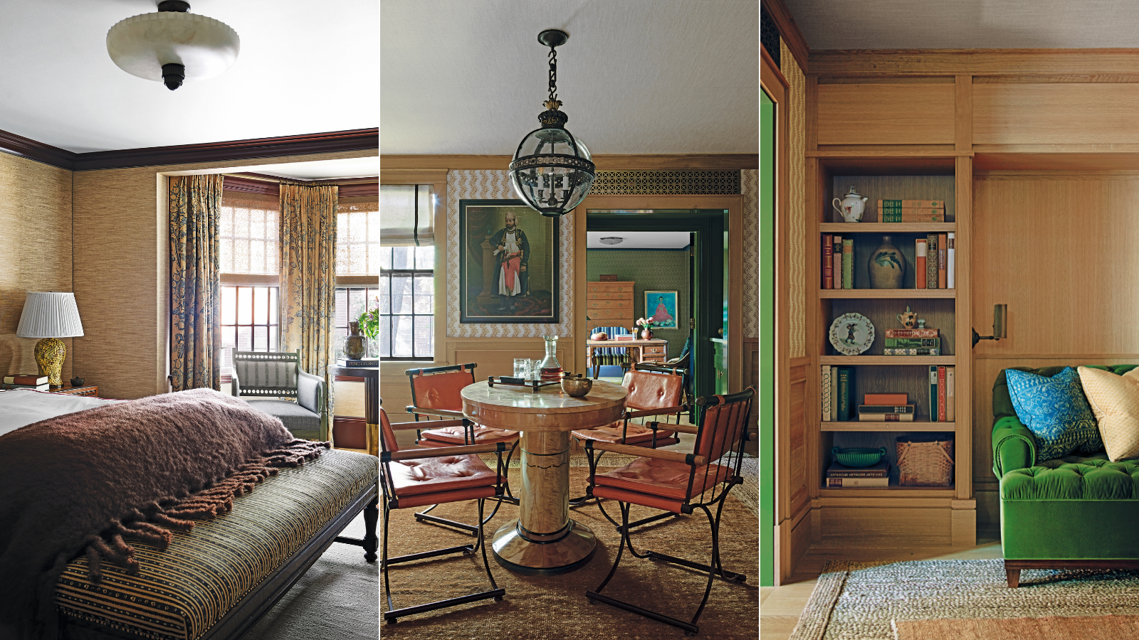
Wallpaper, Soane Britain. Globe pendant light, Jamb. Vintage chairs, Cleo Baldon.
‘There’s something about a certain British way of living that somehow manages to feel formal, friendly and familiar all at the same time. There’s an exciting boldness to the way interiors are being designed in the UK. Colours are deeper and richer and more patterns are used. Contrasting textures are highlighted and designers show a willingness to layer in the most sophisticated way. There’s also a healthy dose of playfulness and whimsy that ensure any floral prints and chintzes feel more fresh than frumpy,’ Nina enthuses.
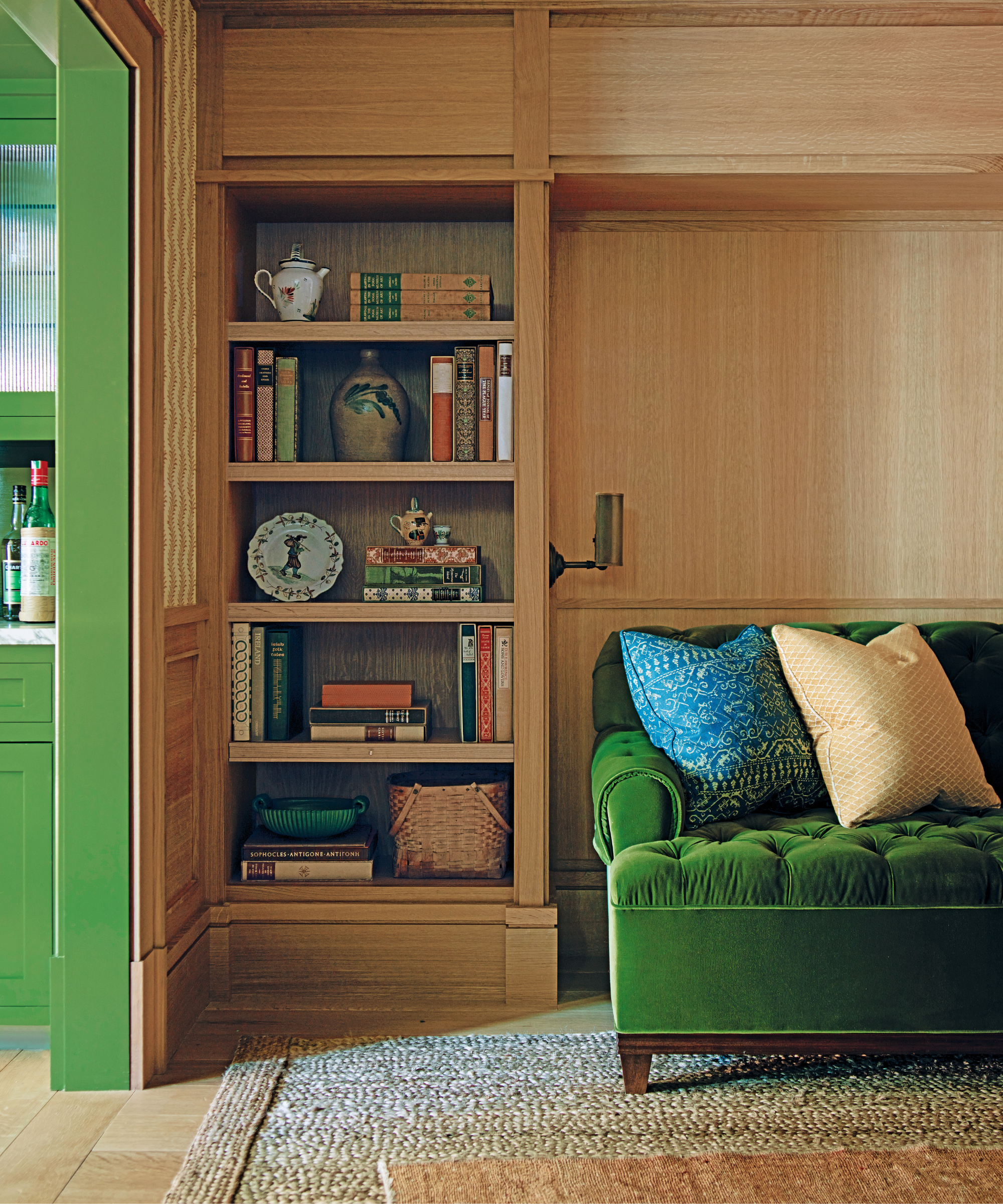
Cabinetry and sofa, custom pieces. Wall light, Jamb. Bar area in Bancha by Farrow & Ball.
‘The clients are a married professional couple with two school-age children and, being regular visitors to London, they shared my affinity with England,’ Nina elaborates.
Design expertise in your inbox – from inspiring decorating ideas and beautiful celebrity homes to practical gardening advice and shopping round-ups.
‘The tall, narrow building had already been renovated in the 1990s but was white and sterile. It was lacking personality and missing characterful mouldings. Whilst the exterior couldn’t be touched, we completely rethought the floor plan, moving the kitchen from the first to the ground floor and created a parlor and adjoining office where it was formerly located. We all play cards regularly so this was expressly designed for that purpose and entertaining in general with an intimate, cozy and welcoming tone,’ she explains.
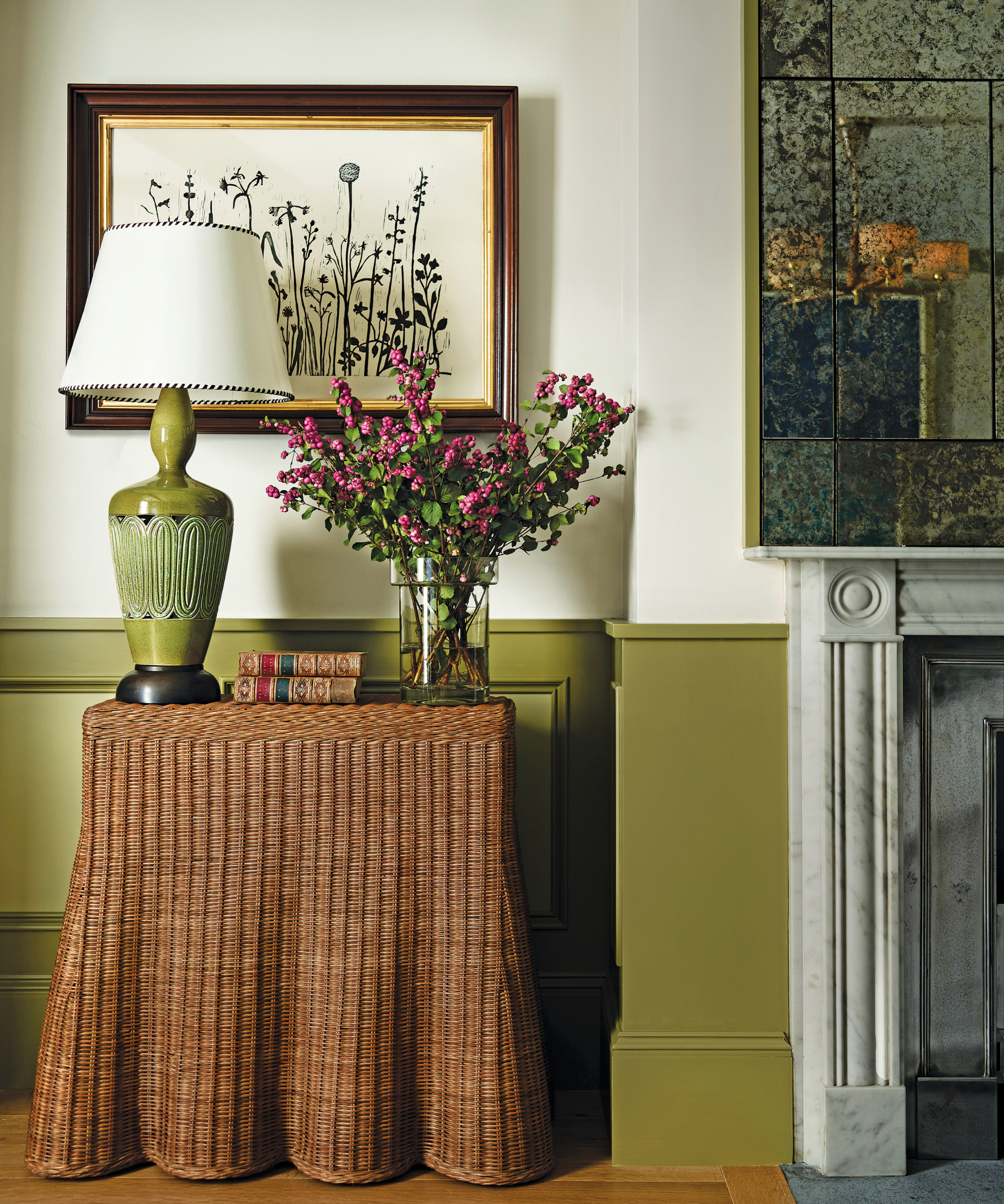
Adeline console table, Maison Flâneur. Walls in (above wainscot) Skimming Stone by Farrow & Ball. Artwork by Hugo Guinness. Source a mid-century ceramic lamp at Pamono.
‘My friends are great lovers of antique and vintage pieces and were keen to use bold colors, especially picking up on my fondness for decorating with green. It extends throughout the house, at its brightest in the kitchen and getting moodier from there, shifting toward moss and olive in other spaces, such as the board-and-batten-clad dining room and the living room and parlor, where a variety of greens are set off against paler neutrals and deeper cognac hues,’ Nina explains.
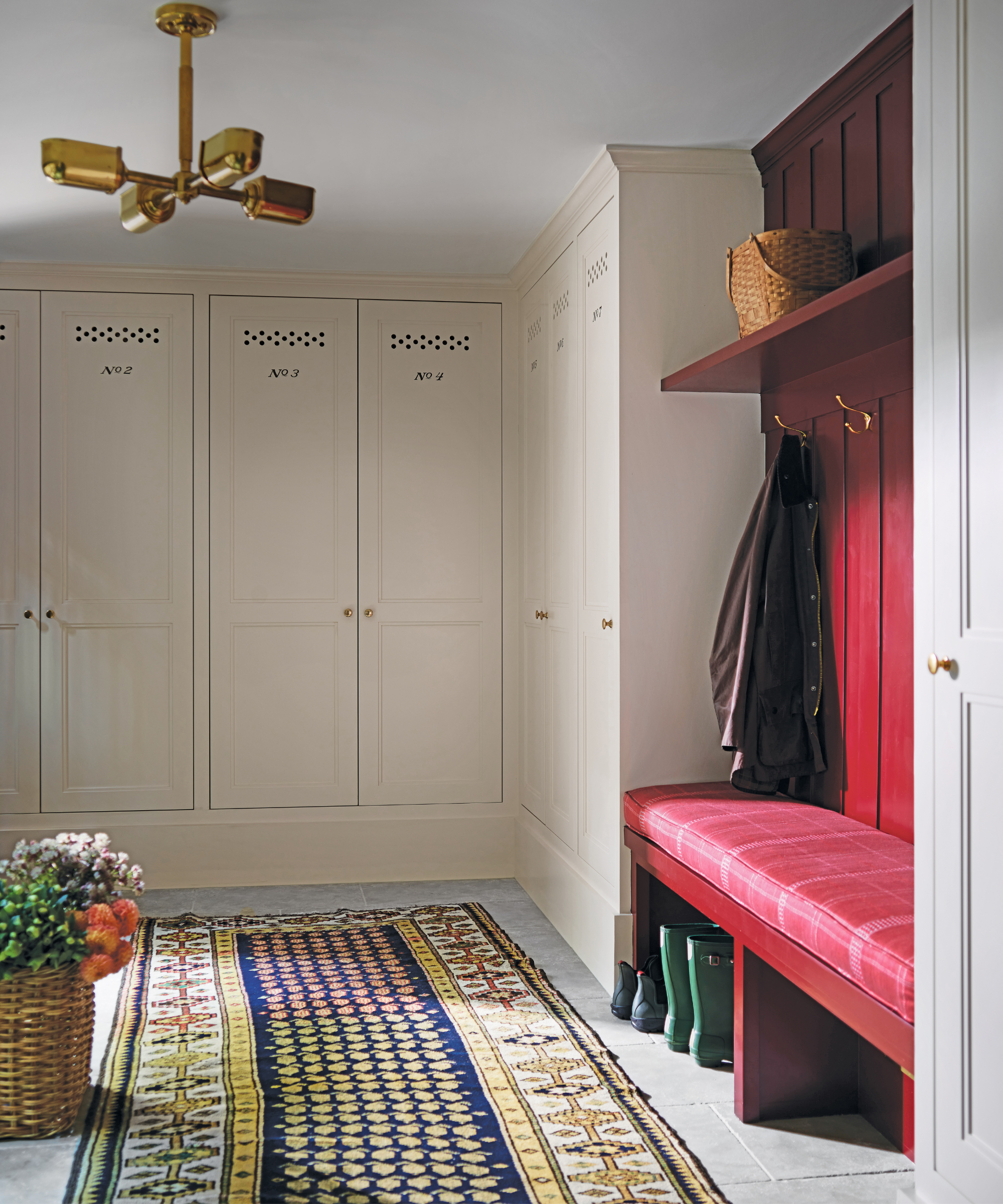
Custom cabinetry in Wheatberry by Benjamin Moore & Co.
Designing for such Anglophile clients meant Nina mostly sourced from British brands as well as taking trips to the UK for antique hunting. Paint colors are from Farrow & Ball, the kitchen cabinetry was supplied by Plain English and light fittings came from Jamb. There are also wallcoverings from Soane Britain and fabrics from Robert Kime.
‘I chose works by British artist Tom Hammick for the living and dining room as his style transcends both place and time, which felt appropriate for this house.’ Evoking the interior of an English ancestral manor house, this home transports both through time and over the ocean.

Madison Wall Harvest wallcovering; curtains in Pamina, both Rose Tarlow. Coving in 18360, Fine Paints of Europe. rug, Steven King Decorative Carpets. Artwork, Get The Gusto.
MEET THE DESIGNER
Nina Farmer shares her style inspiration
What's your go-to color?
For this project, Bancha by Farrow & Ball.
Do you have a favorite room in this project?
The parlor space where everything was really layered on.
Who is your design hero?
There are so many but Jacques Grange who designed Yves Saint Laurent’s house in Marrakech is a perennial favourite.
Describe your style in three words.
Timeless, layered, sophisticated.
Right now, what objects would we find on your coffee table?
My father’s turned wood bowls, a stack of books, an English wood tray, candles and antique finds.
What was the last museum you visited?
The Isabella Stewart Gardner Museum. It’s fashioned after a Venetian palazzo and the courtyard in the center always has stunning seasonal displays.
Name an indulgence that you can't live without.
I have a soft spot for Art Deco tea services
What are your words to live by?
Shy away from things on trend that will have an expiration date.