This house had two empty rooms until a bold redesign gave it a sense of purpose – and some elegant new furniture
The elegant dining room in an Atlanta home was once the kids' tricycle race track until a radical design update reclaimed it
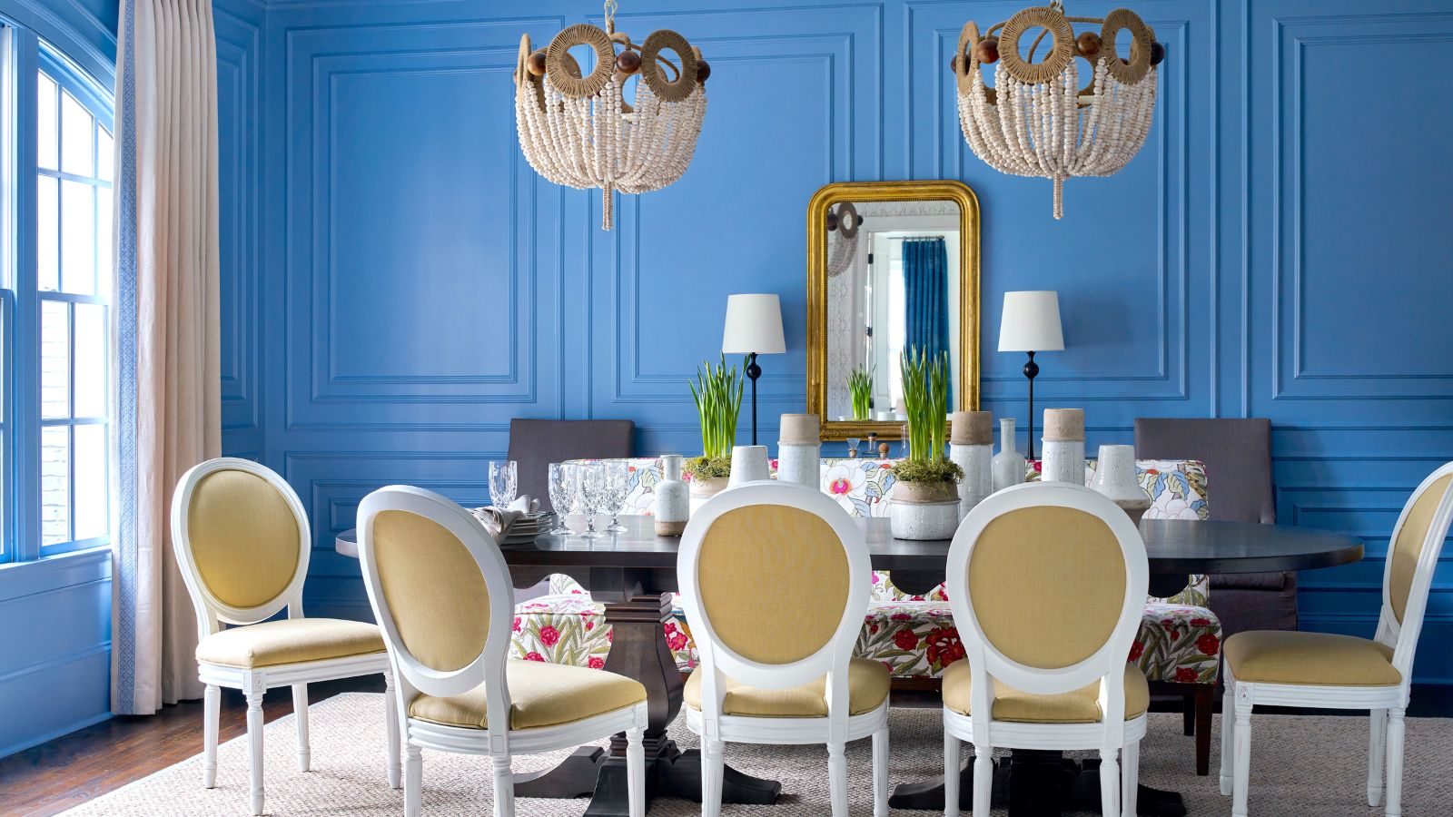
Fun fact about this Georgia home: two of its reception rooms were empty for almost a year and the kids used to ride their tricycles through them. It's hard to believe but this family home, now one of the world's best homes, was once a bit of an empty shell, lacking design direction and practical purpose.
The young family of five had upsized, moving from DC to Atlanta and had prioritized getting to know their new house and neighborhood before thinking about furnishing and décor. After almost two years, however, they felt it was time to get the professionals in for some fresh interior design ideas. The design experts at Atlanta-based GordonDunning were only too happy to help, coming up with a series of room schemes to put the house back on track.
The main aims were to create a classic dining room where they could entertain friends and family, and a music room that doubled as an office. Cate Dunning and Lathem Gordon, co-founders of the design studio explain how they arrived at the perfect solutions.
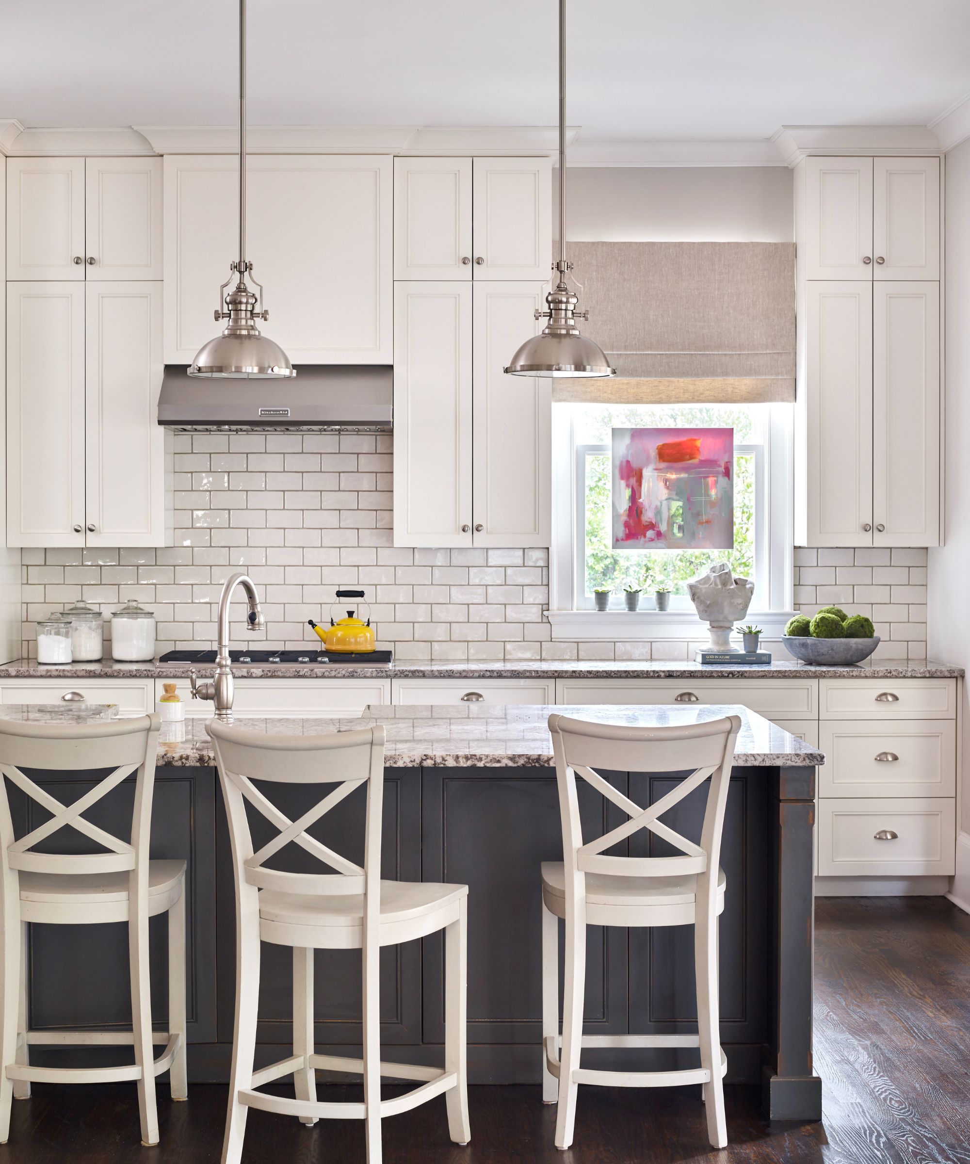
Kitchen ideas are the perfect fit for the home's historic detailing. The cabinetry is simple and traditional, with clean lines and heritage-friendly subway tiles, vintage style lighting and dark wood flooring.
This is a practical family space, but the quiet, classic look and traditional kitchen ideas here speak of generations of good cooks catering for friends and family over the years. Importantly the room is in line with GordonDunning's vision for the rest of the home. 'We wanted to create a space for them that was rooted in classics but packed a punch,' says Cate Dunning. 'We wanted the spaces to be family-friendly but have elevated style.'
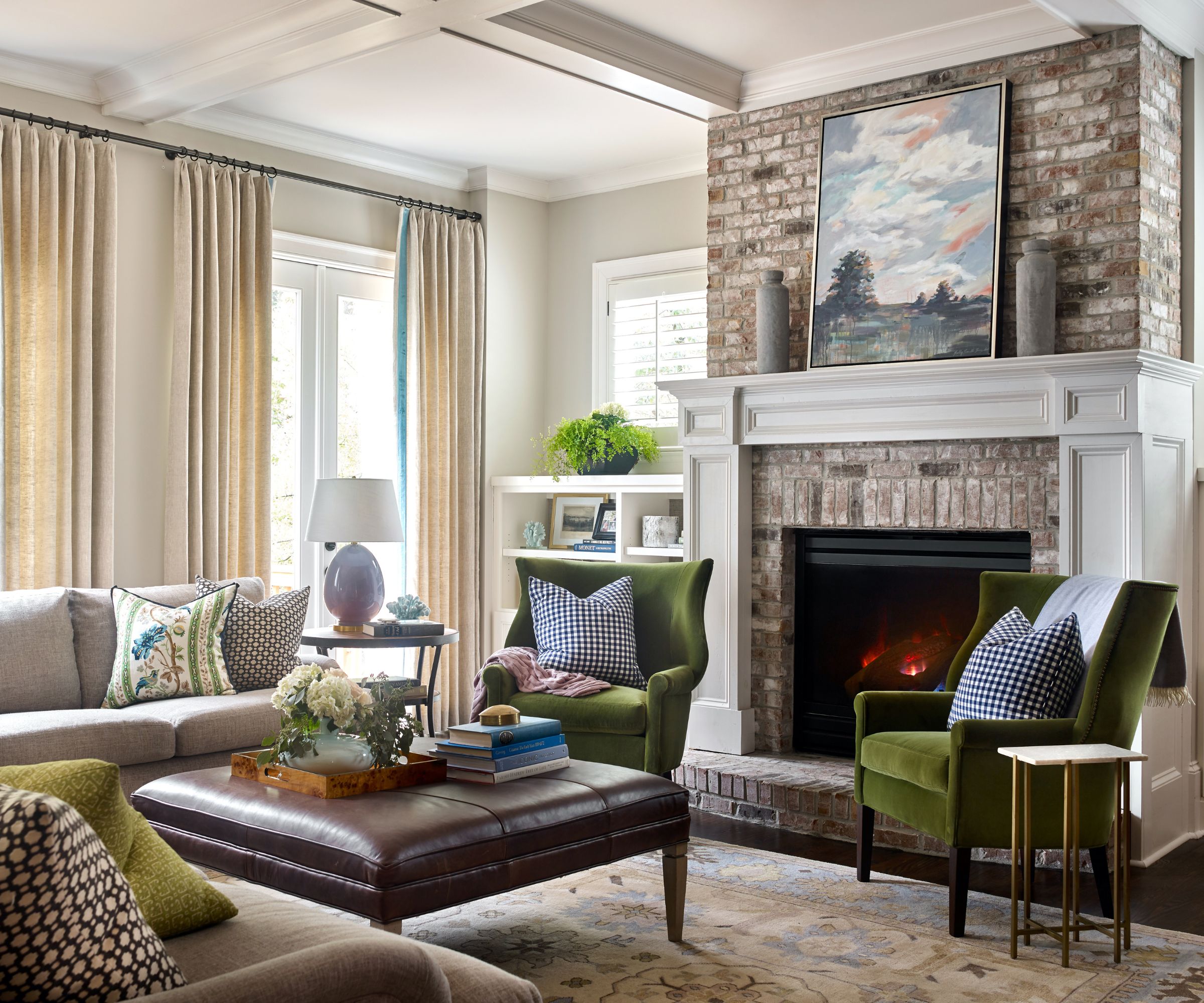
'The idea is that the home should feel cohesive but become cozier as you moved further in, so we incorporated some warmer tones and textures in the living room to complement the peacocks, blues, and bolder hues elsewhere,' says GordonDunning's co-founder Lathem Gordon. 'This is the center of their home, where the Christmas tree lives, where family movie nights happen, where the core family memories are made – and we wanted to embrace that.'
So this space factors in all those living room ideas to create a relaxed and welcoming room. There's space for everyone, and it looks especially cozy with the fire lit in the big stone fireplace.
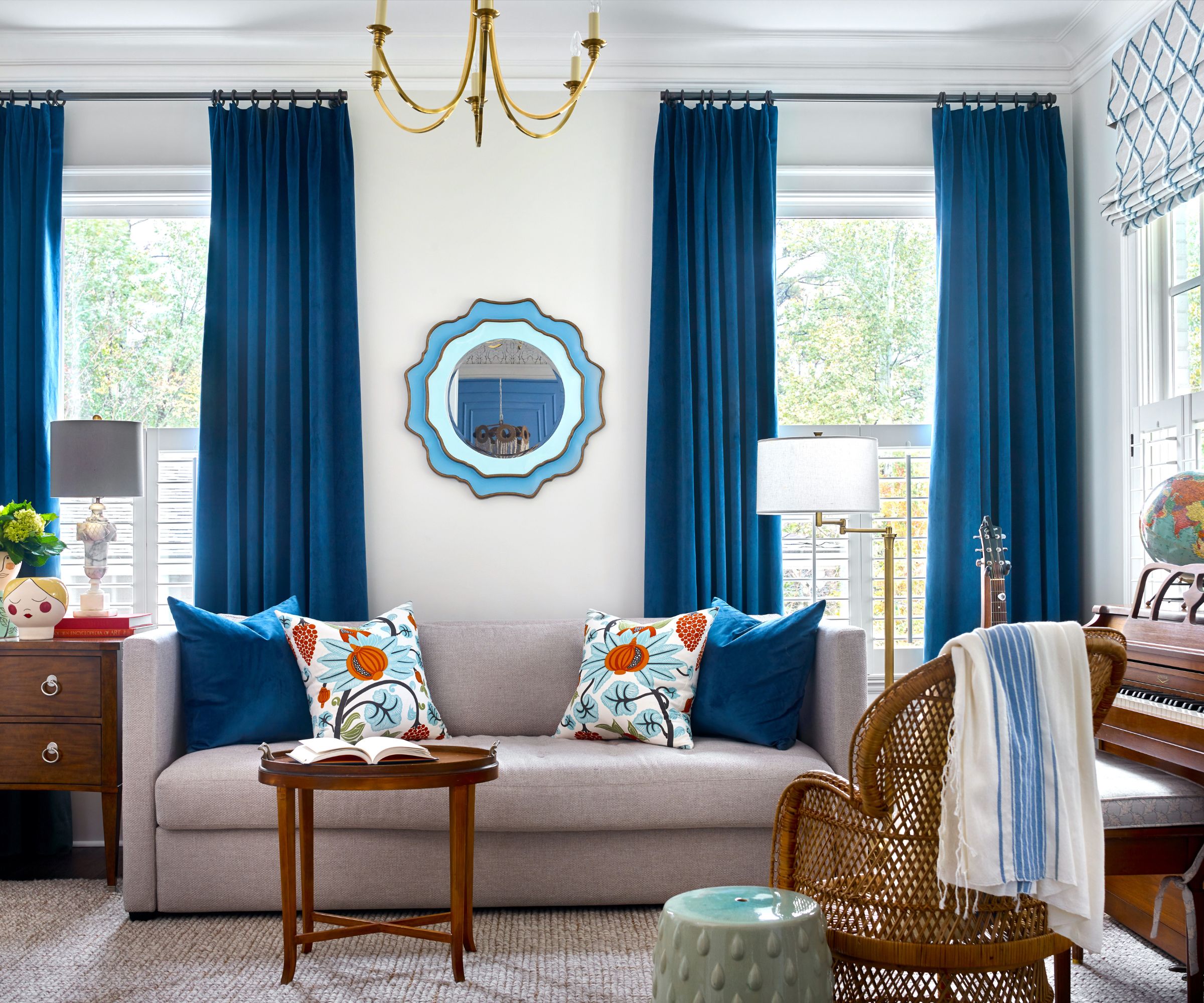
Coming up with music room ideas for this previously empty room was a key part of the family's brief. Designers Cate and Lathem of course considered these in the context of the whole house. 'Given that this and the dining room spaces are the first you see upon entering the foyer and are directly across from each other, we really had to consider how they worked together,' explains Cate. 'We wanted the dining room to be the star of the show, but the music room needed to be complementary. We incorporated blues and oranges into the music room to mirror the dining room.'
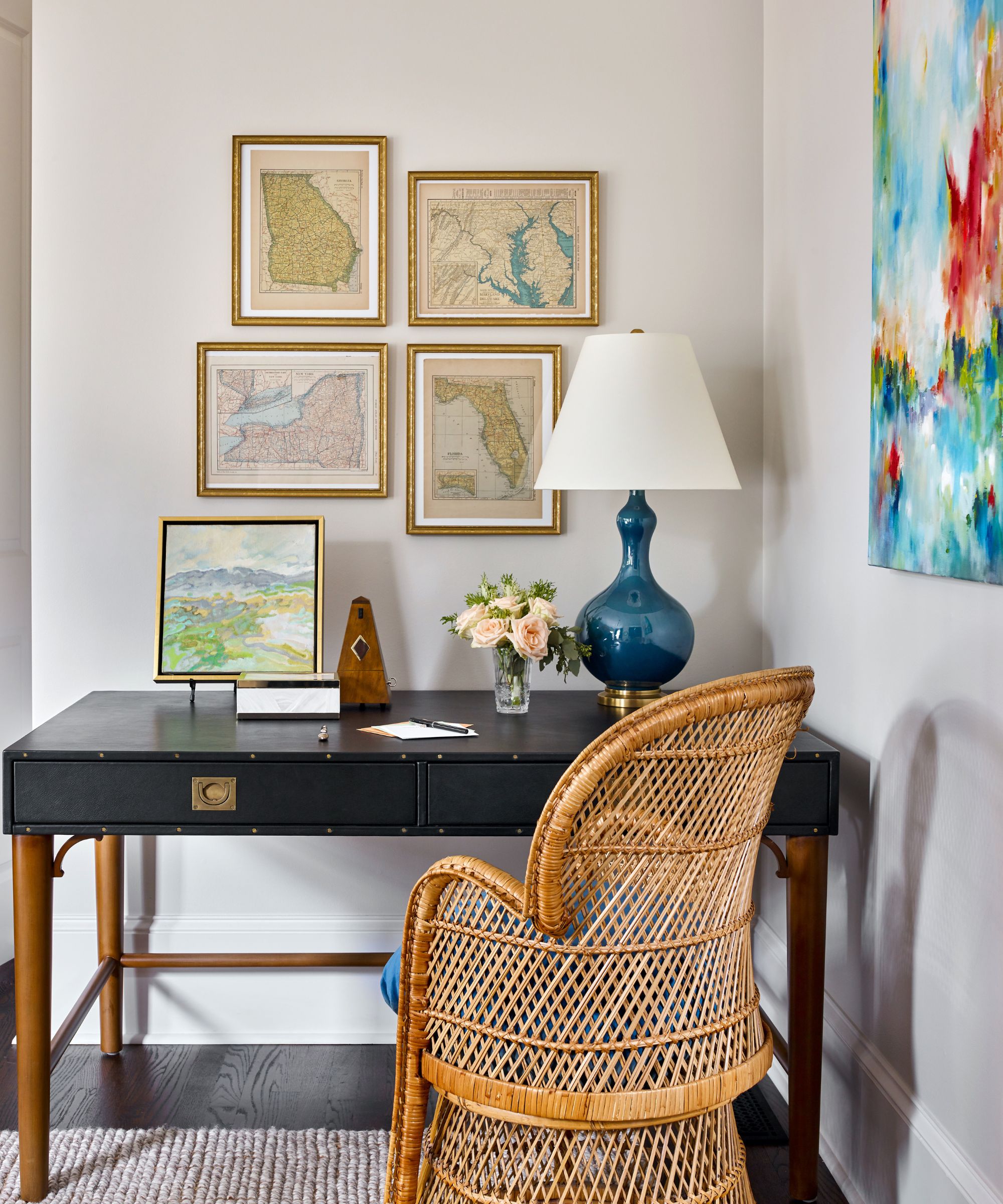
A small workstation has been included in one corner of the music room, perfect for occasional working from home days. The style is matched to the overall aesthetic so that the home office ideas add to rather than taking over the elegant look and feel of the room. The gallery wall above the desk is made of maps from the family's travels.
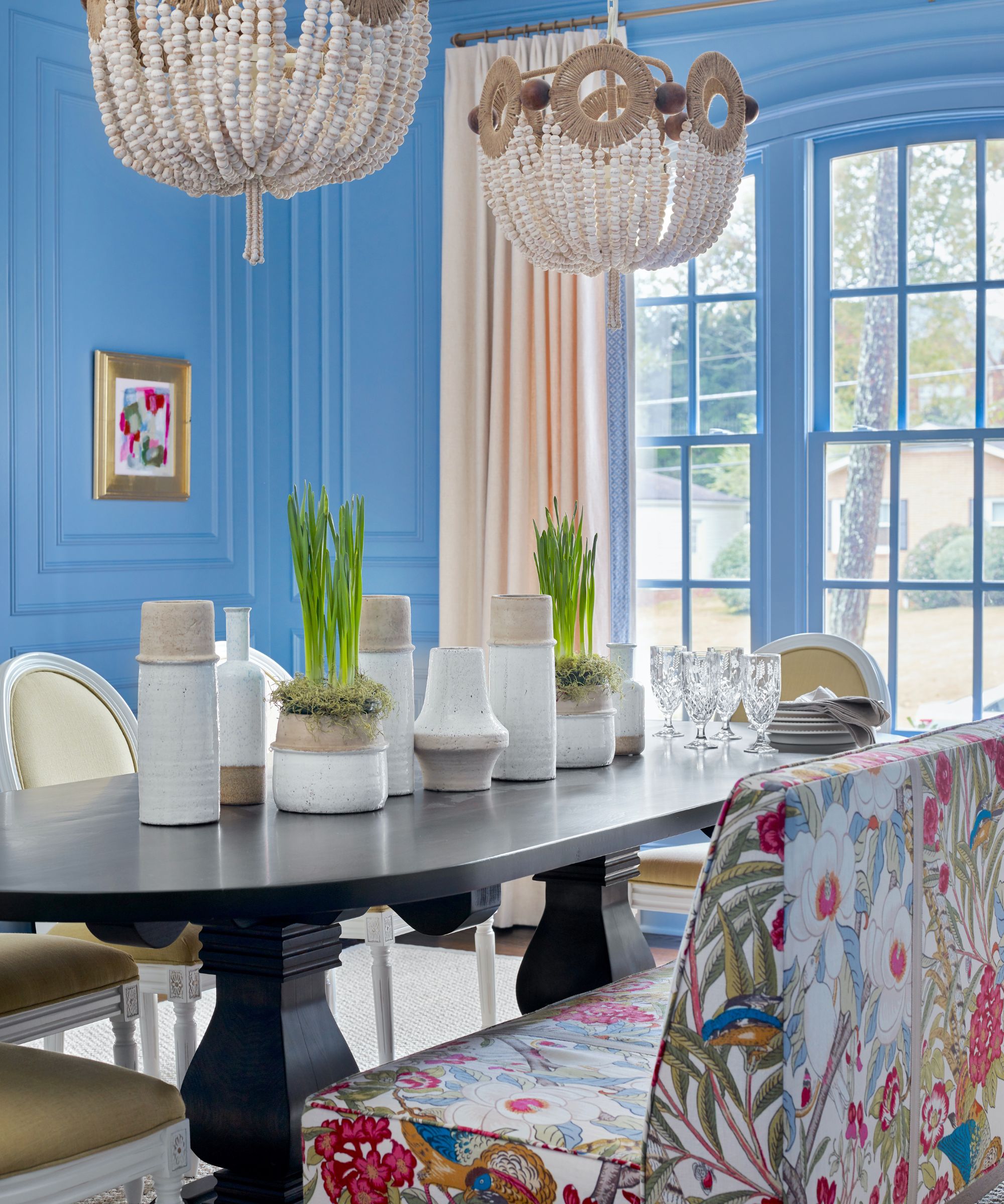
The new dining room décor is the home's showstopper. First, that vibrant paint color, the aptly named Sherwin Williams Notable Hue, was applied to specially designed and custom made millwork. The color was painted all over, 'to cocoon the room', explains designer Lathem.
Thinking back to how it looked when they first saw it, designer Cate recalls, 'The room was a white box! There was no molding, no light fixture, no nothing. It was exclusively used as a kid racetrack.'
Explaining the starting point for their dining room ideas, she adds: 'The owners knew they wanted a dedicated dining space, but they wanted to wait until their children were a little older and they could fully focus on doing the space as they dreamed'
How did they go about marrying a traditional look with a more fun and contemporary vibe? 'We took great care to design and map out the millwork and select the “just right” blue to be the backdrop of the memories created in this room,' says Cate. 'We worked to incorporate classic lines to give the space a strong foundation, but we also brought in some punchy color and pattern for spunk.'
Aside the dramatic color scheme, designer Lathem explains that the banquette was to be the focus of the space. Covered in Lee Industries in Jofa fabric, it is indeed a beautiful piece, a key player in bringing the furniture back into the realms of the traditional.
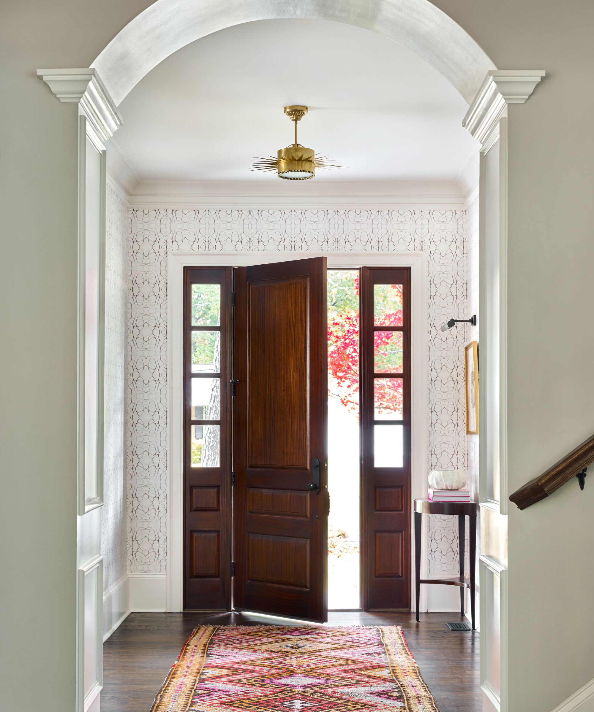
Anyone looking for entryway ideas for a more traditional setting, will find plenty to inspire in this simple but elegant space. 'We wrapped the entire space in wallpaper to really add some pizazz,' explains Lathem Gordon. 'We didn’t want to add color in order to allow the dining room to be the color star, but we wanted texture and visual interest.
'We wanted it to feel classic but have meaningful and memorable impact as you entered the home. The Lindsay Cowles wallpaper provides textural and pattern interest, allowing the architectural details and artwork to be the main focus of the space.'
Alongside the wallpaper, the statement rug is a key player in the hallway ideas, echoing the warm rich tones of the wooden front door and flooring.
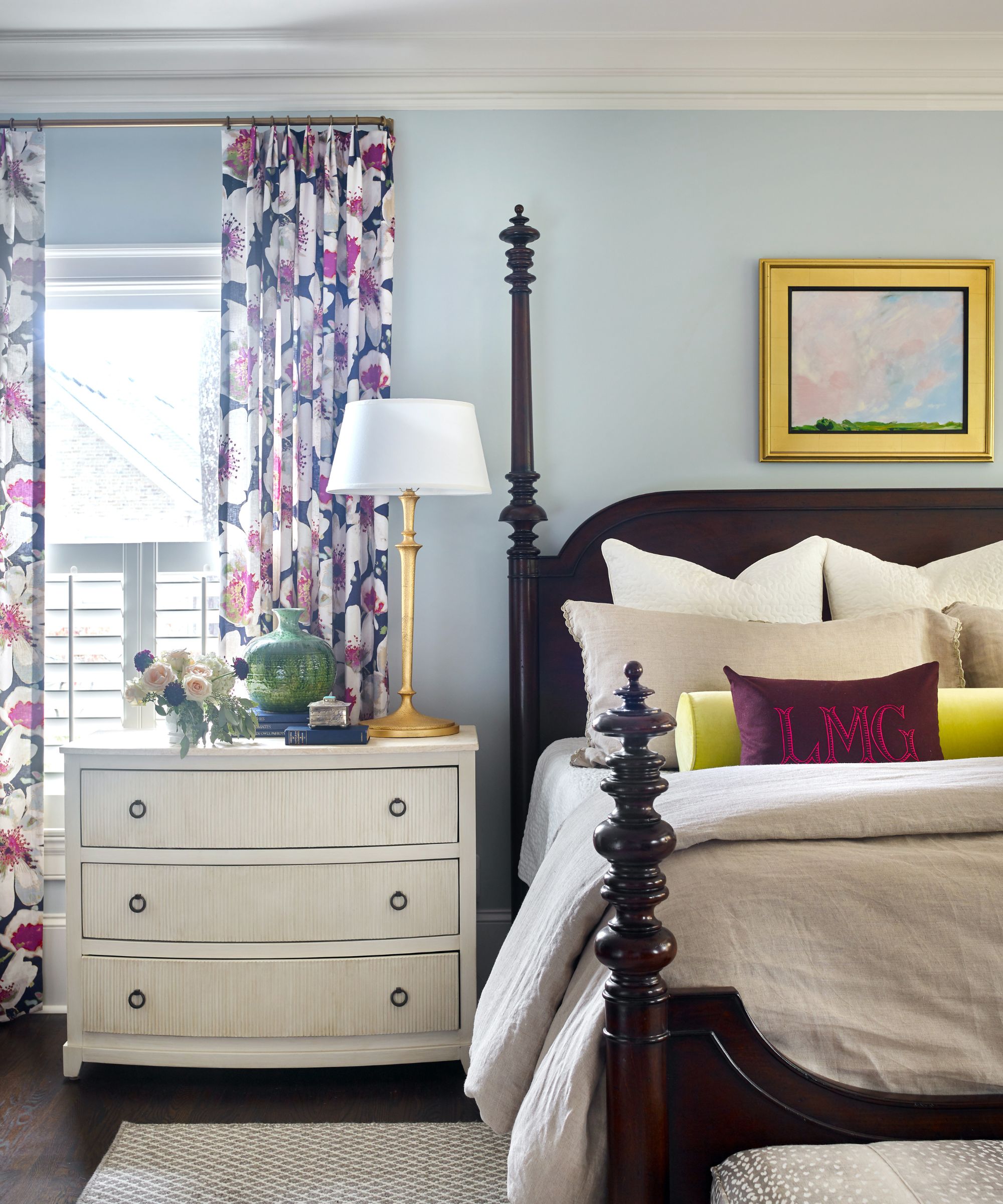
In keeping with the downstairs spaces, bedroom ideas for the main bedroom have a traditional elegance, but with fresh colors providing a contemporary twist. Soft blue walls and bold floral print drapes offer a good counterpoint to the dark wood bedframe and flooring. Bedding in soft beige linen grounds the whole scheme.
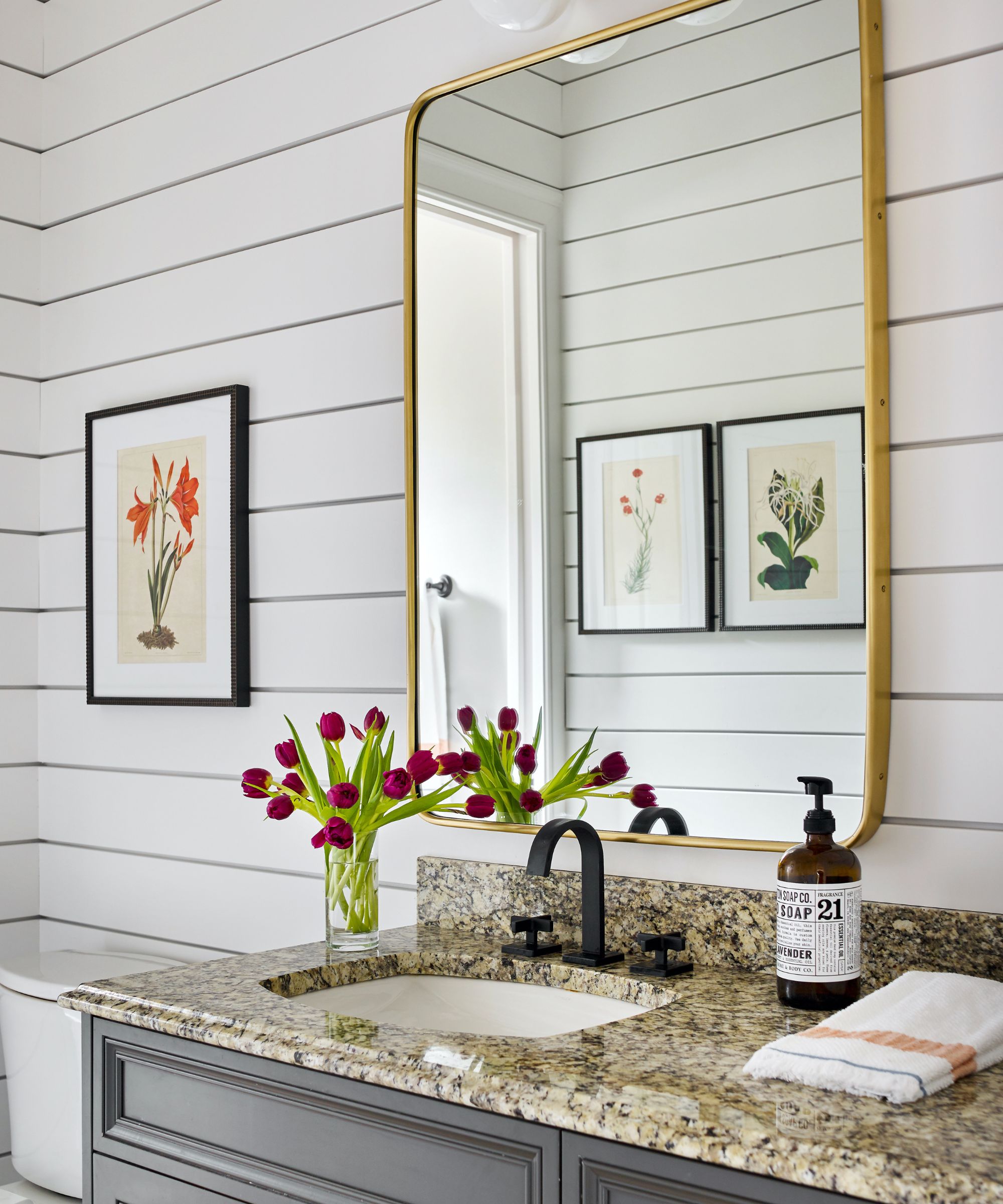
Bathroom ideas for the compact ensuite started with the clapboard paneling on the walls. The dark flecked granite vanity top complements the gray cabinetry, with black faucets adding a further contemporary detail.
In the bathroom, as elsewhere in the home, designer Lathem says they were very conscious about 'specifying fabrics, upholstery, and case pieces that could hold up against crayons, trampolining, and spills, but aesthetically, our goal was to make the space feel refined enough for entertaining friends, family, and colleagues.'
While Cate adds: 'We were thrilled to play a role in making the home truly reflect them as a family.'
Interior design: Cate Dunning and Lathem Gordon at GordonDunning
Photography: Emily Followill
Sign up to the Homes & Gardens newsletter
Design expertise in your inbox – from inspiring decorating ideas and beautiful celebrity homes to practical gardening advice and shopping round-ups.
Karen sources beautiful homes to feature on the Homes & Gardens website. She loves visiting historic houses in particular and working with photographers to capture all shapes and sizes of properties. Karen began her career as a sub-editor at Hi-Fi News and Record Review magazine. Her move to women’s magazines came soon after, in the shape of Living magazine, which covered cookery, fashion, beauty, homes and gardening. From Living Karen moved to Ideal Home magazine, where as deputy chief sub, then chief sub, she started to really take an interest in properties, architecture, interior design and gardening.
-
 Hake and clams in parsley and wine sauce
This one-pan hake and clams recipe is light, flavourful and made for spring — perfect for impressing Easter guests without the stress
By Alice Hart
-
 Lemon cheesecake tart
This lemon cheesecake tart combines two favorite desserts into one smooth zesty showstopper that's perfect for spring gatherings
By Alice Hart