The designer describes this English home as having an 'Oscar Wilde-y feel' – it's as richly colored and flamboyantly decorated as you'd expect
The amazing aesthetic of this renovated Georgian house encompasses the modern, the classic and the charmingly bold
Design expertise in your inbox – from inspiring decorating ideas and beautiful celebrity homes to practical gardening advice and shopping round-ups.
You are now subscribed
Your newsletter sign-up was successful
Want to add more newsletters?
'There’s a real Oscar Wilde-y feel to this home,’ Jennifer Hamilton, director of The Vawdrey House, says of one of the firm’s latest projects in London. The clients, an Australian couple, had watched as Jennifer and her team worked on their neighbors’ house design and acted quickly to appoint the firm for their own home.
‘We get a lot of work through client referrals, but this one was particularly exciting as we had already redeveloped one side of this pair of grand semi-detached Georgian houses,’ Jennifer explains.
While both houses had the same footprint, their respective owners differed dramatically in taste. ‘We really enjoy the variety of the work and we are versatile with our design language,’ she adds. ‘We always look at both architecture and interior design from the start, anticipating usage and planning with foresight.’
Article continues below 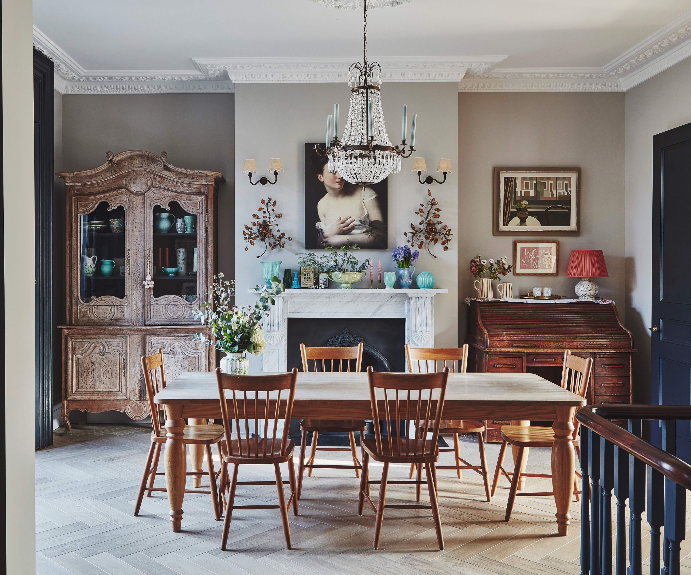
The owners had lived in the house for 23 years, and with two teenage children, they wanted more space, connectivity and to overhaul the lower-ground floor of the house, which had been neglected and underused for years.
‘At one point the house had been divided into flats, so on the lower-ground floor there was a side door, but little connection to the garden. There was a study and a guest room, but they were damp and cold. It felt like a lost floor,’ Jennifer says.
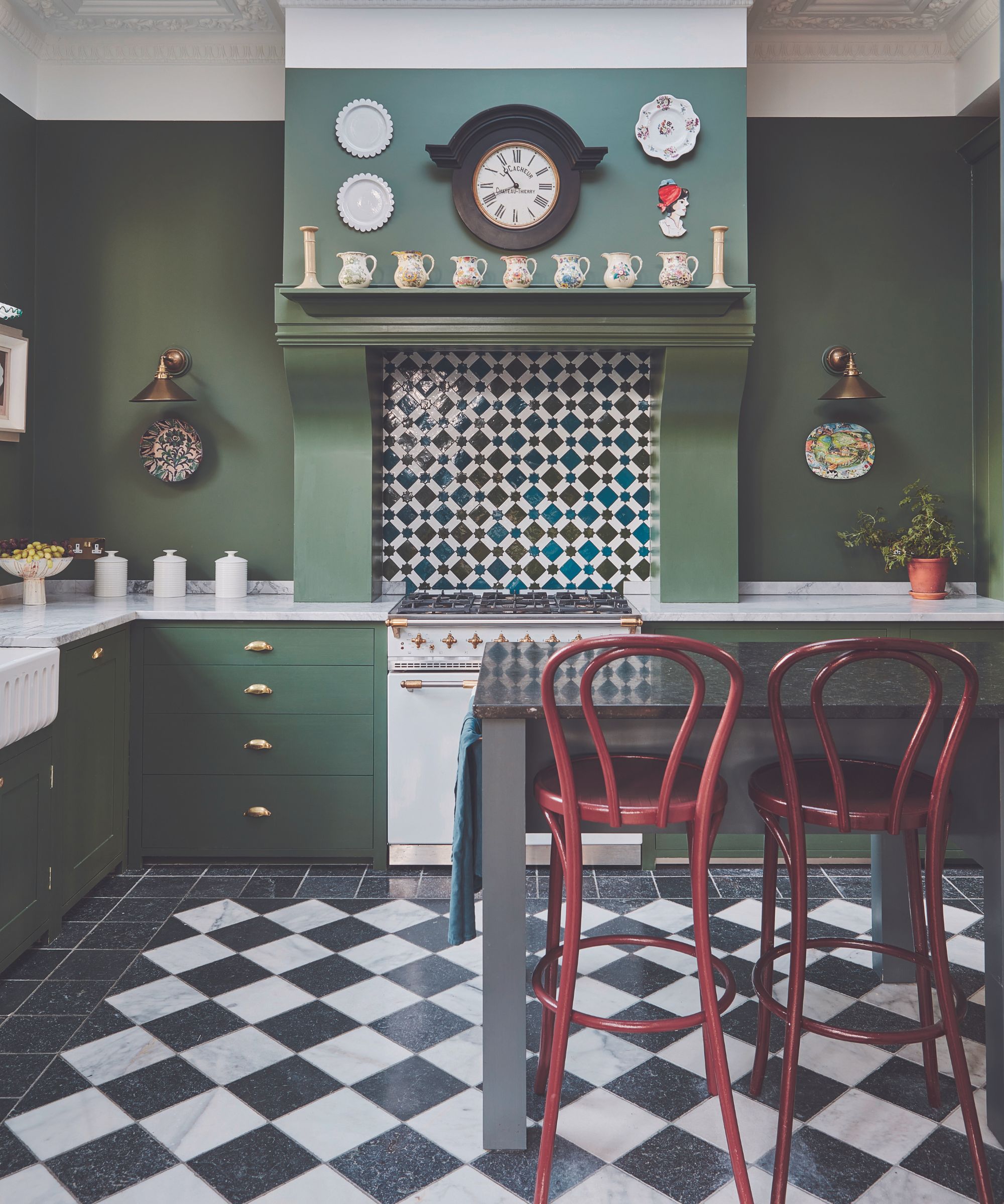
The owners, having always enjoyed the kitchen and living layout on the raised upper ground floor, opted to leave them put. ‘Not many houses have stuck to this tradition,’ Jennifer notes. ‘So, our challenge was how to give this main floor a greater connection to the garden.’
The solution was for the kitchen to open onto a roof terrace above the new lower-ground floor extension. A new set of steps lead into the large garden. ‘It feels much closer to the house now,’ says Jennifer. ‘Previously, you had to go out of a side door and down a narrow steel spiral staircase to reach it.’
Design expertise in your inbox – from inspiring decorating ideas and beautiful celebrity homes to practical gardening advice and shopping round-ups.
While planning permission for the extension had been granted previously, Jennifer realized that a central internal staircase connecting the lower and upper-ground floors would invigorate the layout with a dynamic central axis.
‘The owner, who is a great lover of all things vintage and antique, didn’t want to slap something on the back and lose the period feel of the house. We discussed what sort of windows to use for the extension at length, opting for fine new timber French doors. The brickwork obviously looks a lot cleaner than the rest of the house, but in time it will all blend down effectively and appear as one.’
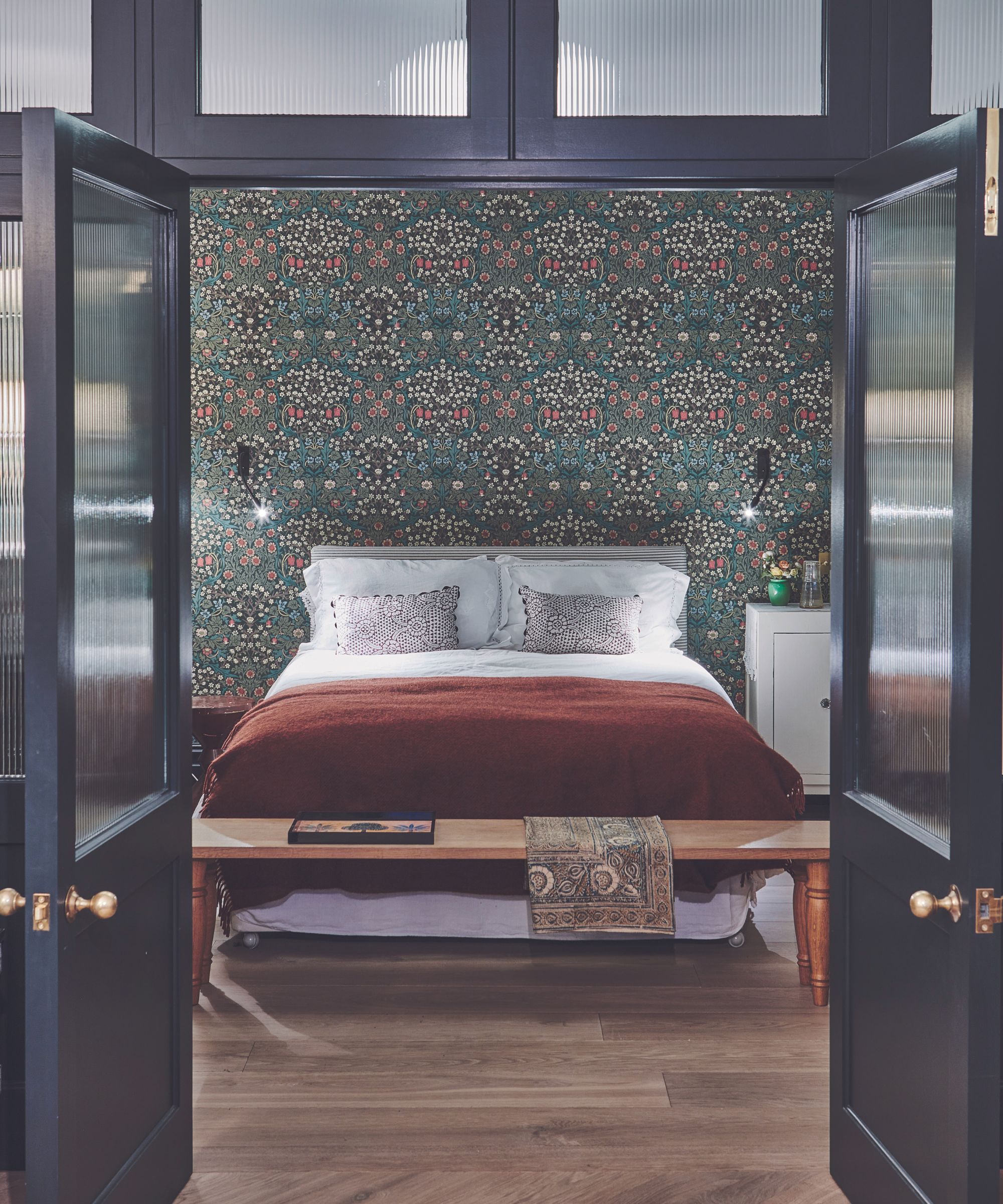
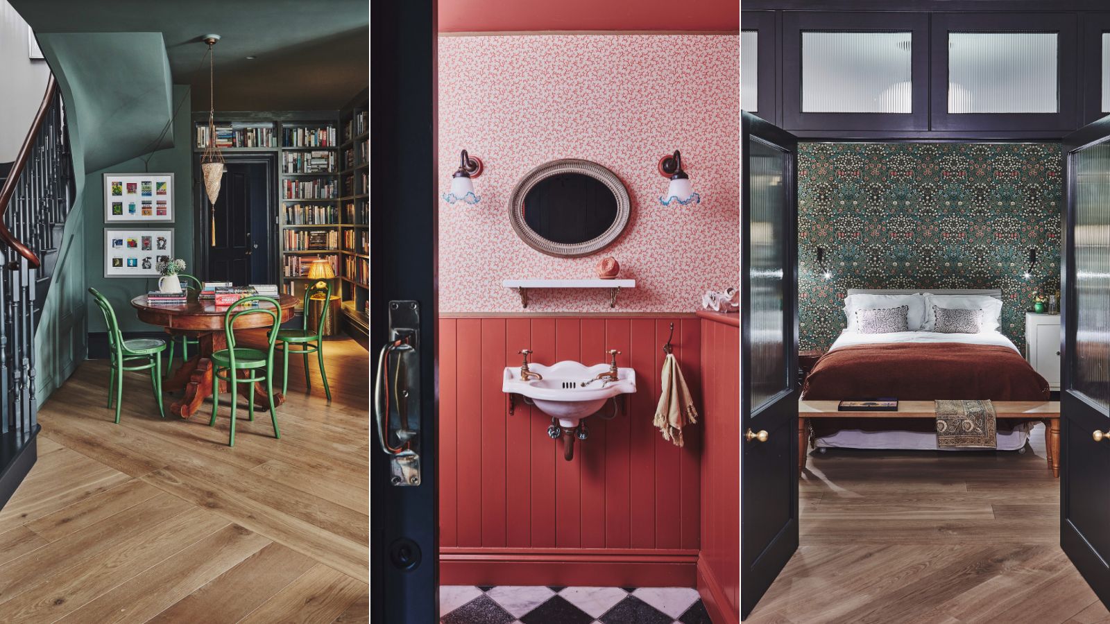
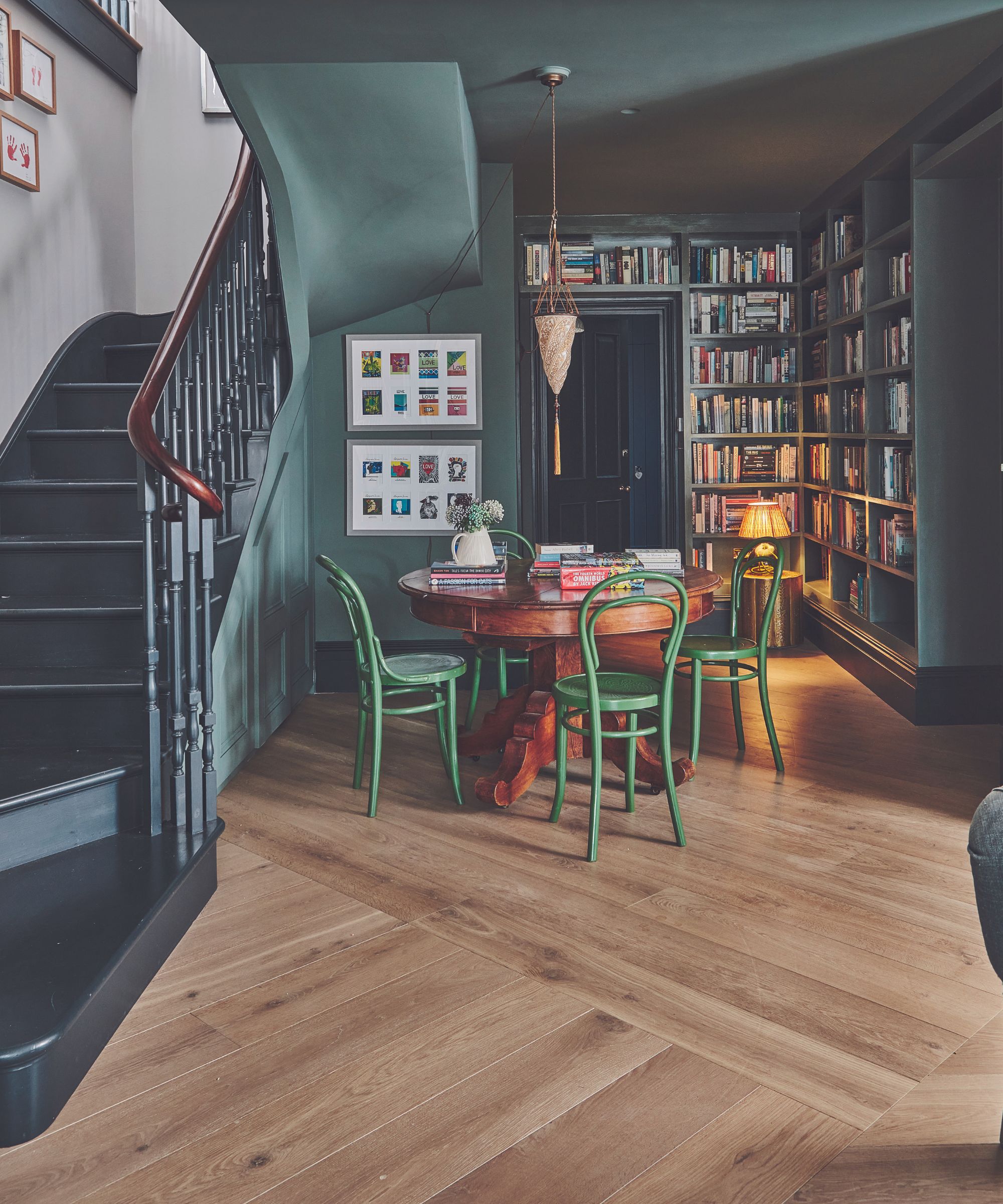
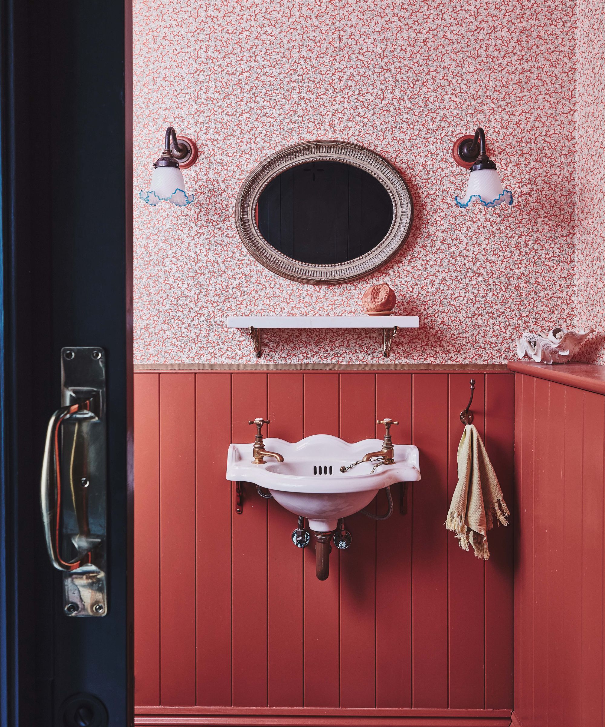
The house had previously been decorated in neutrals, but for its new manifestation, the owner felt emboldened to try richer hues. ‘She was keen to introduce color and warmth and has a lot of pieces from flea markets that we designed joinery around,’ says Jennifer. ‘We aimed for more variation from room to room with dark window and door frames creating a period look. We used Farrow & Ball’s Green Smoke and Railings for these accent colors.’
The lower-ground floor itself has been transformed into a vast, light-filled space for leisure and relaxation. A library area greets visitors with floor-to-ceiling bookshelves, opening into the sitting room with inviting sofas backed by pages of the famous Rocque Plan of London from 1746.
‘The guest suite remains in its old location, but it’s away from a window so we designed a reeded glass screen and sliding doors for privacy and connectivity,’ explains Jennifer. From lost to found, the newly configured basement has breathed life into the home from the ground up.
Meet the designer
Jennifer Hamilton shares her style inspiration
SMALL CHANGE, BIG IMPACT
Opening up the entrance to the kitchen to enable it to work with the dining room.
INSPIRATION
I get design inspiration through travel and visiting National Trust properties and stately homes – and that is a much-loved way to spend a weekend.
FAVOURITE BUILDING
I love the Royal Pavilion in Brighton – it is so over the top and opulent. We often draw from the maximalist style and then simplify it.
LAST PIECE OF ART YOU BOUGHT
A pencil drawing of the New York skyline acquired on a recent trip there.
CAN’T LIVE WITHOUT
Nice brunches at the weekend.
SECRET ADDRESS
We love Ardingly Antiques Fair and the whole town of Midhurst is great for vintage finds.
WORDS TO LIVE BY
Look at all the options available to you so that, at the end, you can be sure why you didn’t choose something else.