Color and pattern have transformed this family home from bland to beautiful
Designer Elizabeth Hay has brought together enticing pattern and color with more traditional elements in this Singaporean house

Design expertise in your inbox – from inspiring decorating ideas and beautiful celebrity homes to practical gardening advice and shopping round-ups.
You are now subscribed
Your newsletter sign-up was successful
Want to add more newsletters?
As an interior designer, the talented Elizabeth Hay is always looking to craft spaces full of individuality. And that certainly was the brief – and challenge – with this home built in the 1980s in Singapore.
‘It was a bland building and the biggest difficulty was introducing architectural interest,’ says Elizabeth. The clients, two busy doctors with young sons, were keen for their home to have character, be low-maintenance and have plenty of sociable areas.
The year-long project, resulting in one of the world's best homes, involved a full renovation of the bathrooms and kitchen and replacing uPVC windows with distinctive metal-framed ones, in addition to installing doors to match. The new windows and doors, along with a light well in the dining room, have flooded the interiors with light. Replacing the windows also made the house’s facade much more aesthetically appealing.
Article continues belowFor the decoration, Elizabeth’s aim was to introduce fresh schemes that spoke to the modern architecture, but they needed to be inviting, sumptuous and elegant, too. Known for her richly layered interiors, Elizabeth introduced carefully considered pattern throughout.
Although many of the fabrics are British, there are Eastern influences in the furniture and flooring. Elizabeth has incorporated rattan furniture, occasionally in a bold shade, while woven bamboo, silk and hemp rugs add a luxurious touch. This home is certainly one that blends Eastern and Western elements successfully.
Living room
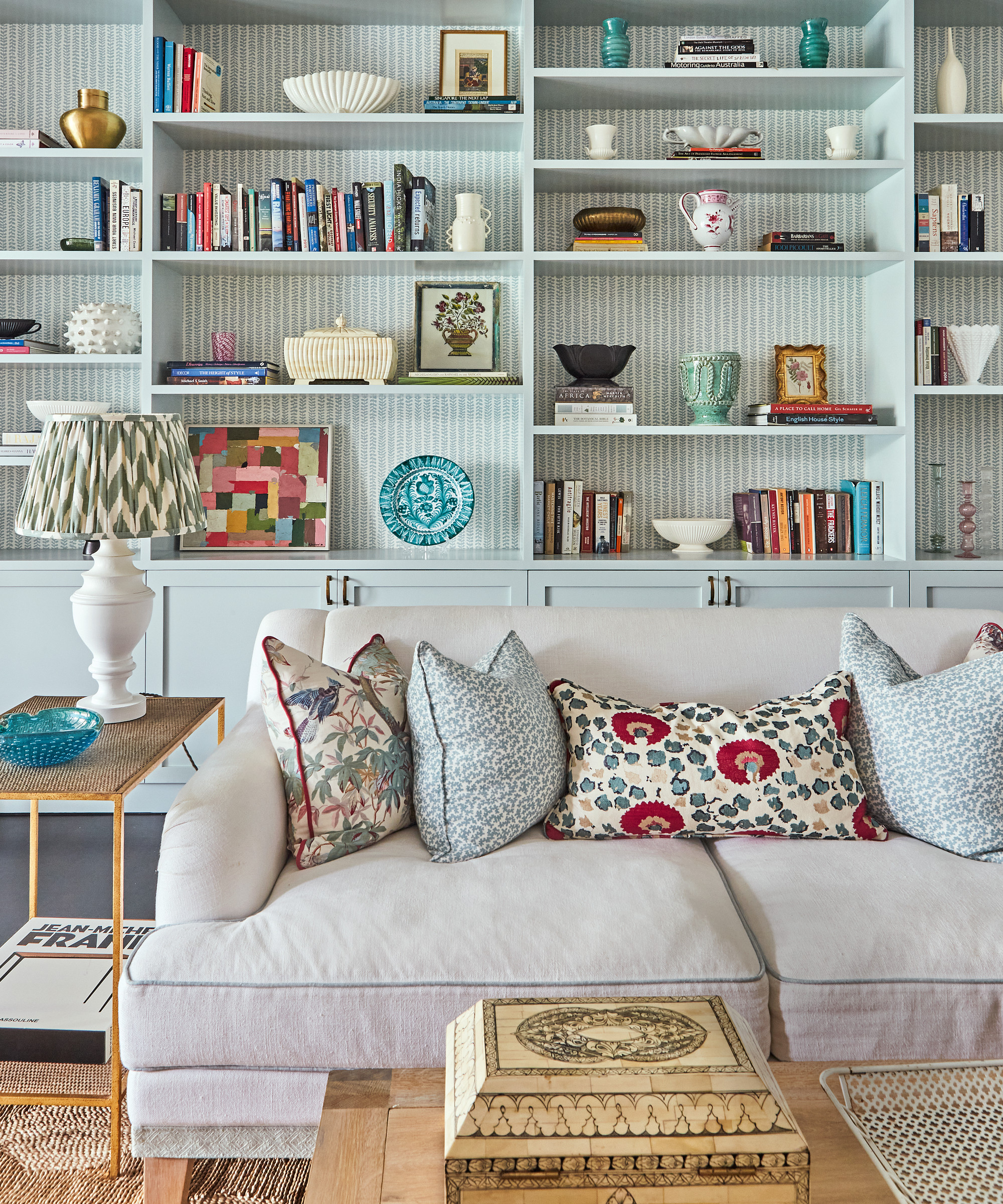
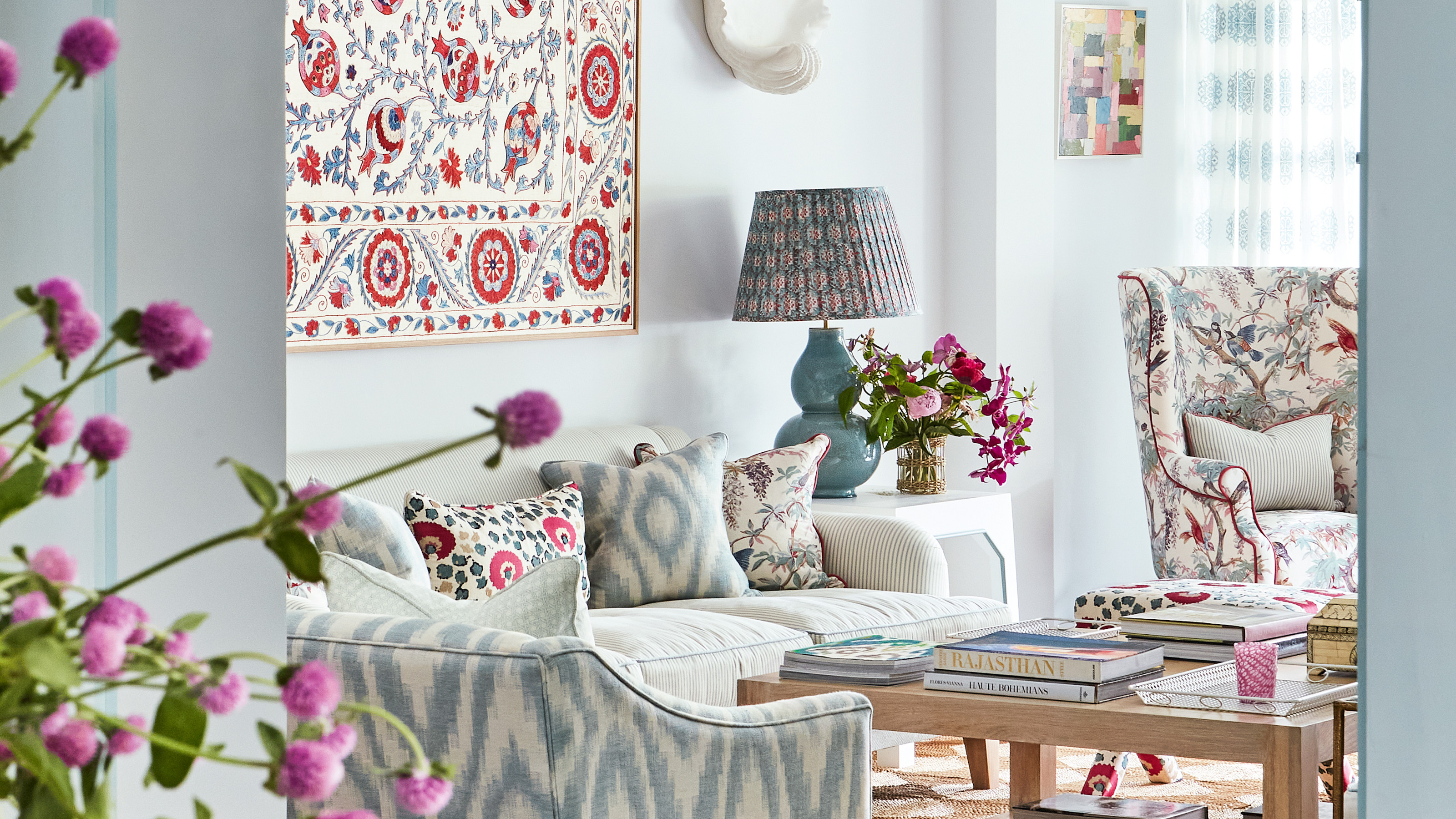
The living room undoubtedly sets the tone. With no entrance hall (they are quite rare in Singapore), it is the first space entered so it needed to be impactful.
‘The clients asked for the living areas to be in a soft palette but still full of life, with color and pattern,’ says Elizabeth.
Design expertise in your inbox – from inspiring decorating ideas and beautiful celebrity homes to practical gardening advice and shopping round-ups.
Living room ideas include introducing a neutral backdrop to enable all of the exuberant designs to sing out, while bespoke blue cabinetry, with a delicately patterned wallpaper inset, injects architectural interest and weaves in another layer.
‘We needed the space to be light and airy but with pops of color and still feel cozy at the same time. It’s homely and layered,’ says Elizabeth.
The layout of the furniture required careful consideration. ‘It’s quite a big room and there needed to be a walkway between the sofa and the bookcase,’ says Elizabeth.
Vietnamese grass mats on the floor are practical as they’re made up of squares so one can easily be replaced if there’s a spillage.
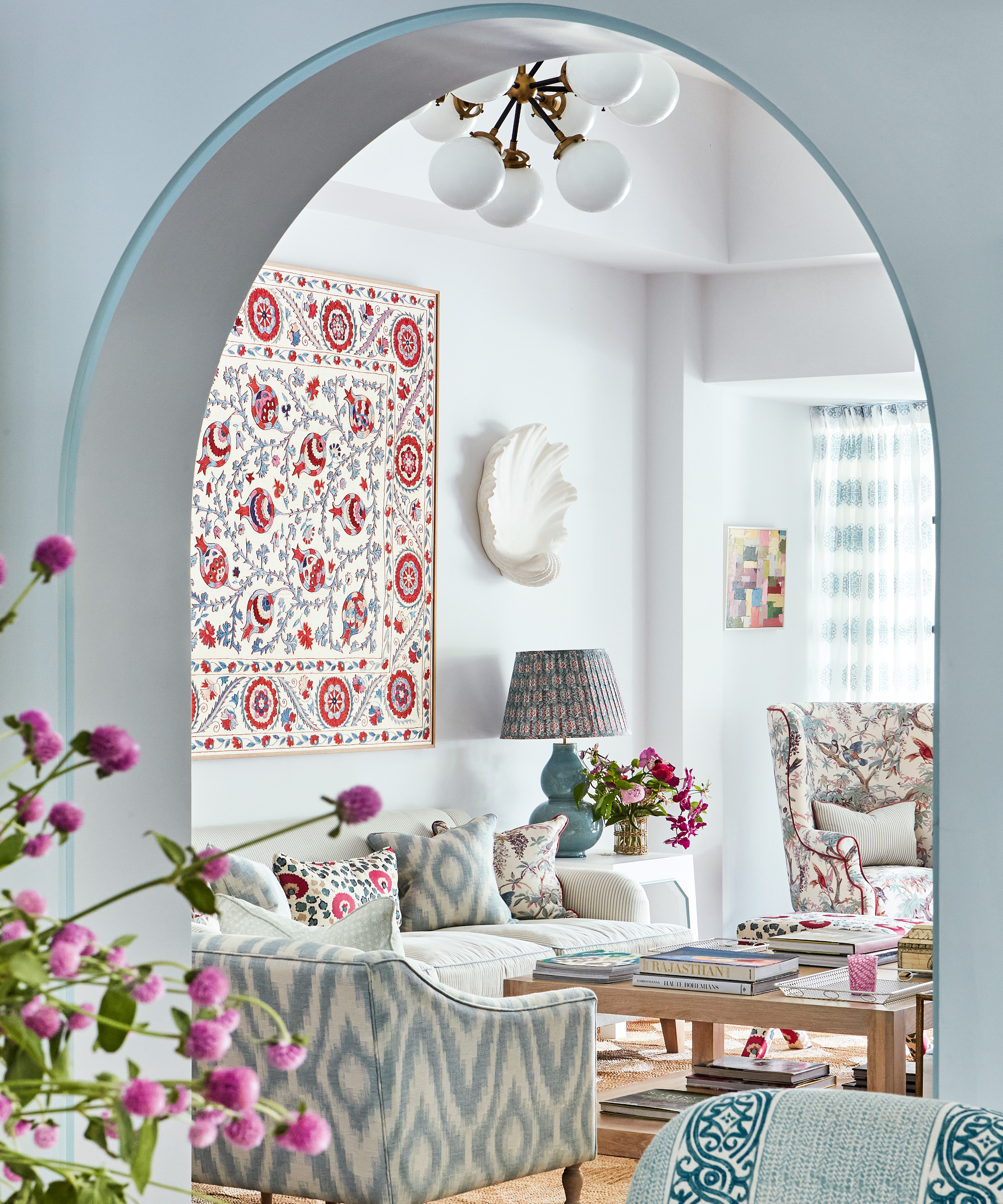
Many of the schemes are built around a hero fabric complemented by co-ordinating colors, and this was the case in the living room where the starting point was a silk suzani used for a wall hanging. Elizabeth showed it to the client and she loved it. Elizabeth then focused on the soft furnishings with a play on patterns and an abundance of trimmings.
Plentiful seating is provided by two large sofas plus additional armchairs and stools. ‘The clients are sociable and have lots of visitors so it needed to be a convivial space,’ says Elizabeth.
Further architectural interest was introduced throughout the house with cornicing and skirting. Sliding doors between the living room and dining room were removed and an archway added to create a striking detail. ‘It draws the eye through,’ says Elizabeth.
Kitchen
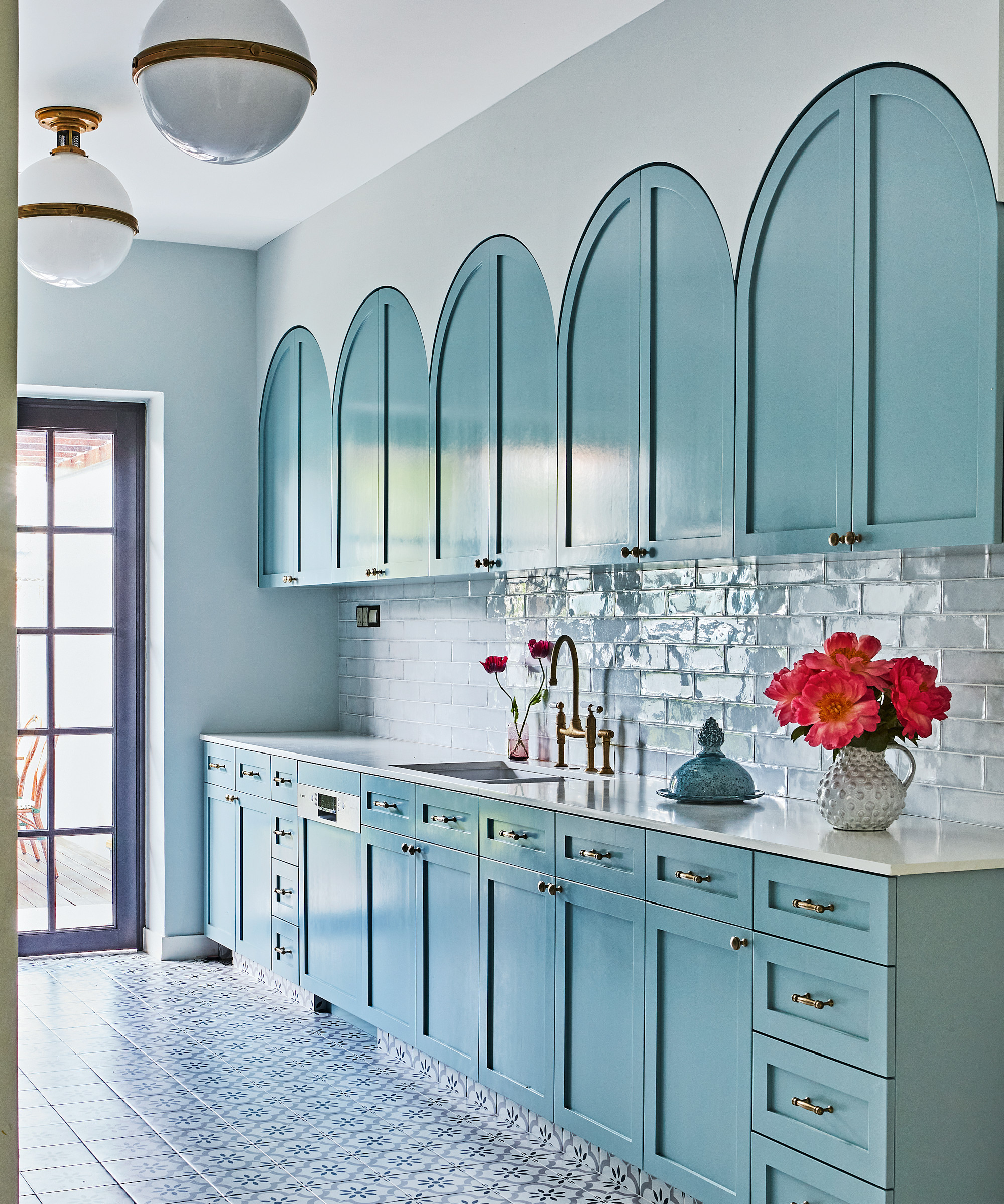
Kitchen ideas include the clever repetition of the arch motif where decorative and shapely cupboard tops form an eye-catching feature. The arched cabinets are in an elegant eau de Nil tone that is found throughout the house for a sense of flow.
The simple metro wall tiles tie in with the bistro-look lighting and the striking patterned flooring matches the arched cabinets’ whimsical aesthetic.
TV room
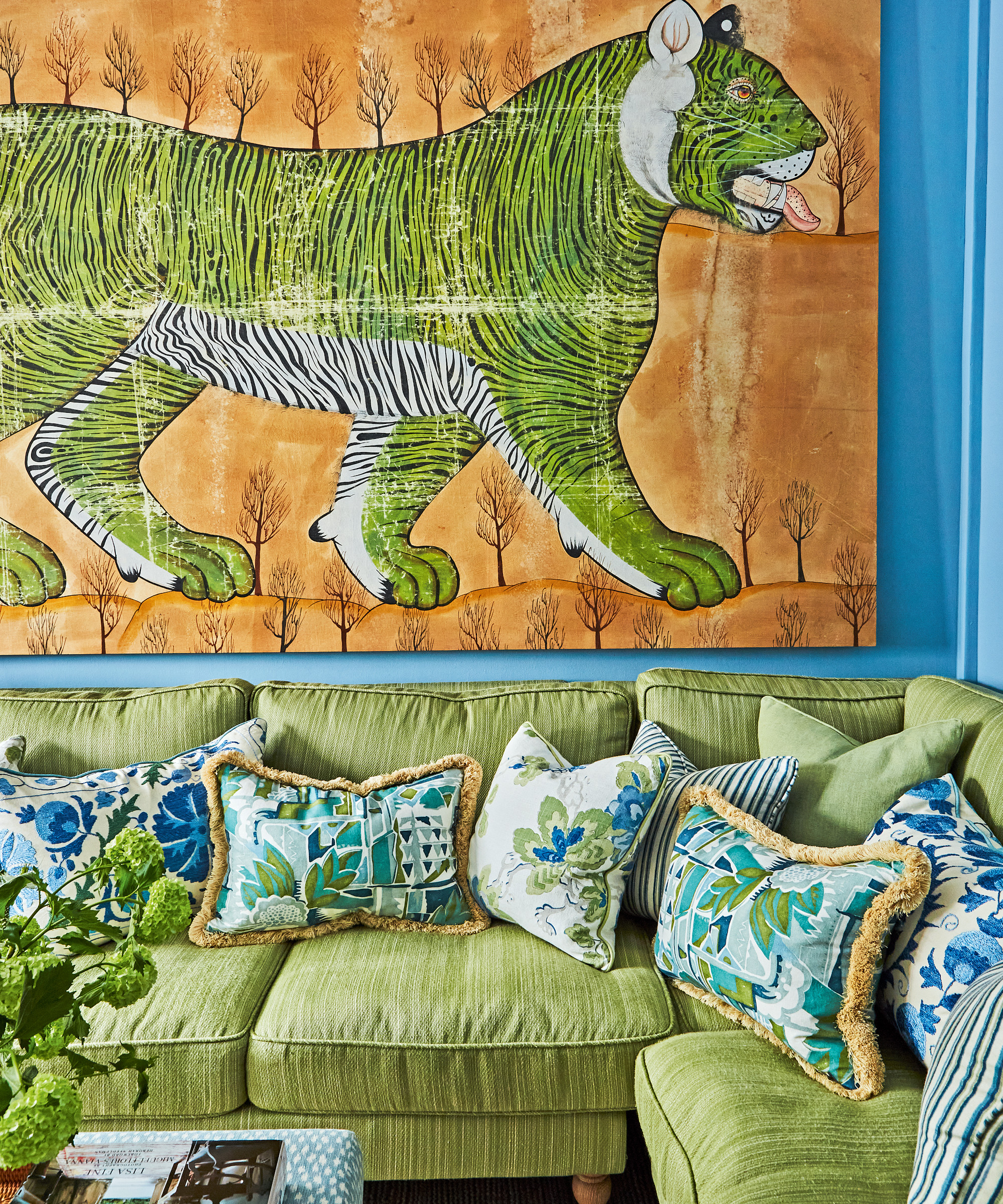
Elizabeth built the scheme in the TV room around the blue and green cushion fabrics. The tiger batik dates from the 1970s. ‘I couldn’t believe how perfectly it went with the room,’ she says.
Landing
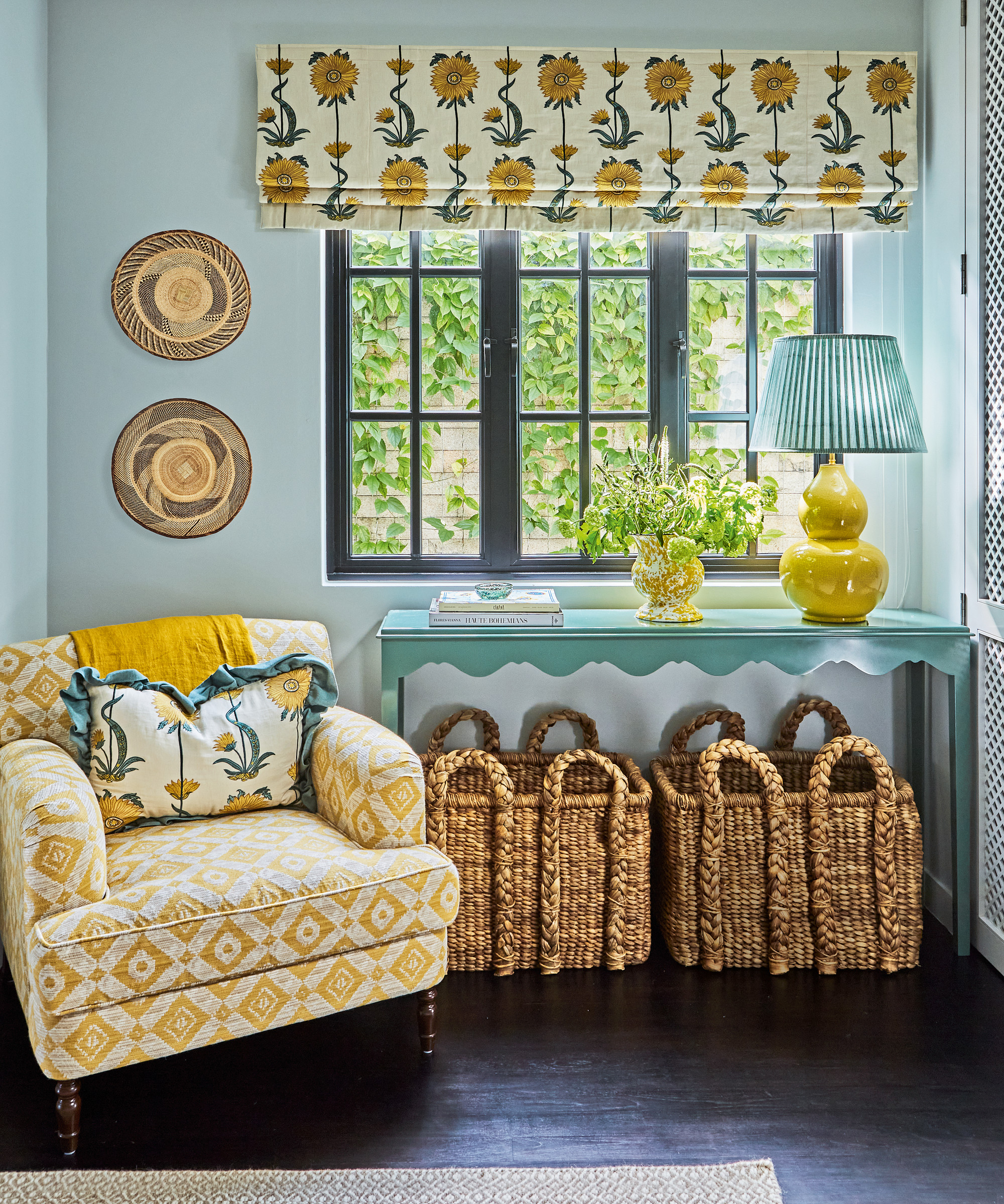
‘This big space was sparse and I wanted it to feel cozy and to add warmth,’ says Elizabeth. ‘There’s no bold yellow anywhere else but it feels cohesive here as you reach the space from green and blue rooms so it doesn’t feel too jumpy.’
Hallway ideas include introducing a comfy yellow armchair to create a homey reading nook.
Main bedroom
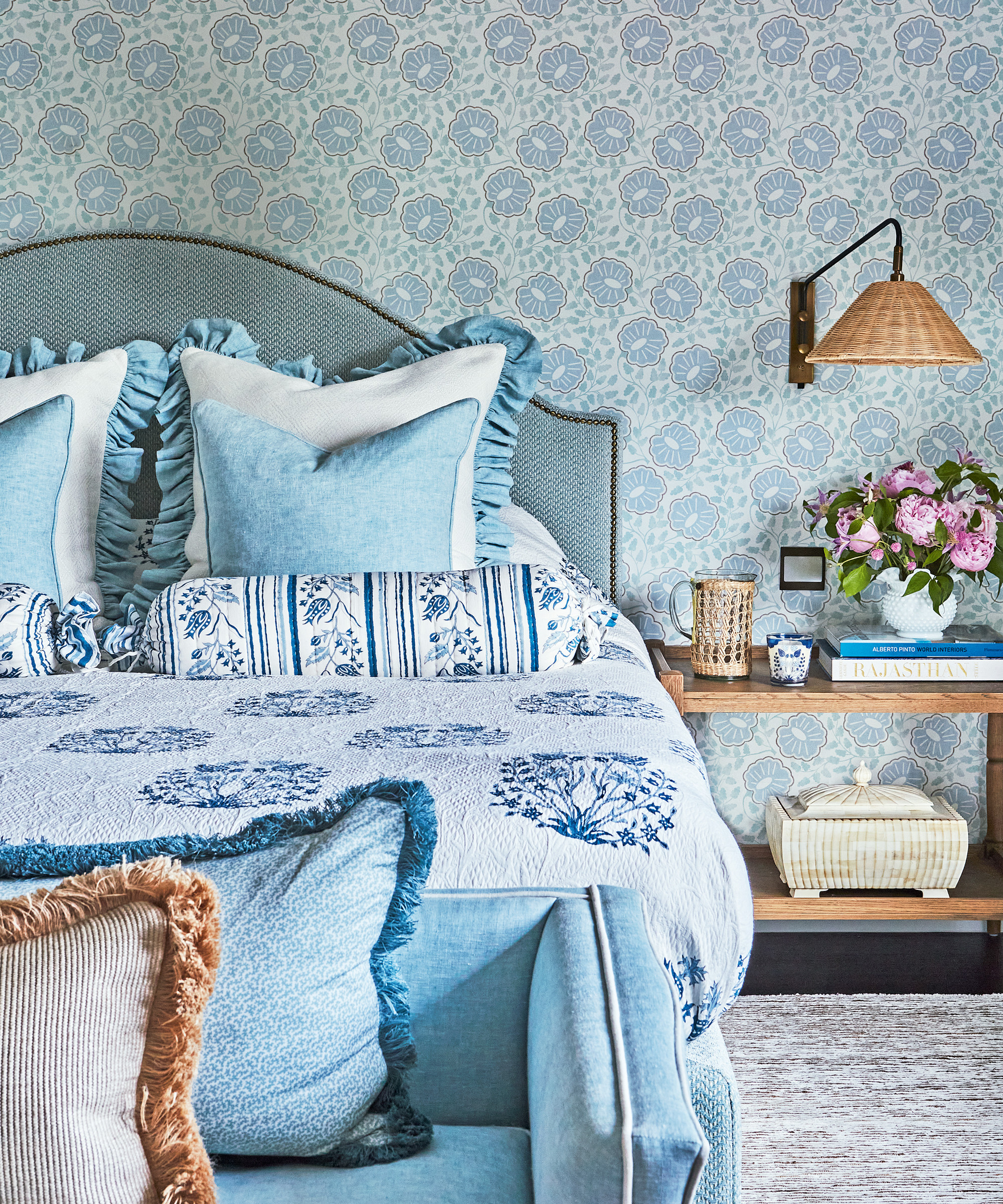
There's a sense of pure luxury in this space. Among the bedroom ideas to enhance the ambience were the introduction of a low sofa – the perfect bed companion – as well as sumptuous fabrics and cushions with trims.
Dressing room
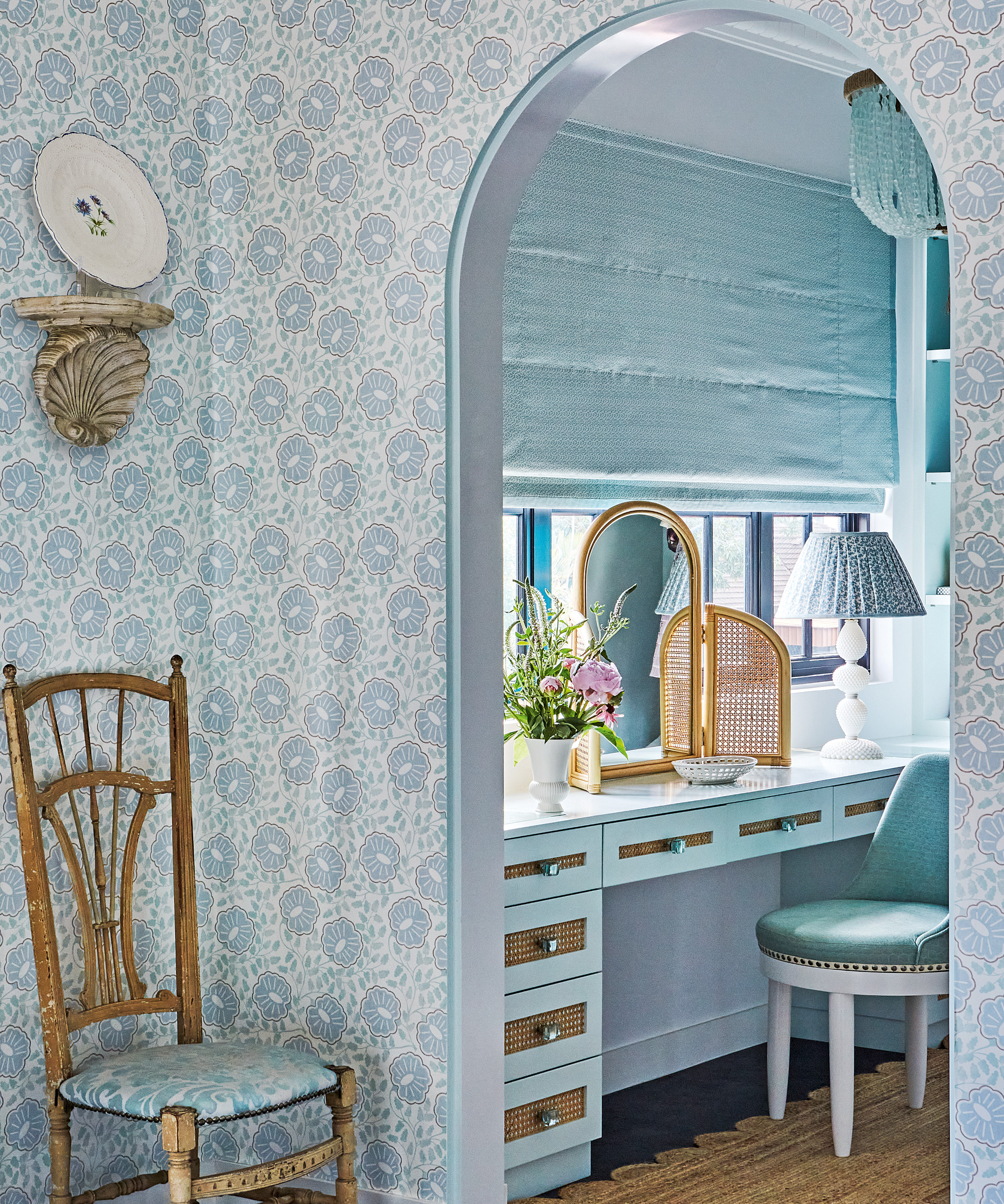
Wicker pieces and details introduce a welcome helping of texture in the dressing room.
Boys' bedroom
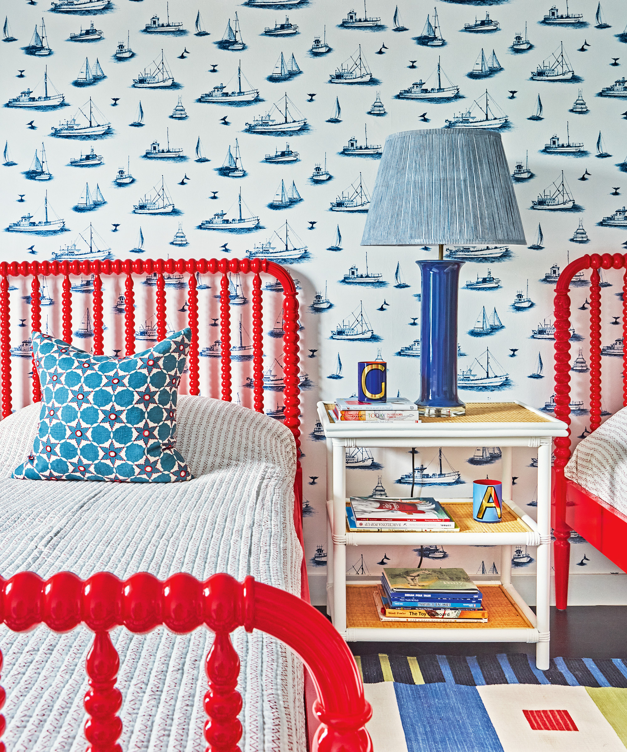
In the boys' bedroom, the blue and red palette has a wonderful jaunty feel, while the boat motif wallpaper injects a whimsical touch.
Playroom
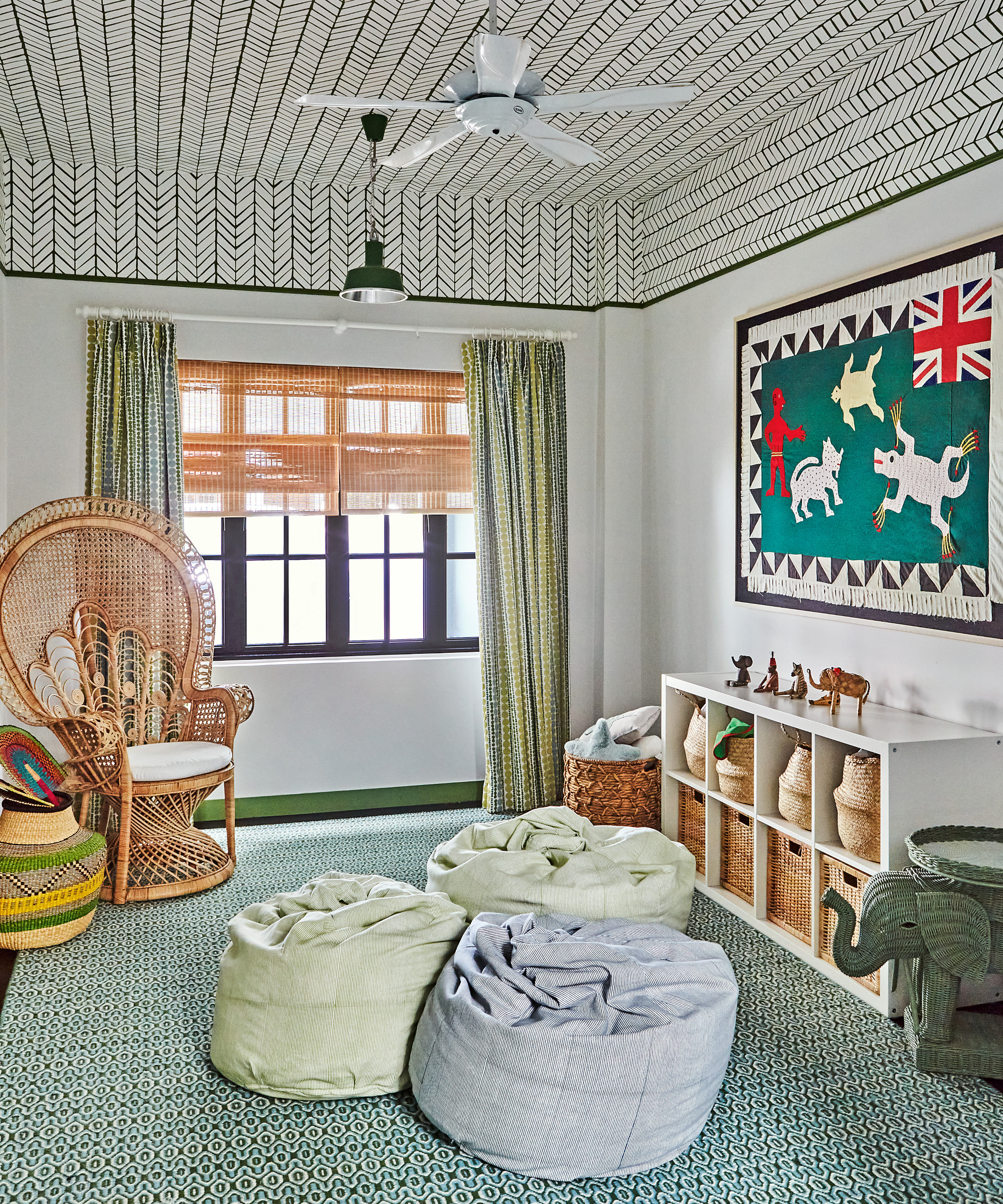
Elizabeth didn’t want to paper the walls in the playroom so instead chose to paper the ceiling down to the picture rail and incorporated the same green shade on the rail and skirting, with toning curtains and beanbags.
Interior design/ Elizabeth Hay
Photographs/ Alecia Neo

Interiors have always been Vivienne's passion – from bold and bright to Scandi white. After studying at Leeds University, she worked at the Financial Times, before moving to Radio Times. She did an interior design course and then worked for Homes & Gardens, Country Living and House Beautiful. Vivienne’s always enjoyed reader homes and loves to spot a house she knows is perfect for a magazine (she has even knocked on the doors of houses with curb appeal!), so she became a houses editor, commissioning reader homes, writing features and styling and art directing photo shoots. She worked on Country Homes & Interiors for 15 years, before returning to Homes & Gardens as houses editor four years ago.