Creating elegant coastal interiors in an open-plan space – this pied à terre gets it right
Calm, elegant and contemporary coastal interiors lend a sense of space to this smart apartment with stunning city views
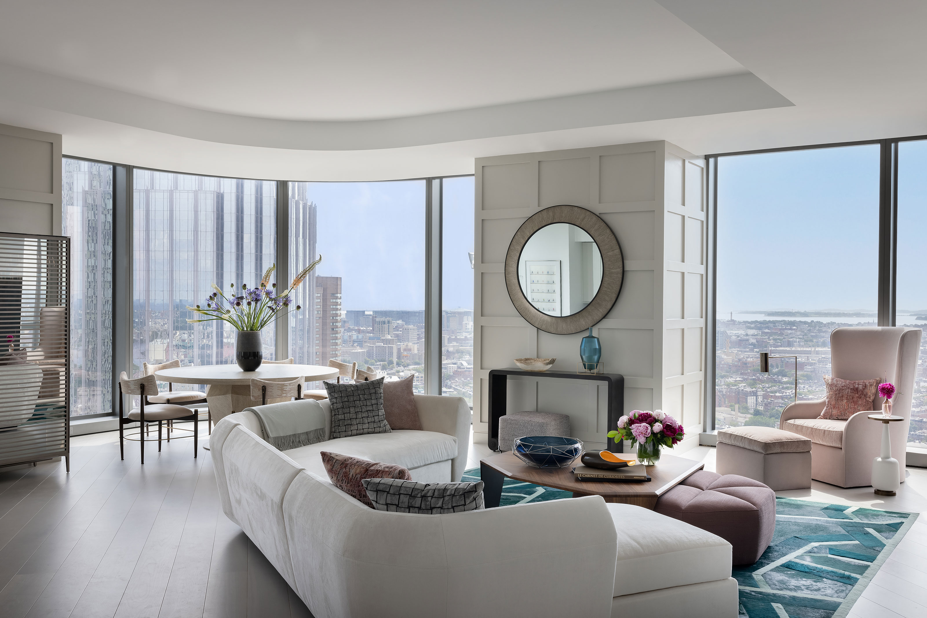
One of the first things that strikes you about this two-bedroom, two-bathroom apartment in a newly constructed high rise in Boston, Massachusetts, is its breathtaking view. From this light space on the 34th floor you can see right across the city to Boston’s Back Bay. That view alone makes this one of the world's best homes, but factor in its recent redesign with calm, elegant interiors, and the apartment really becomes something special.
The owners use it as a second home, to be near to their grown-up children, and called on the services of design duo Vernon Applegate & Gioi Tran of Applegate Tran Interiors to help them make the most of the new space. The owners wanted to combine the laid-back sensibility of California design (open spaces, light filled, casual but elegant) married with some of the classic elements of the Boston and New England aesthetic. They wanted to incorporate playful but elegant touches that would serve as a foundation for when the family of four (plus the kids' significant others) relax, hang out, cook, eat and rest.
The owners have worked with San Francisco-based Applegate Tran on three previous projects, forming a tight-knit team who understand how to get the best results.
Living-diner with a view
The apartment's main living space is open plan. So the 'great room' combines the living, dining kitchen and breakfast spaces. As this is a new construction, certain materials and finishes were inherited from the developer. Vernon and Gioi replaced the flooring with wide plank oak laid out diagonally, which draws you into the heart of the main space.
The owners were looking to create a coastal, vacation like aesthetic within a practical family home. With that in mind, Vernon and Gioi chose a bright and airy color scheme complemented by pale oak flooring and sprawling windows to evoke a California- chic vibe in the entire abode.
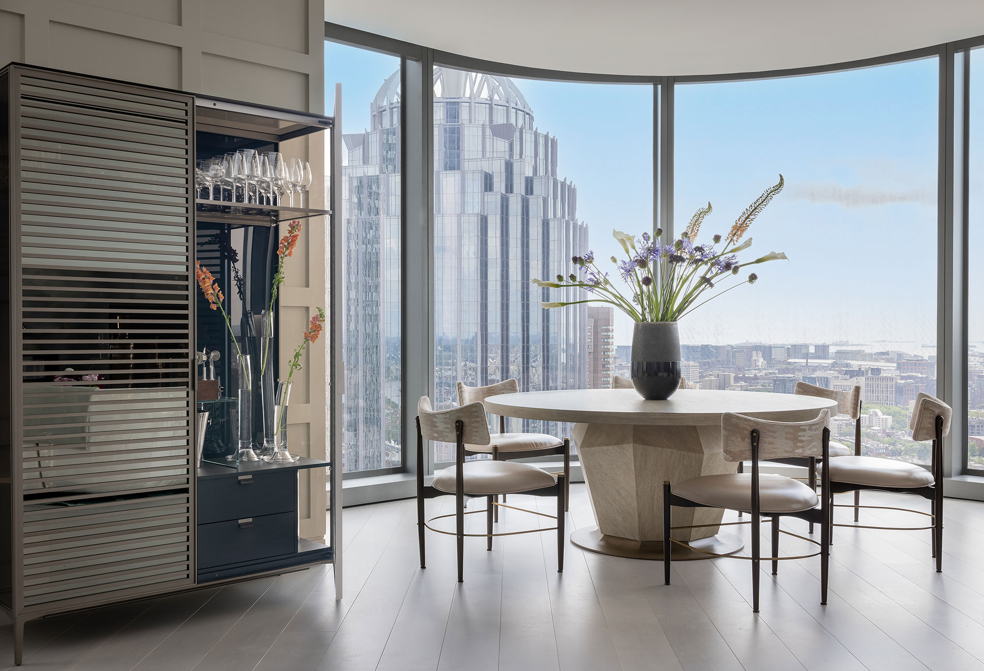
Vernon and Gioi's dining room ideas for the open-plan space focused on putting the dining table right next to the full-height windows to make the most of the magnificent views out to the bay and over the city. The table can be extended to seat eight, and the choice of a round table was part of the plan – on a practical level to save space, but also aesthetically to echo the curve of the windows. A bar unit next to the table ensures easy entertaining.
Key pieces include: table from Robert James Collection (Partridge SF); chairs by Mr. Brown London (Witford SF); bar cabinet from Rimadesio (Nido SF)
Kitchen
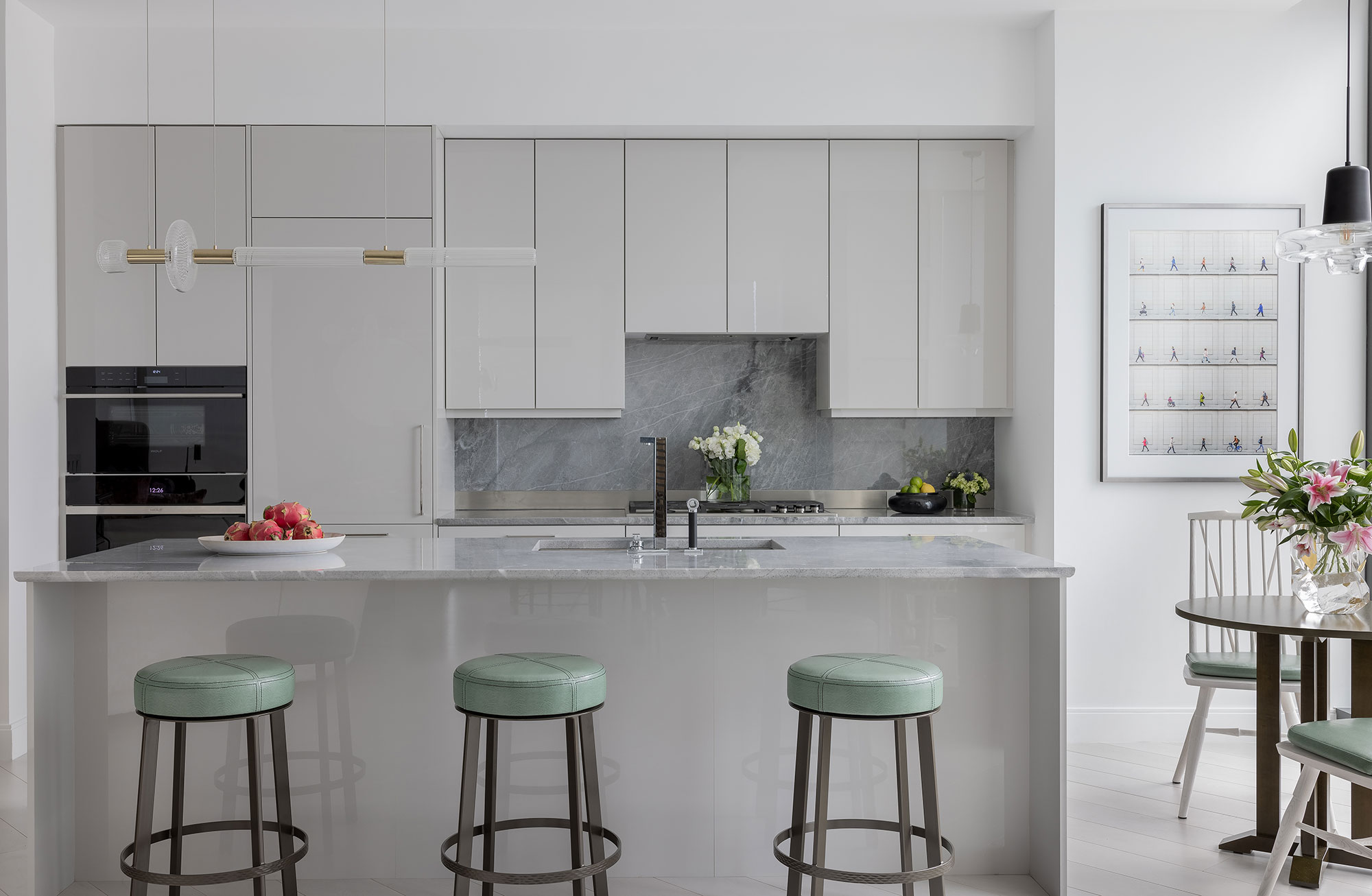
Kitchen ideas included extending and repainting the island and cabinets in a high gloss finish, as well as adding a new stone counter top and backsplash. The pale stone colors combined with a soft sea green are inspired by ocean shades to give the coastal look the homeowners wanted. Since the kitchen is open plan and on view to the main living area it was important to have sufficient storage space to keep things tidy. The kitchen is by Siematic with Sterling Grey high gloss SimiLaque finish; marble counter top is Blue De Savoie; Wolf range cooker; Sub Zero fridge; and Dornbracht plumbing fixtures. The leather-topped counter stools provide a pop of color and are from Berman Rosetti.
Breakfast nook

'The homeowner requested we source something from his native Rhode Island, so we discovered O+G Studio and had the breakfast room table and chairs custom made,' says Vernon. 'It’s the perfect nook for morning coffee, afternoon tea or simply to sit and gaze out onto the Back Bay.' The striking light fixture above the table is by Lasvit.
Entry hall
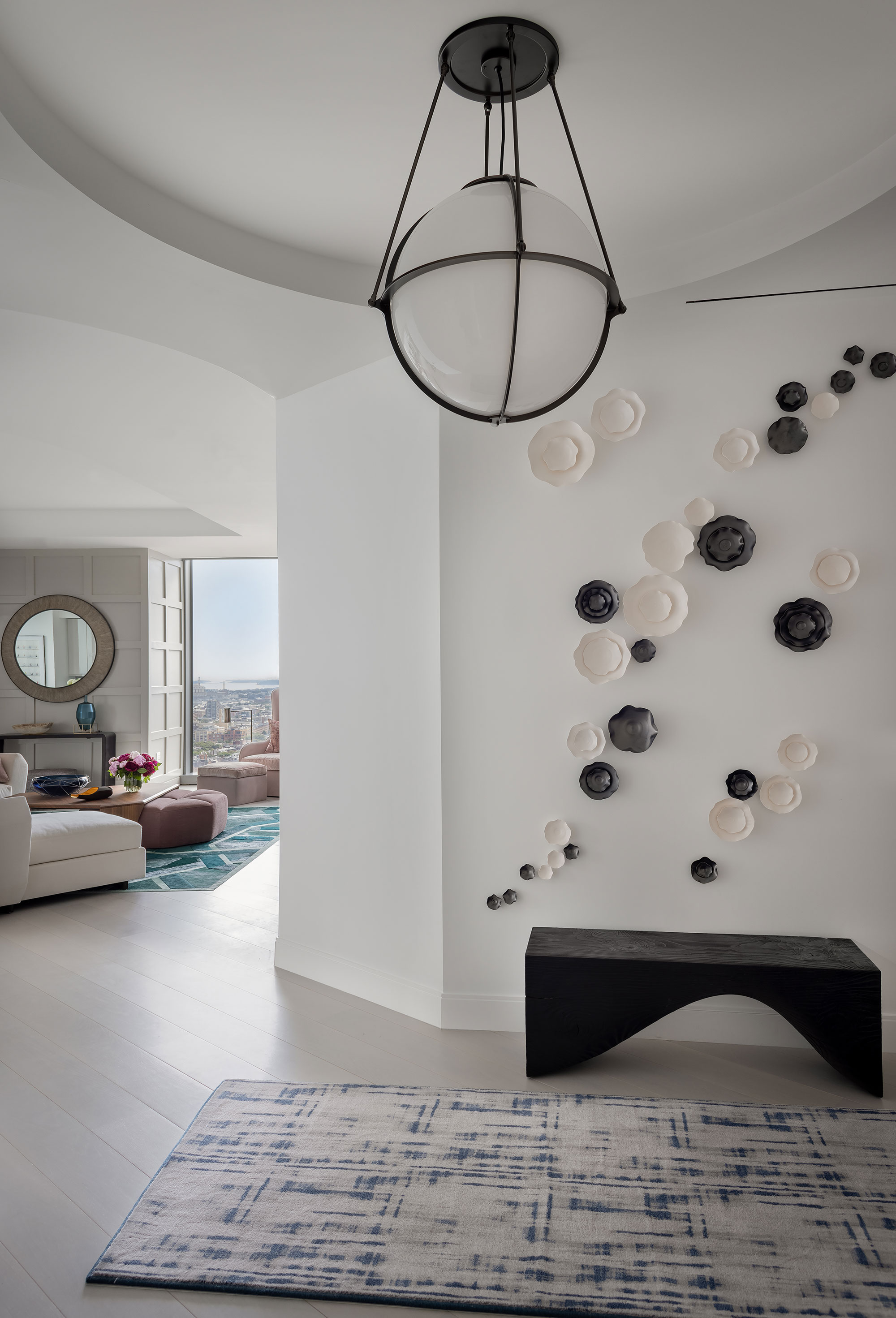
What could be more welcoming than a wide, open-plan entry hall that allows you to see right into the home's reception area. Hallway ideas include the new wide oak flooring, laid diagonally specifically to add direction into the main space and heart of the home. The entry hall proved the ideal space for a striking monochrome wall-mounted ceramic installation by Elizabeth Strasser. The runner is by Stark Carpets and the huge globe ceiling light is from Boyd Lighting.
Living room

Living room ideas successfully blend a California-style open and airy aesthetic with a soft color palette that evokes a coastal location. Applegate Tran suggested adding custom board and batten on both structural walls for texture, and warmed up the space to make it feel more residential, casual, coastal and welcoming. Fully automated black-out, and sheer roller shades hidden in pockets can be drawn when the family sits on the extra-large Juin Ho sectional sofa to watch TV.
'The open living room is our favorite space,' says designer Vernon Applegate. 'the accessibility of the kitchen, bar, and dining areas makes it the perfect space to entertain. You can watch a movie, have a fun family game night, or simply host a cocktail party. With so many distinct zones that work effortlessly together, this heart of the home is truly everyone’s favorite space.'
Among the room's key pieces are a rug from Kyle Bunting; wing chair and ottoman by Holly Hunt in Jane Churchill Fabric; pillows in Cowtan & Tout fabrics; mirror by Partridge, San Francisco; console from Taracea; coffee table and ottoman, Nido Living.
Primary bedroom
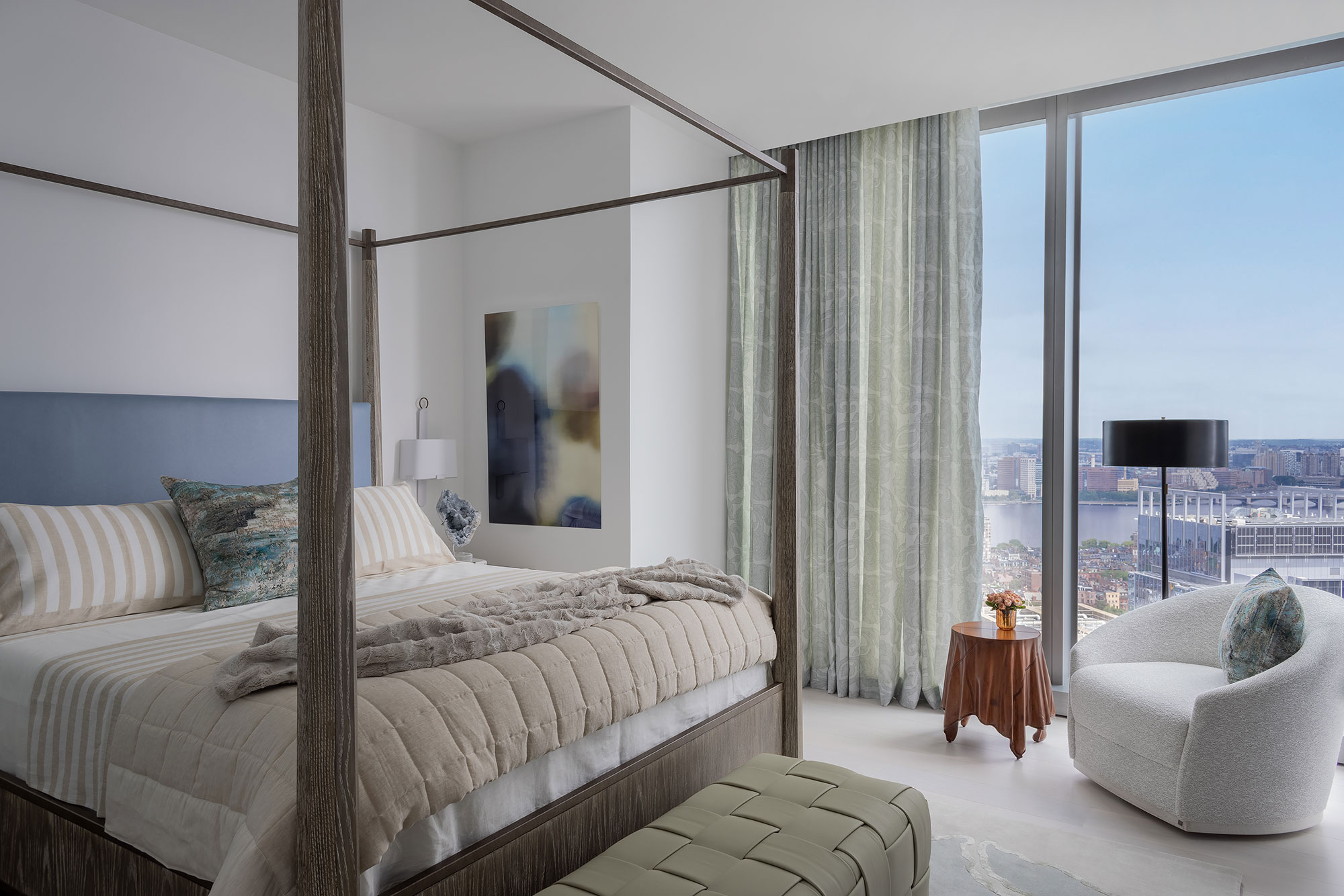
When a bedroom has full-height windows and a view like this, it makes sense to keep bedroom ideas calm and simple to ensure the view takes centre stage.
'The primary bedroom brings in a more classic coastal aesthetic with the choice of colors and materials,' explains Vernon. 'It was meant to soften the harder architectural lines of this new construction and give the space the feel of a freestanding shore house.'
Key pieces include the contemporary-style four-poster bed by Robert James Collection (Partridge SF); Curtain Fabric by Christopher Farr at DeSousa Hughes; chair by Bernhardt, covered in Holland & Sherry Fabric; drinks table by Bunny Williams Home; bench by Marcali Designs from Hewn SF; bedside lamp from Salgado Saucier; and a rug from Safar Rugs.
Guest bedroom
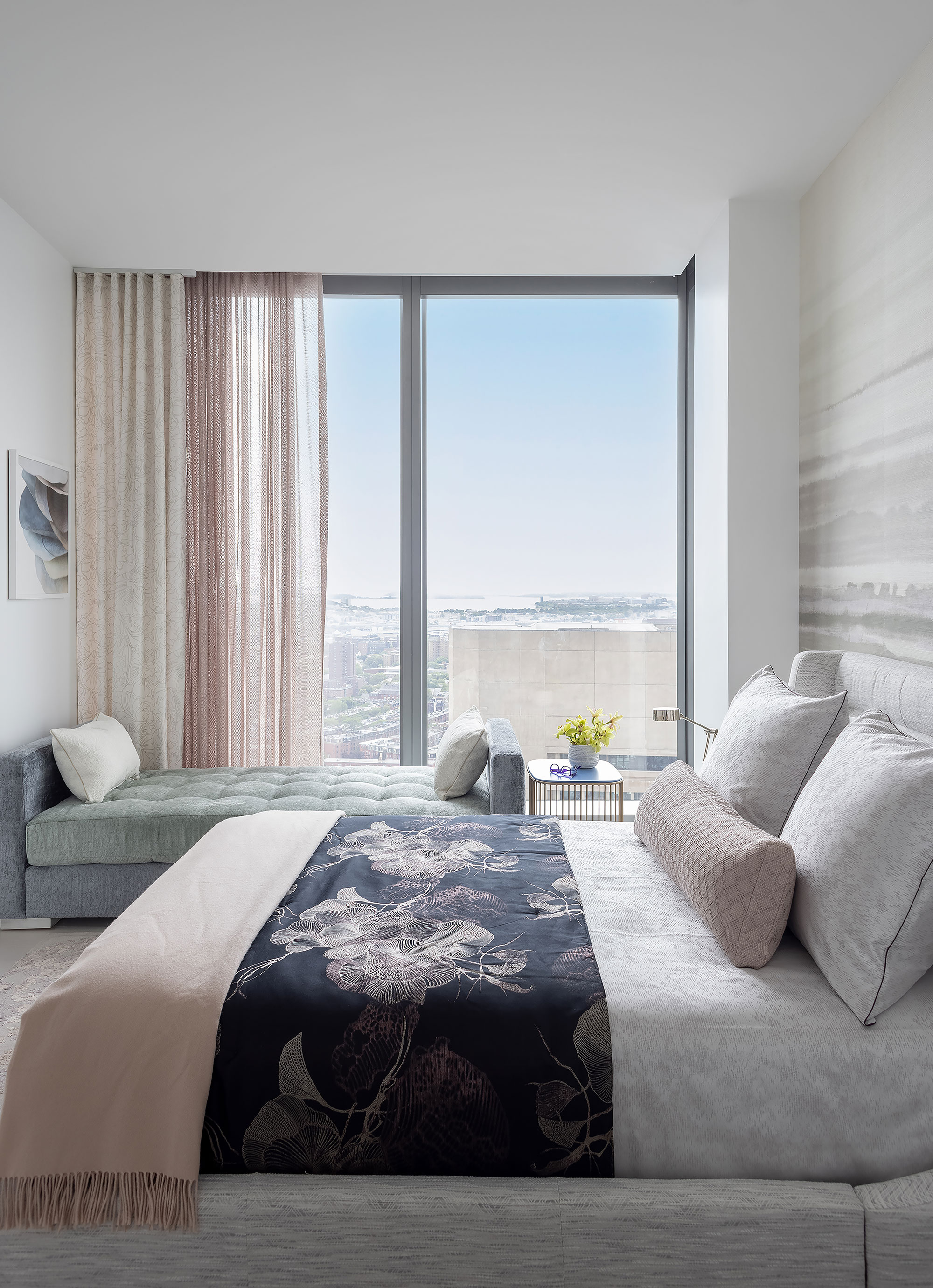
Tight on space, the guest room was designed to accommodate a daybed as an additional sleeping nook in case one of the kids' friends joins them. The pale pinks, soft greys and pale blue-green palette carries over to give this 2,200 square foot home a sense of harmony and softness and to warm up the modern architectural lines.
In this space the design team employed a layered effect on walls and windows with multiple textures to add a romantic and almost feminine touch to the clean-lined upholstery pieces.
The bed is from Ironhorse, San Francisco; daybed from Lee Industries; wallpaper on back wall, Philip Jeffries; curtain fabrics, JAB; rug from Safar Rugs .
Bathroom
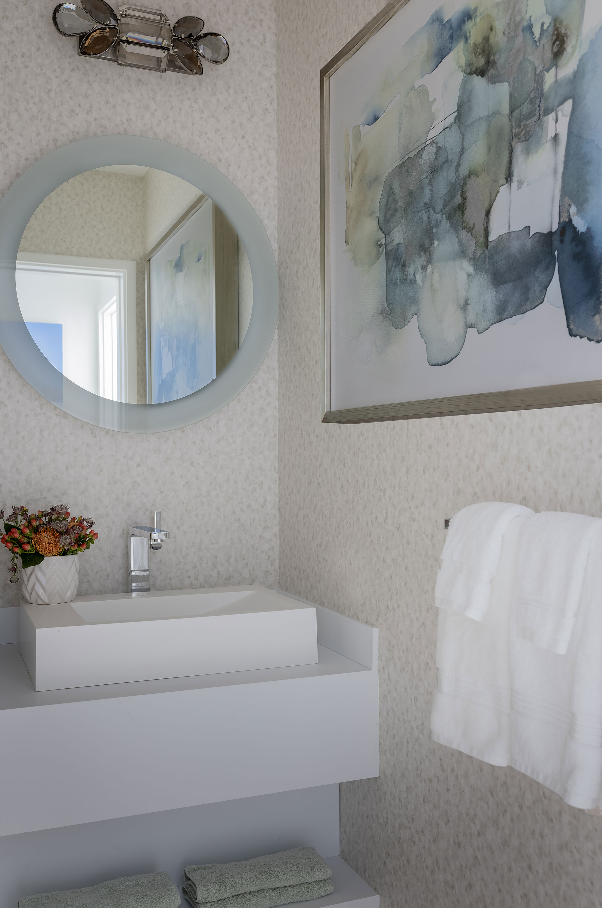
Bathroom ideas here include using wallpaper and artwork as a way of adding character and softness to what was a very utilitarian space when the owners first took on the apartment. The mirror is from Nido Living and the unusual sconce is from Circa Lighting.
The finished project
The designers and – more importantly – the homeowners are delighted with the apartment's new look. 'We knew that it was essential for us to bring the homeowner's Rhode Island roots into this project. This allowed us to have a little fun engaging with New England-based artists and makers to furnish some of the pieces we needed for the plan,' explains designer Vernon Applegate. 'The result is an elegant mix of our clients' tastes with a strong nod to New England and coastal living. The incredible views of Boston and the sea inspired the colors and textures seen throughout the apartment.'
Sign up to the Homes & Gardens newsletter
Design expertise in your inbox – from inspiring decorating ideas and beautiful celebrity homes to practical gardening advice and shopping round-ups.
Karen sources beautiful homes to feature on the Homes & Gardens website. She loves visiting historic houses in particular and working with photographers to capture all shapes and sizes of properties. Karen began her career as a sub-editor at Hi-Fi News and Record Review magazine. Her move to women’s magazines came soon after, in the shape of Living magazine, which covered cookery, fashion, beauty, homes and gardening. From Living Karen moved to Ideal Home magazine, where as deputy chief sub, then chief sub, she started to really take an interest in properties, architecture, interior design and gardening.
-
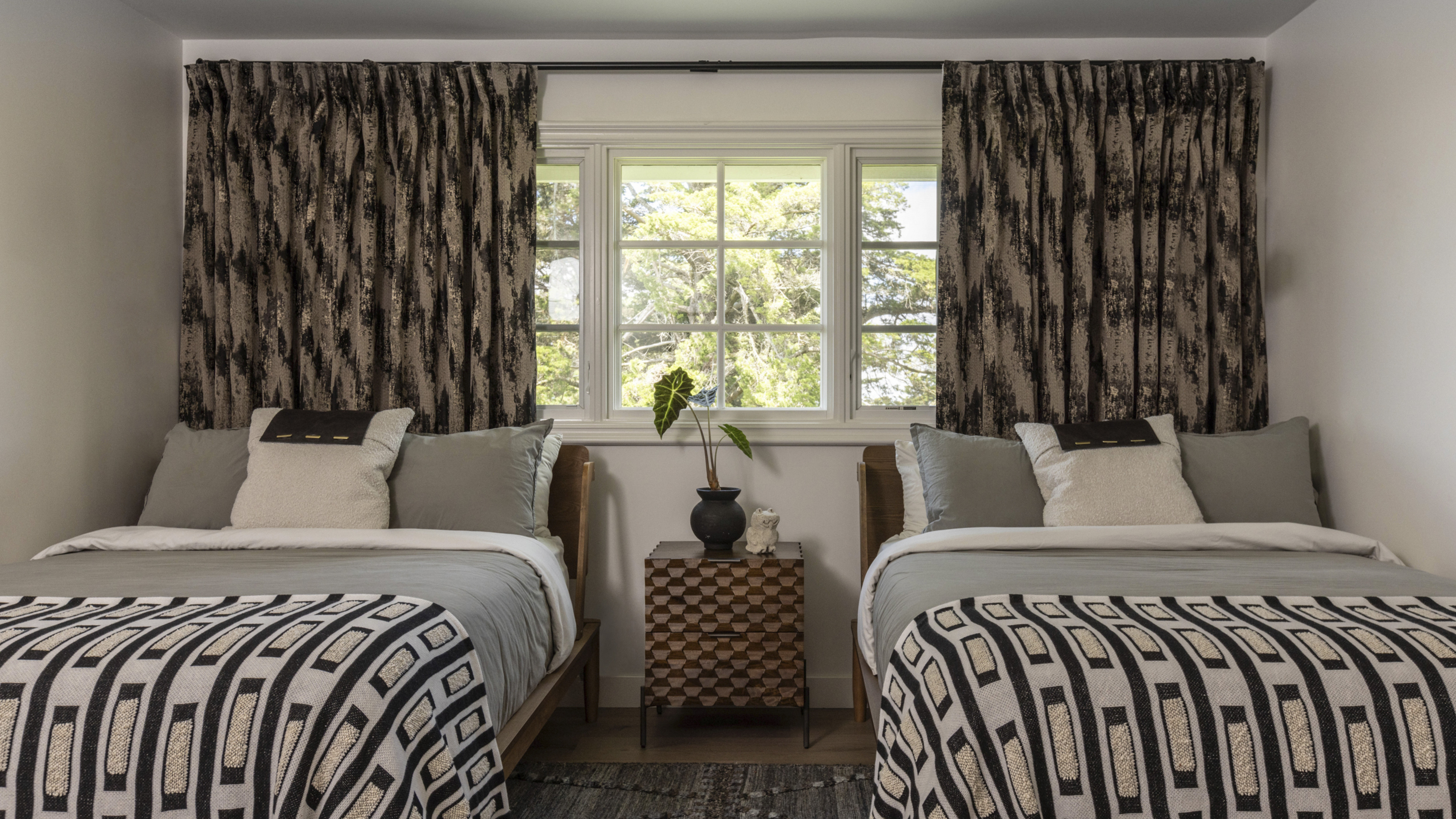 The biggest curtain trends to follow in 2025 – 8 key looks to shop that will instantly elevate your rooms
These are the colors, styles, and materials to embrace in your windows this year if you want desirable drapes, plus our favorite places to shop the trends
By Lilith Hudson
-
 Reese Witherspoon upgraded a small corner into a cozy reading nook – designers say you can replicate her 'ultimate little escape' (from $18)
'It’s all about comfort, calm, and just the right amount of cozy': You only need three things to follow Reese's example – and it's not only for book lovers
By Megan Slack