This rejuvenated period home in London feels like a country house in the city
With its imaginative mix of styles, the city home of designer Sarah Brown is a showcase for her classic-meets-modern aesthetic
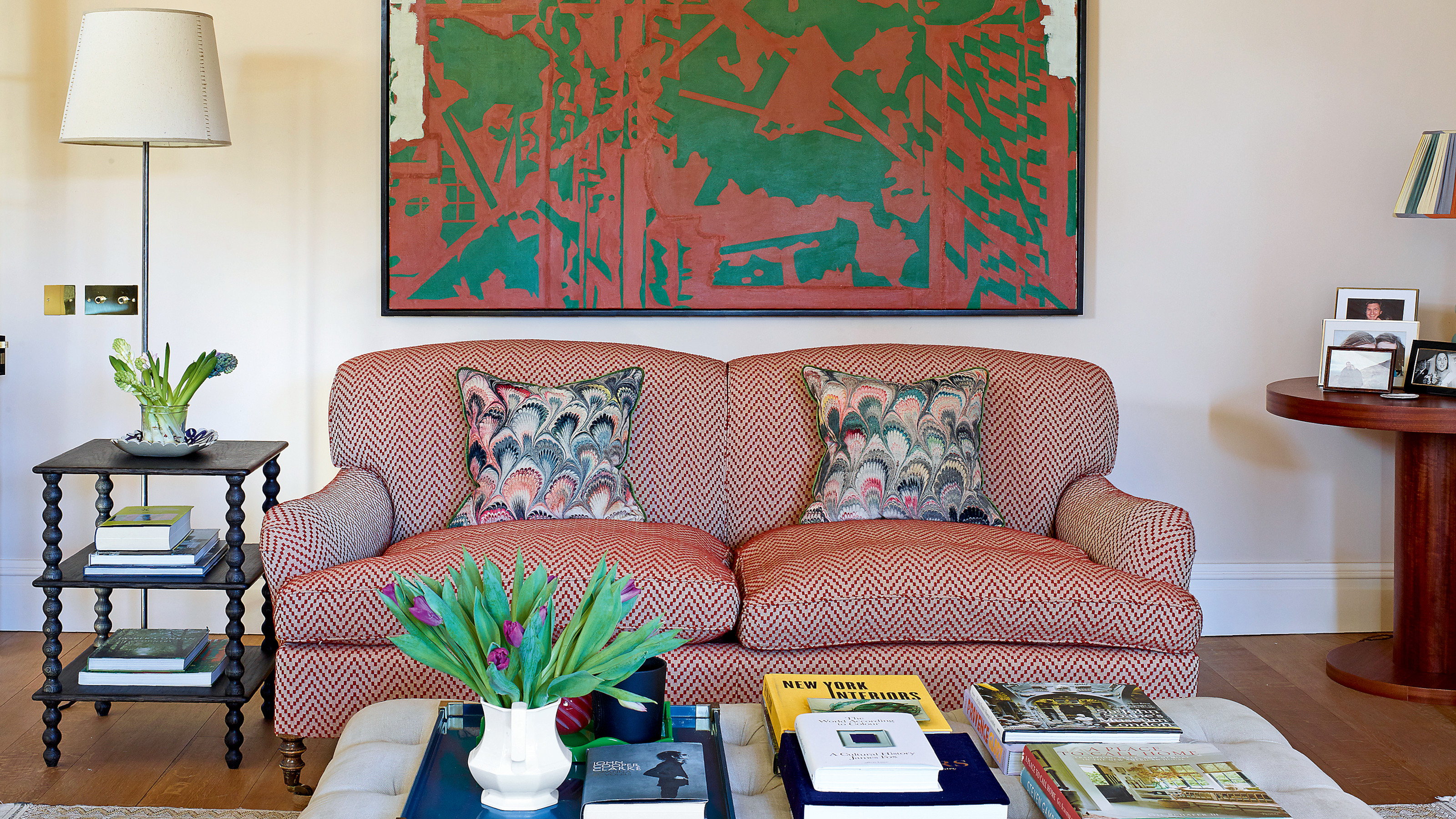

Can it ever be too late to change your career? Sarah Brown would say no. The former graphic designer spent more than a decade working in publishing before deciding it was time to fulfil her teenage dream of becoming an interior designer. A course at KLC School of Design led to work placements with Nicola Harding and Rita Konig, both doyennes of colorful interiors. Becoming ‘the oldest intern in town’ (sorting samples and doing the coffee run were part of the job) was an invaluable education in the realities of a trade often portrayed as glamorous. ‘Being creative is a small part of the business. The rest is about being organised, keeping on top of budgets and getting on with suppliers,’ says Sarah, who set up her practice in 2017.
She has put all those lessons to good use in her own home, not surprisingly one of the world's best homes, where double-fronted, light-suffused living rooms beckon from either side of the hallway, giving the feel of ‘a country house in London’.
Previous owners had hardly touched the 1901 interior, which retains its original decorative plasterwork and fireplaces, and Sarah has conserved the authentic atmosphere. New additions – including a window in the dining room, glazed glass doors that lead to the cloakroom and a capacious pantry – feel as if they have always been there. Rejuvenating the house, where Sarah lives with her husband and two daughters, has also allowed Sarah to develop a style which, she says, sits neatly between ‘classic and modern, urban and rural’. Her background in graphics has also fed into the way that she composes spaces, confidently mixing pigments with unusual antiques and pieces by British craftspeople such as Alfred Newall. ‘It’s like designing a page. I can visualise color and work out where a gap needs to be filled,’ says Sarah, who sometimes applies the ‘three-color’ approach to decorating: ‘I’ll use a deeper grounding color for the walls, mixed with a softer color and a brighter pigment to offset that.’
Hall
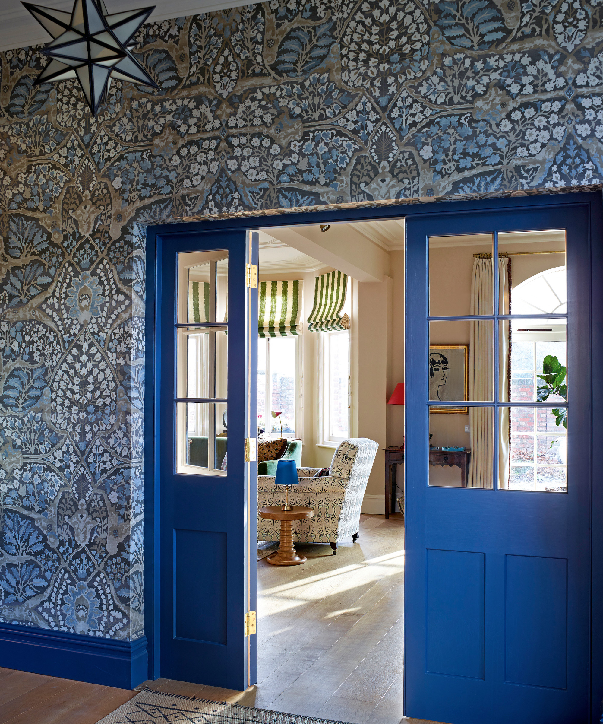
Sarah carefully considered her hallway ideas – exuberant mixing of color and pattern is calmed by subtler design choices, including pale wood flooring and a few walls in more neutral hues.
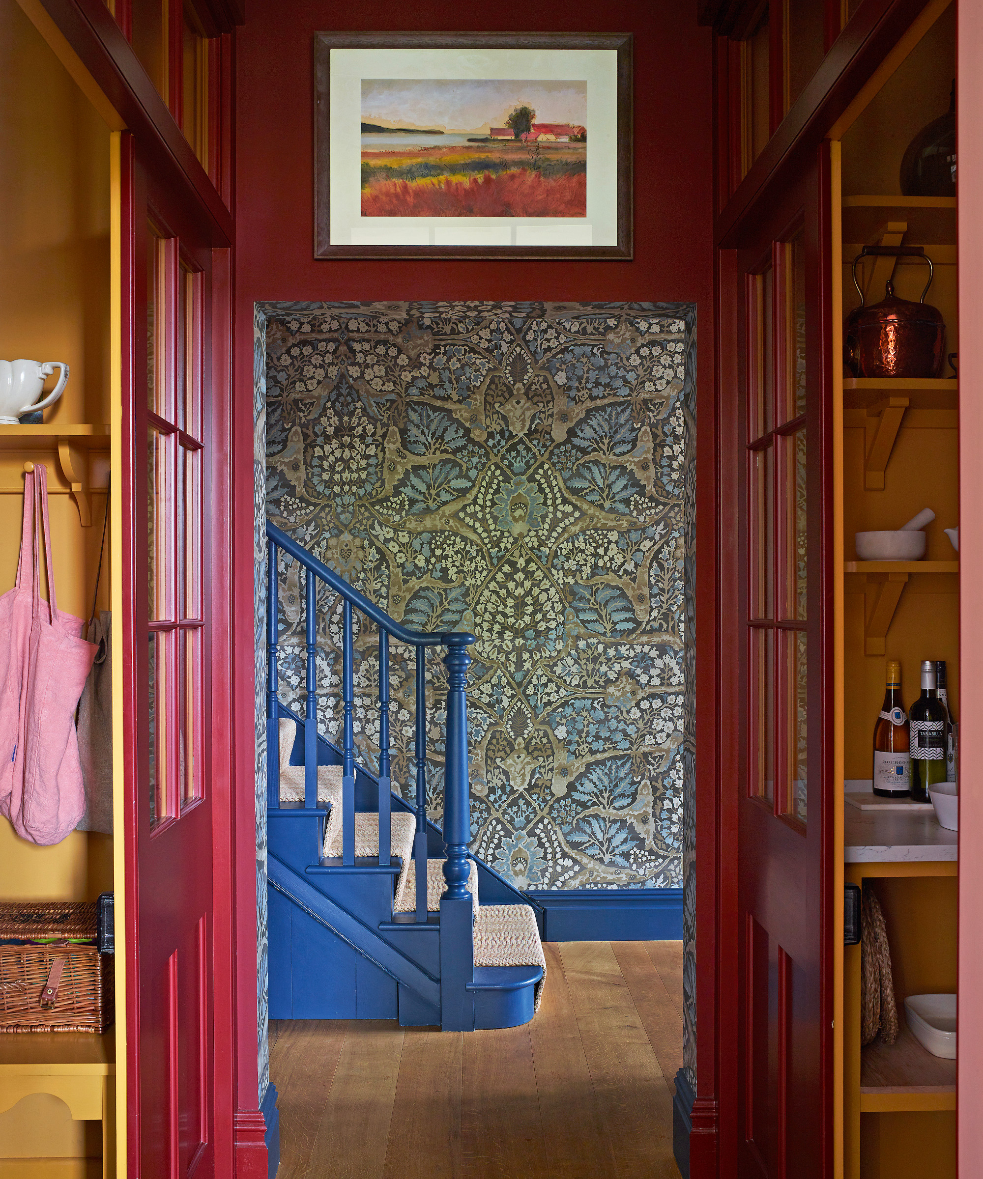
Painting the skirting board and banister in the same shade has enhanced the simply stunning decoration.
Living room
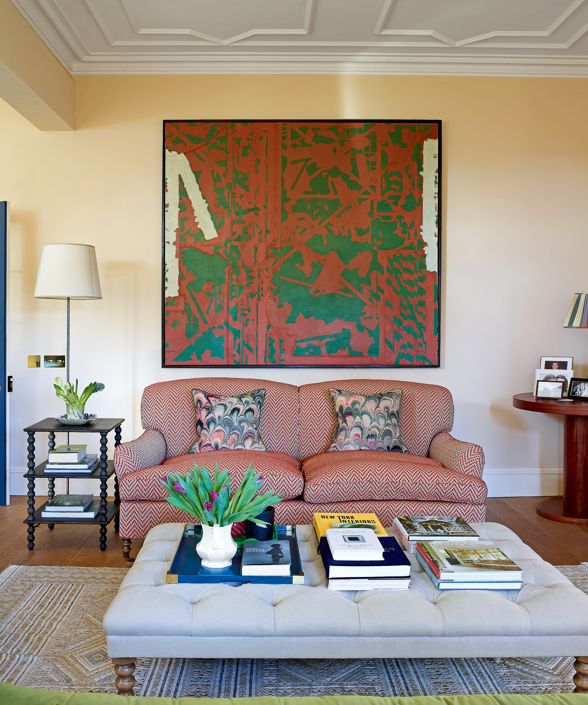
From her first bosses, Sarah learnt about ‘those small details that add comfort to a room’. You can see this in the living room with its side tables – at optimal height for that G&T – and glowing lamps. Inviting seating and low lighting have been used to create welcoming zones in this space.
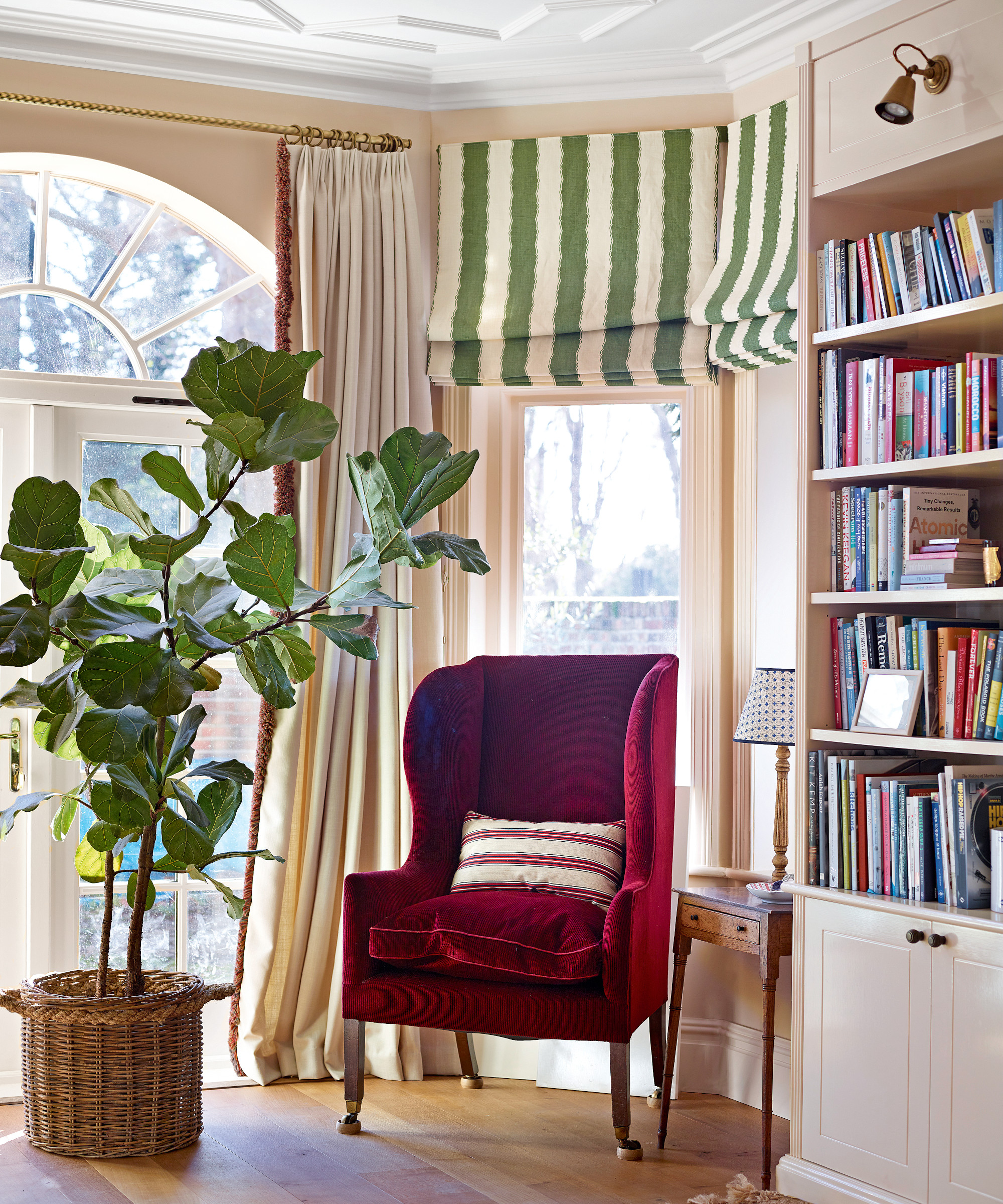
The living room was not an easy space to design because it is so wide. Among Sarah's living room ideas was the addition of L-shaped bookshelves, painted a softly glossy pink, which bring definition to the space and inject further architectural interest to this large space. The shades of red and green in the reading corner are echoed throughout the room.
Dining room
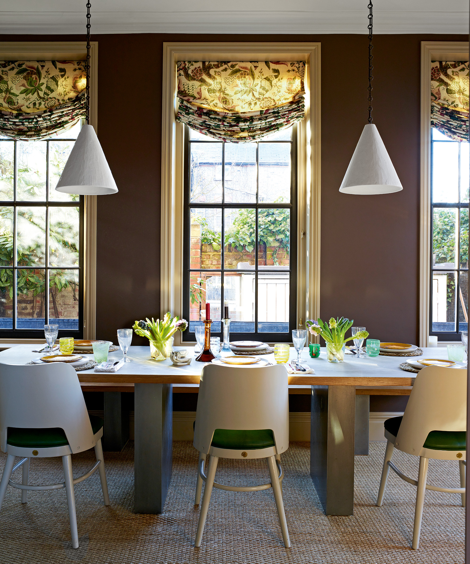
Among Sarah's dining room ideas was the introduction of deep mid-brown walls to make this an atmospheric setting for entertaining. Generous swag blinds bring softness and a rich botanical pattern to the scheme.
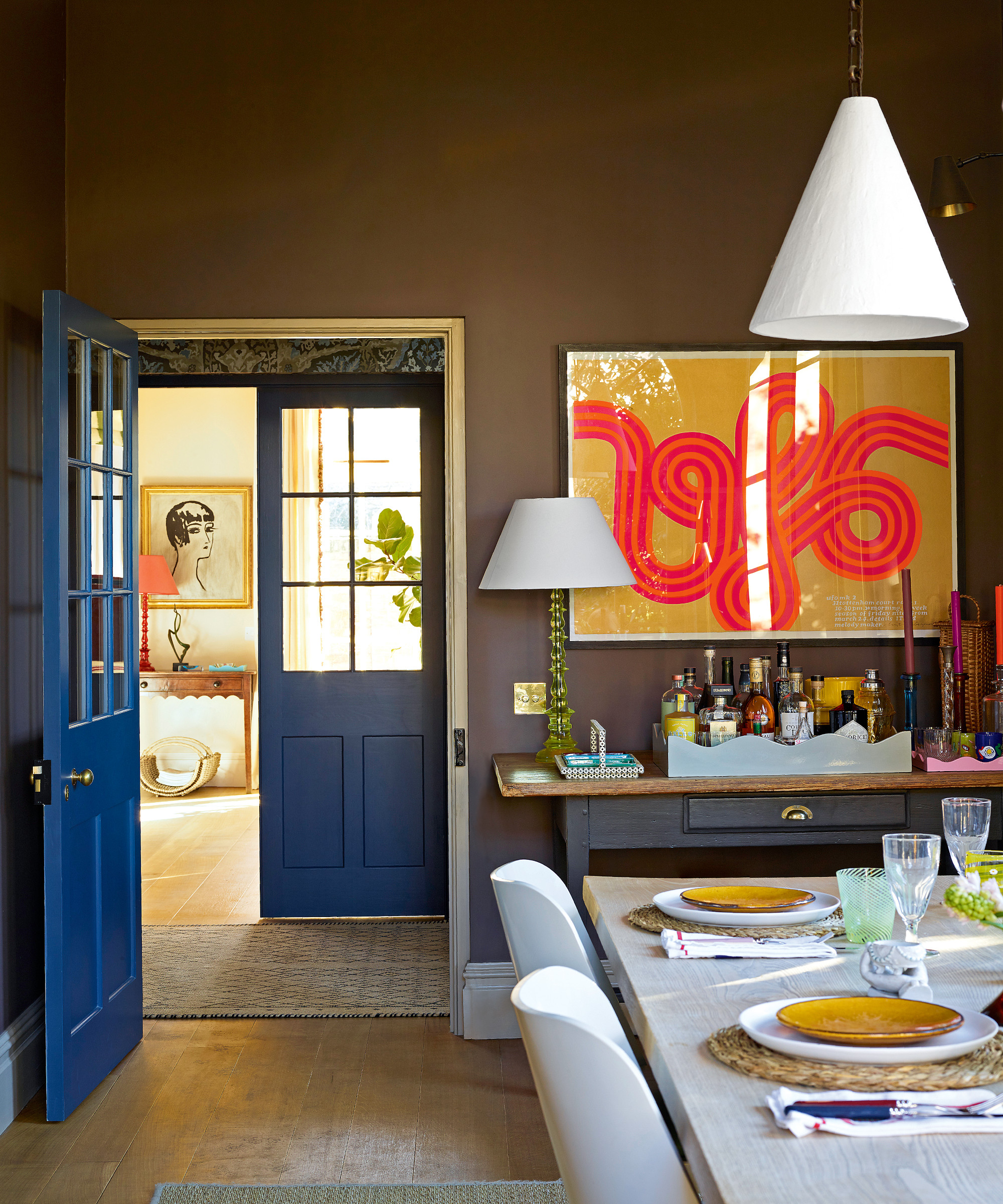
The 1960s fluorescent print is a striking contrast to the botanical swag blinds.
Kitchen
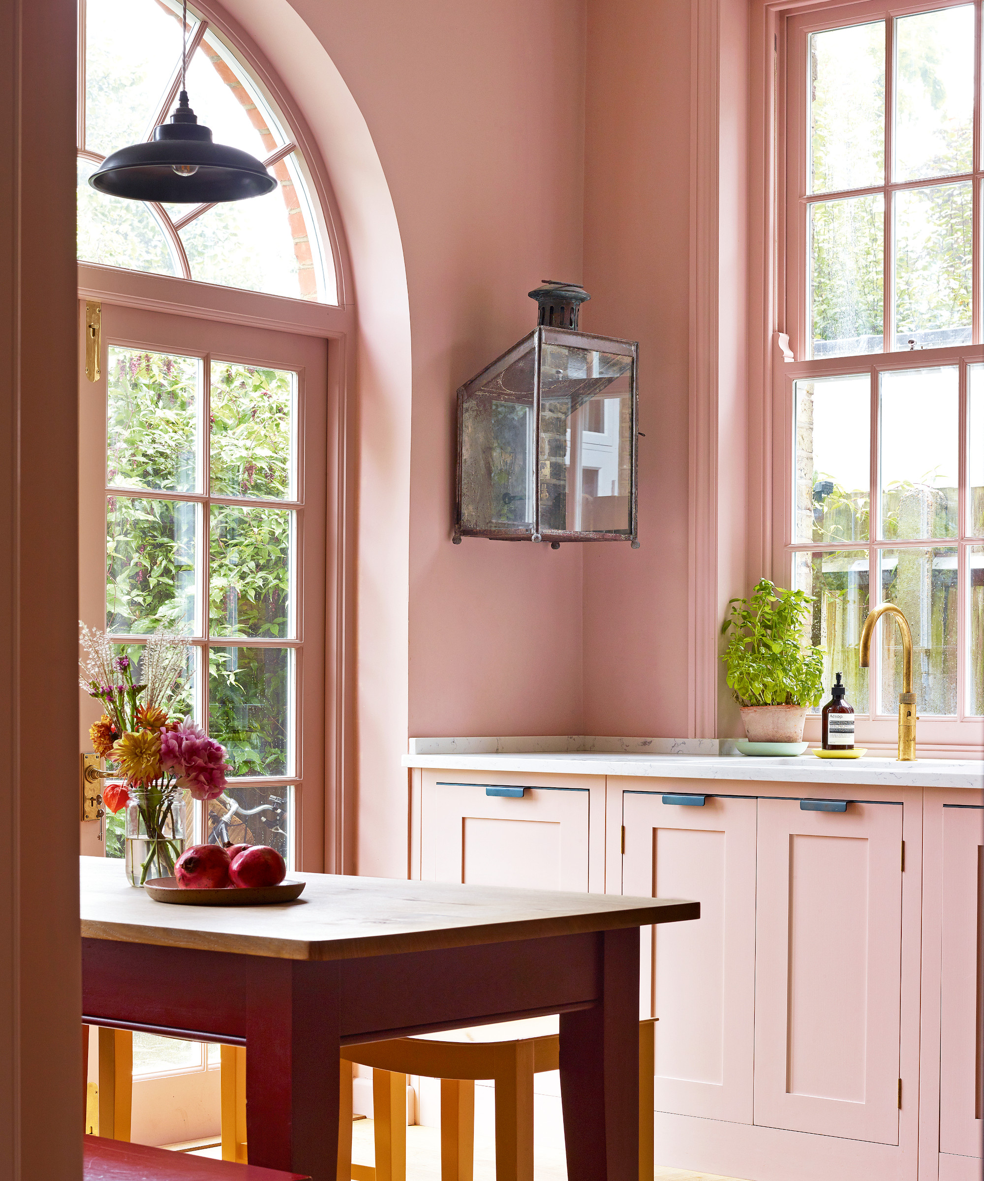
The unique red and pink palette has given all of the traditional elements in the kitchen a fresh spin.
Sarah knew exactly how she wanted the kitchen to look, and was decisive about her kitchen ideas. ‘I’m not a fan of islands; they tend to dominate a space.’ The ‘chop and chat’ kitchen table and bench that overlook the pretty garden are a sociable alternative. The new sash windows mirror the bespoke classic cabinetry made from solid wood (‘a downside of being in the industry is a taste for the best’). On the shelf, confit pots – as gold as harvested fields – were a present from another key influence: her late mother-in-law, Ann Brown, who ran an antiques shop. ‘She opened my eyes to a new world. I’d never have thought of buying brown furniture – but mixed with the right things it looks wonderful.’
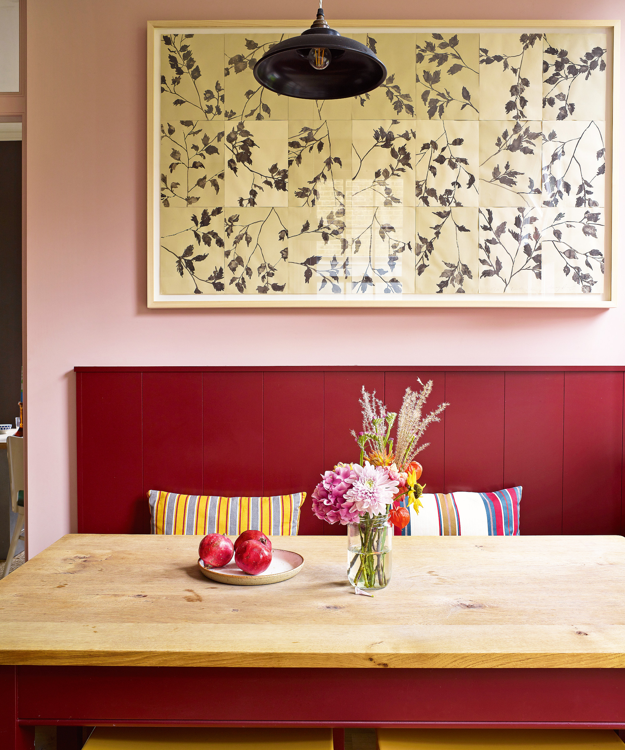
The Lucy Augé artwork above the bench creates a focal point while striped cushions inject a jaunty touch.
Main bedroom
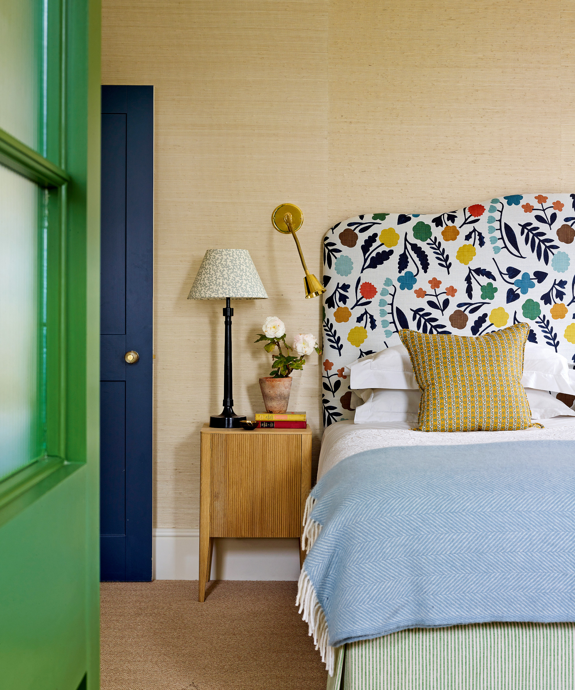
Bedroom ideas included introducing grasscloth as a textural backdrop to the scheme.
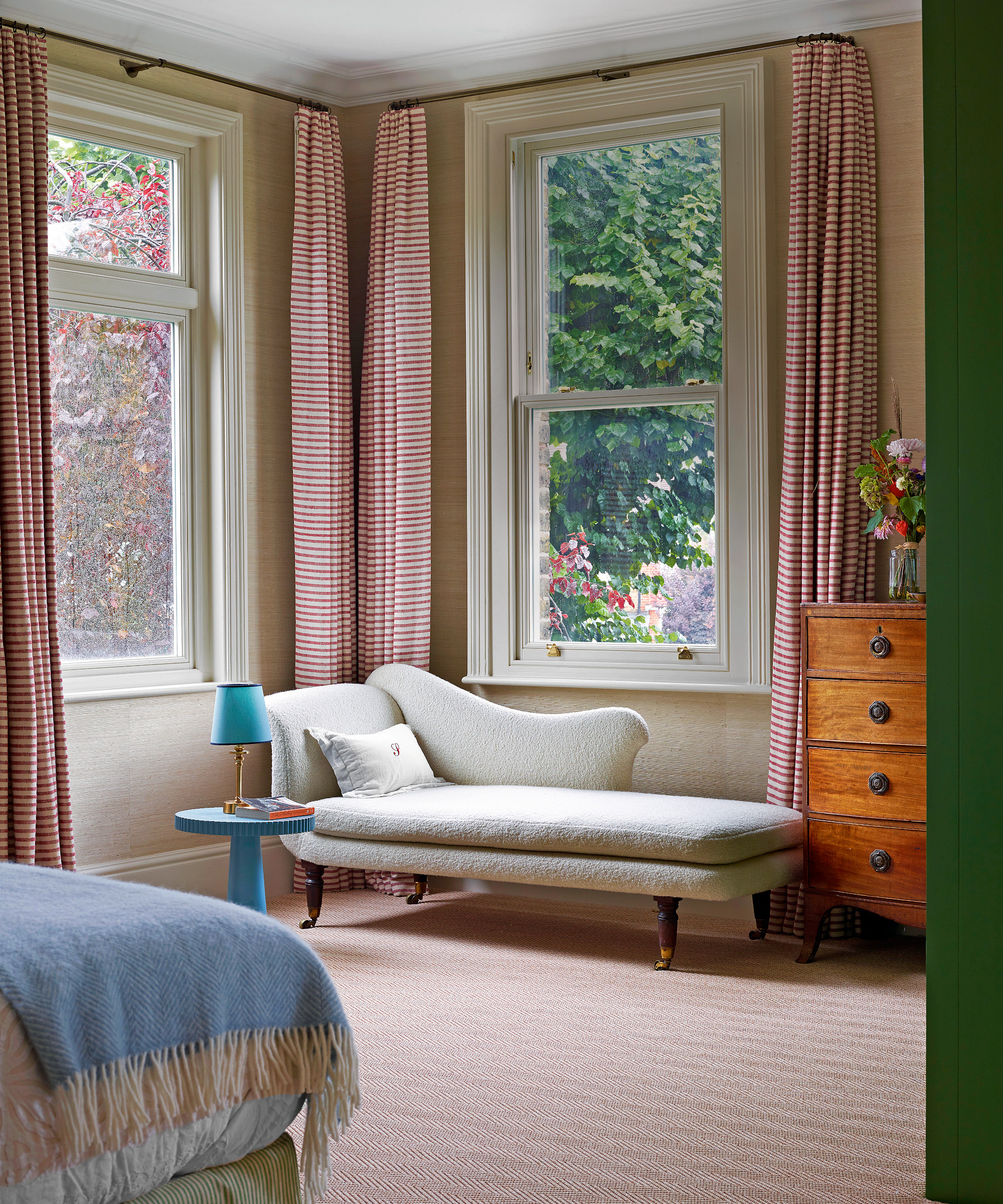
Traditional furniture enhances this city home’s country house feel.
Main bathroom
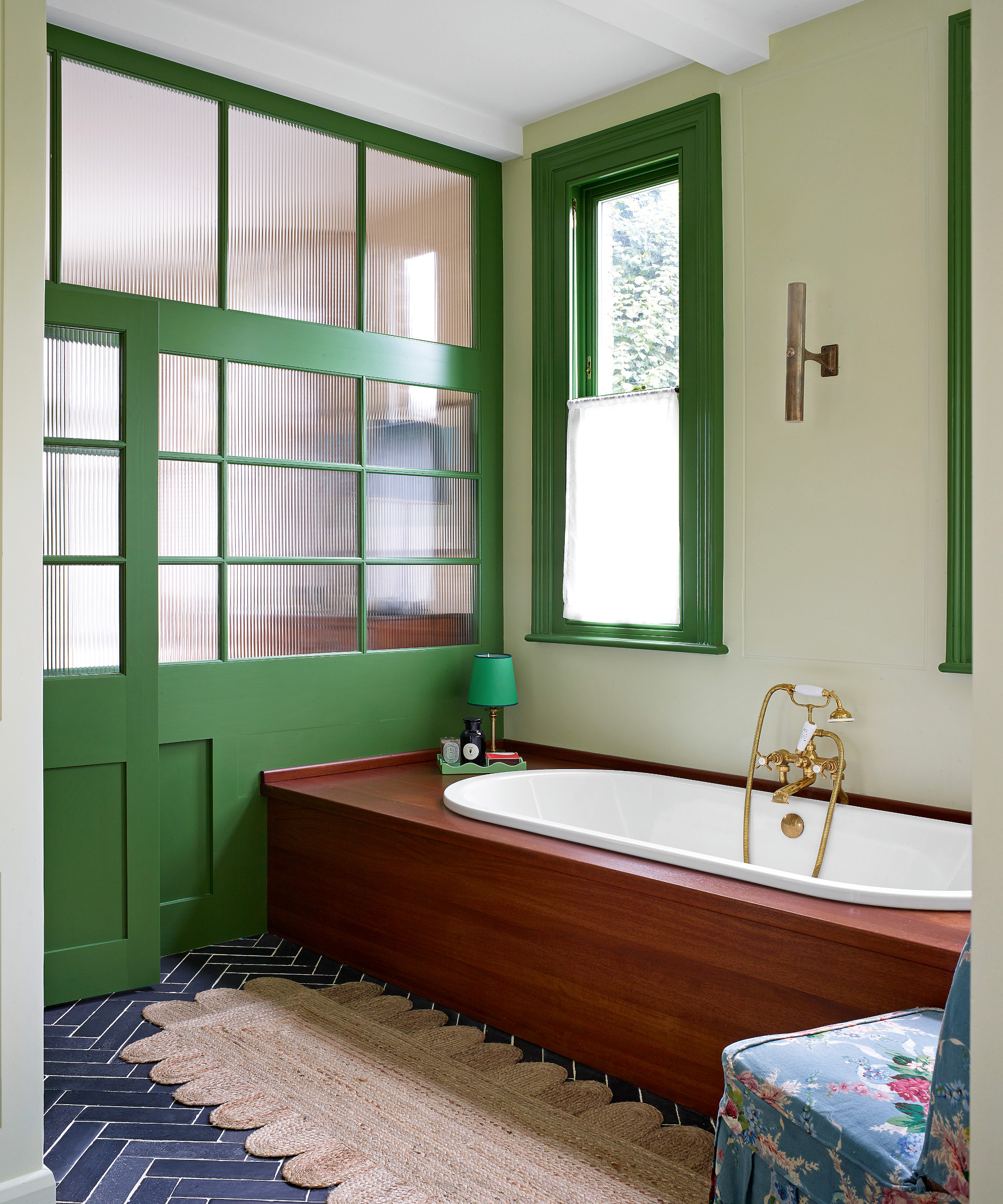
Among Sarah's bathroom ideas was using reeded glazing to ensure plenty of light and a feel of privacy.
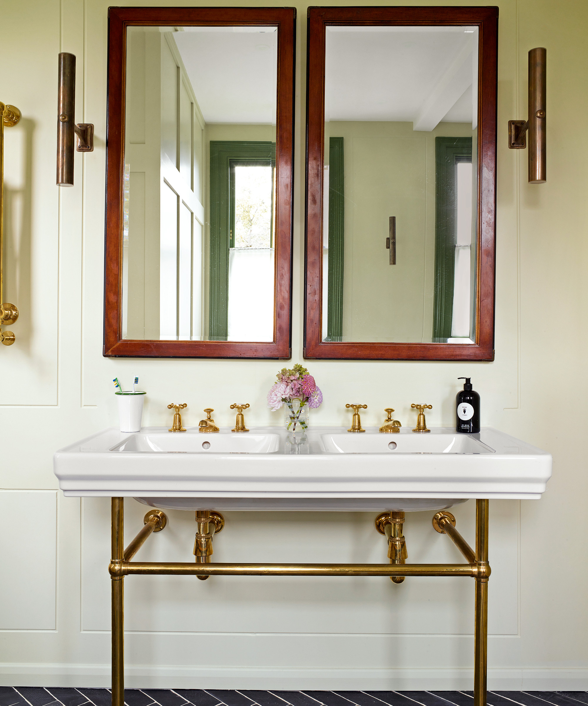
Pale walls are the ideal backdrop to the warm wood and dark flooring in the bathroom.
Inevitably, this house has become a showcase of ideas, where clients can see how Sarah likes to work. It has brought commissions for large houses in the UK and New York, where she is bringing a brownstone to life. It is proof that sometimes in life you need to be brave – and make a change.
Interior design/ Sarah Brown
Photographs/ Rachael Smith
Text/ Serena Fokschaner
Sign up to the Homes & Gardens newsletter
Design expertise in your inbox – from inspiring decorating ideas and beautiful celebrity homes to practical gardening advice and shopping round-ups.

Interiors have always been Vivienne's passion – from bold and bright to Scandi white. After studying at Leeds University, she worked at the Financial Times, before moving to Radio Times. She did an interior design course and then worked for Homes & Gardens, Country Living and House Beautiful. Vivienne’s always enjoyed reader homes and loves to spot a house she knows is perfect for a magazine (she has even knocked on the doors of houses with curb appeal!), so she became a houses editor, commissioning reader homes, writing features and styling and art directing photo shoots. She worked on Country Homes & Interiors for 15 years, before returning to Homes & Gardens as houses editor four years ago.
-
 How to get rid of bean seed flies – a pest control expert reveals how to keep crops safe from these seed munchers
As their name implies, these insects primarily feed on bean crops
By Tenielle Jordison
-
 Sarah Michelle Gellar's kitchen cabinets are moody yet elevated – I've always used dark paint with caution, but they make bolder tones accessible
The actress's black kitchen cabinets are bold yet palatable, proving that this dark shade is a trendy yet timeless color pick
By Hannah Ziegler