Classic American design and English country style combine in this '80s revival
Mark Lavender has conjured up childhood memories with English country style, plaid, chintz and clever use of color


‘This is a once in a lifetime design,’ says Mark Lavender of M Lavender Interiors. The owners of this pretty Georgian-style house in Chicago, one of the world's best homes, built in 1924, were keen to hire a designer that the wife could collaborate with and understand her desire to create certain moments from her 80s childhood.
Mark's aim was to create an ‘80s redux with elements of Ralph Lauren American design mixed with the best of English country design style.’ He continues, ‘We brought the best of the 80s: a country-style kitchen, a clubby plaid library, chintz, and plenty of burgundy and green. The updates are in the details. Copious woodworking and molding details were installed. Archways and casement windows were added to bring romance and drama. There are storybook qualities throughout: sculpted wooden bows imported from England adorn the archways, nooks and crannies thoughtfully designed for cozy and comfortable living. Plaid was the first choice for fabrics and wallpaper, with chintz as a safety. When in doubt, we went “weird”, the clients have an extensive contemporary art collection and a wacky sense of humor. Our design completely captures their spirit and personality – warm, inviting and a bit eclectic.’
The team and the client worked closely to realize her vision for this home. ‘We wanted to create an environment that was warm, colorful, and most importantly had a layered look as though the design had been crafted over time to evoke classic memories of childhood, family holidays and events,’ says Mark. ‘It was a deeply personal project for both of us, and we wanted to create a unique interior that reflected the client’s personality and provided a great backdrop for their extensive modern art collection.’
The exterior was given a facelift too. ‘The original exterior featured dark red/brown masonry with a conventional shingle style roof,’ says Mark. ‘We wanted to create a monochromatic look for the exterior of the home so we painted the masonry, wood trim and the shutters the same creamy white color. We replaced the existing roof with a new cedar shingle roof.’
Kitchen
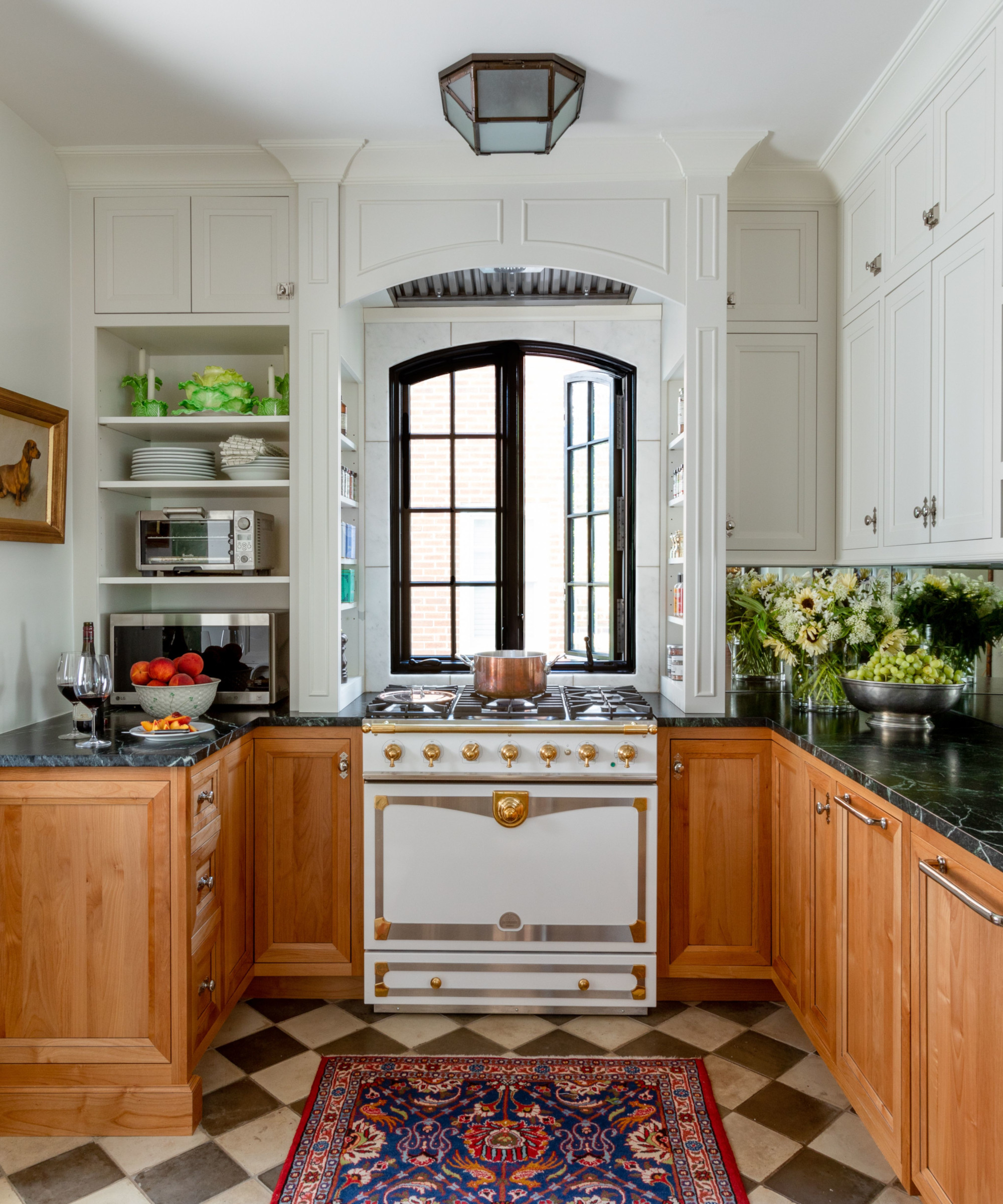
‘We completely reorganized the kitchen,’ says Mark. The original space was very small and dark so kitchen ideas included adding a window above the range and creating a new opening into the adjacent breakfast room to bring light into the space. ‘We felt strongly that natural light belongs in a kitchen,’ Mark says. Mirrors were added to the backsplash to let the new light bounce under the wall cabinets creating the illusion of a larger space.
To bring an overall 80s vibe into the room, a country style kitchen was chosen that features honey-stained cabinets reimagined with a faint pewter wash and nickel-plated hardware. A verde marble countertop was fitted and modernized with an eased edge. ‘The client had fond childhood memories involving the green countertops she used to see at Marshall Fields in Chicago and was insistent they be in her new home,’ says Mark. Along with the French range, the classic tile pattern of the reclaimed tiles adds to the richness of the design.
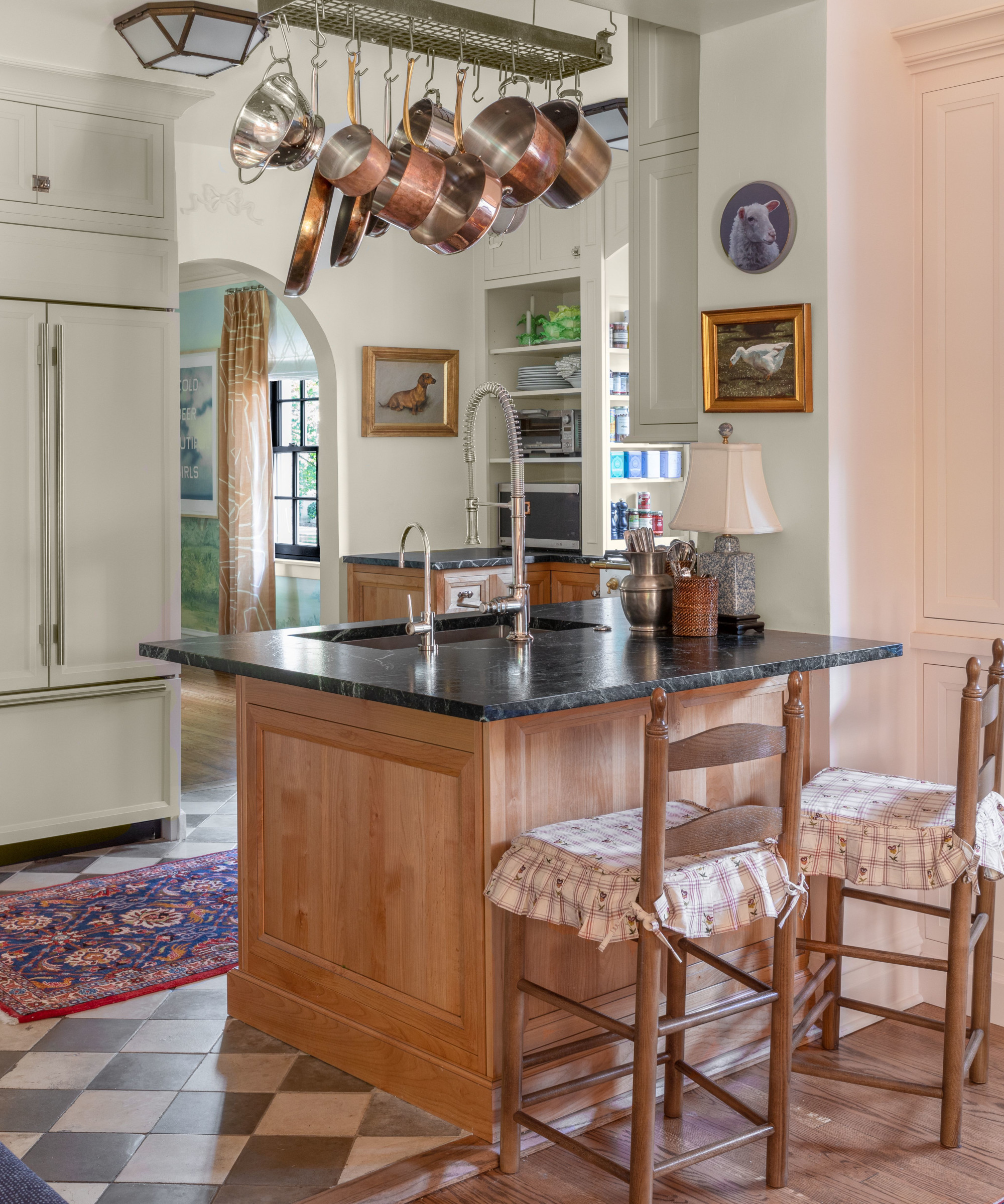
Another 80s touch is the kitchen pot rack that hangs above the island.
Breakfast room
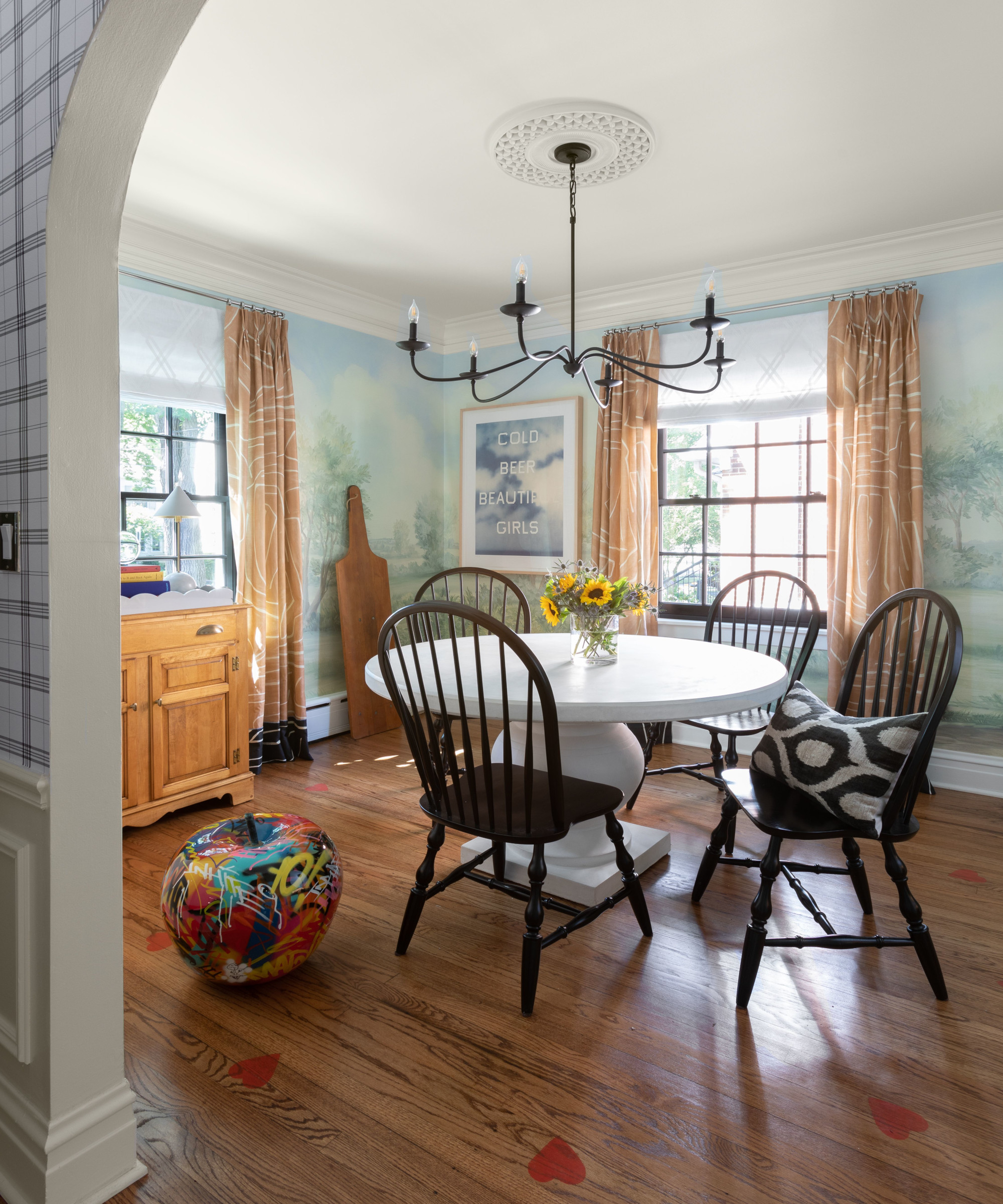
The breakfast room boasts a beautiful custom mural that was created specifically for the space to create a light and airy feel. ‘We wanted to create an alfresco look in the room and this was achieved with the muraled walls,’ says Mark. ‘Our team had to measure the space multiple times and make assumptions for areas that were still under construction at the time to create this one-of-a-kind mural. We then added hearts in a circular pattern, a homage to Woods Restaurant on Mackinac Island, Michigan. The curtains in this room were brought by the client from her previous dining room. They were originally too short, so we added panels in the same fabric in the black colorway and created a zigzag seam in light blue fabric to tie into the adjacent mural colors for a dramatic finish.’
Living room
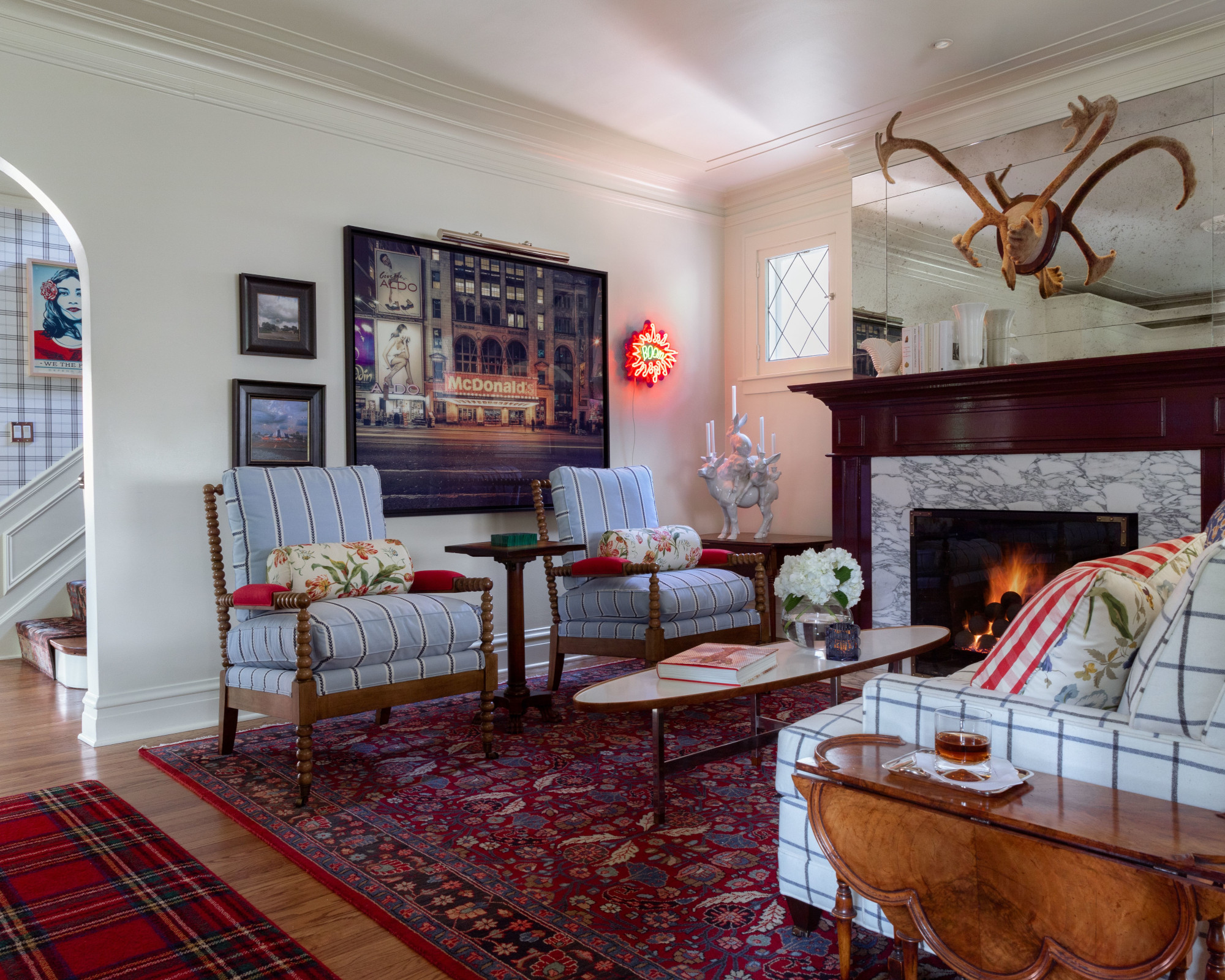
The living room is the main hub of the home and is used everyday with a seating area next to the fireplace and a library at the opposite end of the room. ‘We created a design that does triple duty for the family,’ says Mark.
Living room ideas include introducing a burgundy mantle, Persian and plaid rugs and bookcases to create the ambience of a Ralph Lauren library, along with a shed antler decoration, with a backdrop of palette-cleansing white and mid century accents throughout.
Library/dining area
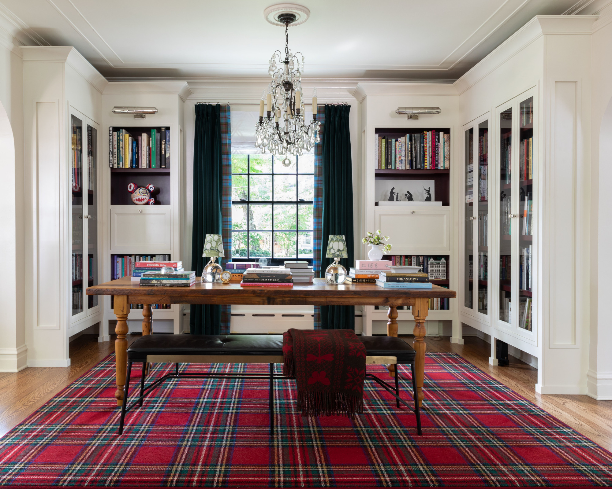
Home office ideas include millwork (including a bar) and a large table, which serves as a buffet and dining table when the family entertains.
Tartan plaid vertical banding from Lochcarron of Scotland was used to make a statement on the velvet curtains.
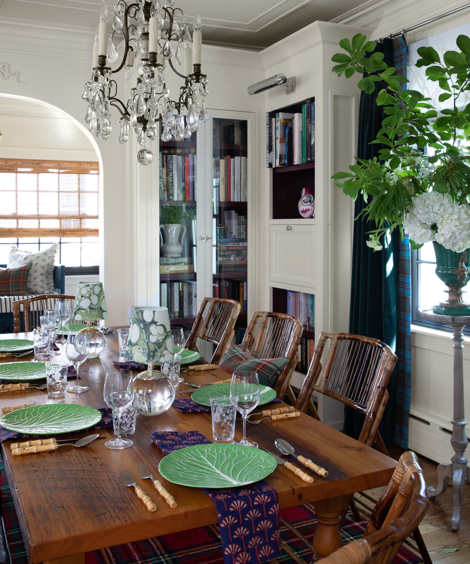
The library table is transformed for entertaining. Dining room ideas include injecting an 80s touch with striking cabbageware.
Sun room
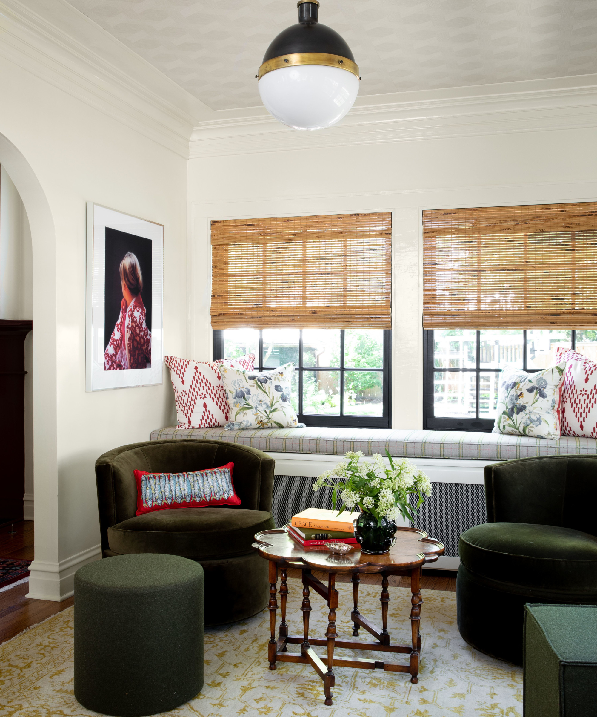
One of Mark's favorite rooms is the sun room. ‘I love the lightness of the space and the use of different textures in similar colorways to create drama. From the textured wallpaper on the ceiling to the high gloss finish on the trim, it is a great and interesting space,’ says Mark. ‘We went with light, happy colors with shades of green and yellow. These shades were punctuated with more vibrant colors consistent with the rest of the home.’
Play room
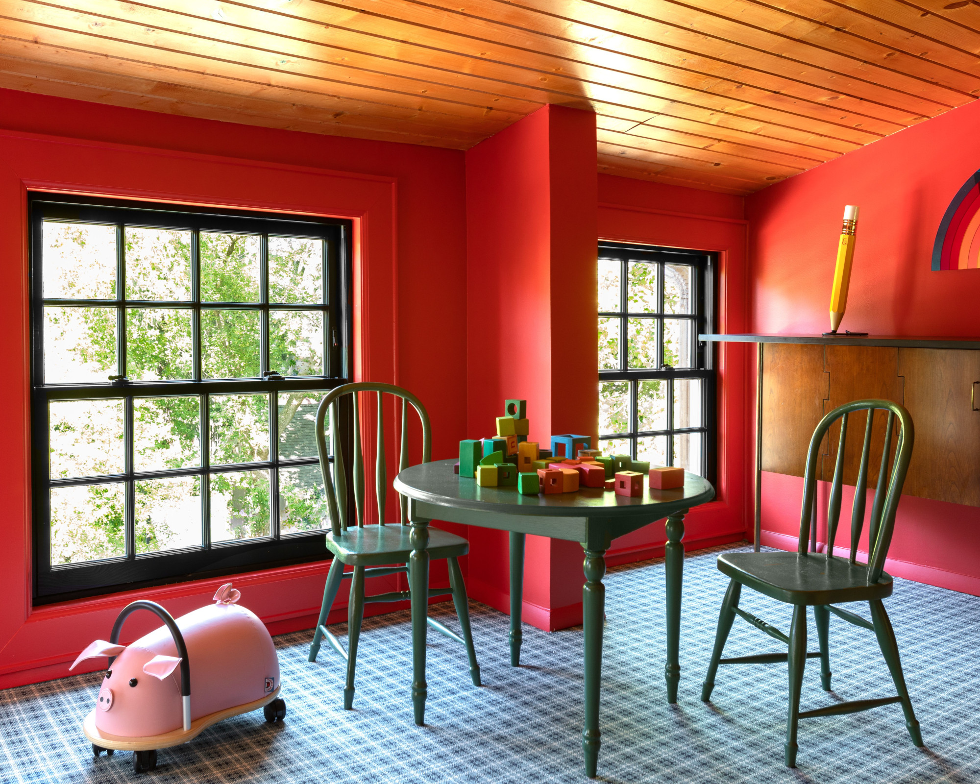
‘For the playroom, we kept the primary color scheme in place and accented the room with shades of green. The pine paneled ceiling with the strawberry red paint color brought back great memories of summer camp,’ says Mark.
Bedroom
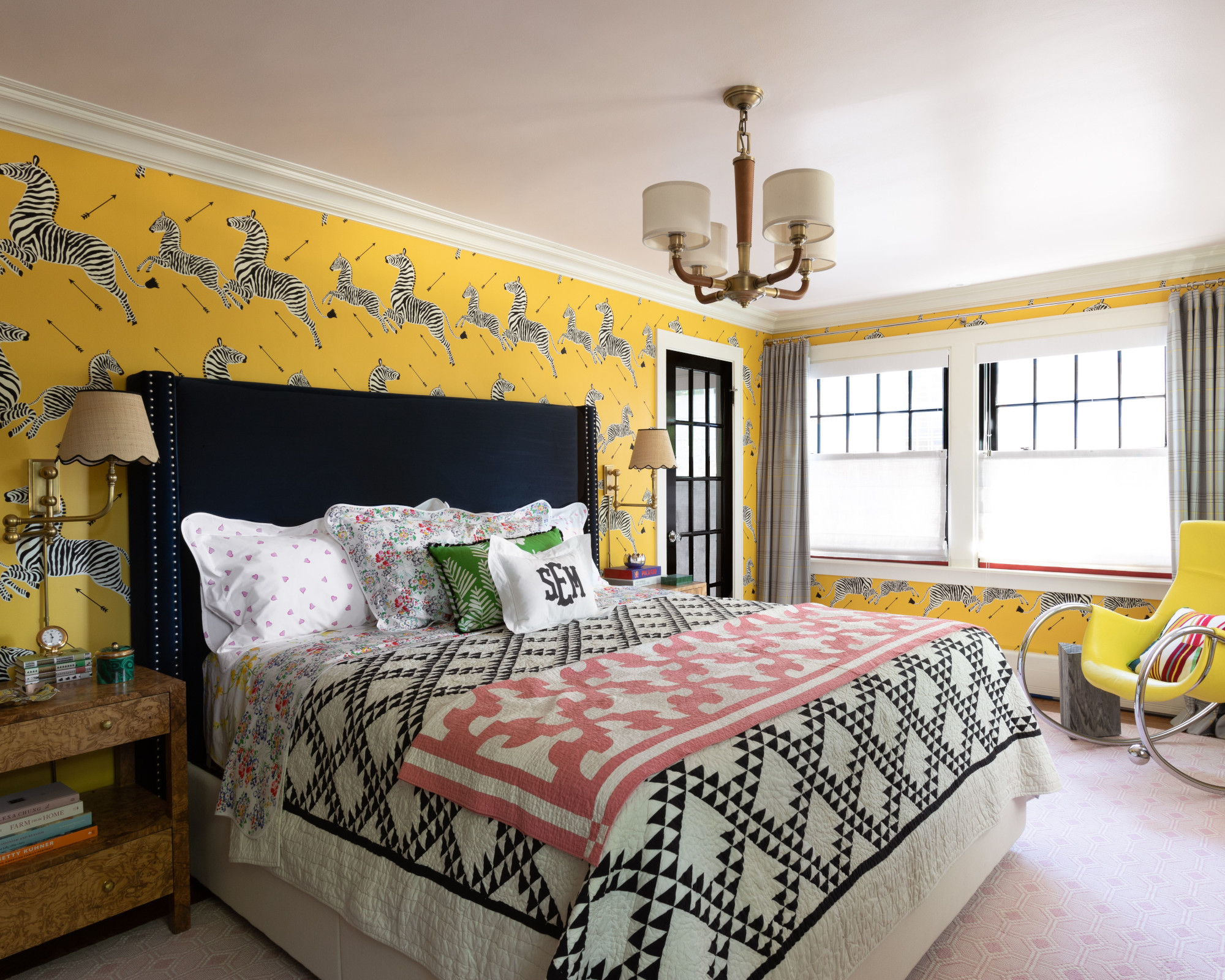
‘The client wanted to bring in the same vibrancy to this space that we had created in the rest of the house. We wanted to make the room happy and classic,’ says Mark. Bedroom ideas include a statement zebra wallpaper, softened with a pink ceiling color and area rug. The light plaid window treatment brings in the yellow and pink colorways and softens it with a gray background, while a yellow rocker injects a retro touch.
Bathroom
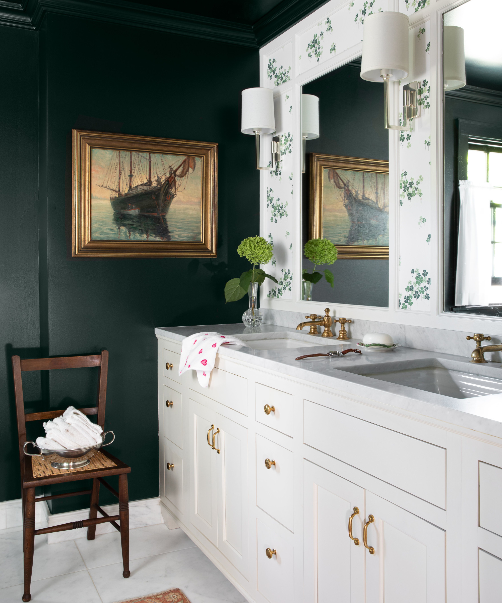
Bathroom ideas include creating a dramatic scheme with contrast. ‘'We used a very dark and moody dark green paint that created tension with the light and sunny clover patterned wallcovering,’ says Mark.
Interior design/ M Lavender Interiors
Photographs/ Janet Mesic/ Mackie Photography
Sign up to the Homes & Gardens newsletter
Design expertise in your inbox – from inspiring decorating ideas and beautiful celebrity homes to practical gardening advice and shopping round-ups.

Interiors have always been Vivienne's passion – from bold and bright to Scandi white. After studying at Leeds University, she worked at the Financial Times, before moving to Radio Times. She did an interior design course and then worked for Homes & Gardens, Country Living and House Beautiful. Vivienne’s always enjoyed reader homes and loves to spot a house she knows is perfect for a magazine (she has even knocked on the doors of houses with curb appeal!), so she became a houses editor, commissioning reader homes, writing features and styling and art directing photo shoots. She worked on Country Homes & Interiors for 15 years, before returning to Homes & Gardens as houses editor four years ago.
-
 Do cleaning products expire? Professional cleaners warn time could make them ‘less effective, and in some cases, irritating to use’
For the best results, it pays to stay on top of the timeline of your cleaning products
By Chiana Dickson Published
-
 7 of the best tomatoes for growing in pots - expert growers pick their top varieties ideal for large harvests from containers
You can enjoy bumper homegrown harvests in small spaces
By Drew Swainston Published