Tour this Georgian townhouse for a masterclass on how to create a home with masses of personality
A beautiful mix of hues – ranging from the bold to the discreet – are the stars of the show in this period townhouse that oozes character
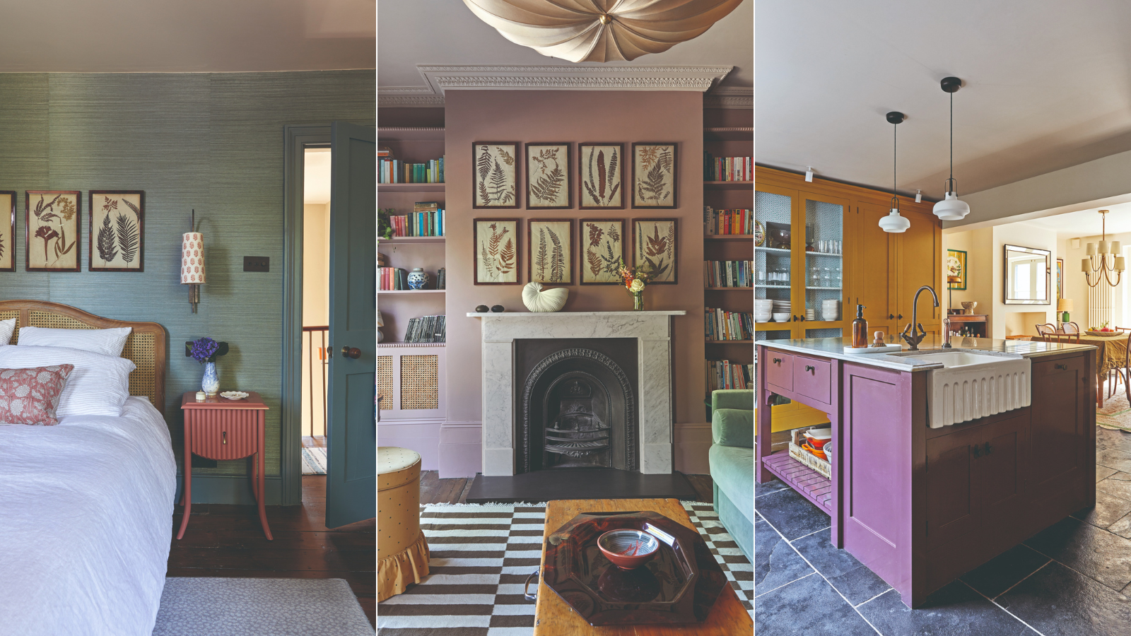
When it comes to house design, designer Emilie Fournet has an uncanny ability to decorate with colors that look as if they’ve always been there. ‘I’m drawn to palettes that feel authentic to the period of a house, but also work with more modern elements,’ she explains.
This meant that when her clients brought her on board to redesign the interiors of their Georgian Grade II-listed townhouse in London, a key part of the process involved rethinking the house’s hues.
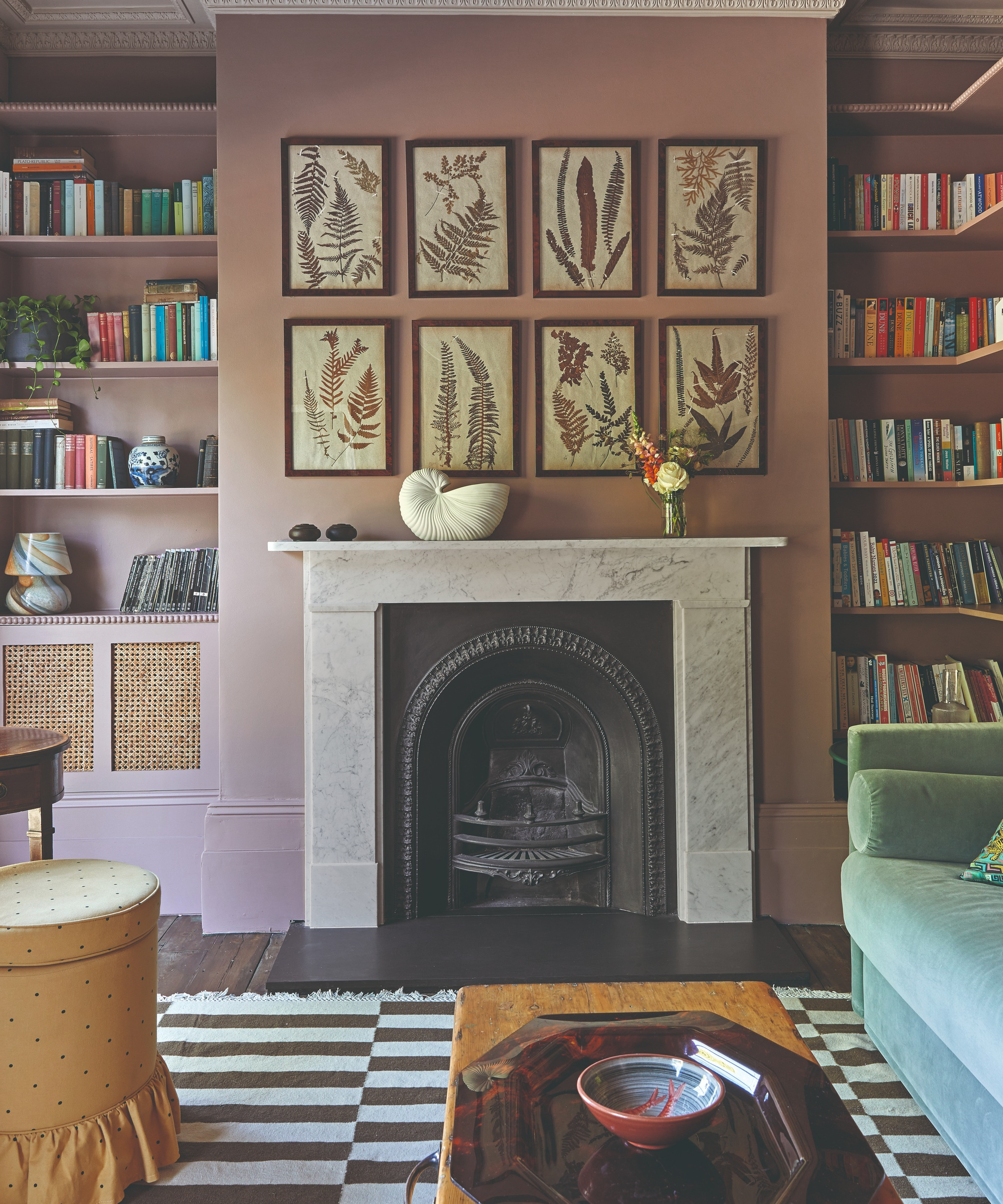
Walls and cabinetry in Rouge II, Paint & Paper Library. Botanical prints, Adelphi Gallery. Antique fireplace, The Better Hearth. Stool, Ceraudo. Rug, Penny Morrison.
‘The owners described the existing decor as 'bankers’ grey', and were quite happy to erase all memories of it,’ Emilie says. Alongside making the house colorful, cozy and warm, Emilie’s role included sourcing furniture and fabrics, restoring original features that had been stripped out during the house’s grey era, and changing the functions of some rooms.
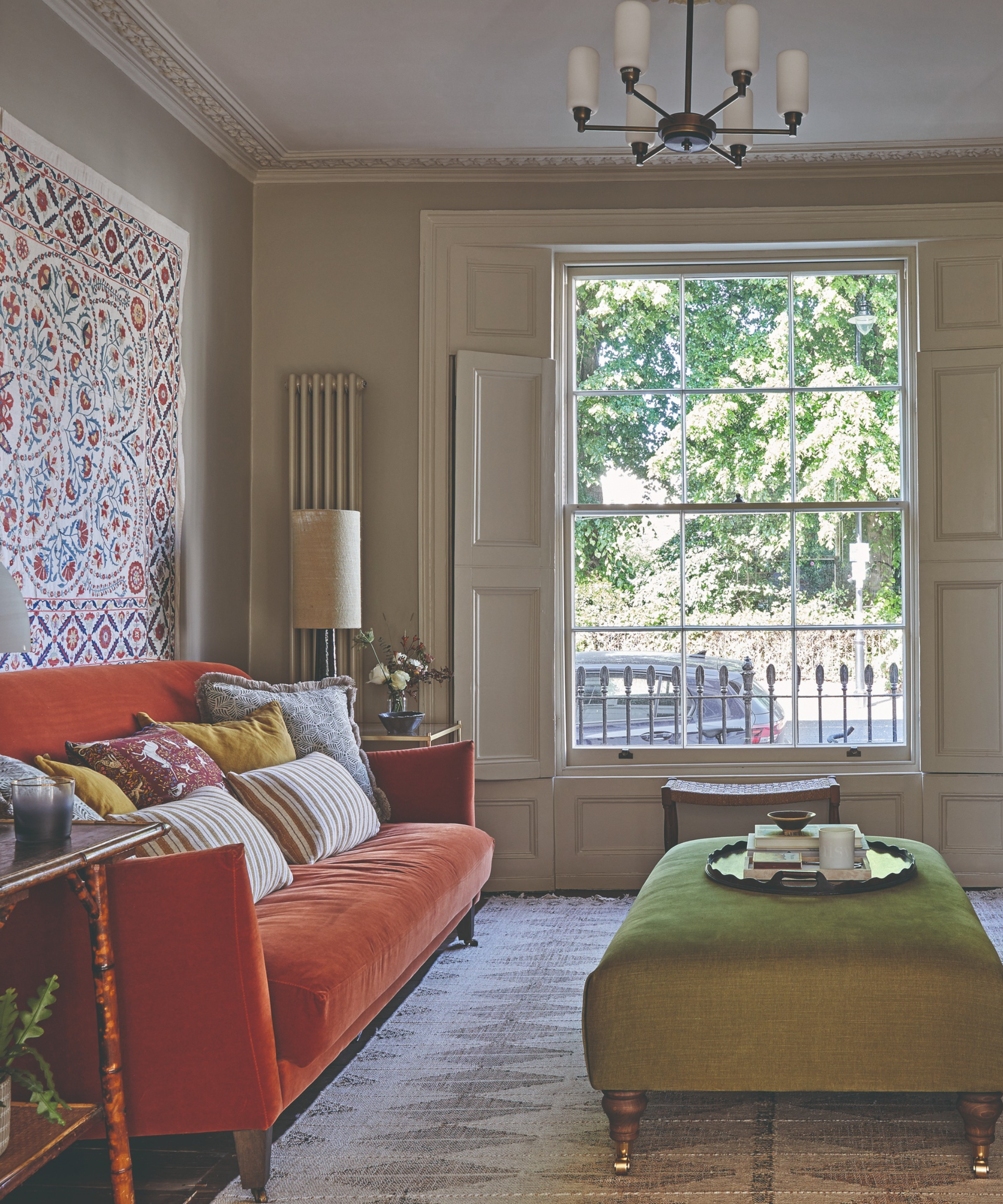
Floor lamp, Le Klint. Sofa, Love Your Home. Footstool, Sofa.com. Rug, Soho Home.
Working within strict planning constraints, Emilie turned a former spacious ground-floor utility room into two new rooms: a shower room and a boot room that has plenty of space for family paraphernalia. This was just as well because, as the project progressed, the couple broke the happy news they were expecting their first child. Now the boot room accommodates a buggy as well as coats and shoes.
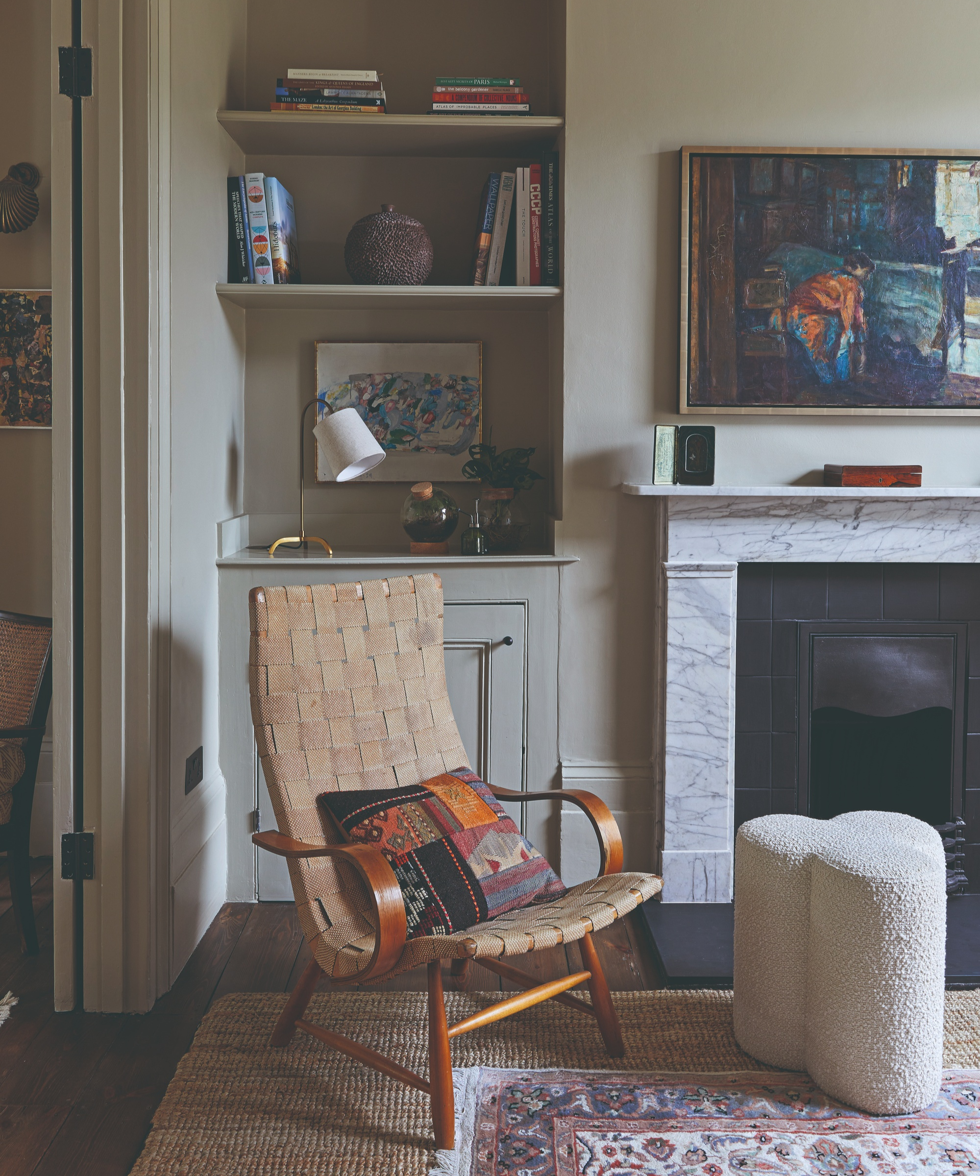
Walls and skirting in Old White, Farrow & Ball. Chair sourced by Emilie Fournet Interiors. Coir rug, Ikea. Vintage painting, Medium Room.
Emilie worked with Stevensons of Norwich to reinstate period moldings and sourced a replacement antique fireplace for the first-floor drawing room, which is now an elegant space with walls in a dusty pink paint – a color Emilie sensed would work in this room that overlooks a private square.
‘For me, choosing paint colors is intuitive. When I enter a room, I can often visualize which colors will work. Sometimes, we try alternatives but then find ourselves coming back to that original, instinctive idea.’
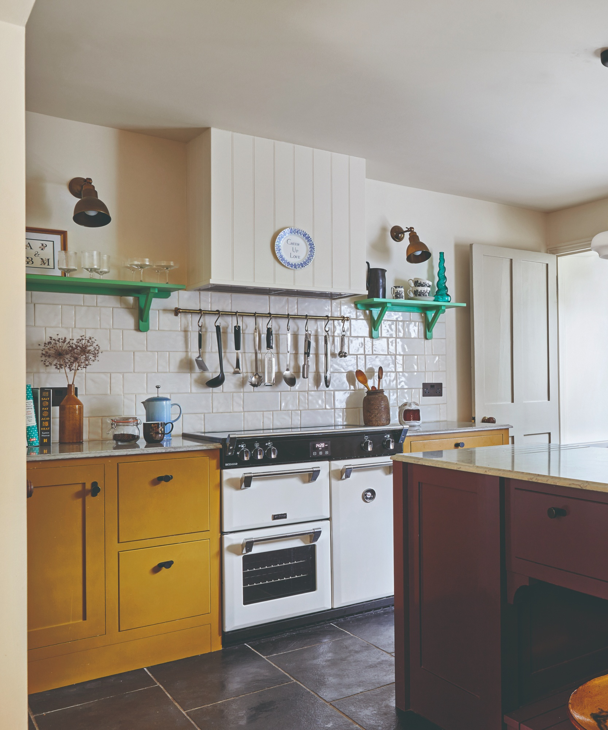
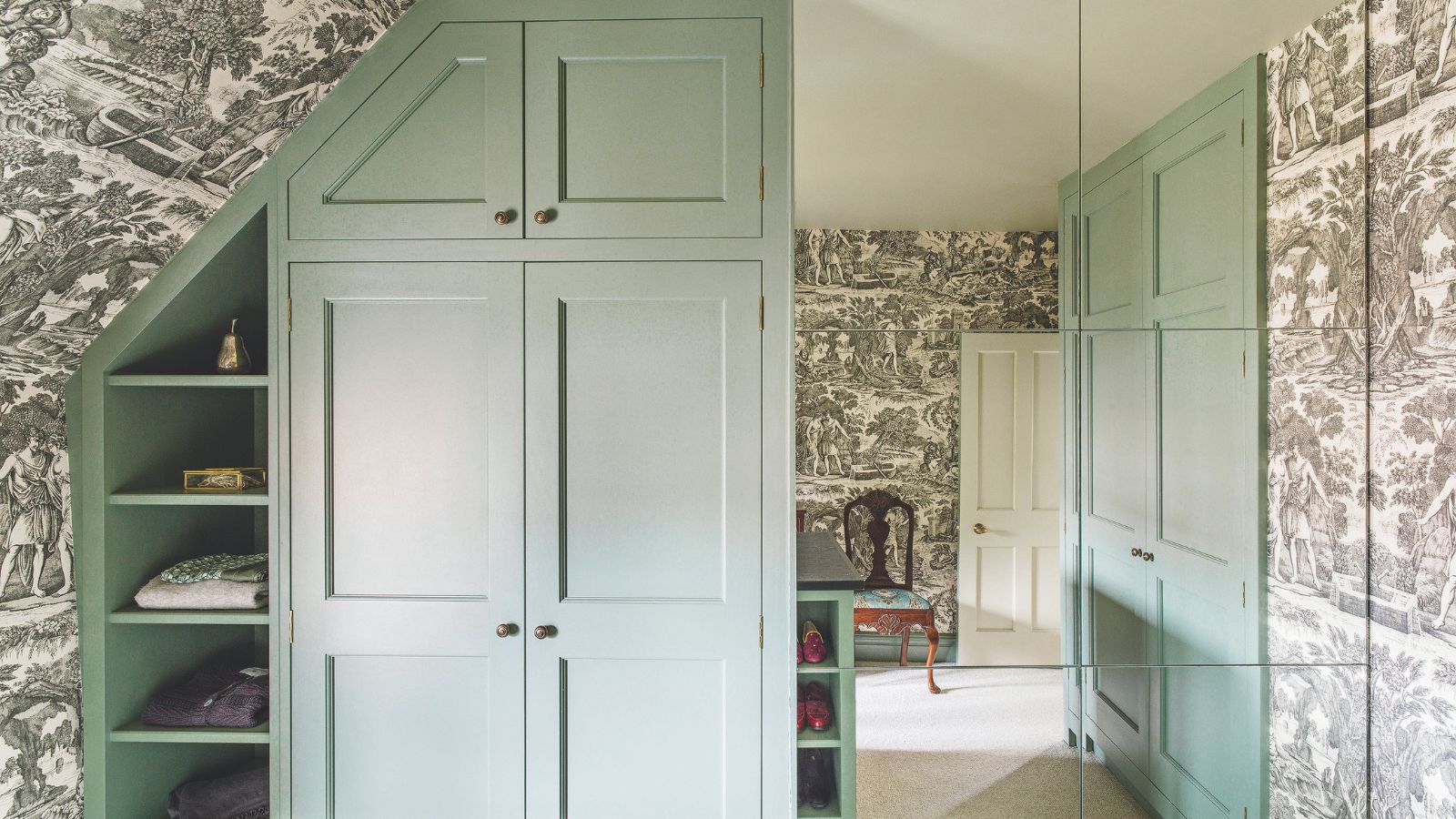
Cabinets in Muga, Paint & Paper Library. Wall lights, Mullan Lighting.
As Emilie points out, color is never experienced in isolation. ‘It is not about picking one shade from a chart, it’s about how colors interact.’ In the drawing-room, she combined Rouge II by Paint & Paper Library with Mushroom by Little Greene on the ceiling. ‘Seen in isolation, Mushroom is a beige, but here it works as a foil for the pink. A bright white paint would be too harsh a contrast.’

Island in Plum Tree, Mylands. Pendants, &Tradition.
Emilie’s favorite approach is to use one color on the walls and skirting boards but switch to a second shade for the ceiling and other woodwork. ‘I find this technique cuts down on visual distractions while highlighting period features,’ she says.
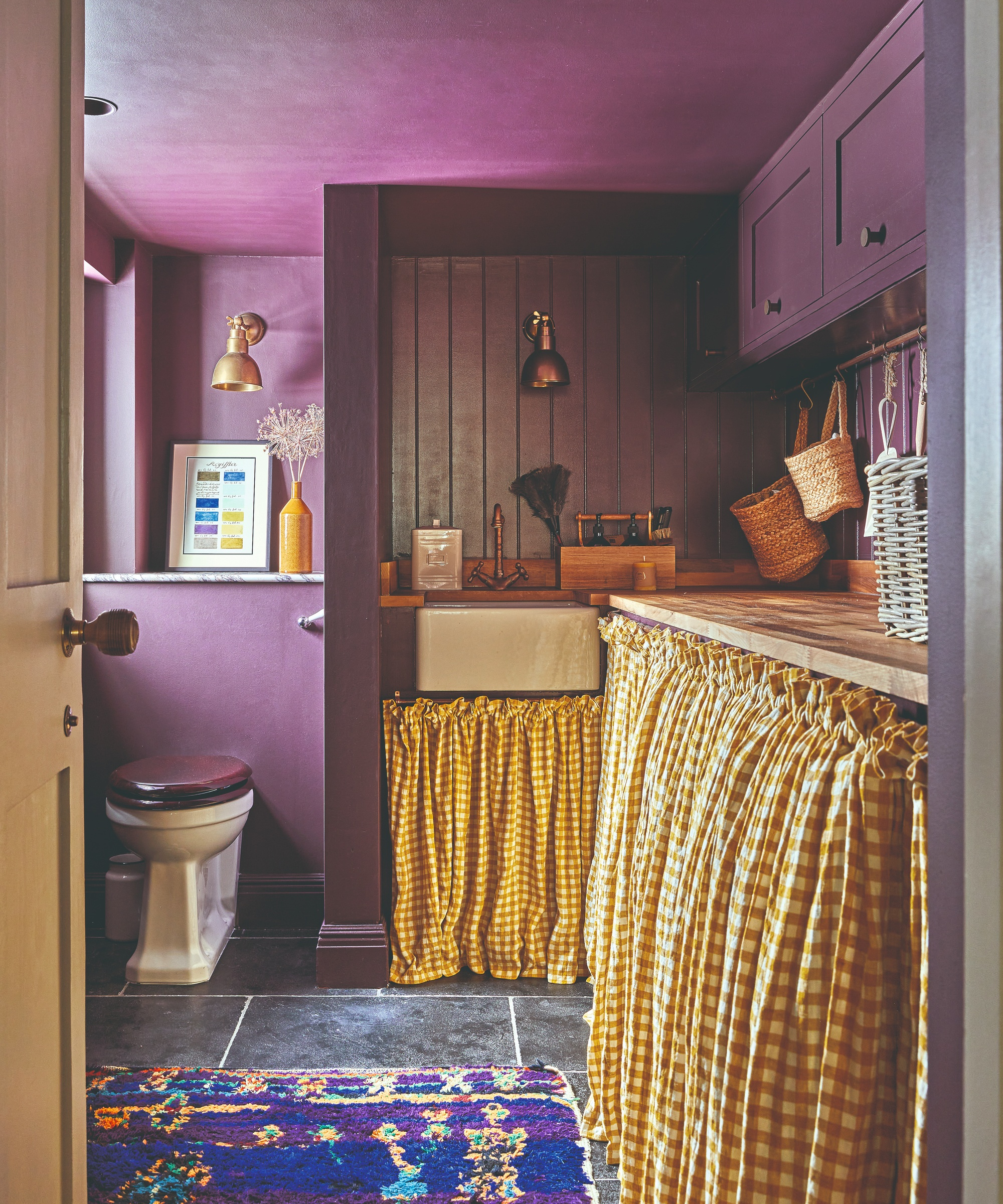
Walls in Plum Tree, Mylands. Gingham, Merchant & Mills. Wall lights, Mullan Lighting. Tap, Bespoke Taps.
However, Emilie is a firm believer that while paint ideas can set the mood, it should not dominate. ‘Colour can be strong, but it must also visually recede and allow all the other elements to breathe.’
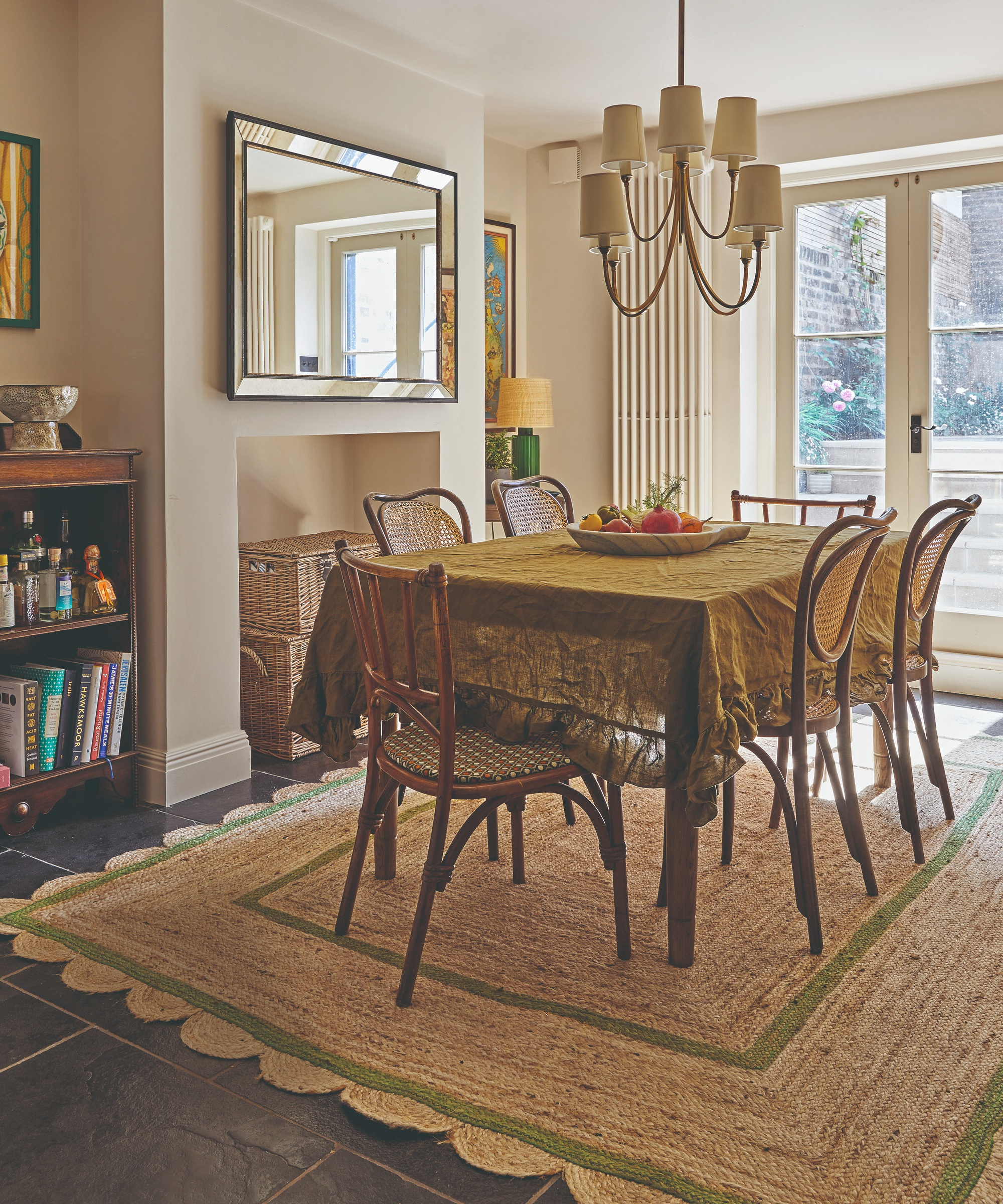
Walls in Whitening, Little Greene. Chairs, Vinterior. Mirror, Graham and Green. Pendant , Visual Comfort & Co. Rug, Sarah Vanrenen. Lamp, Pooky. Artwork, Unity Coombes
Emilie also sourced furniture, rugs, lighting, and fabrics that suited this house’s Georgian proportions, from refined antique finds to contemporary design shapes. Crucially, she dovetailed these new pieces with a few of the clients’ favorite mid-century designs and some heirloom pieces.
Then, to keep the mood upbeat, she added in some modern details. ‘I like to throw in the odd wild card,’ she says. ‘In this home, a few subtle animal prints soften the historic character so it feels less formal.’

Wallcovering, Altfield. Woodwork in De Nimes, Farrow & Ball. Wall light, Porta Romana. Table, Trove.
The result is a home that reflects the past but has its sights set firmly on the future. ‘A design has to be true to the people who live there as well as the building,’ Emilie explains. ‘I want the owners to take pleasure from these rooms every day'.
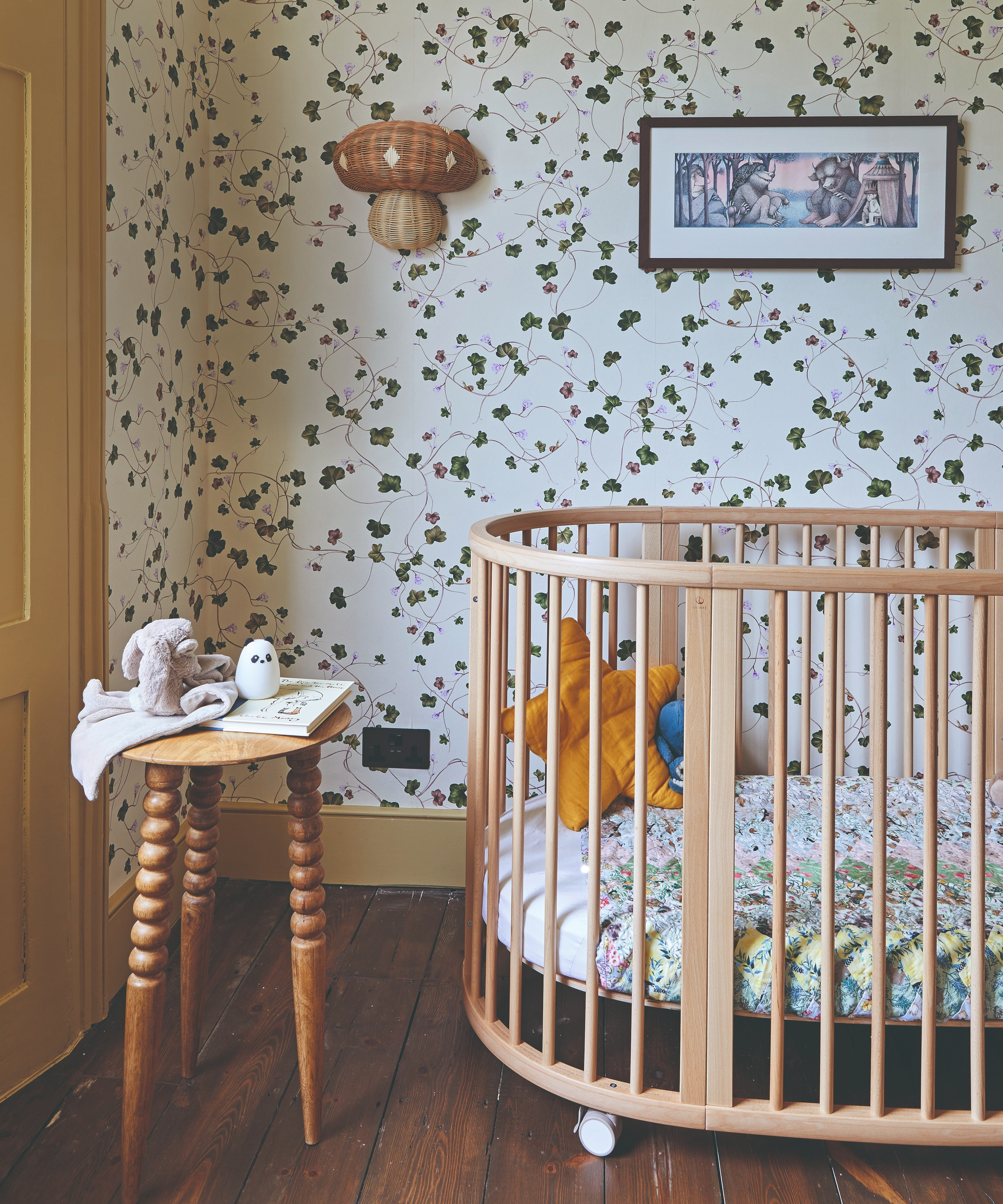
Wallpaper, Living Quarters. Woodwork in Oak Apple, Little Greene. Cot, Stokke. Wall light, Oyoy.
MEET THE DESIGNER
Emilie Fournet shares her style inspiration...
Describe your style in three words?
Considered, color-rich, and coherent.
What was the last thing you bought for your home?
A framed stitched textile artwork by Jessie Cutts of Cutts & Sons, as a rare present to myself.
Where's next on your travel destination wishlist?
Rome – to soak up design inspiration, ancient and modern.
What was the most recent exhibition you went to see?
I loved A World in Common: Contemporary African Photography at the Tate Modern and I’m looking forward to seeing the work of performance art pioneer Marina Abramović at the Royal Academy of Arts.
Can you reveal a hidden gem store?
Kernow Furniture, for anything vintage and antique. It does great pieces that are nicely priced and is always a pleasure to work with.
Finish the sentence, a home should be...
...a place where moving through the spaces feels effortless, like a natural journey.
Sign up to the Homes & Gardens newsletter
Design expertise in your inbox – from inspiring decorating ideas and beautiful celebrity homes to practical gardening advice and shopping round-ups.
-
 Why you need this renter-friendly coffee mug hanger trick in your closet – and expert-approved alternatives for tiny spaces
It's quick, cheap, and doesn't have to be forever
By Ottilie Blackhall
-
 I spent the entire afternoon browsing Martha Stewart's furniture – this wooden chair is the piece that deserves a place on your patio (and it's hidden on Wayfair)
Classic, sophisticated, and ultra-durable: This simple chair, inspired by Martha's Bedford home, is the one outdoor furnishing you need for summer 2025
By Megan Slack