This cozy mountain home mixes modern minimalism with retro log cabin cool – and looks good in all weather
Modern interiors combine with retro charm to create the perfect holiday hideaway in the Canadian mountains
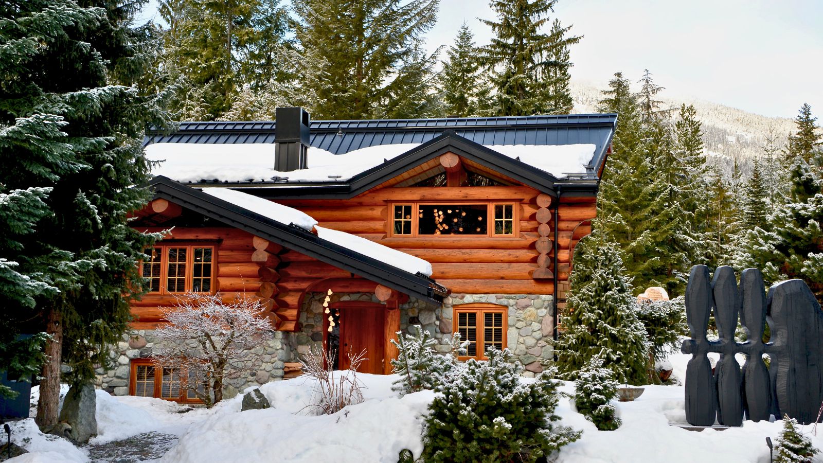
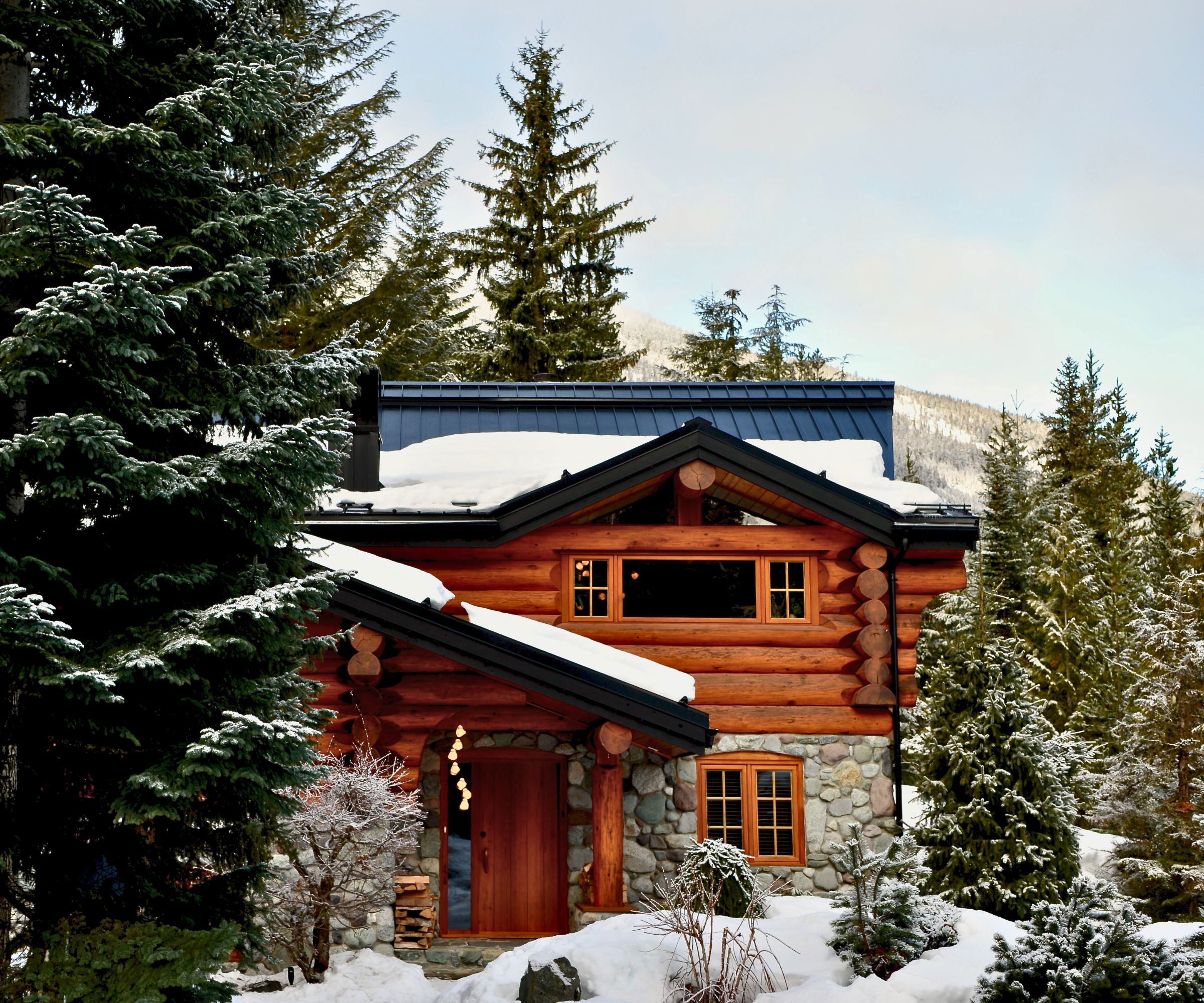
From the outside, it's the quintessential Canadian log house, built in the 1990s in the traditional style that dots the mountainside and hunkers down next to the forest in Whistler, BC, Canada. The home's recently renovated interior architecture and interior design, however, are refreshingly unexpected. Sparse and minimalist in places, organic and natural in others, and with furnishings and artwork that reference a retro vibe, the finished look perfectly encapsulates the brief homeowner Lyndon Cormack gave the team at Little Giant, led by architect Mark Burkart.
Take the tour to discover how one cozy cabin embraces both contemporary and retro styling, all under one picture-perfect snow-topped roof.
'Despite being a modernist at heart, when looking to establish a basecamp for his family in Whistler, Lyndon rejected the idea of creating a modern architectural statement in the mountains,' remembers architect Mark Burkart. 'Instead, he opted for the authentic, mountain character that only a log house could provide. Our design juxtaposes this nostalgic spirit of shelter and warmth with a modern sensibility and focus on art.'
Owner Lyndon Cormack, co-founder and MD of Herschel Supply Co., specializing in backpacks and travel goods, says he wanted a 'cabin, not a cube' and aimed to respect the original features while introducing fun 'zones'.
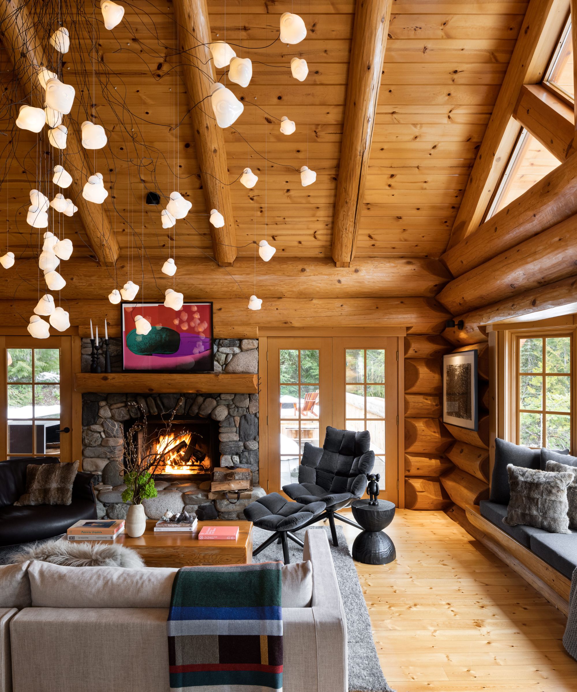
Living room ideas here in the main living room balance the cabin's original rustic log construction with contemporary and organic moments, including a dramatic Bocci lighting fixture and river stone fireplace. On the mantel, Andy Warhol's Space Fruit Watermelon introduces a splash of 1970s color, with B&B's Husk chair adding to the retro vibe, with a black Riva wooden stool alongside.
'We wanted to create a true mountain cabin experience, but with an irreverent and playful twist. While the exterior is part of the fabric of the mountain village, experiencing the interior is meant to be an exploration into the unexpected,' says Mark Burkart of Little Giant Studio's approach.
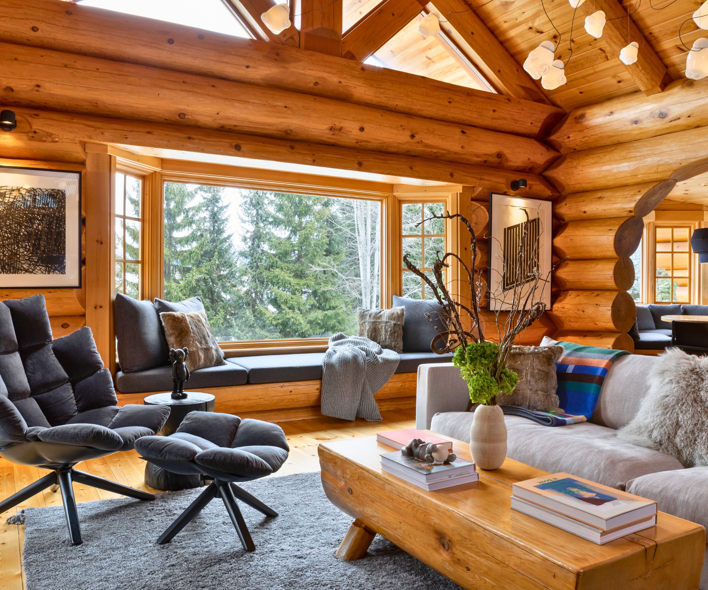
The room's original lofted structure maintains the focus on the landscape outside, with inviting window seats set before panoramic views of the mountainside. The sofa is the Flexform Magnum sofa.
'Canadian cabin culture, my childhood memories of time spent in our family's A-frame house, snowboarding, vintage vibes, music and records, and the coziness of fireside chats inspired the project,' says owner Lyndon Cormack.
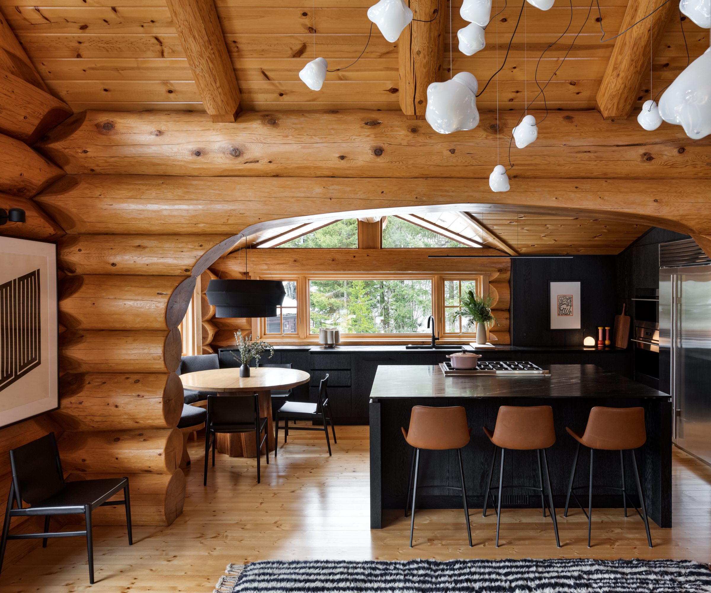
A dramatic arch in the log walls gives a view through to the contemporary kitchen space. 'Dark, modern, wire-brushed cabinetry is scribed against the irregular, golden hue of the log structure,' says the architect. 'In contrast to the original home, the architectural intervention is formally minimal and modern while the materials complement the organic, natural tones.'
'Introducing a modern aesthetic of clean lines to the traditional log architecture produced logistical construction challenges,' says the architect. His kitchen ideas have that minimalist, sleek character and he says the room is one of the areas that presented particular construction challenges: 'It required particular finesse on the part of the carpenters and millworkers when scribing new paneling or millwork against the organic forms.'
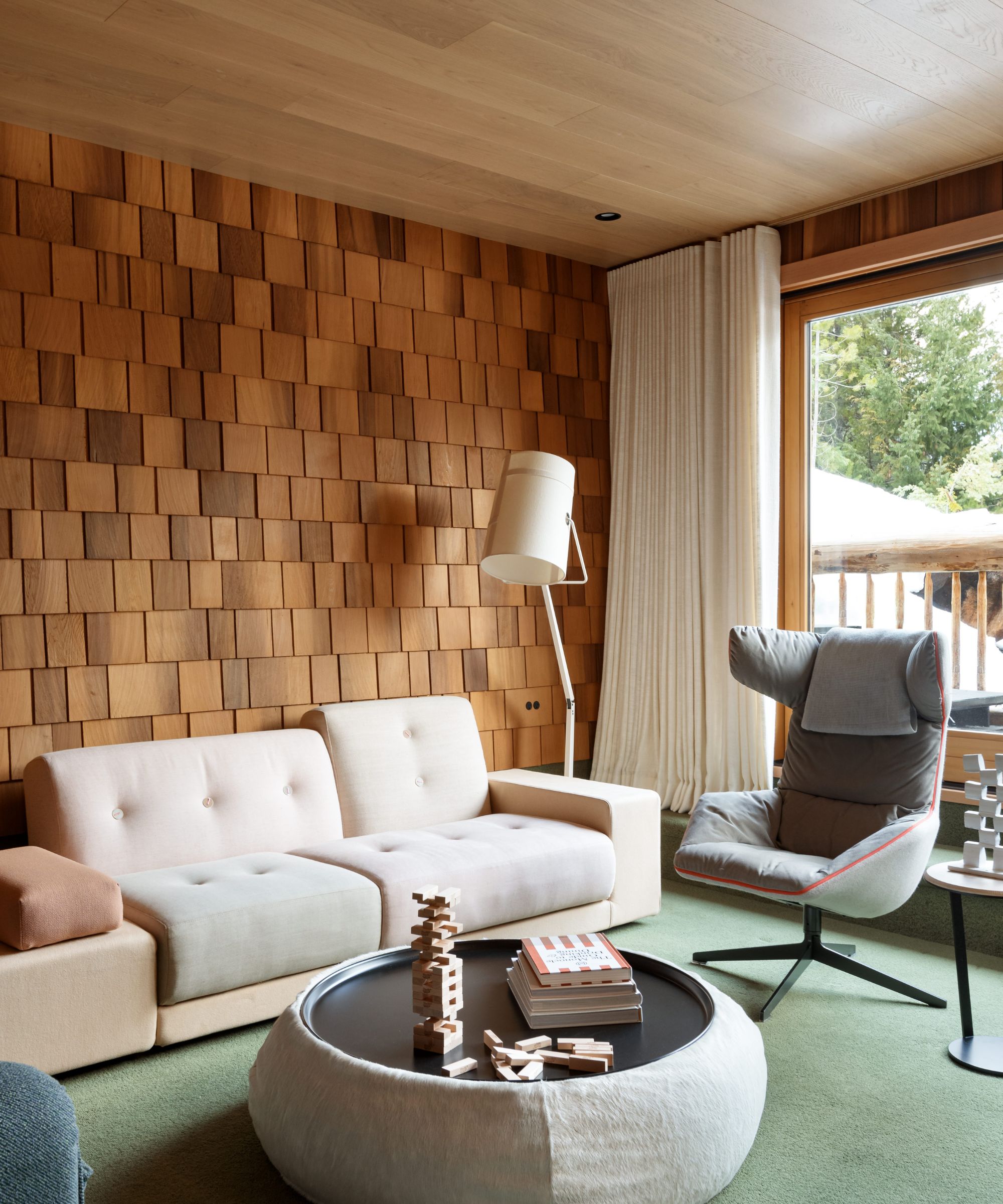
For the so-called hideout, used as a family living room and music space, architect Mark Burkart introduced texturally rich cedar shingles, an architectural feature also found on the exterior and intended to blur the lines between outside and inside. Mossy green wool carpeting also hints at the natural colors of the forest seen through huge picture windows.
Family living room ideas in keeping with the home's retro style include the Moroso Take a Line for a Walk chair and the Polder sofa from Vitra, with a B&B ottoman used as a coffee table.
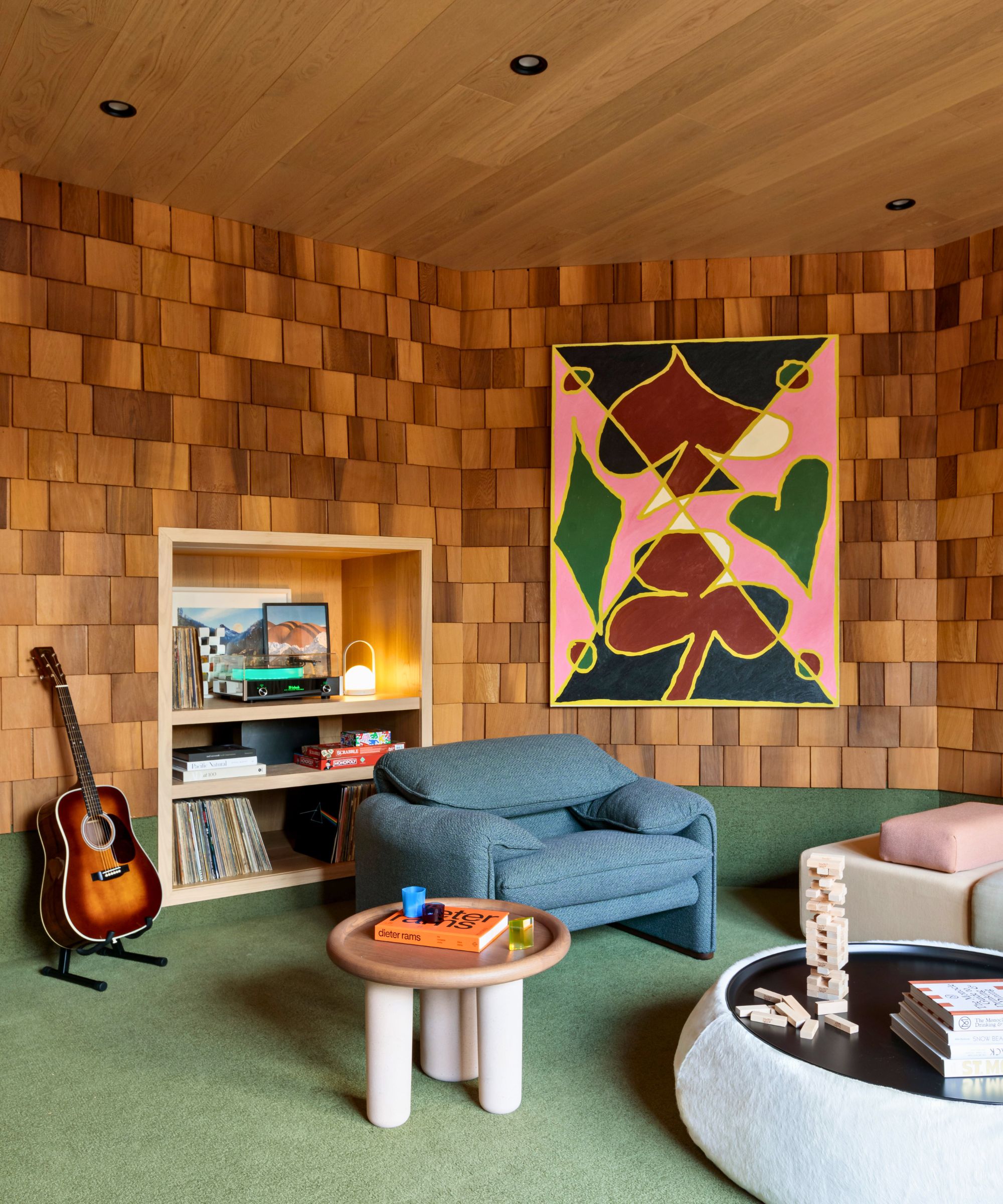
Setting the scene in the music room section is a 1970s design classic, Cassina's Maralunga armchair, with the quirky Pluto side table from Tacchini. This is surely one of the home's fun zones and playful, statement furniture underlines that aspect of the design. For rooms like this, without the exposed log structure, the ceilings were paneled in light white oak for a clean-lined contemporary finish.
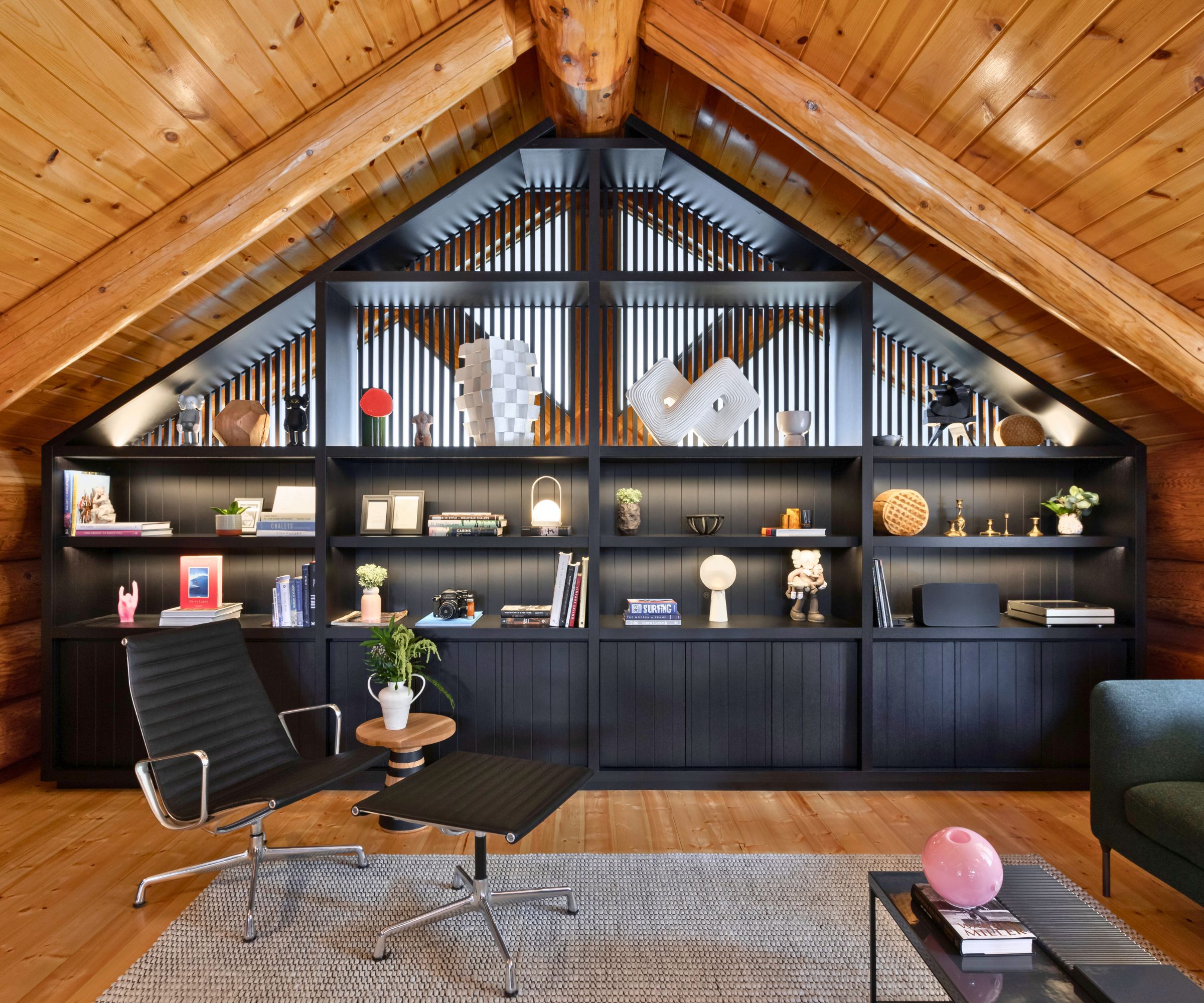
A further living space showcases black display shelves that intricately complement and contrast with the original log structure. An Eames Aluminum Group chair partners with a Benson sofa (just seen) and Mabeo Thuthu stool. The room doubles as a home office and the shelving is used to display owner Lyndon Cormack's prized collection of work by Vancouver sculptor Cameron Kerr.
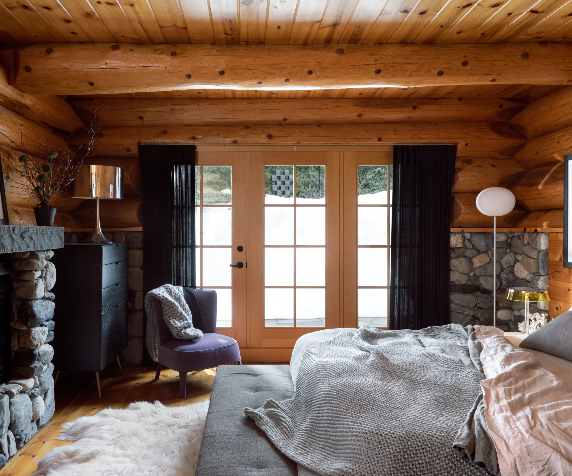
Who wouldn't sleep well in a room like this? Among the bedroom ideas we'd like to see becoming more of a 'thing' is the bedroom fireplace. This one is constructed in river stone for a truly organic look and feel. The windows are dressed with curtains from Cloth Studio; the chair is B&B's Maxalto Febo.
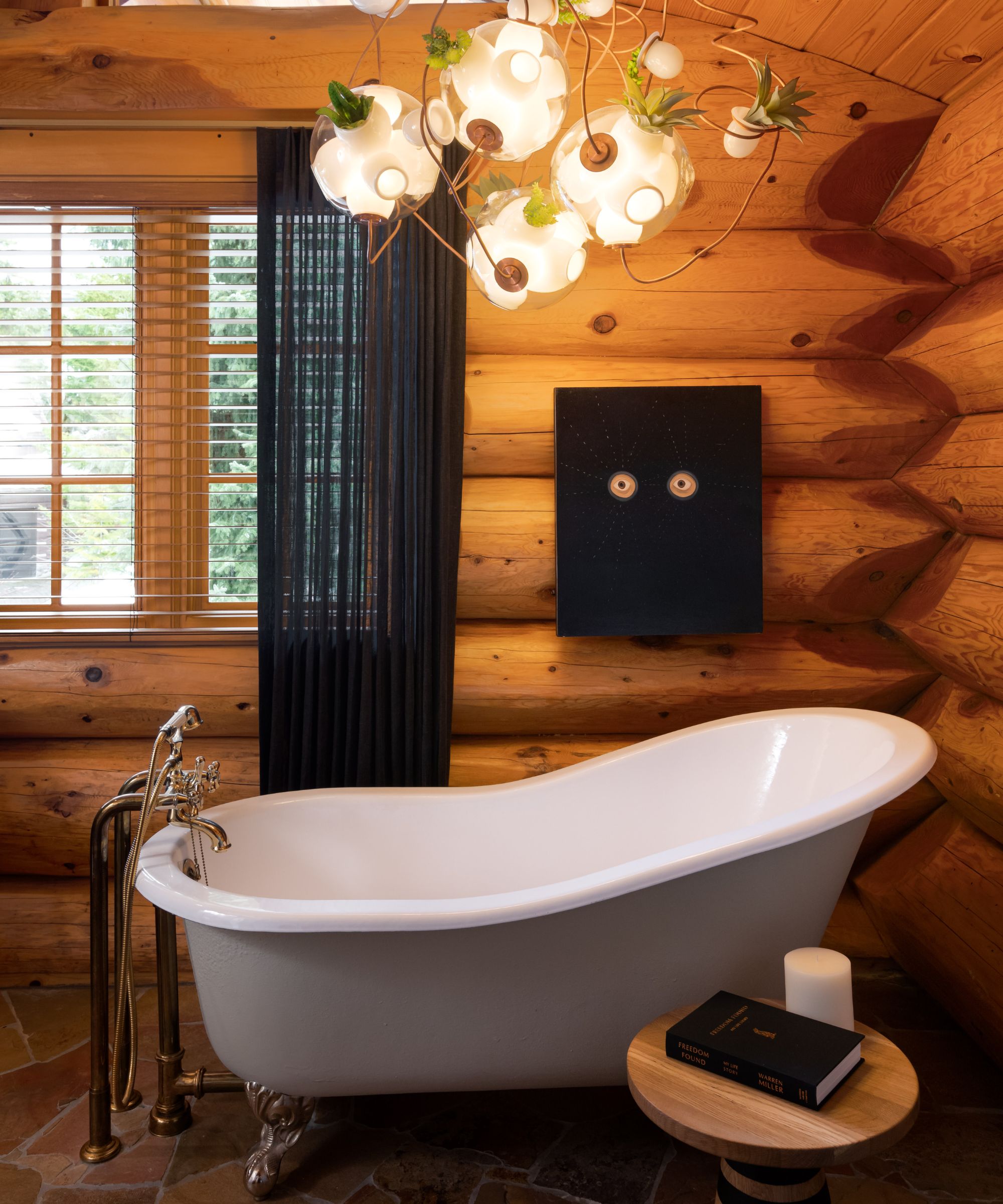
As for the cabin's bathroom ideas, it's not the roll-top that has us talking, much as we love it. It's the ceiling light that gives this small space the wow factor. The Copper Suspension light from Bocci, part of its 38 series, it's a mix of glass light sources and vessels deep enough to contain succulents, cacti and air plants. Now that's the way to brighten up your bathroom lighting ideas!
Photography: Ema Peter
Architecture & Interior Design: Mark Burkart, principal at Little Giant Studio
Homeowner: Lyndon Cormack co-founder and MD of Herschel Supply Co.
Sign up to the Homes & Gardens newsletter
Design expertise in your inbox – from inspiring decorating ideas and beautiful celebrity homes to practical gardening advice and shopping round-ups.
Karen sources beautiful homes to feature on the Homes & Gardens website. She loves visiting historic houses in particular and working with photographers to capture all shapes and sizes of properties. Karen began her career as a sub-editor at Hi-Fi News and Record Review magazine. Her move to women’s magazines came soon after, in the shape of Living magazine, which covered cookery, fashion, beauty, homes and gardening. From Living Karen moved to Ideal Home magazine, where as deputy chief sub, then chief sub, she started to really take an interest in properties, architecture, interior design and gardening.
-
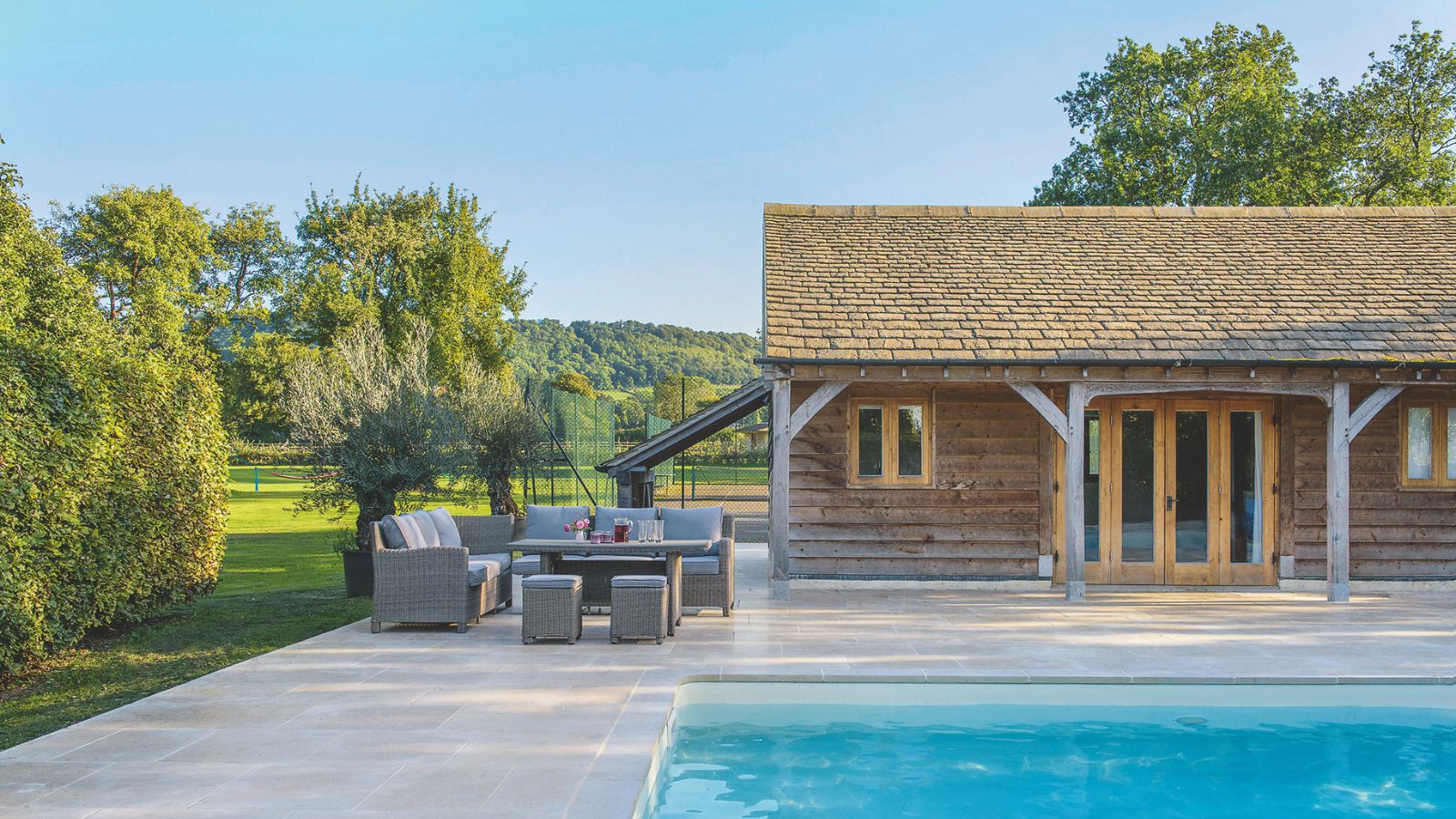 How to clean a patio – 6 different methods, and when you must use a chemical cleaning agent
From manual scrubbing, natural solutions or calling in the pros, industry experts reveal the benefits and considerations of each method
By Andy van Terheyden Published
-
 Kris Jenner's favorite air fryer, the Ninja Crispi, is the perfect small kitchen solution – it deserves a place on the most compact of countertops
Kris approves of this compact yet powerful air fryer, and so do our own kitchen appliance experts, praising it for its multifunctionality
By Hannah Ziegler Published