A simple color palette creates serene, calm spaces in this high-rise city home
Clean-lined contemporary elegance and soft neutrals create a restful look for this apartment in Chicago's Magnificent Mile
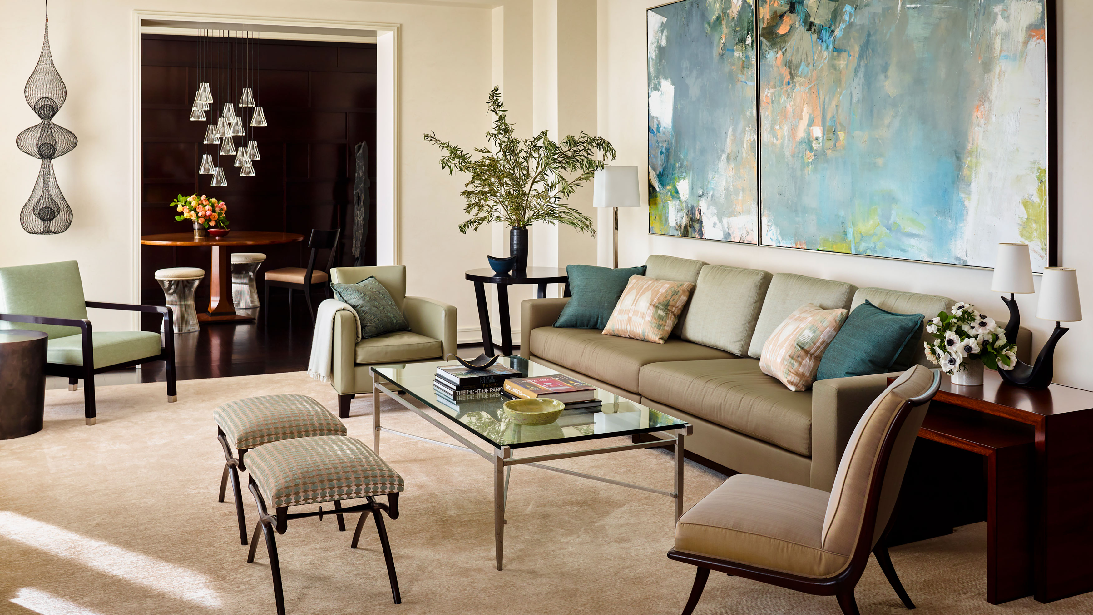
Moving from a traditional suburban home to an apartment in a city center high-rise condominium presented the perfect opportunity for a change of interior style. The building dates from the 1990s, but was updated in 2020, when this apartment was added.
The apartment's new owners wanted to ring the changes from their previous home and were looking for a much more contemporary clean look. The results of its recent redesign truly make this apartment one of the world's best homes, with an unbeatable view across Chicago to Lake Michigan.
The new interior schemes, by Bruce Fox Design, created serene, calm spaces that ensure the owners enjoy the best of contemporary high-rise living. Take a look round and discover how this stylish look was achieved.
Entry foyer
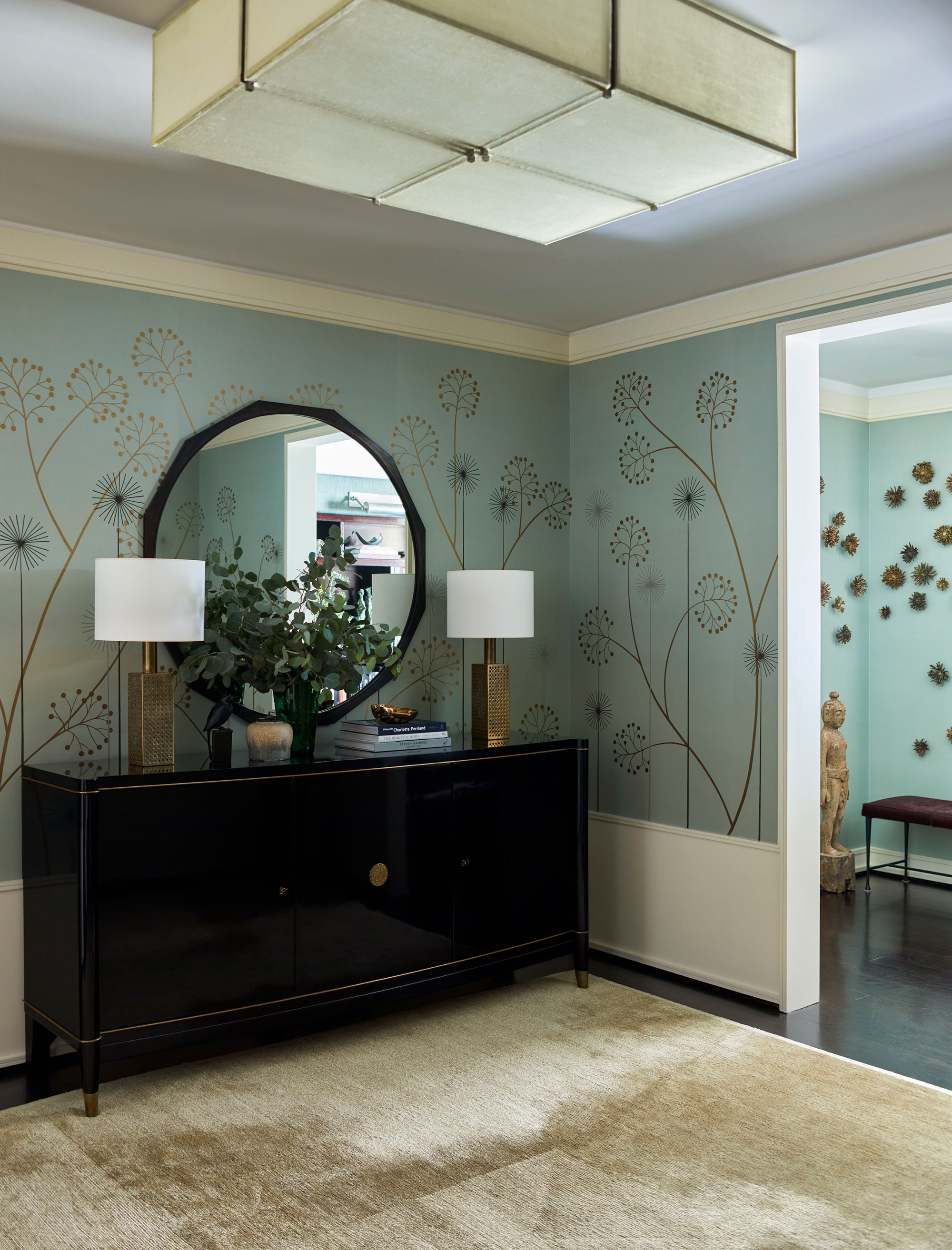
Looking for hallway ideas to make a strong opening statement? Designer Bruce Fox's choices for the Chicago apartment's entry foyer do exactly that.
'The creative wallcovering in the entry really made a wow moment as soon as you step inside the apartment,' says Bruce.
In the foyer, as elsewhere in the apartment, there's a harmonious mix of modern and retro pieces. However, to achieve the clean-lined look the owners wanted, it was important to choose the right antiques – so Bruce picked out classic pieces with simple profiles.
The elegant silk wallcovering from Fromental, an Art Deco ebonized three-door sideboard topped with vintage lamps, the space sets the tone for the apartment - particularly its stylish lighting solutions. Here in the foyer the showstopping custom light sculpture is by John Wigmore.
Reading nook
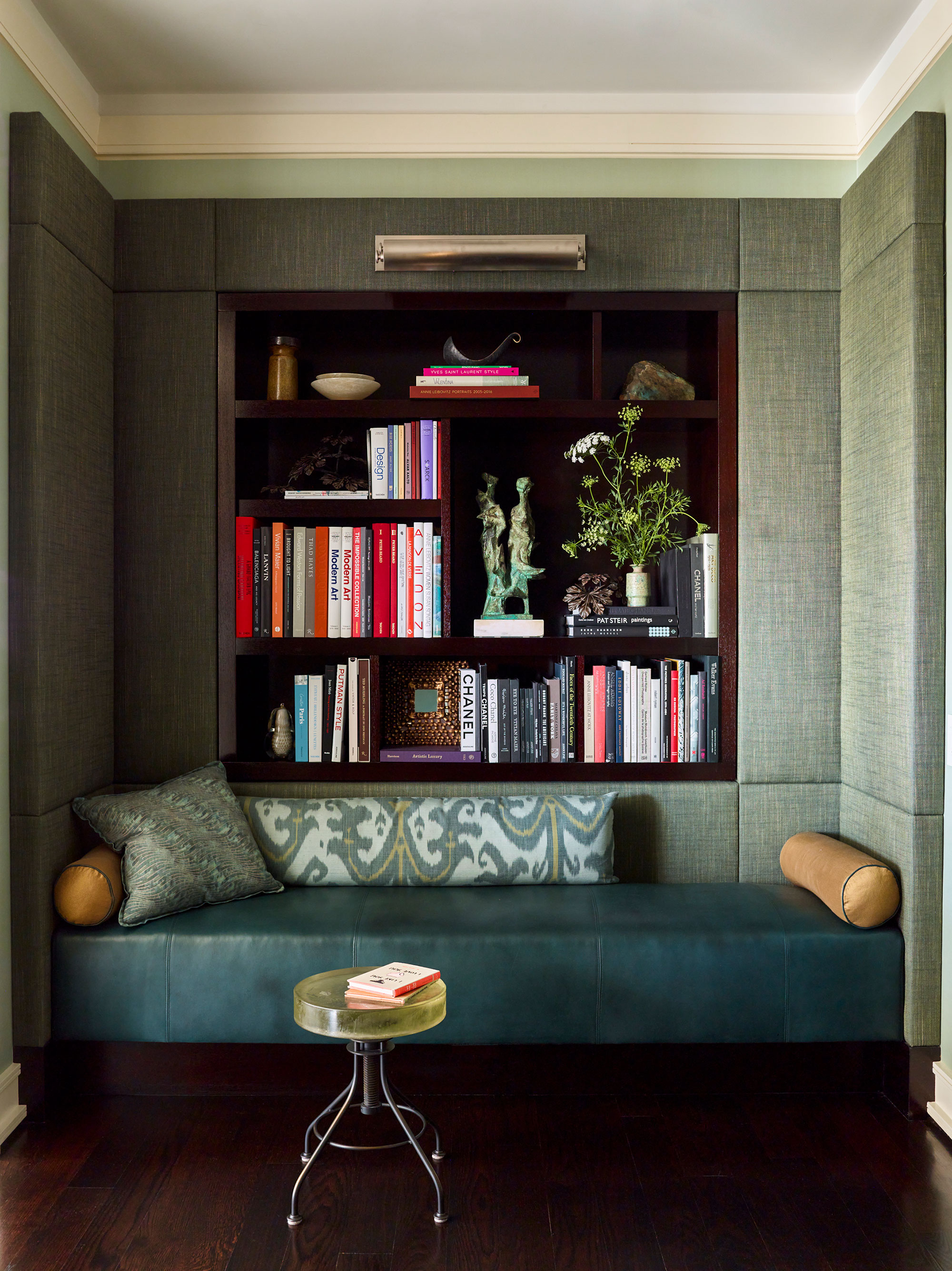
Just off the foyer is a small ante room, with a custom Bruce Fox Design sofa, integrated book niche and upholstered wall panels. The textured walls add an extra layer of interest to this compact space, making it a cozy spot to curl up with a book. The stool is by Alison Berger at Holly Hunt.
Kitchen and breakfast room
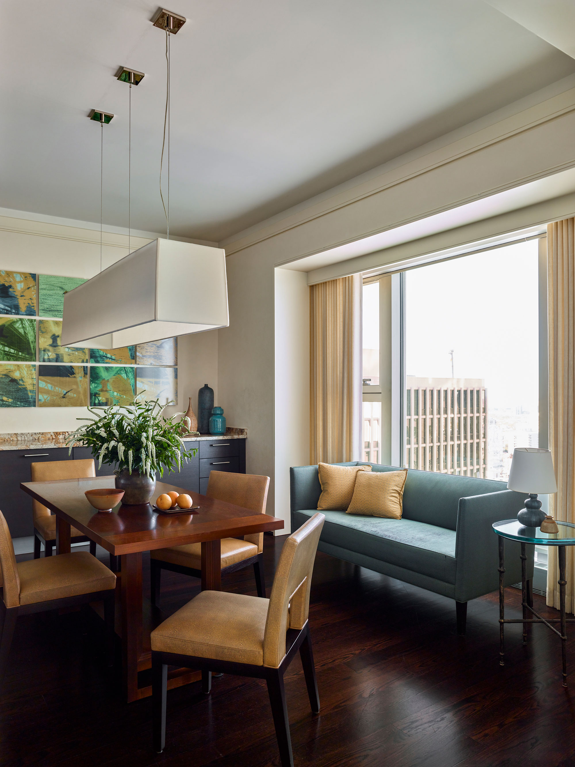
Kitchen ideas for this apartment included a dedicated breakfast table. This part of the room faces north, so it makes a cozy spot to start the day. The custom sofa is from McLaughlin with Fortuny pillows. The table is from Troscan Design and the chairs are by Christian Liaigre. Another bold statement light, also from Liaigre, lights the table for informal meals.
Living room… with a view
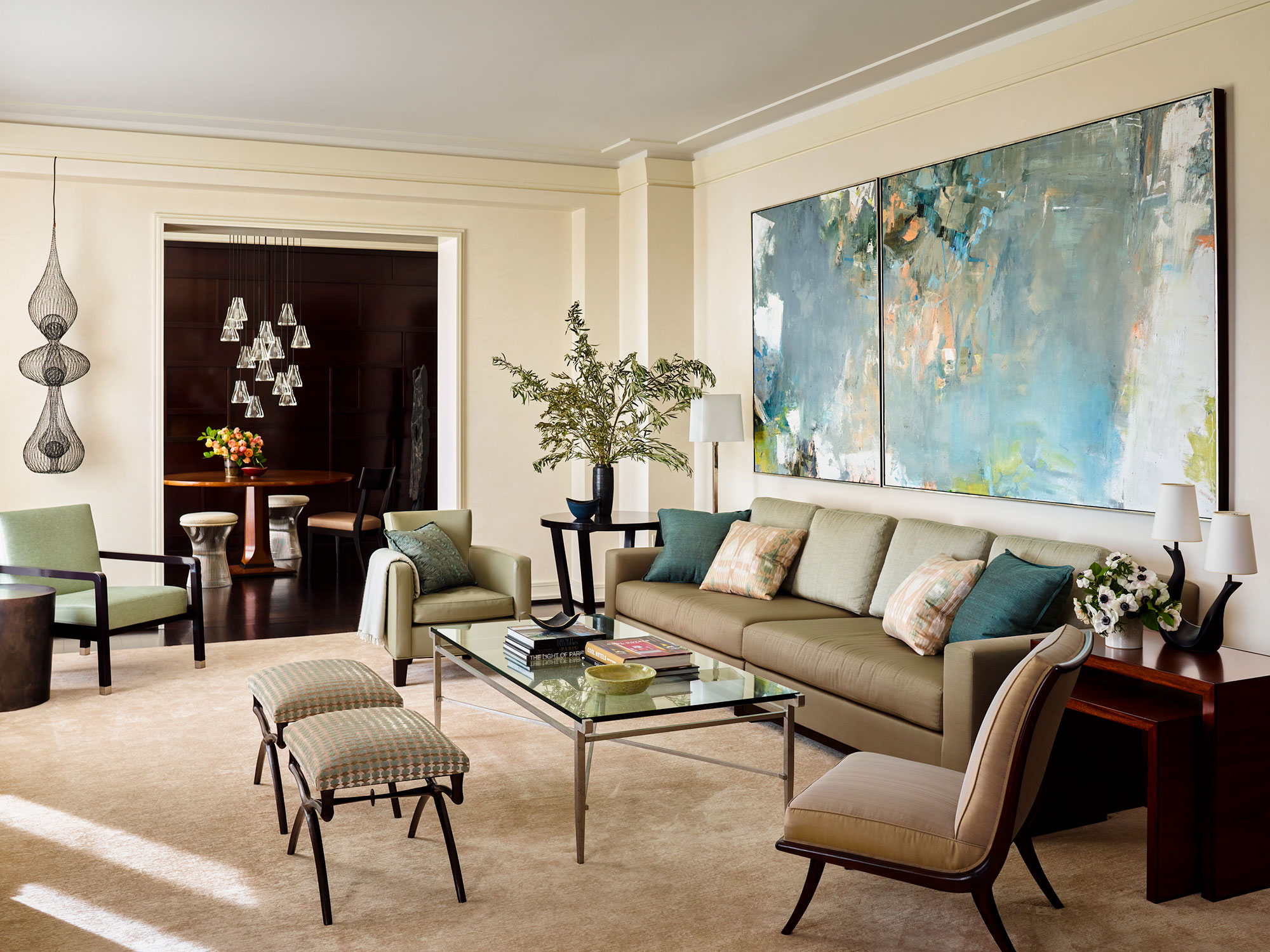
One of the living room ideas of which Bruce Fox is most proud is the Venetian plaster finish for the walls.
'The Venetian plaster is one of my favorite elements. It has a softness and tactile quality that is very appealing. I love the living room with the oversized sofa and the amazing city and lake views,' he says. The clients choice of a striking contemporary diptych is the perfect finishing touch for the space.
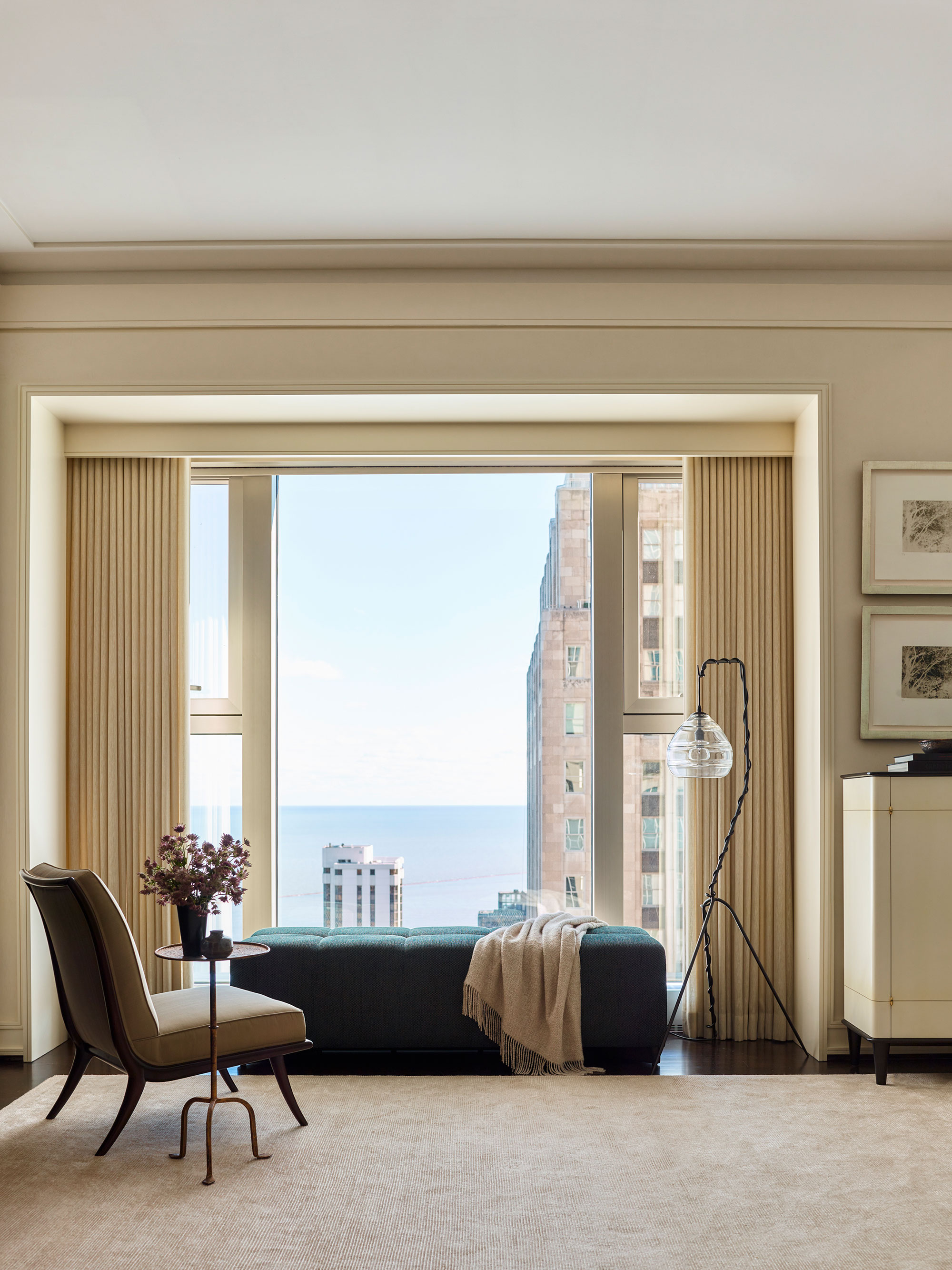
On the opposite side of the living room, a vast window gives a spectacular view high above the streets of Chicago towards Lake Michigan. A 1950s TH Robsjohn Gibbings slipper chair, with its clean lines, is a design classic that fits the contemporary space despite its advancing years.
Dining room
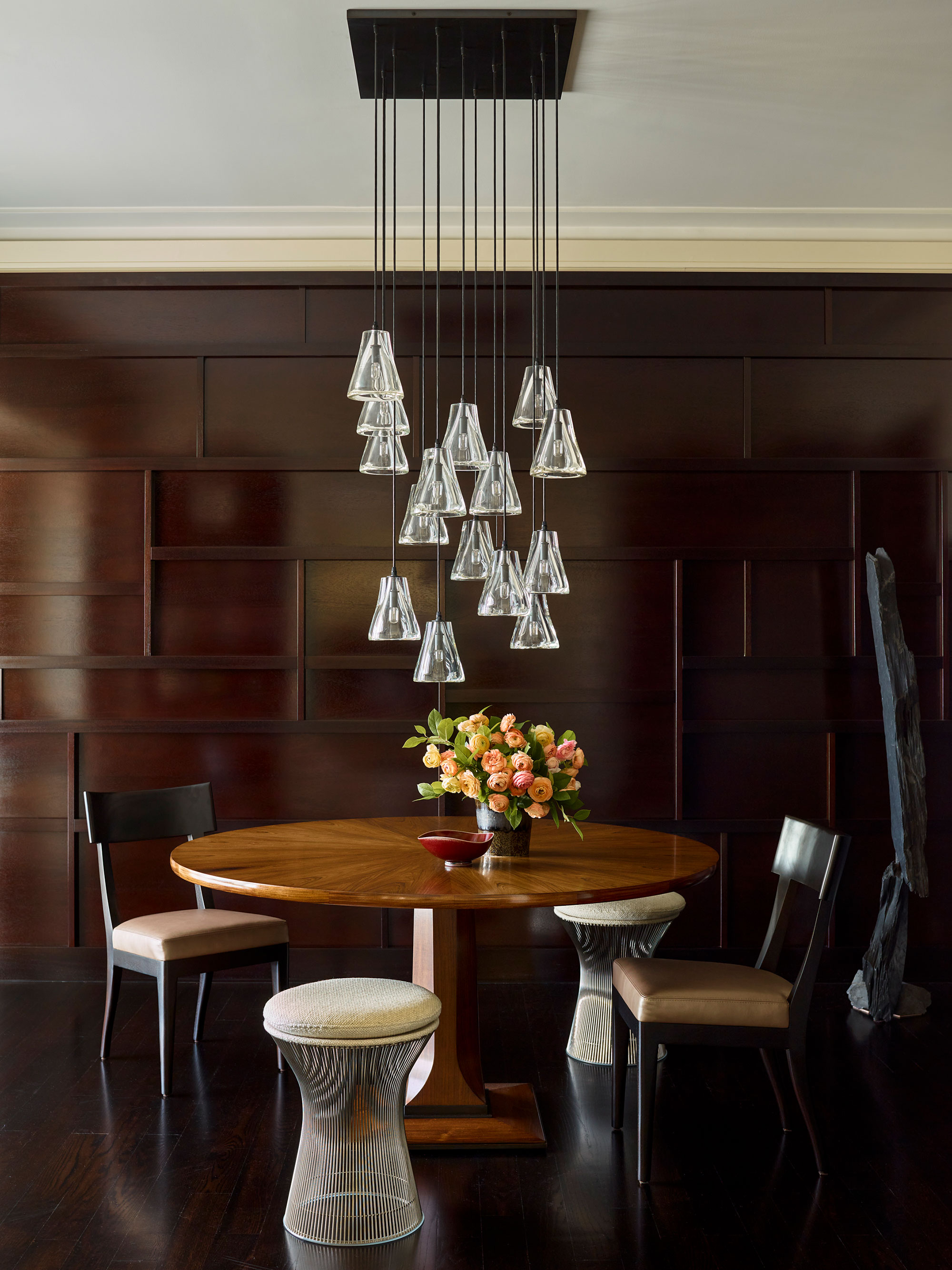
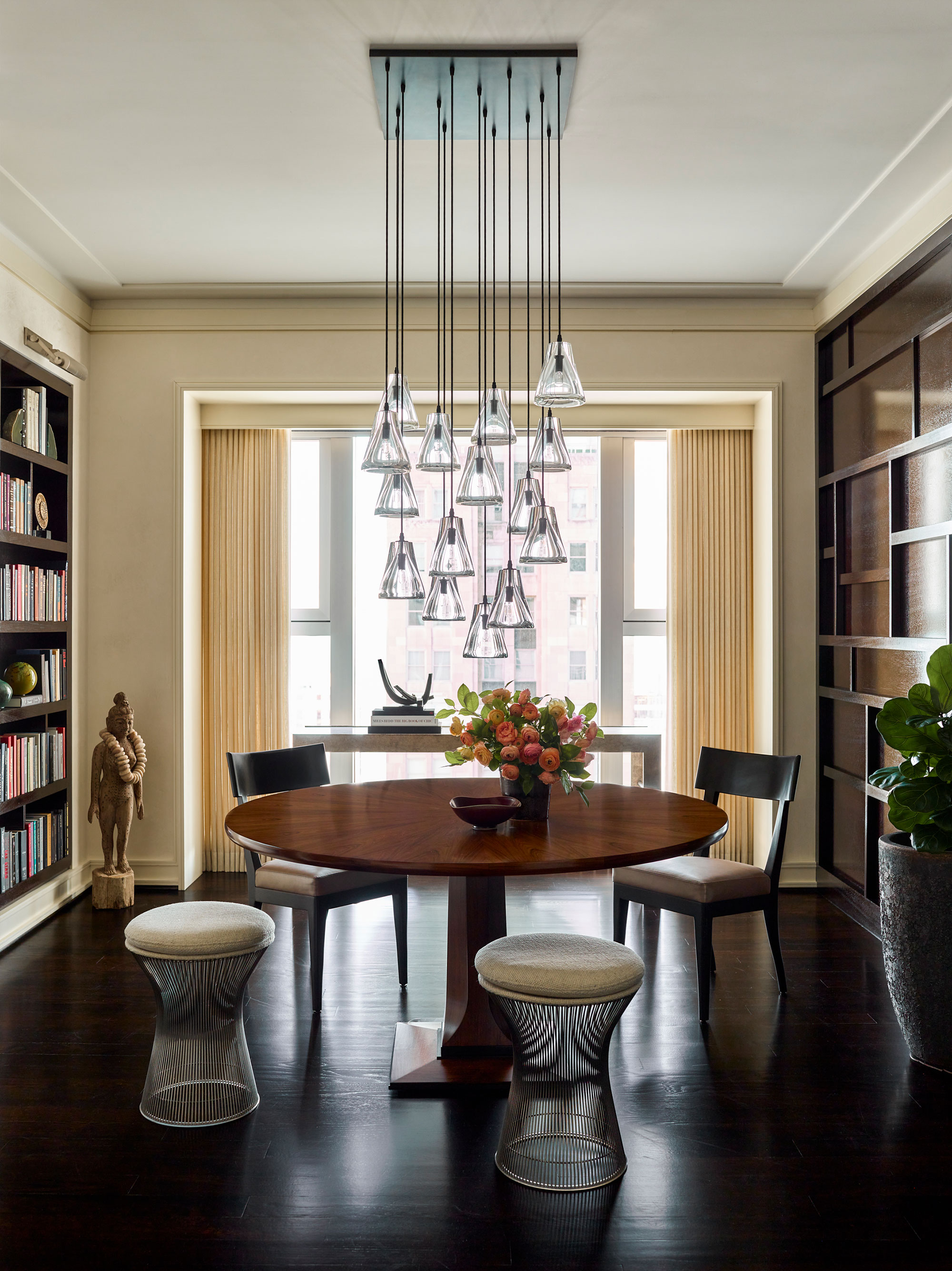
Bruce's dining room ideas included adding bold architectural detailing to create this smart entertaining space at the heart of the apartment. The custom mahogany millwork panels are arranged in an asymmetric pattern designed to anchor the room and provide the backdrop for a stunning Alison Berger chandelier. The room's window looks east to the Palmolive building and Lake Michigan. The rosewood Marci table is from Troscan Designs, the chairs are the Terra design by Christian Liaigre. The stools are by Warren Platner for Knoll.
Bedroom
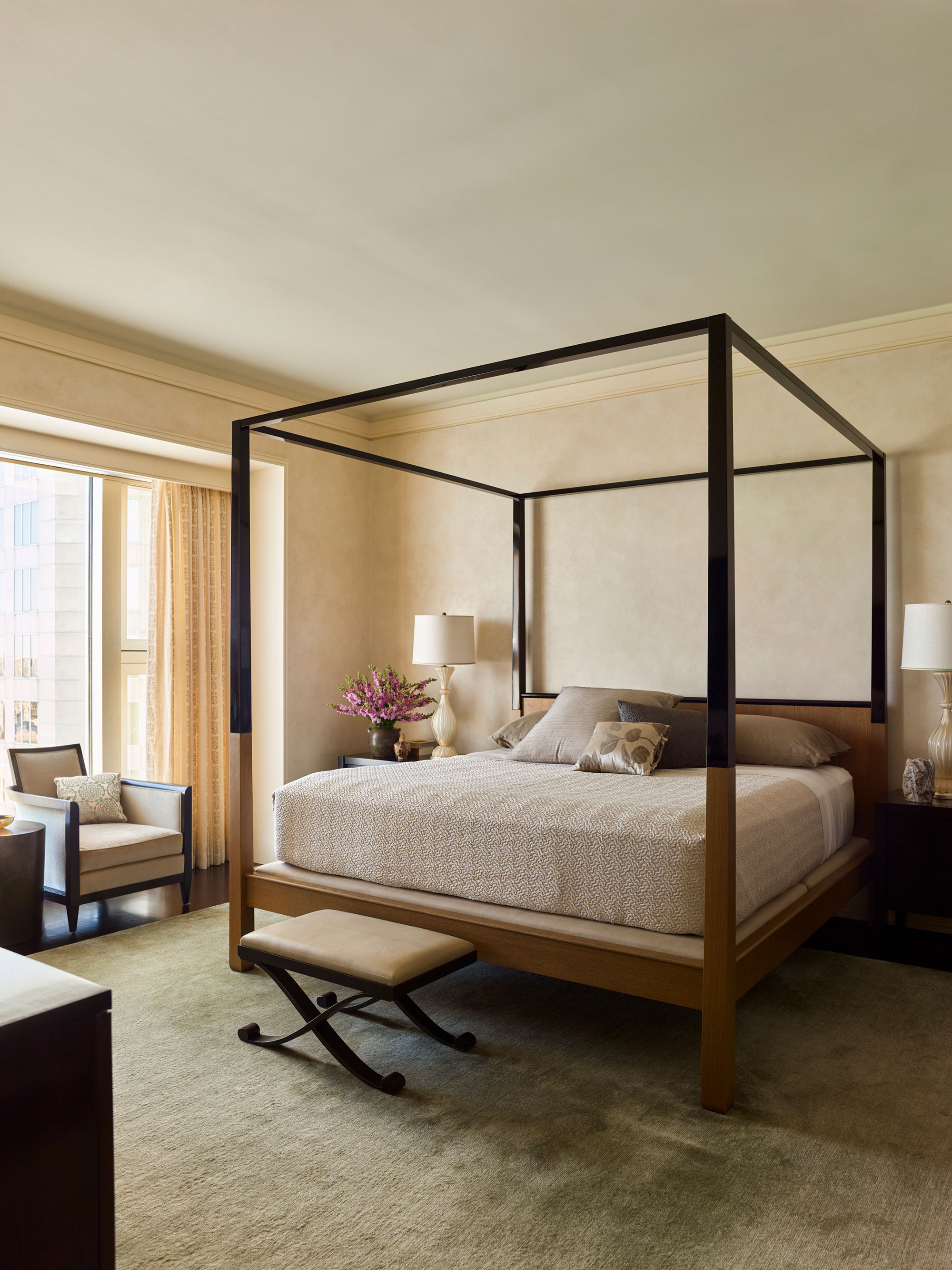
Designer Bruce chose to include the Venetian plaster wall finish in his bedroom ideas for the apartment's main bedroom. He's designed a Zen-like space with a soothing green silk and wool rug from Hokanson. The contemporary four-poster is by Christian Liaigre and its understated simplicity make it the perfect choice for this no-frills space. The table lamps are vintage Murano glass.
It's only natural that the bedroom should be the calmest space in the apartment, but Bruce Fox has ensured that the entire footprint of the property has a serenity that makes it the perfect city retreat for its new owners. 'The clients and I are extremely happy with the results and the apartment stands the test of time,' says Bruce. 'It was truly a dream come true for the clients and they love their new urban lifestyle.'
Interior design: Bruce Fox Designs
Photographs: Eric Piasecki; and styling: Anita Sarsidi
Sign up to the Homes & Gardens newsletter
Design expertise in your inbox – from inspiring decorating ideas and beautiful celebrity homes to practical gardening advice and shopping round-ups.
Karen sources beautiful homes to feature on the Homes & Gardens website. She loves visiting historic houses in particular and working with photographers to capture all shapes and sizes of properties. Karen began her career as a sub-editor at Hi-Fi News and Record Review magazine. Her move to women’s magazines came soon after, in the shape of Living magazine, which covered cookery, fashion, beauty, homes and gardening. From Living Karen moved to Ideal Home magazine, where as deputy chief sub, then chief sub, she started to really take an interest in properties, architecture, interior design and gardening.
-
 7 expert-approved painting hacks to minimize clean up – to make an already exhausting task easier
Avoid a backbreaking clean-up after your next painting project with advice from the professionals
By Chiana Dickson
-
 Gwyneth Paltrow's quiet luxury kitchen is so beautiful, we almost overlooked her ultra-smart cabinets – they make the use of 'every inch' of storage space
The Goop founder makes use of dead space in her kitchen with customized cabinetry that reaches to the ceiling, providing ample storage
By Hannah Ziegler