This Californian home has been updated with a fresh, modern English country feel
The owners of this quirky cottage style house wanted a home that felt a little younger, without losing any of its period character and charm

This charming cottage style home in California, location of many of the world's best homes, required a few clever tricks of the trade when it came to its renovation.
‘The house definitely had some challenges as far as the quirky layout and all the angles,’ says Katie Monkhouse, founder of Katie Monkhouse Interior Design. ‘It had been added on to many times since it was built so we were trying to connect the dots without removing all the quirk that gave it character. We really wanted to streamline wherever we could to reduce some of the visual noise from all the angles.’
The owners moved from the city and welcomed their first child during the project. ‘They fell in love with the property but knew they wanted it updated to feel a little younger without losing all the charm and traditional feel.’
Katie's approach was simple. ‘We painted the walls and ceiling the same color to eliminate contrast and the angles just started to fade away. We pulled millwork details from existing areas through to the renovated areas to create continuity and make it all feel like it had always been there.’
Her inspiration came from her time living in England. ‘All the paint colors are Farrow & Ball. We wanted lots of wainscotting and paneling, lots of draperies, and herringbone floors – we knew the house needed to keep its cottage charm but we wanted to layer it in color and pattern to give it some gravity.’
‘We were going for an English cottage feel, warm with layered colors and patterns but still modern enough for this young family.’
Kitchen
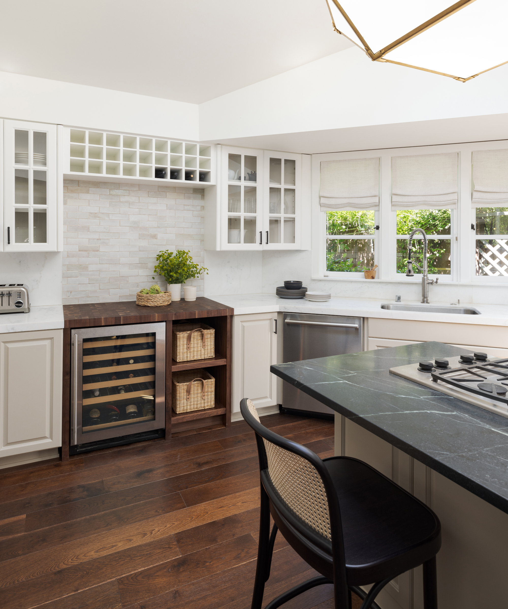
The clients were keen to maintain the character of the home through updates and making each space usable.
‘We did small reconfigurations to create a larger laundry area by removing an outdated kitchenette and a more functional kitchen by filling an awkward nook with a custom butcher block walnut cabinet and wine fridge,’ says Katie. ‘We wanted to maintain some quirk but clean it up to feel more cohesive and functional.’
Katie plumped for a facelift in the kitchen, rather than a full renovation. Among her kitchen ideas was painting the cabinetry in two-tones, updating the island countertop, switching out all the hardware and sink faucet and adding a statement lantern over the island. ‘The kitchen feels fresh and updated without replacing existing cabinetry and marble.’
Dining area
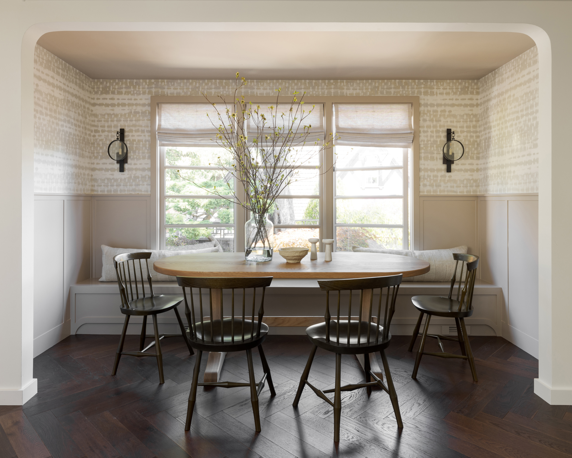
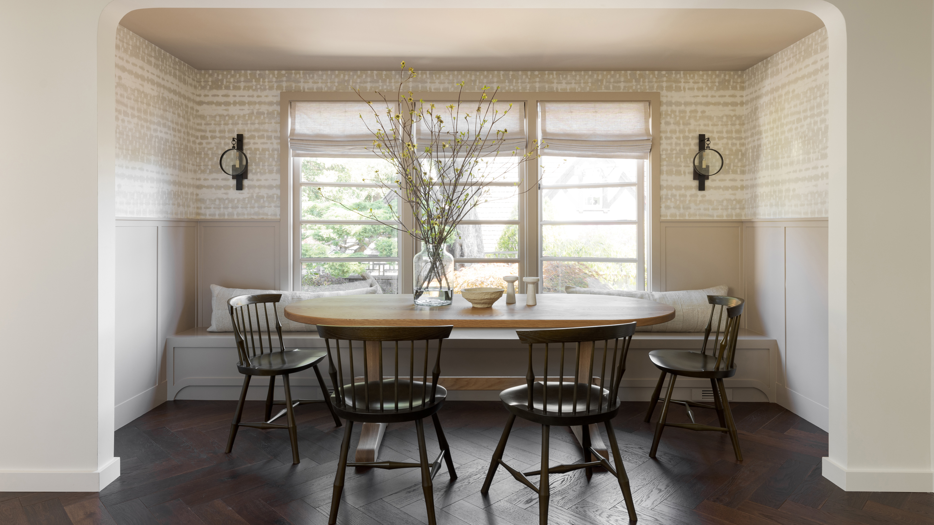
This space is one of Katie's favorite transformations. Dining room ideas were plentiful. ‘We ripped out some built-in bookcases to make the space symmetrical and reframed the opening to be wider and have a soft curve,’ says Katie. ‘The millwork is an extension of what is existing in the adjacent hallway and the built in dining banquette adds loads of extra seating. Farrow & Ball Jitney on the millwork and a printed grass cloth Philip Jeffries wallpaper create a sofa contrast to the rest of this area in the home, which is a warm white.’
Living area
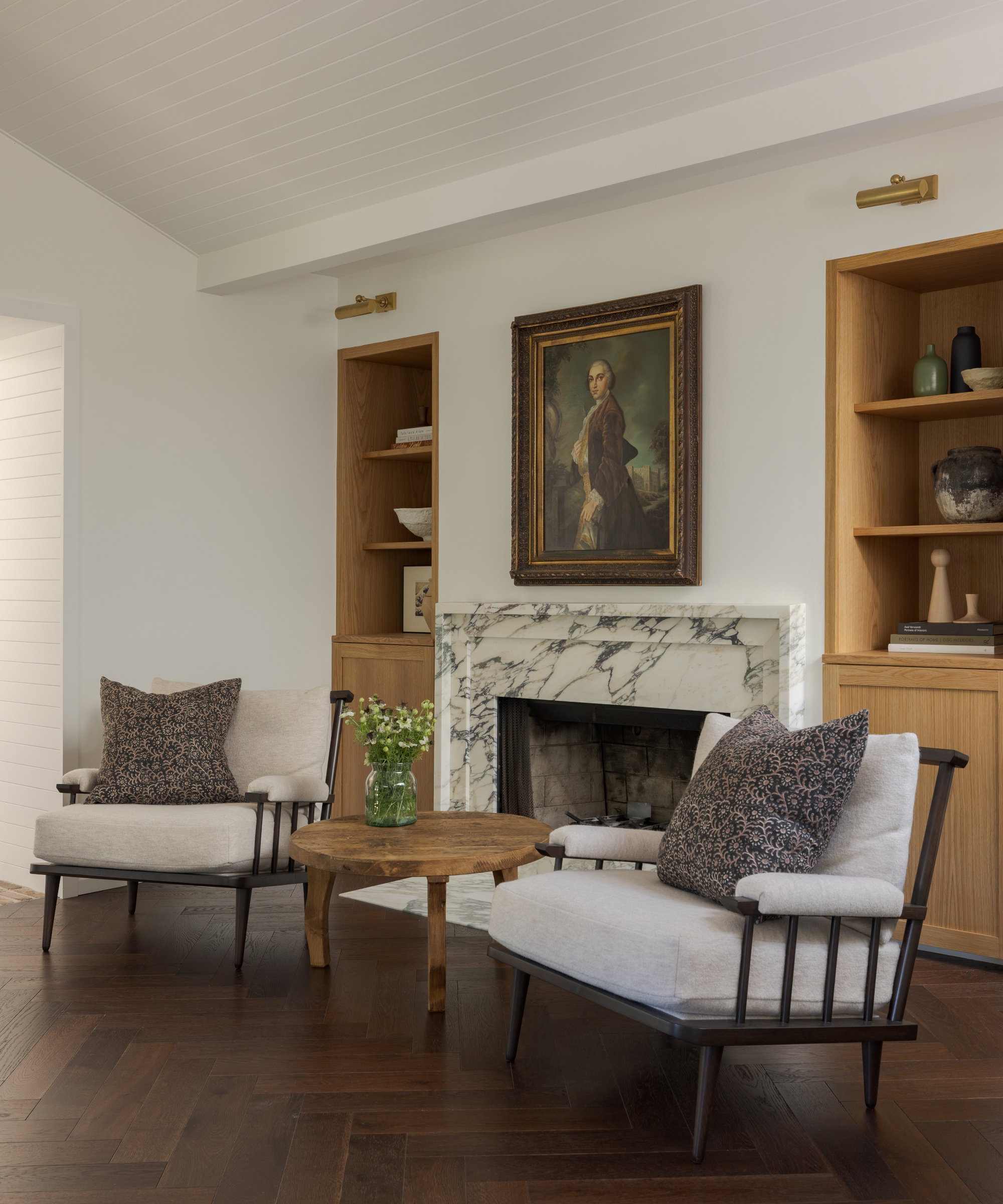
Katie's living room ideas included recladding the existing built-ins with a white oak that contrasts with the dark herringbone floors and adding a new fireplace surround in her favorite marble, Calacatta Monet. ‘All of these elements are consistent with the character of the home but feel so updated and fresh,’ she says. ‘We added comfortable seating and picture this as a place to sit with a coffee or a glass of wine for good conversation – it’s a very intimate little spot.’
Entry to library
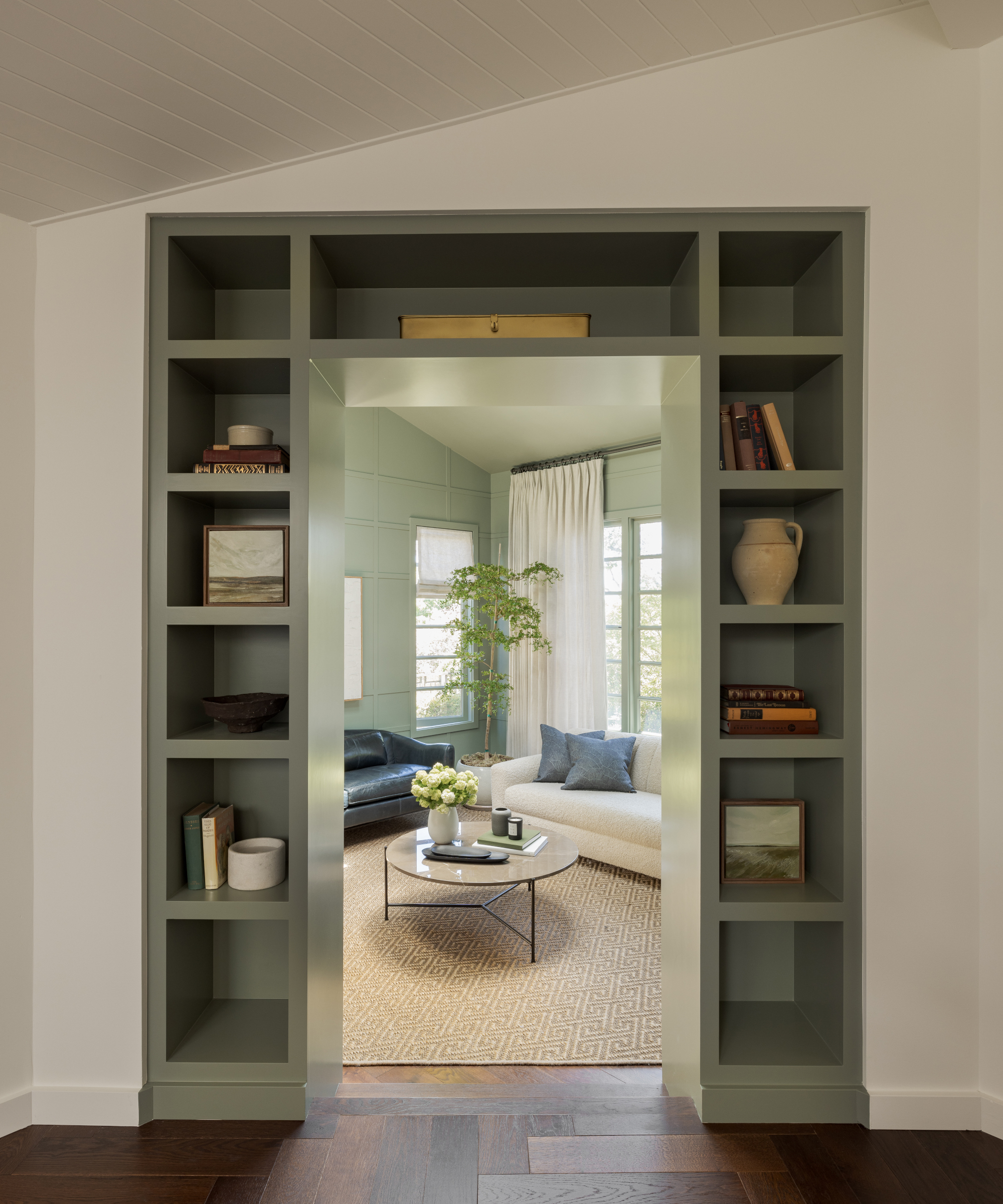
Katie's clever design ideas included a built-in shelving unit around the doorway that leads the eye through to the library beyond.
Library
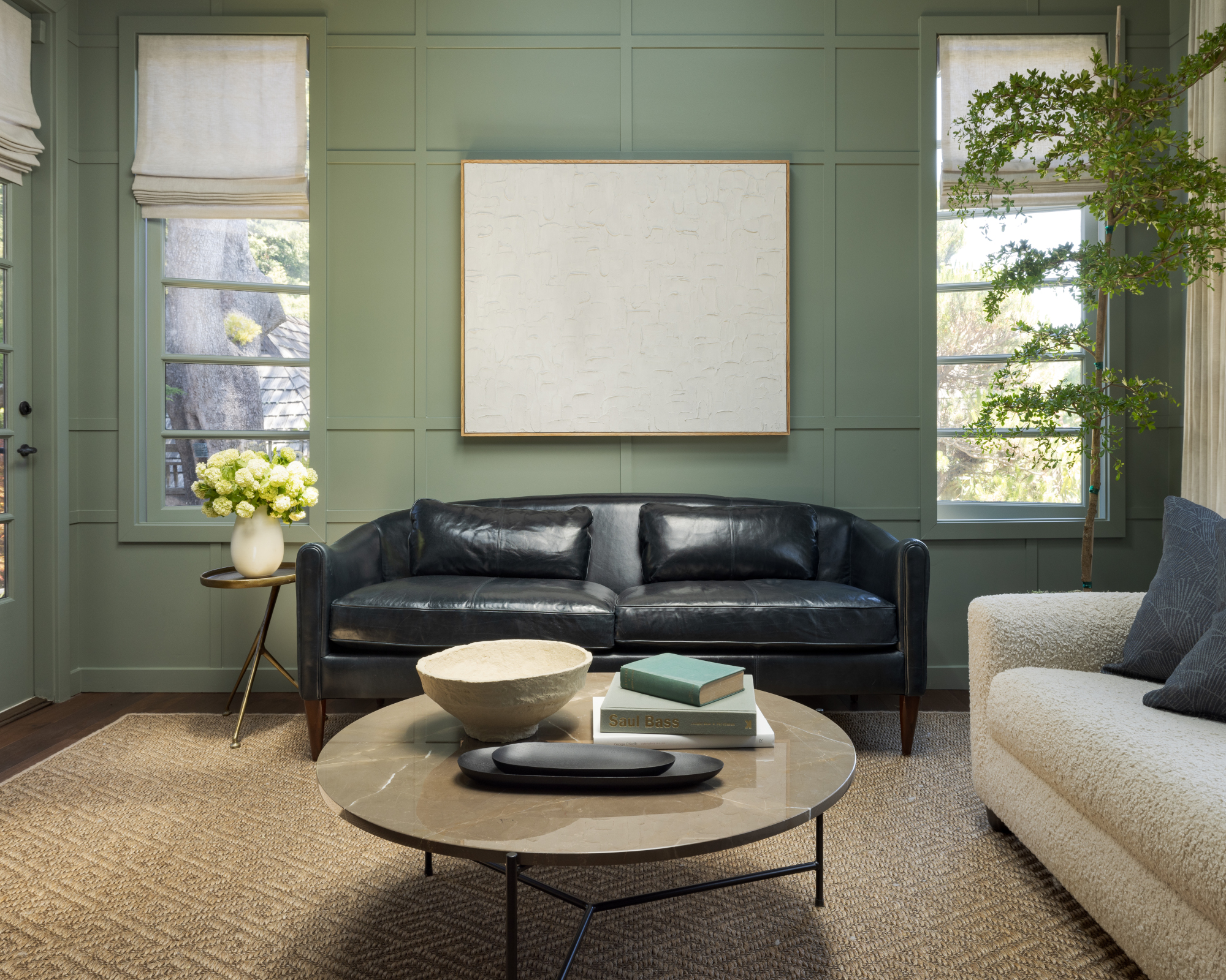
The library is flooded with natural light so Katie used it as an opportunity to envelop the space in color. The oldest oak tree in the area is outside the window so Katie used it as inspiration for the palette with a lush green paint on the walls. Even the marble coffee table has a warm brown tone that connects to the scenery. She also introduced a tan sisal custom-cut carpet, a deep indigo leather sofa and a soft faux shearling design.
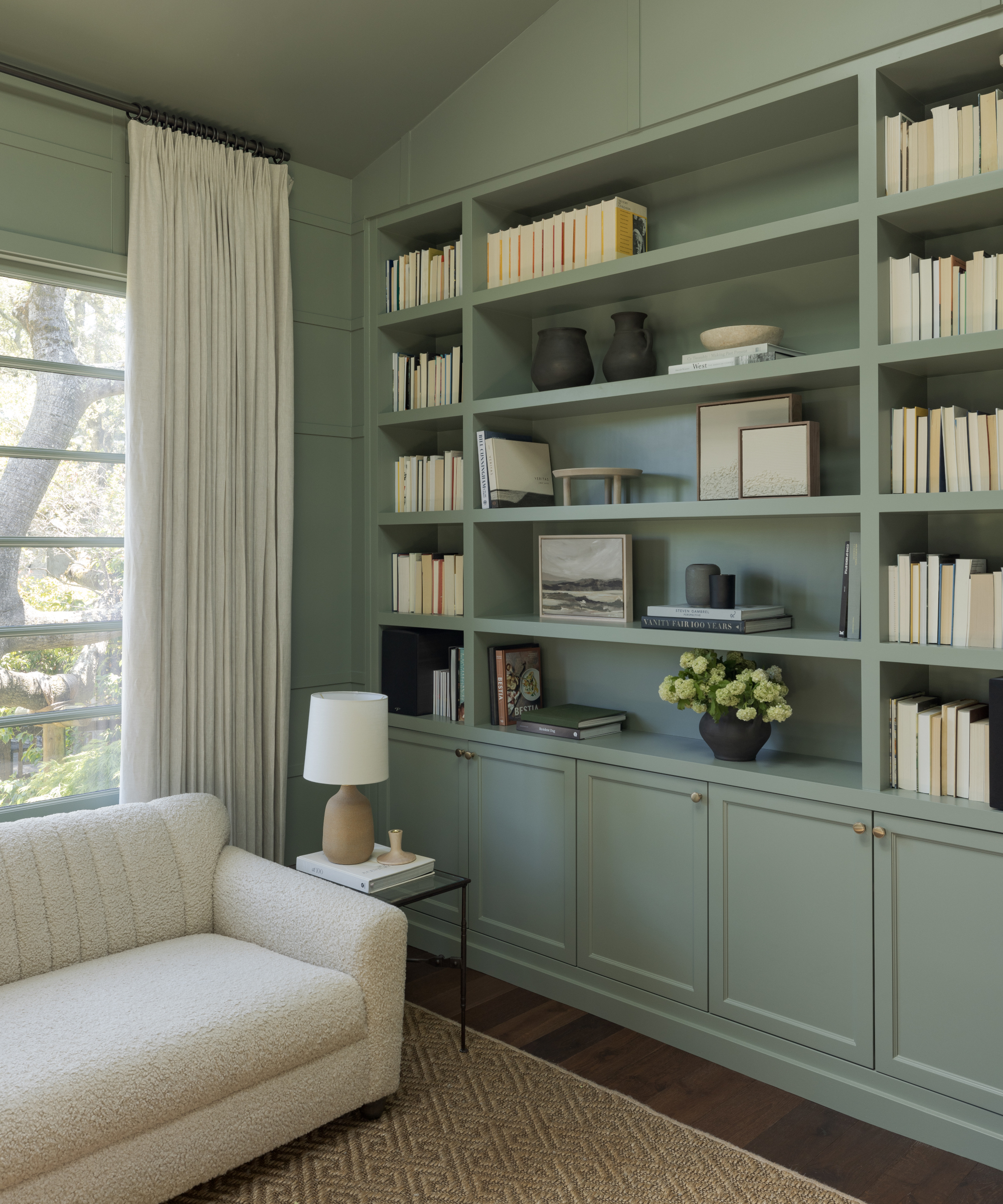
The built-in, painted in a soothing green, provides plenty of storage.
Powder room
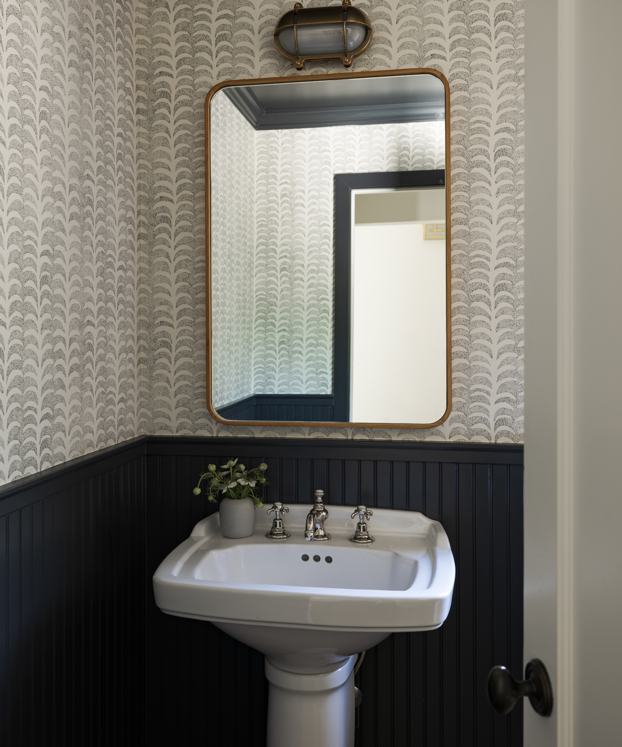
Katie's vision was to create a statement scheme for this small space. ‘We love a dramatic powder room,’ she says. Her bathroom ideas included painting the existing wainscotting and ceiling a dramatic off-black and adding Rebecca Atwood wallpaper for a fun element, as well as updating the lighting and mirror.
Family room
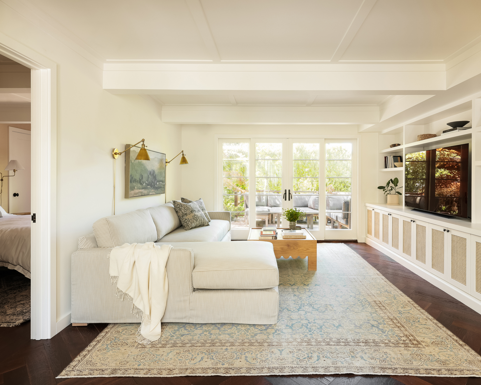
A light palette is used in the family room, creating the perfect environment for relaxing. ‘We updated the built-ins with new cane doors and added furnishings with a cottage feel,’ says Katie. The antique rug and coffee table came from her shop, Westpark Home.
Guest bedroom
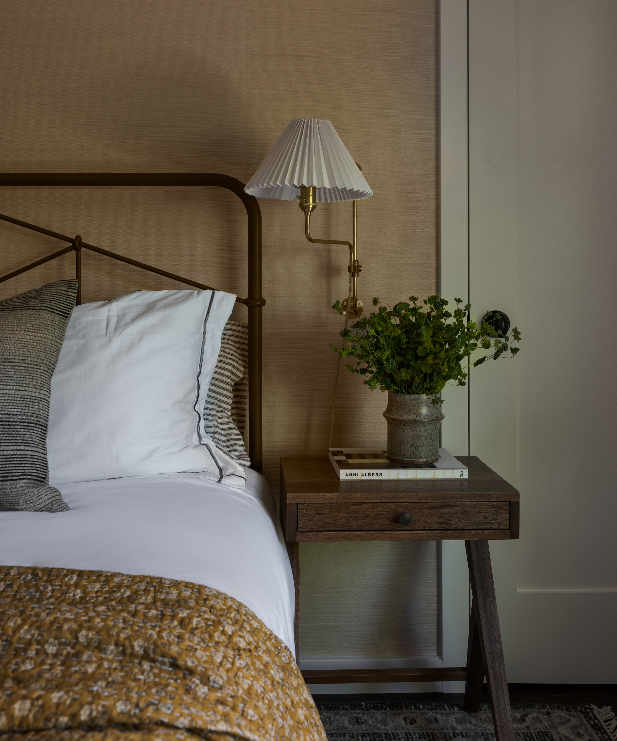
The guest bedroom is connected to the lower level family room, so Katie extended the color palette from that room. The bedroom walls are clad in a natural tone grasscloth and patterned textiles and an iron bed enhance the cottage look.
Primary bedroom
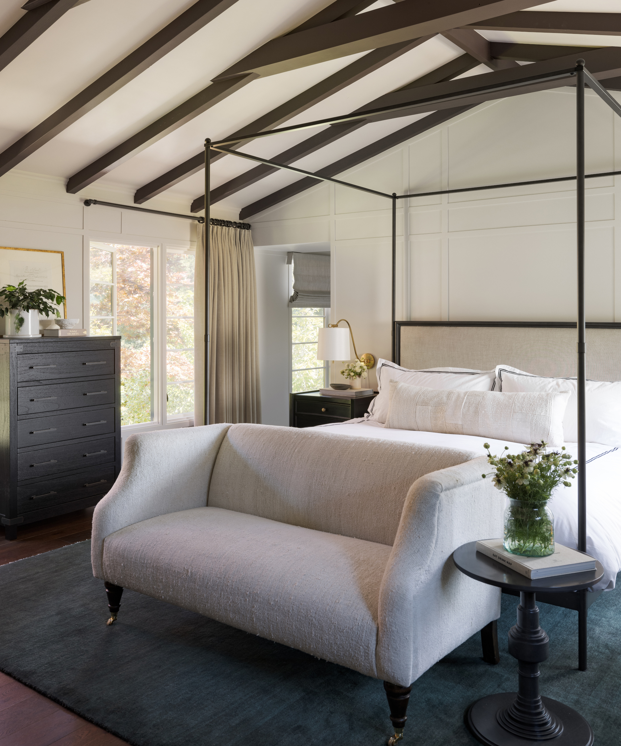
Katie undertook a big transformation in the primary bedroom. The wall behind the bed was originally a freestanding partition separating the sleeping area from the bathroom that created a closet. Katie's bedroom ideas including extending the wall to the ceiling and out to the sides to create cased openings. ‘This really changed the feeling of the space and provided a lot of privacy,’ says Katie.
‘We also removed old iron collar ties and reinforced and then painted the beams to accentuate the tall ceilings. The clients wanted the space to feel like a luxury hotel suite and I think we achieved that with the plush area rug, dramatic canopy bed and velvet drapery.’
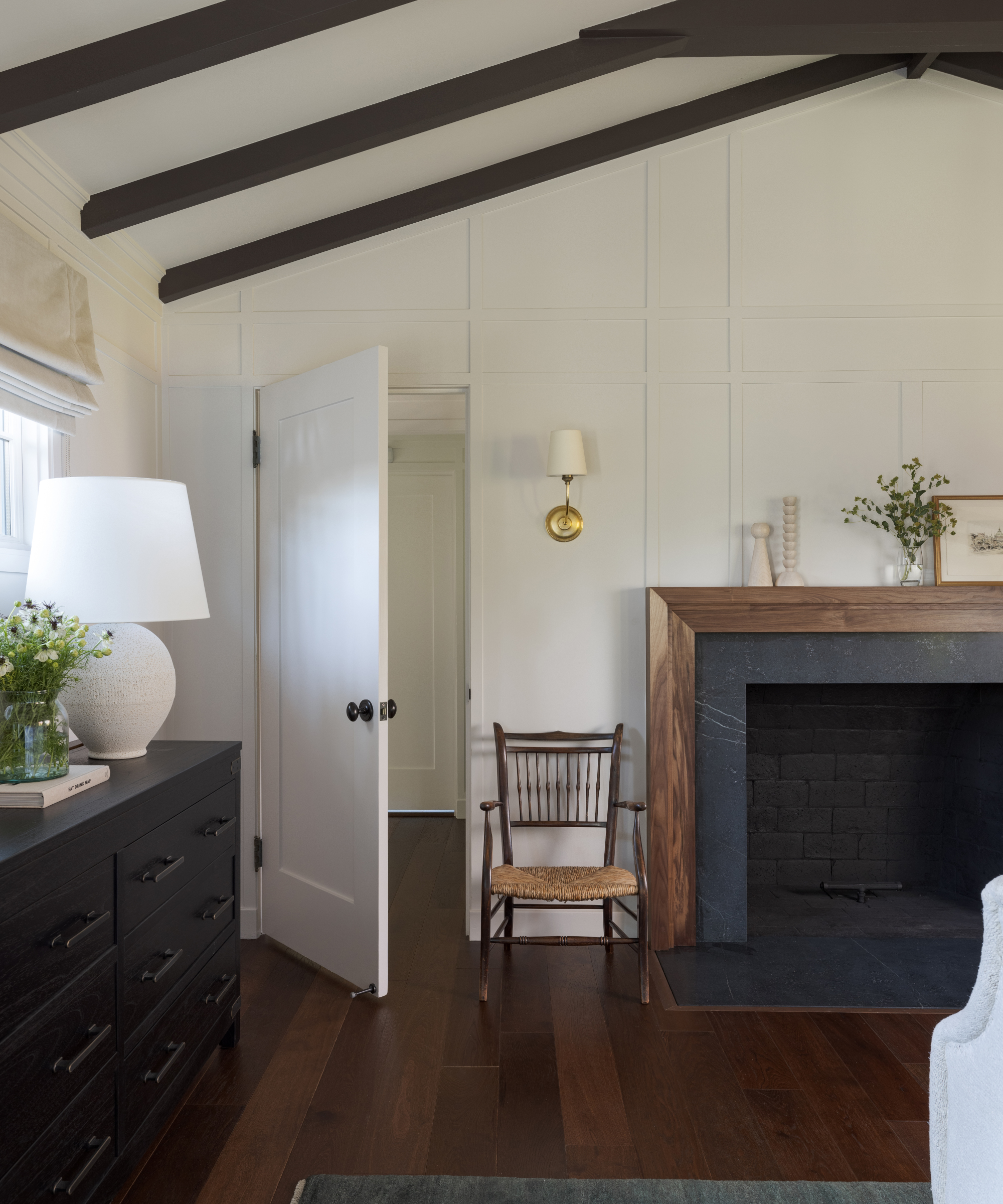
Katie emphasised the period feel with an updated fireplace using the remnant soapstone from the kitchen island and a millwork mantel.
Interior design/ Katie Monkhouse Interior Design
Photographs/ Stephanie Russo
Sign up to the Homes & Gardens newsletter
Design expertise in your inbox – from inspiring decorating ideas and beautiful celebrity homes to practical gardening advice and shopping round-ups.

Interiors have always been Vivienne's passion – from bold and bright to Scandi white. After studying at Leeds University, she worked at the Financial Times, before moving to Radio Times. She did an interior design course and then worked for Homes & Gardens, Country Living and House Beautiful. Vivienne’s always enjoyed reader homes and loves to spot a house she knows is perfect for a magazine (she has even knocked on the doors of houses with curb appeal!), so she became a houses editor, commissioning reader homes, writing features and styling and art directing photo shoots. She worked on Country Homes & Interiors for 15 years, before returning to Homes & Gardens as houses editor four years ago.
-
 5 bedroom colors going out of style in 2025 – and what designers are using instead for a stylish sleep space
Designers are ditching these bedroom colors in favor of these on-trend and more restful alternatives
By Emily Moorman
-
 How to create an urban oasis in a city courtyard – and escape to a tranquil, sanctuary garden
Dreaming of an urban oasis? Then step this way...
By Kayleigh Dray