Space-saving designs and vintage buys make this a practical and chic family home
With its remodeled layout and carefully considered elements, this relaxed Californian home is the perfect place to bring up a family
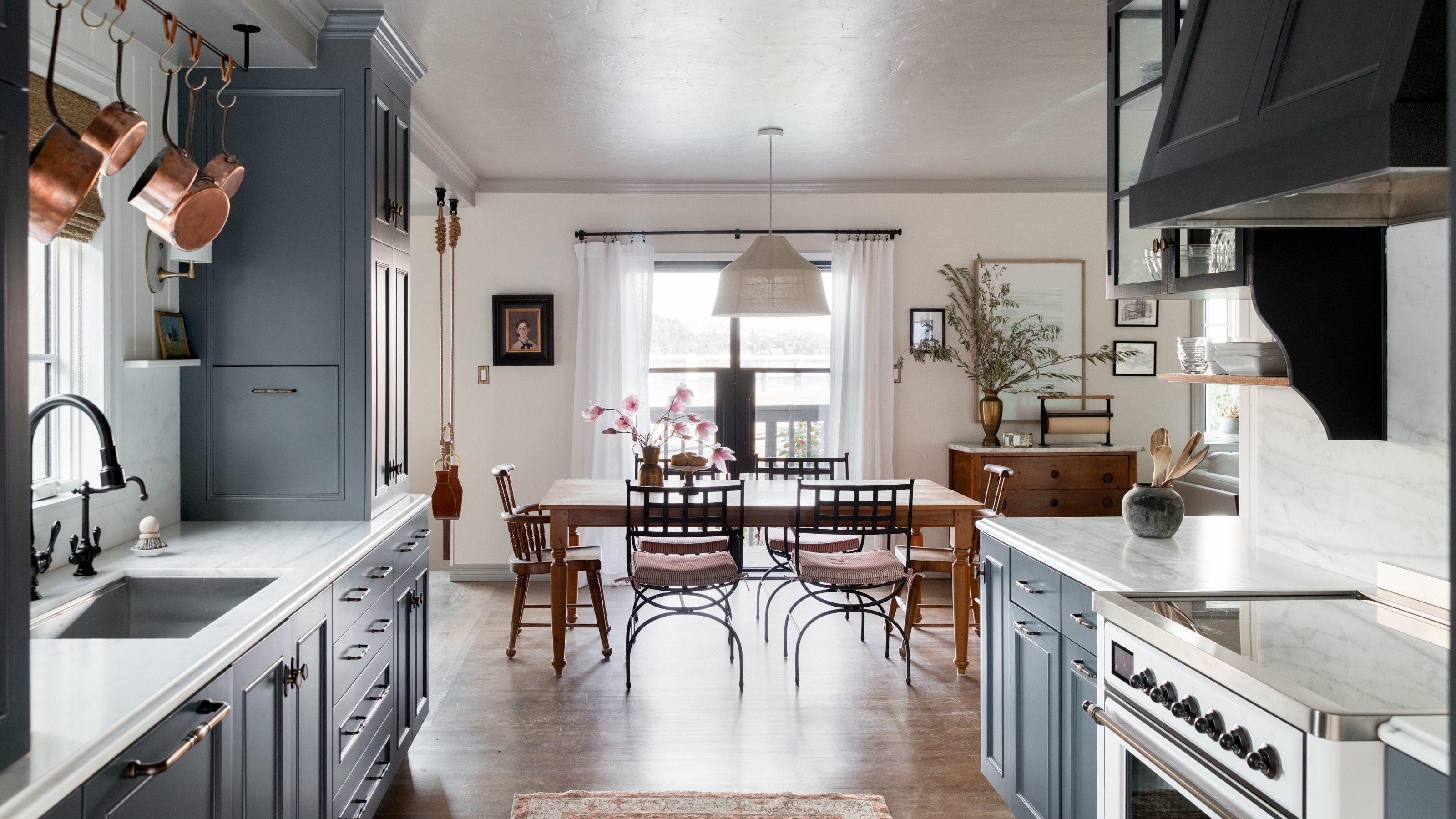

‘Design is a series of compromises,’ says Corine Maggio, and clever layout remodeling has resulted in the home she shares with her husband Beacher Schneider and their young son Shiloh becoming their dream home.
Their 1930s home in the San Francisco Bay Area, location of some of the world's best homes, was bought in 2018, just a few weeks before Shiloh was born. Corine, founder of CM Natural Designs, says she and Beacher initially thought it would be a starter home, ‘but we fell in love with the location, the light, the view and the yard so we started troubleshooting what would need to be done to make it our long term home,' says Corine. ‘After a few rounds of space planning, it was clear that we could make it work, especially by adding a separate home office.’
The main purpose of the remodel was to create a house that could grow and evolve with the family over the course of a couple of decades. ‘This was achieved by opening up the kitchen, dining and living rooms, which used to all be separated. It was also achieved by making a more functional kitchen space and maximizing storage throughout all of the rooms.’
When it came to the decor, Corine was overwhelmed with choice. ‘I see so many images and styles that I love, being in this industry, so narrowing down what I wanted for my own home was a slightly torturous part of the project. I do a style study with all of my clients, and I wish I had done one with myself before starting because I think it could have saved a lot of headaches and changes I ultimately ended up making. I’m a very decisive person so I was surprised by how much I vacillated when it came to my own home.’
Despite Corine's hesitation, the resulting interior is a masterpiece of classic vintage casual style. ‘After our remodel, not a day goes by where we don't talk about how much we love our home. We got so lucky.’
Entry
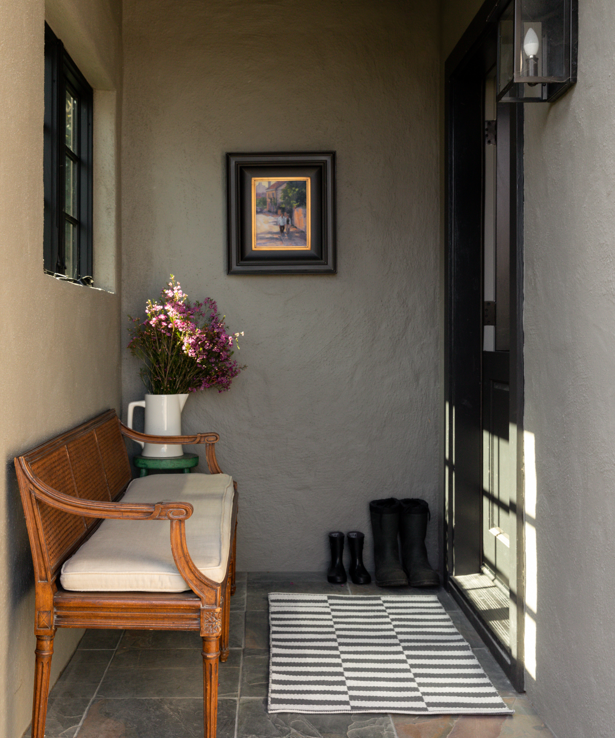
Clever ideas with this house begin before you've even set foot in the door.
‘Our front entry is quite small and inside we only have room for a shoe cabinet and nothing else so we added a beautiful antique cane-back bench outside since the space is covered. It’s perfect for guests to sit on to put on and pull off their shoes but it’s also great for setting down groceries when your hands are full and you’re wrangling a toddler while also trying to unlock the front door,’ says Corine.
‘We also hung up an original art piece. I love art and have a lot of it but don’t always have the wall space. This piece reminds me of a trip my husband and I took to Lake Maggiore in Italy and, contextually, it was perfect since it shows a couple walking and this is a transition space.’
Living room
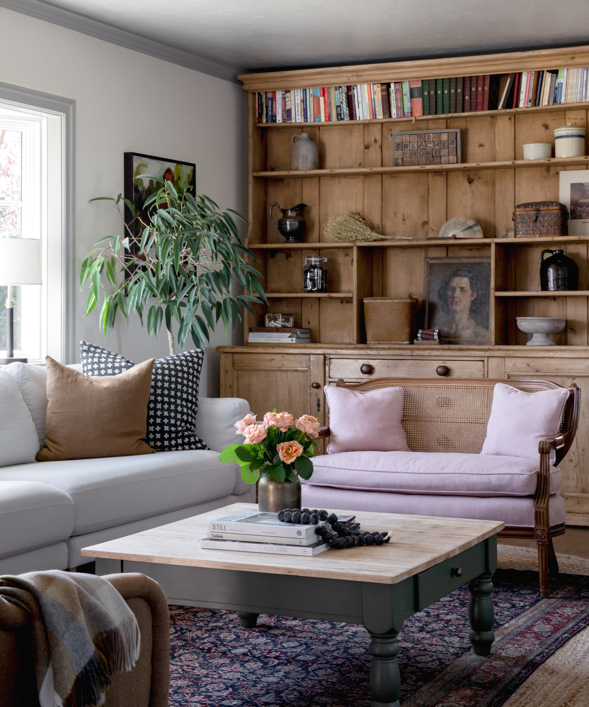
Antique and vintage finds are among the living room ideas used to set the tone for the scheme.
‘The showpiece is the large antique cabinet. It used to be where we displaced goods we were selling when we had a showroom and when we moved, it came with us and fit perfectly within a couple of inches,’ says Corine.
‘My favorite color combo is probably navy blue and brown, which you can see with the chair, pillows and rugs, but I wanted to liven it up so I painted the coffee table that I found on Facebook Marketplace a subtle green and reupholstered a vintage settee (also found on Facebook Marketplace) in a red ticking stripe that almost reads as a soft pink and works beautifully with the rug.’ Both of those elements bring a freshness to the room.
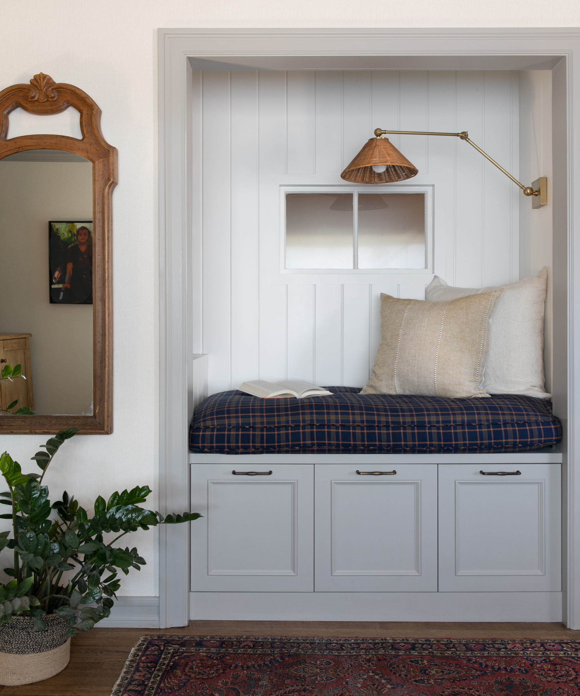
Corine and Beacher made compromises in the living room. They removed the wood burning fireplace to put in a reading nook. ‘This gave us a lot more storage, which is key since we don't have a playroom, so it houses a ton of toys. It also increased the seating in our main social space,’ says Corine.
Kitchen
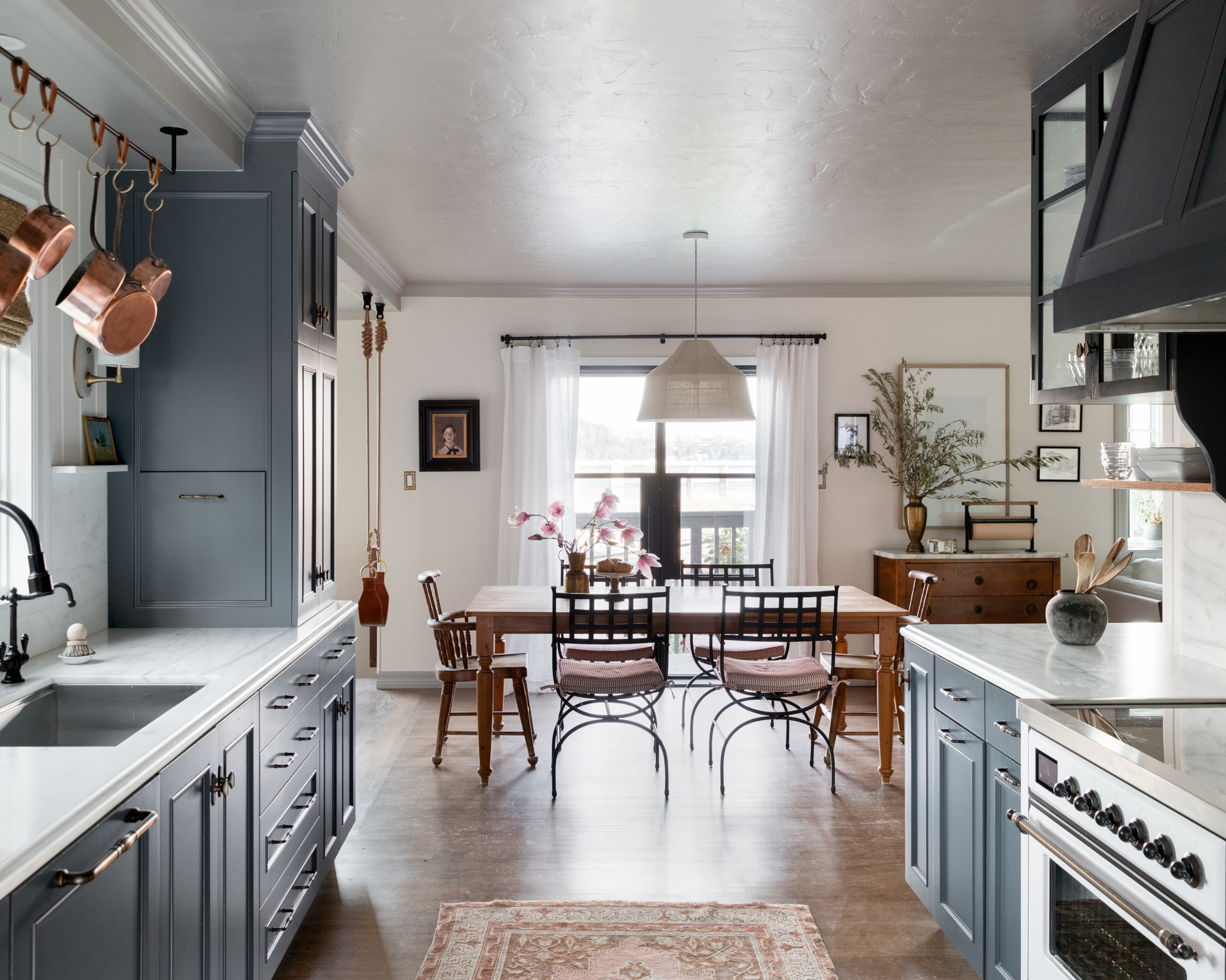
The kitchen involved some tricky space planning.
Among Corine's kitchen ideas was using some very narrow spaces (7 inches deep) for cabinetry. ‘It ended up doubling our pantry storage. It's perfect for cans, jars, and boxes of food,‘ she says. They also needed a place to store their steam oven. ‘The steam oven can't be used in a cupboard because it steams and would ruin the cabinetry so we made a pullout appliance garage in the tower closest to the dining room next to the sink. It pulls out over the counter when in use and gets tucked away when we're done.‘
Corine had originally chosen a putty color for the cabinets but ‘they just didn’t sing so I switched to Benjamin Moore’s Westcott Navy and that really did the trick,‘ she says.
She fell in love with a Calacatta Caldia marble for the worktop. ‘Heavy, high contrast veining is very popular right now, but I wanted something that felt more classic and I wasn’t afraid about all the wear it would show.‘
On the stove wall, glass fronted wall cabinets are used to store and display china, while an open shelf is used for the dishes the family use most. ‘I wanted a natural wood element to contrast the formality, color and texture of the rest of the kitchen so the shelf was a great way to do it. Functionally it works amazingly well since we never have to even open the cabinet when plating dinner or grabbing a bowl for cereal.‘
A pan rail is used for hanging pots and pans. ‘It was a way for us to free up cabinet space for other things, plus I love the look. It’s down to earth and gives the kitchen a farmhouse feel,‘ says Corine.
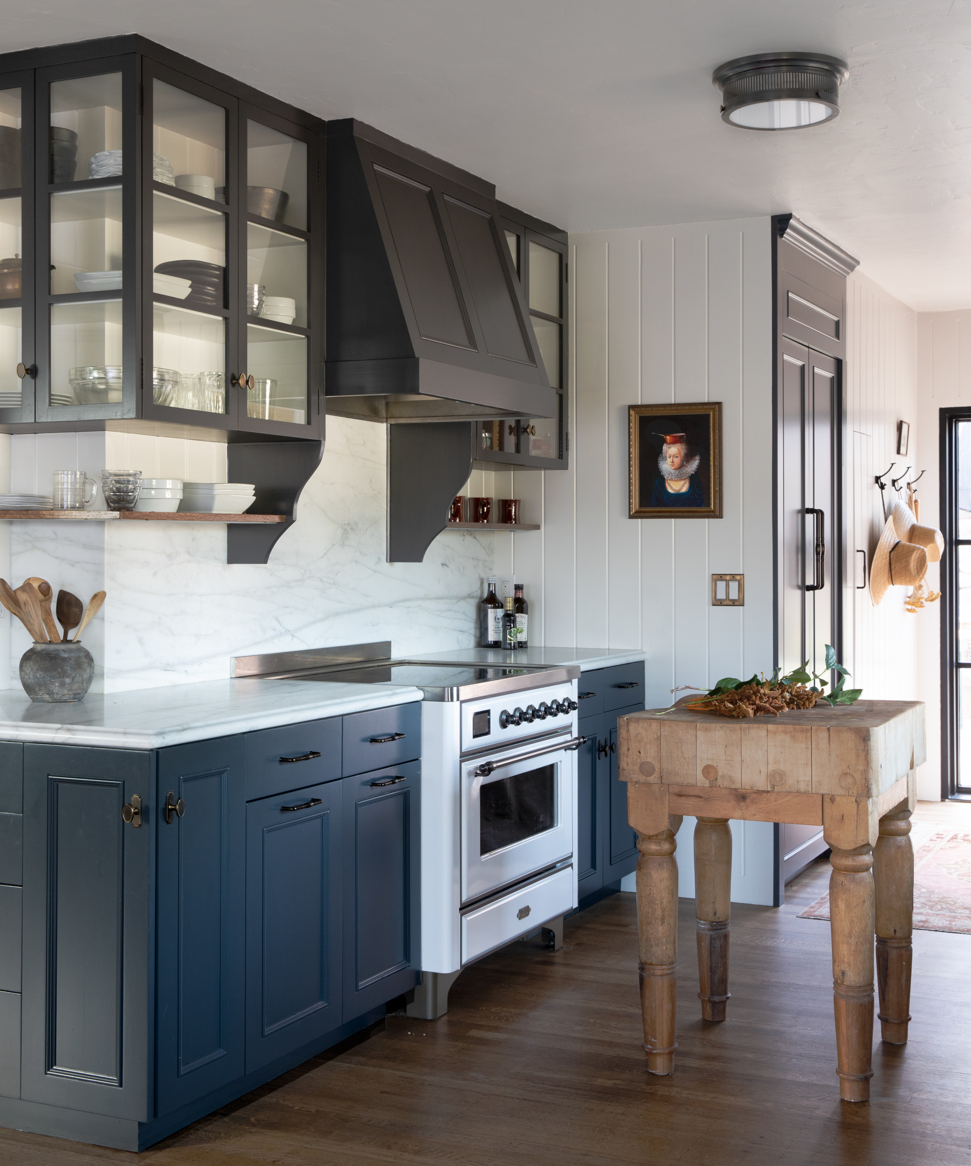
As the kitchen is a galley style, Corine didn't feel there was enough room for an island but because it’s a wide galley, knew it would fit something small. ‘A standard island would look weird in that size but the butcher block was the perfect size and since it’s more like furniture, it doesn’t feel out of place,‘ she says. ‘Plus, I love the rustic feel it brings. It was originally from an actual butcher shop from the 1940s. You can’t fake that kind of wear.‘
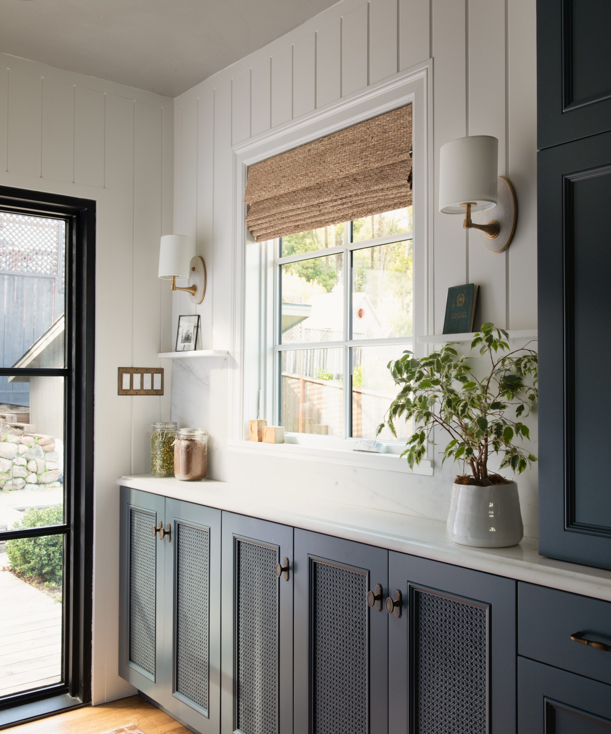
Because the dining room, kitchen and family room are all open, one of the more subtle ways Corine differentiated between the spaces is by having paneling in the kitchen and wallpaper in the family room.
Dining room
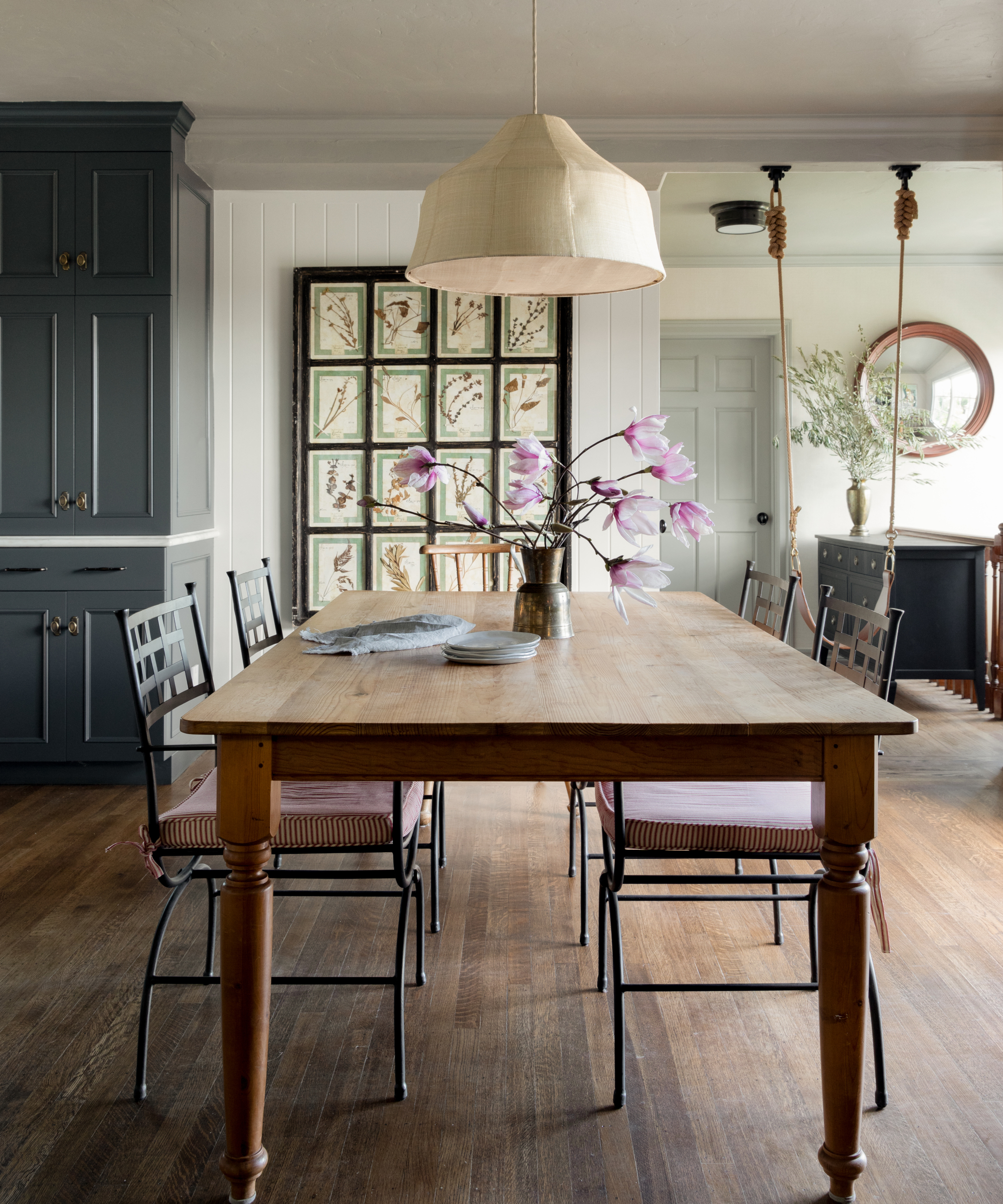
‘The dining room is the center of our home in every way,‘ says Corine. ‘The dining table was a whole saga. I got a beautiful vintage one from France but ended up deciding it was too gray for the space and got this much less expensive one from a local thrift shop. The table really gets beaten up, but I don’t fret. It just adds more character.‘
The art in the dining room went through many iterations. ‘It wasn’t until we settled on this Italian vintage herbier that the room felt like it worked with the rest of the house.‘
One of Corine's best dining room ideas was the swing. ‘I love the swing,‘ she says. ‘When we have guests, that's the first place they go. And Shiloh uses it every day. It's surprisingly not in the way at all. I was going to add a hook to the wall so it could be pulled aside but we ended up never needing it.‘
Office
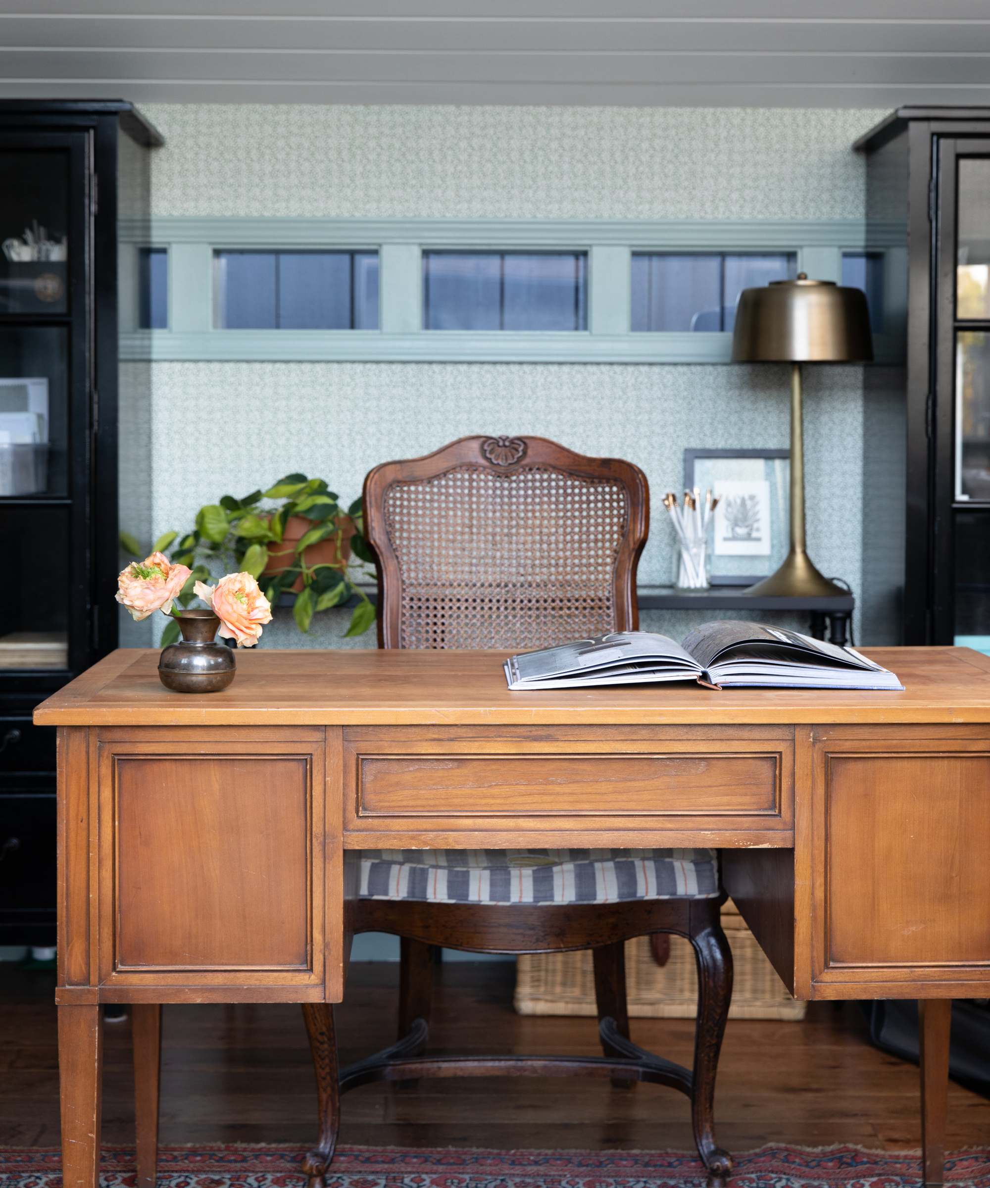
‘We built a 10ft x 12ft structure in the backyard for my office and that was key to our longevity in the house,‘ says Corine. ‘Being a designer, I have a ton of samples and random stuff that needs to be stored and organized. Having a space away from the house to do that was crucial.‘
The structure is in the garden so one of Corine's home office ideas was a nod to a greenhouse, which is why she landed on the Sloane Britain wallpaper. The desk and chair are vintage and the black bookcases provides maximum storage.
Main bedroom
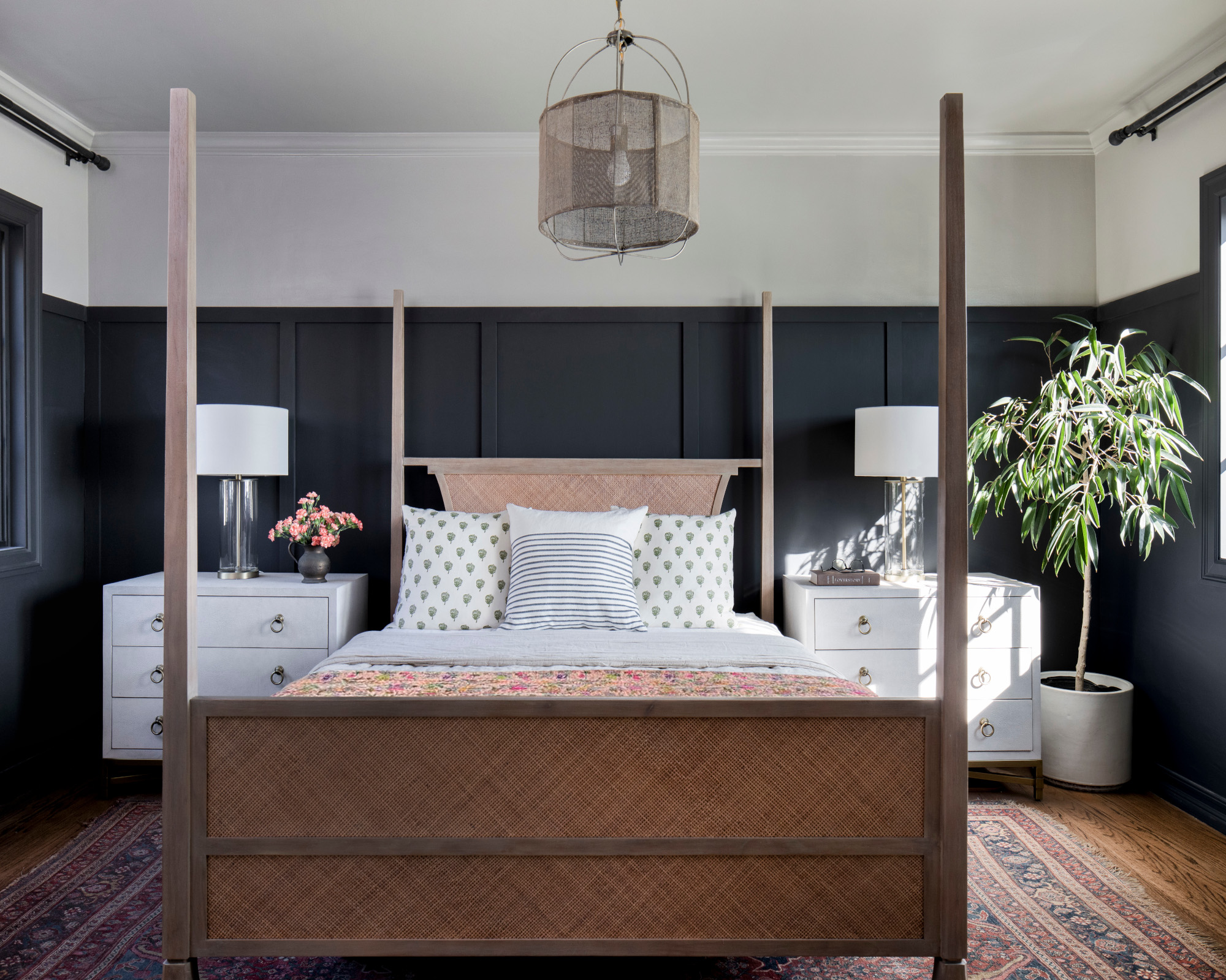
Corine knew exactly what kind of look she wanted for the main bedroom. ‘I feel strongly that a bedroom, especially for adults, should be a place for rest. It should not be a multipurpose room, if it can be avoided. It should also be a room free of clutter and distraction.‘
Her bedroom ideas to create a cozy sanctuary included painting the walls in a dark shade. ‘I love dark walls and, in our bedroom, the dark paneling serves like a cocoon. It feels peaceful and grounding,‘ she says. It would have been a little too much to bring it all the way to the ceiling so we brought it partially up the wall and then painted the rest of the wall and ceiling in PPG Hot Stone, which is one of my favorite colors of all time. By painting the upper wall and ceiling the same color, it tricks the eye into thinking the ceiling is higher than it is.‘
Bathroom
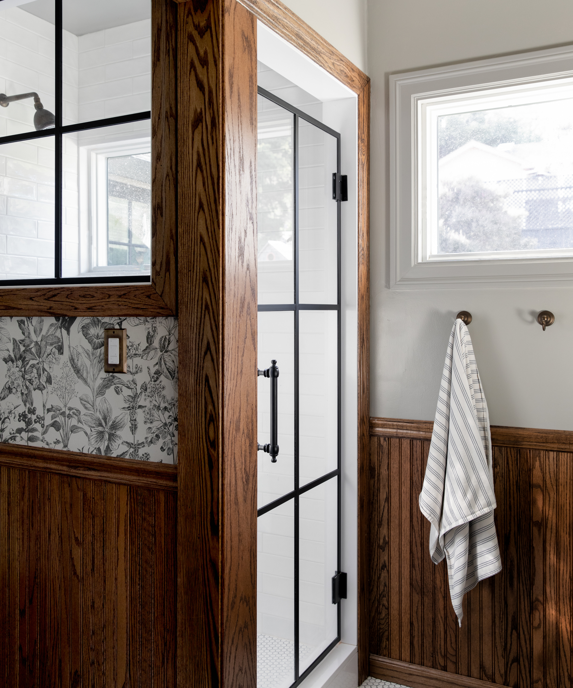
Corine decided to take space from the primary bathroom to create a dedicated laundry room. ‘The bathroom was bigger than what we needed and, since we had a tub in the other bathroom, we could get away with pulling out the tub here and just having a shower in this one. It ended up being a huge life upgrade for us,‘ she says.
Corine was able to implement a range of bathroom ideas. ‘I think there’s so much opportunity in small spaces, partially because you can do things that would otherwise be overwhelming in a large space,‘ she says. ‘The floral Peter Fasano wallpaper is the perfect example of this. It’s small spaces like this that often get forgotten and I wasn’t about to let that happen. The shower is small but this was the sacrifice we were willing to make in order to steal some square footage for a laundry room. Wood is not always an obvious choice for a bathroom but the wood beadboard and trim bring a stately element to the space that brings the whole thing up a notch.‘
Child's bedroom
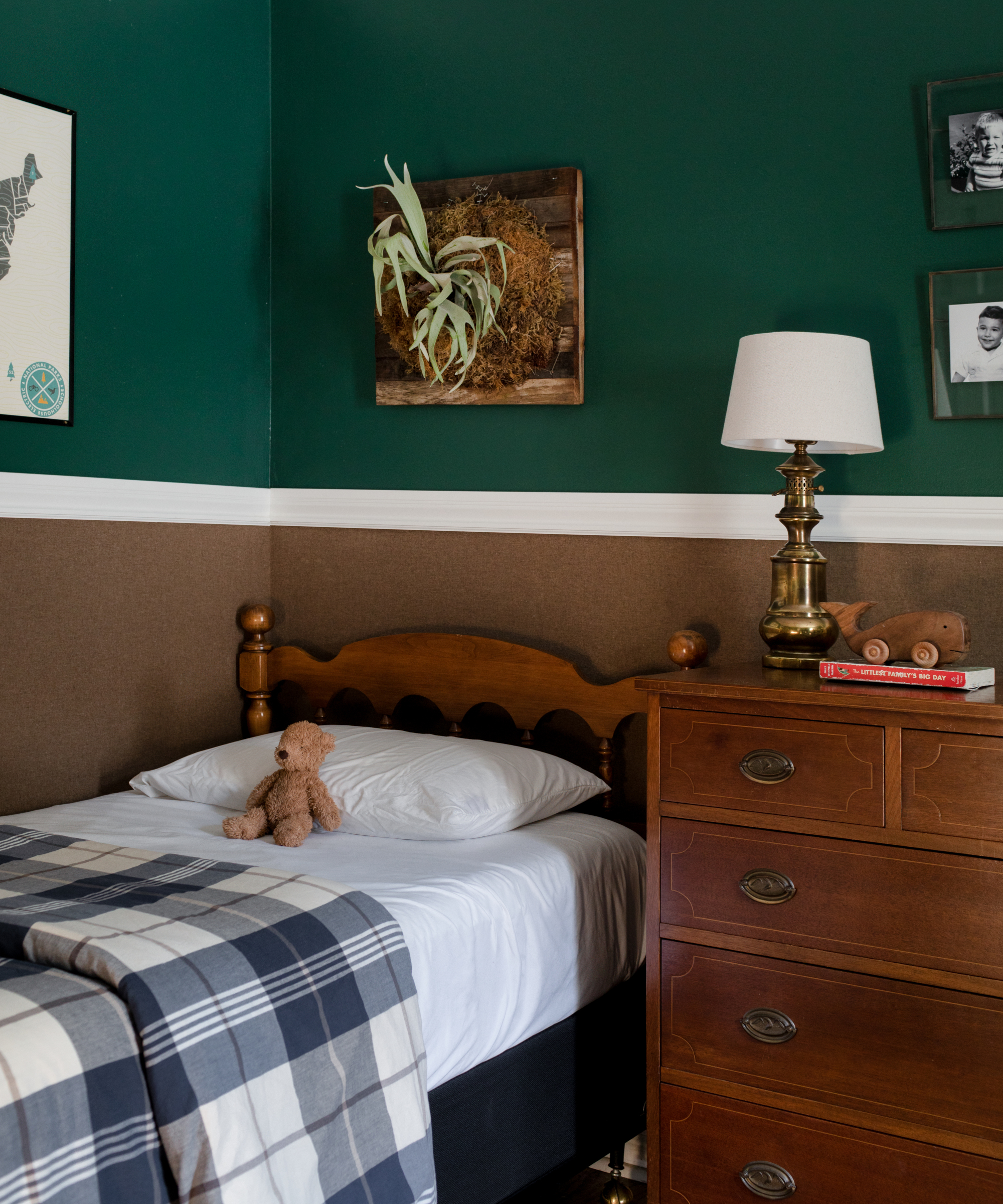
‘I love Shiloh's room. It's a space that feels modern enough for the times but still has a sense of nostalgia about it. The space is soothing and something that will work just as well for him now as a toddler as it will when he's a teenager,‘ says Corine.
She thought carefully about the scheme, incorporating a number of clever ideas. A vintage bed and dresser give the space a more comfortable, weathered feel, while the wallpaper from S Harris has a felt texture to it that softens the room and is sound dampening. The blue plaid comforter brings a nice contrast to the green and brown through the room and adds a classic pattern.
A lovely touch is hanging vintage photos of Shiloh's grandparents above the dresser. ‘I love that it gives him a sense that we were all young once, and that he is not alone but connected to a lineage of people that have made him who he is.‘
Interior design/ CM Natural Designs
Photographs/ Bess Friday
Sign up to the Homes & Gardens newsletter
Design expertise in your inbox – from inspiring decorating ideas and beautiful celebrity homes to practical gardening advice and shopping round-ups.

Interiors have always been Vivienne's passion – from bold and bright to Scandi white. After studying at Leeds University, she worked at the Financial Times, before moving to Radio Times. She did an interior design course and then worked for Homes & Gardens, Country Living and House Beautiful. Vivienne’s always enjoyed reader homes and loves to spot a house she knows is perfect for a magazine (she has even knocked on the doors of houses with curb appeal!), so she became a houses editor, commissioning reader homes, writing features and styling and art directing photo shoots. She worked on Country Homes & Interiors for 15 years, before returning to Homes & Gardens as houses editor four years ago.
-
 Midimalist kitchens are the trending way to create a characterful yet clutter-free space – and these 8 spaces prove how chic this best of both worlds style can be
It's the go-to kitchen style for a balance of busy and simplistic design
By Molly Malsom
-
 I tried the baking soda trick to quickly and naturally clean my outdoor rug – it’s now set for Easter outdoor hosting
Baking soda is perfect for lifting dirt and debris
By Eve Smallman