This California hacienda was decorated with a joyful cocktail of color and pattern and the final result is utterly sublime
After some major renovations, designer Courtney Smith's home was transformed into a boldly decorated characterful cottage
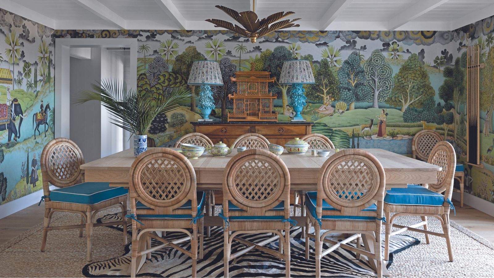

Courtney Smith’s adobe hacienda, located in the hills of Marin County, California, with views over the East Bay, both surprises and delights. The home’s Spanish-influenced architecture is not common in northern California, nor is the bold interior within that sings with color and pattern.
‘A mash up of East Coast traditional and California cool’ is how Courtney of Courtney B. Smith Design describes her style. And it is a heady mix. ‘The East Coast with its sense of history appreciates provenance, while the West Coast is more casual, approachable and easy breezy,’ she says. ‘In the West, we really connect our interiors to our exteriors, but I use more pattern and color than many Californian designers, with my house designs informed as much by their settings as they are by specific fabrics and wallpapers.’
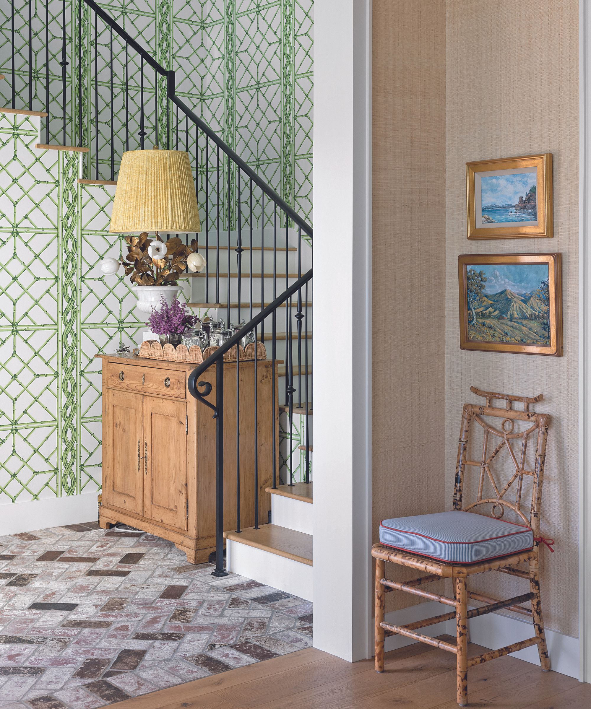
The love affair with the house began in 2016 when Courtney ‘was craving a project’ and she and her husband Greg and their children Jackie, now 15, and Drew, now 12, first viewed the property.
The cottage had been built in the 1950s, with a wonky extension added in the 1980s. ‘It hadn’t been touched in 35 years but it had great bones,’ says Courtney. ‘Greg and I love Santa Barbara but for us northern California is home. The house’s Spanish-style architecture and tiled roof reminded us of the properties there - they have a very particular aesthetic. Our dream was to create a home that was reminiscent of Santa Barbara, using the property’s hacienda bones as inspiration.’
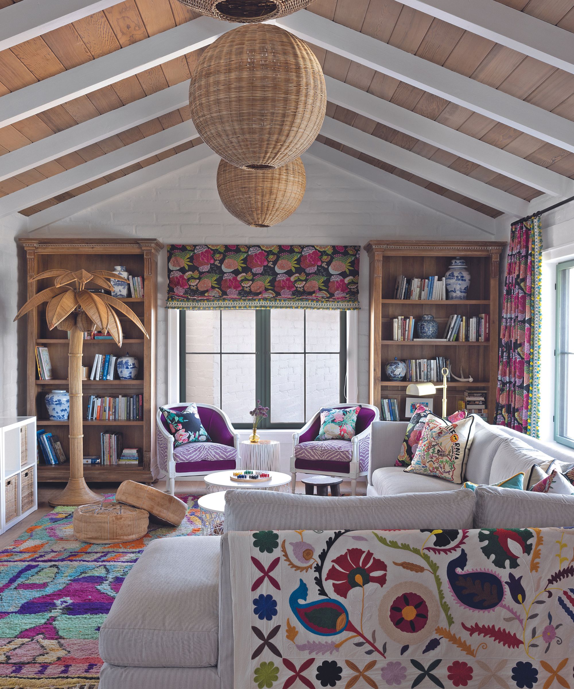
With help from architect Jessica Fairchild of Fairchild Broms Design, they spent three years planning a renovation that maximized the beautiful views. The plan was to double the house’s size while merging the old and new, creating a property that felt like it had always been there.
The 1980s extension was torn down but the original hacienda with its adobe walls remained intact because each wall was interconnected. ‘Greg and I have traveled in Europe and we’ve always been inspired by the patina of homes that have been lived in for generations. It’s hard to buy that here,’ Courtney says.

She then had to rework every space in the charming older part to serve the family’s needs. ‘We wanted something that would be cozy for our family but also accommodate large groups for entertaining.’
The spaces flow beautifully with the focus on sightlines from one room to the next as Courtney selected wallcoverings, fabrics, furnishings and lighting. ‘I love a challenge, and used different textural and patterned wallcoverings throughout, broken up with some white V-groove walls and original adobe, also painted white,’ explains Courtney.
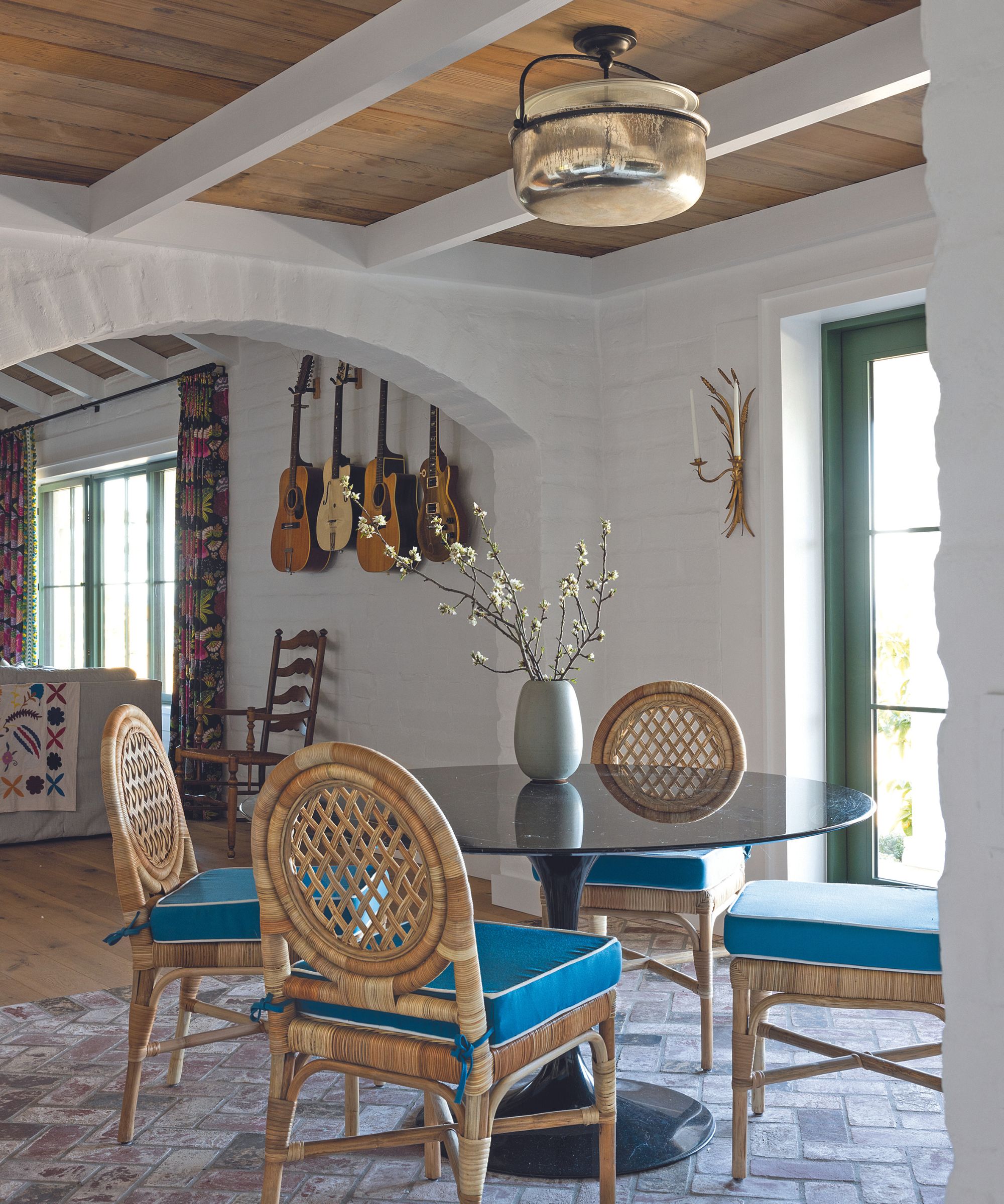
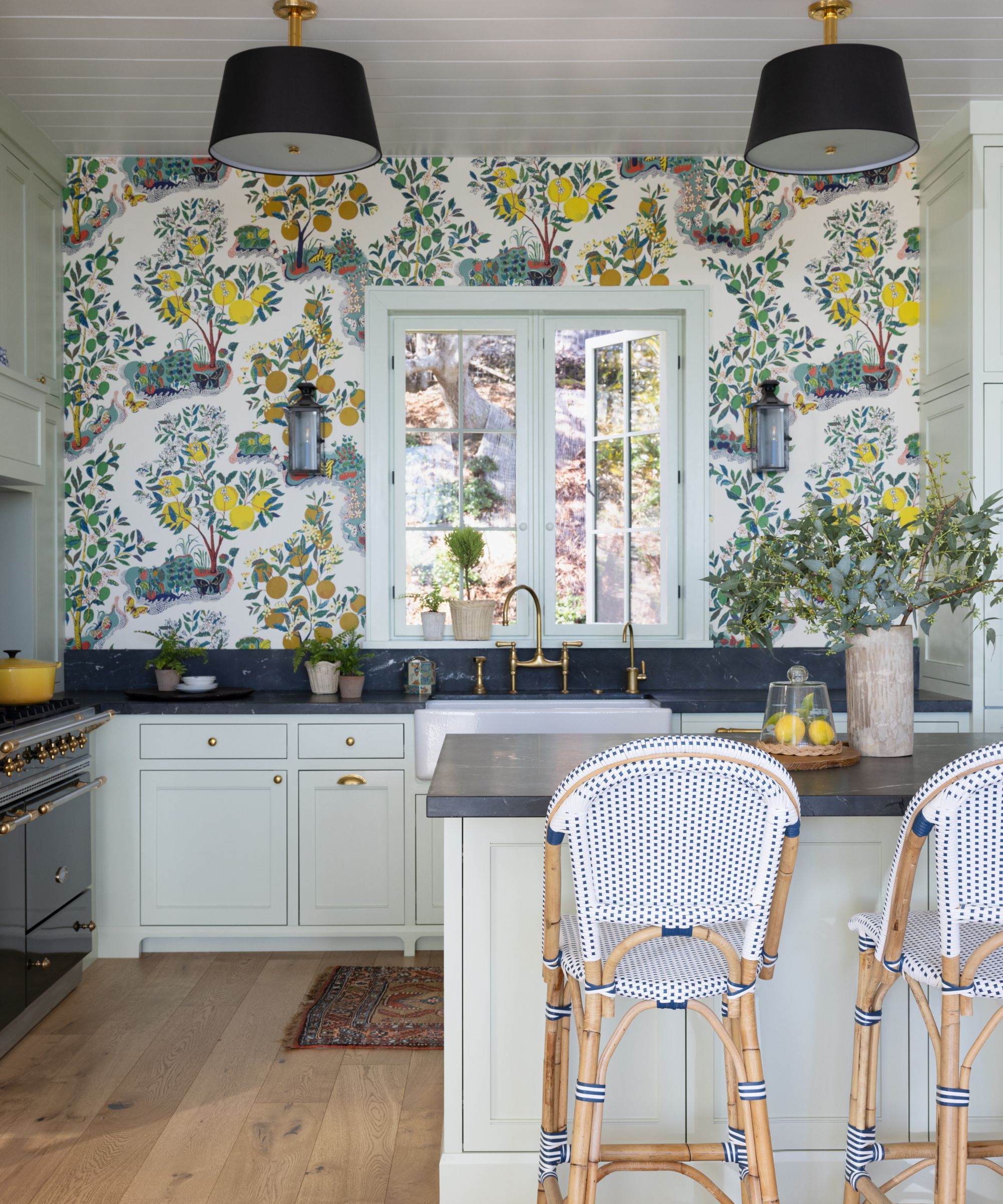
The starting point for the interior was the statement Josef Frank wallpaper in the kitchen. ‘It’s a traditional 1940s pattern and features citrus trees, which I’ve always loved and which we have in our front yard,’ says Courtney. ‘The decor was then all created around what made sense in the next space, working from the Josef Frank pattern.’
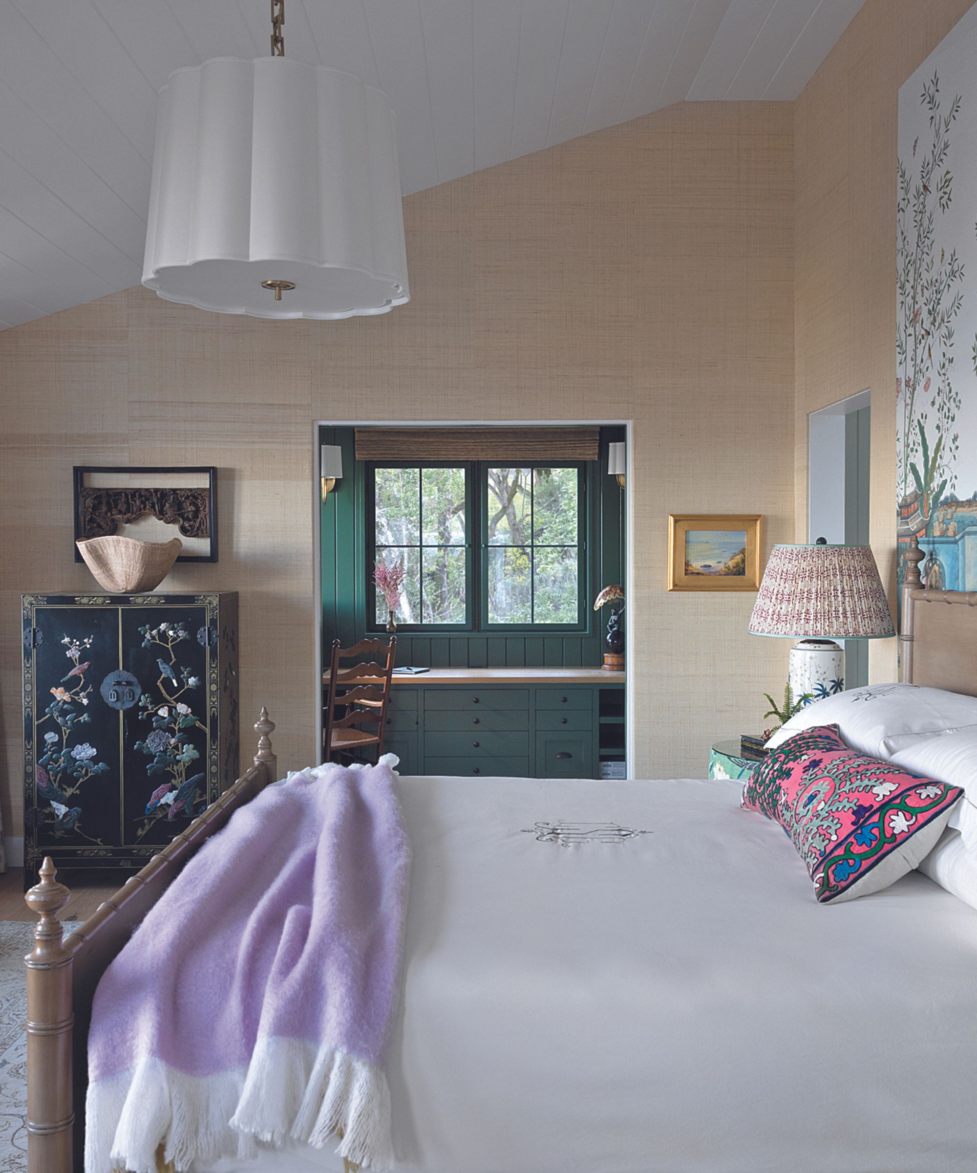
A blend of old and new furniture enhances the relaxed, eclectic look. ‘I have a lot of treasures from my family and Greg really appreciates antiques, too, but we mixed it up with new items.’
The design of the interior has a nod to practicality, too. ‘It’s really nice to live in spaces that have color and pattern,’ notes Courtney. ‘Not only does it help hide inevitable wear and tear in a busy home and gives decorating more longevity but it adds an energy to a space. I’ve always loved color – it inspires me.’
MEET THE DESIGNER
Courtney Smith shares her style inspiration
SMALL CHANGE, BIG IMPACT
It is always the last 10 per cent that really finishes a space – custom lampshades, throws and decorative cushions, trays and accessories.
GO-TO COLOUR
Different shades of green.
FAVOURITE DESIGN DETAIL
Decorative trim on drapes, contrast welt on chair cushions, custom lampshades.
DESIGN HERO
Albert Hadley.
YOUR STYLE IN THREE WORDS
Joyful, timeless, memorable. INSPIRATION Colour combinations found in nature, 1940s decor, fancy hotel bars.
I KNOW I’M A CREATIVE BECAUSE…
My creative outlet is creating homes. HOME MAKES ME FEEL Happy.
SECRET ADDRESS
Elsie Green in northern California.
Sign up to the Homes & Gardens newsletter
Design expertise in your inbox – from inspiring decorating ideas and beautiful celebrity homes to practical gardening advice and shopping round-ups.

Interiors have always been Vivienne's passion – from bold and bright to Scandi white. After studying at Leeds University, she worked at the Financial Times, before moving to Radio Times. She did an interior design course and then worked for Homes & Gardens, Country Living and House Beautiful. Vivienne’s always enjoyed reader homes and loves to spot a house she knows is perfect for a magazine (she has even knocked on the doors of houses with curb appeal!), so she became a houses editor, commissioning reader homes, writing features and styling and art directing photo shoots. She worked on Country Homes & Interiors for 15 years, before returning to Homes & Gardens as houses editor four years ago.
-
 Extend the lifespan of your appliance with 5 simple but crucial washing machine maintenance tips
From cleaning the filters to keeping the door open, experts reveal the washer tips they swear by
By Andy van Terheyden Published
-
 These are the 6 must-have colors to decorate with in April 2025
What do retro-inspired yellows and beautiful blues all have in common? They're on our hot list for the season ahead
By Sophia Pouget de St Victor Published