California coastal updates brought style and sunshine to a dated ranch
Dark wood ceilings and soft white walls – how two simple updates made all the difference to a Spanish revival home
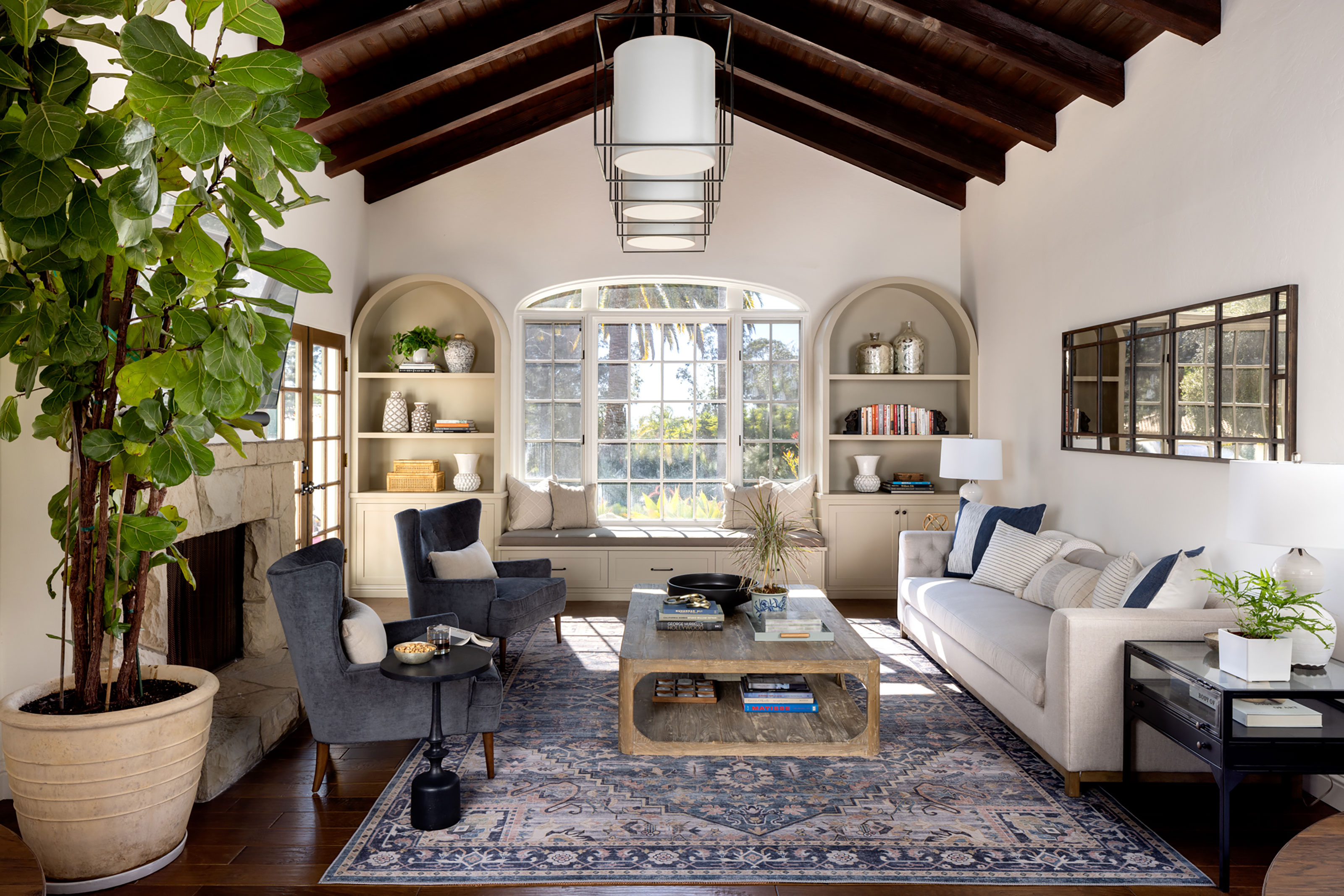
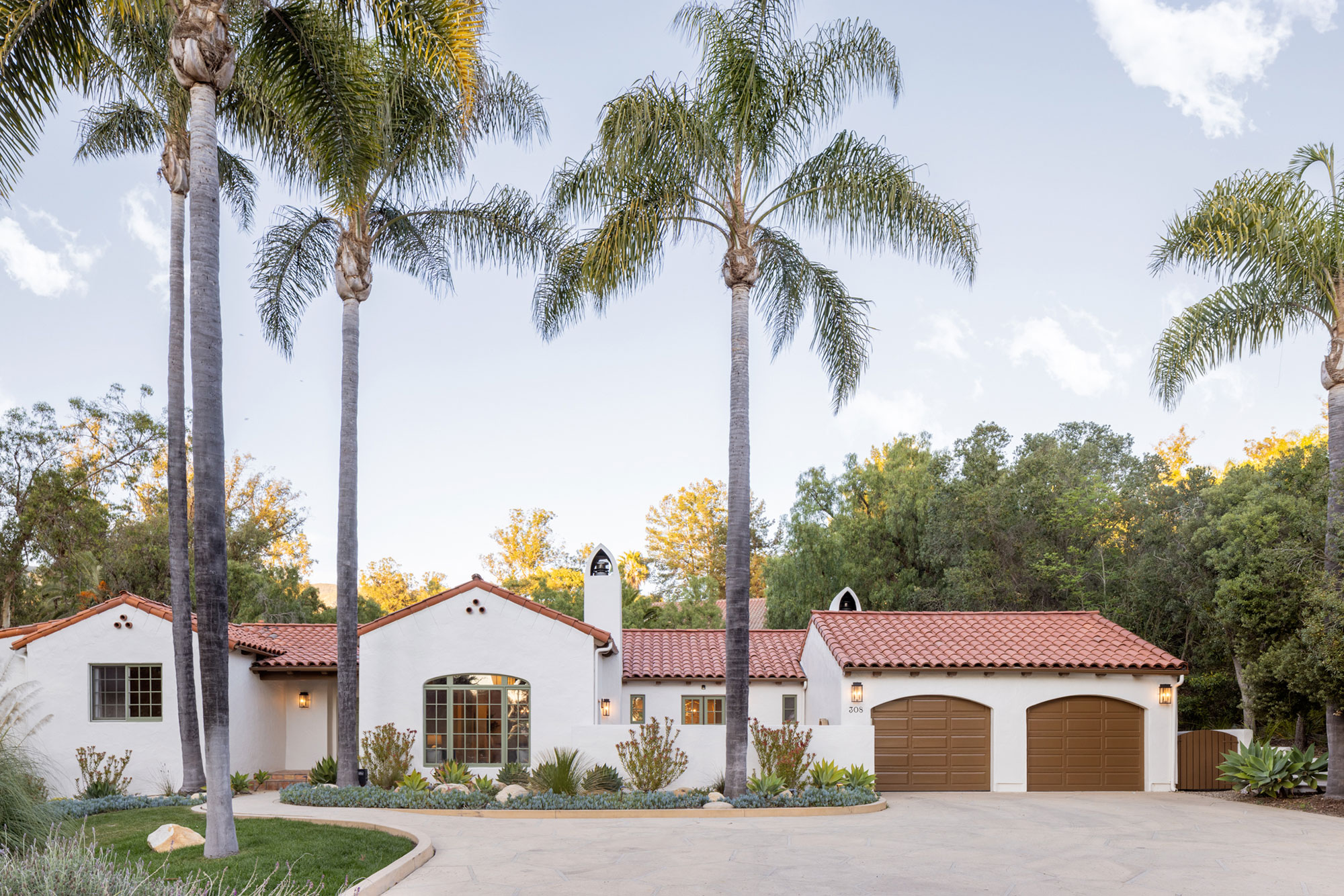
Brightening and modernizing a tired, dated home by painting the ceilings darker? Well, yes, and it worked – but that wasn't the only change made to this 1980s Spanish revival house in Montecito, California. Inspired updates throughout the property have put the family home firmly on our list of the world's best homes and, in case you're wondering, the paneled ceilings and beams were the 1987 bright orange wood originals. Toning them down to a darker more natural shade and refreshing the walls with warm whites made an instant improvement.
It was one of the first things Dmar Interiors suggested when the homeowners called them in. The firm's team, led by Mollie Ranize, with Kim Serani and Maria Aramburu, are experts in California Modern design and could see that although attention had been paid to the overall flow and layout of the house, the interiors had not been updated since the house was built. There were other changes to be made too, to increase the sense of light in the house and create a fresher look.
'Unifying the flooring throughout and introducing new furnishings and finishes as a series of layered textures rather than bright colors means your eye can truly travel around the spaces but also out into the gardens and lush landscaping that surround the home, making the most of the natural light and colors,' explains lead designer Mollie Ranize, who describes the home's new look as 'California coastal meets Spanish revival'.
Kitchen
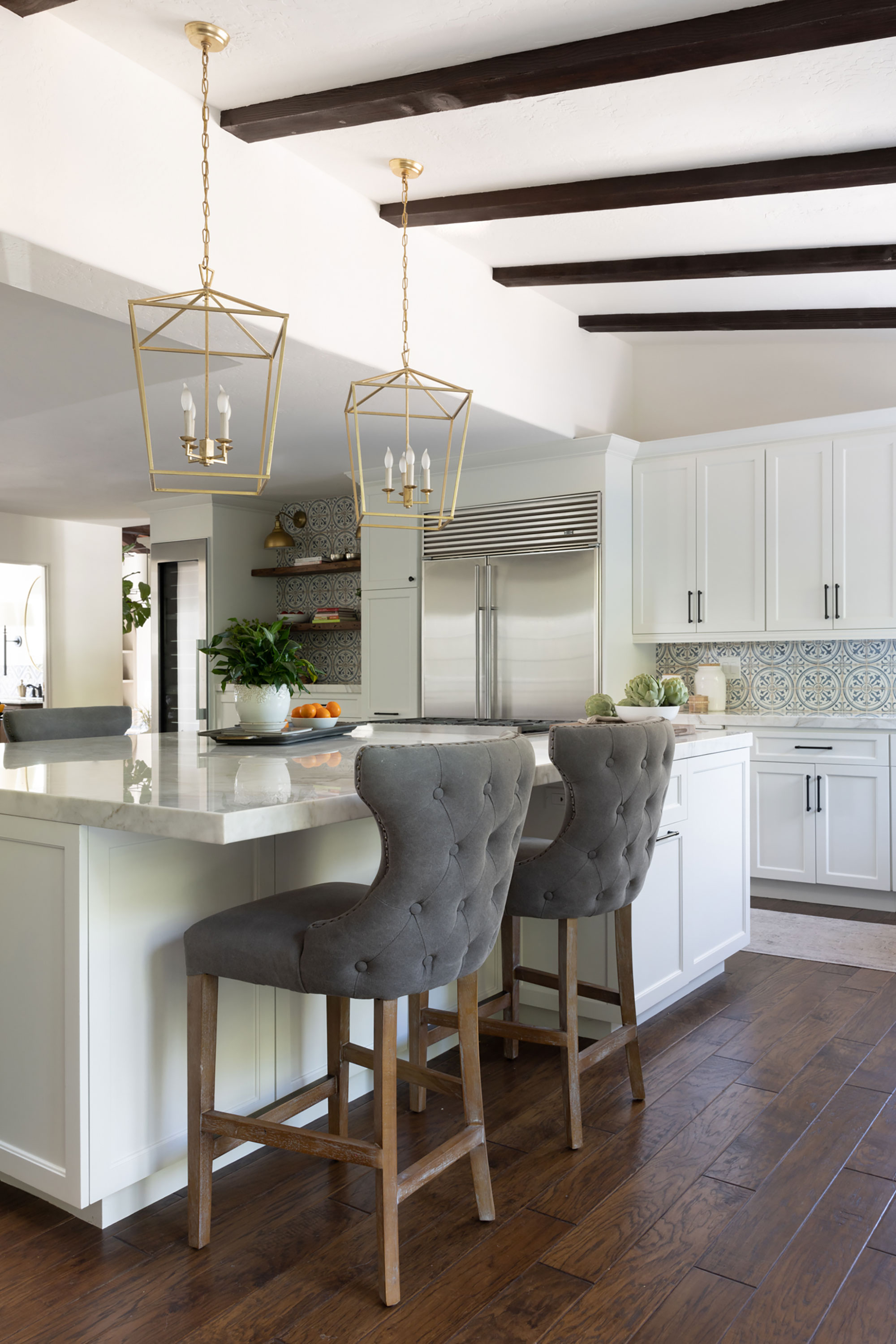
'The star of this home is certainly the kitchen,' says Mollie, whose kitchen ideas included a new layout with a functional and social island where the family can gather to chat and have informal meals.
'Aesthetically it’s a bright and joyful space with the light surfaces, rich Calacatta Gold countertops (from Tristone & Tile) and a fun patterned backsplash,' adds Mollie.
It's a dramatic turnaround for the dark, drab kitchen that was here when the family bought the home. 'There was a load-bearing post that landed directly in the center of the countertop of the island making it an awkward shape,' says Mollie. 'As a solution, we relocated the roof weight load so we could remove the post and create a large, usable island.'
Tile perfection
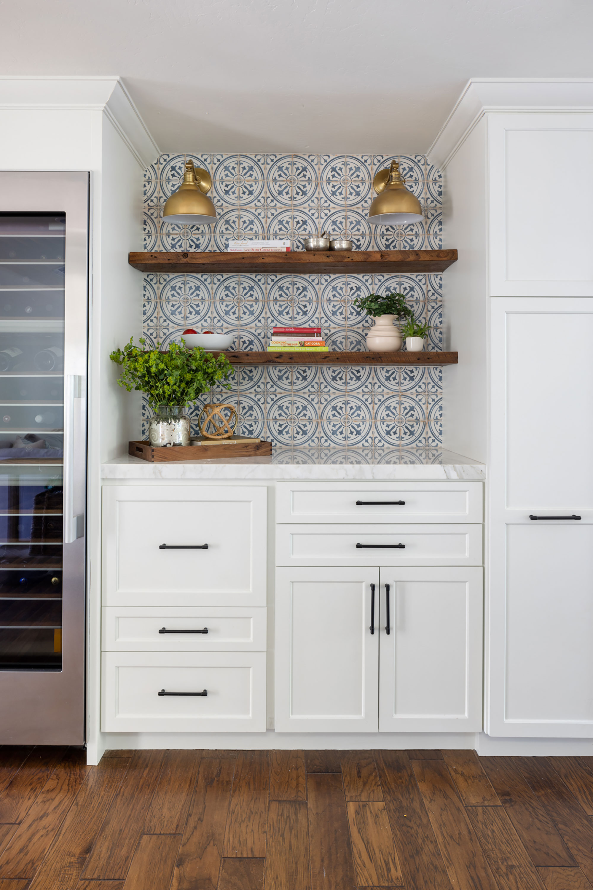
'The original cabinets and finishes were also extremely outdated,' says Mollie. 'We replaced the cabinet doors with new solid, Shaker panel doors in a lighter color, which modernized and brightened the room. The backsplash tile (Casablanca in Zane from Bedrosians) is our nod to the Spanish style, in a cheerful blue that keeps things feeling a bit coastal.'
Breakfast area
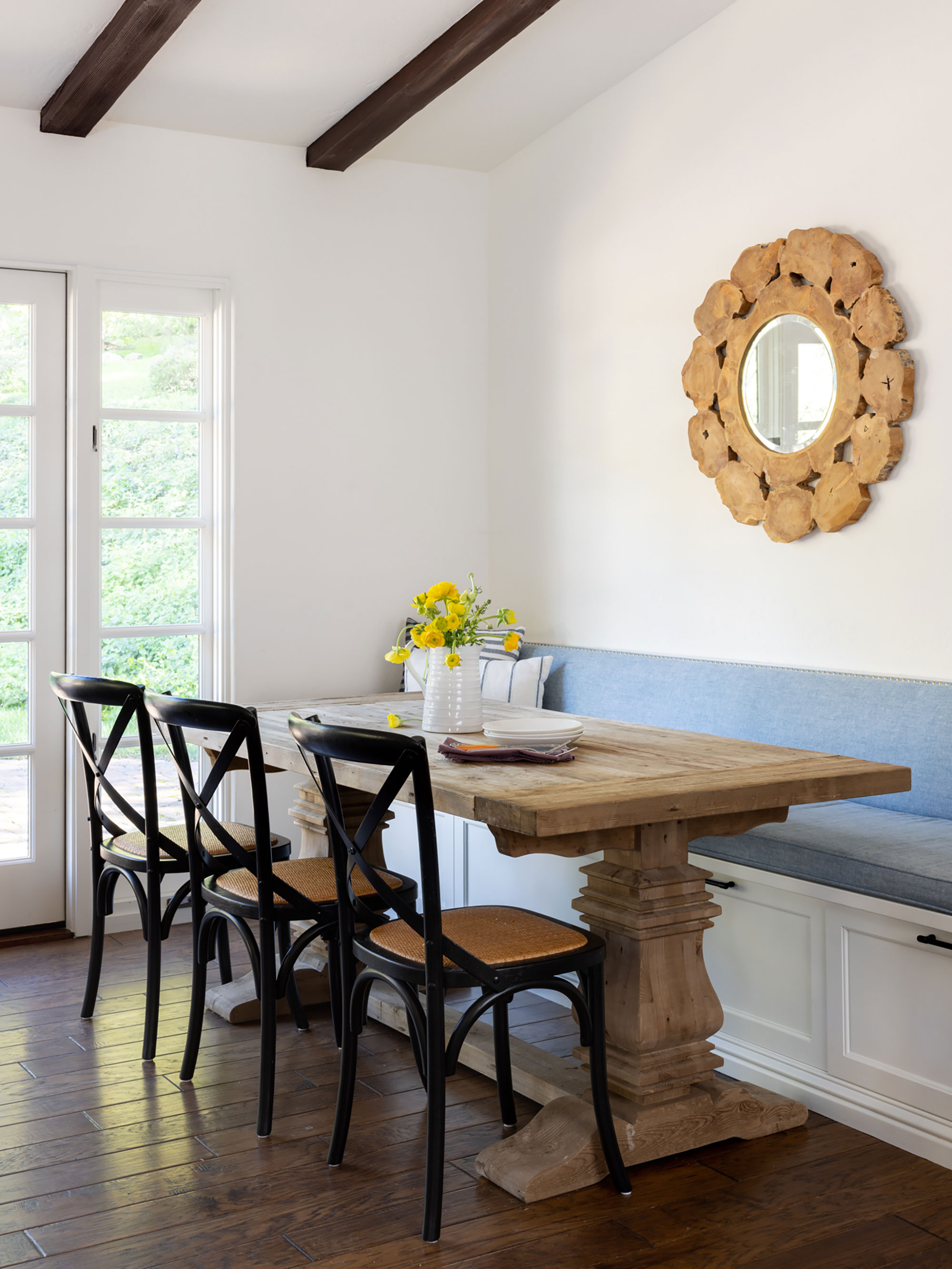
The kitchen's new layout created enough space for a built-in breakfast area, ideal for this busy family of four. Bistro side chairs from Williams Sonoma; cabinetry painted in Sherwin Williams Alabaster.
Living room

Although the existing ceiling treatment and height were both impressive when the homeowners purchased the home, there was nothing else to harness the room.
The Dmar Interiors team discussed their living room ideas and decided the room badly needed a focal point to accentuate the large window facing the front yard. 'We designed a double arched built-in with a center window seat that frames the view and draws your eye across the room,' says Mollie. Apart from the obvious aesthetic improvement, one of the advantages about creating extra storage and display units like this is that they help to keep clutter under control and so increase the sense of light and space.
The sofa and end tables are from Fourhands; area Rug is Rosemarie Collection from Loloi Rugs; lounge Chairs are Wilmette; mid-century wing back from Kathy Huo; side table is Huntlee; accent table from Arteriors; mirror is Avidan from Uttermost.
Dining room
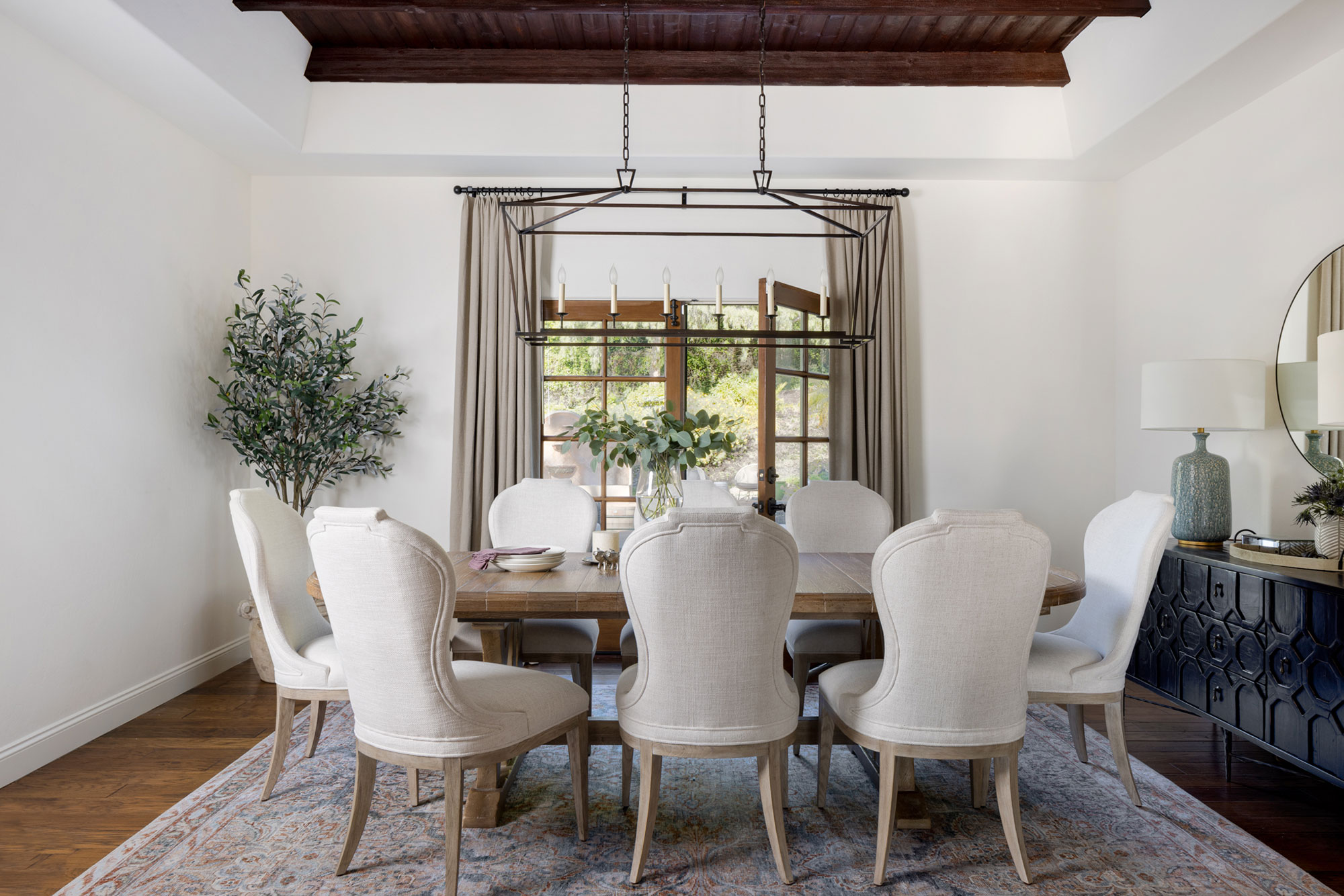
Dining room ideas were shaped by the fact that the room opens out onto a poolside outdoor lounge area. 'We knew we wanted to keep the view and access to the outdoors,' says Mollie, 'but we needed to make the space a bit more formal. We did this with some high contrast and beautifully detailed furnishing pieces, mixing angular and curved patterns, adding in full height natural linen drapery panels and gentle pops of color with the area rug and lamps.'
Lilith trestle dining table from Hooker Furniture, with Santa Barbara upholstered oval-backed dining side chairs by Bernhardt; Harten sideboard from Dovetail Furniture; Lenna Ocean apricot rug from Loloi Rugs; Hattie table lamp from Serena & Lily; custom drapery in Marco Performance Linen from Schumacher, handmade by Heritage Draperies.
Bedroom
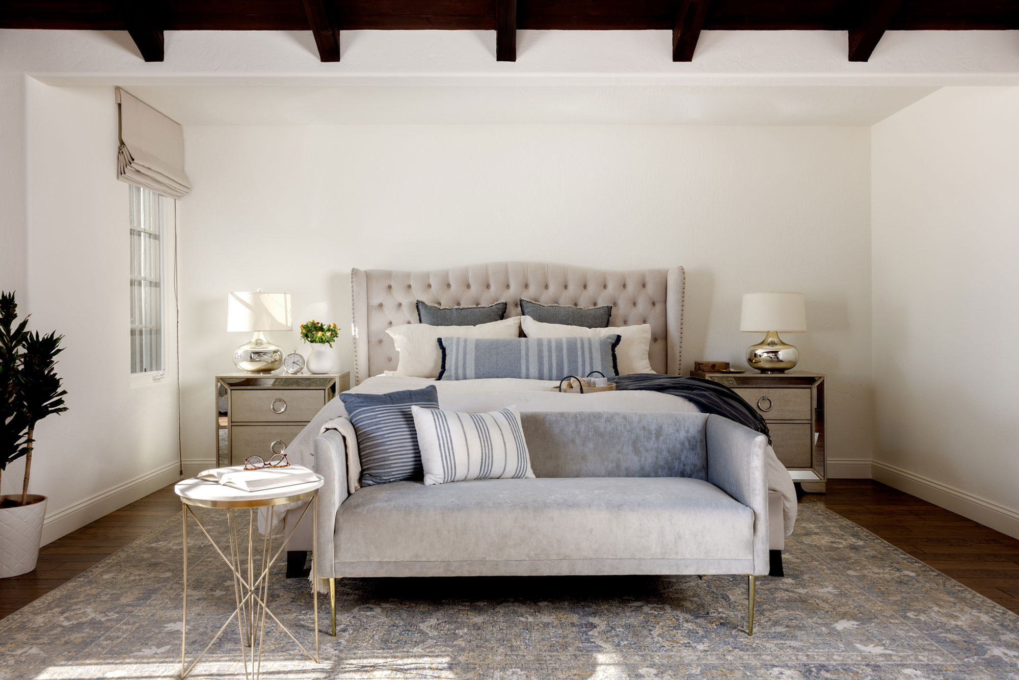
Anyone looking for bedroom ideas will surely find inspiration in this cool, calm and collected scheme. A symphony of coastal blue-grays and sandy neutrals have made the original room so much brighter and more airy than its previous rather dated incarnation.
'The primary bedroom has its own beautiful ceiling treatments, which were stained to coordinate with the rest of the home,' says Mollie. 'Walls were kept light and bright to create the ultimate relaxation spot.'
Settee from CB2; rug from Loloi Rugs; Farrah 2-drawer nightstands from Pulaski Furniture; the Raleigh wingback upholstered bed from Pottery Barn is a similar design to this one which is discontinued.
Bathroom
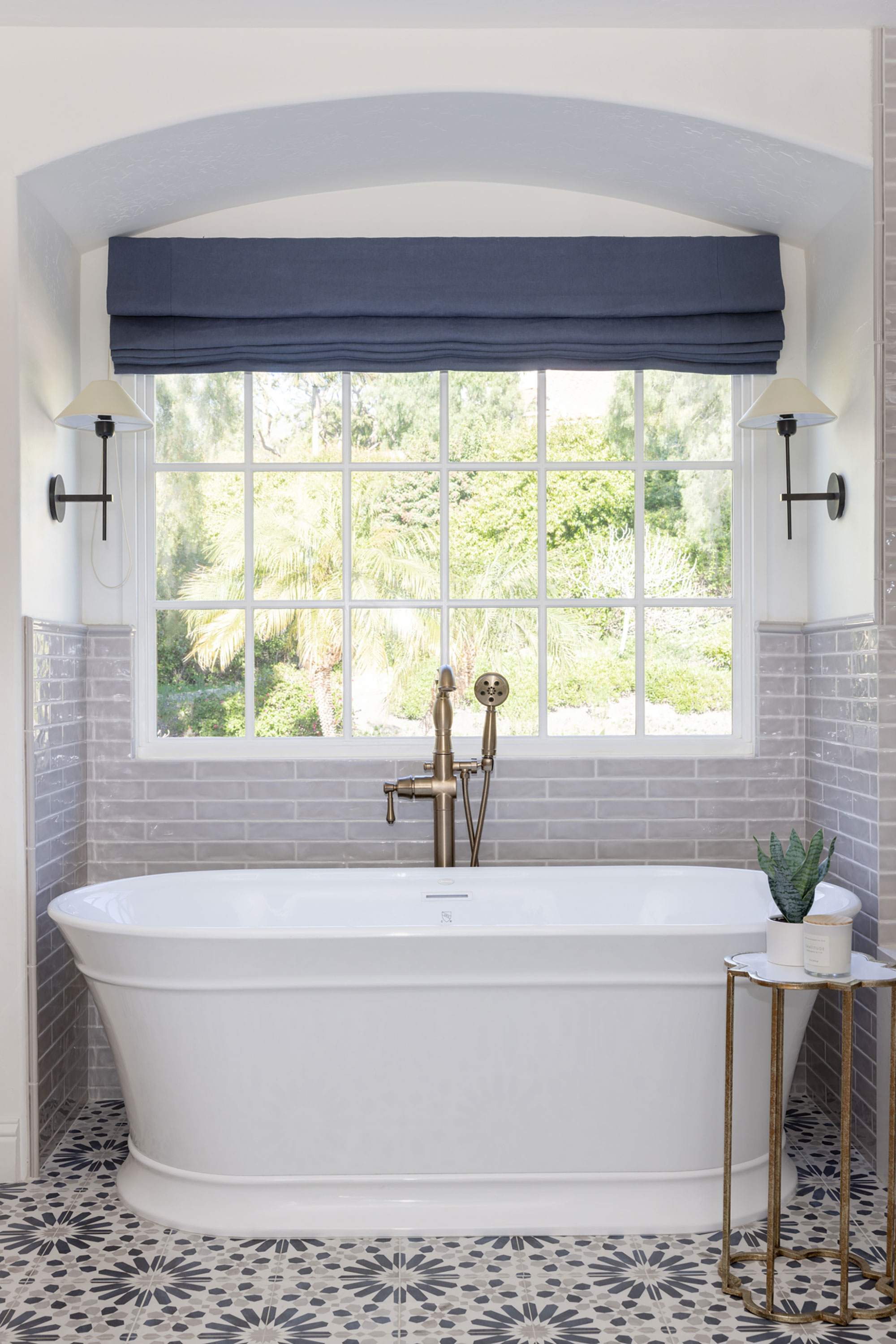
If, like the owners of this home, you're faced with a gloomy, outdated bathroom and need bathroom ideas, take heart from this bright and beautiful new sanctuary.
'The original room was right out of the 80s, and felt dark, dated, and cramped,' says designer Mollie. 'We knew that we had to rework the entire layout to provide an expansive vanity, space for a freestanding bathtub, a larger open shower and a private water closet. We did this by creating a new entrance to the room, removing all of the 80s angles and opening up the previously enclosed shower/toilet room.'
The room's crowning glory is surely the arched detail over the new bathtub alcove. This detail ties the design to the rest of the home, along with another eyecatching floor tile (Casablanca porcelain from Adessi).
Seaport Hibiscus ceramic tiles (on wall) from TileBar; Hackney single sconces from Circa Lighting; Lyndsay freestanding soaking tub from Ferguson.
Twin vanity unit for the kids' bathroom
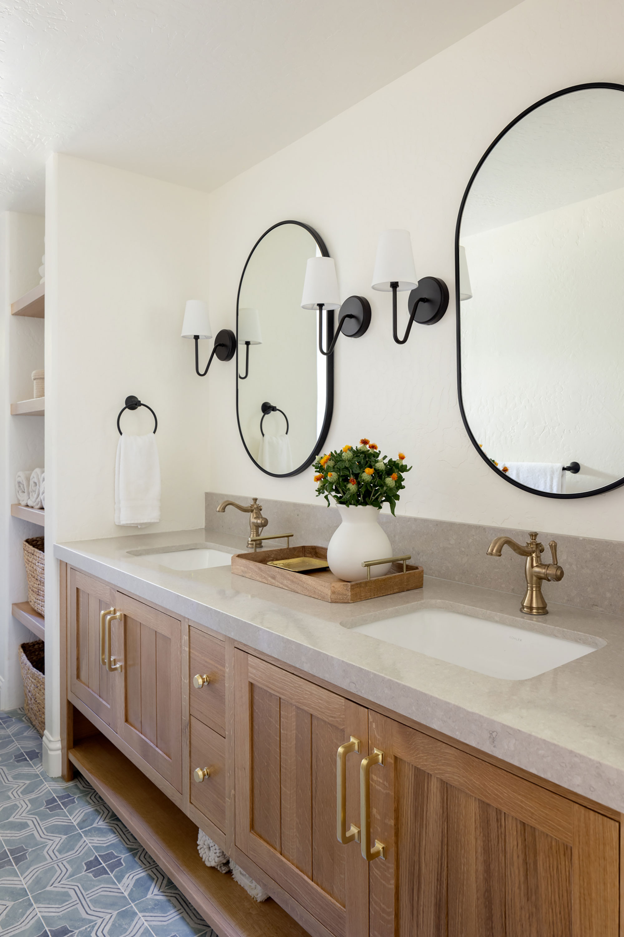
The footprint of the children's bathroom is extremely long and narrow and there's no natural light. Dmar Interiors designed a new double vanity and created a floor-to-ceiling storage tower to maximize functional space in the room. The toilet is sited behind that tower for more privacy. 'We lightened up the finishes throughout and again, for consistency, selected a fun pattered tile for the floor (Alesso Deco Iberia from TileBar),' says Mollie. 'We topped the custom vanity unit with a countertop in Cendre from Pental Quartz.'
The wall lights are the Kearse armed sconce in bronze.
Back yard plans

The Dmar Interiors team are delighted with the results of the redesign, which is the perfect complement to the home's beautiful secluded setting.
'The good bones of the property were obvious, but it took a lot of polishing and refining to bring this home into its current light,' says Mollie.
Next on the agenda for the homeowners and Dmar Interiors are a guest house in the grounds, with a kitchen, bar and lounge, as well as an outdoor fireplace, kitchen and covered dining space. Exciting times ahead!
Design: Dmar Interiors
Photographs: Molly Rose Photography
Sign up to the Homes & Gardens newsletter
Design expertise in your inbox – from inspiring decorating ideas and beautiful celebrity homes to practical gardening advice and shopping round-ups.
Karen sources beautiful homes to feature on the Homes & Gardens website. She loves visiting historic houses in particular and working with photographers to capture all shapes and sizes of properties. Karen began her career as a sub-editor at Hi-Fi News and Record Review magazine. Her move to women’s magazines came soon after, in the shape of Living magazine, which covered cookery, fashion, beauty, homes and gardening. From Living Karen moved to Ideal Home magazine, where as deputy chief sub, then chief sub, she started to really take an interest in properties, architecture, interior design and gardening.
-
 Ina Garten's storage pantry is an insightful window into all of the best cookware used by the chef – and it's easy to recreate on your kitchen shelves from $48
The beautiful dishware in The Barefoot Contessa's Hamptons pantry showcases the tools she uses most often to cook – this is exactly how you replicate it
By Sophie Edwards Published
-
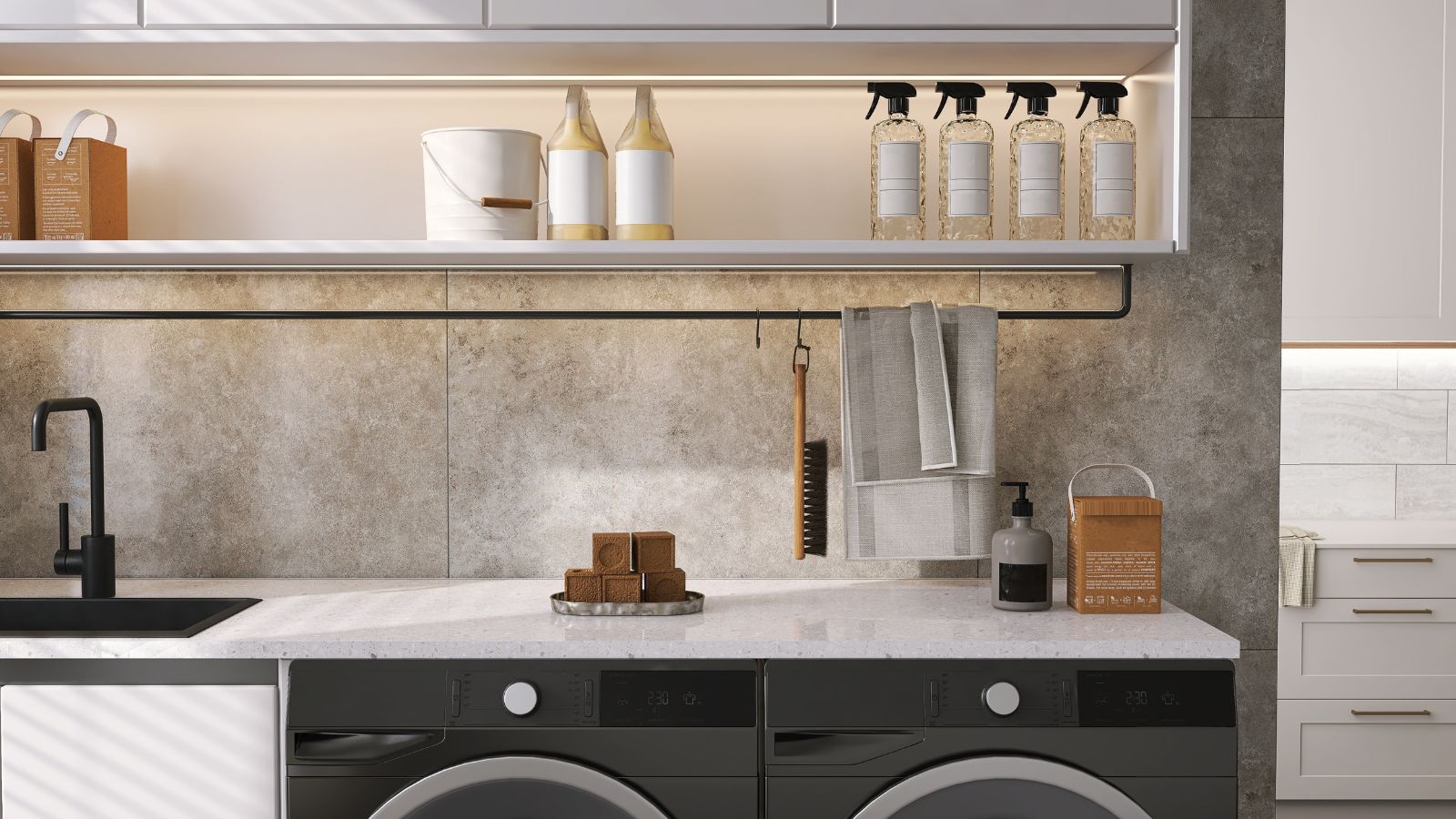 Extend the lifespan of your appliance with 5 simple but crucial washing machine maintenance tips
From cleaning the filters to keeping the door open, experts reveal the washer tips they swear by
By Andy van Terheyden Published