This redesigned home nails California Casual style – and everyone's invited
Clever interior updates turned a dated Mediterranean-style house into a cool California Casual home with a warm welcome

Design expertise in your inbox – from inspiring decorating ideas and beautiful celebrity homes to practical gardening advice and shopping round-ups.
You are now subscribed
Your newsletter sign-up was successful
Want to add more newsletters?
Ric and Mindy Prete's five-bedroom home in Simi Valley, Ventura County, CA, had Mediterranean architecture and dated features and finishes inside, which the couple wanted to change. The look they had in mind was a more modern, clean-lined California Casual look but they still wanted their home to feel comfortable and inviting. And just as important, they wanted enough space to entertain a crowd.
They called in an interior designer for advice and to help them translate their ideas into workable plans to transform their home. The results – as you can see – are stunning, and truly make this one of the world's best homes.
It's now somewhere the couple are proud to welcome friends and family, with plenty of space for entertaining and a relaxed vibe for quieter times with close family - and dogs!
Article continues belowThey wanted everything durable enough for high traffic and it's a place they can hang out in comfortably without worrying about ruining the furnishings and finishes.
Ric and Mindy already had firm ideas about the new look they wanted for their home, but the pair credit Jamie King of JLK Interiors with making those ideas a reality. Designer Jamie shows us round and explains how she helped transform a Mediterranean muddle into Californian cool.
Kitchen-diner the heart of the home
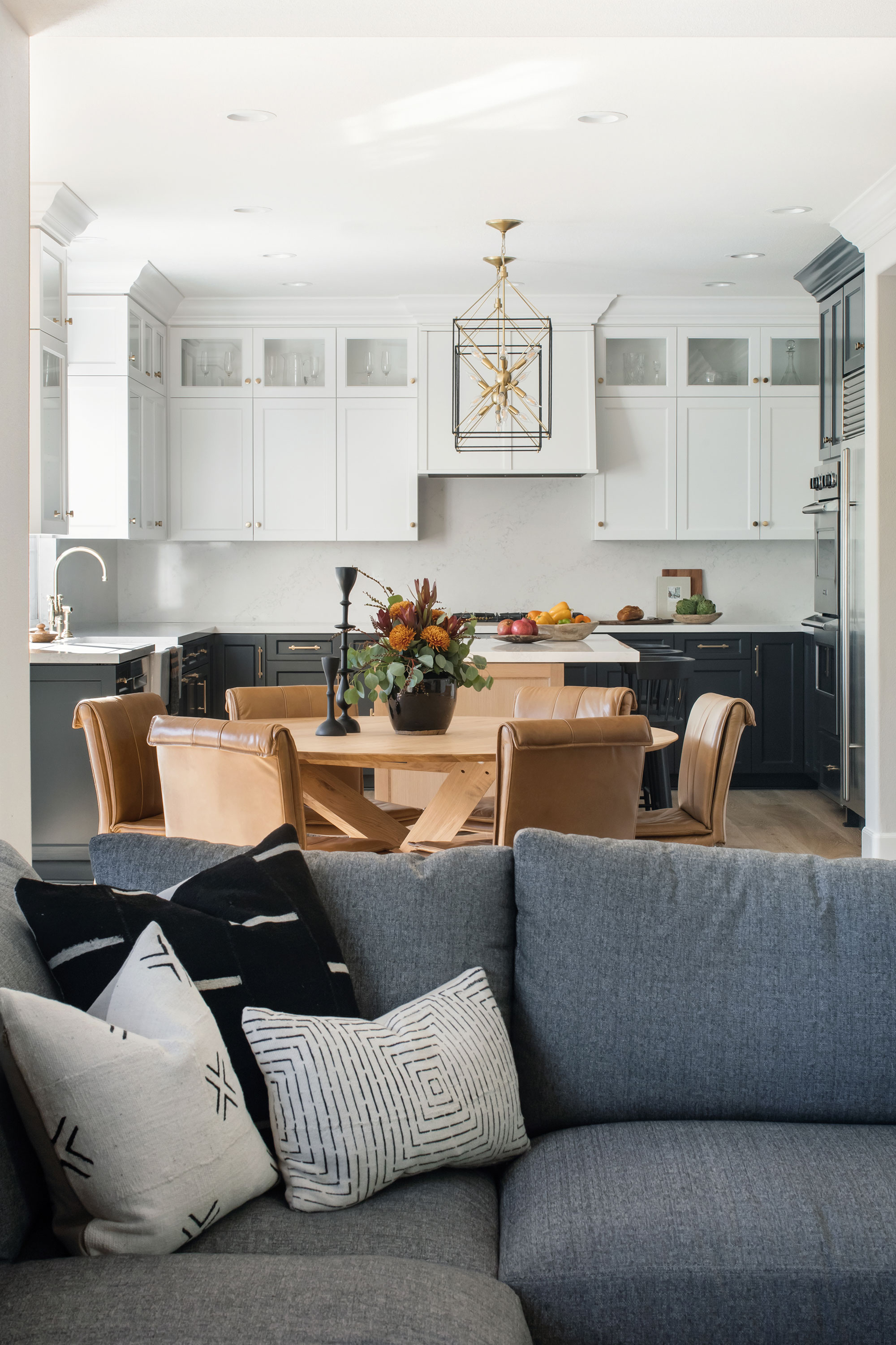
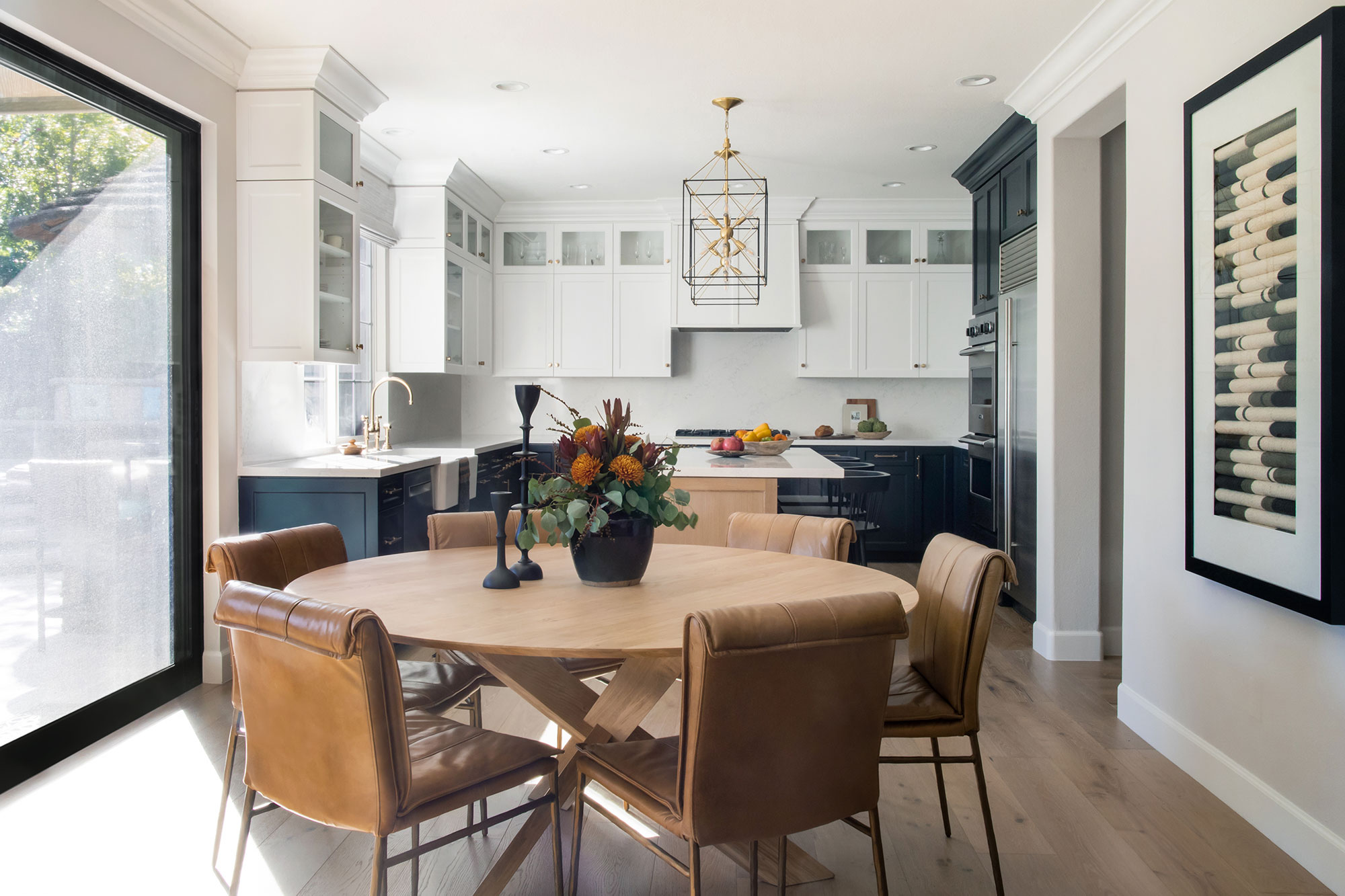
Why stick to one finish when you can choose three? Kitchen ideas here include cabinets in three contrasting tones which give the space airiness and interest. The wall between the family room and the kitchen was replaced with a large black metal sliding door, so now the room can be opened right up to create a very much more sociable space.
And what of the three finishes? 'We used white painted uppers, charcoal gray lowers, and a rift oak island with a custom stain and glaze treatment,' explains Jamie. 'We added the oak dining table and leather chairs for warmth and durability, and Sputnik pendants for modern bling.' Oak and leather are typical elements of the California Casual look, introducing rustic, natural materials to soften the clean-lined scheme.
Design expertise in your inbox – from inspiring decorating ideas and beautiful celebrity homes to practical gardening advice and shopping round-ups.
Dining table by Ethnicraft and Sputnik pendants from Hudson Valley Lighting.
Family room
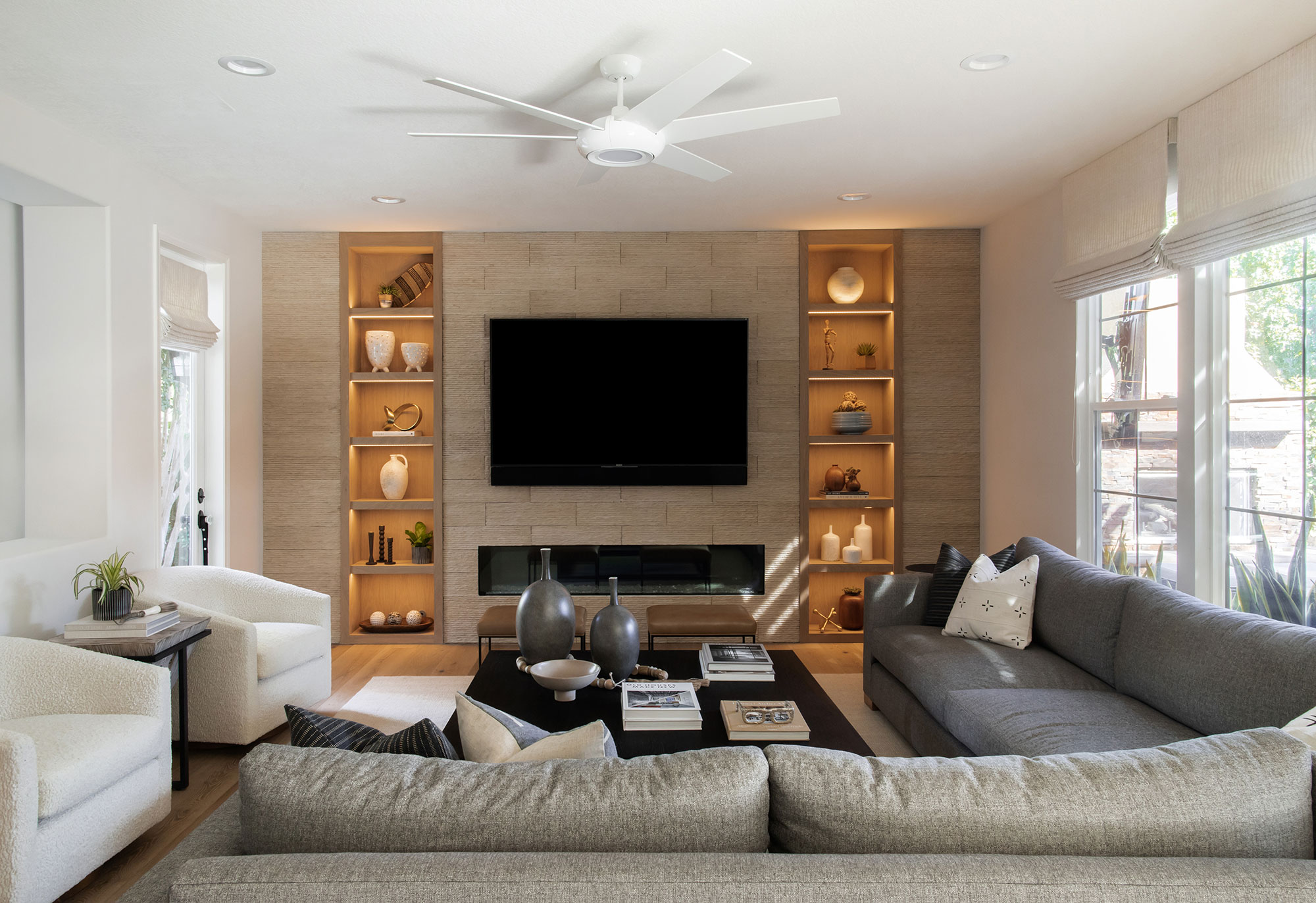
Anyone looking for family room ideas could do well to pay attention to this cozy space. Essential elements include: ample comfortable seating in durable fabrics, a smart fireplace, wall-mounted TV, and a good-size coffee table.
Jamie explains how this room evolved. 'The family room is where the family hangs out daily, but as it's visible from the formal living room, the finishes had to stand up to the living room but in a more casual way.
'We used performance fabric on the custom sectional, but in medium gray tone, and used sherpa on the custom swivel club chairs to relate to the off-white sofa in the living room. We added an oversized black oak coffee table to anchor the entire space and add a modern rustic element'
Jamie says the fireplace wall in this room is her favorite design element in the whole house. 'We removed the existing bulky fireplace and replaced it with a sleek linear fireplace allowing us the ability to hang the TV above it. We designed the shelving units with inset lighting, and lastly, we used a heavy textured concrete tile for the entire wall as an additional rustic element.'
Formal living room
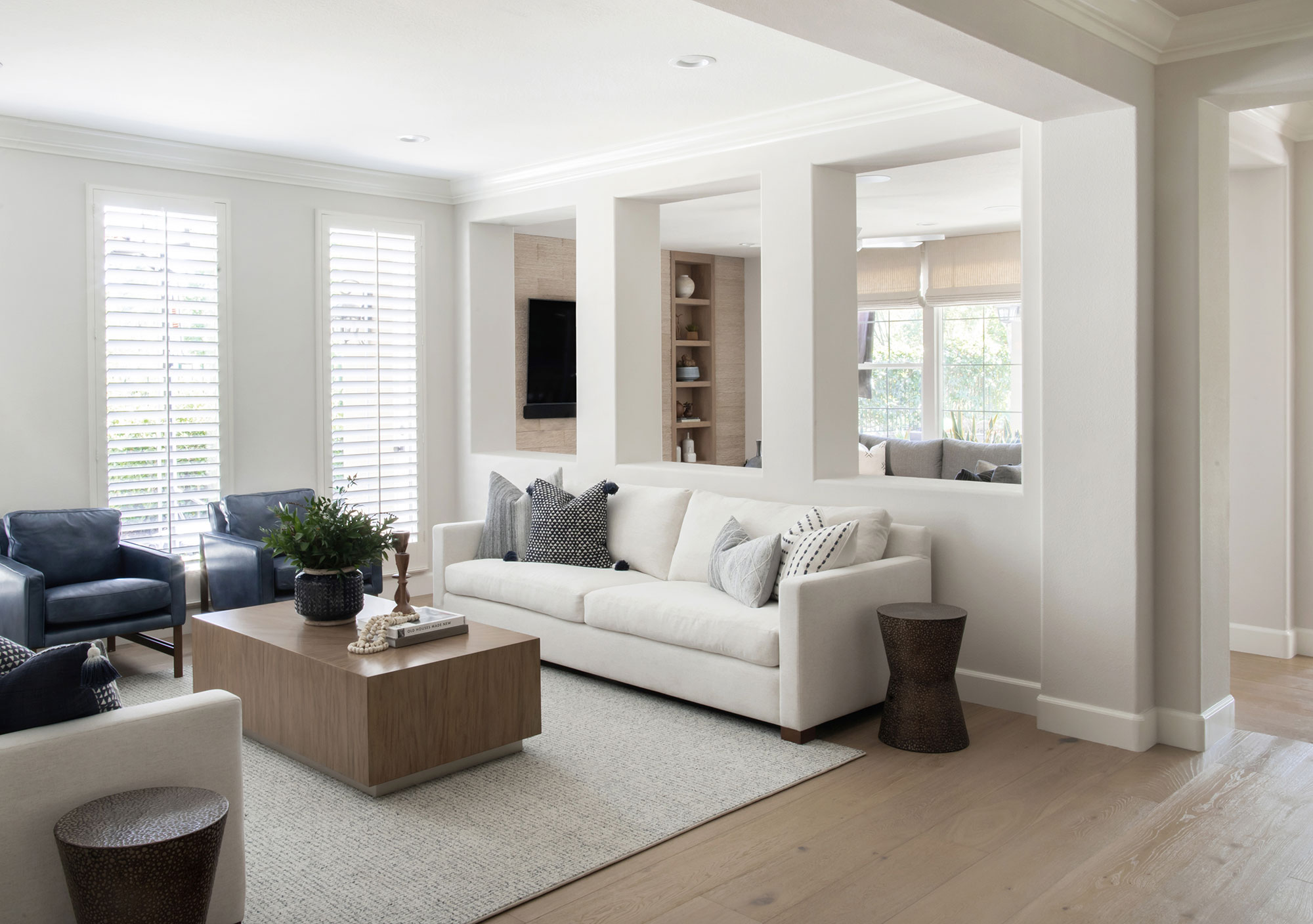
If your living room ideas are for a more formal space, then there's plenty here to inspire you. This symmetrical space centers round the coffee table and rug.
Jamie explains: 'We selected custom off-white sofas (with performance fabric for durability) from The Tac Room as the modern elements, and the leather chairs, and an inlaid wood coffee table from Rowe Furniture to add warmth to the room.'
The finished look is calm, serene, and effortlessly stylish, but in reality the project was full of challenges. All the original doorways were arched, and the wall between the family room and this formal living room had arched openings in the upper portion of the wall, and recessed niche areas in the lower portion of the wall.
'It was a visual nightmare,' says Jamie. 'We changed all of the doorway openings to rectangular and framed and drywalled in all of the lower niche areas to create walls where we could place furniture. Leaving the open upper areas between the two rooms allows the family to entertain large crowds without the two rooms feeling separated.'
Dining room
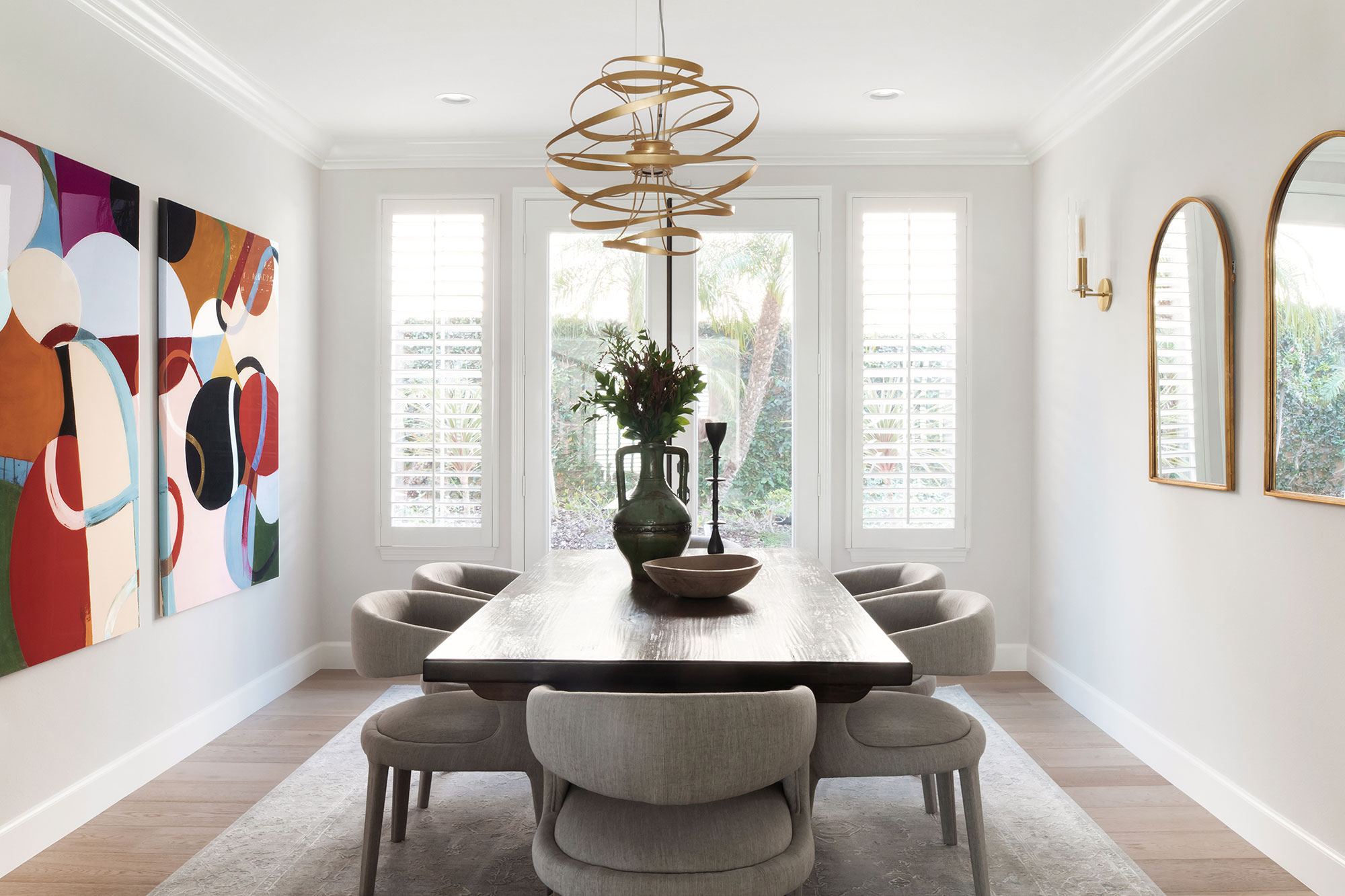
Anyone looking for dining room ideas will find this dedicated space ticks all the boxes: bold, contemporary art as a talking point, comfortable upholstered dining chairs, and statement lighting as the finishing touch.
The family's original rustic wood dining table was an old favorite and in good condition, so it has been repurposed here. 'We added the gold finish arched mirrors as a nod to the Mediterranean architecture,' says Jamie, 'and the whimsical light fixture, modern art, and modern dining chairs brought a balance between modern and rustic to the dining room. We continued this theme throughout the home.'
The original front door – a transitional space
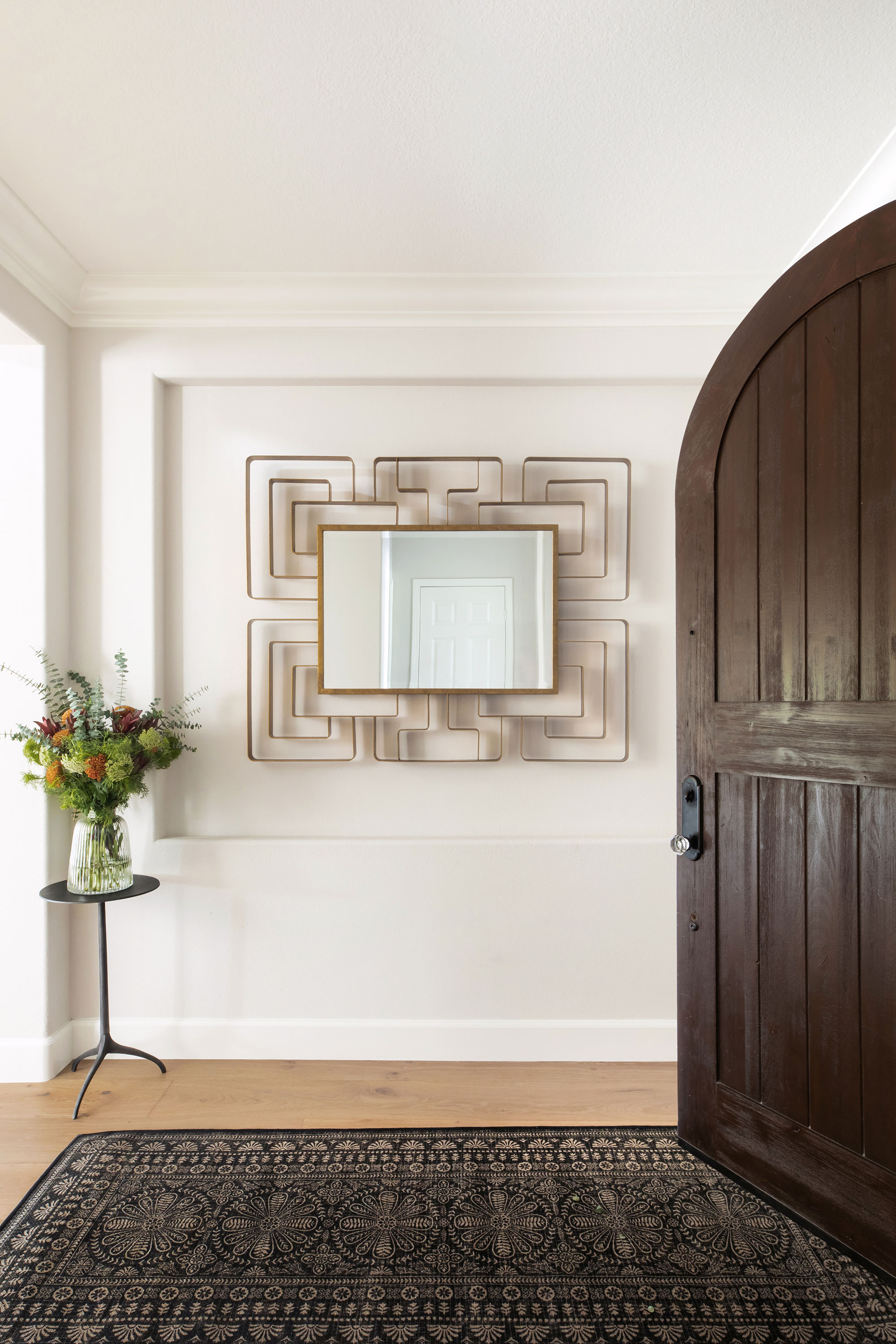
If you're looking for hallway ideas, consider the simple elegance of this calm space, where the dark rug echoes the old wooden door and the mirror picks up the shade of the pale wooden floor. Having replaced all the interior arched doors, Jamie felt it was important to leave the existing front entry door as it was.
'Its rustic finish and arched top was a perfect transition from the Mediterranean exterior into the more modern interior where there's a beautiful balance of rustic and modern finishes,' she says. 'We made our intentions known the minute you walk in the house, by adding a large modern mirror in a brushed gold finish. The juxtaposition of the rustic door and the modern mirror set the tone for the rest of the house.'
Powder room style
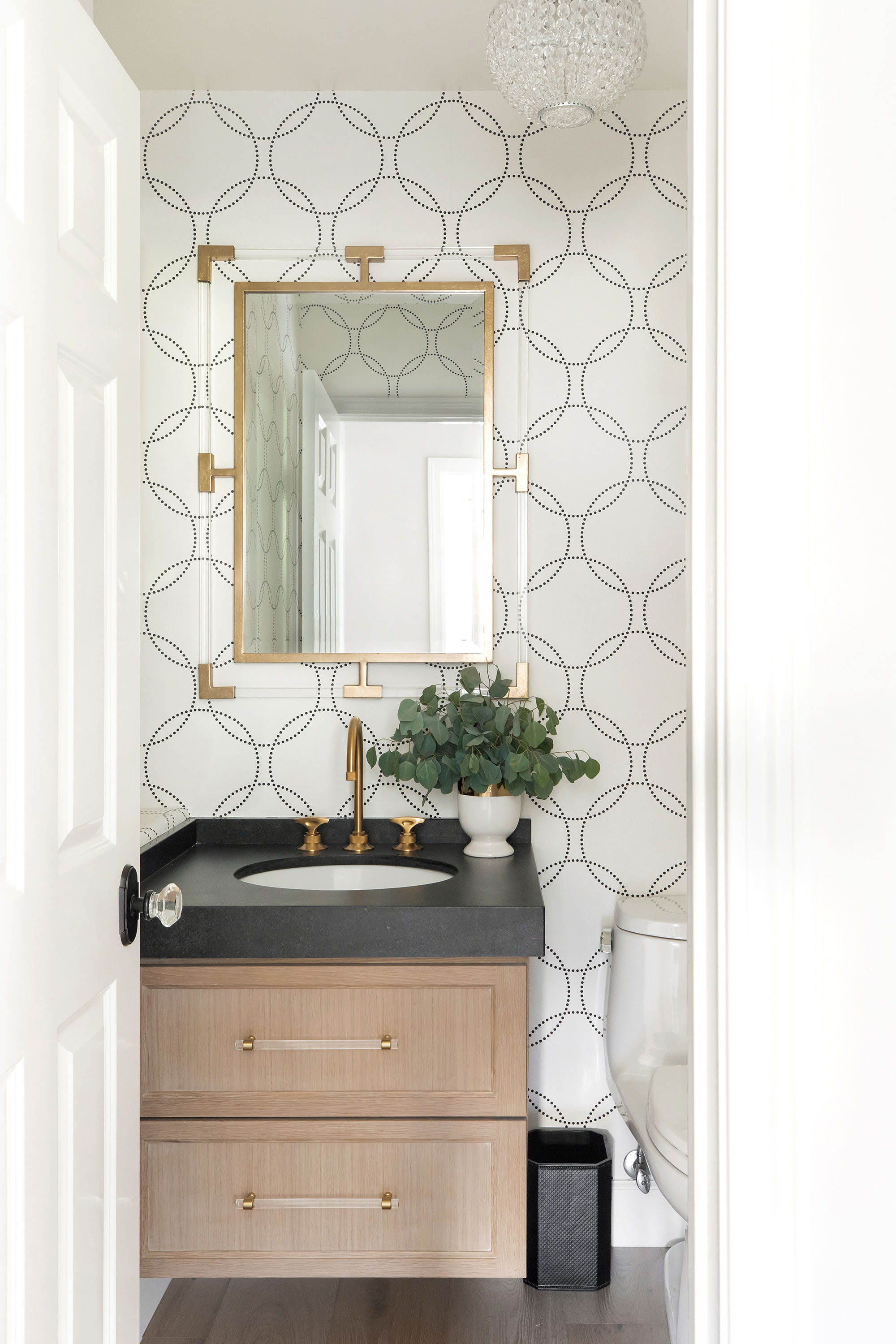
Further along the hall is this smart powder room, in keeping with the style theme elsewhere in the house. 'We used a custom rift oak vanity as our rustic element, and the whimsical dotted circle wallpaper in cream and black as our modern element,' explains Jamie.
Sweeping staircase and spacious hallway
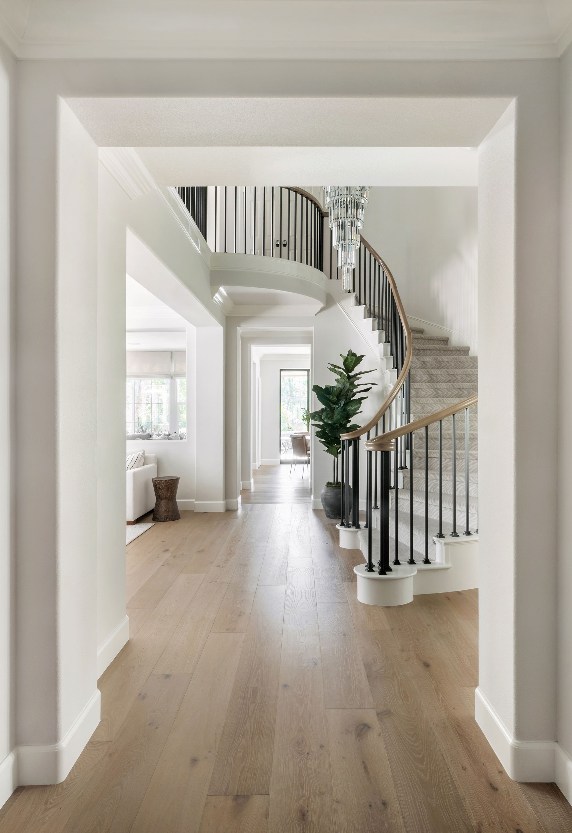
With the main reception rooms downstairs now open to the hallway, the new staircase needed to pack a punch. Staircase ideas here, include adding sleek liner rod iron balustrades, refinishing the handrail in a light faux finish that resembled the new French oak flooring installed throughout the entire house, and a grey and cream zebra print wool carpet insert.
Primary bathroom and recessed shower
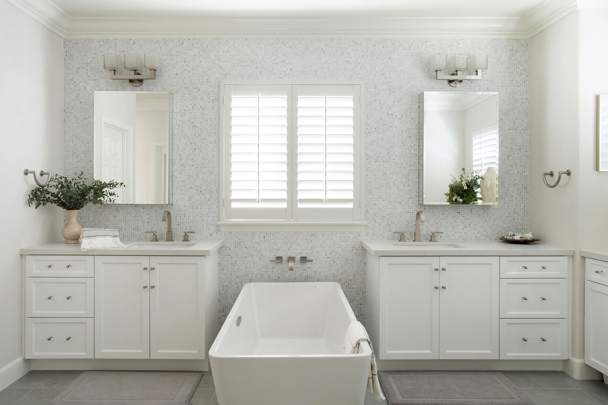
There are plenty of bathroom ideas worth copying from this sanctuary space. Its generous proportions allow room for twin vanity units, a freestanding bath and a recessed shower.
'This is the only room where we really stuck to more classic and elegant finishes,' says Jamie. 'The carrera marble is timeless. We used modern plumbing fixtures from Newport Brass in polished nickel to elevate the look of the bathroom and give it a more modern look.'
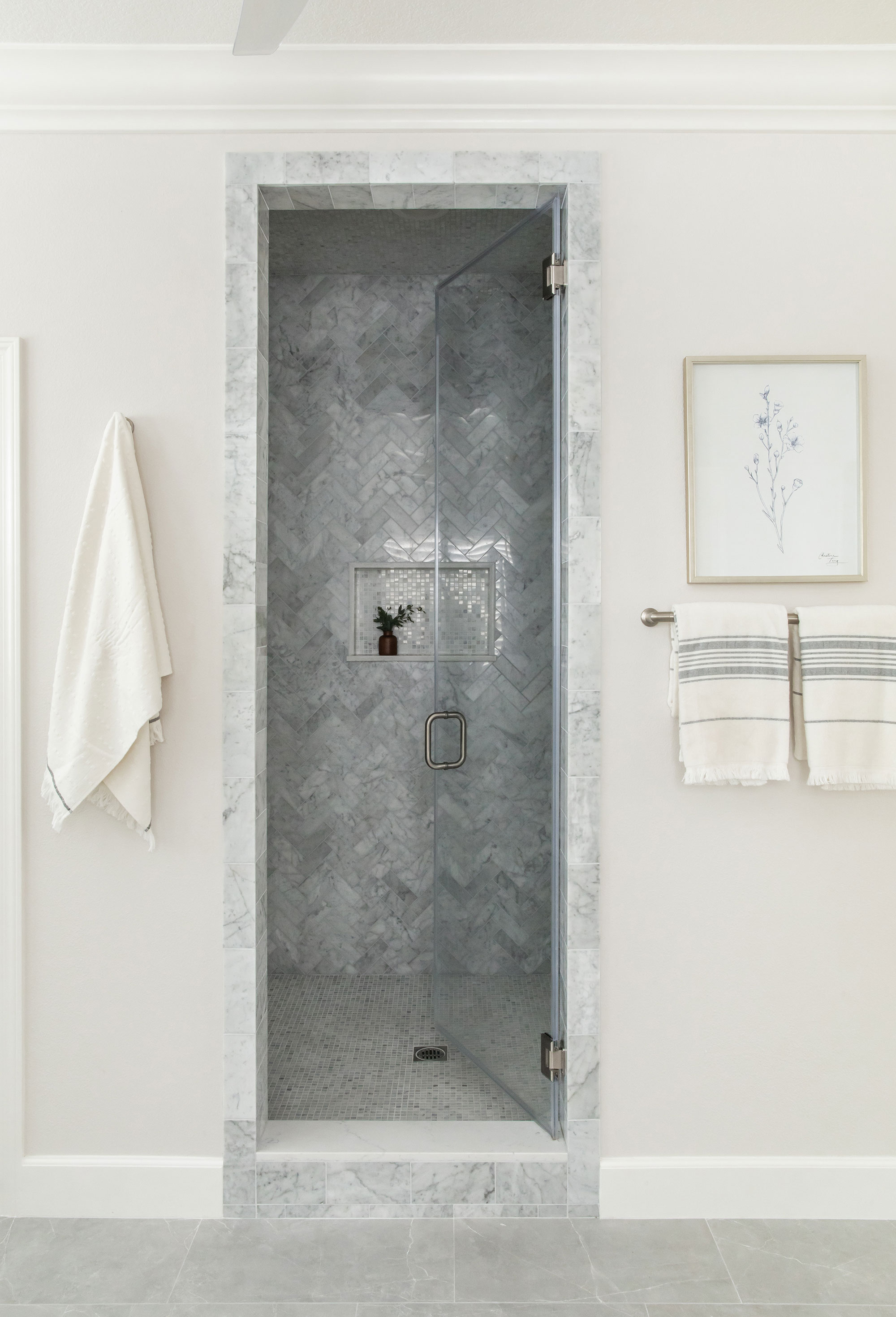
Opposite the end of the bath is a smart recessed shower with opalescent tiles arranged in a herringbone design, edged in marble to match the vanity countertops. The overall effect is a relaxing and indulgent space, a peaceful retreat for the homeowners from their busy family lives.
'We couldn't be happier with the end result. More importantly, our clients couldn't be happier,' says Jamie.
Karen sources beautiful homes to feature on the Homes & Gardens website. She loves visiting historic houses in particular and working with photographers to capture all shapes and sizes of properties. Karen began her career as a sub-editor at Hi-Fi News and Record Review magazine. Her move to women’s magazines came soon after, in the shape of Living magazine, which covered cookery, fashion, beauty, homes and gardening. From Living Karen moved to Ideal Home magazine, where as deputy chief sub, then chief sub, she started to really take an interest in properties, architecture, interior design and gardening.
