This 1930's Beverly Hills remodel proves that being bold with pattern and color can really bring a home to life
This major remodel of a 1930s home in Beverly Hills not only created extra space, but added bold color and pattern too
This Beverly Hills, CA, house had plenty of charm but many of the rooms were small and outdated and its owners, a family of four, wanted to make it more suitable for their modern, active lives and so a major remodel was planned.
The house is a two-story, Cape Cod-style property with a mix of shingle and stone veneer siding, a central front door, and a gabled roof. Its size, history and desirable location already put it in line to be one of the world's best homes, but a recent redesign has taken it to a whole new level.
Interior designer Betsy Burnham, founder of Burnham Design, oversaw the whole 5,500-square-foot project, inclusive of construction, furnishing, accessorizing, and art placement.
'My clients are busy, hard-working, down-to-earth people who told me they wanted a great family house and not a “fancy Beverly Hills house”, which made perfect sense to me and was an excellent starting point,' designer Betsy recalls. 'We set out to create welcoming, attractive, comfortable rooms. We reconfigured the entire back of the house to be a more open, better functioning kitchen and family area.'
One of the most striking elements of the remodel is its confident use of color and pattern. 'Wallpaper was used in a few key places, and we chose a lot of traditionally-inspired, printed fabrics. We tried to use color in interesting ways,' explains designer Betsy Burnham, who picks out her highlights below, and explains her approach.
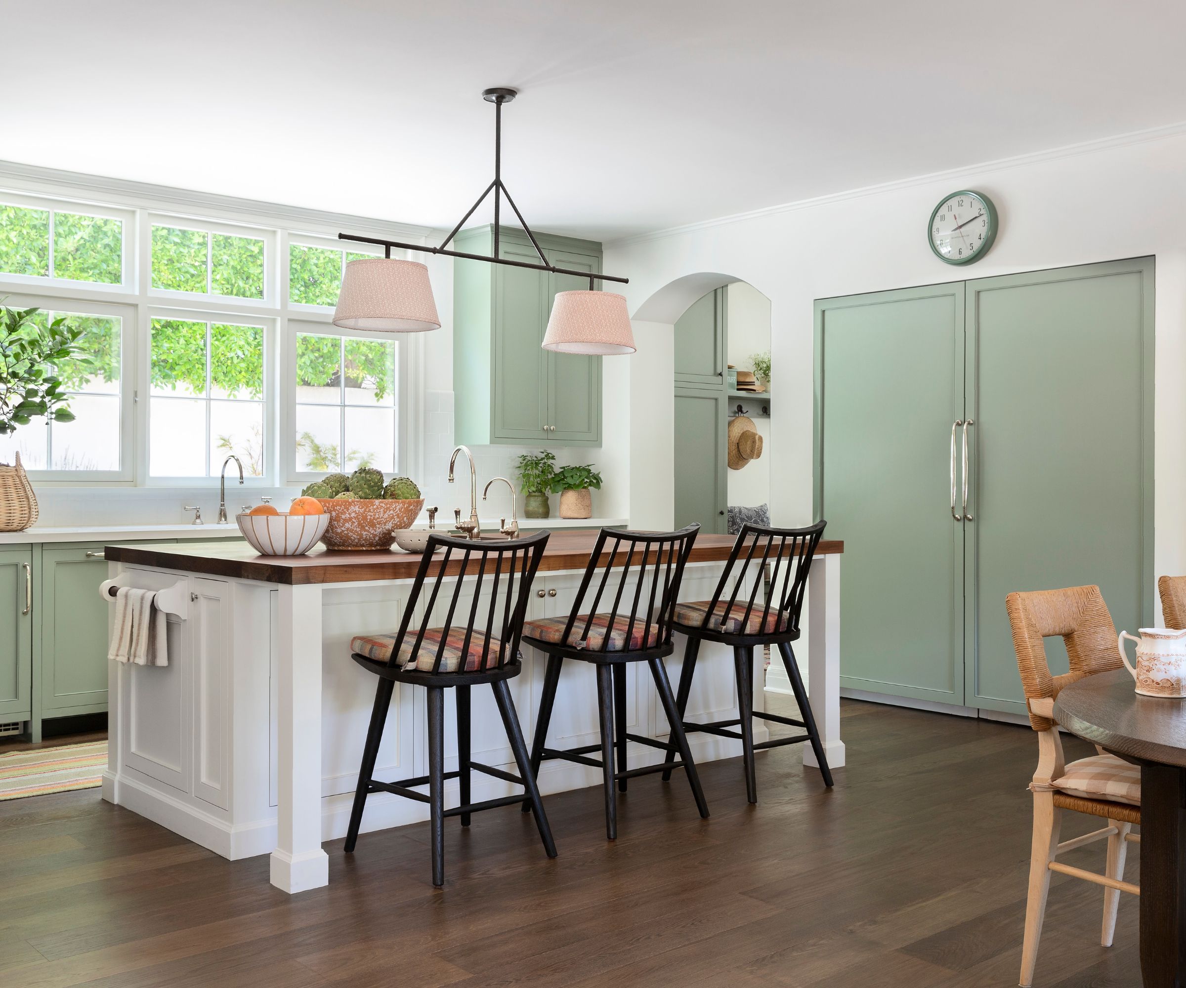
Where previously there was a small, vintage kitchen and several small back-of-house rooms, walls were taken down to open all the rooms up. The space was reconfigured to provide an up-to-date kitchen/family room as well as a first-floor guest suite.
'This was really the heart of the remodel,' explains designer Betsy Burnham. 'Dave Lach, one of my senior designers, did a major reworking of the layout of this entire part of the house before the project even started and his plan is ultimately what was used for construction.'
The aim was to create an easy working layout. Kitchen ideas included a large island with a butcher-block top and room for three stools, the Lewis Windsor counter stools in black oak, from Four Hands. A full-sized refrigerator and freezer were also integrated. 'The kitchen sink is under a large window which faces the driveway greenery and gets a ton of natural light,' adds Betsy. Heritage-style notes in keeping with the age of the house are provided by the stools and pendant above the island, the Vaughan Designs' Lancaster Kitchen Downlight with shades in Serena Dugan's Oletta /Canyon fabric.
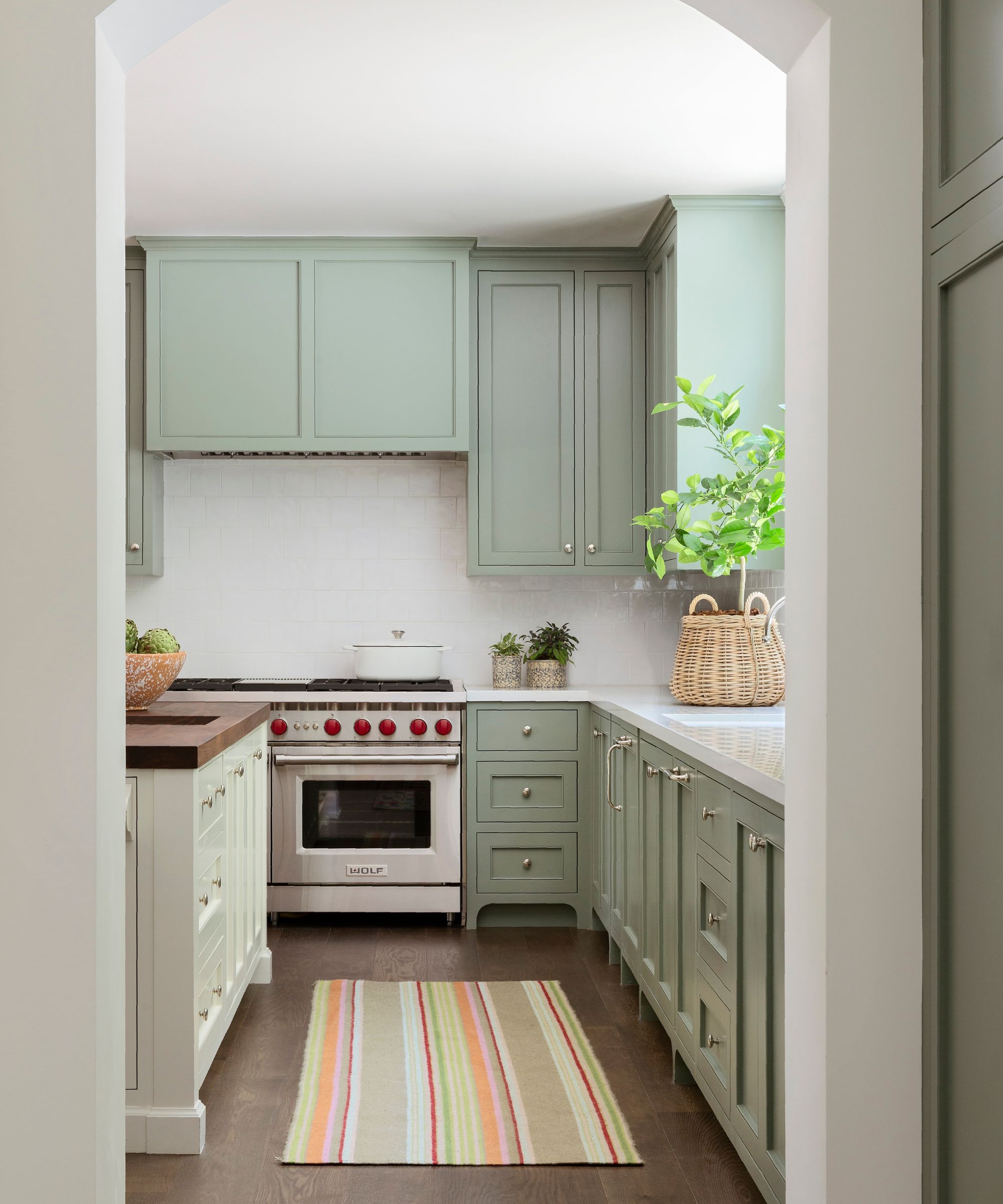
Anyone looking for painted kitchen cabinet ideas can't fail to be inspired by the soft green shade used in this kitchen: Farrow & Ball's Card Room Green. The hardware is from Restoration Hardware and the perimeter cabinetry is topped with white Caesarstone 'Blizzard' countertops. The range is from Wolf, and on the floor is an eye-catching and highly practical indoor-outdoor runner, Stone Soup by Annie Selke.
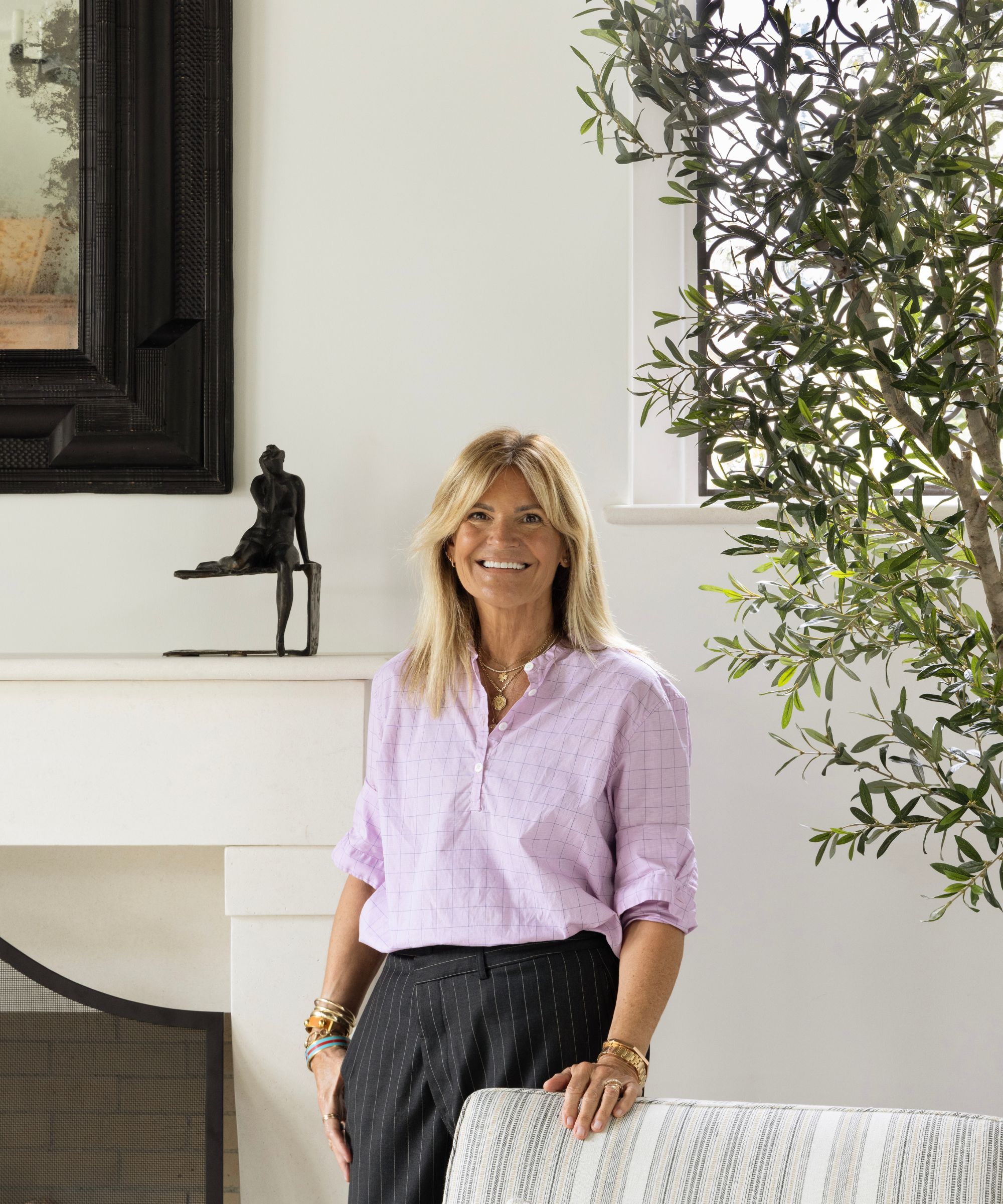
Founder and principal of Burnham Design, Betsy Burnham is known for her elegant, comfortable interiors. This Beverly Hills project was a gift for Betsy and her aim to create welcoming, attractive, comfortable rooms for the family of four was accomplished with her trademark style and confident use of color and pattern.
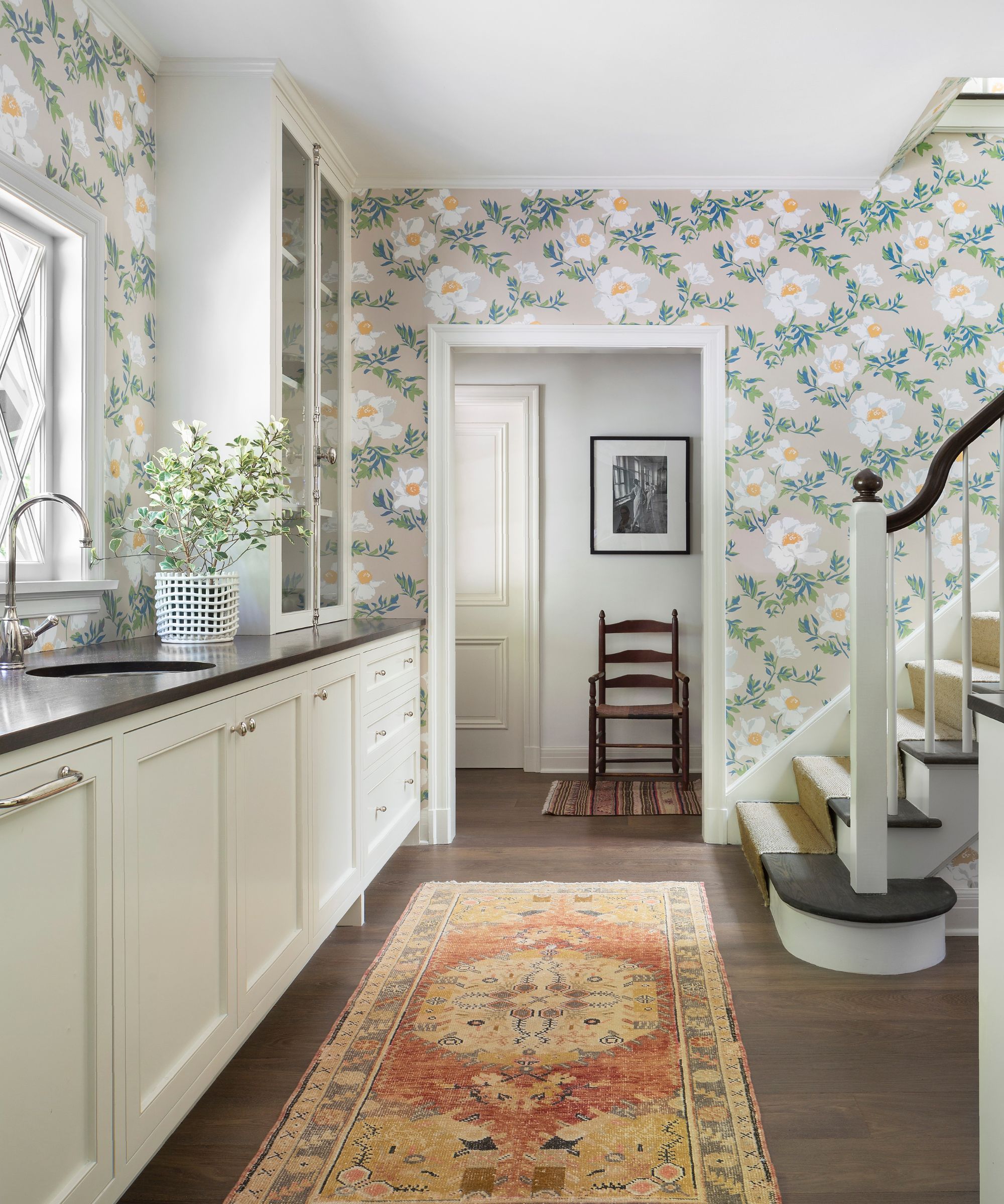
A challenging space at the back of the house became a practical butler's pantry with warm white cabinetry and walnut countertops.
'By adding a large window with an “x” design, as well as a tall storage hutch and polished nickel bar sink, we gave new life to the space,' says designer Betsy Burnham. 'The Lake August Matilija wallpaper keeps it fun and casual.'
The room retains a nostalgic link to the home's past by retaining the back stairs, and a richly colored vintage rug from Mehraban completes the scene.
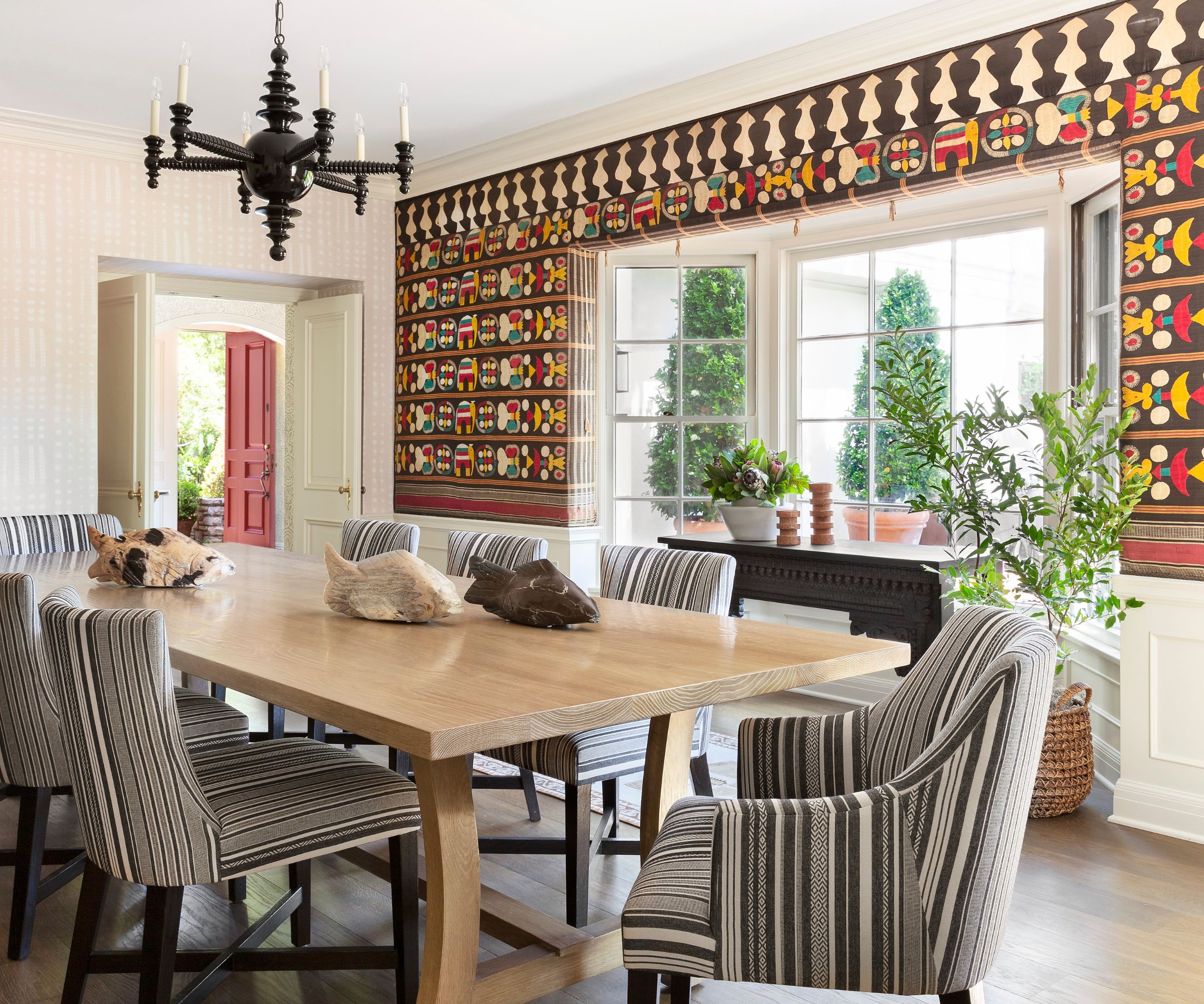
Dining room ideas evolved around the room's standout piece, a tapestry made from vintage textiles (collected on the clients’ many travels). 'We selected a subtle wallpaper to complement, but not distract from, the textiles, and added a long table with plenty of seating for family holiday dinners,' adds designer Betsy.
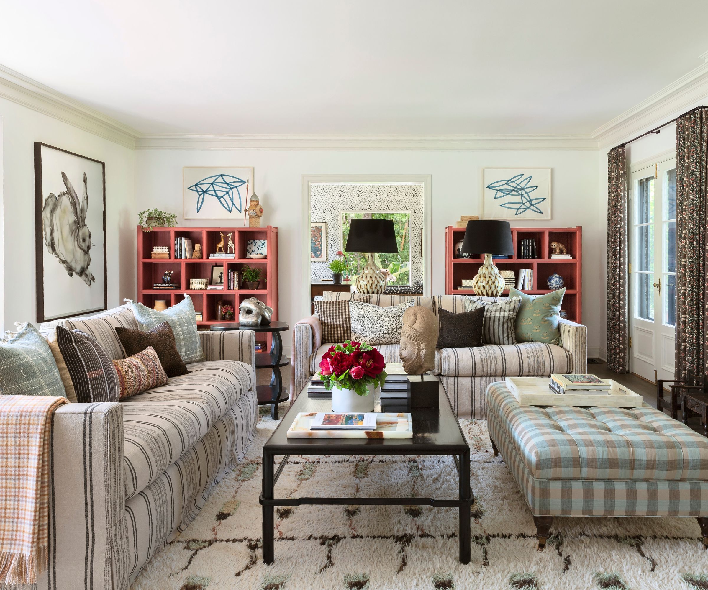
Explaining her living room ideas, designer Betsy Burnham says: 'We wanted to create warmth and intimacy in what is actually quite a large room. The layout of the room was done with conversation in mind; two sofas arranged around a pair of coffee tables help fill the space and allow for plenty of seating.'
The existing sofas were reupholstered in Ralph Lauren's Ivin Stripe fabric to give them a fresh look. A pair of Clubcu Reedition Elm Shelves have been painted in Sherwin Williams Bravado Red and help to ground the room and give it symmetry, they also reference the front door color (see exterior photo below). The Moroccan rug and the artworks were part of the homeowner's existing collection.
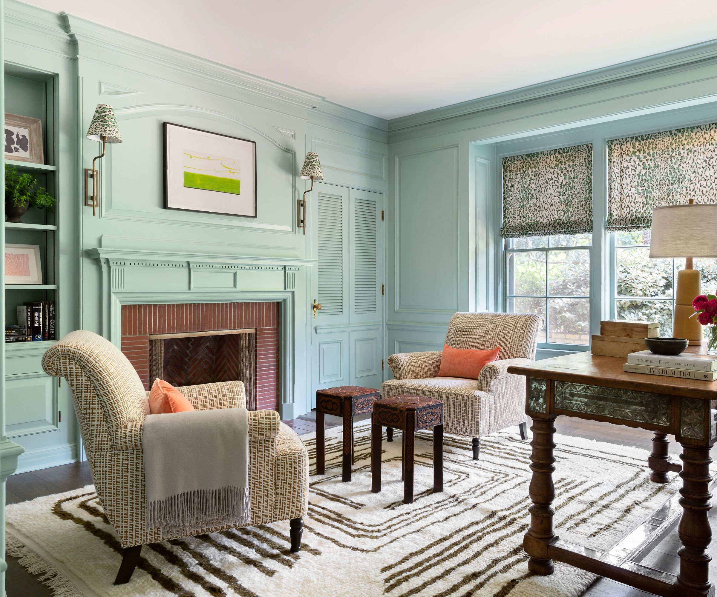
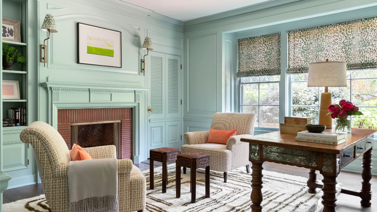
The library is one of designer Betsy Burnham's favorite spaces in this home. Since one of the homeowners planned to use it regularly as a study, its design required careful thought.
'This was always a special room, with floor to ceiling moldings and a hidden bar – all of which were original to the house, and all of which got a refresh,' explains designer Betsty. 'The client loves green, so it was fun finding a color (Farrow & Ball's Green Blue) we could use everywhere – moldings, bookcases, fireplace surround – and then finding fabrics that played with it.' The
Key pieces include custom armchairs from Burnham Design, upholstered in Tiana fabric from Kravet. The area rug is from Lulu & Georgia, the sconces are by Urban Electric, and the side tables are vintage. The Roman shade fabric is Rose Cumming's Sabu on Linen.
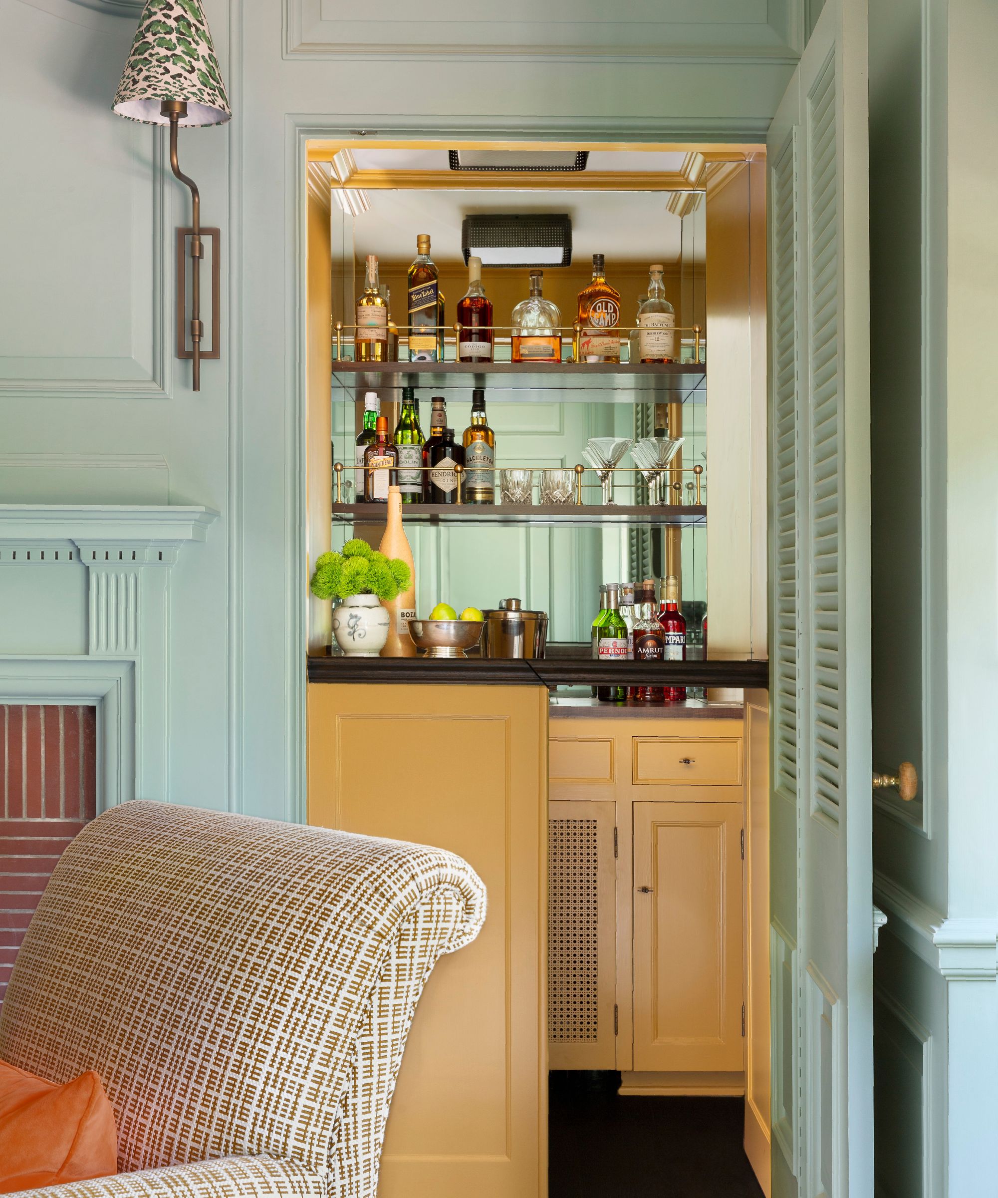
Once the library scheme was drawn up, home bar ideas soon followed. 'For that 'secret' bar, we refurbished the entire inside of it and painted it in Farrow & Ball's wonderful India Yellow, which provides a splash of unexpected color-within-color,' explains Betsy Burnham. Walnut countertops provide a pleasing contrast with the yellow.
We absolutely love this original feature of the 1930s home and, thanks to its beautiful vibrant yellow paintwork, we doubt it will be staying secret much longer.
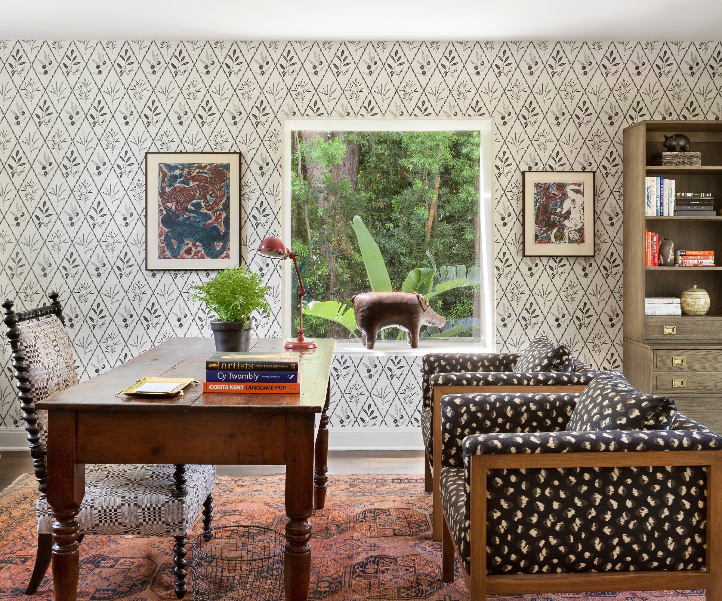
The home's second office space is affectionately referred to as the 'Wintergarden', says designer Betsy Burnham. 'Originally, this was an outdoor room, and as part of the remodel we added wood flooring and treated it like an extension of the living room. We added wallpaper that relates to the living room palette (black, brown and shades of red), but which also helps define this as its own space.'
Home office ideas here include Schumacher's Endimione wallcovering; Lee Industries chairs covered in Kravet's Feline fabric; vintage bookcase from Chairish; and a vintage area rug.
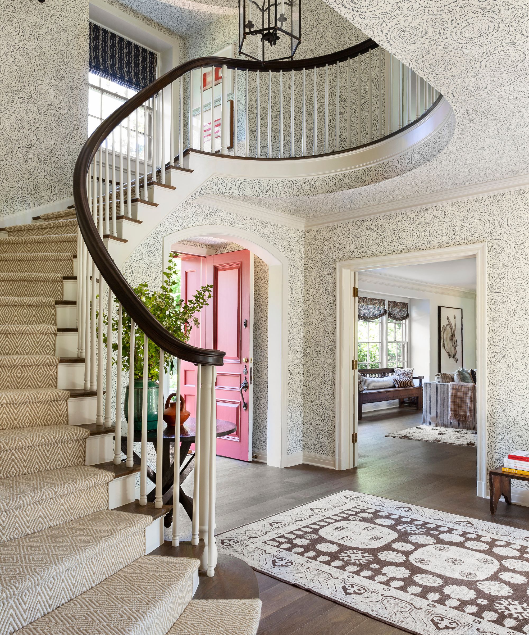
'Great wallpaper, a vintage rug, a special table, and interesting light fixtures work together in the hallway to achieve the primary goal, which was to make a splash and give the entry some gravitas without doing anything too fussy or showy,' says designer Betsy Burnham.
'When I found that wallpaper I just knew it would be a knockout,' says designer Betsy Burnham of her entryway ideas. 'It’s equal parts showstopper and subdued. I know that sounds crazy but the navy-blue-on-cream floral print is fabulous enough for the beautiful, focal staircase and just understated enough not to be in any way flashy.'
The wallpaper is GP&J Baker's Kamala design in Indigo and as part of the designer's staircase ideas, new white oak flooring and simplified pickets and a new Granada Diamond runner, from Bradford’s Rug Gallery, were fitted to elevate the space and add impact as you arrive at the house.
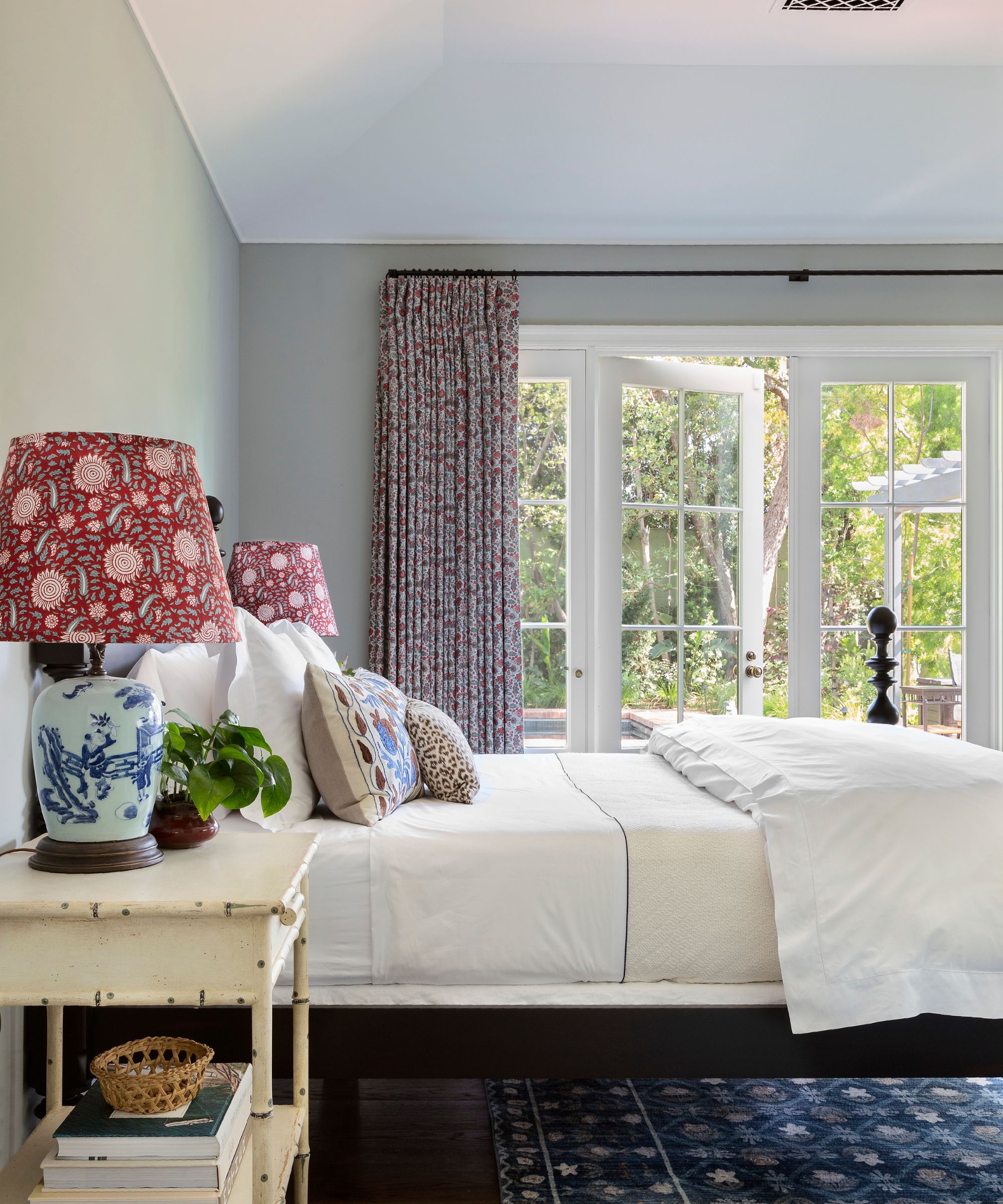
Bedroom ideas for the new guest suite at the back of the house have a classic English look about them, says designer Betsy Burnham. 'We went with a traditional turned-post bed, faux bamboo nightstands, and a liberty-inspired print for the drapes,' she adds.
A Quincy bed from Ethan Allen is topped with Matouk bedding, and flanked with Chelsea Textiles' side tables. The lamps are vintage, with shades in Pierre Frey's Semi Kalamkar fabric. The area rug is from Loloi, and the drapes are in Namay Samay's Keeda print. The walls are painted in Farrow & Ball's Light Blue.
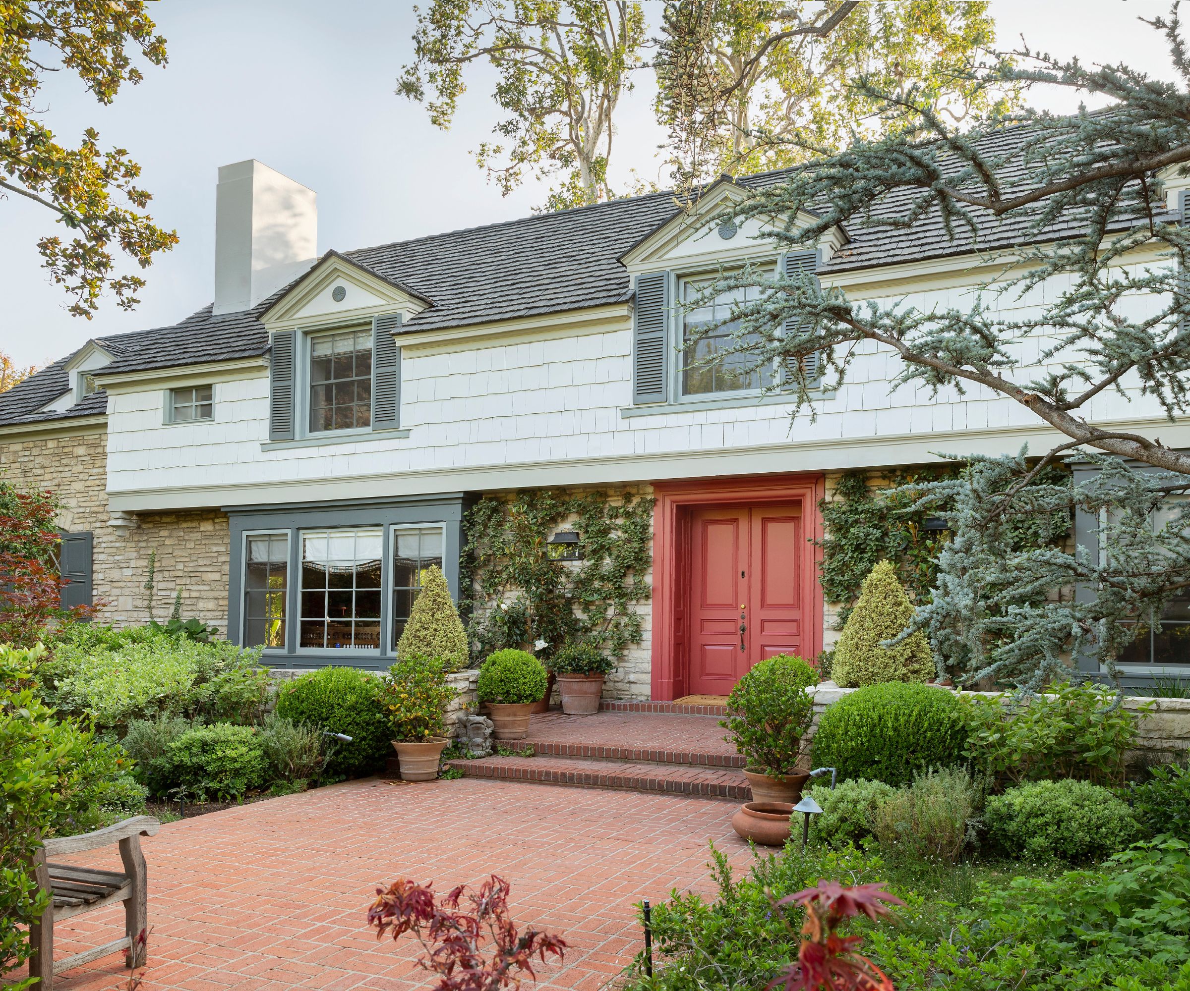
'Even though the spaces are big and the furnishings are upscale, I hope the intended coziness and “unfussiness” comes through, and the result is a warm and welcoming house,' says designer Betsy Burnham.
Mission accomplished, and with style.
Interior design: Betsy Burnham and Dave Lach at Burnham Design
Photography: Laura Hull
Architect: Thomas Johnson
General Contractor: Alisal Builders
Landscape Architect: Dryden Helgoe
Sign up to the Homes & Gardens newsletter
Design expertise in your inbox – from inspiring decorating ideas and beautiful celebrity homes to practical gardening advice and shopping round-ups.
Karen sources beautiful homes to feature on the Homes & Gardens website. She loves visiting historic houses in particular and working with photographers to capture all shapes and sizes of properties. Karen began her career as a sub-editor at Hi-Fi News and Record Review magazine. Her move to women’s magazines came soon after, in the shape of Living magazine, which covered cookery, fashion, beauty, homes and gardening. From Living Karen moved to Ideal Home magazine, where as deputy chief sub, then chief sub, she started to really take an interest in properties, architecture, interior design and gardening.
-
 'Big results before you know it' – Experts urge you to use the ‘Take Away 10’ method for simple decluttering with zero decision fatigue
It can cut hundreds of items from your home in just a few weeks
By Ottilie Blackhall
-
 Kevin Bacon and Kyra Sedgwick's rustic kitchen island is stunning, but controversial – designers say you can get the look without the hassle
A popular material finds an unorthodox home in the couple's kitchen, but experts disagree on whether it should be used – here's how to do it instead
By Sophie Edwards