9 beautiful design tips worth borrowing from this converted Georgian church
Interior designer Dean Keyworth renovated a former church, giving it a colorful new look that's guaranteed to lift the spirits
There can't be many people who would be excited by a for sale sign outside an enormous neglected church. Dean Keyworth and his husband Gavin Hilton saw the decommissioned church and decided it would make the perfect renovation project. They were looking for a second home near the coast and the church was situated in a quiet village, almost as far north as you can go without crossing the border into Scotland. That was 14 years ago and unfortunately things didn't go to plan. Their offer was outbid and Dean and Gavin continued their search.
In 2018, the pair discovered the church was back up for sale again and that it had been barely touched in the interim. 'This time I wasn't going to let it get past me,' says Dean and he set about making plans and finding out what was possible given that the former church was a Grade II-listed building, built in 1821.
It turns out that with flare, creativity and bravery in equal measure quite a lot was possible. And the dramatic results of Dean's church renovation project make it one of the world's best homes.
There's plenty here to inspire anyone who's taking on a major renovation project. However, the building's creative transformation is packed with ideas that would transfer just as well to smaller projects, especially for those looking for kitchen ideas
before embarking on a refit.
Interior designer Dean Keyworth took on this neglected building, which consisted, he says, of just 'one huge main room with seven-metre-high ceilings, and an old bathroom with a tree growing through the wall'. Dean, who set up Armstrong Keyworth and is a past president of the British Institute of Interior Design, has brought the former church back to life in style, He added his signature colorful vistas and quirky talking points, all the while retaining the essence of the original space and period features.
We've picked our favorite corners of this unusual conversion. Here are some of its most inspiring design elements.
1. A former choir stall has been transformed into a mezzanine kitchen
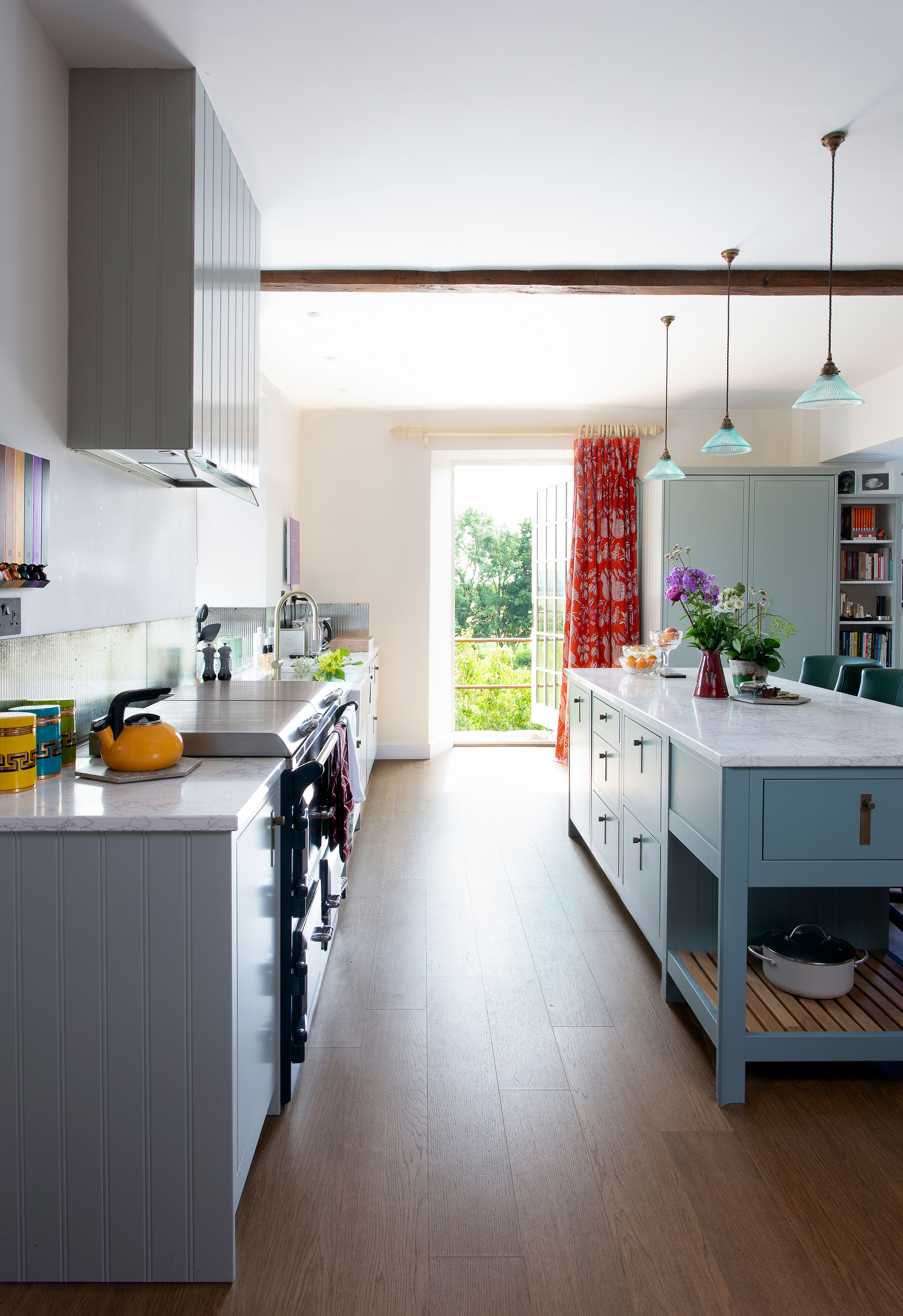
A kitchen in a choir stall - why not? We're definitely singing its praises! Looking for smart kitchen cabinet ideas? These elegant grey-blue cabinets were handmade by 1909 Kitchens, and Dean added the unusual distressed mirrored splashback. An island breakfast bar was also built into the scheme and a door opens to a Juliet balcony to make the most of the room's elevated position bringing great views and extra natural light. A curtain in Balangan fabric by Manuel Canovas provides an additional splash of colour.
2. Color has been added to a modern kitchen
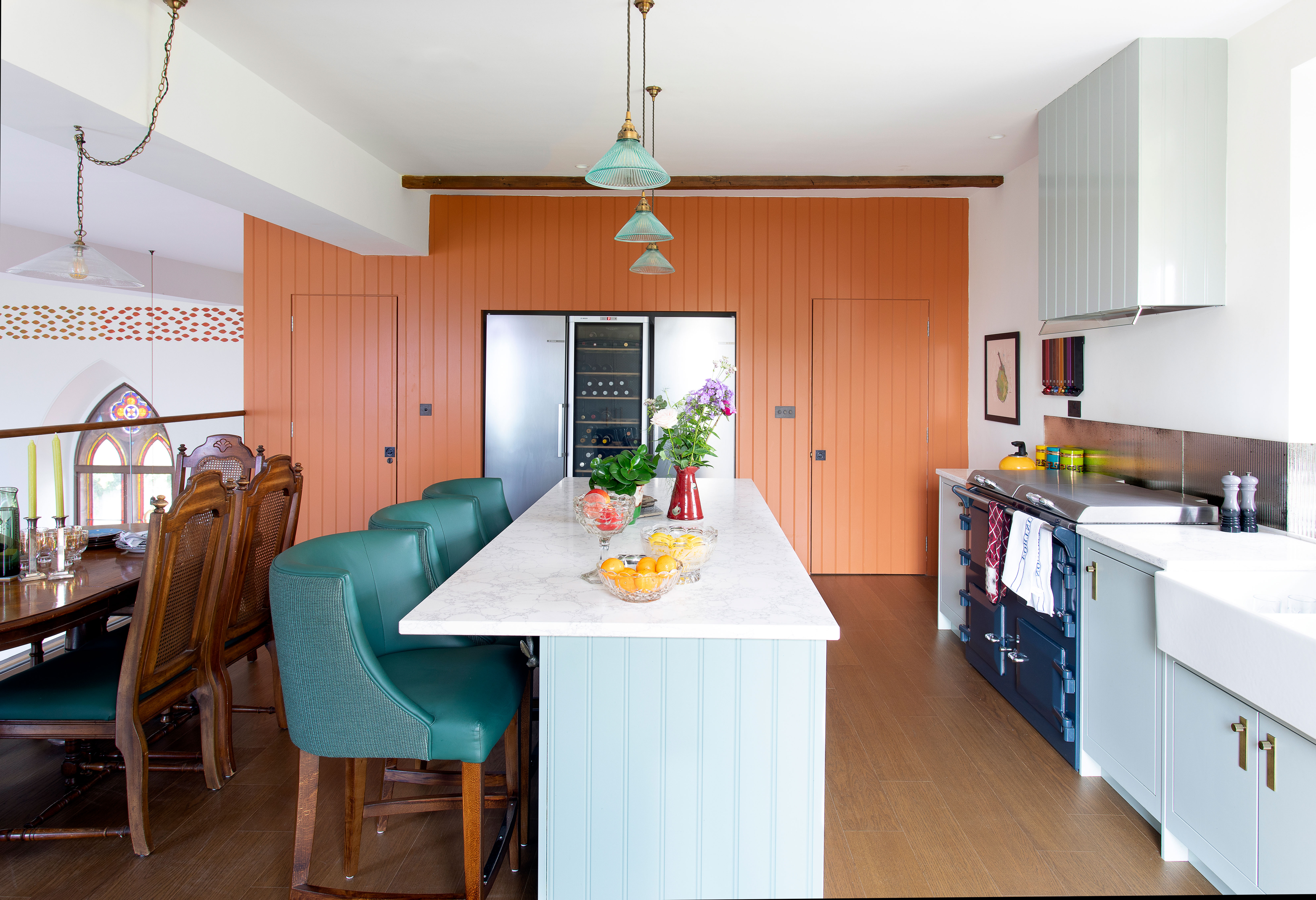
Dean came up with a palette of burnt orange, green and caramel that he uses throughout the project and that works equally well in the old and new parts of the building. Anyone looking for kitchen color ideas, take note: Dean's mezzanine kitchen is a masterclass in color blocking.
The striking tongue and groove paneling is painted in Craig & Rose’s Russet to contrast with the units, but to echo the downstairs dining space, while the Robert Langford chairs at the breakfast bar are covered in Scottish leather and Armani Casa fabric in green, in keeping with the palette. A glass balcony was added to the existing mezzanine, but the couple were adamant that the central space would stay as one area. 'I hate it when you see gorgeous stained-glass windows cut in half with floors,’ says Dean. An expert was called in to restore the windows to their original glory.
3. Embrace the building's origins and architecture
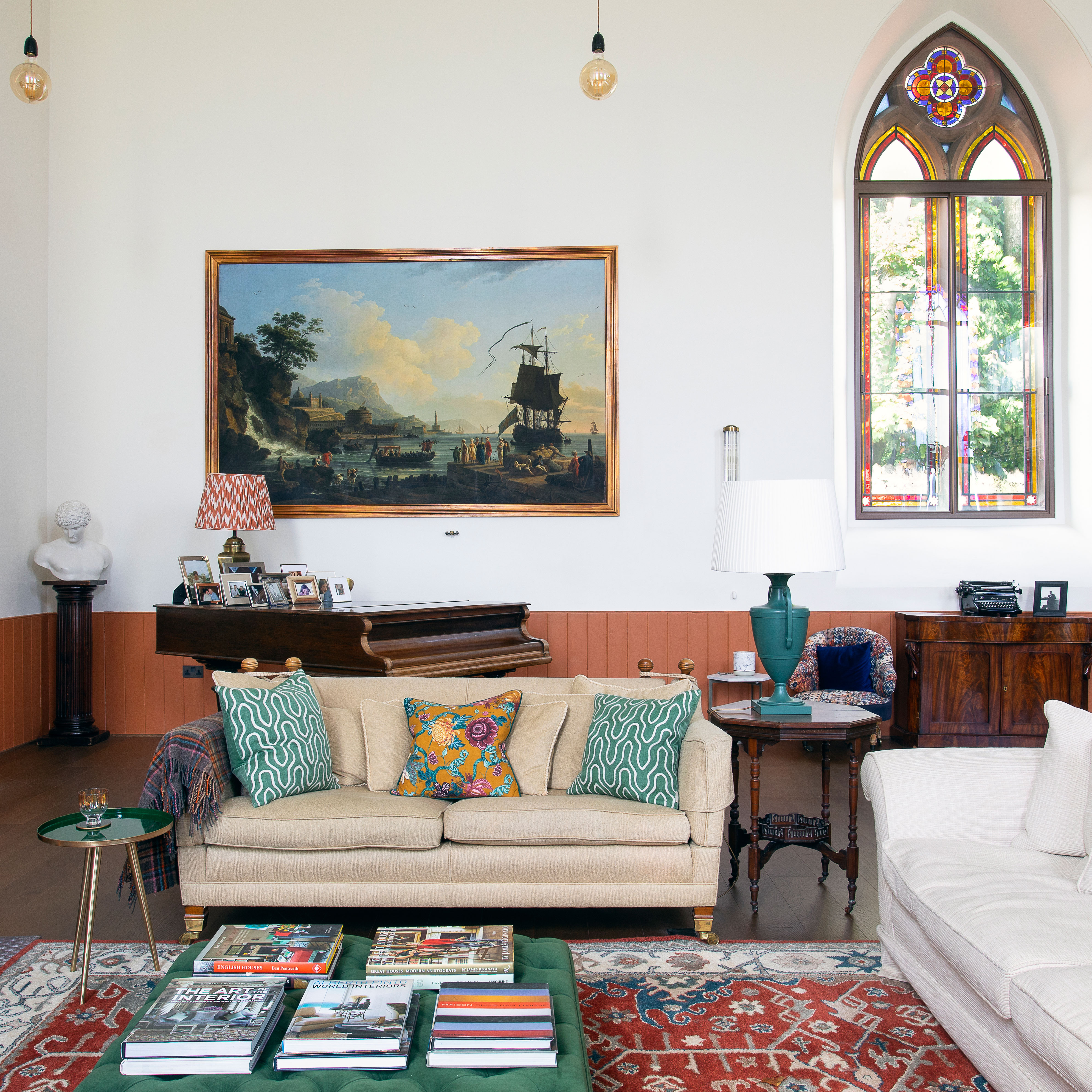
Dean kept the full height of the central living space so that its original features, including the stained-glass windows, were not compromised in any way. The framed mural is Marine Au Soleil Couchant from Papiers de Paris.
4. Create warmth in an open plan living room
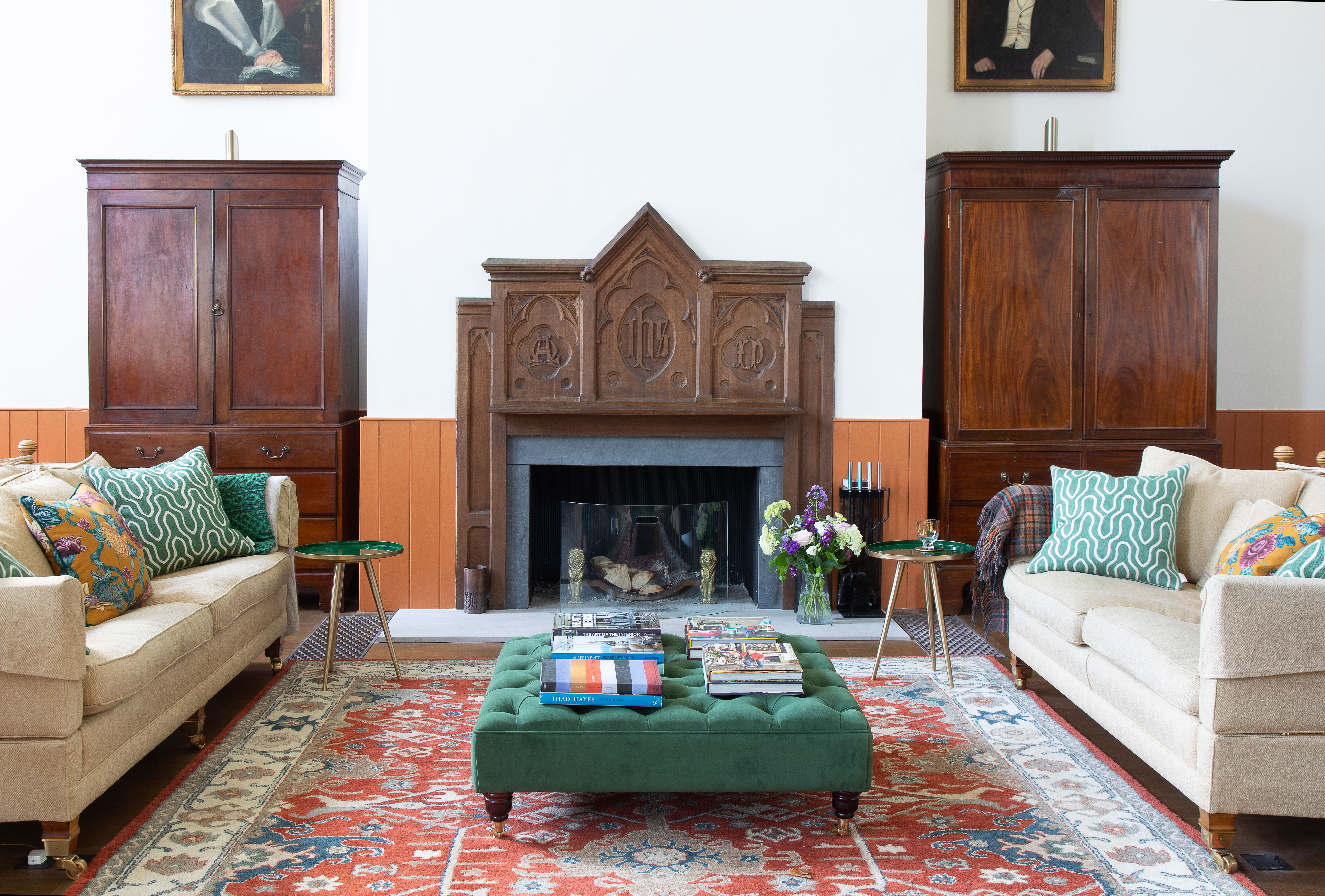
Dividing the property's central space into zones has given each area its own identity, and also helps to create a more intimate, cozy look and feel. Of course, if you're looking for living room ideas, you can't go wrong by grouping your sofas around a fireplace, as Dean has done here. The green footstool is bespoke and Dean bought the antique cupboards on either side of the fireplace from a local auction house. Both the rug and fireplace were online auction buys. The dark wood and Gothic styling of the fire surround make it the perfect choice for a former church.
5. Do formal dining in style
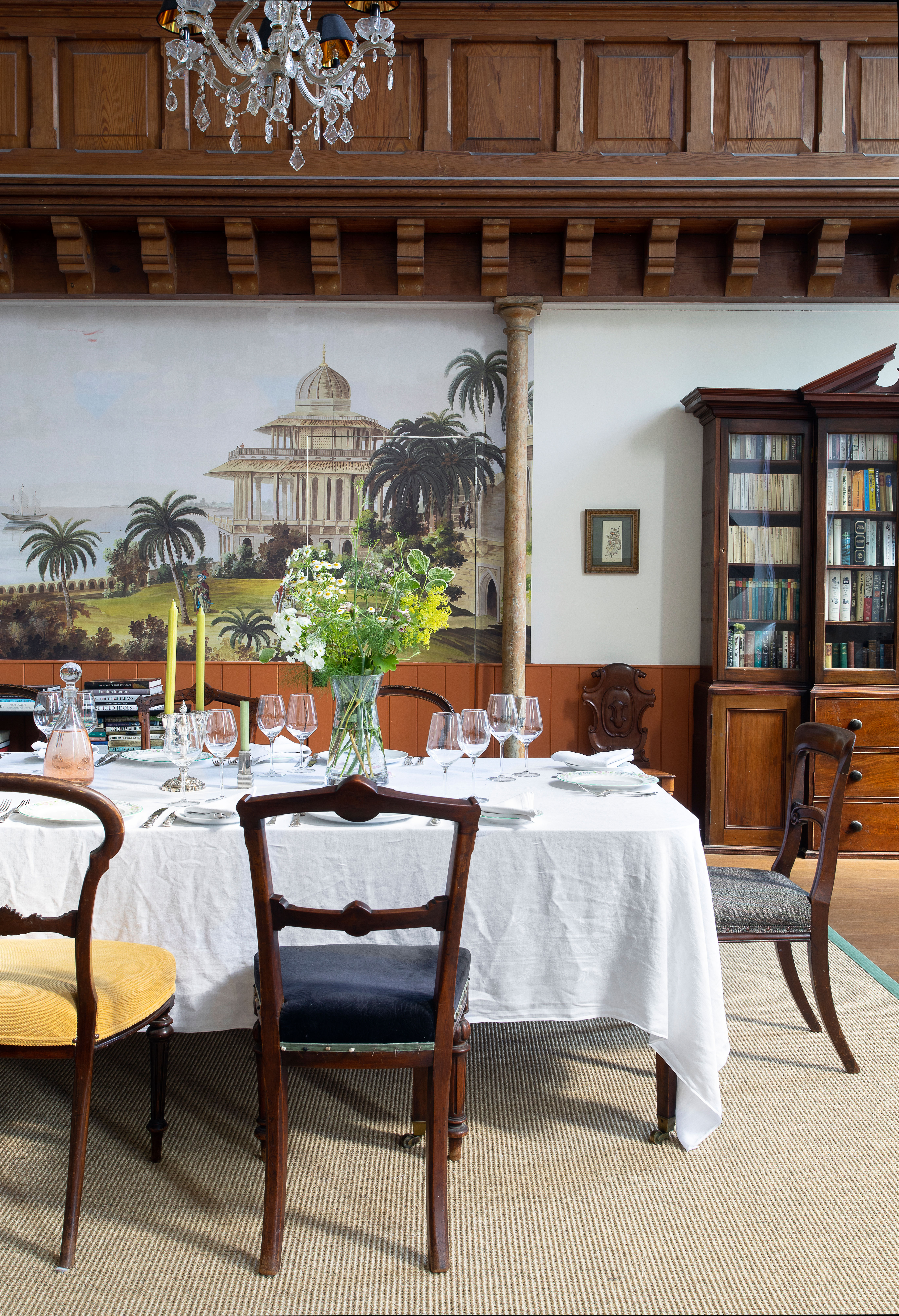
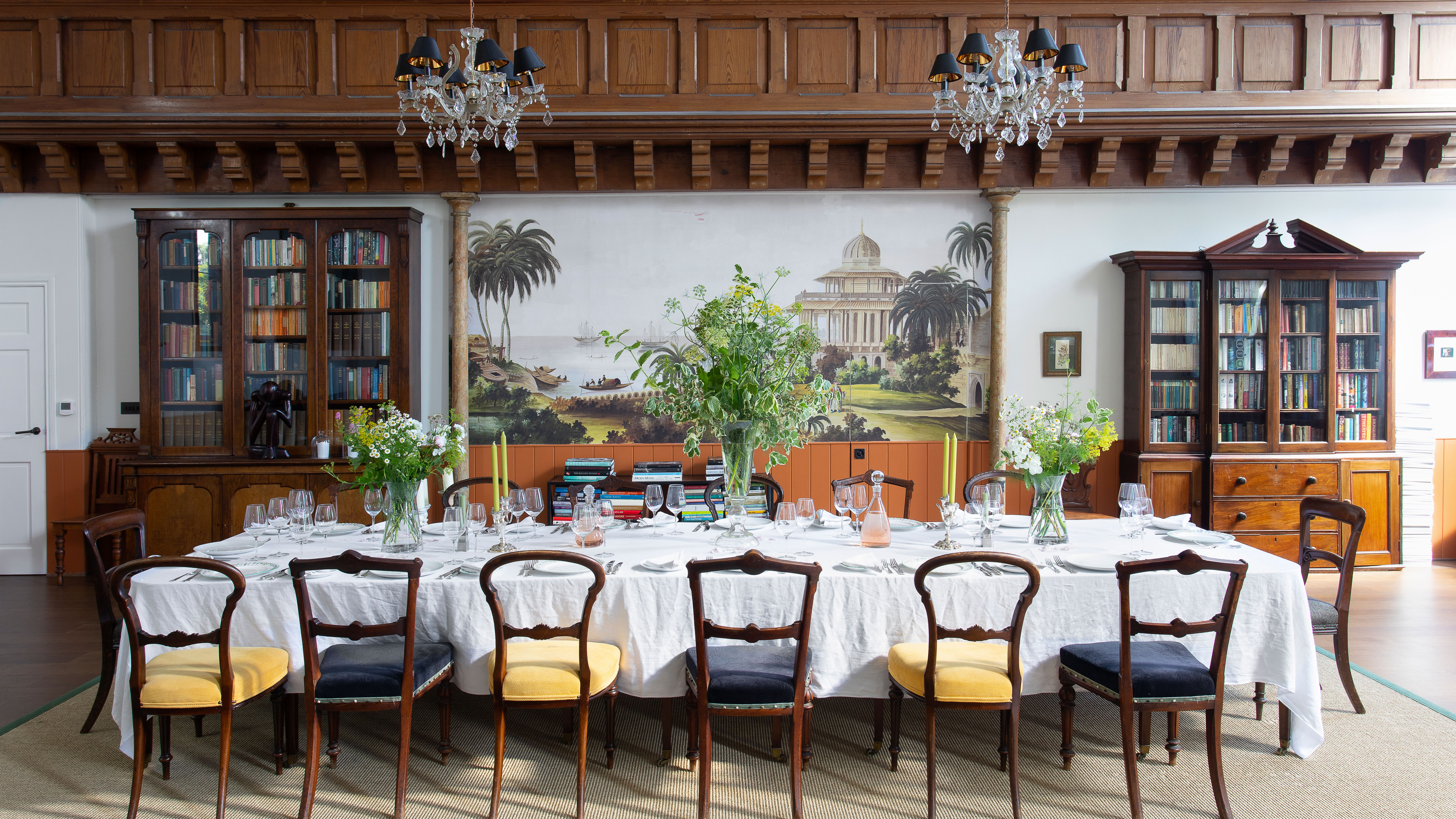
Although there's room for friends around the smaller dining table in the mezzanine kitchen, a more formal space like this is just perfect for entertaining a crowd. If you're thinking of dining room ideas or of reconfiguring a dining area, your starting point should be how many diners will you be entertaining, and how often?
This mahogany dining table seats 14 people with ease and was a bargain buy from a local auctioneers. The large mural across the back of the space is India Couleur by Ananbo, and the orange tone has been picked out in the woodwork. The couple brought some antiques with them from London but like to mix in mid-century pieces and buy furniture specially, or – in the case of the huge antique bookcase – borrow from friends.
6. Get bedroom basics right
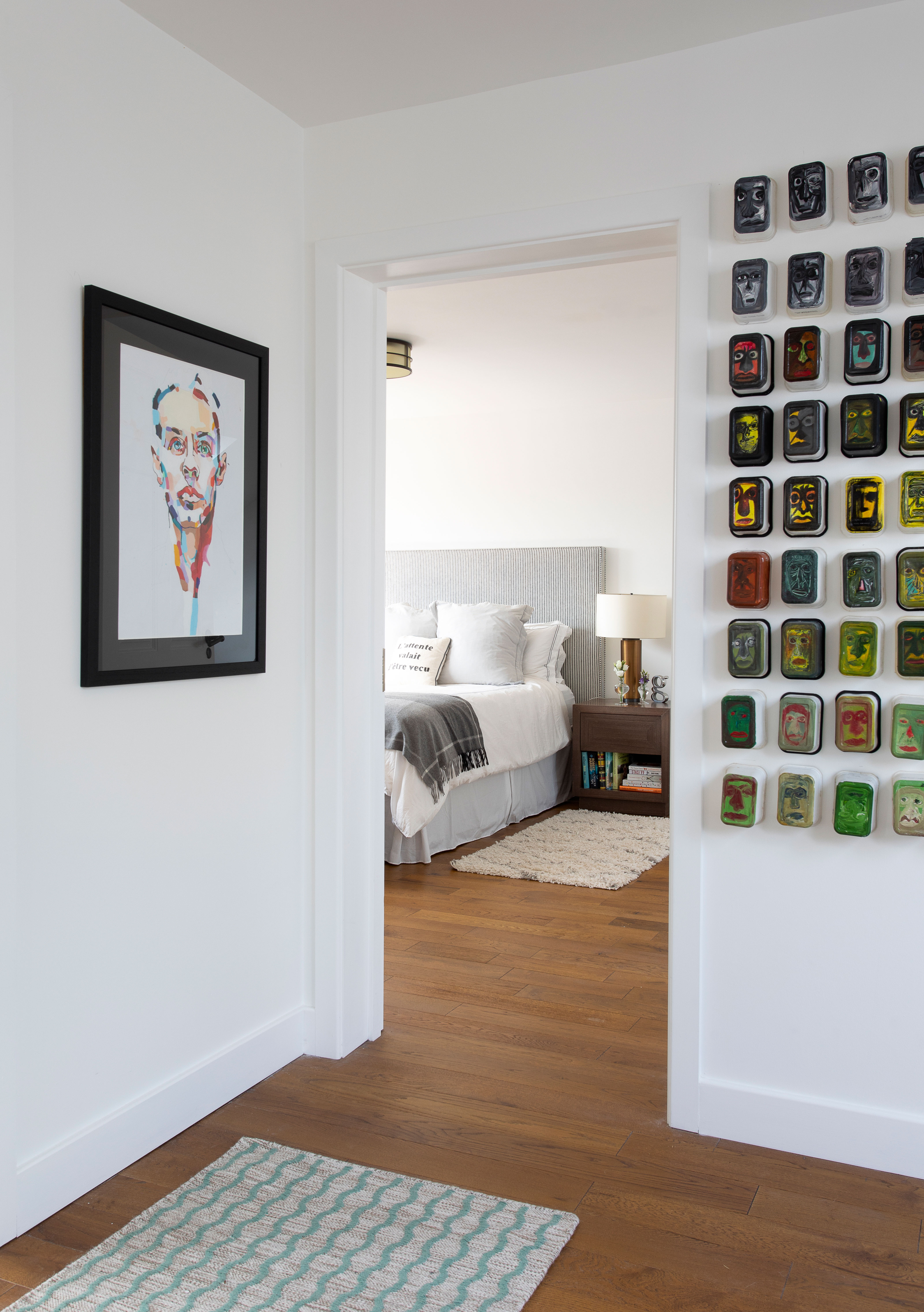
A calm scheme of grays and off-whites ensures the main bedroom is a relaxing retreat – essential for any bedroom ideas. The bed headboard is covered in Pierre Frey’s Reglisse. The table lamp is by Justin Van Breda. In the doorway is a a treasured painting by daughter Georgia, along with modern art made of margarine tubs by Hani Najm.
It's a very restful space now, but Dean found out that his plans to build a whole new floor for the master suite and spare bedroom in the loft initially gave his builder nightmares!
‘Our builder was great, but to strengthen the floor sufficiently, we needed three steels of 12 metres each,' says Dean. 'He admitted to me later that he’d had sleepless nights over that one.’
7. Go wild with pattern and color
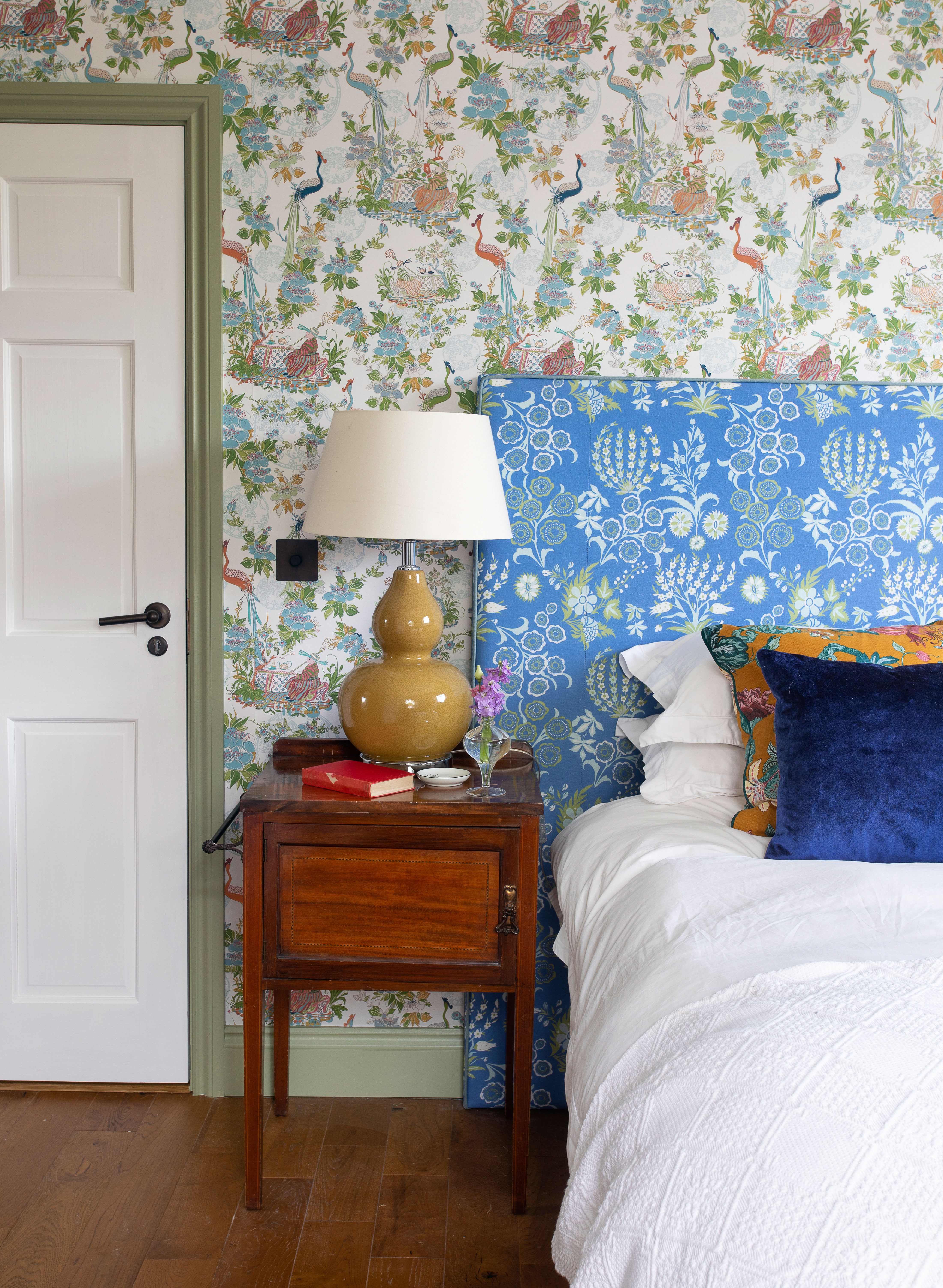
Sometimes when it comes to pattern it's best to go for it in a big way. Daughter Georgia’s room features Charlotte Gaisford’s prints on the walls (The Countess), and headboard fabric (Tsarina). By tying the busy scheme together with a calm, light green shade for the woodwork it becomes a winning combination
8. Install a luxury bathroom
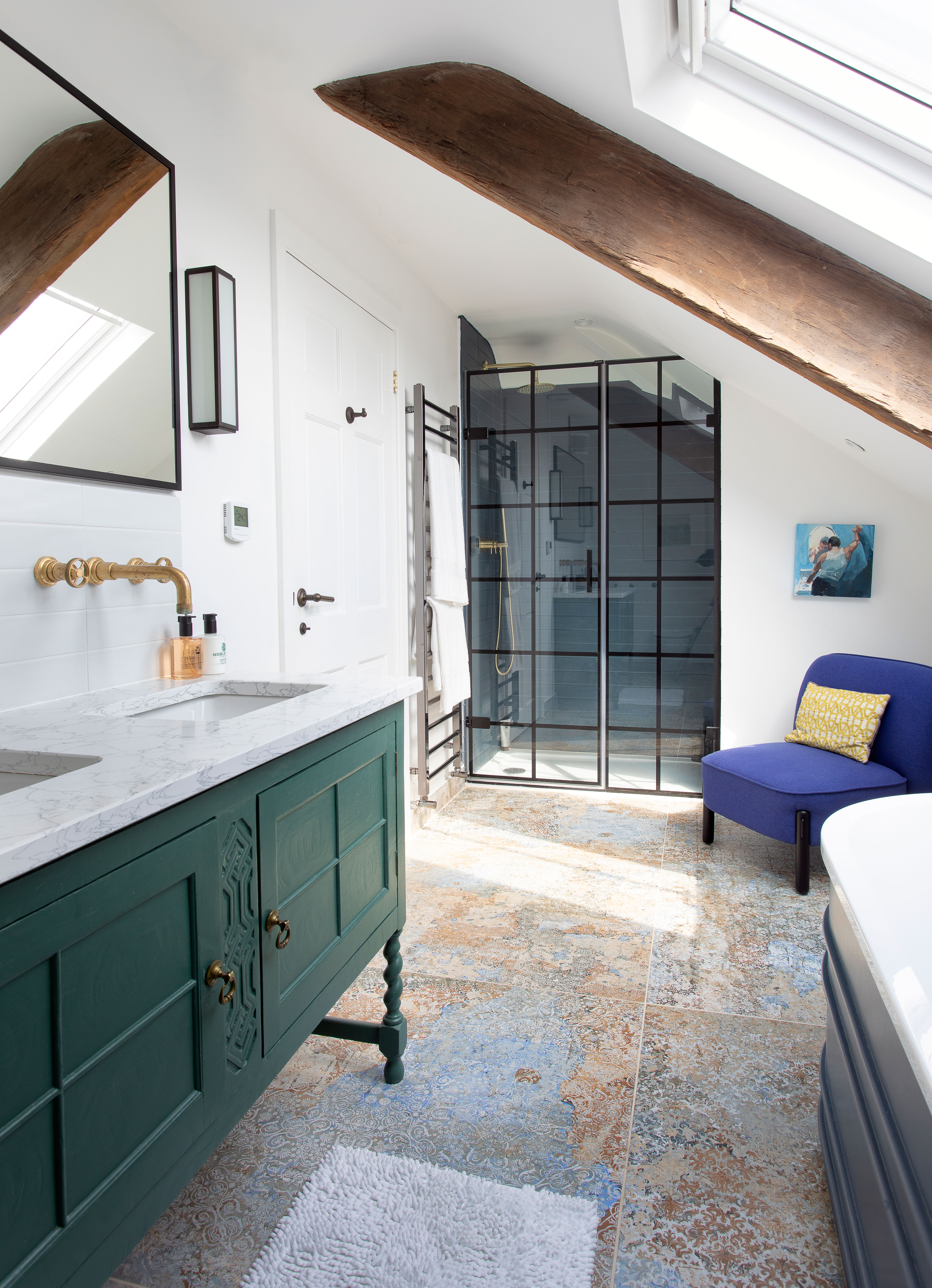
Among the great bathroom ideas worth copying from Dean's new loft suite is a 1930s sideboard upcycled to hold double sinks. A metal grid shower screen divides the large walk-in shower.
9. Go big in a small bathroom
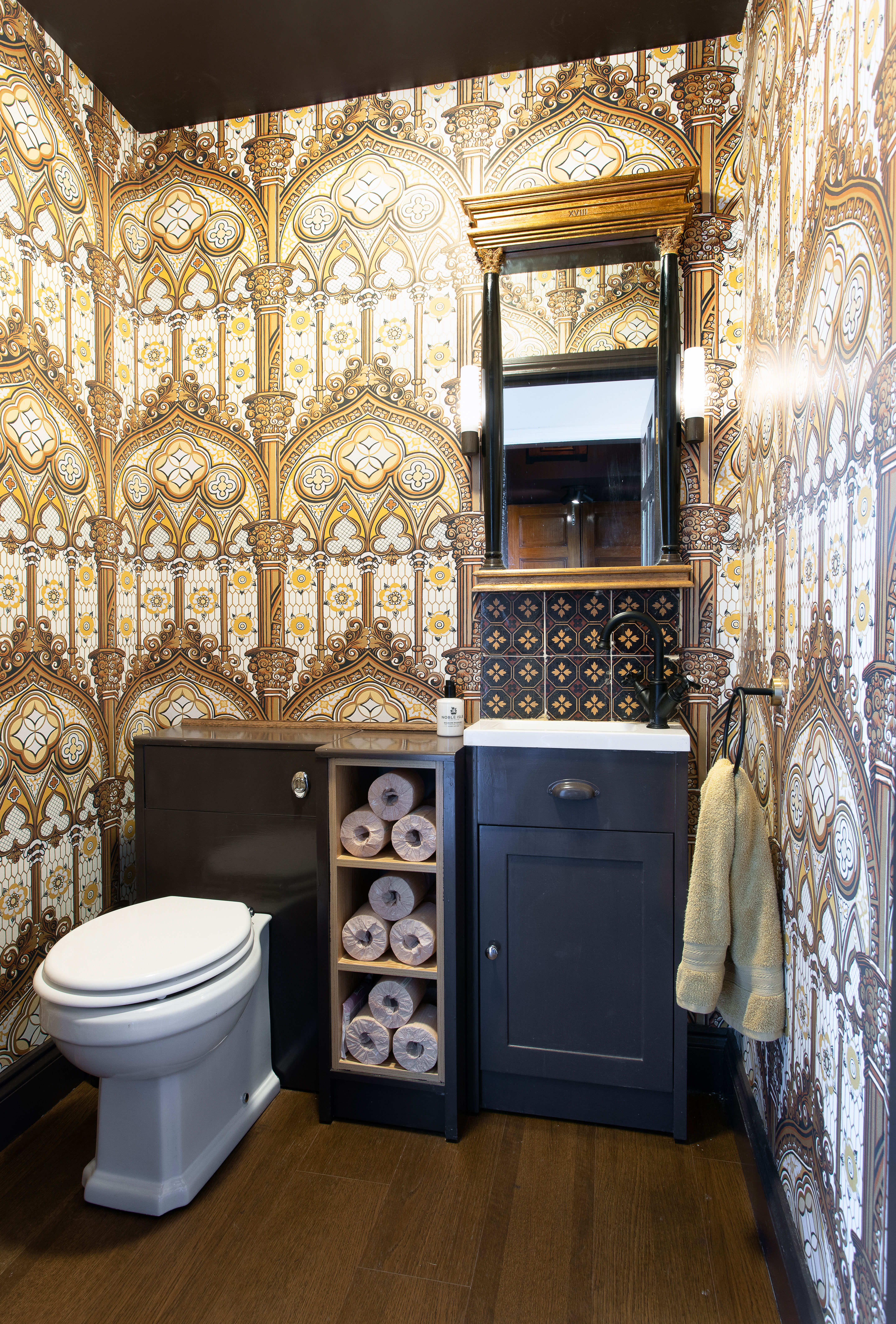
The spectacular wallpaper in the downstairs bathroom is Pierre Frey’s Alleluia, which is based on a Gothic design from 1830 and so ties in with the age of the former church.
It's easy to talk yourself out of choosing a special wallcovering based on its cost, but a little luxury goes a long way and if you find exactly the right bathroom wallpaper, as Dean did here, then it will make a big impact even in the smallest room in the house.
Feature / Stephanie Smith
Sign up to the Homes & Gardens newsletter
Design expertise in your inbox – from inspiring decorating ideas and beautiful celebrity homes to practical gardening advice and shopping round-ups.
Karen sources beautiful homes to feature on the Homes & Gardens website. She loves visiting historic houses in particular and working with photographers to capture all shapes and sizes of properties. Karen began her career as a sub-editor at Hi-Fi News and Record Review magazine. Her move to women’s magazines came soon after, in the shape of Living magazine, which covered cookery, fashion, beauty, homes and gardening. From Living Karen moved to Ideal Home magazine, where as deputy chief sub, then chief sub, she started to really take an interest in properties, architecture, interior design and gardening.
-
 7 expert-approved painting hacks to minimize clean up – to make an already exhausting task easier
Avoid a backbreaking clean-up after your next painting project with advice from the professionals
By Chiana Dickson
-
 Gwyneth Paltrow's quiet luxury kitchen is so beautiful, we almost overlooked her ultra-smart cabinets – they make the use of 'every inch' of storage space
The Goop founder makes use of dead space in her kitchen with customized cabinetry that reaches to the ceiling, providing ample storage
By Hannah Ziegler
-
 This fully renovated London townhouse expertly blends antiques and modern design classics
A curated collection of antiques, artwork and more recent design classics sit side by side in this renovated London home
By Karen Darlow
-
 This old farmhouse was renovated from top to bottom so its original features shine through
Snapping up this 18th-century farmhouse before it went to auction, its owners have carefully given it a complete overhaul
By Rachel Crow
-
 This ancient thatched cottage has had new life breathed into it
Restoring this beautiful old thatched cottage using traditional methods and materials breathed new life into its ancient frame
By Karen Darlow
-
 Reinstating period features to a Victorian home returned it to its former glory
With reinstated original features and decorated in an eclectic style, this Victorian townhouse is a perfect marriage of old and new
By Sara Emslie
-
 A fairy-tale thatched cottage updated with a light and tranquil interior
This fairy-tale thatched cottage in the woods has been sensitively updated by its owners with a calm and neutral decorating scheme
By Heather Dixon
-
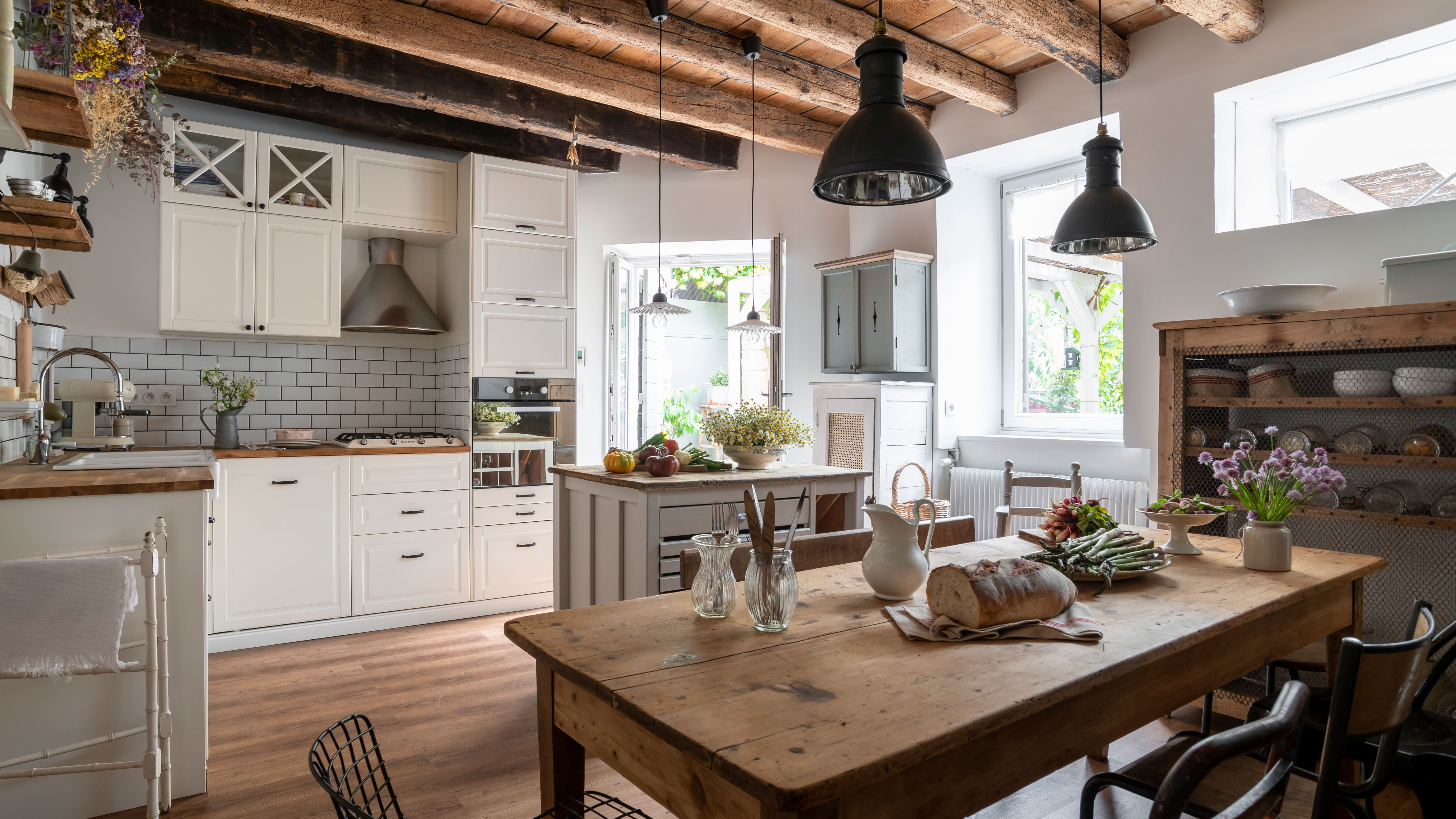 This 400-year-old rural French house is oozing authentic rustic charm
This 17th stone-built home in Burgundy, France, has been brought back to life with beautiful original features sensitively restored
By Rachel Crow
-
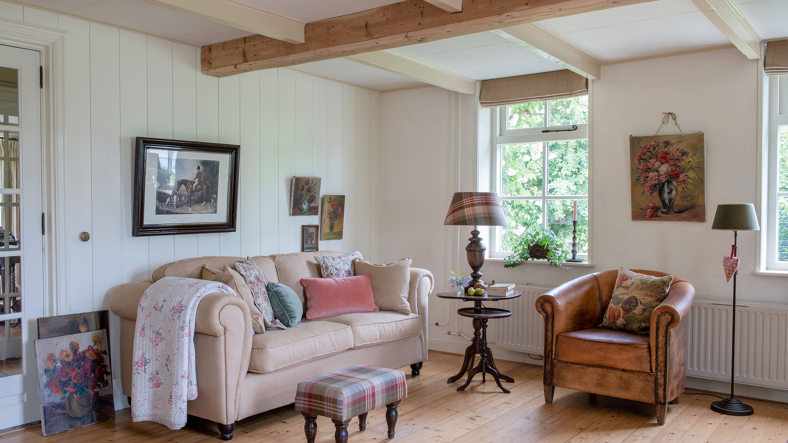 This charming country cottage is full of pretty ideas for stylish vintage looks
Mixing floral fabrics with toile print wallpapers and antique treasures gives this cottage an eclectic but very pretty charm
By Karen Darlow
-
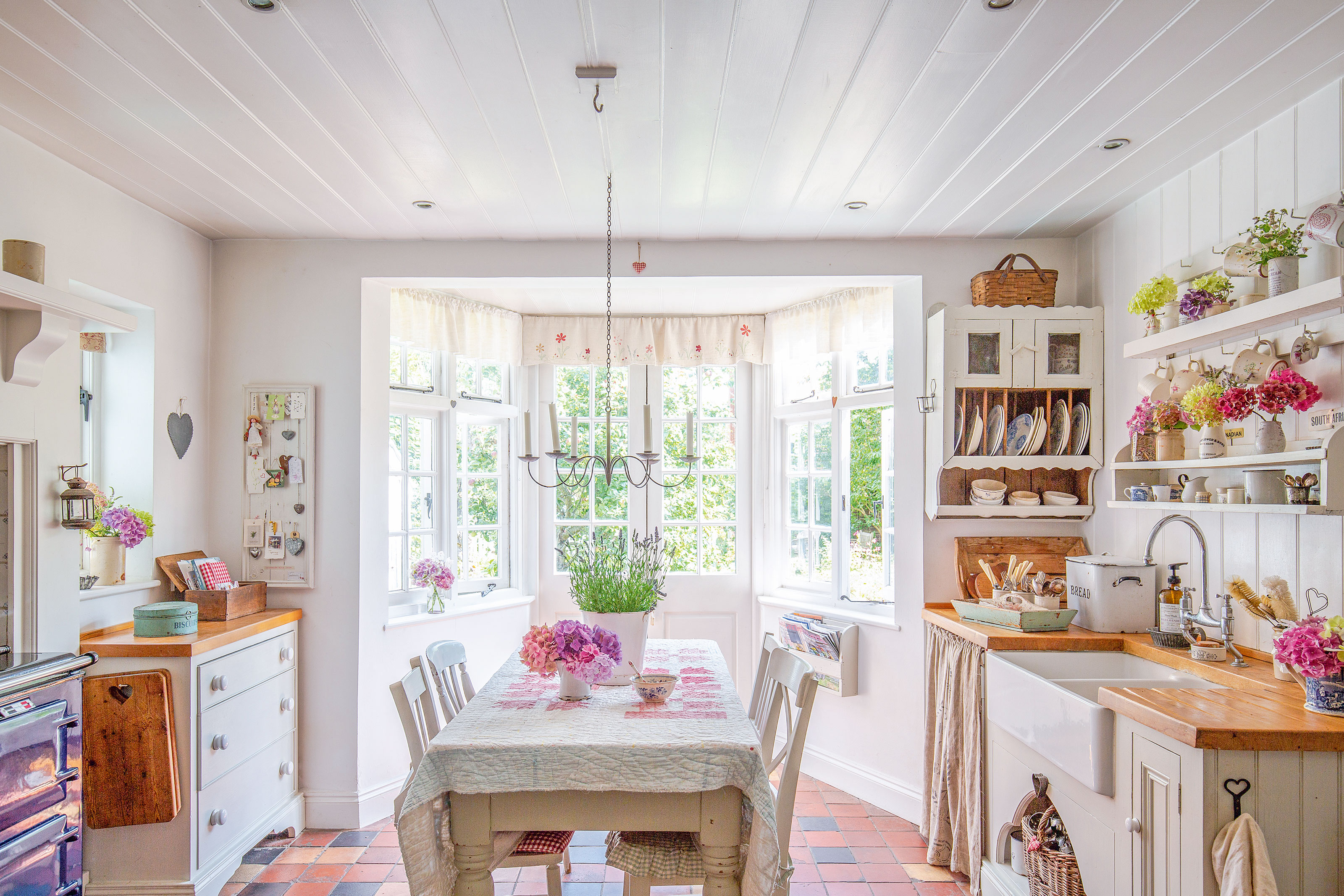 Full of handmade quilts and vintage finds, this home offers the warmest welcome
This pretty home layers up checks, chintz and patchwork quilts to create a crafter's paradise with a touch of nostalgia
By Karen Darlow