This breath-taking beach house is full of exuberant color, pattern and fun
Interior designer Cortney Bishop has conjured up a magical decor that combines vibrant and vintage in this Kiawah Island newbuild
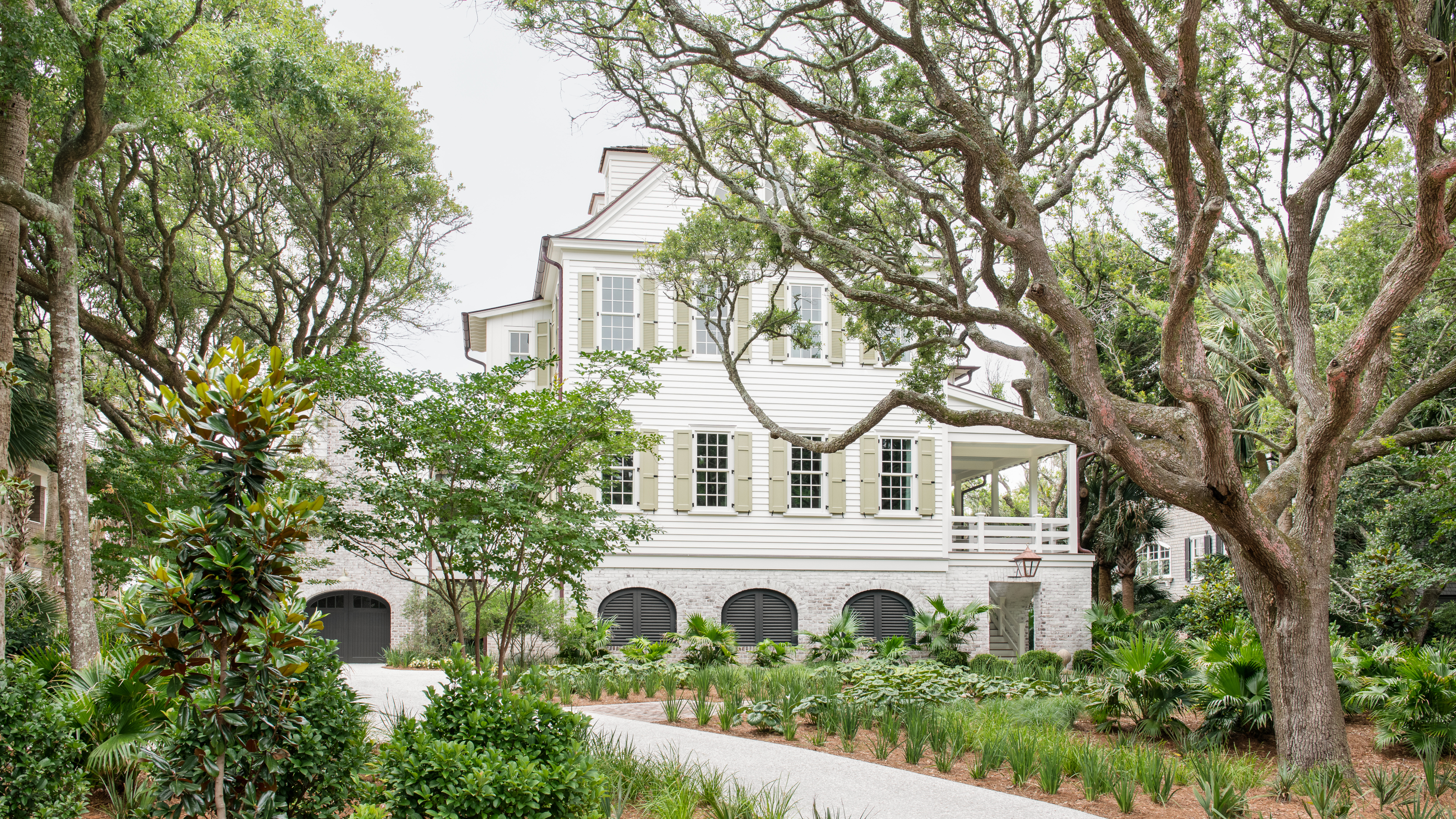

It's hard to believe that this idyllic period-style house with its wraparound porch on Kiawah Island, South Carolina, was only built in 2019. Located right beside the beach, it's undoubtedly one of the world's best homes and is the perfect vacation retreat for a young professional couple with four children.
The owners had bought a home on the lot several years previously with the intention of tearing it down and rebuilding it. They asked Charleston-based architect Mark Maresca to create a fairytale home, resulting in a design that's reminiscent of the classic beach houses on Pawleys Island with their wrapround porches. When Mark showed them a house that he'd collaborated on with interior designer Cortney Bishop of Cortney Bishop Design, they loved it and immediately commissioned her to do the interior.
'The client said to me, "I want that house but I want a lot more color. We’re really lively. Look at my Instagram account and you’ll get my sense of humor," so he really set the stage,' says Cortney. 'He said, "Do what you do, we trust you, we really love your laid-back aesthetic but we really want you to turn it on its head and just add as much color as possible." '
The project took two years and Cortney was hired before they broke ground so was particularly involved with the color palette and the finishes. She plumped for a playful palette of greens, blues and yellows throughout the house.
'The clients have lots of parties and lots of friends and they bring them to the beach for a parents' vacation so it was really important to them that we stayed thoughtful in the sense that they're going to have to do some upkeep with this young family,' says Cortney.
So Cortney focused on sourcing vintage furniture and, mindful of the clients' sense of humor, she found fun and quirky vintage pieces. 'I have wonderful vintage dealers all over the country and all over the world that I was excited to use,' says Cortney. 'It was a really fun project.'
Hall
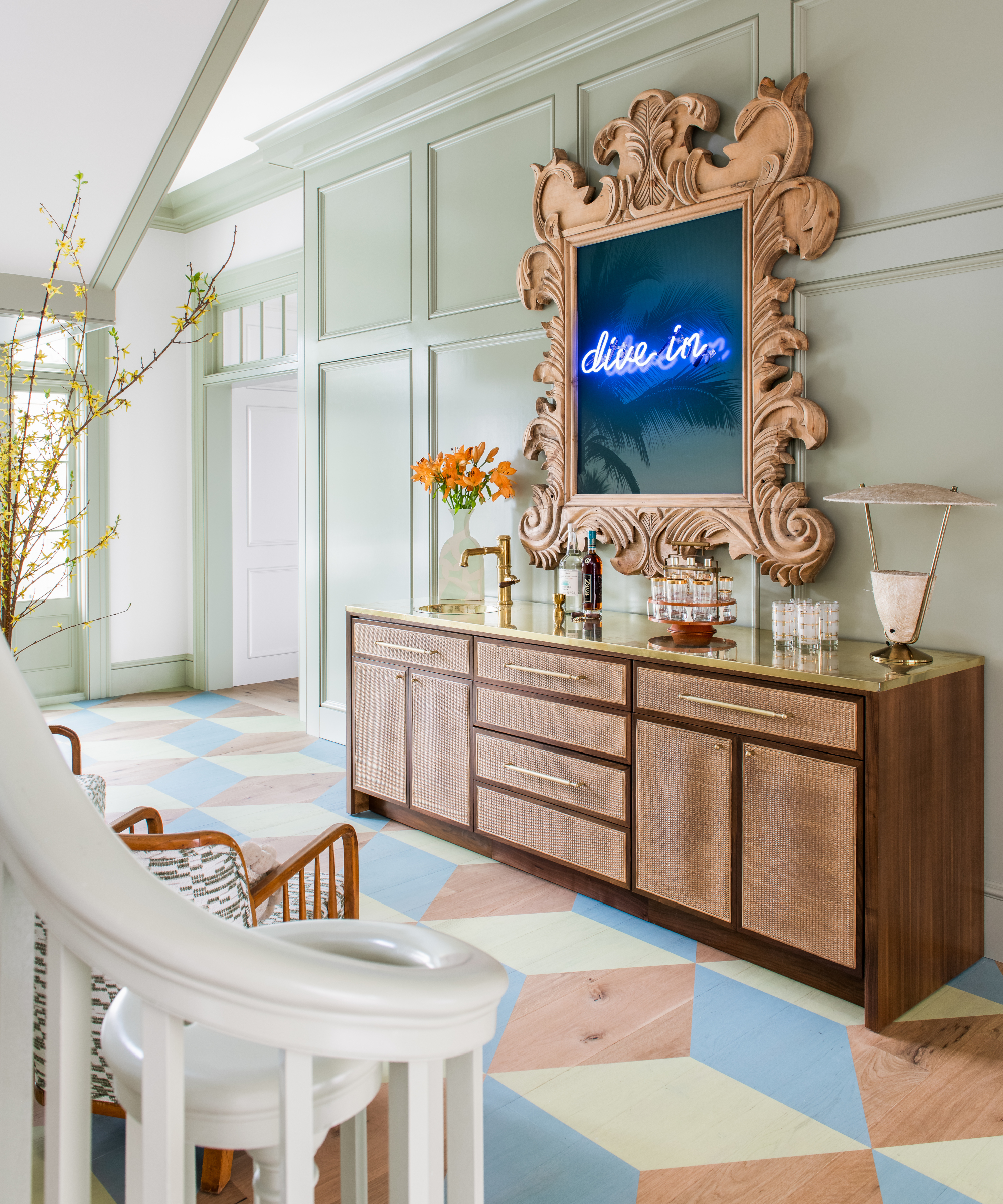
'The home dictated this grandness and we wanted to juxtapose it with informality,' says Cortney. Hallway ideas include a custom bar. 'We had this huge foyer and we weren’t sure how to furnish it without it feeling formal, so we decided what better way to set the tone than to build a bar?' explains Cortney. 'The owners were on board and Mark was on board but it's a scary thing to do. We wondered whether anybody would use it, whether it would feel out of place, but it ended up being perfect. It's a really great focal point.'
The statement artwork above it reflects the owners' sense of humor too. 'The owners are art collectors and when I found the dive in neon sign early in the project, I knew that it would be something they would appreciate with their love of modern and contemporary art,' says Cortney. She sourced a vintage mirror with a gorgeous frame and replaced the mirror with the dive in sign for a quirky twist.
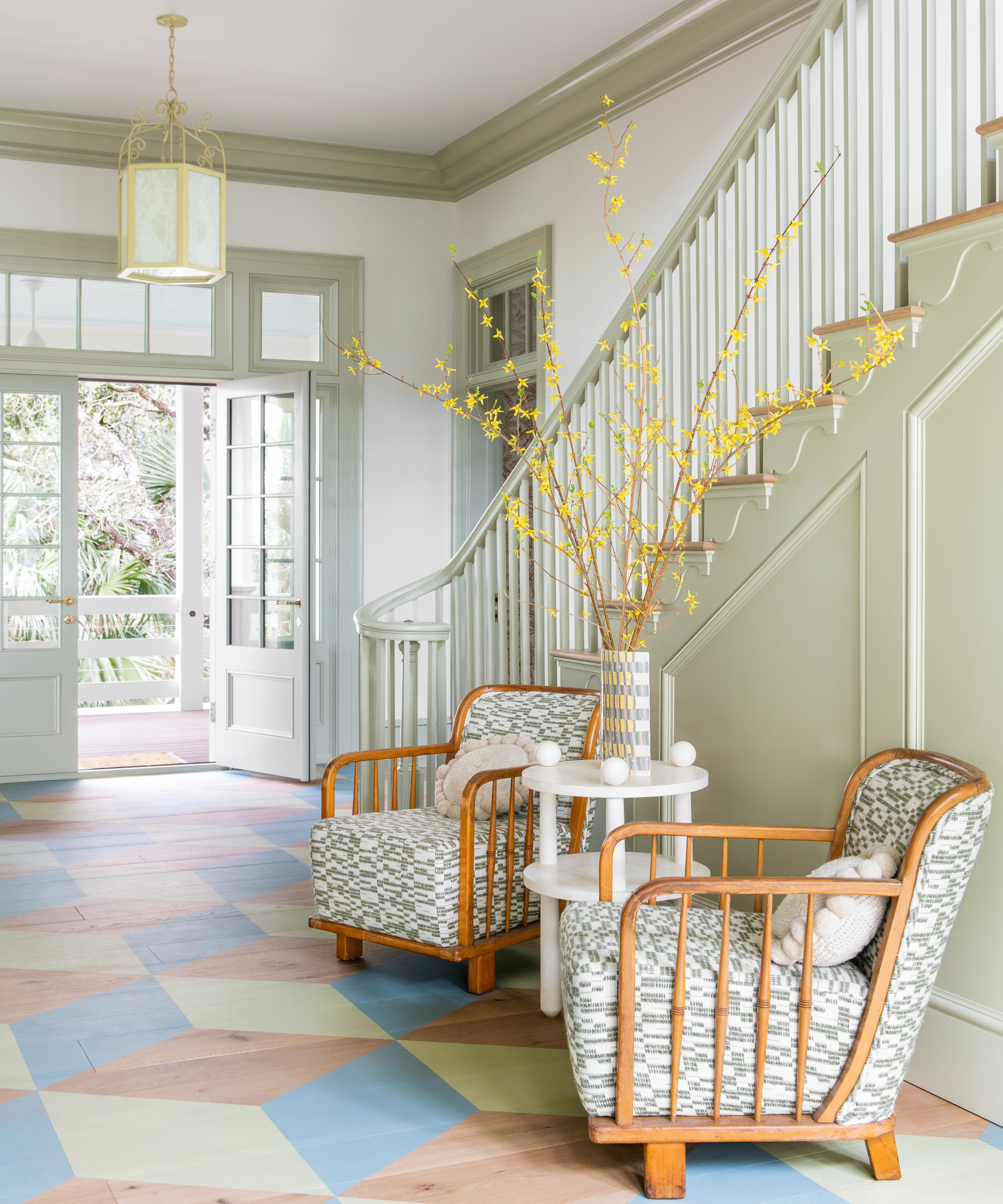
Originally, the intention was to tile the entry but the owners didn't want the house to feel formal in any way so Cortney decided on a wooden floor, painted with a colorful geometric pattern. 'It made a huge difference. We wanted to embrace the relaxed environment. You’ve got quite a grand house but you walk in and don’t feel any sense of formality or concern for coming in with bare feet or with wet clothes.'
The two vintage bamboo armchairs tone beautifully with the scheme and are perfect for sitting and enjoying a drink from the bar opposite.
Living room
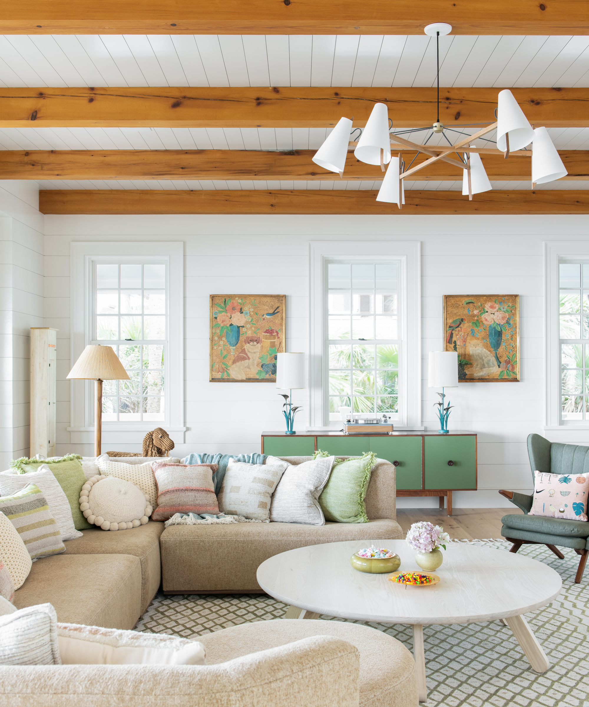
Because the house is quite a linear home, Cortney's living room ideas included introducing organic shapes with a funky sofa from Verellen. 'I love unexpected shapes and I love rounds and curves. I think providing unique shapes to rooms gives more interest and creates an approachable, collected sense of space,' she says.
To house the owner's record player, Cortney sourced a vintage cabinet and painted it a soothing green, creating a focal point in the room.
The two matching paintings were bought from an antique store. 'I showed them to the owners and I don’t think they were quite into them, they looked kind of granny chic to them, but once it all came together, I hung them on the wall and they got it. They’re just so full of color,' says Cortney.
Dining room
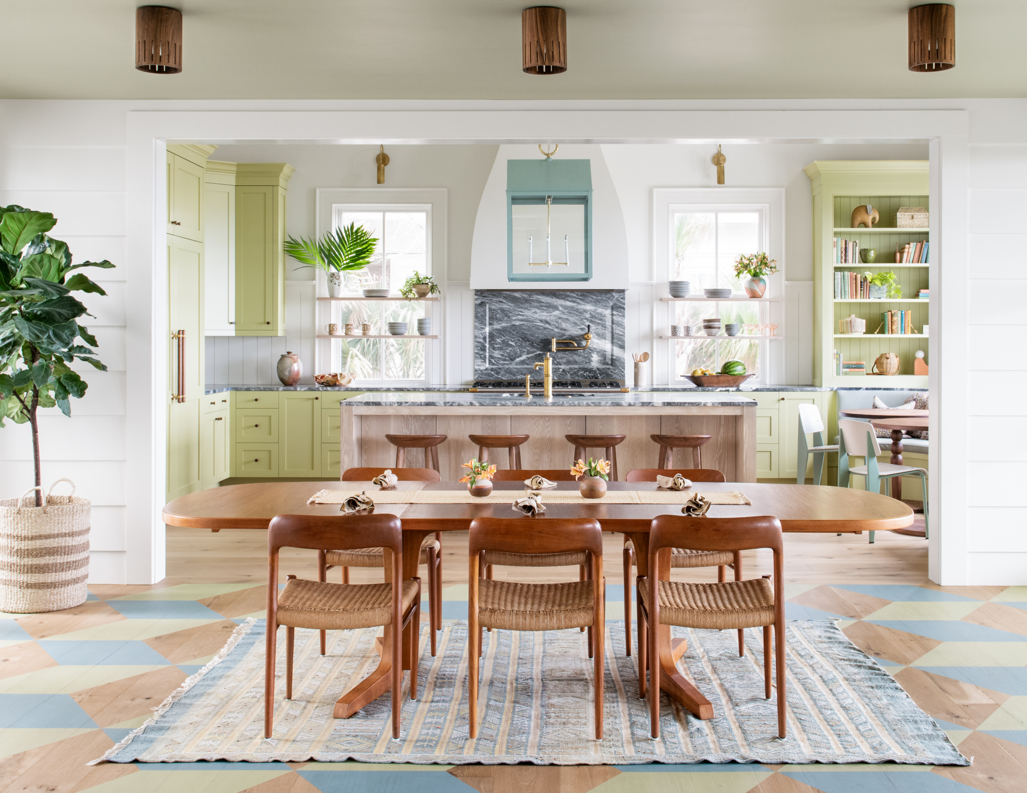
The patterned floor carries through to the dining room from the hallway. In this space there's a change of pace, a more pared back feel as the rooms at either end are full of lots of interesting details.
Cortney chose a mid century table and chairs. 'Mid century seemed to be the perfect vibe for the quirkiness and also for affordability of some of the pieces that we knew the kids might wear and tear. The modern juxtaposition with mid century made sense with all the artwork. The dining table was a really good find. The chairs have just that kind of texture that we really loved for the beach house.'
Dining room ideas include a run of ceiling mount fixtures. 'They’ve got a boho teaky kind of vibe to them,' says Cortney. 'They're really great in scale, we decided to move away from chandeliers and do a ceiling mount so that we could focus in on the lantern above the island in the kitchen.'
Kitchen
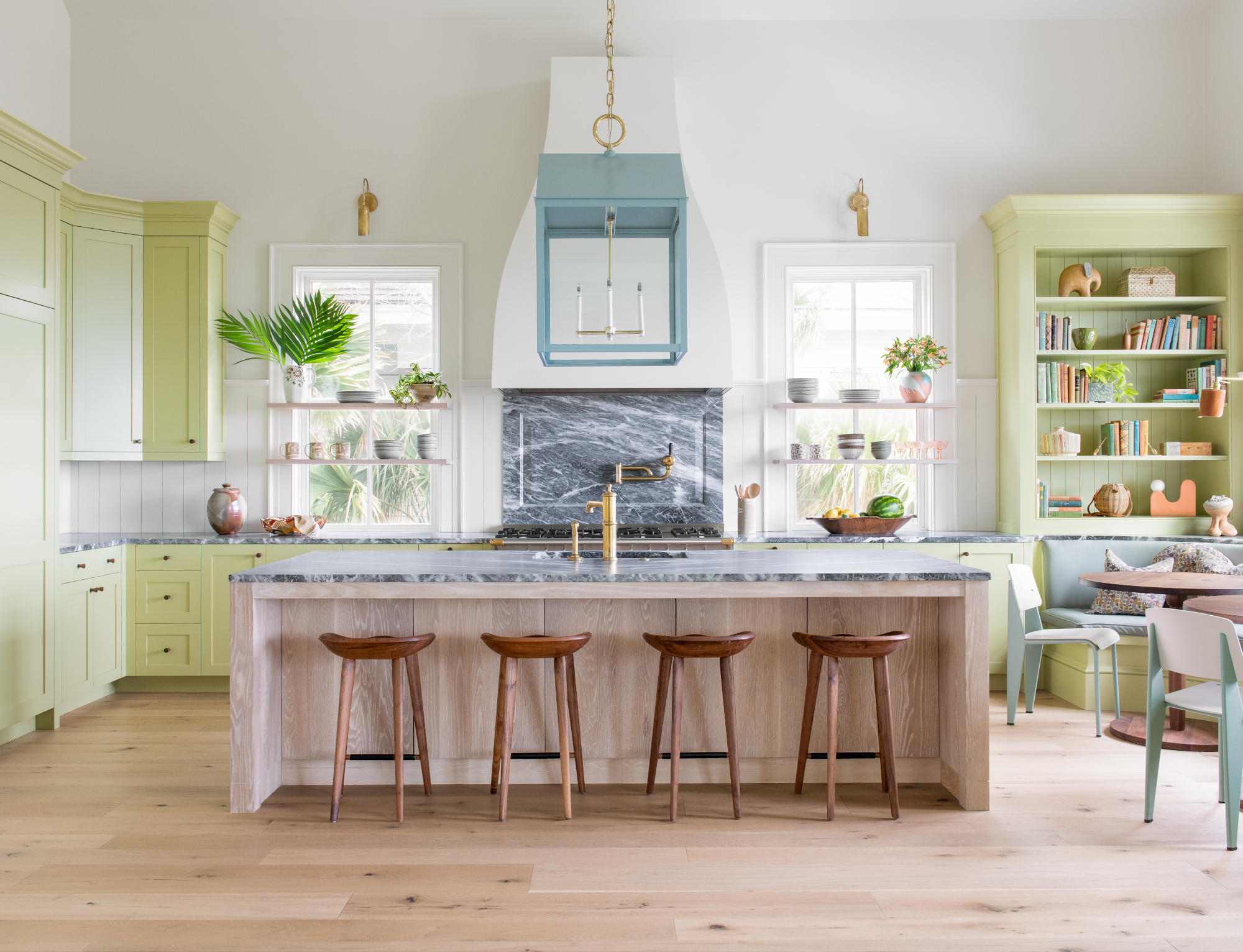
Cortney's kitchen ideas include a modern take on classic kitchen cabinets by painting them a vibrant color, Churlish Green by Farrow & Ball. 'I was so bored with grays and whites,' says Cortney. 'We really wanted to go for it, this was our breakout moment and this was the perfect home to do it in. The color just brings in so much life. We knew that the kitchen would be in the distance when you walked into the home and entered the family room, it needed to draw you back there because it’s a football field away and we wanted a bright color to do that.'
Because the ceiling is so high, a statement light was needed to help fill the space. Mark designed an oversized lantern above the island and Cortney decided to paint it a soft duck egg blue.
Creating an informal dining area was a challenge. In the end, a double banquette was built so that the children and adults could eat at different times if necessary and have their own tables. 'We felt it was better than having this ginormous table for everybody to scoot in and out of,' says Cortney.
Den
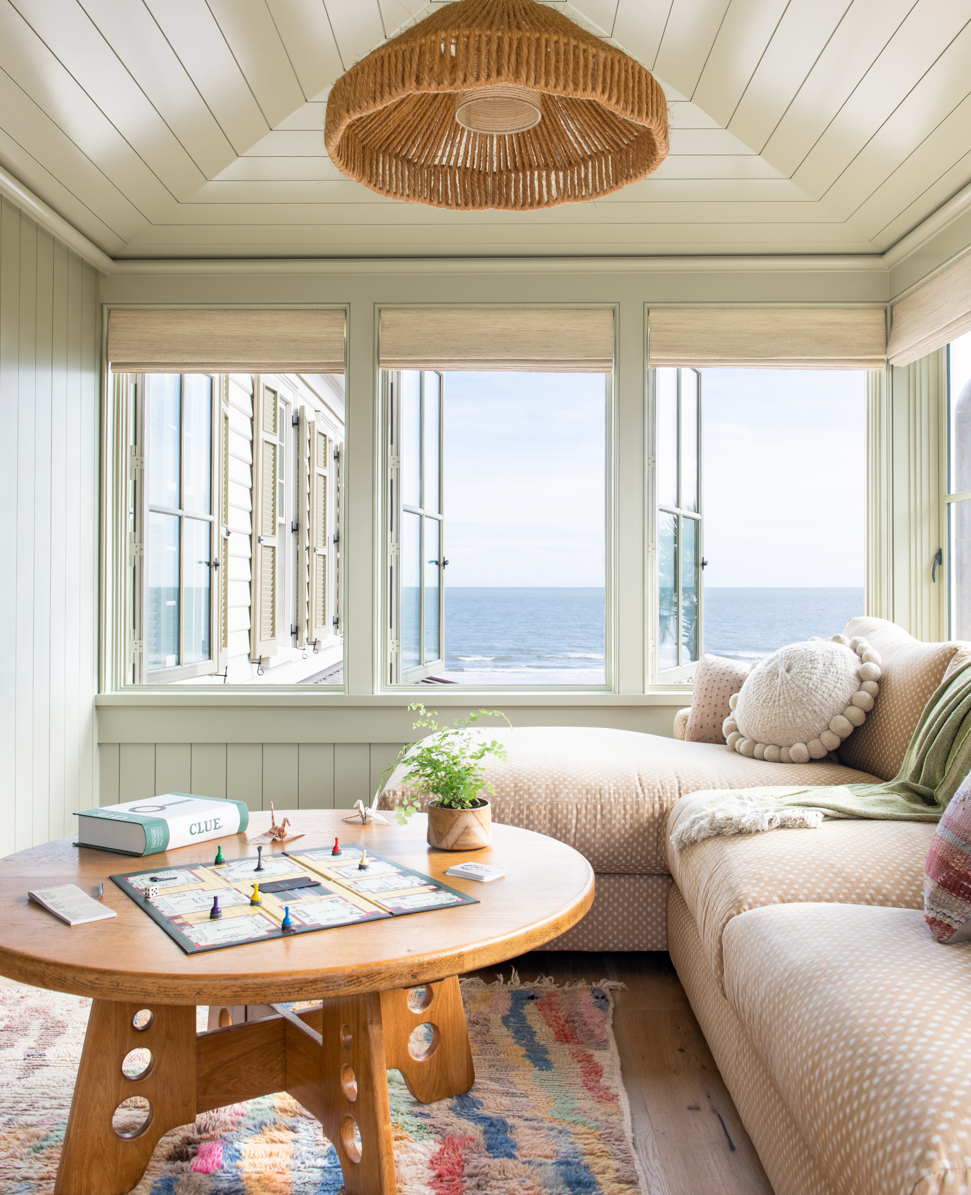
Mark designed this idyllic space with lots of windows – it's surrounded by trees on two sides with an ocean view on the third. As it's above the entry porch, it almost feels as if it's floating in the trees.
Much of the millwork in the house is painted in Ball Green by Farrow & Ball, one of Cortney's favorite colors. 'Mark incorporated so many beautiful architectural details in this home that just sent me singing! In order to really appreciate his detail, we had to accent all the wood and so we used the same color to keep some consistency throughout the house,' says Cortney.
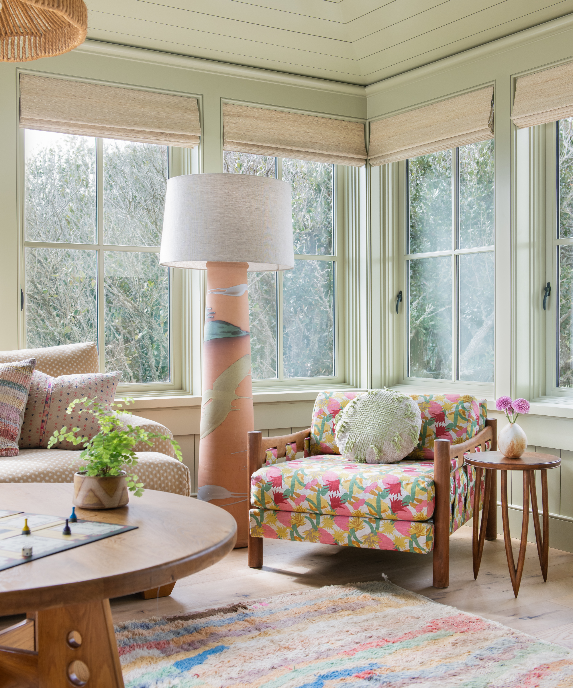
Cortney reupholstered a vintage armchair with a colorful, boldly patterned fabric to create a joyful corner.
Main bedroom
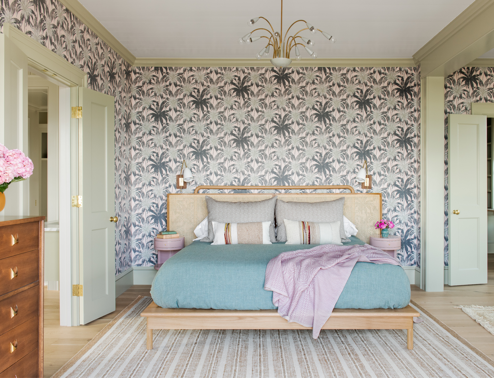
A large scale wallpaper makes an eyecatching backdrop in the main bedroom. 'The wallpaper was our last decision – the wallpapers in the other bedrooms were coming along beautifully and they were all making so much sense but in this room we were challenged by what would work and would carry this energy. The big pattern just felt right. It was the biggest pattern in the whole house. I’m usually drawn to smaller repetitive patterns but we decided to go for it,' says Cortney.
Main bathroom
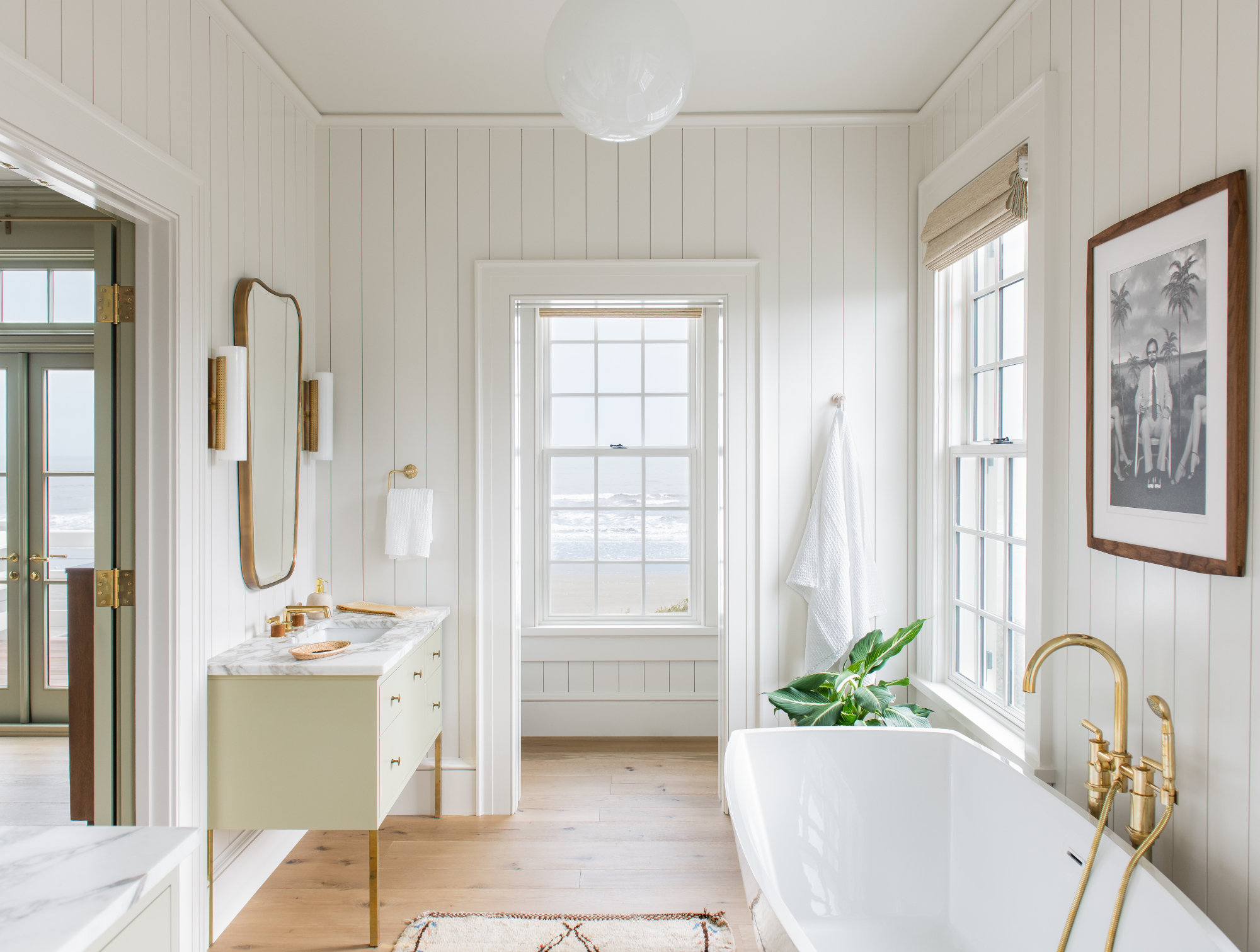
Having used horizontal wood on the walls in the larger spaces such as the living room and kitchen, and wallpaper in the bedrooms, Cortney's bathroom ideas included using vertical shiplap. 'We chose to go smaller in scale and change the direction of the wood. I love wood on bathroom walls because it looks cleaner than a sheet rock wall and the wood finish gives off such a beautiful light. The wood just gives it a little bit of that cottagey throwback,' she says.
Bedroom
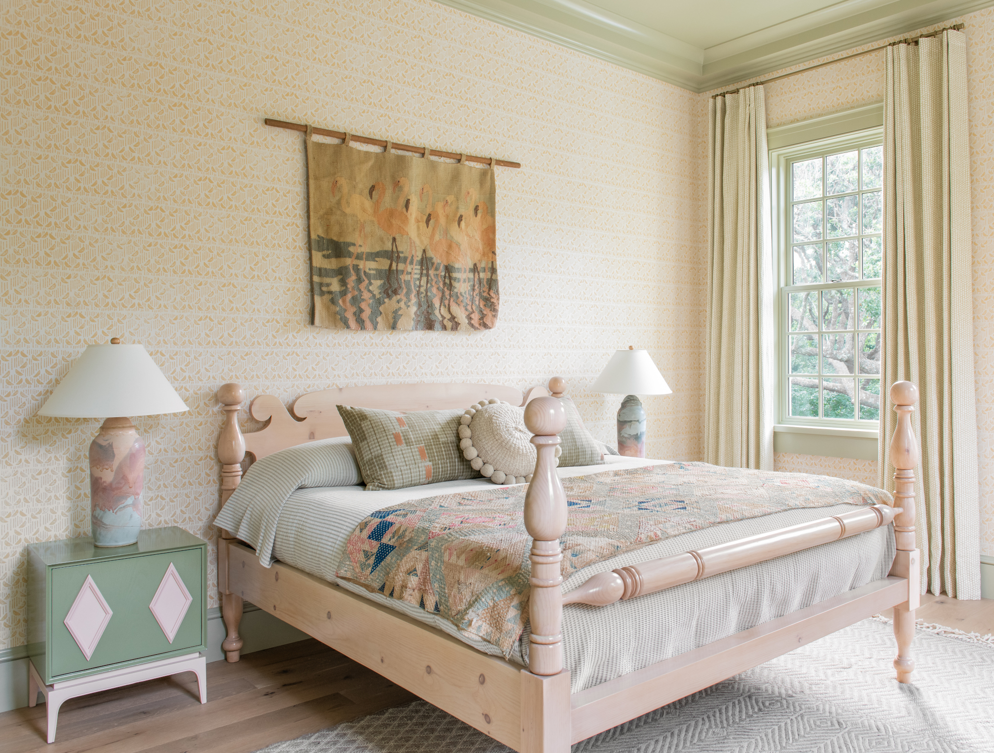
The guest bedroom continues the yellow, green and blue palette. Cortney painted the vintage bedside cabinet to inject more color. The yellow patterned wallpaper was chosen to create a cozy feel. Cortney had bought the quilt years before and was just waiting for the perfect home for it.
Boy's bedroom
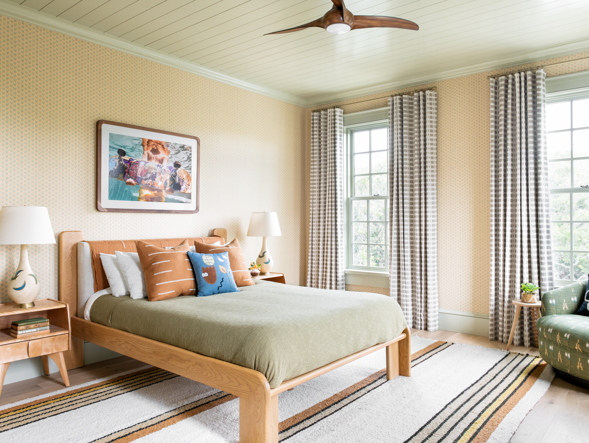
This is the eldest son's room so Cortney wanted to create a little bit more of a masculine perspective. 'We added a picture of a kid skateboarding in large scale to develop a room that had his own personality in it,' she says.
A mid century bedside table sits comfortably alongside a contemporary bed. 'We were able to really push the envelope with modern furnishings mixed in with mid century and it was quite interesting,' she says.
Girls' bedroom
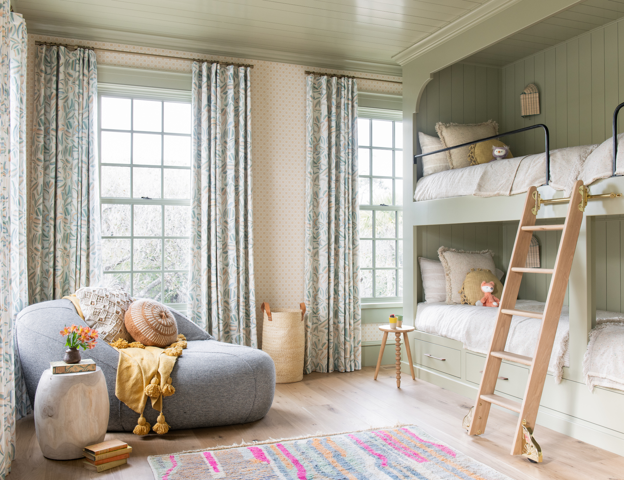
Bedroom ideas include custom bunk beds with four twin beds, which are perfect for sleepovers. The contemporary chaise was chosen for the corner so as not to take up too much of the floor space where the girls like to play. A vibrant rug from Morocco takes center stage on the floor and adds comfort when the girls are playing, as well as injecting extra color.
Wraparound porch
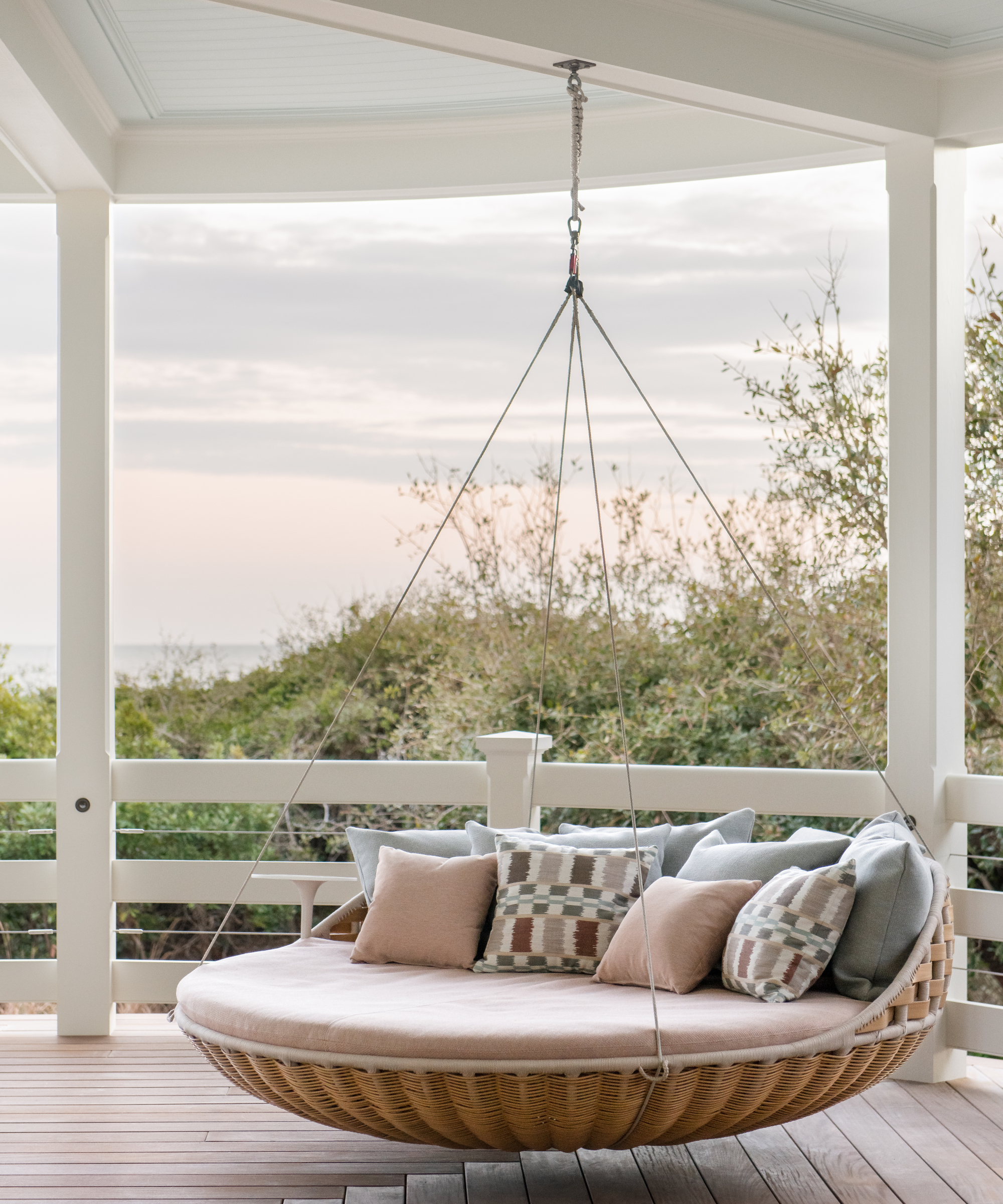
A circular day bed is situated on a corner of the wraparound porch, the perfect place for a siesta in the ocean breeze.
Interior design/ Cortney Bishop Design
Architect/ Mark Maresca
Photographs/ Katie Charlotte
Sign up to the Homes & Gardens newsletter
Design expertise in your inbox – from inspiring decorating ideas and beautiful celebrity homes to practical gardening advice and shopping round-ups.

Interiors have always been Vivienne's passion – from bold and bright to Scandi white. After studying at Leeds University, she worked at the Financial Times, before moving to Radio Times. She did an interior design course and then worked for Homes & Gardens, Country Living and House Beautiful. Vivienne’s always enjoyed reader homes and loves to spot a house she knows is perfect for a magazine (she has even knocked on the doors of houses with curb appeal!), so she became a houses editor, commissioning reader homes, writing features and styling and art directing photo shoots. She worked on Country Homes & Interiors for 15 years, before returning to Homes & Gardens as houses editor four years ago.
-
 April is the ideal time to prune beautyberry shrubs – for a stunning display of vibrant berries this fall
Whether you choose to trim gently or hard prune, cutting back in spring promotes healthy and productive growth
By Drew Swainston
-
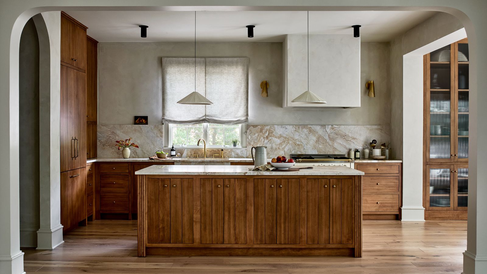 This kitchen has been transformed from cramped and outdated to warm and welcoming – and it's all thanks to a few thoughtful Japandi-style features
Warm wood tones, textural designs, and considered contrast are key to this beautiful transformation
By Molly Malsom