A pretty Craftsman house full of original features has been given a new lease of life
Interior designer Jamie Haller embraced this Californian house's period character by creating an authentic and stylish decor
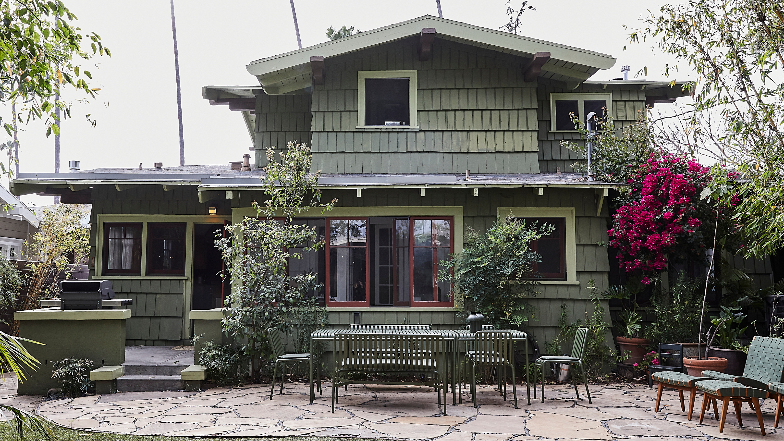

This idyllic 1910 Craftsman house in California, location of many of the world's best homes, was bought unseen by the clients of interior designer Jamie Haller from their computer in New York City during the first few months of Covid and before they moved to the west coast. 'They fell in love with it, but often these old Craftsman homes need a little love and attention. I came on board to make the home feel like them,' says LA-based Jamie.
'The clients had seen my work from a recently completed 1905 Craftsman I had restored and then sold,' says Jamie. 'They reached out and wanted me to help prep the home for their upcoming move. They really connected with my intentional restoration work and my approach to honoring the authentic bones of a historic home.'
Jamie instantly loved the photos of the house. 'It was a very well cared for Craftsman with most of the original details intact and very beautiful millwork,' she says. 'A lot of of the time, remodels rip out the dated and replace with what’s now, which ultimately becomes dated again. My approach has always been to keep the authentic, embrace its quirky character, and discover ways to make it work with the modern needs of life and find that perfect cohesion.'
The distance between Jamie and the clients wasn't a problem. 'We connected very quickly about how we would want to update their home before they relocated their family. It was an interesting project because I didn’t meet the clients until they moved in, I was handed the keys and got to work after escrow closed and had it ready in a few months' time for their end of summer move in. We worked through FaceTime and email and they had a local friend who helped manage some of the deliveries and work schedules surrounding the project.
'The project took about three months, which is very quick, especially considering it was pretty locked down at the time. It was a very decorative remodel. A lot of transformation occurred with paint, wallpaper and lighting.
'We had single crews working at a time to restore the flooring, the painters had to remove textured silk fabrics that had been stapled to the room's wall as wallpaper, restore damaged plaster and then paint the entire home. There was some rewiring. We removed recessed lights and opted for authentic and period-appropriate pendant lights instead. We did some wallpapering and added drapery, which happened at the end and after they moved in.
'The client was a dream because she loved everything I loved, even in the moments when I thought a wallpaper I was going to show her might be too much, she was instantly onboard and loved it as much as me. I was always delighted she picked the best of what I presented her. So in this respect I was really able to bring my most original vision to life in this perfect backdrop of a historic home.'
Kitchen
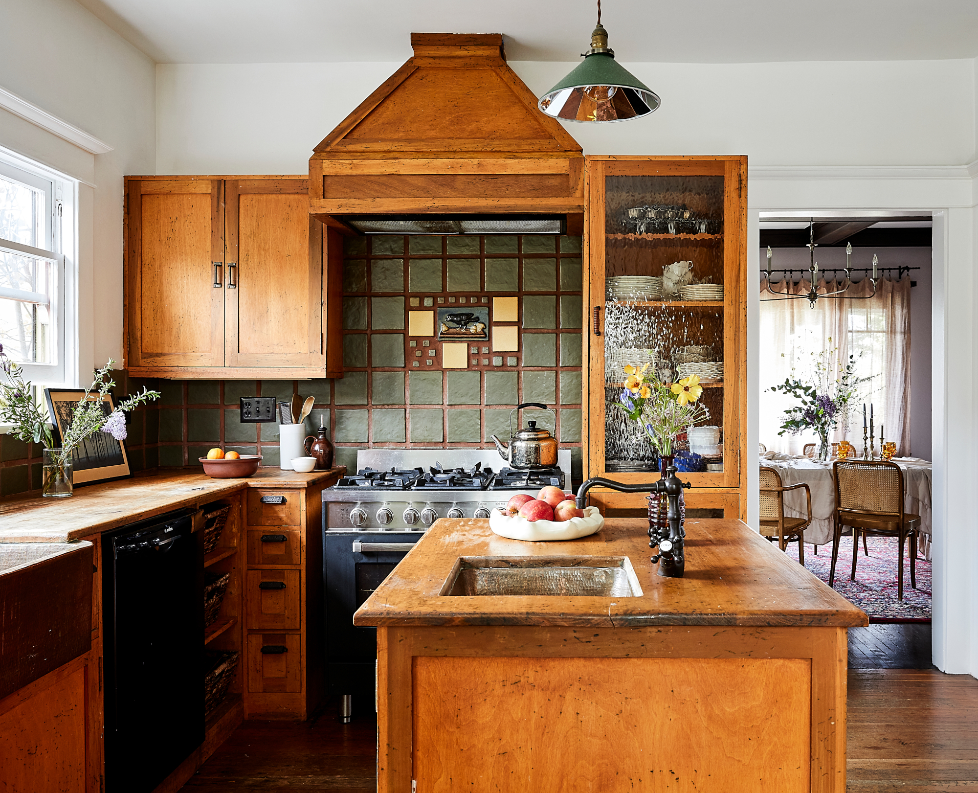
The kitchen had beautiful original wood cabinets with intact wavy glass pantry doors. Rustic wood countertops and a large bronze sink were already in the space. 'The kitchen was perfect as is.' says Jamie. 'The original cabinetry makes it one of the most beautiful kitchens I have seen – there is no improving it.' Some minor restoration was done to the cabinets and the windows needed specialized attention so they could be functional again. Among Jamie's kitchen ideas was to brighten the room with new paint and remove all of the 1980s tech, including speakers, that had been installed. 'We simplified. We brought it back to basics and let the beautiful bones shine. Sometimes restraint is design.'
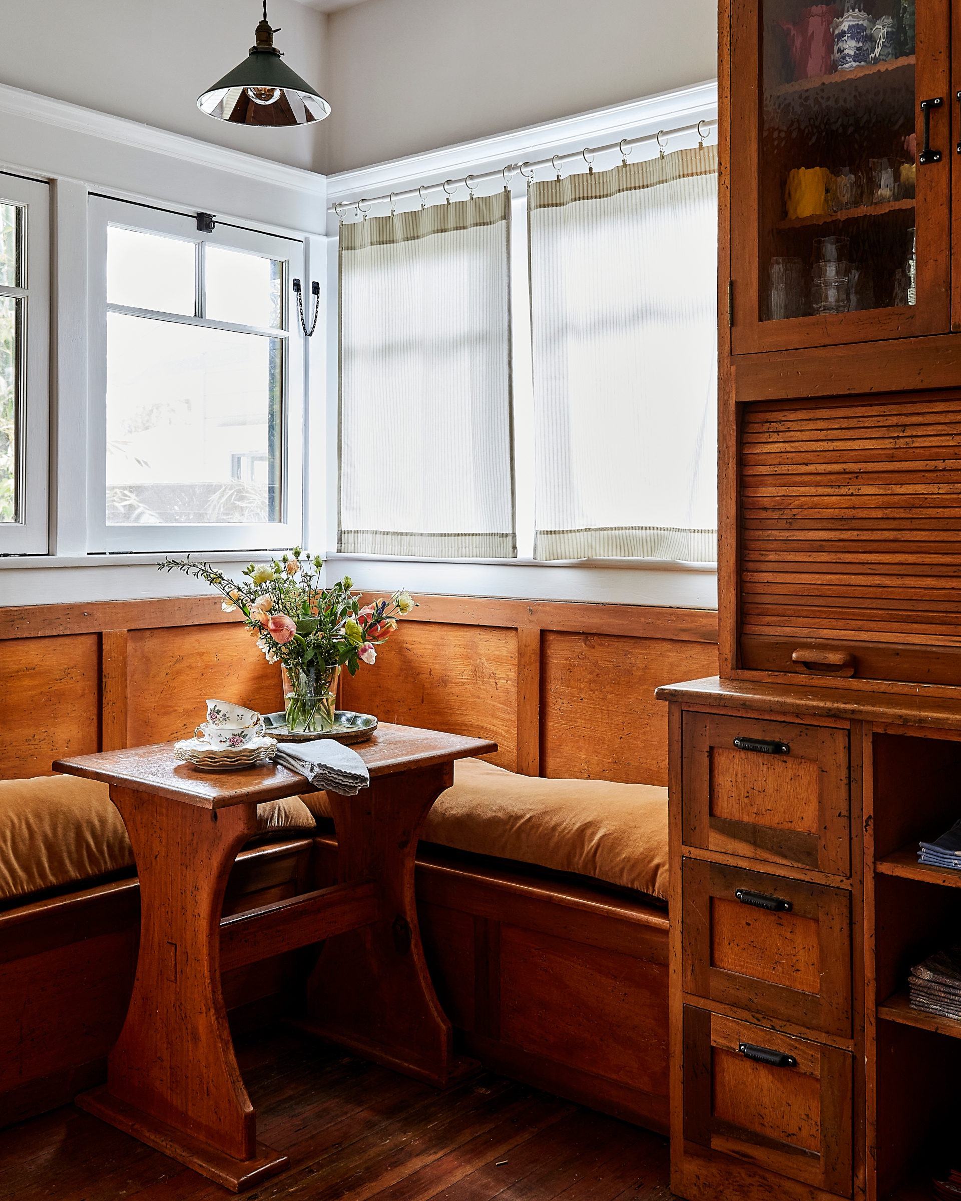
Recessed lighting was removed and traditional-style pendant lights added.
Dining room
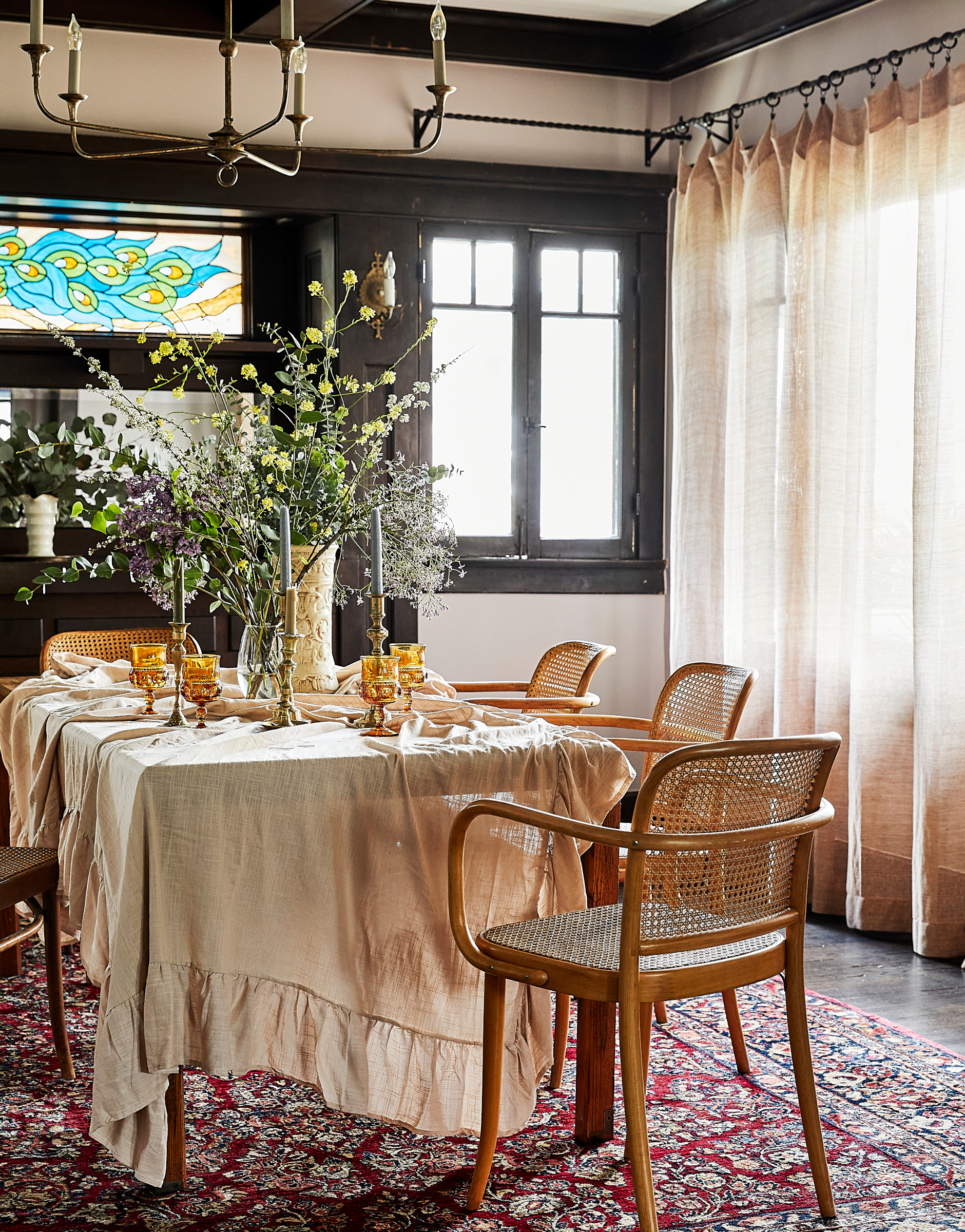
The light dusky pink grout of the original fireplace in the living room was the starting point for the home's color palette and the pink was carried throughout the downstairs portion of the home, including in the dining room, which is separated from the living room by original pocket doors. The walls are painted in a soft pink with a gray undertone that complements the deep mahogany trim throughout the house. 'It feels very neutral and glows rosy in warm light, which filters into the room,' says Jamie.
Other dining room ideas include introducing a soft bronze chandelier with delicate features and hanging tonal pinky beige gauze sheers to filter the light.
Library
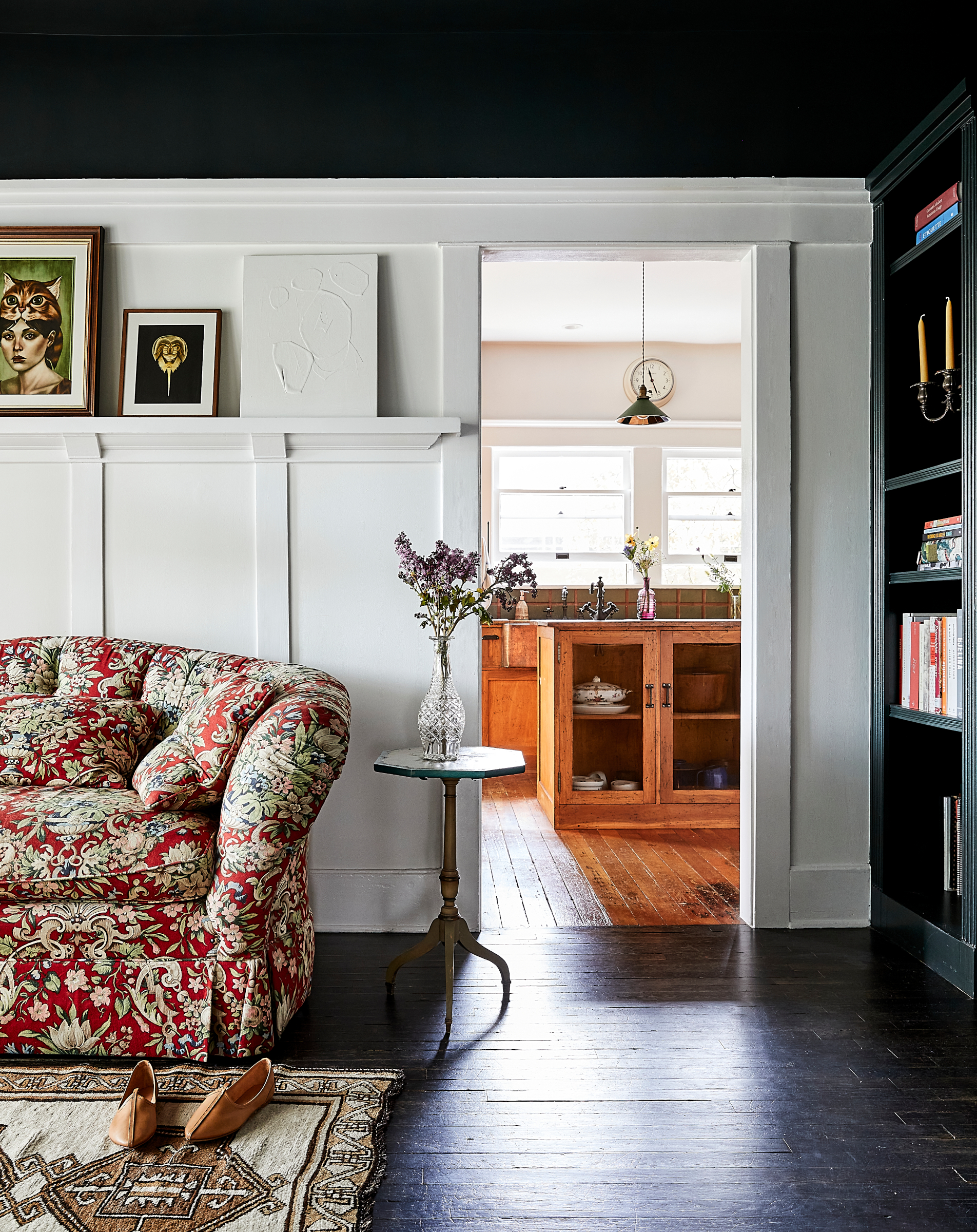
The home library has a large floor-to-ceiling built-in bookcase. 'I wanted to accentuate the height of the room without darkening it,' says Jamie. 'The wainscoting was original and we painted it the same creamy white as the living room and kitchen, primarily to brighten the space. For fun I painted the ceiling and bookcase a deep dark green, a bold contrast. The room still feels bright but with an unexpected moment that doesn’t feel heavy in a small space.'
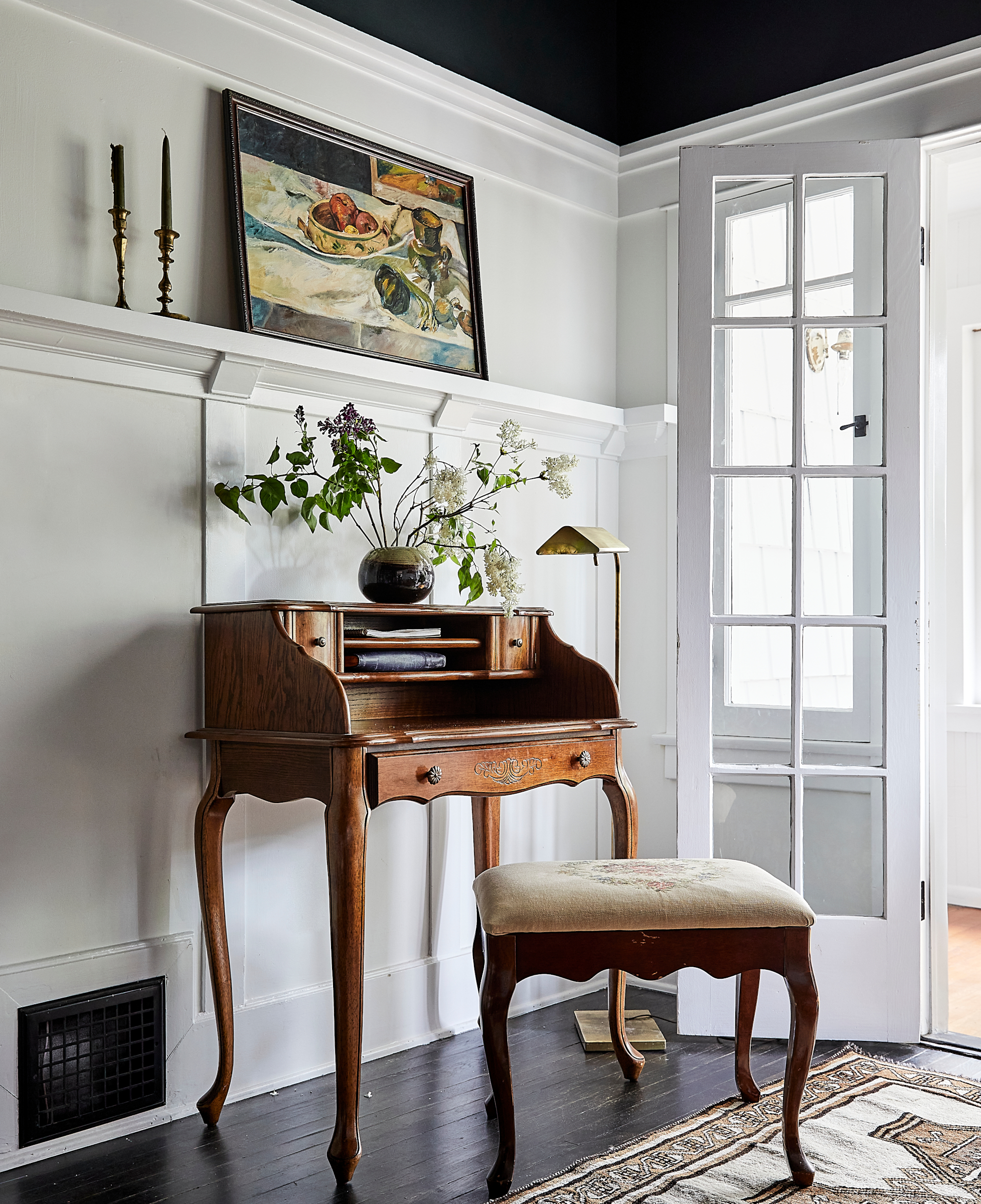
The library leads to an indoor porch that is used as an office with beautiful original sliding windows. The walls of this indoor porch are the exterior wood shingle of the home. 'We wanted a serene space to work and write in, so we repainted it to differentiate it from being part of the outdoors,' says Jamie.
Main bedroom
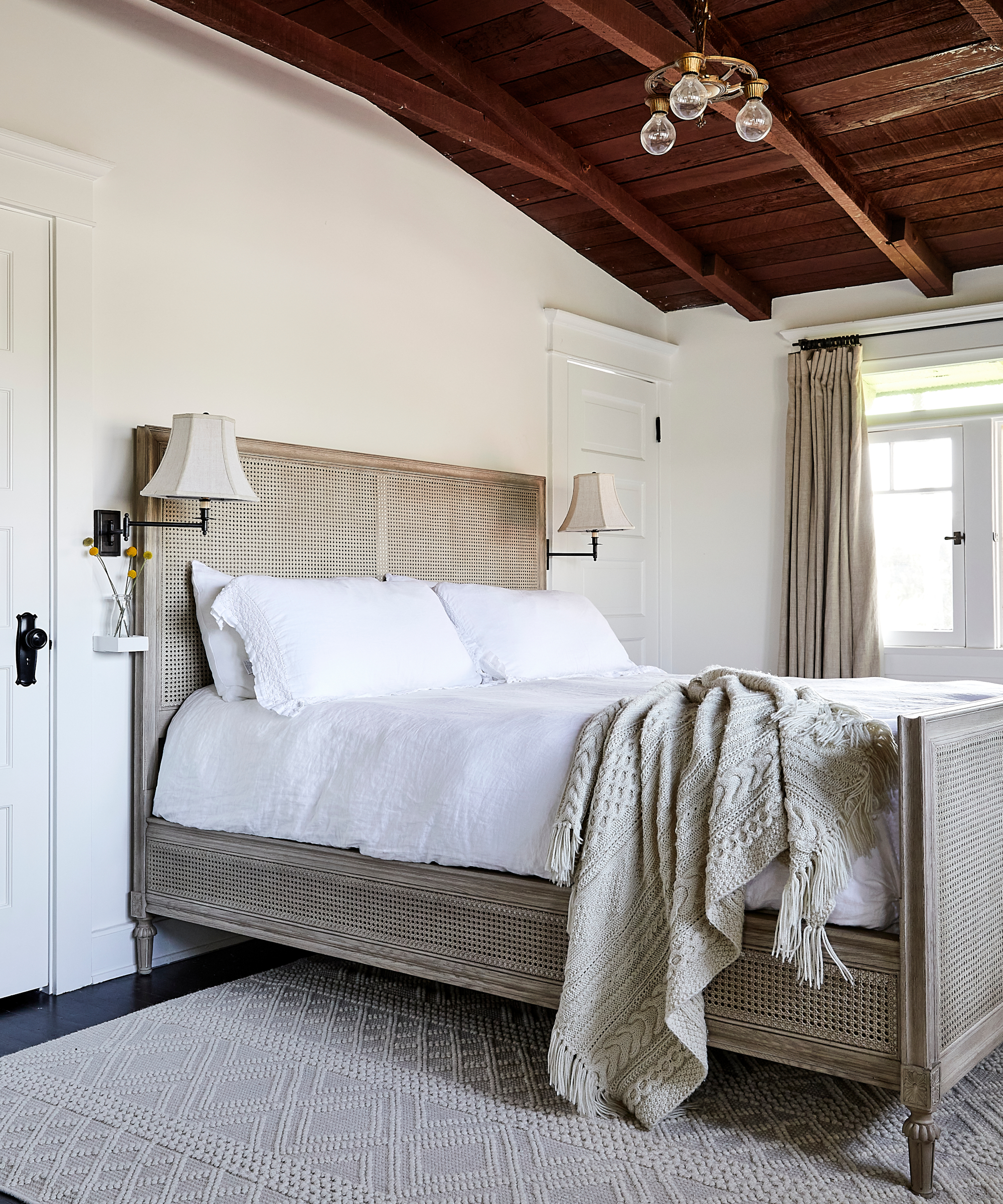
The primary bedroom, decorated in a neutral palette, is a serene haven. 'We kept the wood ceiling intact and contrasted the dark woods with the creamy white color we used throughout the home to make a peaceful retreat for the parents,' says Jamie.
Storage was limited so a closet was added with doors that replicate the house's five panel Douglas fir doors. 'The goal is to finish something like a new closet in a way in which you cannot tell we did anything at all,' says Jamie. 'We took a little space from the adjacent baby’s room closet and were able transfer the storage into the primary bedroom where it was most needed.'
Other bedroom ideas included adding new, elegant lighting in keeping with the age of the house. 'The lighting in this room was fairly minimal in design. A beautiful simple chandelier from the early 1900s was the perfect piece against the heaviness of the open beamed wood ceiling,' says Jamie.
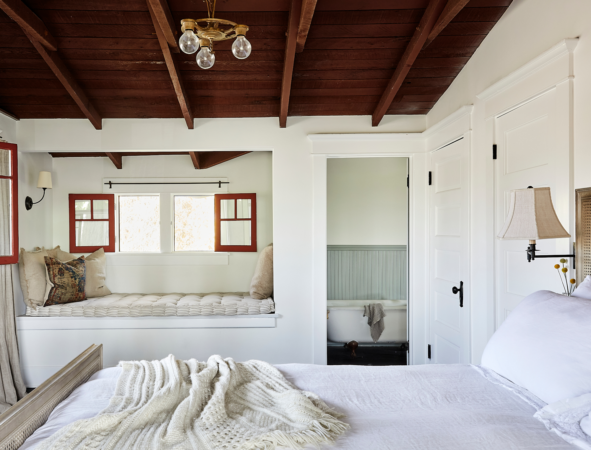
In the primary bedroom, restoration work was done to the windows where there had been previous damage due to window AC units.
Main bathroom
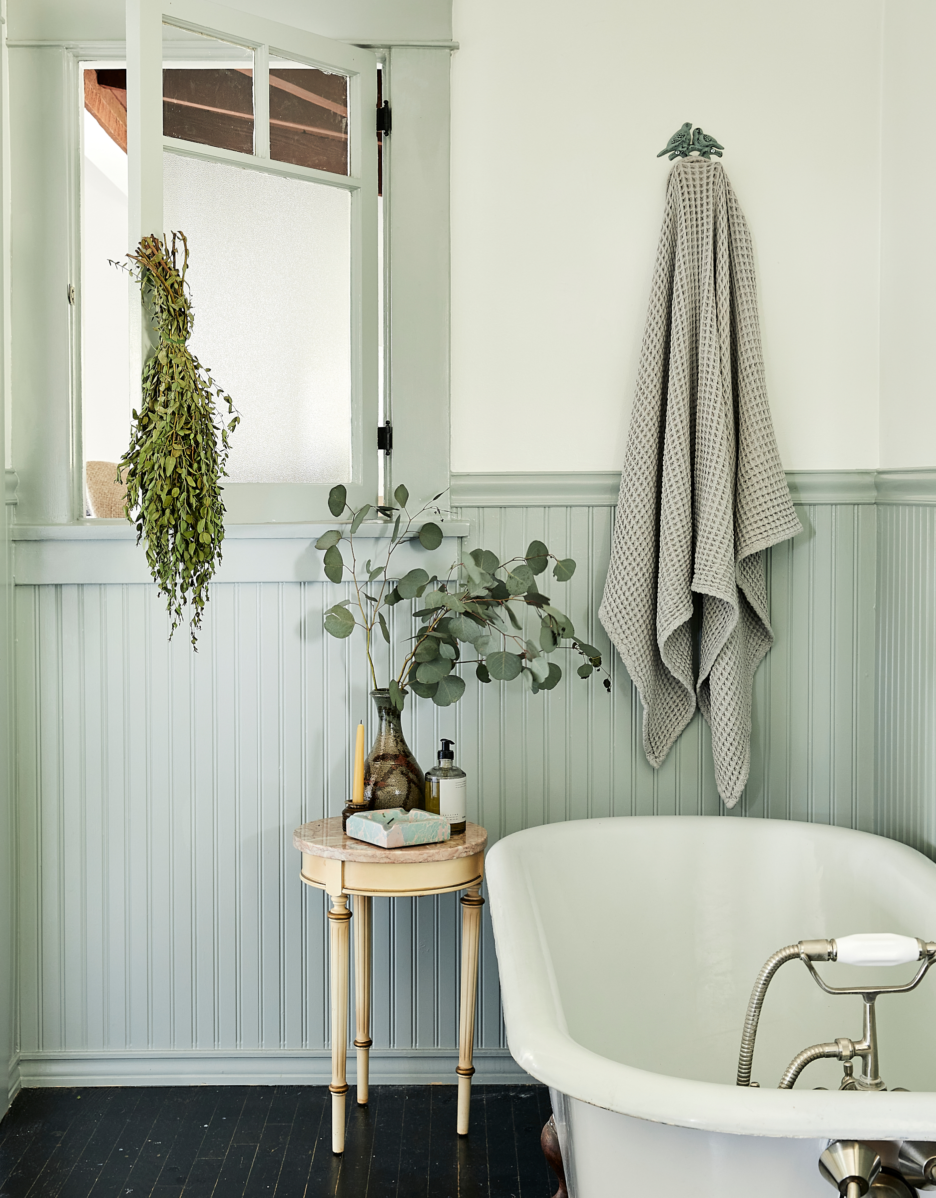
The wainscoting was painted in a pretty shade of gray blue and a blue toile vintage light fixture was added. 'These makeover moments are minimal, but they change the space immensely,' says Jamie. 'It really is about the flow of color from room to room, to create beauty and accentuate the interior architecture existing in the home.'
Children's bedroom
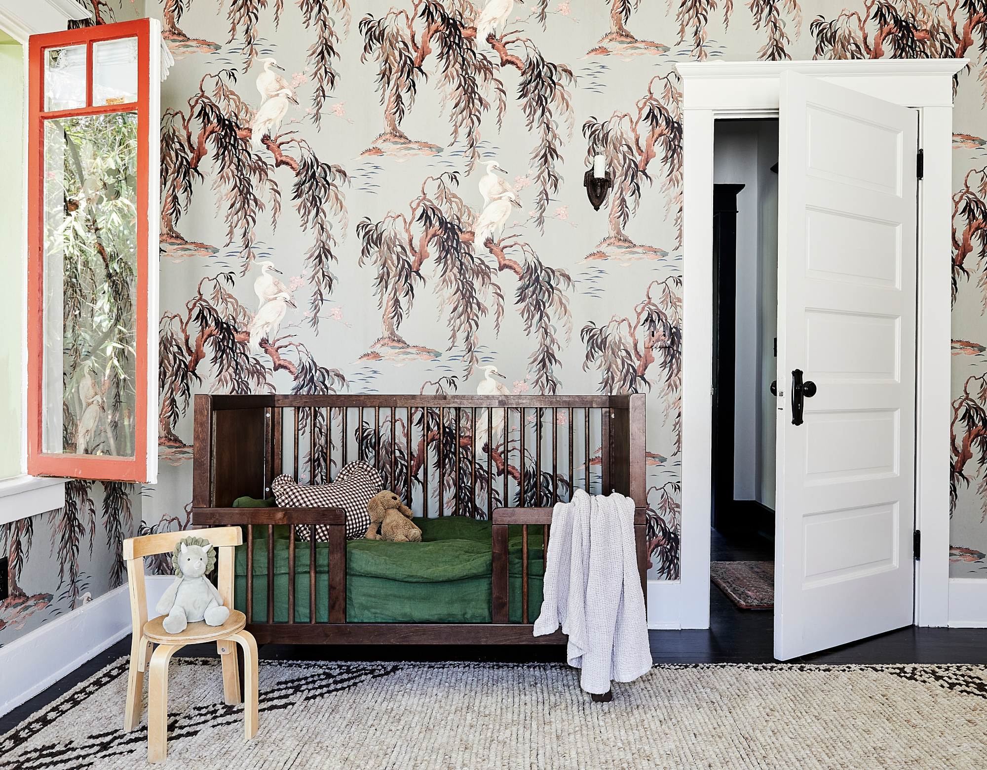
Both children's rooms were wallpapered. 'The idea was to create whimsy in a creative way that isn’t necessarily child-like, but that suits a child,' says Jamie. 'The rooms feel sophisticated and also inspire the adults who are likely to be in the children’s rooms as much as the children. I love to make rooms for children that the parents want to hang out in because ultimately they do.'
This space was decorated in a beautiful crane wallpaper in a soft green gray. 'A warm linen white paint accentuates the pattern of the paper and the original lighting in the room feels renewed.'
Children's bedroom
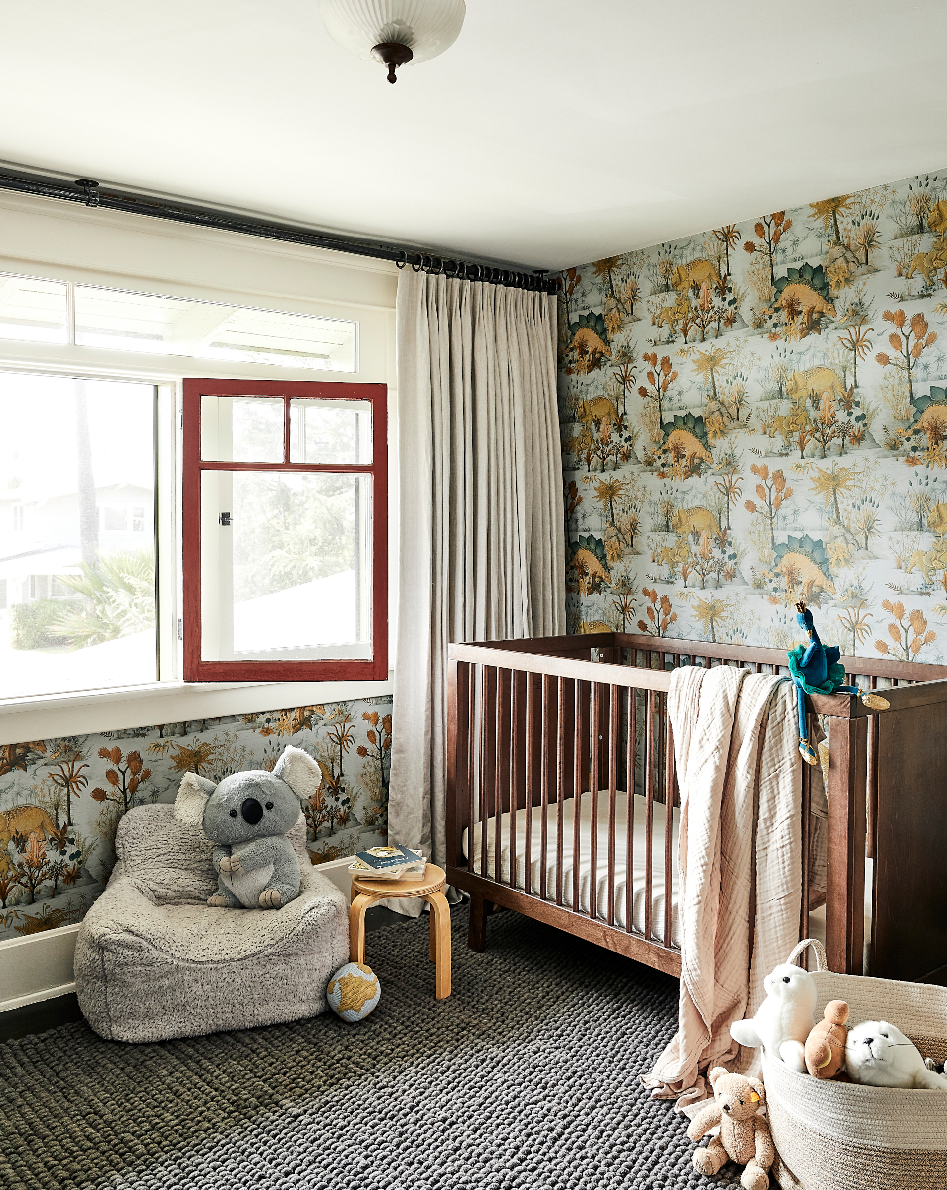
Painterly dinosaur wallpaper creates a fun backdrop in the child's bedroom while new drapes add a sophisticated touch.
Bathroom
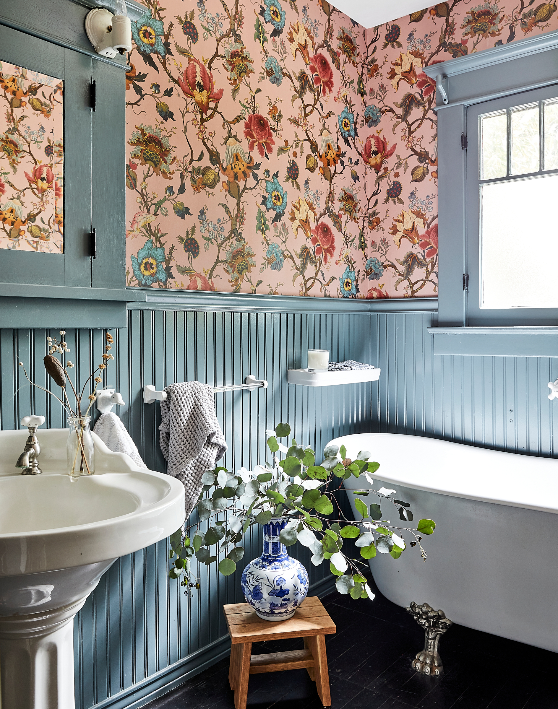
Jamie's favorite room is the downstairs bathroom. 'The porcelain pedestal sink and clawfoot tub were original to the home as was the wainscoting,' she says. Bathroom ideas included repainted the wainscoting in a soft blue and adding a romantic blush grounded floral wallpaper, along with a whimsical antique lighting fixture with beautiful fluted shades. 'It was a moment of fantasy dressed in blue and pink.'
Interior design/ Jamie Haller Interiors
Photographs/ Jenna Ohnemus Peffley
Sign up to the Homes & Gardens newsletter
Design expertise in your inbox – from inspiring decorating ideas and beautiful celebrity homes to practical gardening advice and shopping round-ups.

Interiors have always been Vivienne's passion – from bold and bright to Scandi white. After studying at Leeds University, she worked at the Financial Times, before moving to Radio Times. She did an interior design course and then worked for Homes & Gardens, Country Living and House Beautiful. Vivienne’s always enjoyed reader homes and loves to spot a house she knows is perfect for a magazine (she has even knocked on the doors of houses with curb appeal!), so she became a houses editor, commissioning reader homes, writing features and styling and art directing photo shoots. She worked on Country Homes & Interiors for 15 years, before returning to Homes & Gardens as houses editor four years ago.
-
 Dyson V15 Detect vs Dyson V12 Detect Slim – which is right for your home?
I've spent more than 200 hours testing vacuum cleaners and these two cordless Dysons are my personal favorites
By Dan Fauzi
-
 Your perfect Easter menu: our favorite Easter recipes for effortless entertaining
Fresh flavors, easy dishes, and crowd-pleasing ideas – our selection of Easter recipes make for a relaxed yet elevated spring celebration
By Alice Hart