A modern take on classic English style brings effortless charm to an Australian coastal home
Interior designer transforms a 1970s build to create her sister's dream home
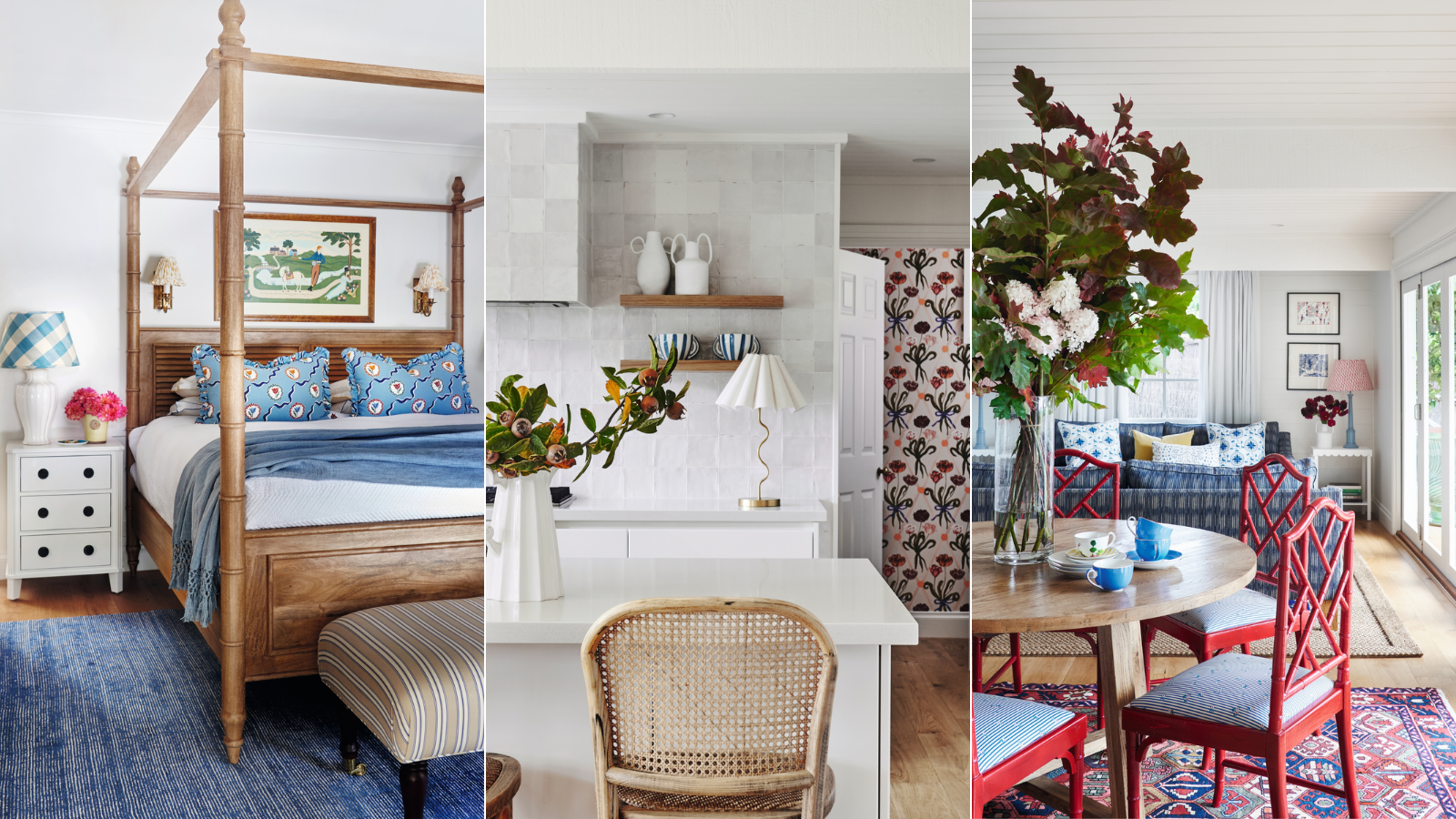

When I first saw this property, I knew it was perfect for my sister and her family,’ says house design expert Amy Spargo of Maine House Interiors. ‘It was screaming out for love and I realized we could make it into something special.’
The house in question was a tired two-story wooden 1970s building situated on the Mornington Peninsula in Victoria, Australia. Hidden behind a row of trees and a mere ten-minute walk from the beach, the property was in an idyllic location.
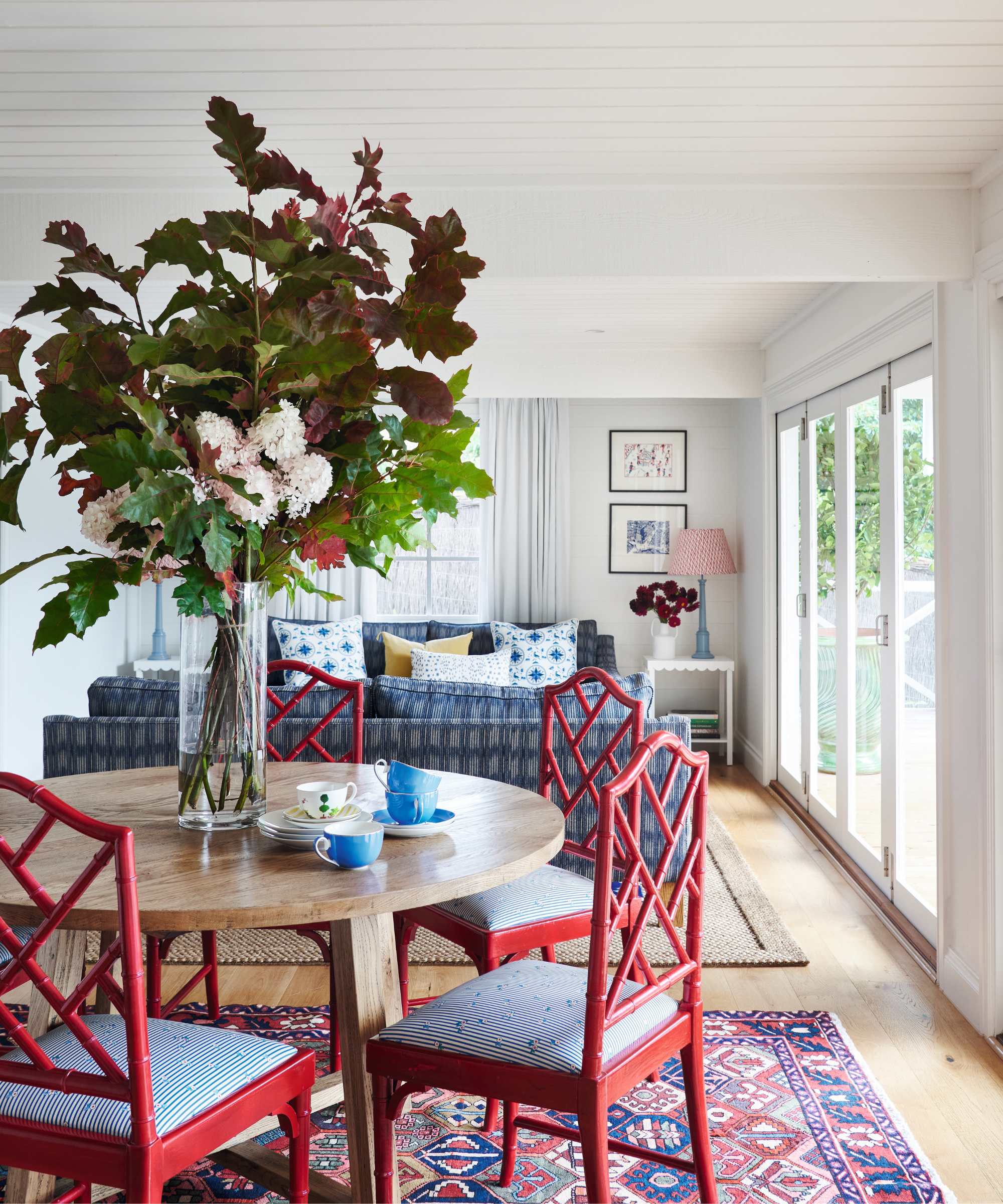
Dining table, Provincial Home Living.
Amy’s sister Clementine and her husband Matt agreed that it could be the perfect family home to raise their three young children, Harry, Ralph and Florence. ‘Clementine and I both adore English design,’ says Amy. ‘So I knew we’d work well together creating the aesthetic she wanted.’
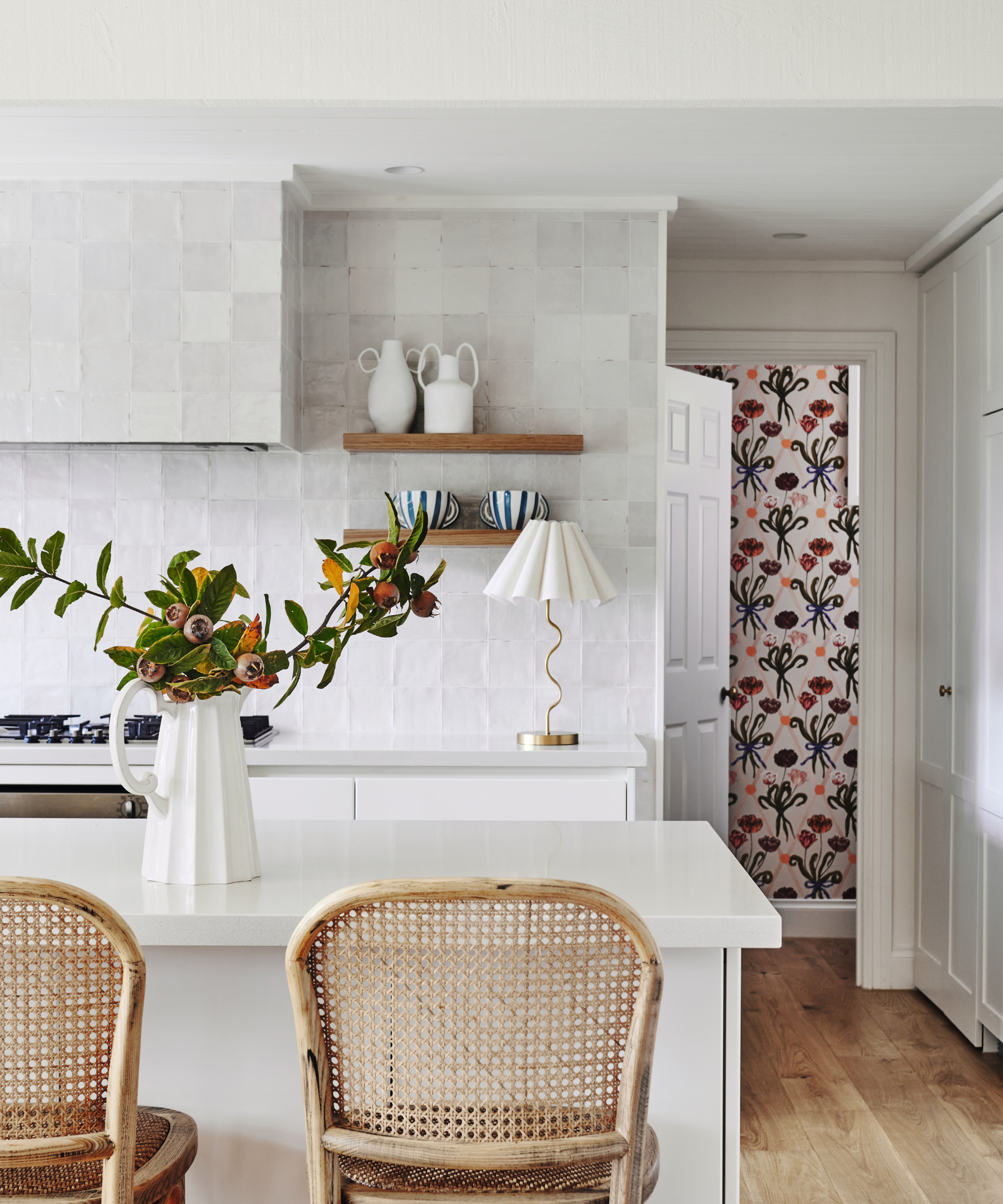
White gloss Zellige tiles, National Tiles. Rattan and timber bar stools, Facebook Marketplace. Table lamp, Urban Edge. Diamond Tulip wallpaper, Polly Fern.
The brief was simple: Clementine and Matt wanted a home that was full of bold color and pattern, that had a place for decorating with art, and would be a fun yet calm space for their family. ‘The ideas flowed between us,’ says Amy, ‘but where I felt I added most value was steering Clementine into the decisions of where to focus her attention and what could be left as is to save money.’
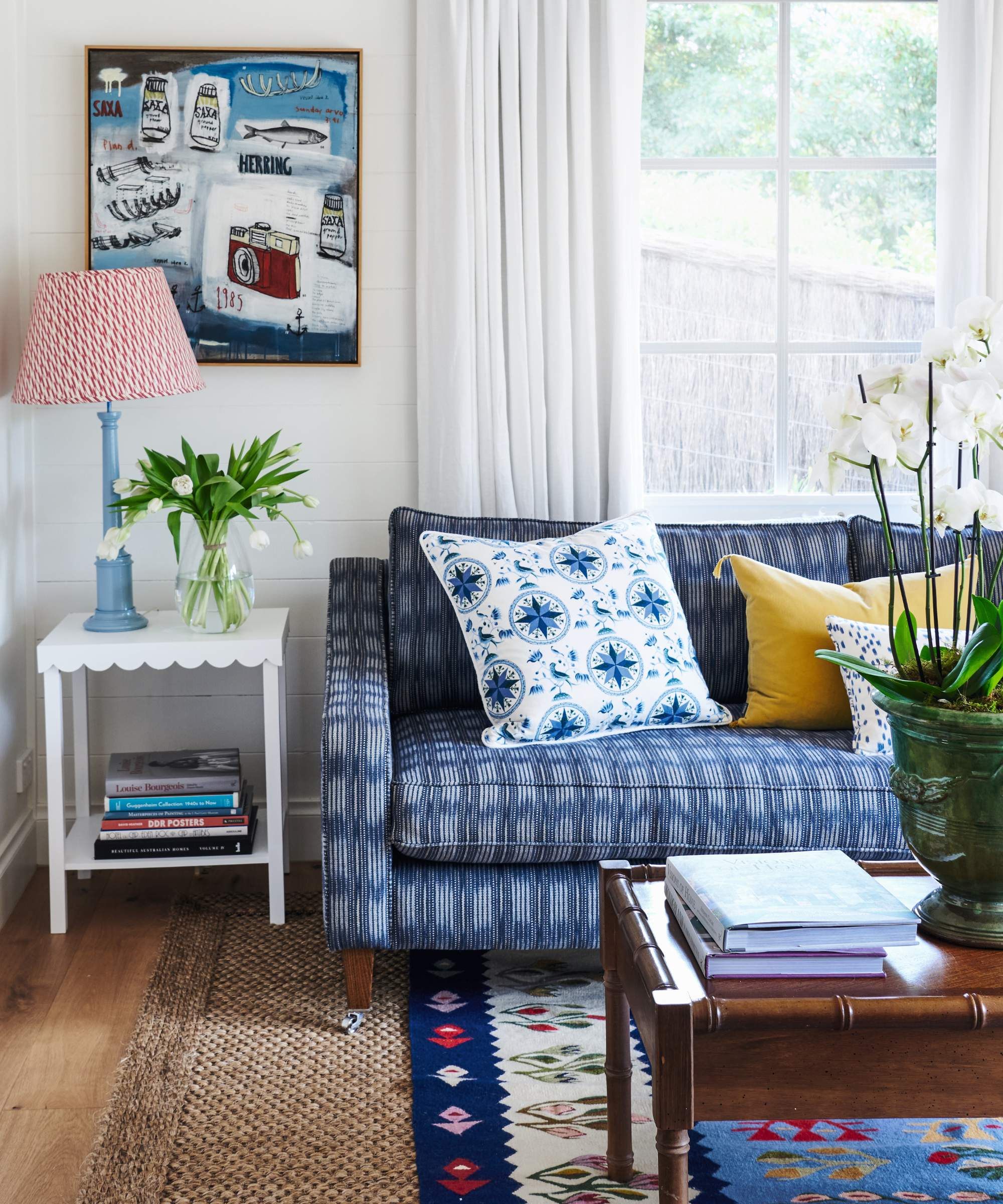
Sofa, Arthur G; upholstered in Ralph Lauren fabric. Antique rug, Cadrys. Cushions in vintage fabrics, Etsy.
One of the earliest decisions taken was to tackle the small entryway to the home. Amy and Clementine agreed the current layout created a bottleneck and ruined the flow, so they demolished the entry storage room and took away a door to help create a more open feel.
The removal of a chunky and unsafe balustrade allowed the space to breathe. Finally, an art deco-style ceiling light was introduced to make a statement and draw the eye upwards.
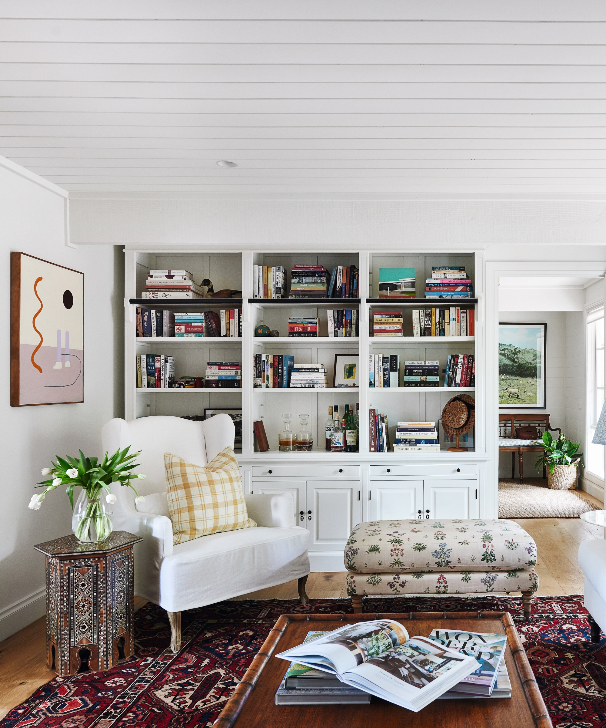
Ottoman, Facebook Marketplace; upholstered in Vita, Lisa Fine Textiles. Cushions in yellow check, Brunschwig & Fils; yellow stripe, Nicky Haslam; blue floral, vintage Schumacher, Etsy. Moroccan-style table, Maine House Interiors.
In the kitchen, Amy persuaded Clementine to keep the white kitchen cabinetry, which saved a significant amount of money. But they removed the dated purple kitchen backsplash and range hood and introduced white gloss tiles and natural touches, such as the rattan stools and the oak flooring and shelves.
A brilliant white backdrop downstairs gives the home a bright and airy feel, while upstairs in the children’s bedrooms the focus is on color. ‘There’s a lot you can achieve with just a paintbrush!’ says Amy.
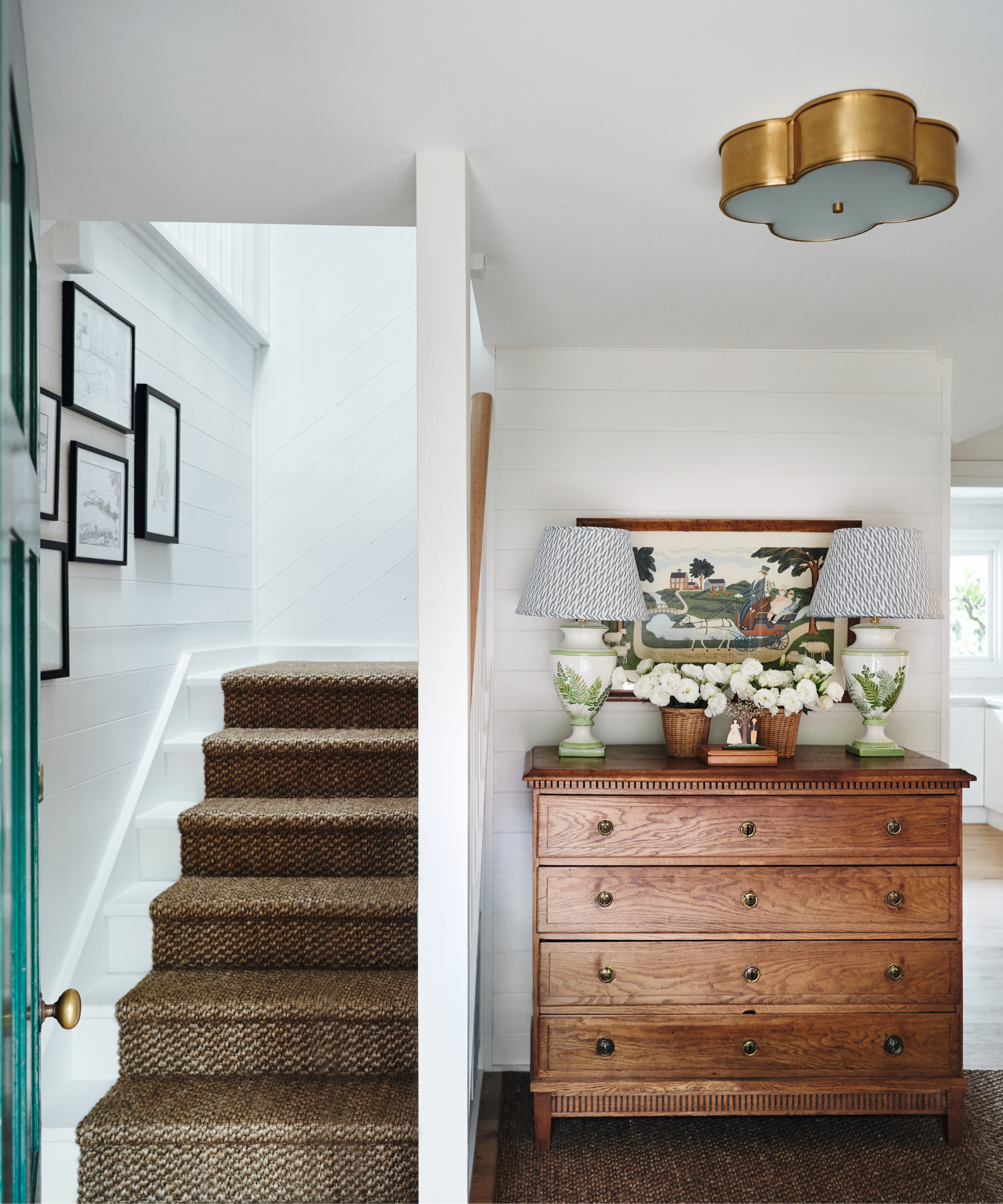
Basil ceiling light, Visual Comfort & Co. Antique wooden chest; for similar, try Vinterior. Sisal carpet, Floorspace.
The two bathrooms were gutted, with a fun but practical bathroom created for the children and a quirkier one for Clementine and Matt to enjoy. With color, pattern and texture being so important to the overall look, the sisters went to town sourcing local furniture, both new and preloved, and infusing their own touches with new and vintage fabrics and rugs.
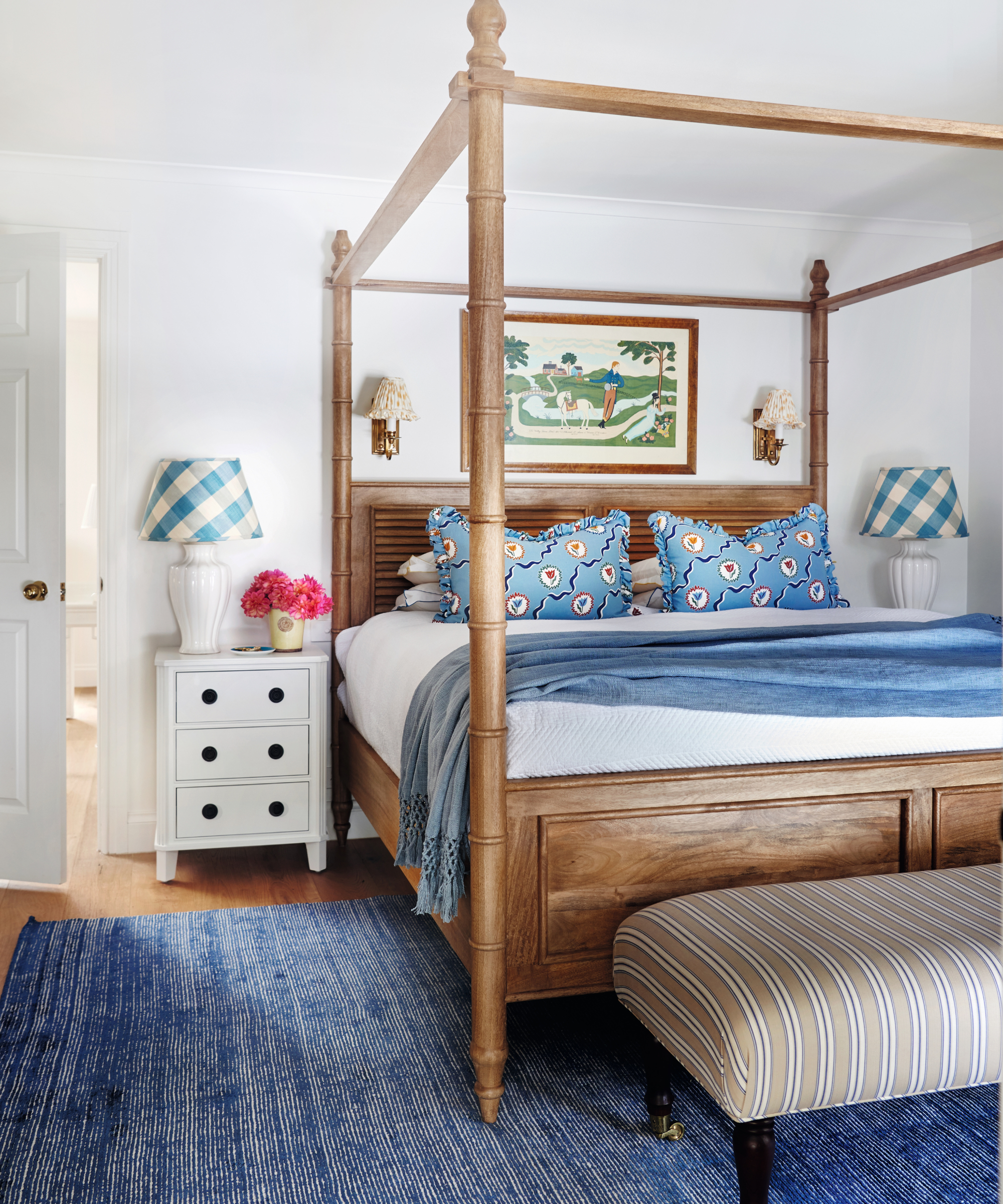
Cushions in Tulips of Belgravia, Ottoline. Lampshades in Eaton Check, Colefax and Fowler. Sconce shades in Les Touches, Brunschwig & Fils.
They scoured Facebook Marketplace and local auctions and bought pieces, such as the ottoman in the living room, to restore and reupholster. Amy also made brightly coloured cushion covers and lampshades using vintage fabrics and the pair even refinished two chairs that they found abandoned at the side of the road.
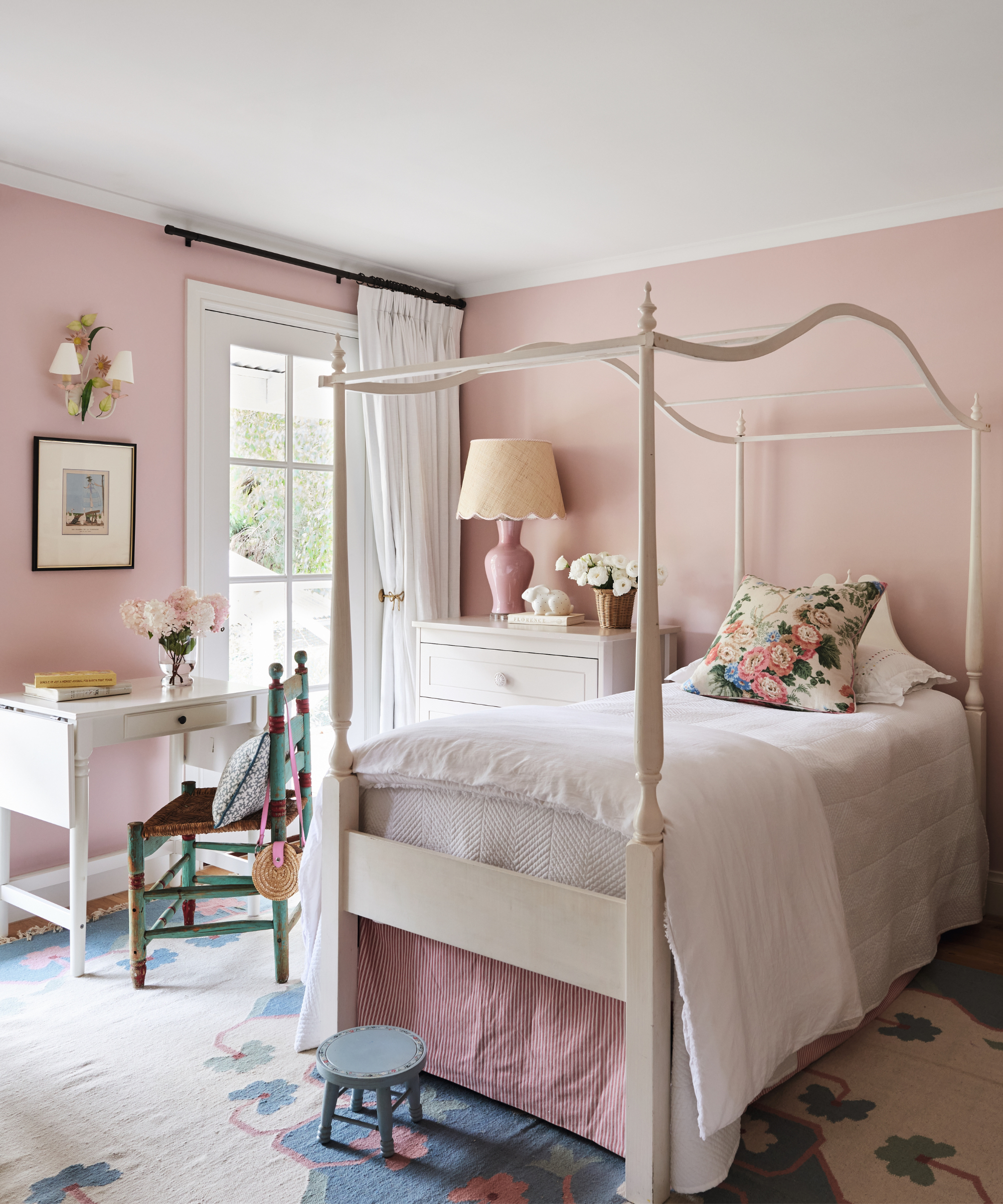
Walls in Middleton Pink, Farrow & Ball.
Clementine and Matt’s art collection, mostly gleaned from their travels in Europe and the UK, takes pride of place and Amy found herself learning a lot from her sister, who used to work in an art gallery, about placement and composition. ‘We often had impromptu design meetings, over a glass of wine,’ says Amy.
‘Designing is fun and I think Clementine now appreciates that my job involves weaving together my clients’ ideas and creating unique spaces to meet their needs. She loves the house and the whole process has brought us closer together.
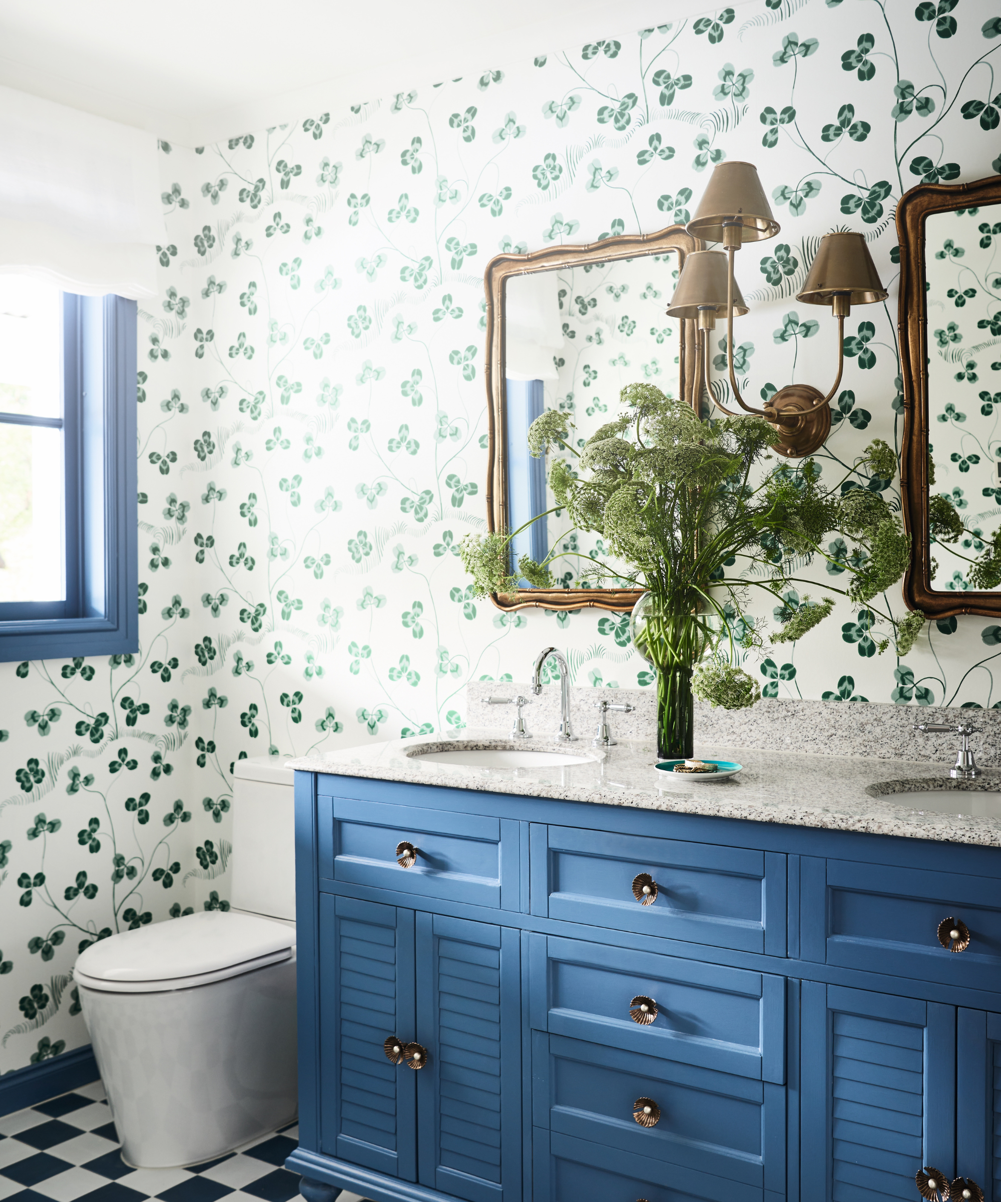
Klöverblad wallpaper, Svenskt Tenn. Vanity in Blue Fin, Dulux. Knobs, Anthropologie.
Meet the designer
Amy Spargo shares her design inspiration
Which part of the home do you think works the best?
The entrance.
What one small change has the biggest impact?
Paint – it’s amazing how it can transform a space.
Your best bargain find?
The hand-painted chairs we found by the side of the road. We put one of them in Florence’s bedroom.
Describe your style in three words.
Classic with a twist – can I use four?
Who is your design hero?
Miles Redd; he’s so bold with color and print.
Tell us your go-to color.
I love working with blue and white – I find it calming. I’m currently drawn to red, pink and yellow.
What's your favorite design detail?
Ruffles. On lampshades, pillows, sofas, anything really!
How do you get inspired?
Nature, travel, movies and my enormous collection of design books.
Name one object you'll never part with.
My grandmother’s Wedgwood Jasperware Mother plate.
Sign up to the Homes & Gardens newsletter
Design expertise in your inbox – from inspiring decorating ideas and beautiful celebrity homes to practical gardening advice and shopping round-ups.

Anna Pattenden is a freelance lifestyle journalist, copywriter and editor. She enjoys exploring the personal stories of homeowners, from what lies behind their choice of where to live to the influences reflected in their interior design decisions. She lives in an Edwardian terrace in south-east London and is about to embark on her own renovation project.
-
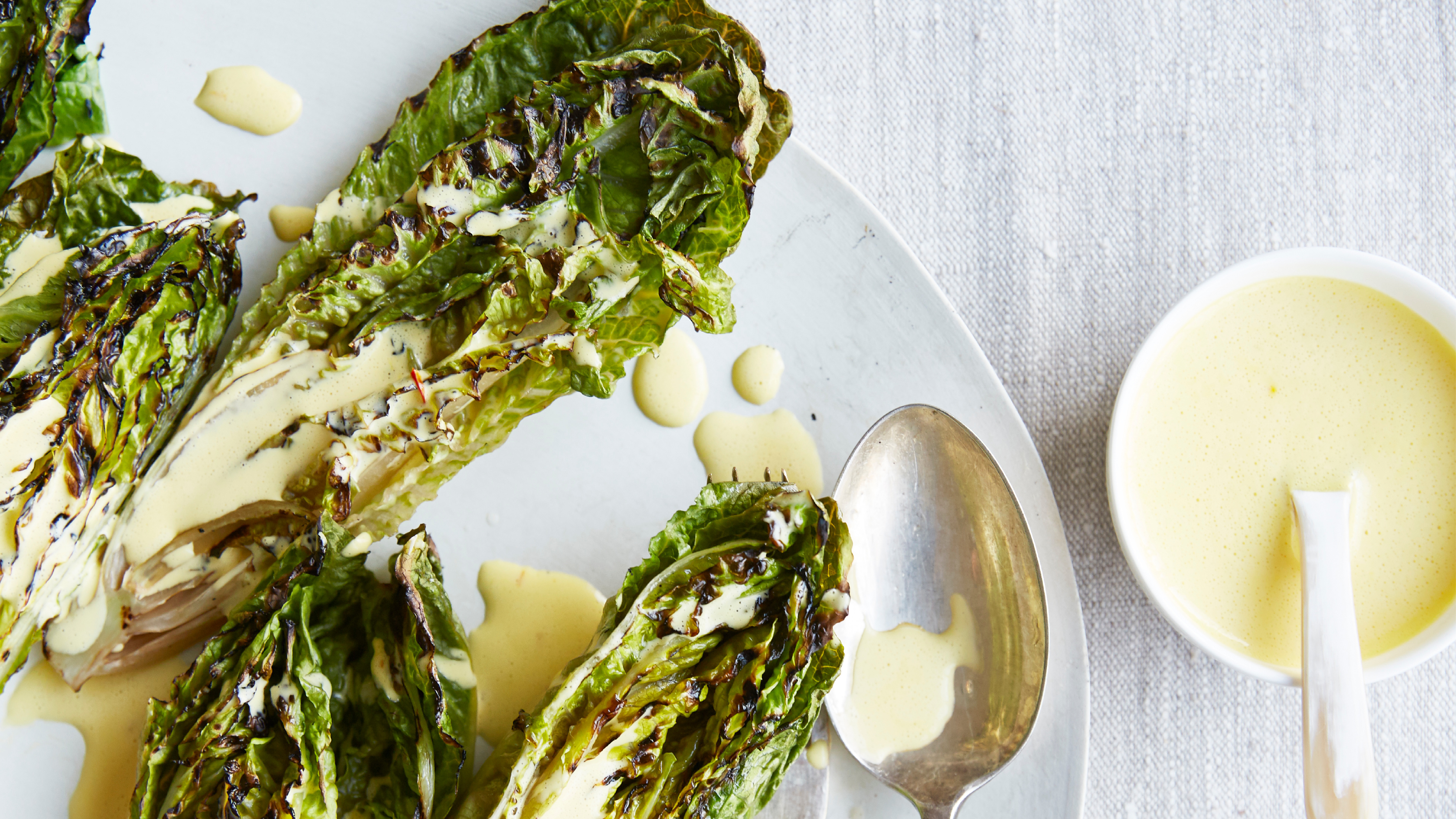 Charred little gem with saffron dressing
This recipe with charred little gem is both easy to make and sure to impress guests. It's the perfect side for fresh spring menus
By Alice Hart
-
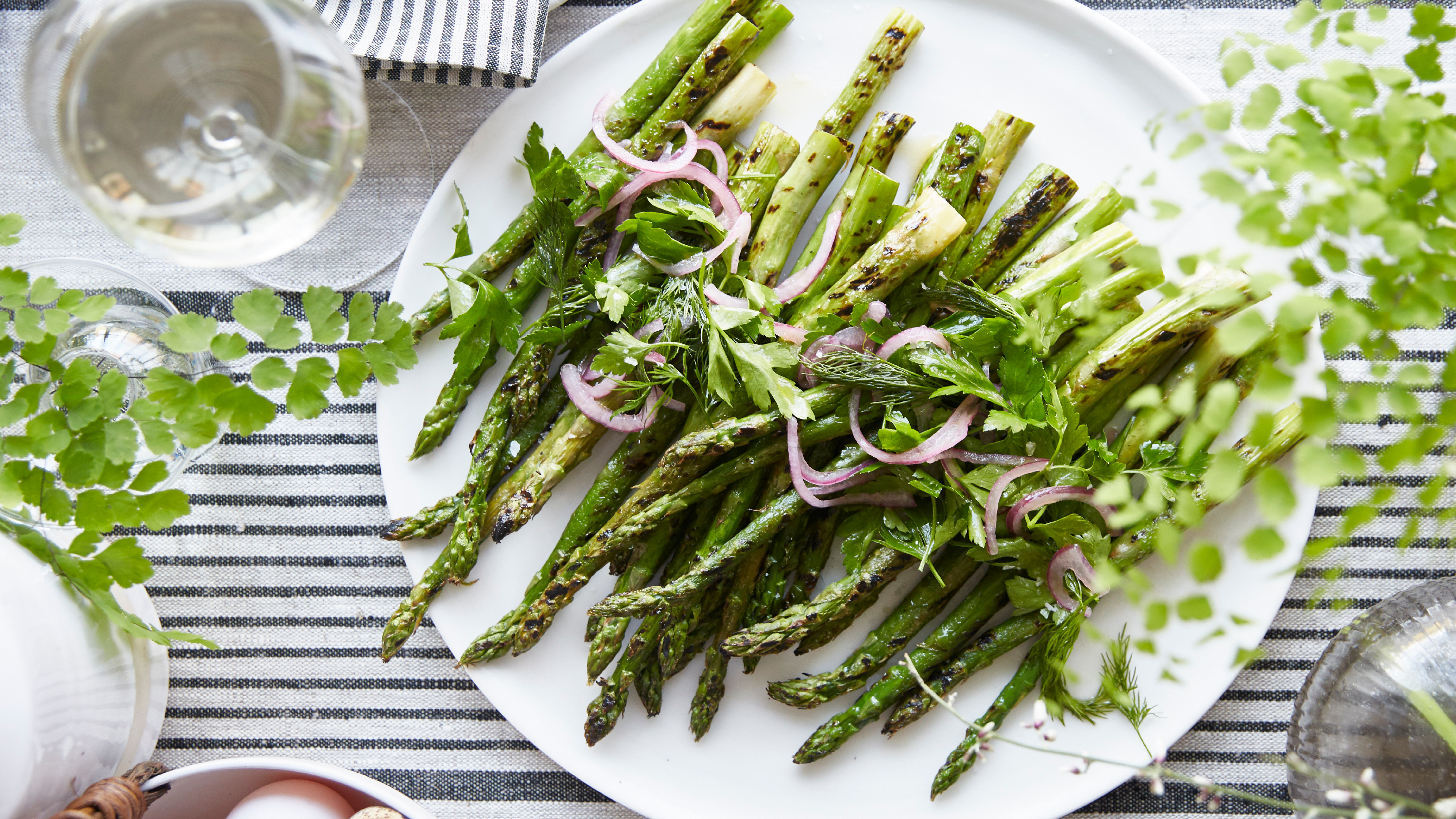 Grilled asparagus with herb and pickled red onion
This grilled asparagus couldn't be easier, and it's a wonderful way to get the best flavor from our favorite spring veg. It's perfect alongside fish or lamb
By Alice Hart