7 ways new design updates added more character to an historic LA home
Brighter, lighter but in keeping with its character, this home's new look balances period features and modern comforts
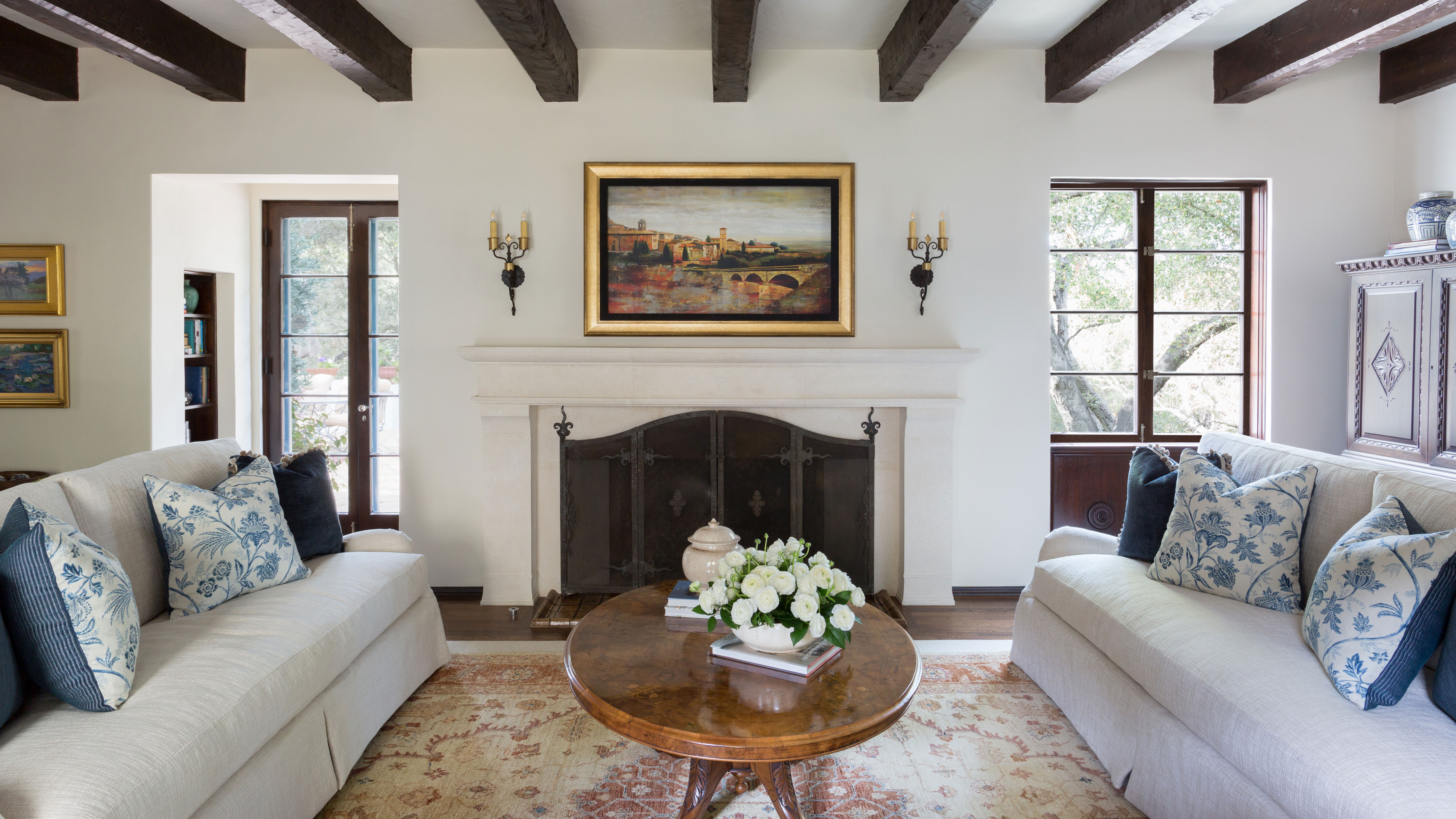
This Spanish colonial house in the Los Angeles suburb of La Cañada was built in 1925 and is full of original features. The interiors, however, were ready for a design refresh. High on the history-loving owners' list of requirements for their home's 21st-century rethink were lighter, brighter interiors, modern luxuries and up-to-date audio visual and home technology solutions.
They asked an interior designer to come up with ideas to brighten the space and incorporate the latest home tech.
The redesigned spaces remain true to the property's unique features and the new design elements actually enhance its character and highlight what makes it so special. It truly is one of the world's best homes.
The revamped space was the vision of Courtney Thomas, who runs Courtney Thomas Design.
She had previously worked with the clients on their Laguna beach home. 'This house in La Cañada started to feel dark in comparison to the sun-soaked walls of their beach home,' says Courtney. 'So they asked us to reinspire it through brighter, lighter palettes and more inviting spaces.'
The starting point, explains Courtney, was the history of the house and the owners' wish to preserve the original features and materials where possible. She also took a good look at how the family were using the rooms before making any changes.
The solutions she came up with offer plenty of inspiration for anyone looking for living room ideas – particularly those wishing to change the way a room is used.
1. Reconfiguring the living room to change its use
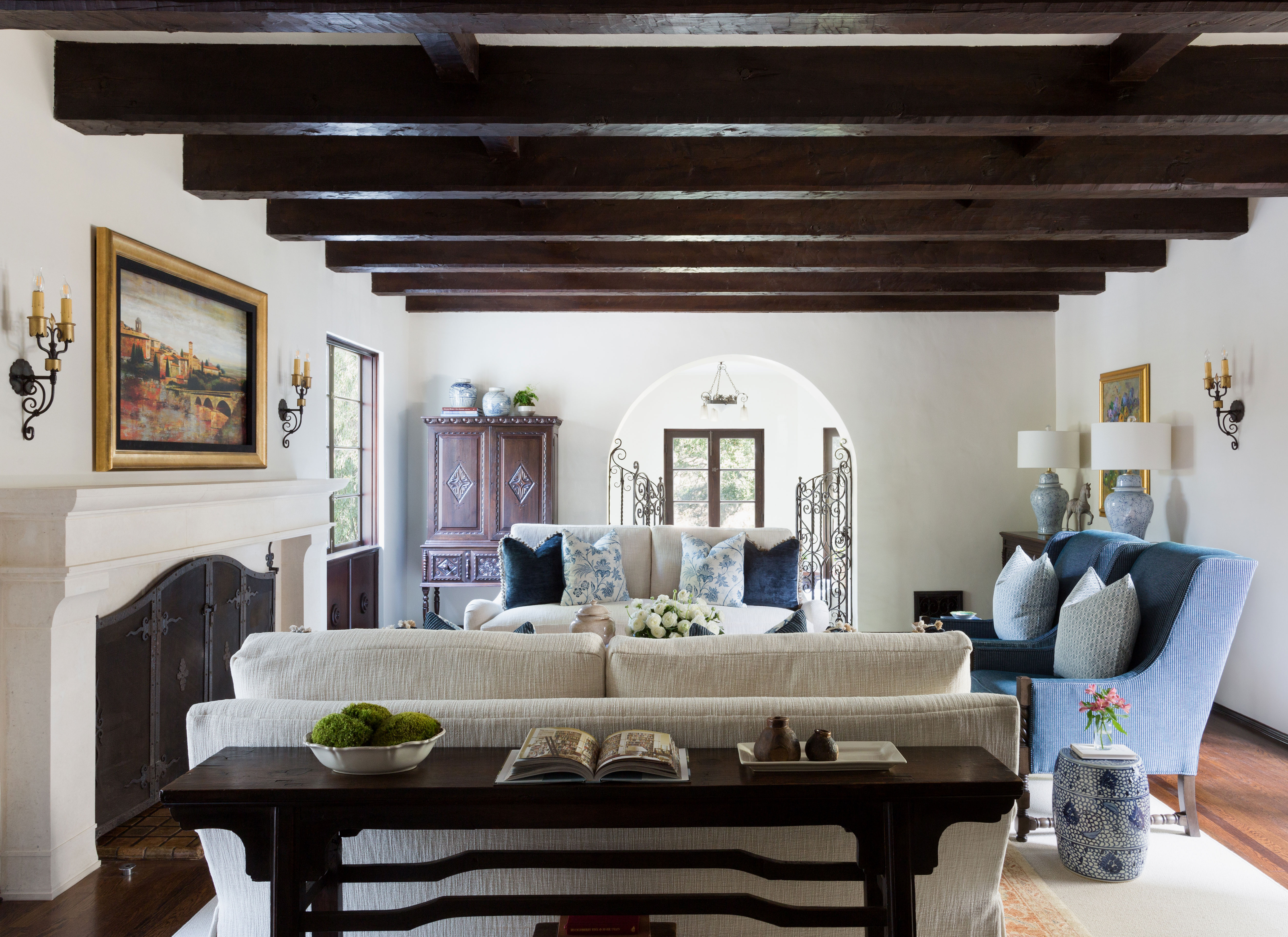
The designer soon established that the living room wasn't getting the use it deserved. 'A bit removed from the other often-used spaces in the house, this room saw only occasional activity,' says Courtney. 'We determined that the client’s love of outdoor entertaining might best be served by an indoor space. The spacious living room, with several french doors onto the patio, was perfect for the job.'
The clients' wish for improved audio visual solutions without compromising their home's historic feel, was also answered by adding TV over the mantle, hidden by a piece of art that rolls away at the touch of a remote. The addition of a bespoke limestone fireplace adds more character to the room and anchors the seating area.
Courtney Thomas specified additional sconces, custom made for the house in an antique style, for better nighttime lighting and sourced new sofas and chairs from Wesley Hall, with side tables from Butler and Chelsea House.
2. A custom bar
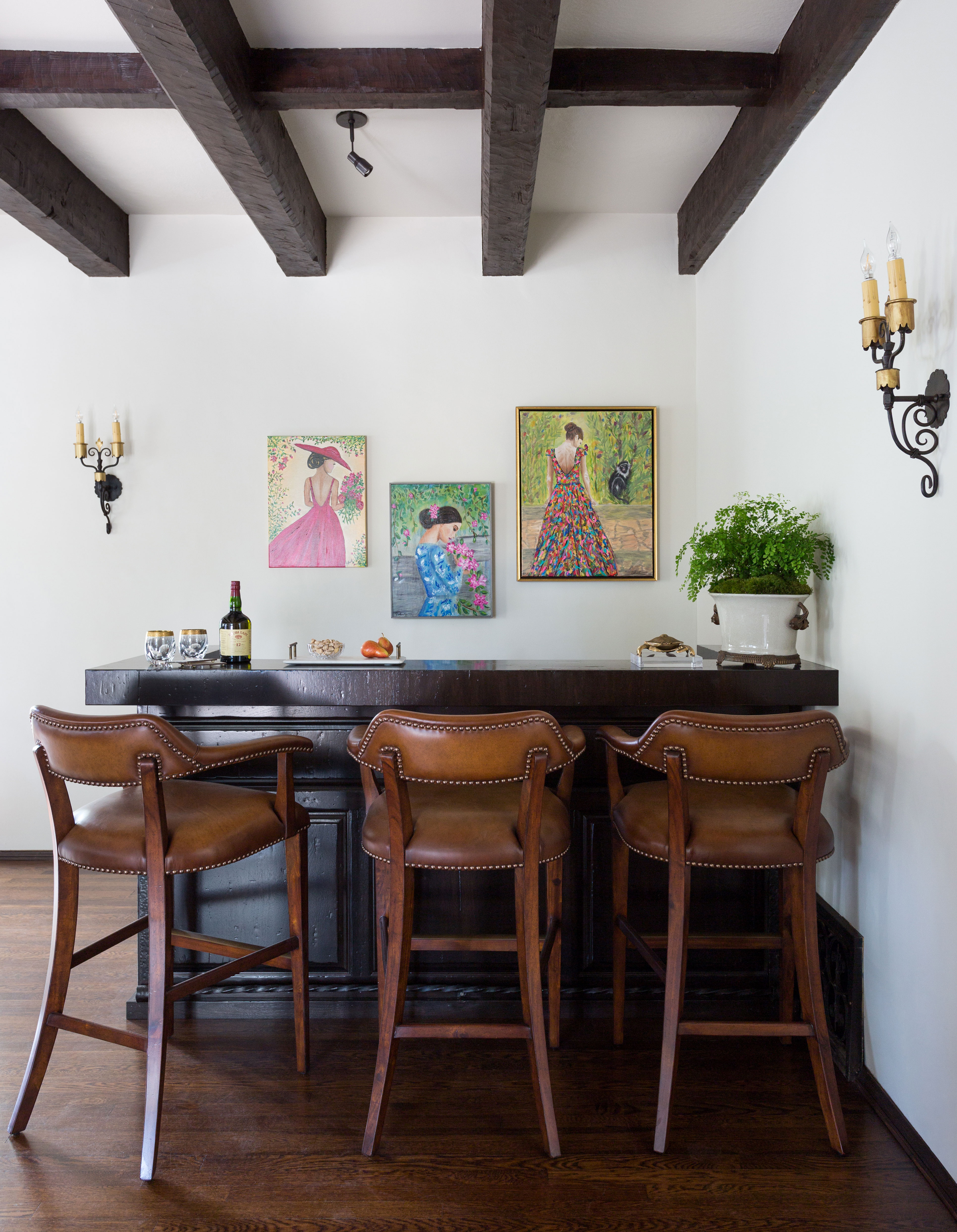
At one end of the living room, in place of a piano that was rarely played, Courtney suggested adding a home bar. Anyone looking for home bar ideas to incorporate in an existing room will find plenty to inspire them in Courtney's design for her clients.
The addition of the custom bar underlines the living room's new function as the main space for entertaining and having fun with friends and family. 'As the bar was installed during the Covid outbreak, I think we can all appreciate that particular choice,' says Courtney. The custom bar here may have come into being in answer to a very 2020 situation, however its traditional styling is in keeping with the home's original features and places it comfortably back in the 1920s.
The console, used as a bar counter, is from Schwung Antiques and traditional-style bar stools are from Jonathan Charles.
3. A sunroom links the living room to the outside space
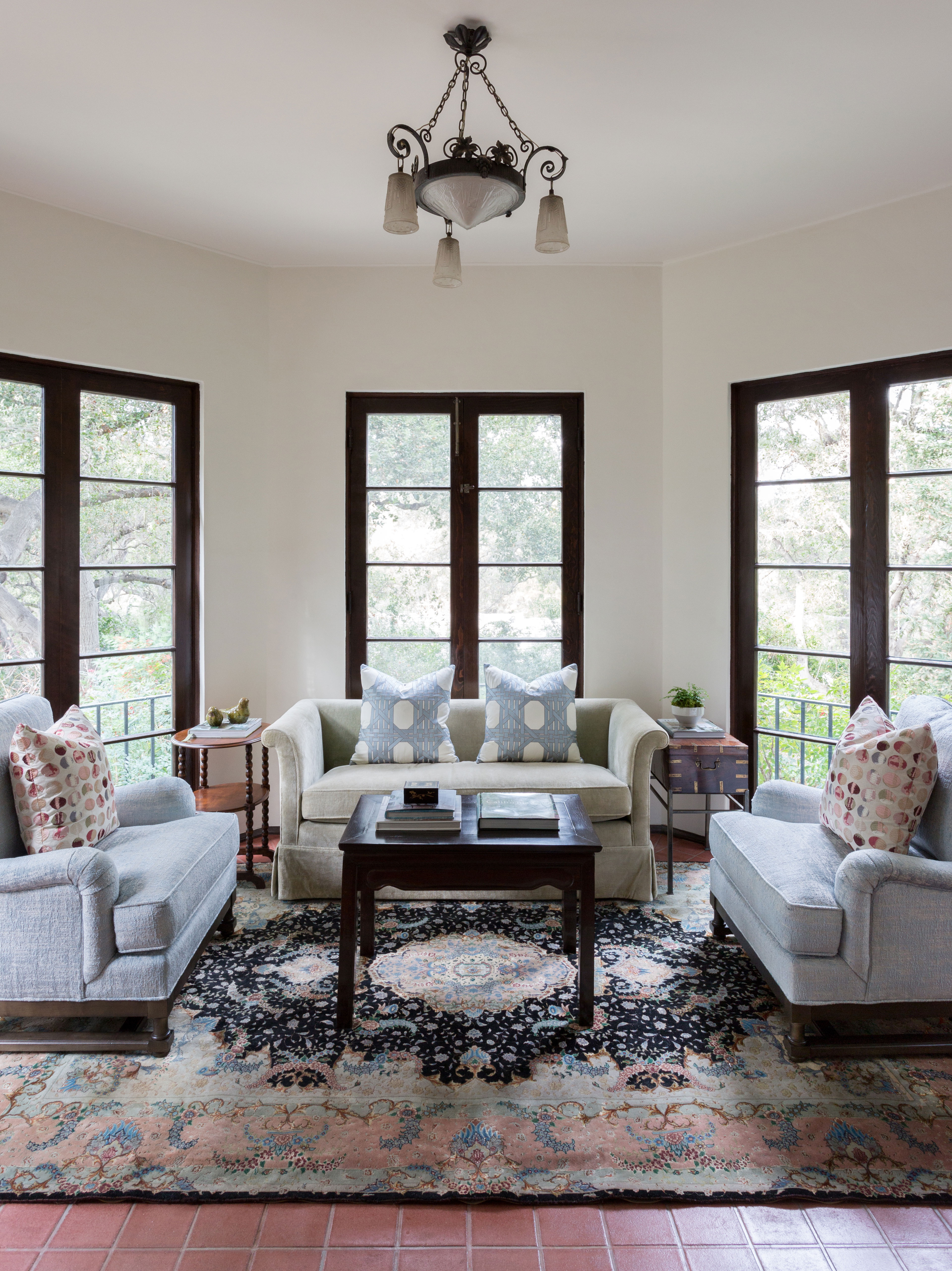
Down some steps from the living room is a more intimate sunroom with views of the garden. Used alongside the main space, it works well for group gatherings large and small.
This sunken area off the living room has plenty of garden room ideas worth copying, with its angled walls and windows all round offering breathtaking views of the oak trees that surround the property. 'We didn’t fully appreciate them until we removed the old drapes around the windows,' says Courtney.
WIth fresh linen-colored paint and brighter, refinished terracotta floors, the light stays in this room long after the trees block the sun out. New club chairs from Wesley Hall provide another reason to linger.
4. Making more of an entrance
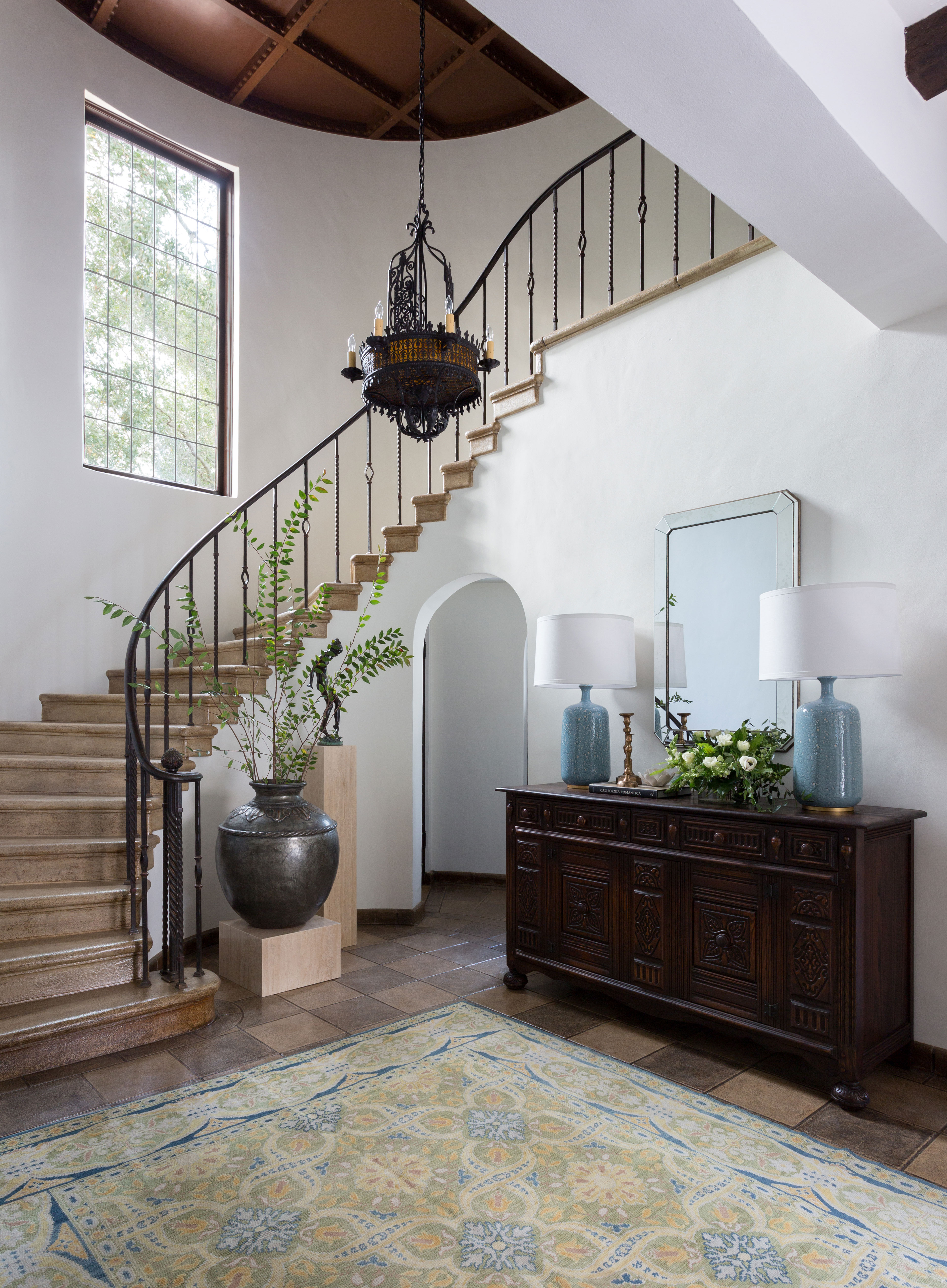
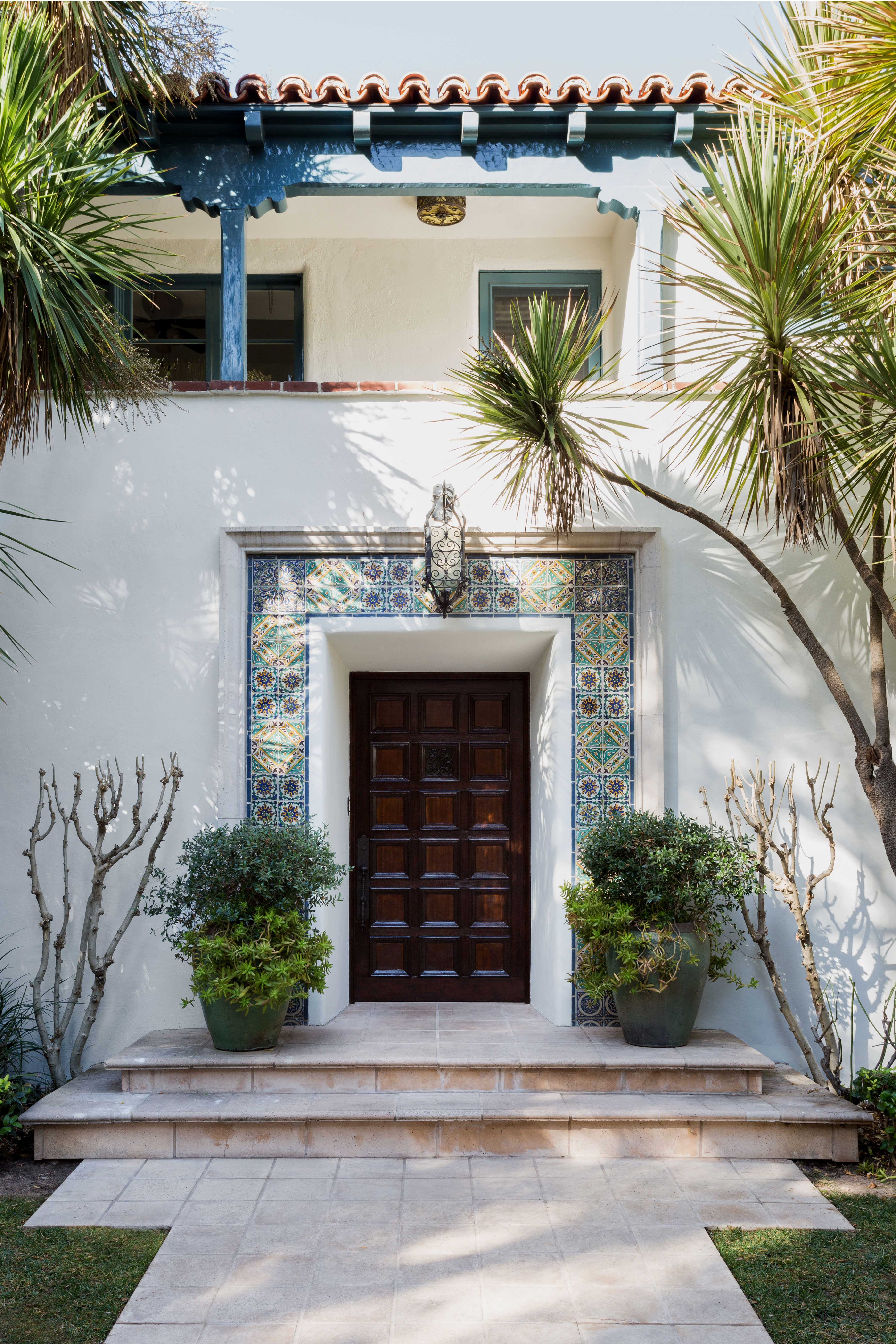
The reworked front entry hall sets the tone for the sympathetic updates Courtney has completed elsewhere in the home. White walls reflect light around the hallway, and provide a contrast with its beautifully detailed wood-paneled ceiling. An antique Alcaraz rug in light tones provides a welcome to visitors. While a Spanish Revival carved sideboard adds history and warmth to the cooler finishes of the stained concrete floor and grand staircase.
Among the inspiring hallway ideas here, is the use of well curated antiques to complement and highlight the home's original features and, in the case of this hallway, reflect the focus back onto the characterful front door and entrance.
The sideboard and ceiling light are from Revival Antiques in Pasadena. The Alcaraz rug was a 1stDibs find. The lamps are from Hollis Pasadena.
5. Family room with adjoining office
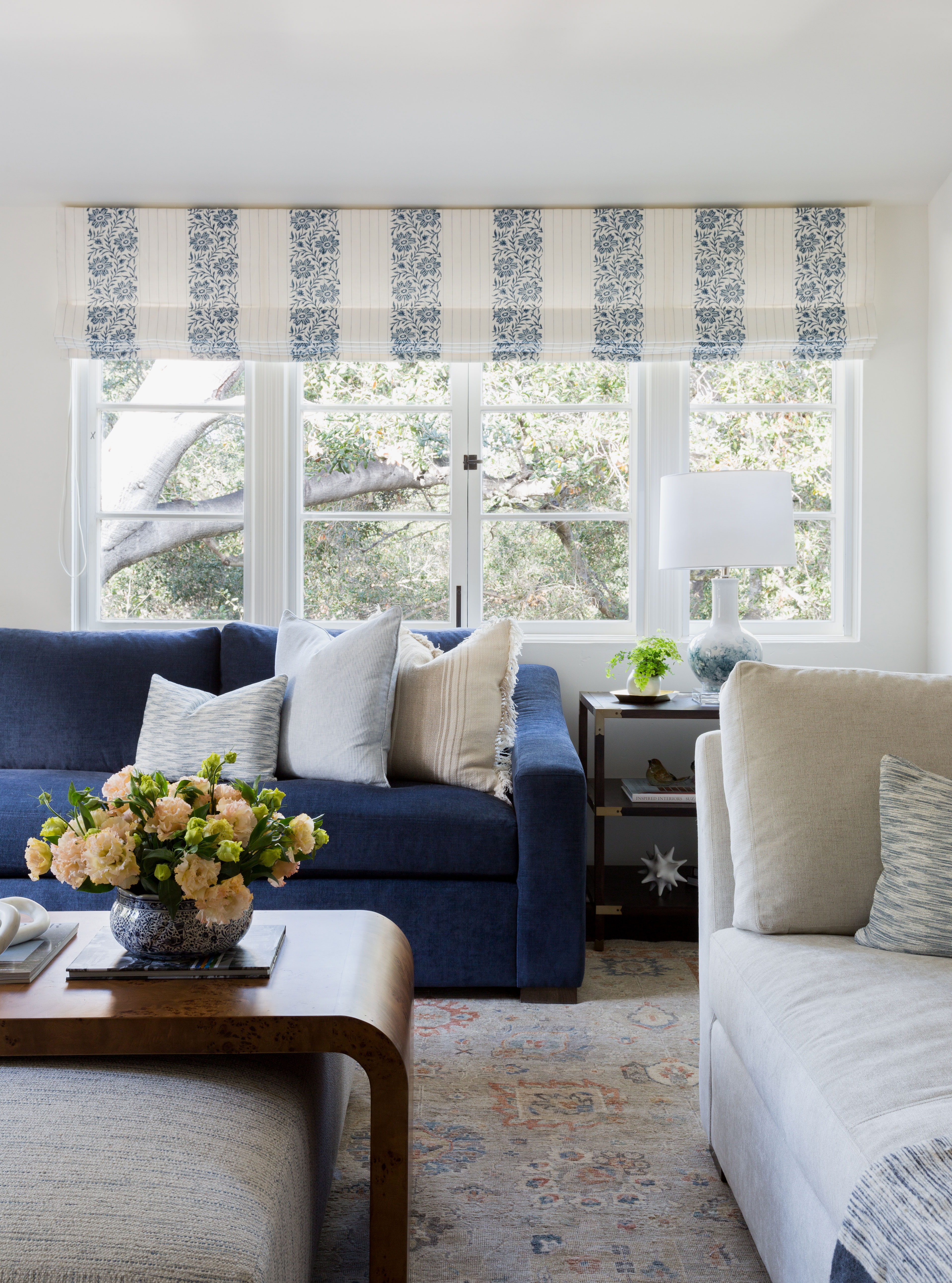
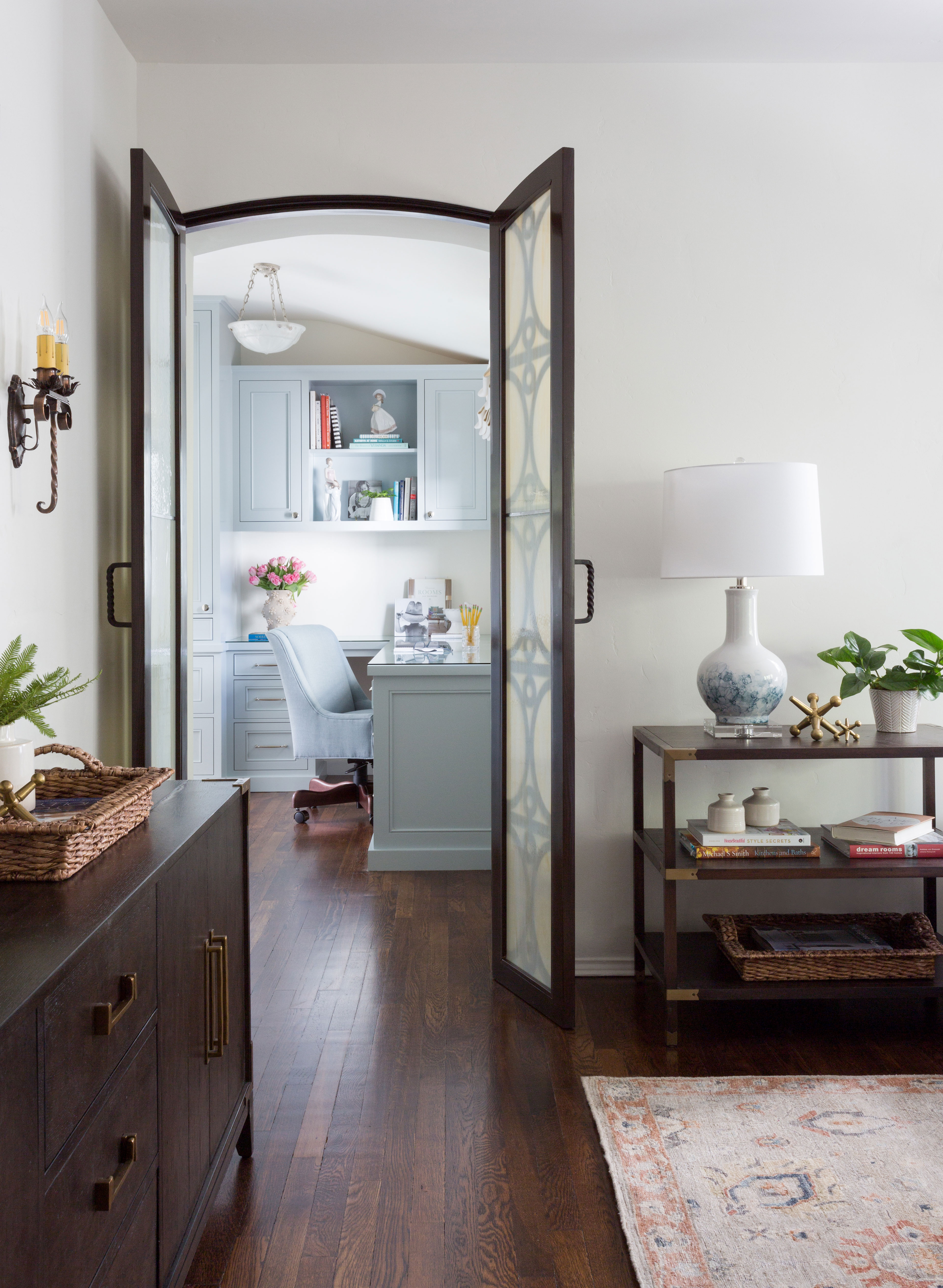
The family wanted an informal upstairs space for lounging, movie nights and Laker games. Courtney showed them that this former bedroom with a dressing area and bathroom could be made to work perfectly. It is now where the family spends most of their time together. The former dressing room (pictured below) became a home office for the mom to finish tasks while still feeling a part of the family’s conversations. Not everyone looking for home office ideas would want to work with a view of the rest of the family taking things easy, but it works well in this house!
The interior styling here has a more contemporary edge than the rest of the home. However, subtle details – including the ottoman, rug, sconces, and dark wood sideboard – refer back to the traditional style and original features elsewhere.
The sofas are from Wesley Hall, in Schumacher fabric. The Roman shade fabric is Cowtan & Tout. The Waterfall table over the ottoman is from Global Views; the table lamps are from Currey & Company; and the sconces are from Revival Antiques.
6. A touch of Jazz Age luxury for the powder room
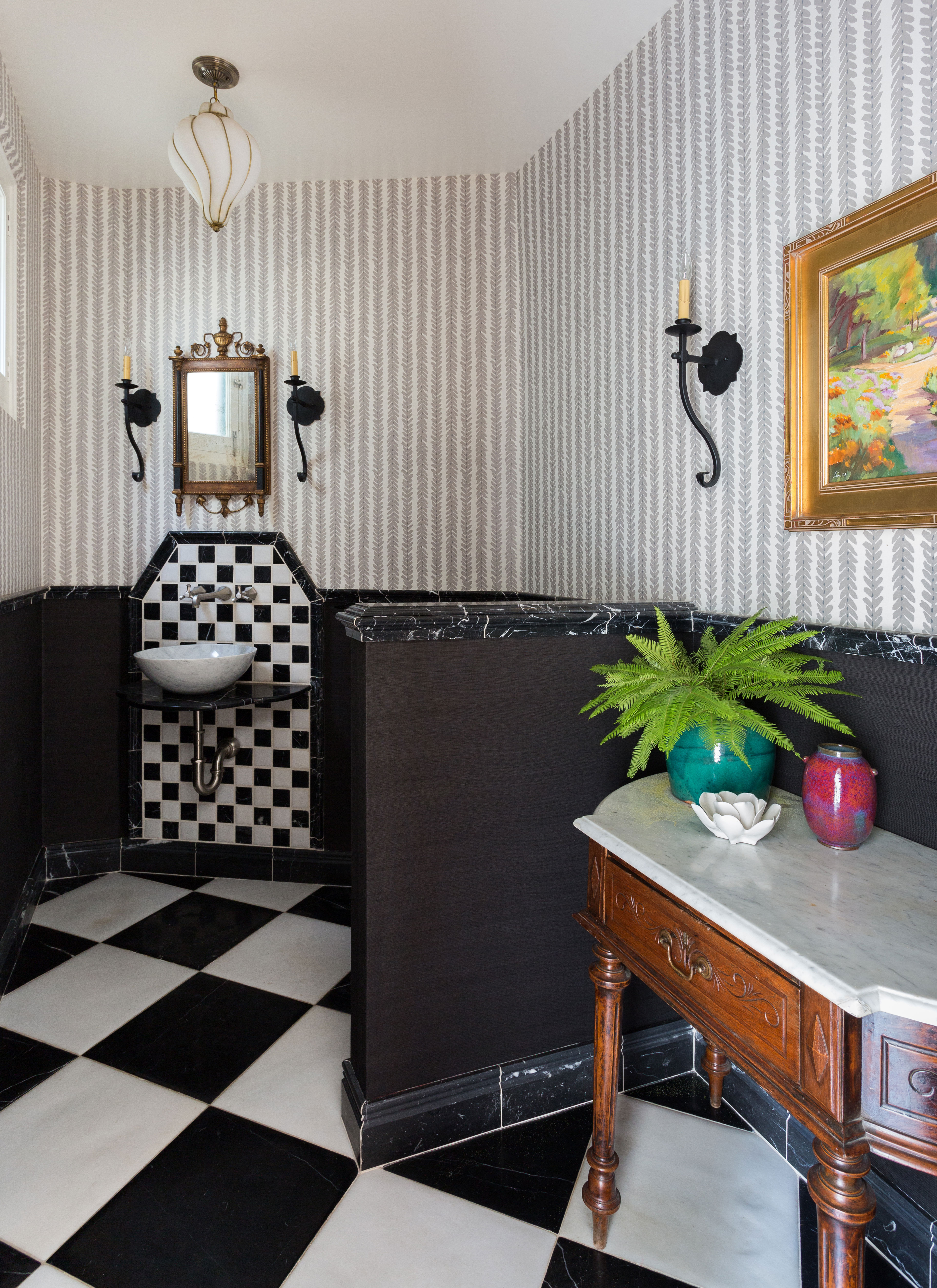
This downstairs room contained some good powder room ideas and strong existing features that Courtney and the clients were keen to preserve. 'We wanted to highlight the pillowed marble floors, vanity backsplash and the milk glass pendants,' she says.
So sticking with the traditional glamor of the existing room, Courtney made a few changes to freshen the look. One striking new addition is the Schumacher wallpaper above the chair rail, that replaced the original marbleized paint. Shortening the height of the original pony wall from seven feet down to its existing four has opened up the room and given the illusion of more space. The new marble bowl is from Stone Forest and the wall sconces are from Hans Duus
7. Sourcing key one-off pieces for a one-off home
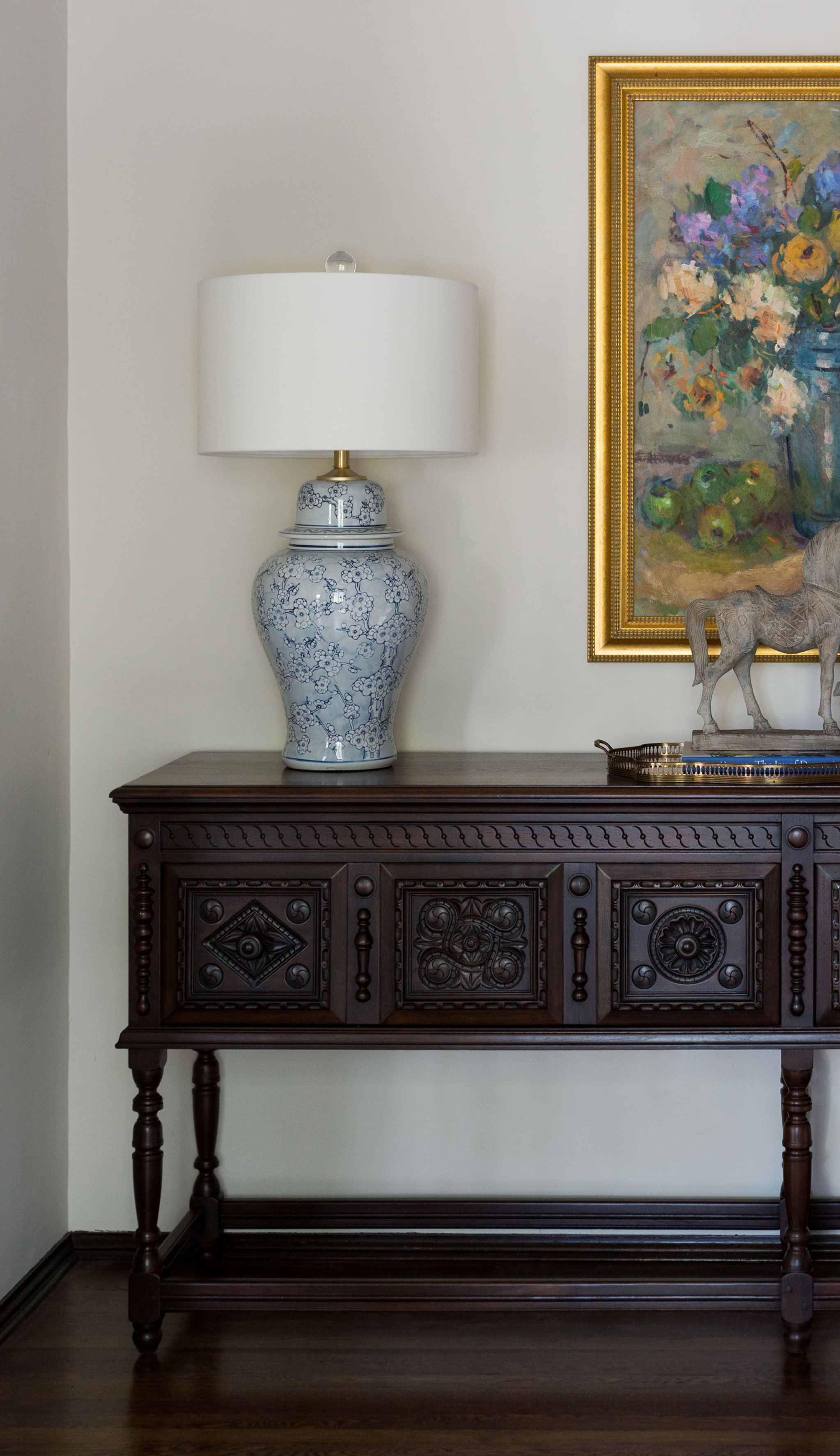
Designer Courtney Thomas took time to research and source the perfect standout pieces for this unusual home. Knowing that her clients were fascinated by home's history and liked to be surrounded by furniture with provenance, she knew they would be prepared to wait until the right things came along.
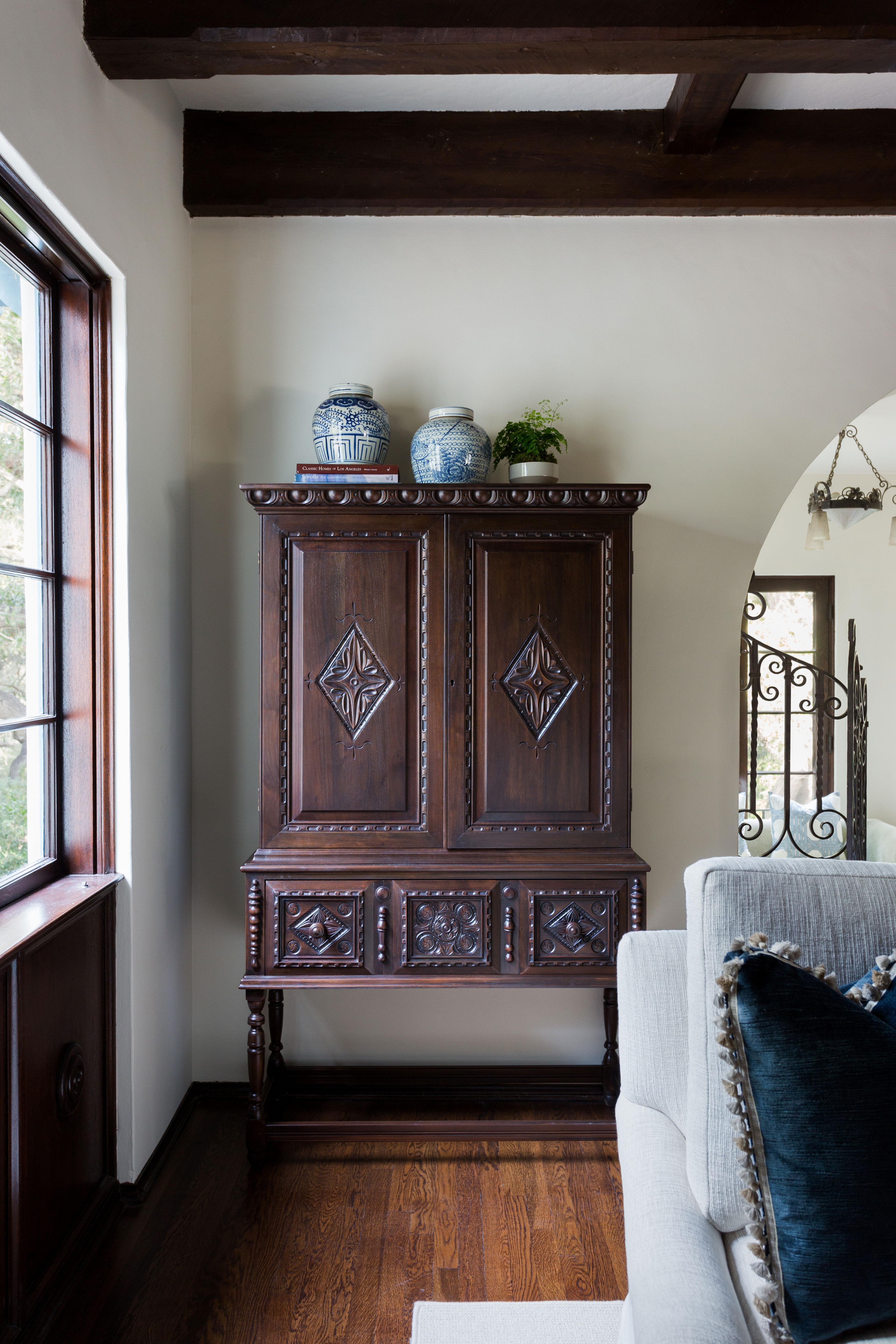
The living room's carved sideboard (above) and the armoire (below), both from Revival Antques, are perfect examples of how Courtney's choices and updates actually brought the house closer to its origins and enhanced its period features, all the while introducing a fresher, more contemporary look.
This is exactly what the clients had asked for in their initial brief and for anyone approaching a renovation it's a great lesson in how to bring an old home up to date without compromising its historic integrity.
Sign up to the Homes & Gardens newsletter
Design expertise in your inbox – from inspiring decorating ideas and beautiful celebrity homes to practical gardening advice and shopping round-ups.
Karen sources beautiful homes to feature on the Homes & Gardens website. She loves visiting historic houses in particular and working with photographers to capture all shapes and sizes of properties. Karen began her career as a sub-editor at Hi-Fi News and Record Review magazine. Her move to women’s magazines came soon after, in the shape of Living magazine, which covered cookery, fashion, beauty, homes and gardening. From Living Karen moved to Ideal Home magazine, where as deputy chief sub, then chief sub, she started to really take an interest in properties, architecture, interior design and gardening.
-
 Gwyneth Paltrow's quiet luxury kitchen is so beautiful, we almost overlooked her ultra-smart cabinets – they make the use of 'every inch' of storage space
The Goop founder makes use of dead space in her kitchen with customized cabinetry that reaches to the ceiling, providing ample storage
By Hannah Ziegler
-
 Martha Stewart's intelligent cabinets 'take every inch into consideration' – their 'visually light' style will solve your small kitchen storage problems
'Every kitchen can be beautiful and functional, no matter what the size': 9 years since sharing her clever storage, Martha's cabinets are just as beautiful
By Megan Slack