How to revamp a house without building or remodeling – this LA home's interior refresh gets it just right
This tired 1960s home was ready for an interiors rethink. Now carefully curated furniture and furnishings make it shine
This four-bedroom family home is in the Los Angeles district of Mandeville Canyon, nestled up in the hills of the Santa Monica mountains. While its new owners couldn't fault the location, in a peaceful neighborhood with nature hikes and beautiful scenery all around, they felt the home's interior design could do with a helping hand.
That's where interior designer Alexis Manfer came in. The couple asked her to plan and oversee a top-to-bottom refresh of the whole property.
'They needed the house to function as a gathering space for friends and family and have enough beds for out-of-town family to spend the night as needed,' says designer Alexis Manfer. 'They wanted to be able to entertain large dinner parties (indoor and out), and hoped for a beautiful home that could withstand the liveliness of their three energetic young boys. They asked us to capture their personality with the interior design as they felt the existing staged furniture and décor was too cold and minimal. They wanted the home to feel inviting and stylish.'
Giving the home a whole new look, without rebuilding or remodelling? That may sound like a big ask, but as designer Alexis Manfer explains, it was all about leaning into the home's existing architecture and taking inspiration from the natural world outside.
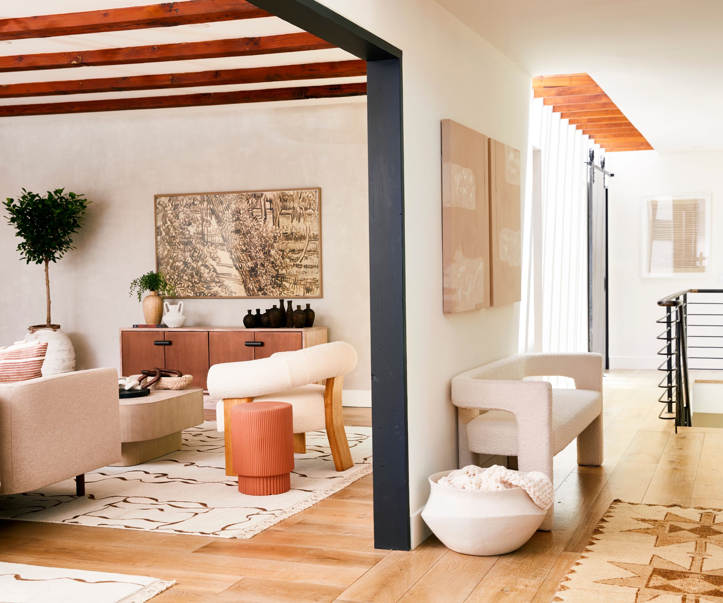
The hallway ideas for this entry space come from what designer Alexis says was a 'Mexico vibe with the gorgeous natural light, wood beams, and the iron stair rail. The soft curves of the settee soften the metal stair rail. The neutral color palette feels warm and cozy, and there are fun shapes in the art and entry runner rug.'
Because the entrance is open to the living room, through a large archway opening, there's a continuation in the palette of warm neutrals to further harmonize the two spaces.
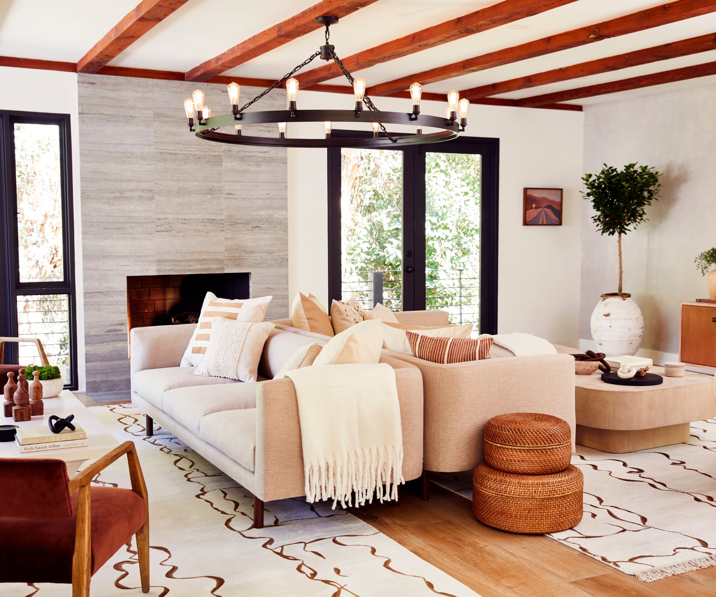
Alexis Manfer's living room ideas have made a dramatic difference to the room, which was tired, dated and empty when she first set eyes on it. Now reworked, it's almost unrecognizable.
'It's definitely my favorite space in the home,' she says. 'It’s ginormous and I immediately thought of making this like a cool hotel lobby seating area. When I first walked into the home, it was staged with minimal furniture: two tiny sofas and a coffee table in the living room. There was so much unused space. I wanted this massive room to feel like an inviting boutique hotel lobby with multiple seating areas and functions.'
So she split the room into two main seating areas by placing two oversized area rugs to divide up the room, and two sofas back to back. One side is a more formal sitting lounge to enjoy cocktails and conversation while the other is a comfy lounge space with a large sectional facing the TV.
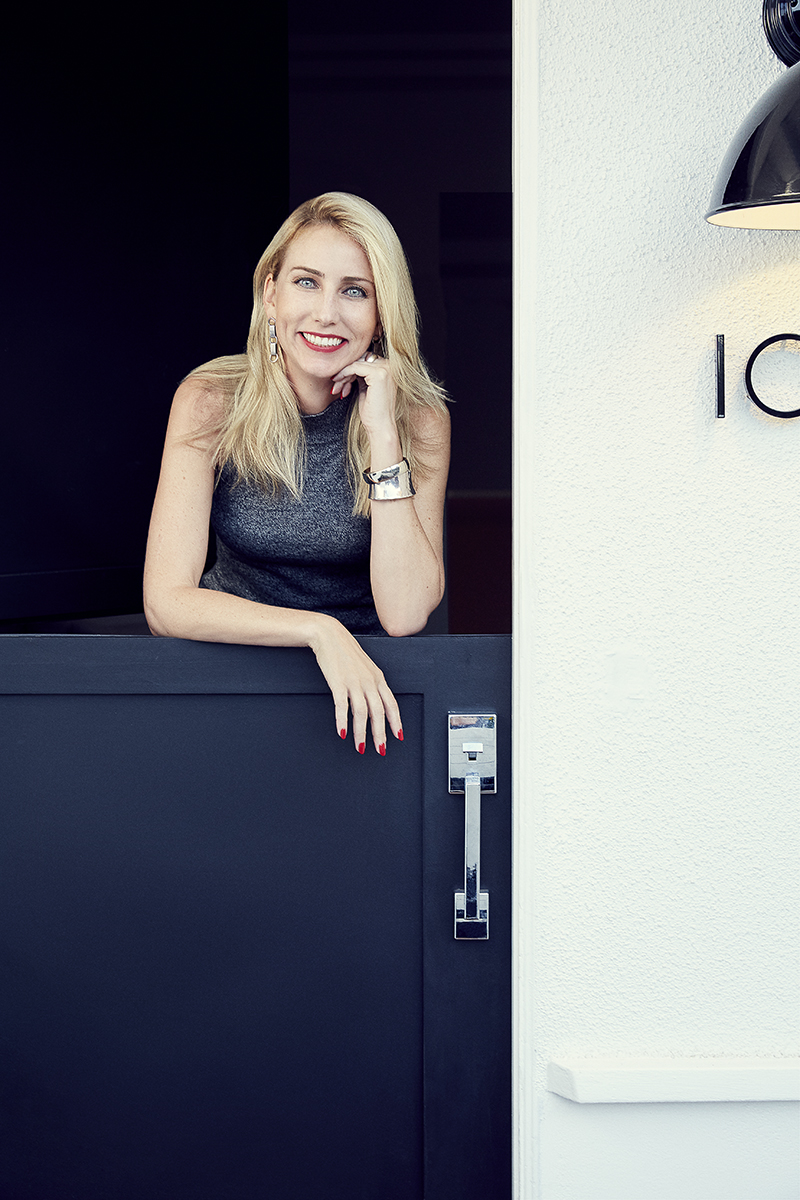
Interior designer Alexis Manfer has established a reputation for producing one-of-a-kind, unforgettable interiors with original concepts, materials, and furnishings. Having lived in San Francisco, Los Angeles, New York City, and Orange County, Alexis brings her worldly experiences to the art of designing notable interiors for a wide variety of clients.
Opening her own firm in 2011, Alexis is recognized as an expert in interior design for residential and commercial projects. Her passion produces unforgettable designs with timeless taste and attention to detail.
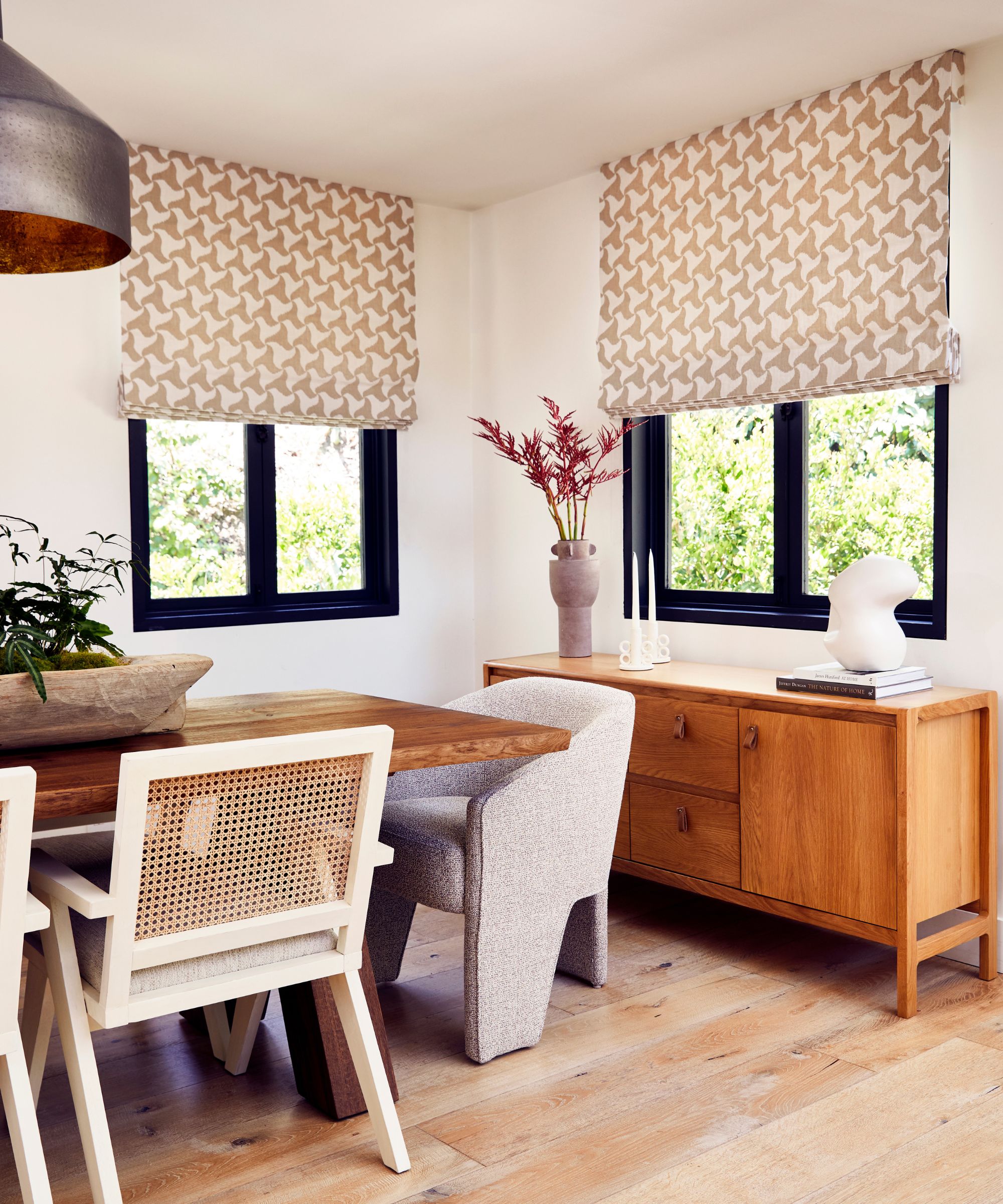
At the heart of designer Alexis Manfer's dining room ideas was a huge 138" oak dining table, to accommodate many guests. 'Head of table we featured soft curved chairs to break up the linear chairs,' she says, 'C&C Milano swirl window treatments add whimsy and the incredible plant center piece was custom designed by The Plant Daddies, to bring the outdoors in. Cane detail on the chairs layers on another organic texture.'
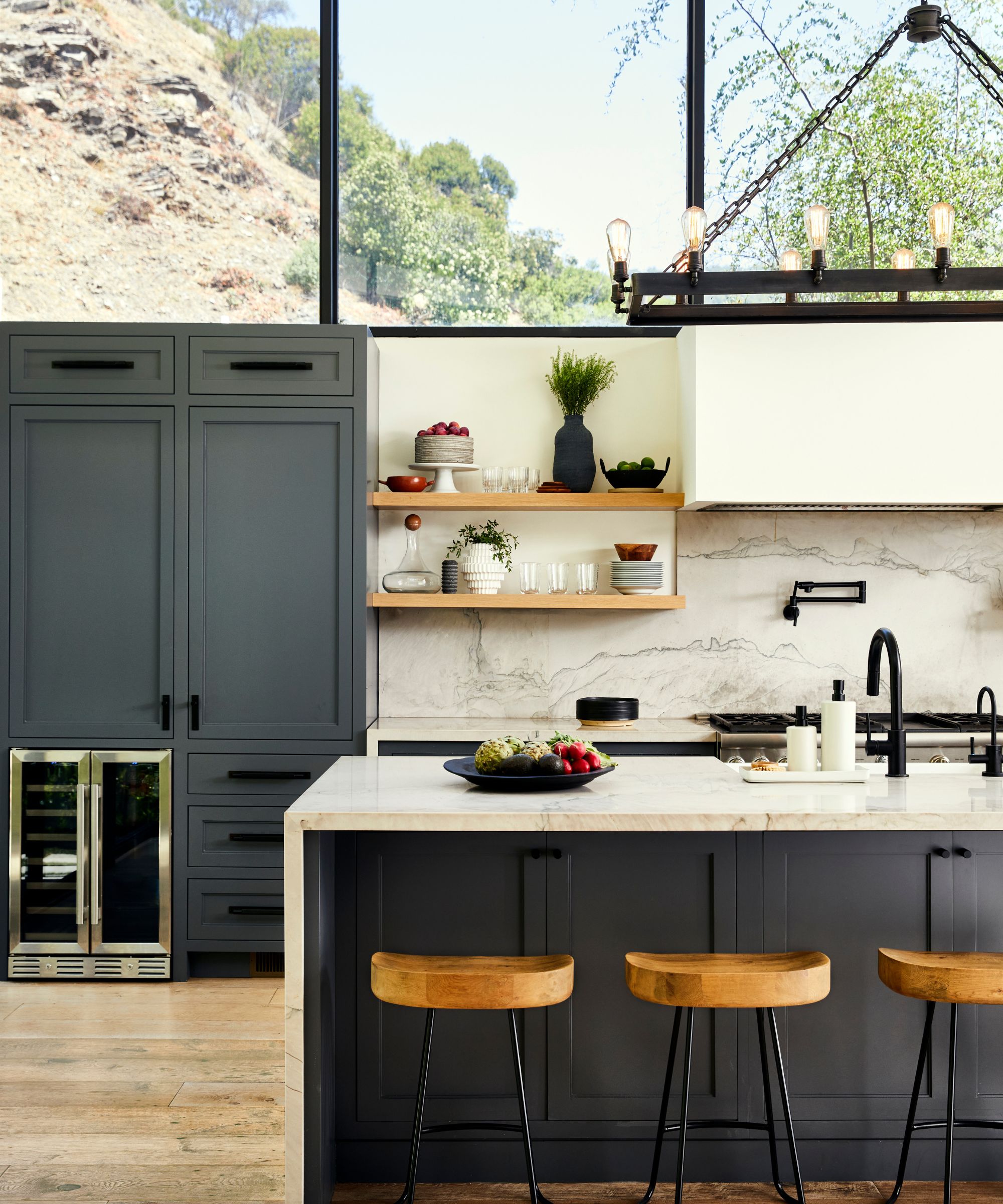
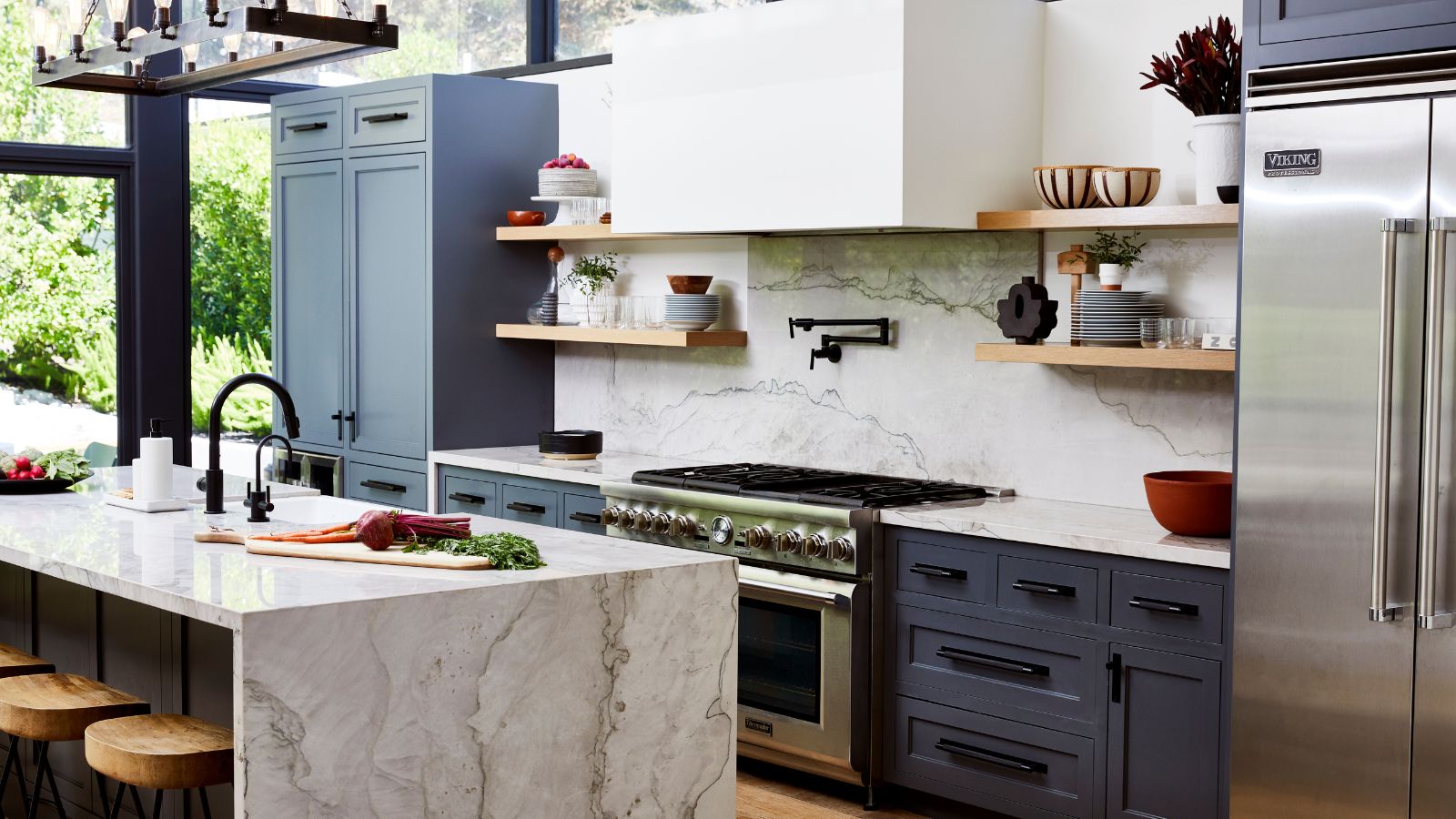
By far the most striking architectural feature of this 1960s-built home is the kitchen, with full-height glazing to one side and high windows above the cabinets in the working section of the room. The result is a bright, sunny room that truly feels at one with the mountain landscape.
Talking about her kitchen ideas, designer Alexis Manfer says: 'It's all about the views. The spectacular windows above the range wall frame the space perfectly. We layered lots of uniquely shaped décor on the open shelves to add some interest and juxtapose the industrial elements.'
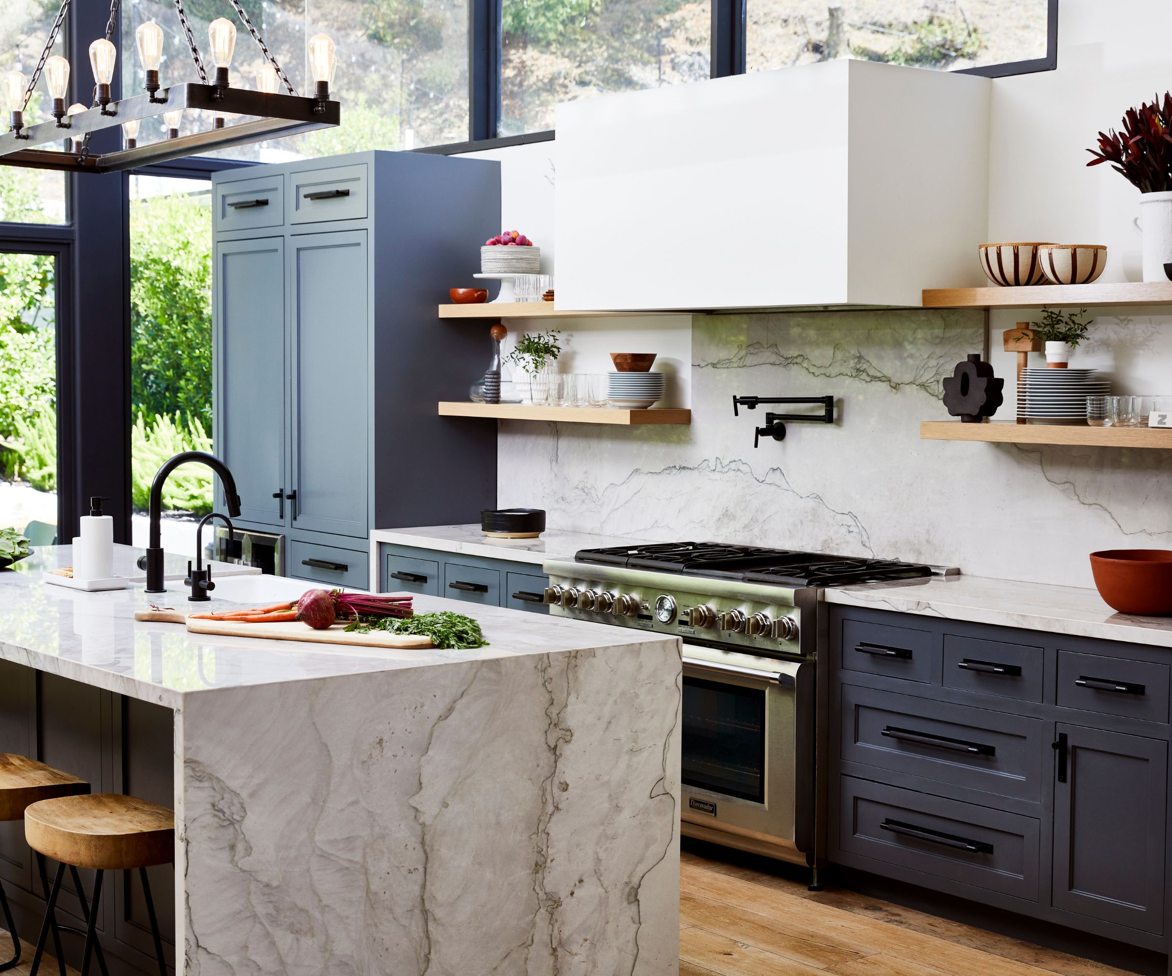
Kitchen equipment includes a full size range cooker, induction hob, wine fridge and plenty of food preparation space, perfect for entertaining. To the left of the picture, the full-height glazing includes doors onto a wrap-around balcony.
'The home's existing architecture had spectacular walls of glass providing backdrops of nature and greenery, the skylights let in radiant light throughout, the wraparound balcony, and the wood ceiling beams throughout. We wanted to accentuate these natural elements by bringing in shapes and colors that are found in nature,' adds the designer, who kept this in mind not only in the kitchen but throughout the house.
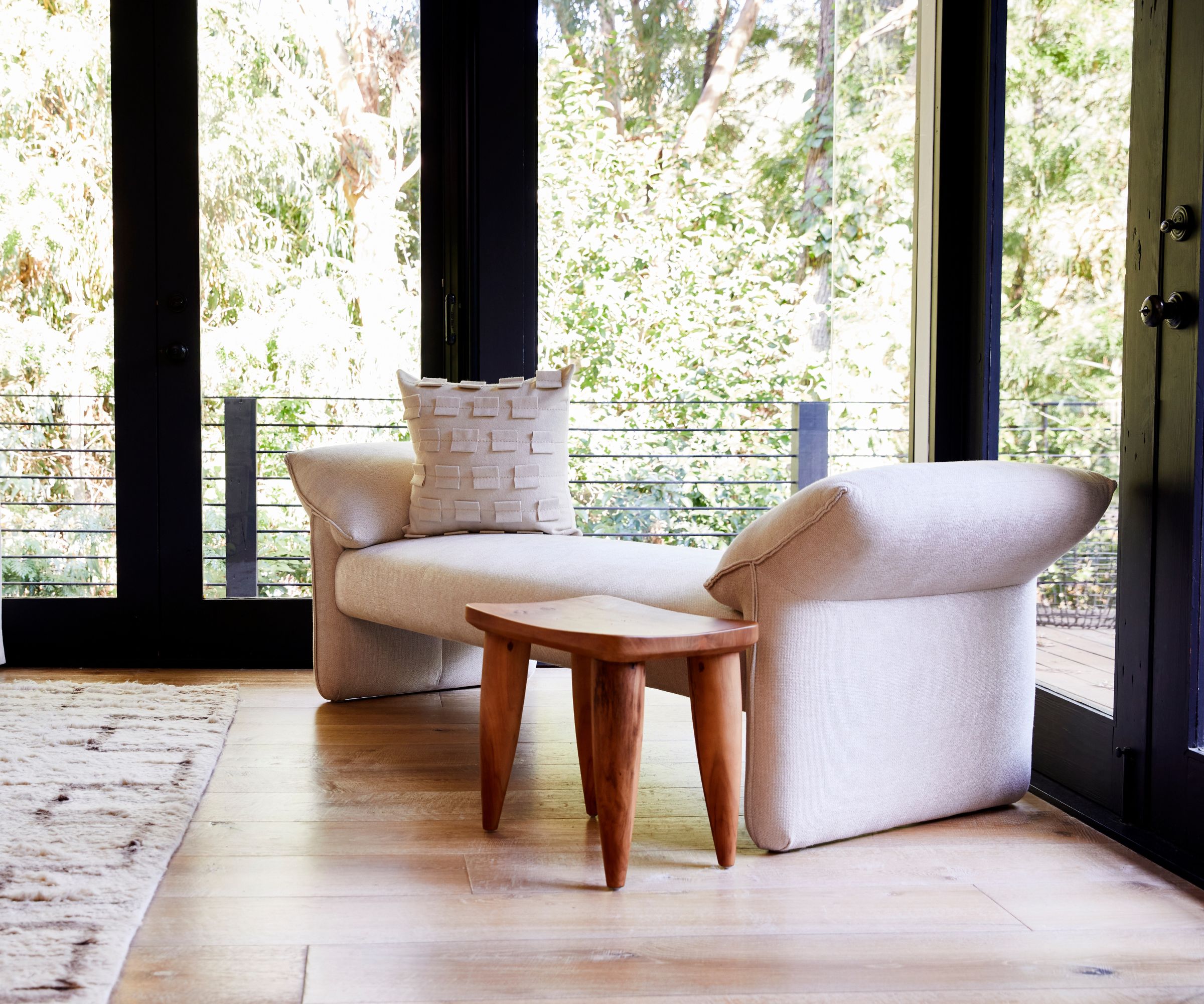
'The clients asked us to warm-up the home and make it feel comfortable while still being beautiful,' says designer Alexis Manfer, so as she considered her bedroom ideas she decided to add in an inviting uphostered bench seat. This really softens the architectural look of the steel framed glazing here in the main bedroom. The rug is from Lulu & Georgia.
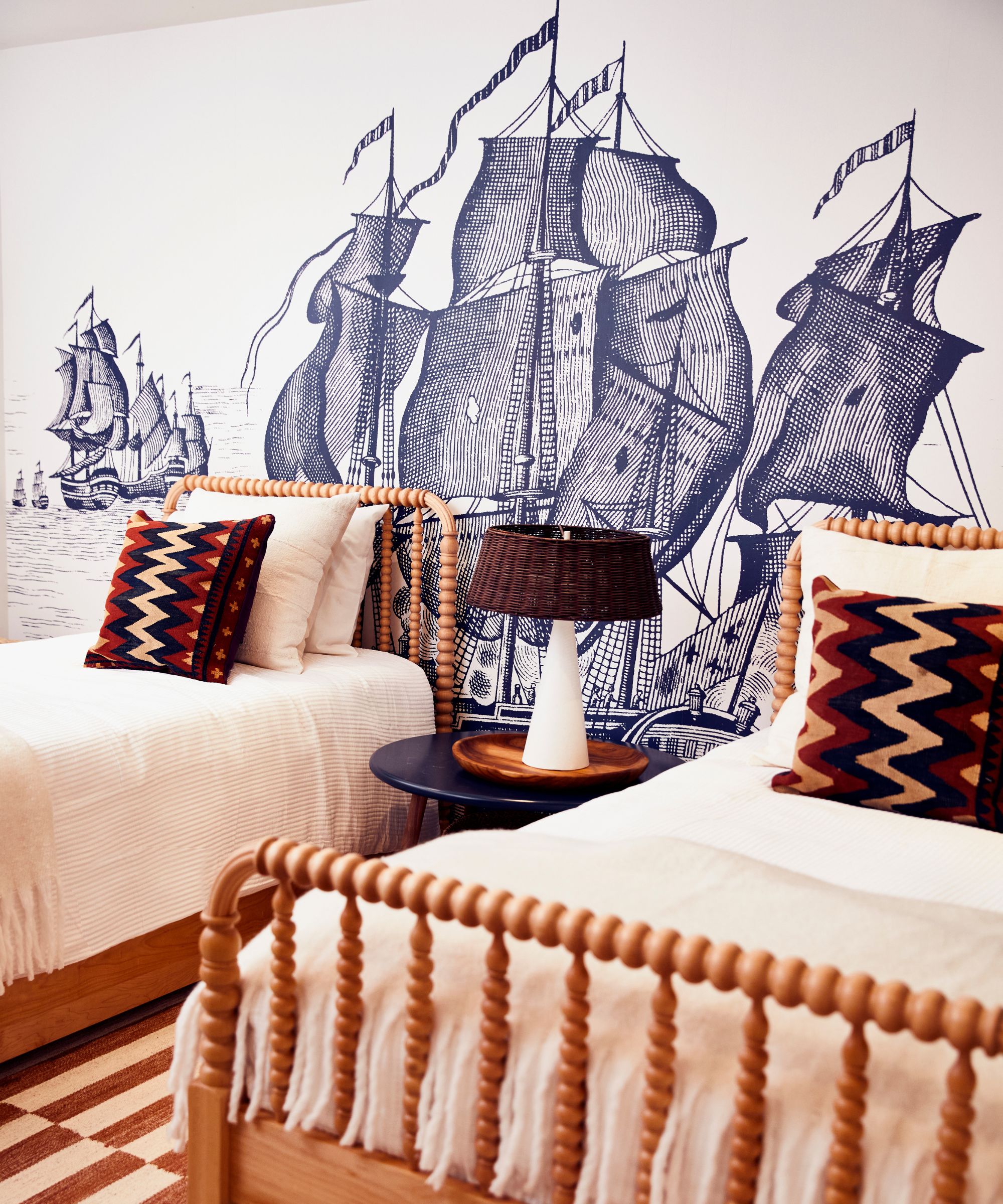
Besides creating space for family and friends to stay over, the owners were keen to make sure the children had distinctive and appealing bedrooms. This room is another favorite of designer Alexis Manfer's.
'The wallpaper was an addition that brought so much life to the space that two young boys would be sharing. The room had originally been decorated for a baby girl so we wanted to make sure the boys felt special and proud of their new bedroom,' she says. 'We found a fun nautical wall mural wallpaper from European supplier Rebel Walls. It was custom designed based on the size of the wall and brings tons of depth and interest to an otherwise flat wall. The boys love it!'
'The clients were stunned by the transformation of the whole home,' says designer Alexis Manfer, 'and amazed by how well everything came together. They felt the design was inviting and cozy and said we captured their personalities perfectly, which was our number one goal!'
Interior design: Alexis Manfer Inc
Photographs: Christopher Patey
Sign up to the Homes & Gardens newsletter
Design expertise in your inbox – from inspiring decorating ideas and beautiful celebrity homes to practical gardening advice and shopping round-ups.
Karen sources beautiful homes to feature on the Homes & Gardens website. She loves visiting historic houses in particular and working with photographers to capture all shapes and sizes of properties. Karen began her career as a sub-editor at Hi-Fi News and Record Review magazine. Her move to women’s magazines came soon after, in the shape of Living magazine, which covered cookery, fashion, beauty, homes and gardening. From Living Karen moved to Ideal Home magazine, where as deputy chief sub, then chief sub, she started to really take an interest in properties, architecture, interior design and gardening.
-
 Kourtney Kardashian's cloud-like chair taps into 2025's most interesting furniture trend – it has the unique ability to improve spatial flow in any room
An accent chair highlights the beauty of the natural world in the socialite's living room – experts explain why it's trending and how to recreate the look
By Sophie Edwards
-
 Little Greene paint colors in real homes – 19 rooms decorated by designers with tried and true paint shades and wallpapers
Gain fresh paint color inspiration with these timeless Little Greene shades, from rich greens to elegant neutrals
By Emily Moorman