This grand 1920s property was saved from demolition to create a luxury family home
A Mediterranean-style home in Illinois has been restored inside and out ready to face its second century in style
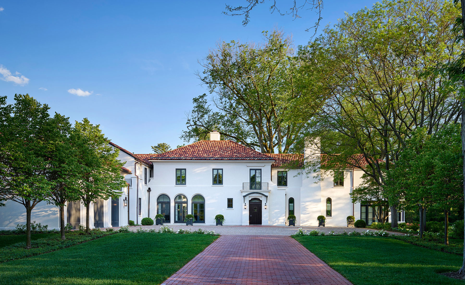
It's always sad to hear of an historic building being allowed to fall into disrepair before eventually having to be demolished. Here's a good news story, with a very happy ending.
This imposing 1920s Edwin H. Clark home on Chicago's North Shore in Winnetka, Illinois, was being marketed for sale as a tear-down. Inside it was dated, unloved and in a bad state of repair. On the exterior, the home’s original Mediterranean style was hidden by a post-modern addition that didn’t fit the aesthetic.
Luckily for this old house, one young couple who were looking for a North Shore family home recognized its potential. They started to look into how the property could be restored and updated. The results are impressive: a luxurious home that honors Clark's original architecture and moves the house on into its second century with a smile on its face and a spring in its step.
The sensitive reimagining of this important architectural gem means it is now one of the world's best homes, and a testament to thinking around a problem rather than choosing the easy 'tear down' option.
A major renovation
The couple enlisted Morgante Wilson Architects early on, to help them determine the home's renovation potential. The firm's team worked with the clients to restore the home’s original style and add new spaces through a two-storey addition. Morgante Wilson managed both the renovation and the interior design for the project. The goal was to keep the interiors modern and clean against a strong architectural backdrop and also infuse the home with its new owners’ personal style.
The design team removed the poorly executed elevations and a landscaped wall, extending the panorama of the home and highlighting its original Mediterranean Revival details. Old windows were replaced, and new sections of roof and stucco were matched to the original for a seamless transition between old and new.
The interiors were updated throughout with features and a design that matched the homeowners’ more modern aesthetic, but with nods to the home’s elegant and traditional style. The kitchen and bathrooms are detailed so they look like they could have been part of the original, but all furnishings are more contemporary.
Kitchen in keeping with the original architecture
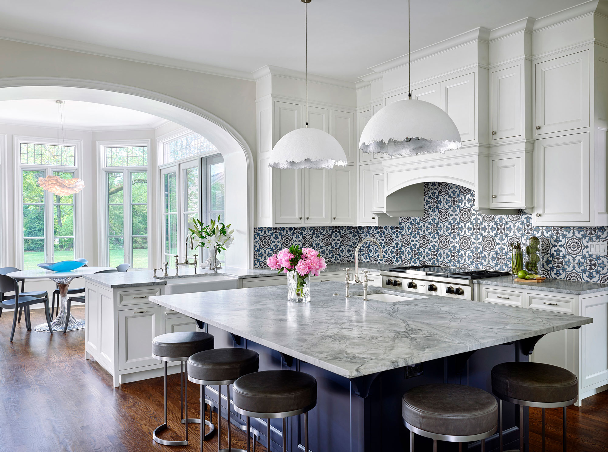
The home’s original kitchen had been through multiple renovations, resulting in an awkward layout and circulation.
Morgante Wilson opened up the space and anyone looking for kitchen ideas will find inspiration in the reworked kitchen. Graceful arches, kinetic light fixtures and a colorful painted ceramic backdrop were all added to echo the home's original aesthetic. Anchoring the room is a dramatic island.
'The clients wanted to preserve and embrace the home’s original architecture and style, but ultimately they also wanted to meld the home’s unique original elements with the latest features and conveniences that go into a modern family home,' explains Fred Wilson, co-founding partner of Morgante Wilson Architects.
The dome pendants are Catellani & Smith via Lightology.
The breakfast nook
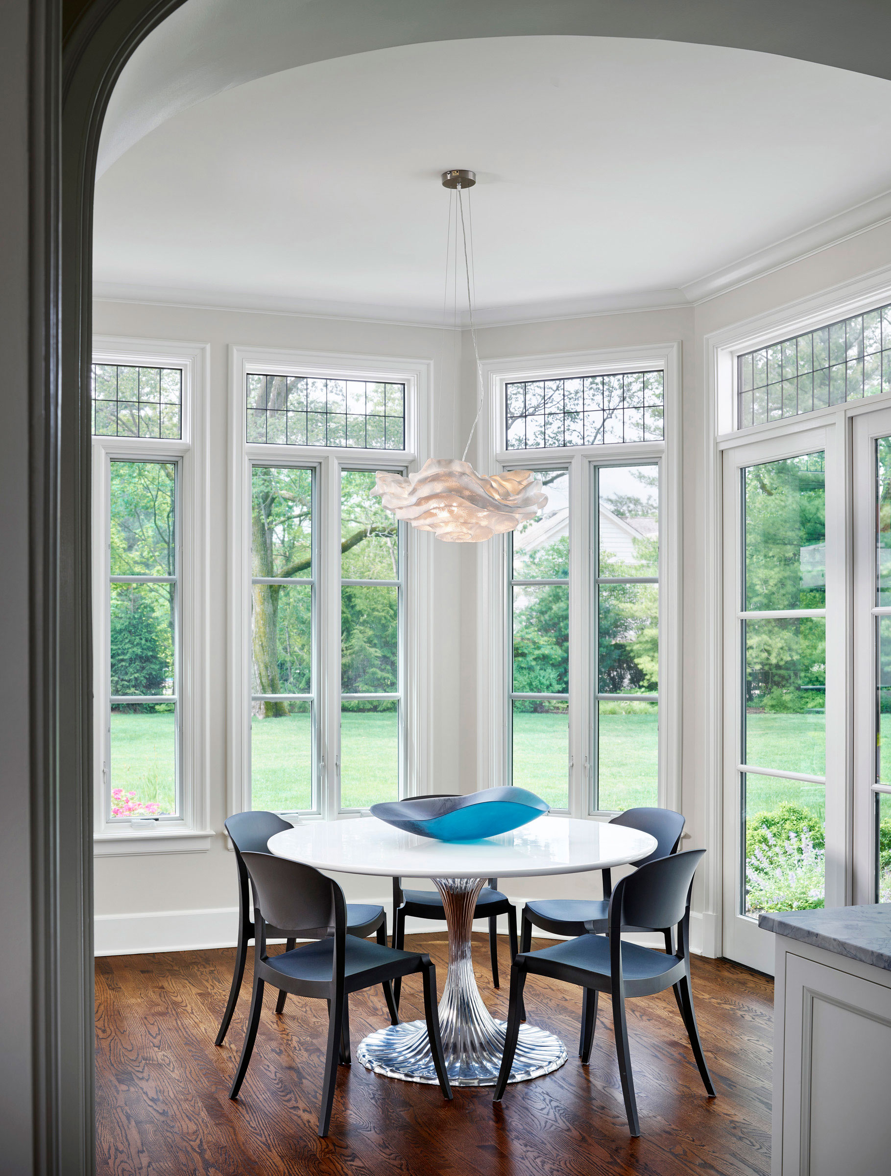
The kitchen opens to the breakfast room, with windows on three sides letting the views of the yard into the center of the home. The breakfast room table is by Oly and is paired with Janus et Cie outdoor chairs. An Arturo Alvarez pendant offers a sculptural light source.
Hallway with classical style
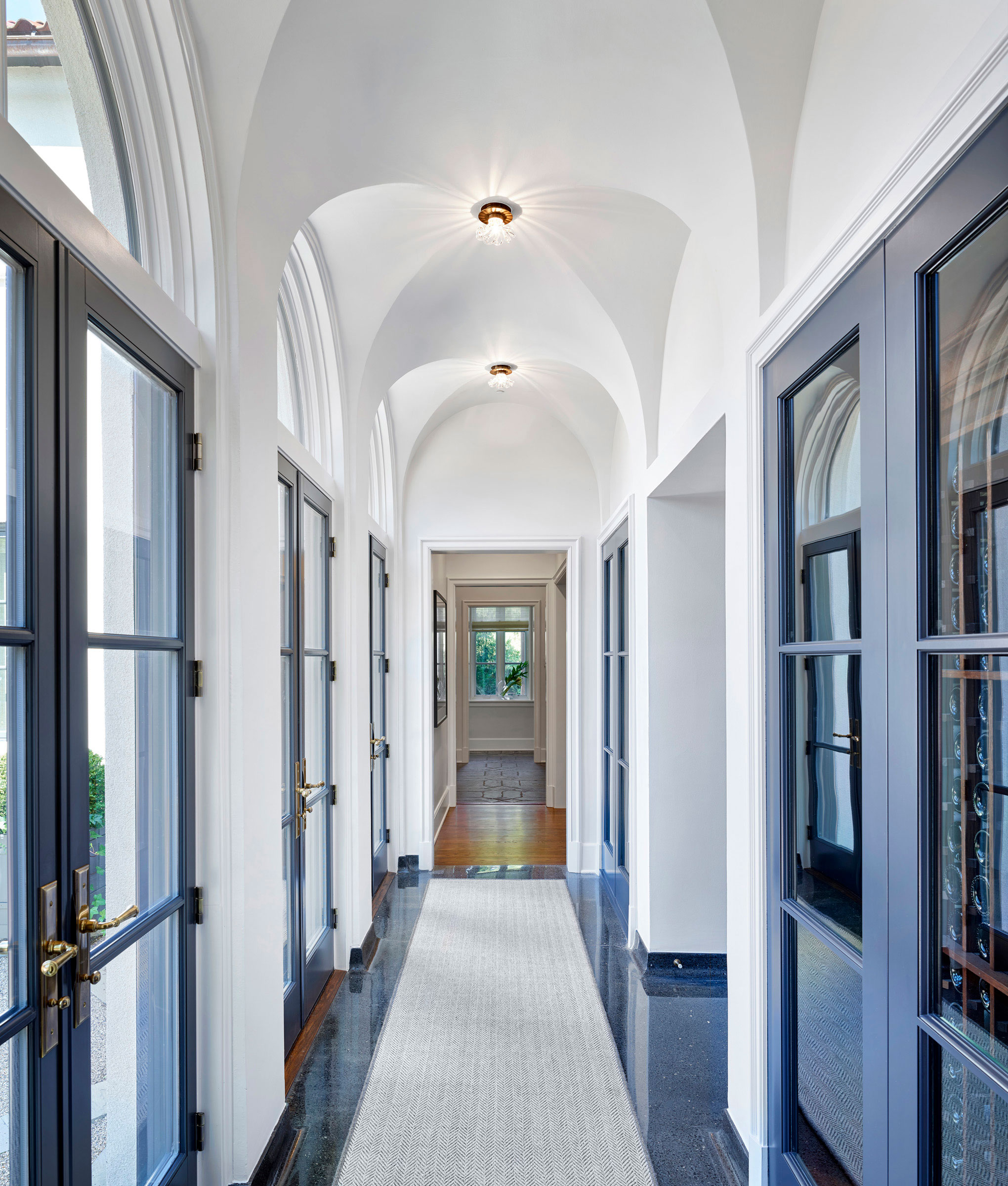
A somewhat dingy front service service corridor between the kitchen, dining room and front entry has been remodeled – classical style. 'This is one of the transformations the team was most proud of,' says Fred Wilson. 'We reworked the space to create a dynamic loggia and focal entry point. The original soaring groin vaults were obscured by retro-fitted louvered doors. We restored the groin vaults and extended them, ultimately doubling the length of the hallway.'
Other hallway ideas include increasing the floorspace by replacing badly sited radiators with hydronic underfloor heat, and restoring the original terrazzo floor to its original luster, with restored Art Deco baseboard profiles.
One particularly clever design element of the new hallway was turning a pair of existing closets into double-sided wine cabinets, which can also be accessed from the home's formal dining room.
Study with traditional library styling
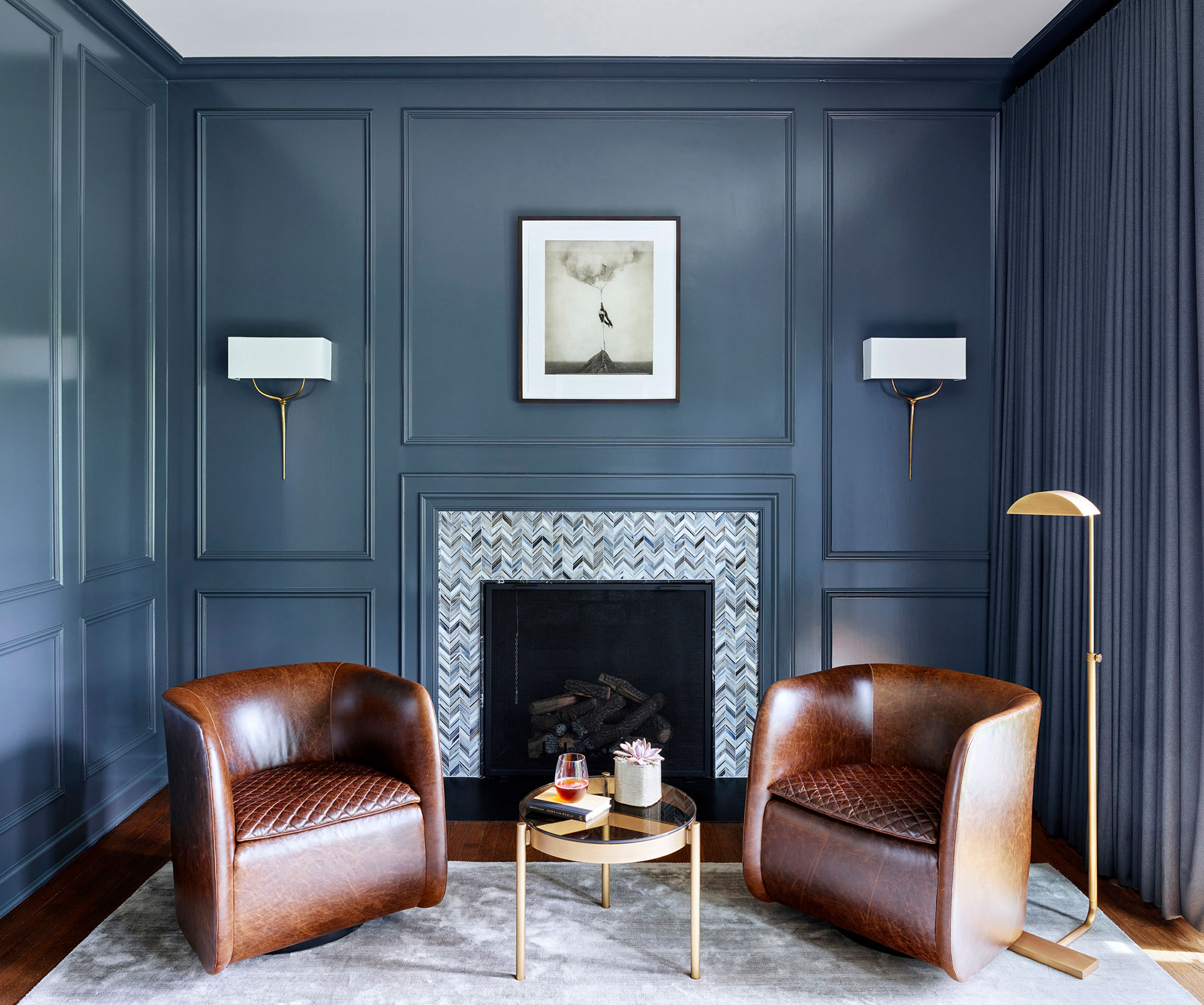
A dark study was re-imagined as a sophisticated library, The fireplace was given a contemporary feel with a mosaic tile surround. Bright swivel chairs flank the fireplace and sconces by Christopher Guy offer gentle light.
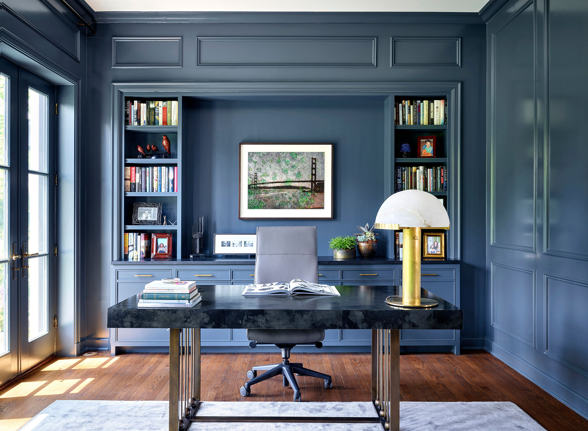
As the clients considered their home office ideas, one factor – good lighting – emerged as more important than anything else. It was decided to replace existing windows with French doors to increase the natural light. The room's original paneling was restored and painted a saturated blue. The room is completed with an antique brass desk from Julian Chichester and Visual Comfort lamp.
Paneled living room gets a refresh
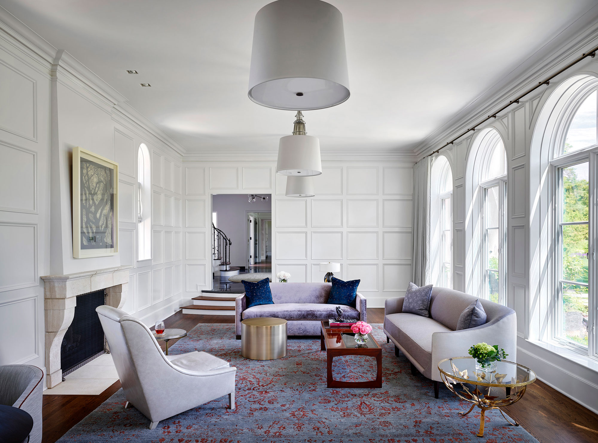
In the formal living room, the look is calm, sophisticated and uncluttered. One of the brightest (literally) living room ideas here, was to paint over the room's original oak paneling. This gave the living room a brighter, more contemporary feel. Some might consider this a step too far, but if your home's period features seem dark and dated, and don't suit your style refreshing them with paint is a good compromise.
A rich grey and ruby Organic Looms rug anchors a leather Ochre chair and George Smith sofa in Kravet fabrics. The furthest sofa was reupholstered in a mink Rodolph velvet, and the room is finished with Barovier & Toso sculptural glass fixtures.
Dining room mixes old and new
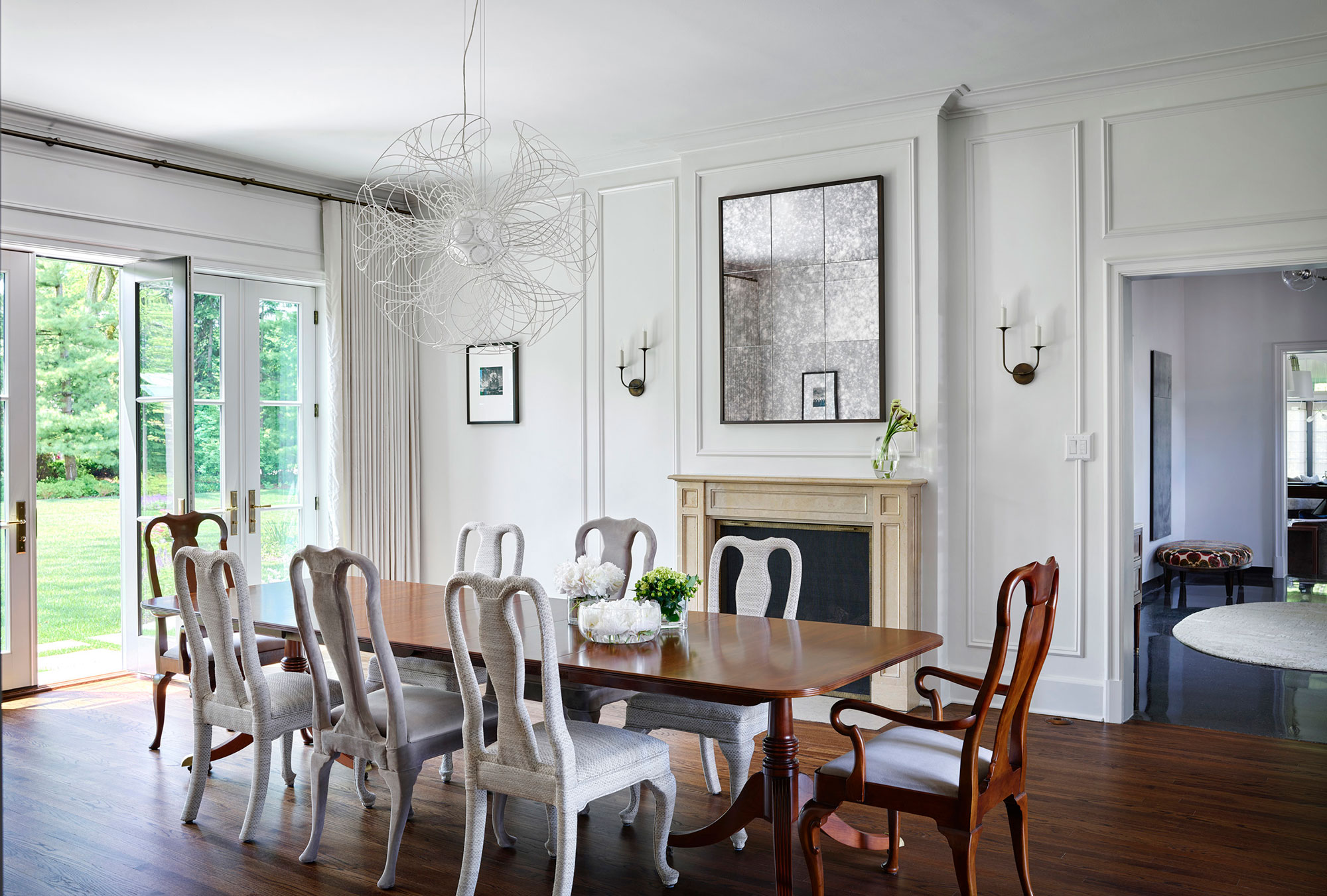
If you're looking for dining room ideas, this space cleverly showcases how to combine old and new. At the heart is a vintage Baker dining table, head chairs that belonged to the homeowner’s grandmother, and reupholstered side chairs by Eurocraft Furniture in Holly Hunt fabric to give a modern edge. The space is completed with restored plaster cove molding, new panel molding, restored fireplace and a striking contemporary chandelier.
Primary bedroom
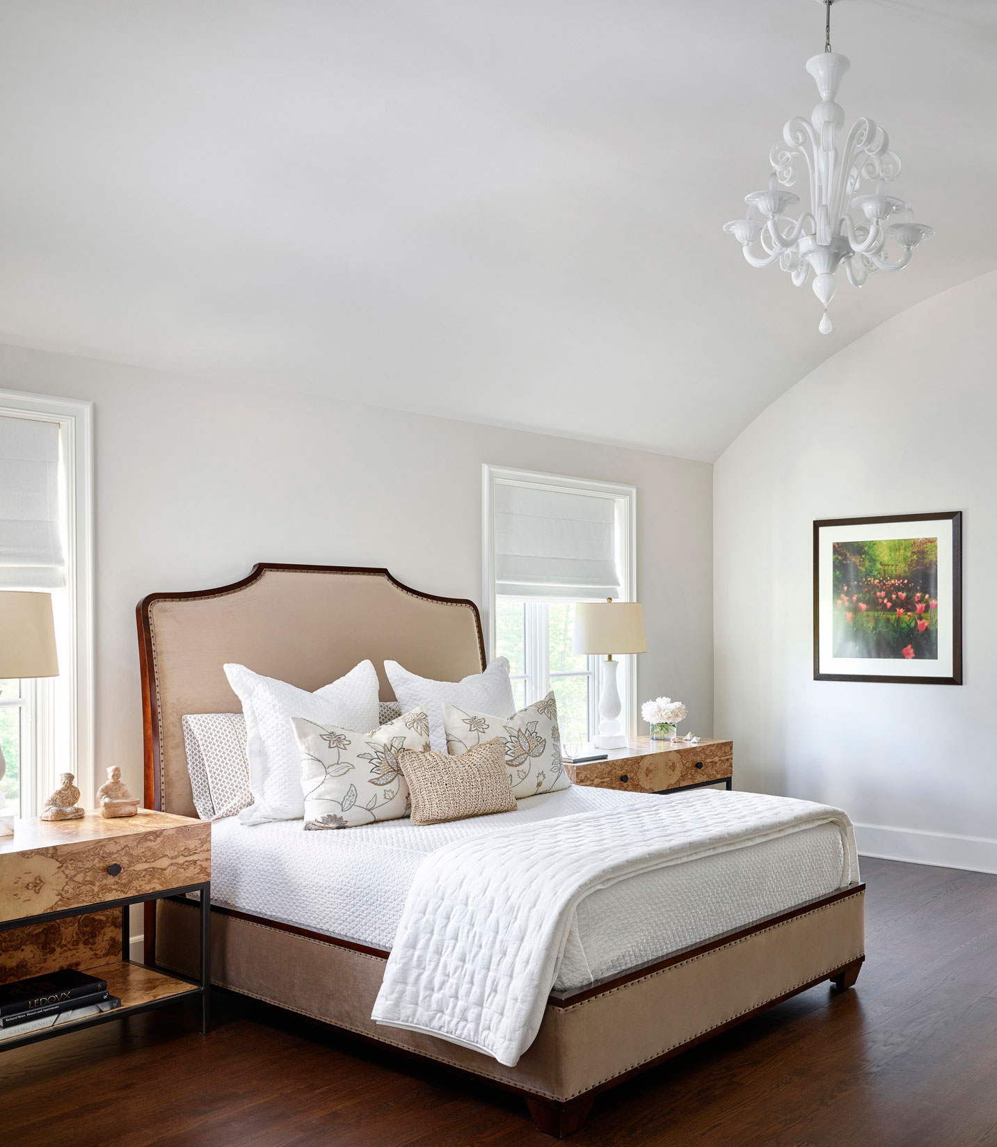
When you're considering bedroom ideas, take a good look at the room's architecture as your starting point as this could help steer the scheme. The arched ceiling here in the primary bedroom adds drama to the room, which is anchored by a Bernhardt bed. Custom burl nightstands are by I2I Design.
Primary bathroom
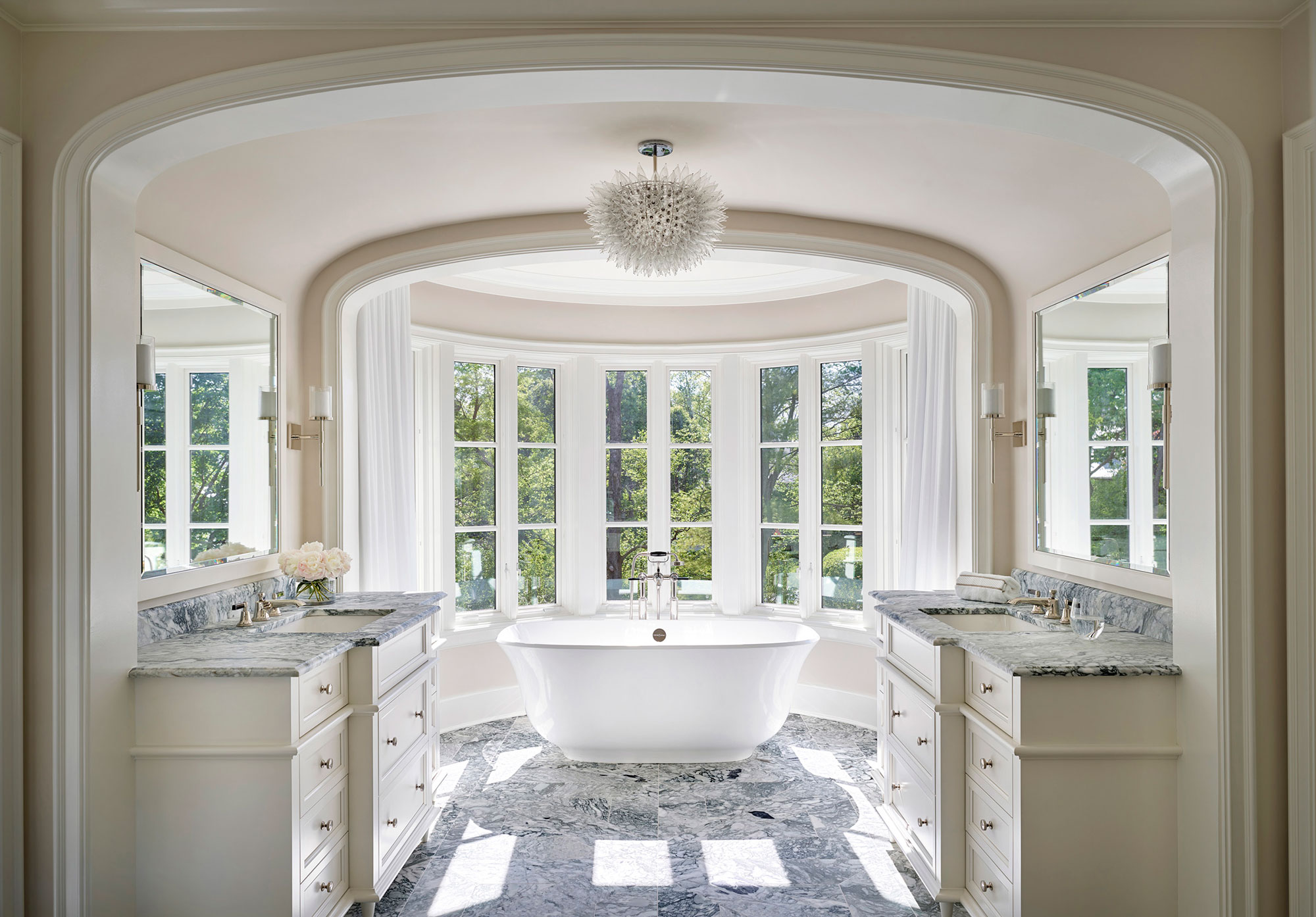
Set in another magnificent window is an elegant freestanding bath, its proportions and position exactly on point with the arched ceiling. The room features two vanity units on either side of the arch, and bespoke lighting by HelenBilt.
Exterior updates
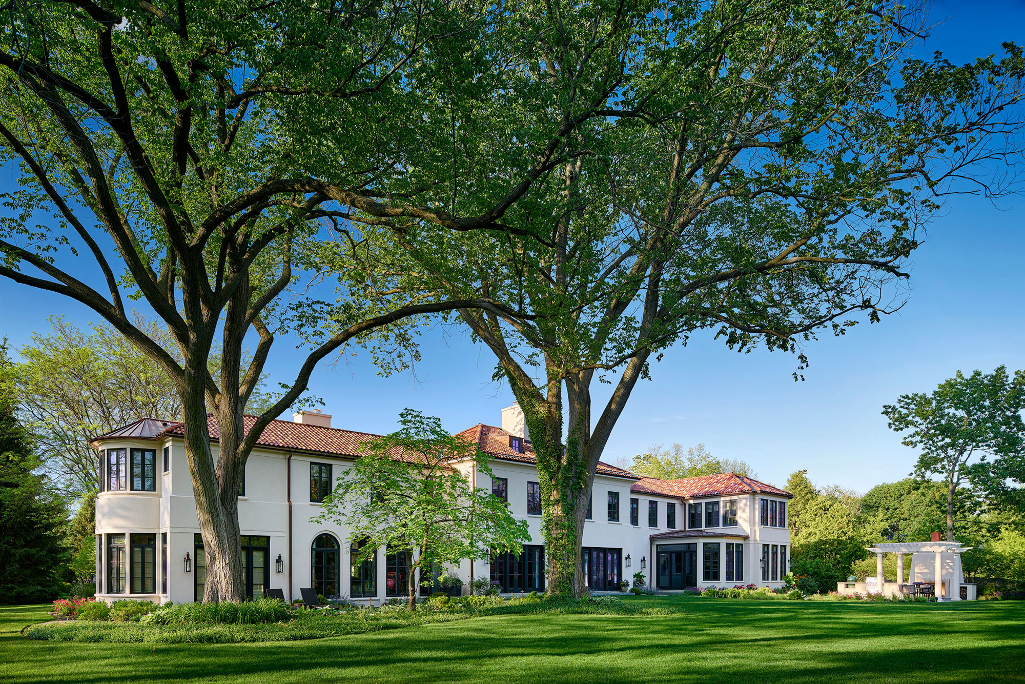
Since this site is almost two acres, the outdoor spaces were very important, says Fred Wilson: 'There were two very large elm trees that were important to maintain during construction, around which were planned exterior sun terraces with access to the study, dining room, billiards room and breakfast room.'
Backyard landscaping ideas that helped to bring more character and functionality to the generous plot include an outdoor kitchen with a pergola that was placed in the yard away from the house to create an intimate dining area, and another pergola to connect the house to the garage with an obscured glass canopy, to match the front door canopy, for weather protection.
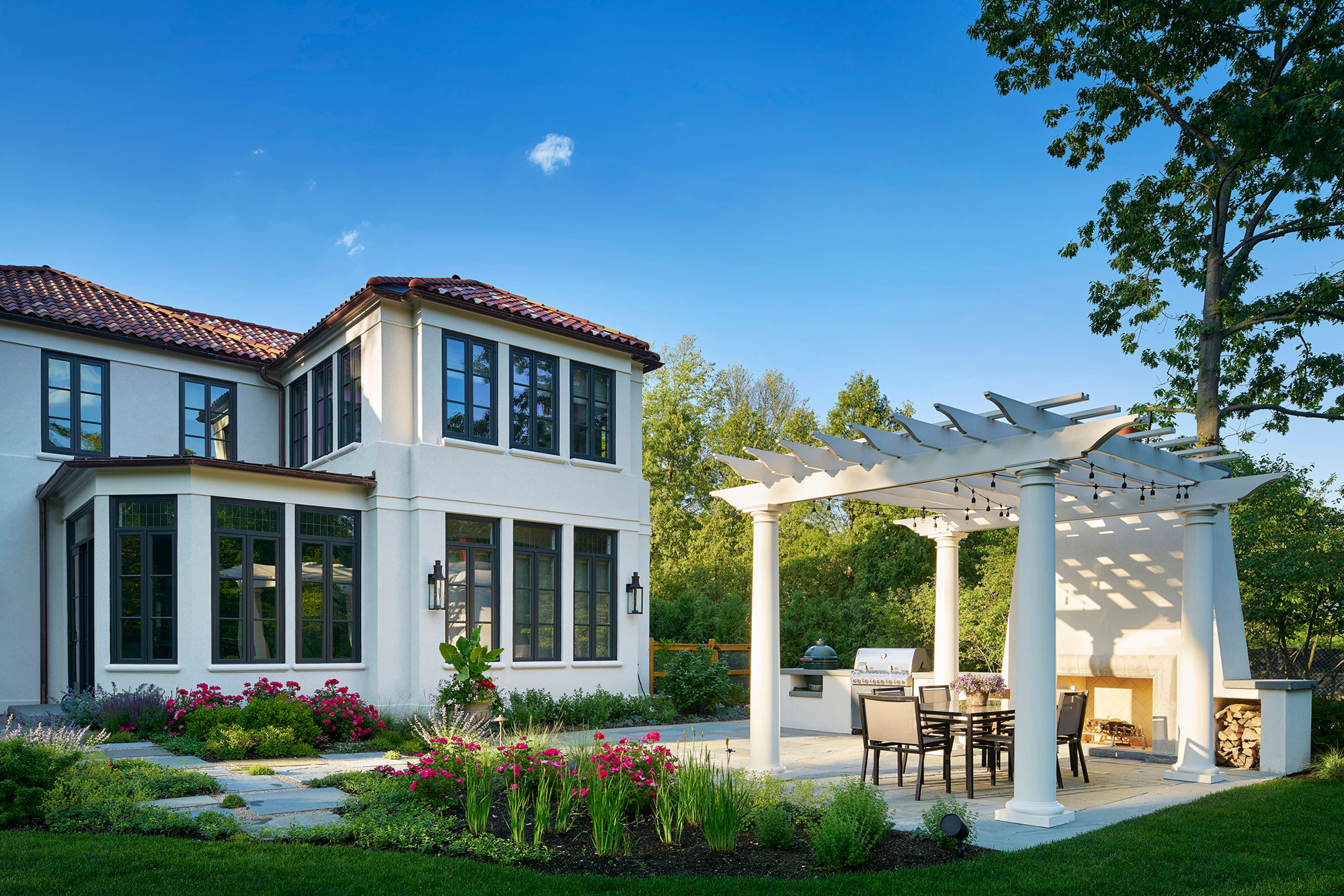
Between the house and garage, the landscape designers also planned a kitchen garden and dog run. The bulk of the back yard though was left for soccer and lacrosse practice for the couple’s two children.
Now that it's fully renovated and updated to suit the needs of the next generation of custodians, we can't help thinking this historic home has had a very lucky escape from demolition.
Sign up to the Homes & Gardens newsletter
Design expertise in your inbox – from inspiring decorating ideas and beautiful celebrity homes to practical gardening advice and shopping round-ups.
Karen sources beautiful homes to feature on the Homes & Gardens website. She loves visiting historic houses in particular and working with photographers to capture all shapes and sizes of properties. Karen began her career as a sub-editor at Hi-Fi News and Record Review magazine. Her move to women’s magazines came soon after, in the shape of Living magazine, which covered cookery, fashion, beauty, homes and gardening. From Living Karen moved to Ideal Home magazine, where as deputy chief sub, then chief sub, she started to really take an interest in properties, architecture, interior design and gardening.
-
 7 expert-approved painting hacks to minimize clean up – to make an already exhausting task easier
Avoid a backbreaking clean-up after your next painting project with advice from the professionals
By Chiana Dickson
-
 Gwyneth Paltrow's quiet luxury kitchen is so beautiful, we almost overlooked her ultra-smart cabinets – they make the use of 'every inch' of storage space
The Goop founder makes use of dead space in her kitchen with customized cabinetry that reaches to the ceiling, providing ample storage
By Hannah Ziegler