This neglected 1840s townhouse had been a run-down rental for over 40 years – an interior designer bought it and turned it into a colorful dream home
‘No one wanted it' so designer Bryony Richardson, snapped up this home and made it beautiful
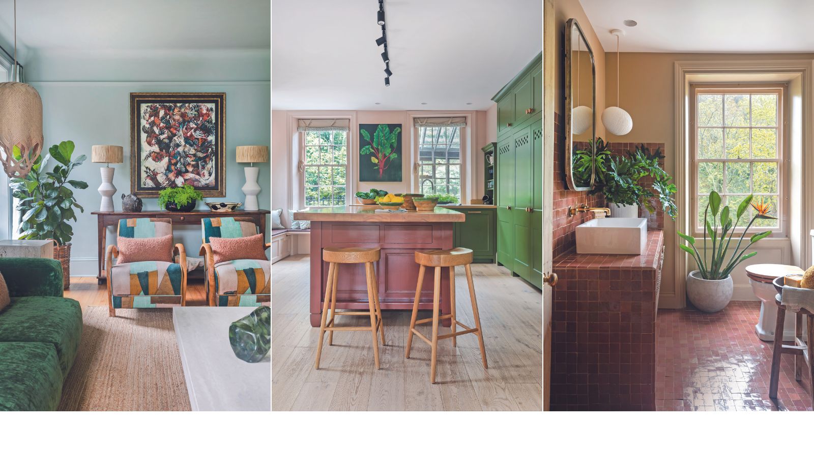
Leaving London and upping sticks for Jersey wasn’t something that interior designer Bryony Richardson and her husband Laurence had planned, but they sought a more rural life after having their first baby. ‘Jersey is a bit like living in an Enid Blyton novel,’ says Bryony. ‘It’s a really magical place to bring up children.’
After months of house hunting, they came across an unusual property: a granite 1840s townhouse replete with its original mottled glass windows, surrounded by cedar trees and coastal views. ‘As we headed down the sweeping hill, we got more and more excited,’ Bryony recalls. Although impressive, the house – Le Rocher – suffered from neglect after being rented out for nearly 40 years, and it had been on the market for a while.
‘No one wanted it,’ Bryony adds. But as soon as they walked in, she was captivated by the Georgian proportions and potential of the house design, so she decided to take on the mammoth task of rekindling it into a rich and cocooning home.
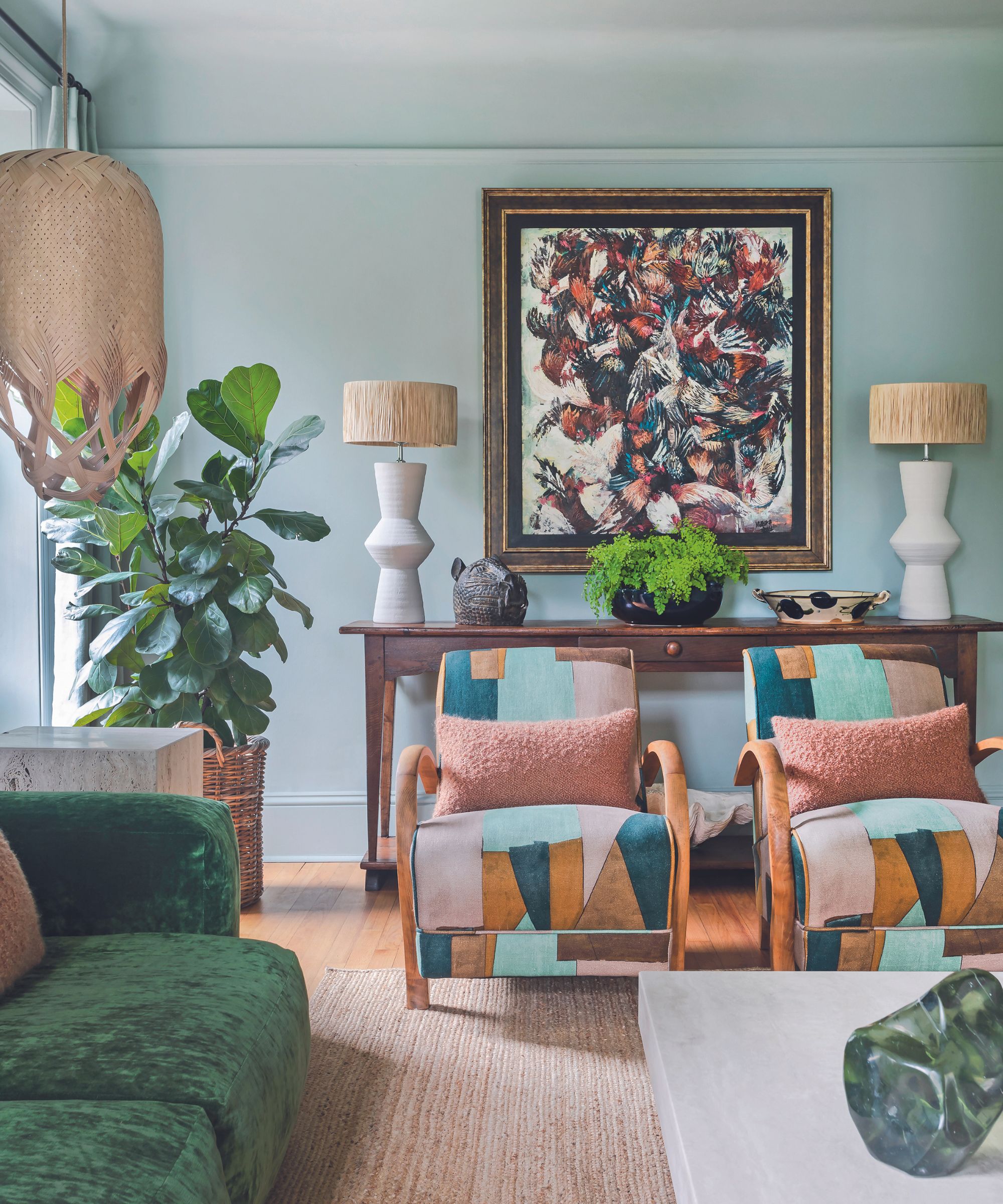
Following an initial period of sinking funds into essential structural and electrical work, the entrance porch – a decaying plastic lean-to – was one of the first things Bryony focused on, replacing it with an elegant black metal frame. ‘It’s a fairly decadent use of the space, because there’s just a seat with baskets underneath for shoes. But visually it really sets the tone for the interior and creates an instant atmosphere upon stepping inside.’
It’s perhaps not surprising to learn that Bryony grew up in an artistic household. ‘My mum was an interior decorator and my dad was a keen antiques collector, so our home was filled with extraordinary and wonderful objects,’ she says. As a designer, she always aims to create spaces that inspire and delight.
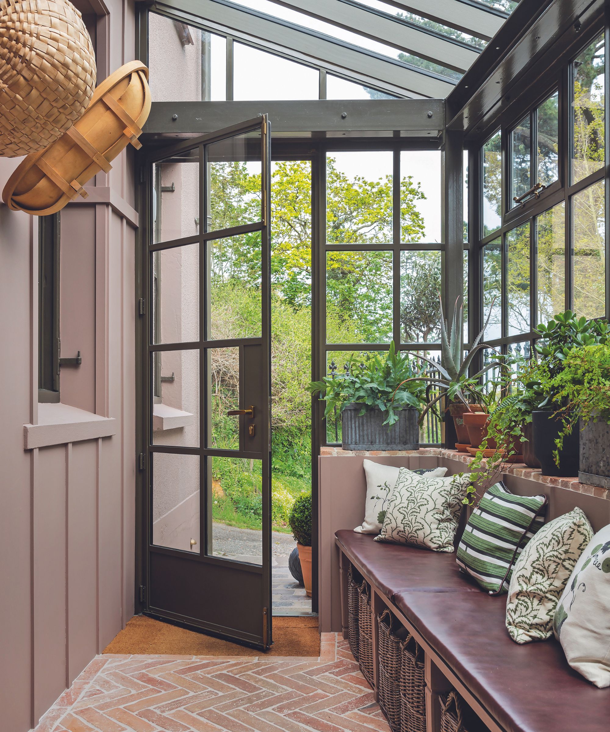
However, it’s the use of grounding color, inspired by the surrounding nature, that really sets her home apart. Sobek, an earthy green by Paint & Paper Library, is Bryony’s go-to shade. ‘It’s got this ethereal quality,’ she explains. ‘This whole house, with its huge windows pulling in so much natural light, really wanted color. In the living room, I was trying to capture the color of lichen, reminiscent of walks along Jersey’s coast.’
While there were few original features remaining, the beautiful concave plaster coving presented a natural opportunity to continue the color up the wall and onto the ceiling. Bryony has contrasted the lichen tone with soft shearling wool cushions in an autumnal bracken hue.
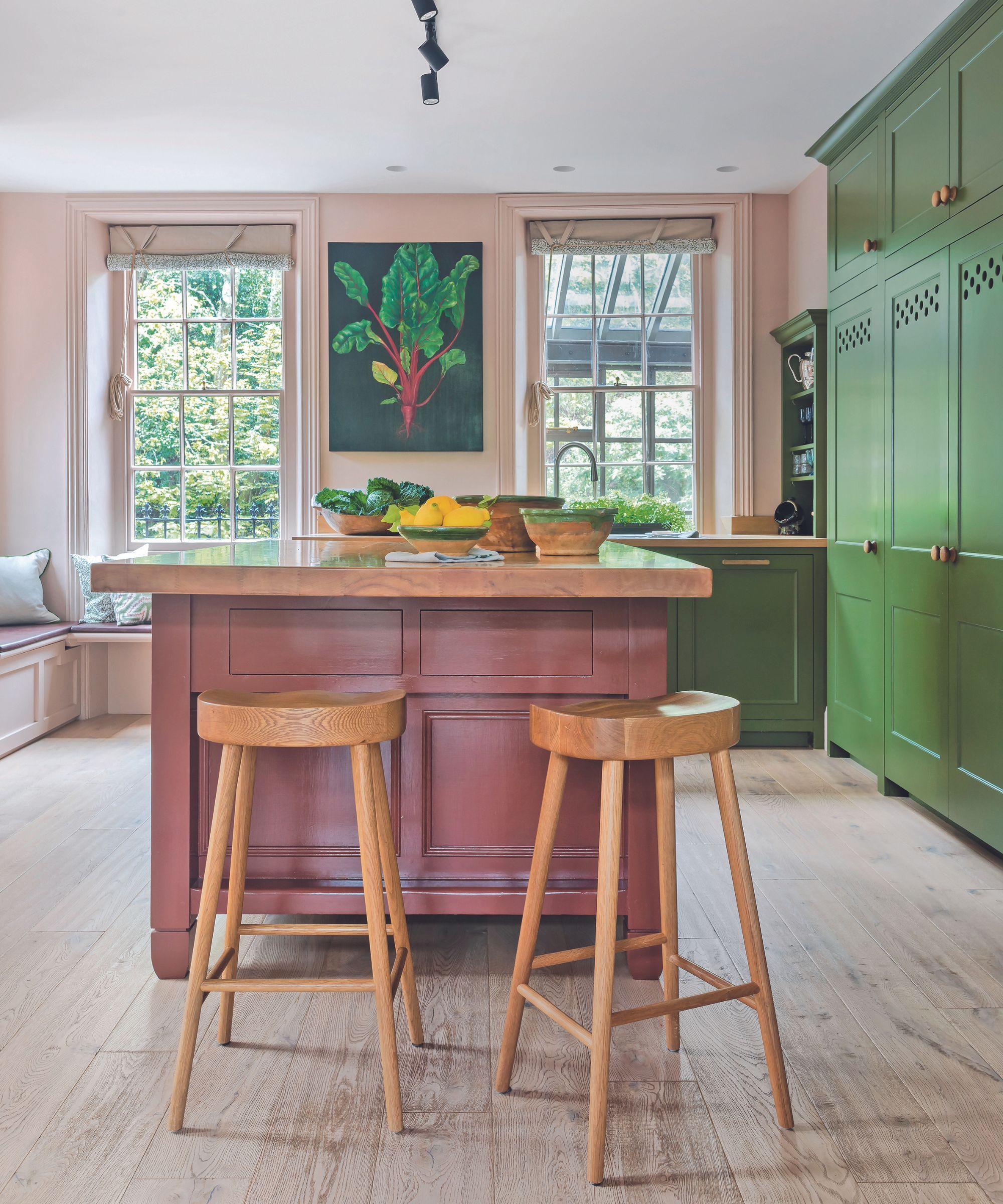
She also set about increasing the usable space in the kitchen. ‘The rental kitchen layout was nonsensical. Closing up a secondary doorway and recessing a range cooker into the chimney breast unlocked the room’s potential,’ she says. Bryony also enlisted the talents of local friend and cabinetmaker Christian Delafield to create bespoke kitchen cabinetry that honors the property’s wonky bones.
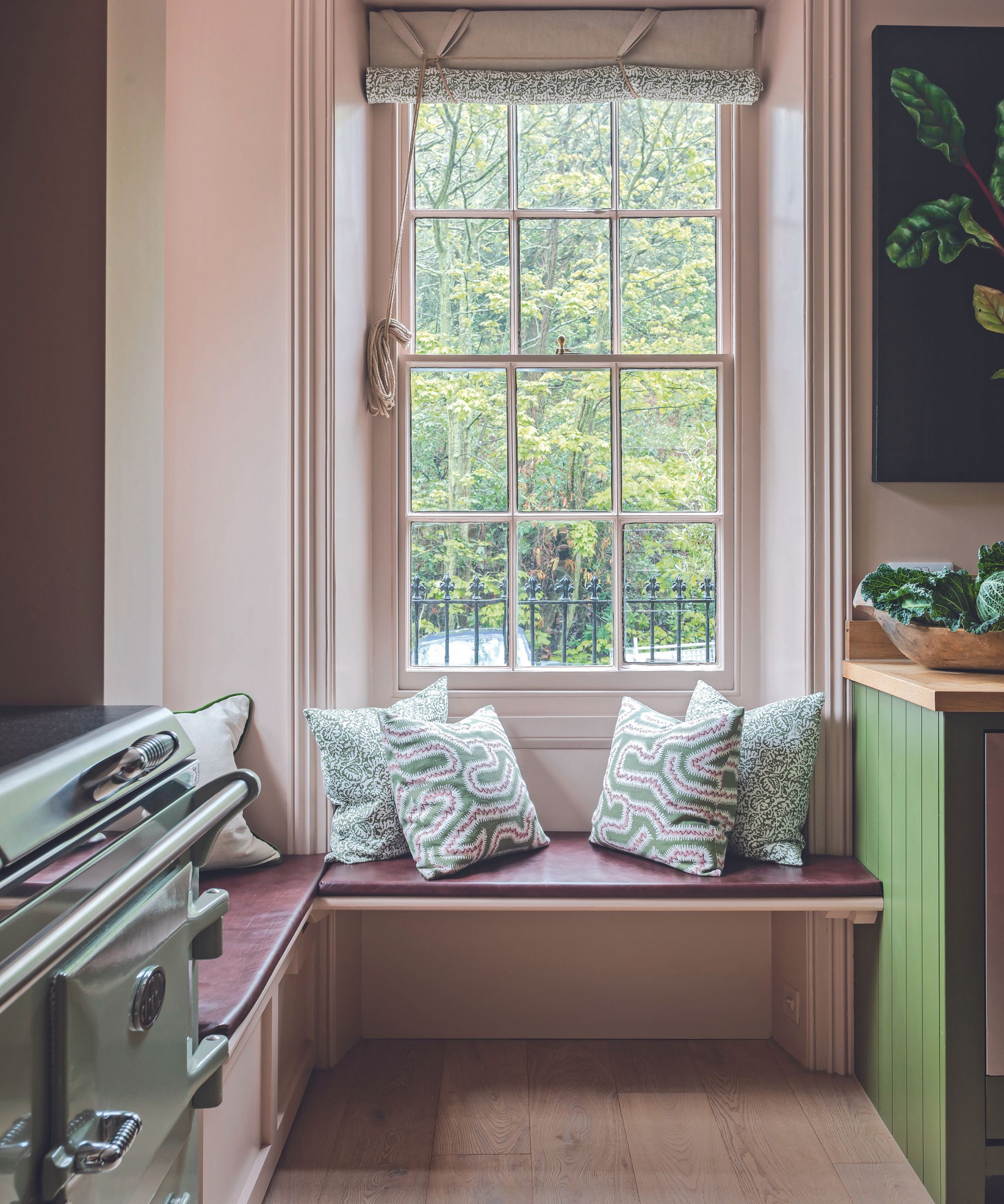
The kitchen island is reclaimed, painted in an earthy shade, and Bryony turned the original cupboard shelves into deep drawers. The walls are a plaster pink with a brown base that stops it from feeling too sweet, especially when clashing against the green on the cabinetry, mirroring the room’s focal point painting of a ruby chard.
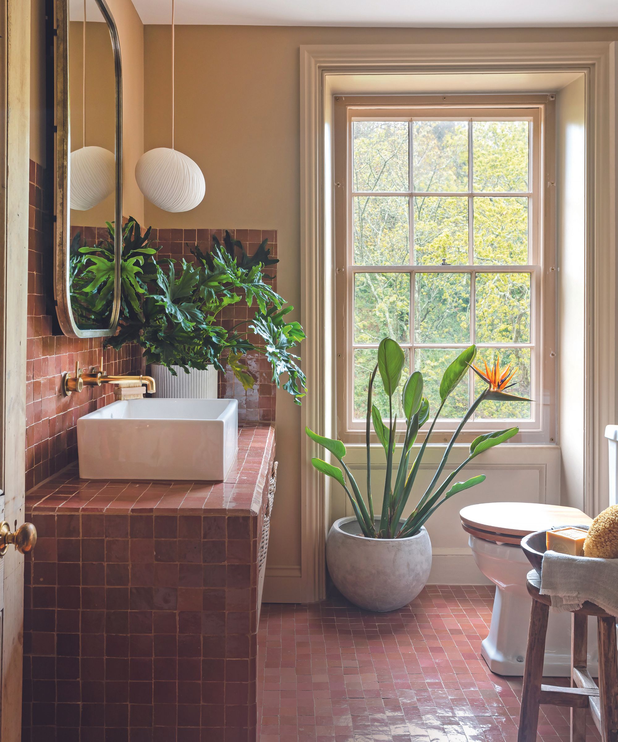
Upstairs, Bryony used a deep glossy green in the boys’ bathroom, a pale neutral and earthy red in the main bedroom, and a warm brown hue in the en suite. ‘Using natural colors boosts the feeling of wellness within a space. My mood improves when using tones inspired by nature,’ she says. ‘It’s amazing how bold you can go, and how much colour a house can take, as long as there are natural elements to ground it all.’
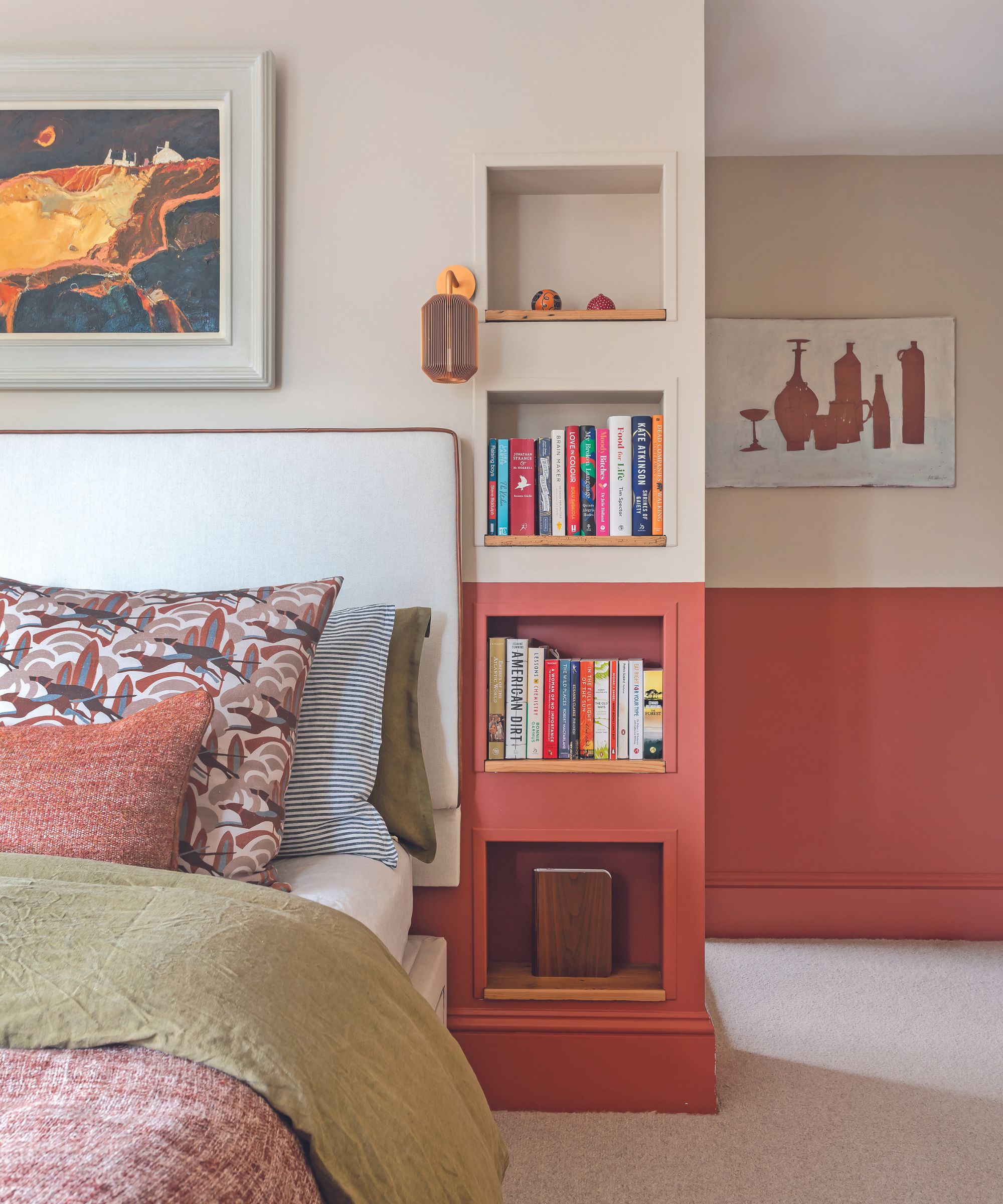
Bryony has managed to reinvigorate the property and fulfill its potential with a varied palette of rich colors, bringing warmth and visual stimulation to this joyful family home.
Meet the designer
Bryony Richardson shares her style inspiration
SMALL CHANGE, BIG IMPACT
Panelling. Introducing wall texture immediately creates atmosphere and interest and can be achieved easily with a variety of styles evoking different feels.
GO-TO COLOR
Paint & Paper Library’s Sobek – an ethereal color that flits between blue and silvery green depending on the light.
FAVORITE DESIGN DETAIL
Bronze curtain rails – I love their slender elegance.
DESIGN HERO
Piero Portaluppi – the renowned interwar Italian architect who designed Villa Necchi Campiglio in Milan.
YOUR STYLE IN THREE WORDS
Atmospheric, authentic, expressive.
I KNOW I’M A CREATIVE BECAUSE…
When it comes to films and TV programs, I could be accused of taking more interest in the backdrop than in the plight of the characters.
HOME MAKES ME FEEL
In my element.
Design expertise in your inbox – from inspiring decorating ideas and beautiful celebrity homes to practical gardening advice and shopping round-ups.