

Old and new blend beautifully throughout the house design of this exquisite Grade II-listed, stucco-fronted, four-story villa, built in 1830 and situated in London's St John’s Wood. The owners reached out to interior designer Katie Harbison via Instagram, and their interior design style and aesthetic turned out to align so well with Katie's, that she describes it as ‘a match made in heaven’.
Irish-born Katie Harbison is based in New York but has lived in London and Europe and cherishes the balance of designing both Stateside and UK homes. ‘Much of my background is in the heritage and listed properties that London has to offer and are what I love and resonate with. The scale and the scope of US properties are significantly different, so it’s the best of both worlds,’ she explains.

Range cooker, Lacanche. Flooring, Trunk Floor. Units, Katie Harbison Design.
Katie’s ethos is working within the parameters of a house’s architecture and ensuring that the interiors feel a part of it or an extension of it. ‘The grandeur and the architecture of this home is what I wanted to play into, still embracing and enhancing those traditional features while making it more homely and adaptable,’ she says.
She intended to honor yet modernize the enclosed nature of each space, and create a consistent, harmonious flow from room to room. A full gut renovation was therefore undertaken with a skylight added in the kitchen-diner and glazing replaced in the garden room.

Table, Arhaus. Bespoke slipcovers on chairs in de Le Cuona’s Shepherd’s Cloth. Pendant light, The New Craftmaker.
The Grade II listing meant there were challenges. The clients were originally keen on adding period features, like panel molding, but they weren't able to do this. There were difficulties also with the main bathroom. Poorly laid out, there was a central step and double swing doors between it and the bedroom that swung outwards.
Fortunately, planning permission was gained to change them to pocket doors and the space was reconfigured. The existing moldings, skirting boards, and cornices were cast and new replicas were made for areas that were past restoration to keep the historic bones of the property throughout.

Fireplace surround, Jamb. Bespoke armchairs in a Rose Uniacke hemp fabric, Katie Harbison Design. Rug, Roja Rugs. Wall in limewash in Mykonos, Bauwerk.
Previously, the property had some modern installations that were not original, so Katie replaced these with fixtures more appropriate to the original architecture. The home was also made more ergonomic for the family; ‘It pays homage to the period while making it suitable for a modern-day family,’ Katie explains.
Aesthetically, the design narrative is a balance of old and new, embracing transitional design. For Katie, and agreed on by the owners, Limewash was the obvious choice for the walls. ‘I love the texture you get from limewash – it’s not a flat wall and it brings a lot of warmth to spaces,’ she says.

‘In most of the rooms, a neutral color scheme was chosen but it brings texture and depth so that there’s a cohesive thread in the home.’ The nuanced backdrop gave rise to a serene, seductive aesthetic.
In the daughter’s nursery, a different treatment was used, perlata, which is textural but also has a subtle shimmer that adds energy. Katie introduced more color and playful elements in the family den, cloakroom, and the study. ‘The primary spaces remain more calm and neutral. Then I like to bring in pockets of fun,’ she says.

Walls in 00YY 12/279, Dulux Trade. Sofa, custom design. Artwork by Heath Wae. Sconce, vintage. Coffee tables, Anna Unwin. Rug, Armadillo. Bowl, Athena Calderone x Beau Rush Ceramics.
Katie has enhanced the intrinsic character of the home by decorating with vintage items, often sourced from Paris antiques markets. ‘I was aiming for a balance between vintage and made-to-order contemporary pieces. I love that juxtaposition between old meets new. I love the character and the charm. The stories you get from the vintage pieces are a lot more interesting.’
Softness is introduced with textured natural materials. Katie has a penchant for linen and hemp, which appear again and again throughout the interior, along with mohair and cotton velvet. ‘Typically linen would be my go-to, and then we brought in pops of heavier fabrics for something a little bit more luxurious.’

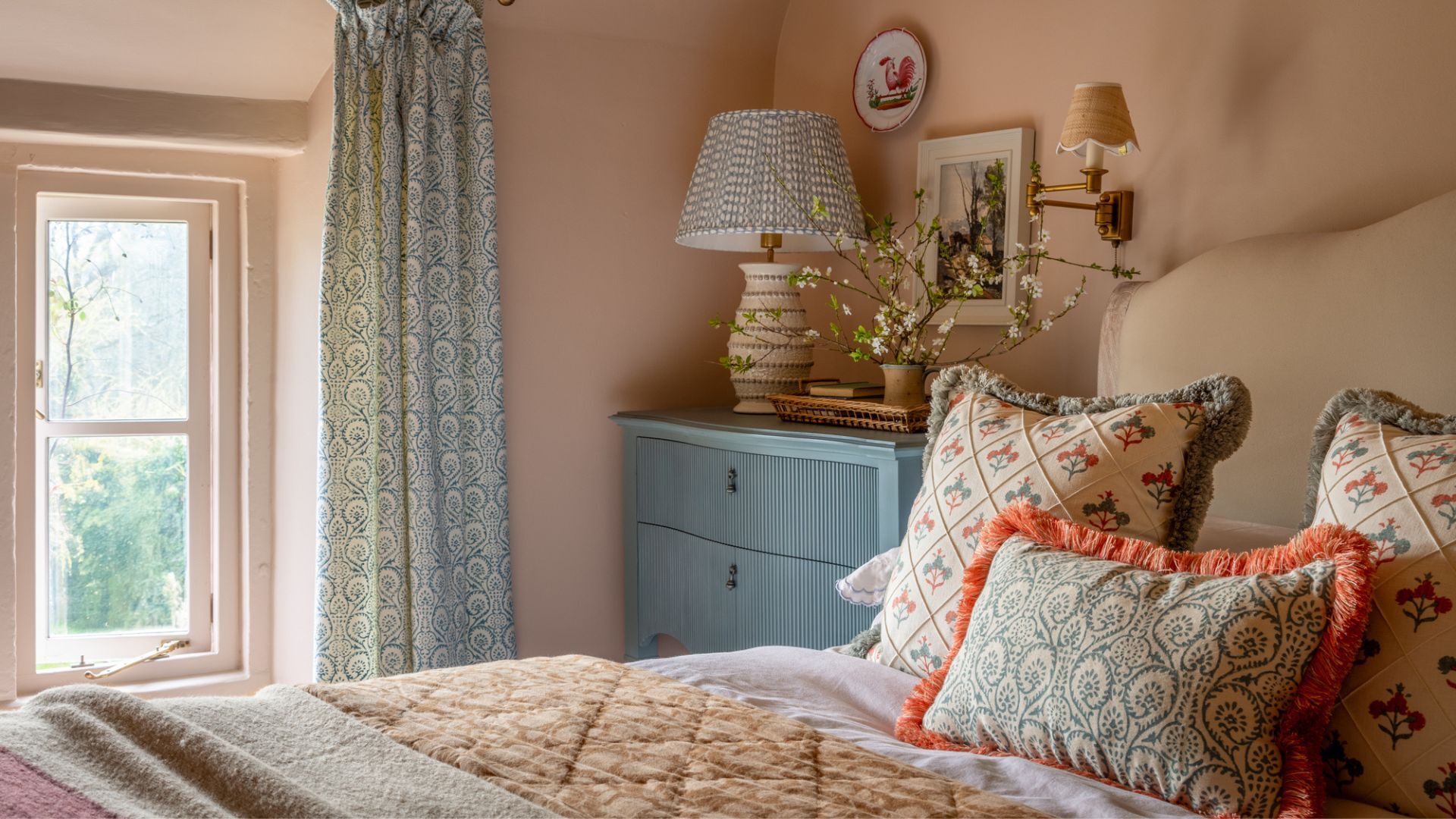
Curtains, KLS Interiors. Rug, Roja Rugs. Bespoke bed in a Rose Uniacke fabric, Katie Harbison Design. Bedding, Cultiver. Bedside tables, vintage. Table lamps, Danny Kaplan Studio.
Katie describes the interior narrative as transitional, taking traditional elements but making the scheme a little more contemporary. Nowhere is that more apparent than in Katie’s favorite room, the sitting room.
Here, an elegant marble fireplace with reclaimed bricks that Katie spent months sourcing rubs shoulders with a contemporary curved sofa that was chosen to improve the ergonomics of the space. ‘We wanted this room to be elevated, but still liveable,’ says Katie. ‘When you’re in that space, it feels very calm.’

Artwork, client's own. Bespoke bath, Katie Harbison Design
5 ways to add beautiful texture to walls
Designer Katie Harbison talks interesting finishes
1. My favorite is plaster. I love it for its versatility. It allows you to choose the level of texture you want to achieve – whether bold, dramatic brushstrokes with a heavy and grainy finish or a more refined, subtle look.
2. I love to add upholstery to walls, particularly in areas like media rooms. It brings a sense of warmth and coziness while making a bold design statement.
3. Tadelakt is one of my go-tos for wet areas. It comes in a wide range of colors and adds an incredible depth and richness to walls with its natural, polished finish.
4. I often incorporate wallpaper into smaller spaces like cloakrooms or playful settings such as kids’ bedrooms. I typically opt for bold prints or textured materials like grasscloth. These not only deliver warmth and visual intrigue, but also create a striking focal point.
5. We are collaborating with an artist to create a hand-painted mural in a child’s bedroom. This will incorporate meaningful references, making it a truly unique feature. The result will be a whimsical and imaginative focal point, adding charm and character.

You must confirm your public display name before commenting
Please logout and then login again, you will then be prompted to enter your display name.
-
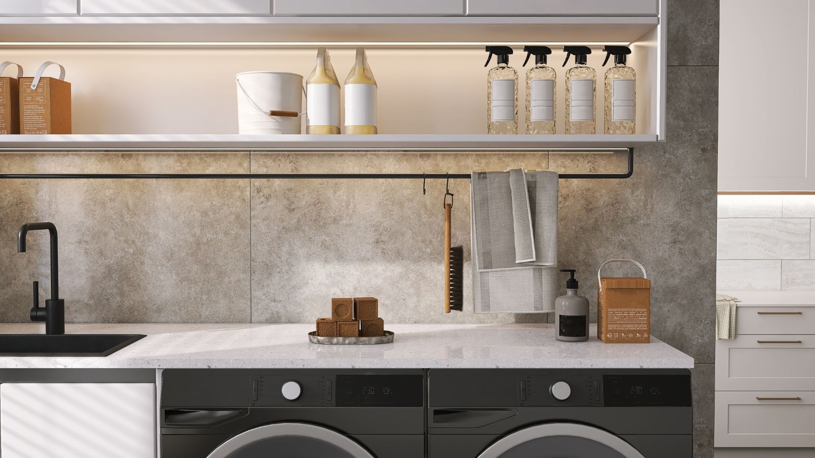 Extend the lifespan of your appliance with 5 simple but crucial washing machine maintenance tips
From cleaning the filters to keeping the door open, experts reveal the washer tips they swear by
-
 These are the 6 must-have colors to decorate with in April 2025
What do retro-inspired yellows and beautiful blues all have in common? They're on our hot list for the season ahead

