
High up on the fourth floor of a property built in 1840, Gayle Warwick and her husband, George Lloyd Roberts, found their London sanctuary. ‘The first thing that made us fall in love with the apartment was the light', begins Gayle.
'The light runs across three buildings overlooking a garden square and the minute we walked in we felt we were in a tree house,’ she recalls. But the flat had been carved up into many small rooms stunting the light and views, so first on the couple’s agenda was a revised floor plan with more open space.

Windows in Railings, Farrow & Ball. Chemin rug, Studio QD at Silk Avenue. Vintage coffee table, 1stDibs. Cologne lamp, Porta Romana.
Wasting no time getting started, Gayle and George assembled a crack team for the house design project consisting of Jena Quinn and Lucy Derbyshire, the founders of interior design firm Studio QD, and Gayle’s son-in-law, Toby Osborne, who became the project manager and builder.
‘We all spent a long time together thinking about transitional design, or in other words – how best to marry the old and the new. It was a great team effort,’ Gayle says. Jena and Lucy had both trained under Nicky Haslam with Jena having met Gayle in 2001 when she had come to the firm to introduce her own company, Gayle Warwick Fine Linen.

Swedish art deco armchairs in cotton velvet in Cocoa by Rose Uniacke. Neo Sienna marble plinth, Ransom & Dunn.
‘Over the years, we have developed a wonderful friendship and collaboration with Gayle incorporating her luxurious linens in our interiors, so when Gayle and her husband George decided to develop the apartment, we were honored to work with her,’ Jena says.
‘The first thing that struck us were the huge windows flooding filtered verdant light in from outside and all these dazzling, dancing leaves. It was simply stunning and we knew immediately there was a magic to the space. But it was decorated in heavy, dark 1980s colors. Wonderfully though, the bones were there,’ Jena says.

Cabinetry designed by Studio QD. Handles, Buster + Punch. Walls in French Grey, Edward Bulmer Natural Paint. Plaster cone light, Rose Uniacke.
‘Architecturally, our priority was to create a feeling of spaciousness, opening up the rooms while also creating distinctive zones. We removed the wall from the kitchen to the dining room and then added bookshelves between the sitting room and dining area. We wanted to harness the incredible light, and with the lateral living, create a sense of flow through the space.
'While we relished the brightness and airiness the new floor plan gave us, we wanted to bring in tone and depth. The contrasts of dark and light and masculine and feminine are what provide the interest, along with sculptural forms and plenty of artwork,’ Jena elaborates.

‘Being able to decorate with art, especially if from a magnificent collection like Gayle's, is a great gift for a designer,' Jena says. Several large works by Marcelle Hanselaar animate the space. The contemporary Dutch artist living in London and one of Gayle’s closest friends.
Elsewhere, a gallery wall in the dining room features works by Pierre Bonnard, Alberto Giacometti, and Robert Delaunay. ‘The works of art set the color palette. For the living spaces we chose French Grey by Edward Bulmer as it has a lovely depth of tone while simultaneously providing a brightness,’ Jena notes. ‘We decided early on to use Edward's paints as they are environmentally friendly'.

Walls in Welmish Blew, Edward Bulmer Natural Paint. Cusi tables, Studio QD. Similar sisal flooring, Alternative Flooring.
The great thing was that Jena and Lucy had an immediate sense of what I liked and what would be timeless,’ Gayle adds. The bathroom in Jonquil and the bedroom in Welmish Blew both divert from the calm neutrals of the living areas. Upon reflection, the pale pink is especially flattering. ‘When you’re in the bathroom with the light on, you’re as beautiful as you can be,’ Jena notes.
The consideration of beauty had always been a pertinent calling card of their former tutor. ‘When we worked with Nicky years ago, we saw that he would always line his light shades in pink silk. He said the success of a room is how beautiful the owner looks in it so we chose colors that Gayle looks radiant in,’ Jena explains.

Existing armchair and stool in fabric by Gayle Warwick Fine Linen.
Furniture is carefully tailored, balanced, and finely tuned to sit alongside the artwork and Gayle’s antique pieces. ‘The sofas and rugs were custom made. We even got Gayle to come and try out the firmness of the sofas in the workshop.
As soon as something is custom, its proportions are perfect and every personalized detail just enhances the overall aesthetic,’ Jena adds. ‘I trusted Lucy and Jena’s eye and their attention to detail,’ says Gayle, ‘but one of the best parts was just the amount of fun we had.’

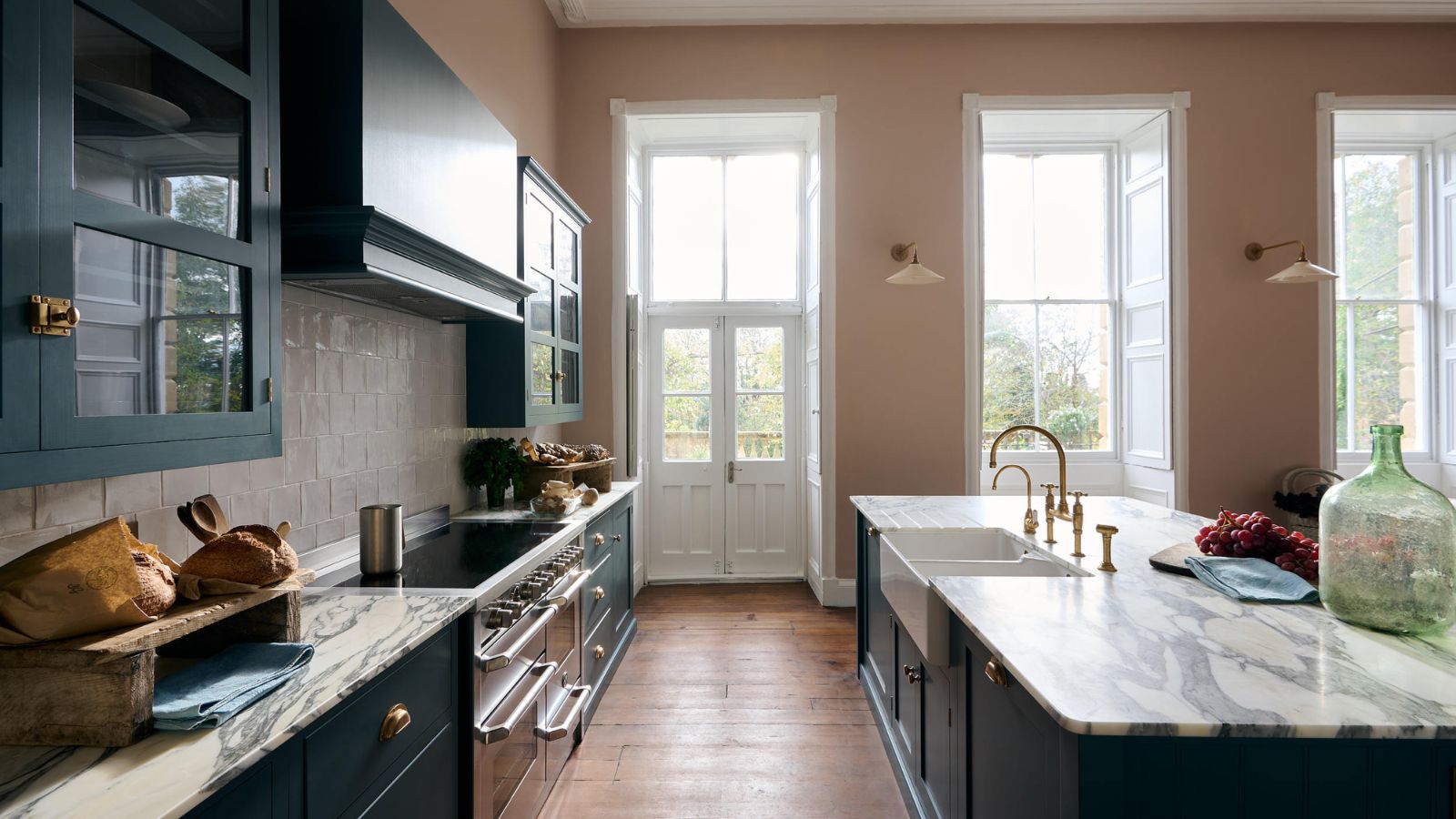
Balnea wall lights, Hector Finch. Tiles, Mandarin Stone.
Meet the designer
The designer shares her style inspiration
What was the biggest indulgence of the project?
Customized soft furnishings. By commissioning bespoke pieces, you can ensure your furniture fits effortlessly into the space, enhancing the tailored look of your interior.
What do you consider the project's greatest success?
The sense of cohesion. By running a restrained color palette throughout, we created an instant visual connection between the spaces regardless of their distinctive zoning.
Tell us a small change that has a great impact.
By introducing the bookcases, we were able to retain the open-plan feeling while creating a more intimate zoning around the dining table. It allowed books to be stored on one side and more wall space for Gayle’s beautiful art on the other.
Do you have a go-to color palette?
Autumnal tones.
Any design heroes?
Nicky Haslam. He trained me and I was constantly inspired by his approach.
Can you reveal a secret address for our book?
Rupert Bevan for beautiful mirrors. He produces incredible antique and eglomise mirrors which we regularly incorporate into our interiors
You must confirm your public display name before commenting
Please logout and then login again, you will then be prompted to enter your display name.
-
 6 things you should never throw in the trash – and what to do for safe disposal instead
From batteries to space heaters, experts reveal what not to throw
-
 Worst-smelling plants to avoid – experts reveal 5 pungent species and suggest perfumed options to grow instead
These are some of the worst-smelling plants that can cause quite a stink

