Subtle layering and airy colors make this Seattle home feel bright and charming
Plenty of natural textures and subtle color contrast are deftly used to create an inviting space
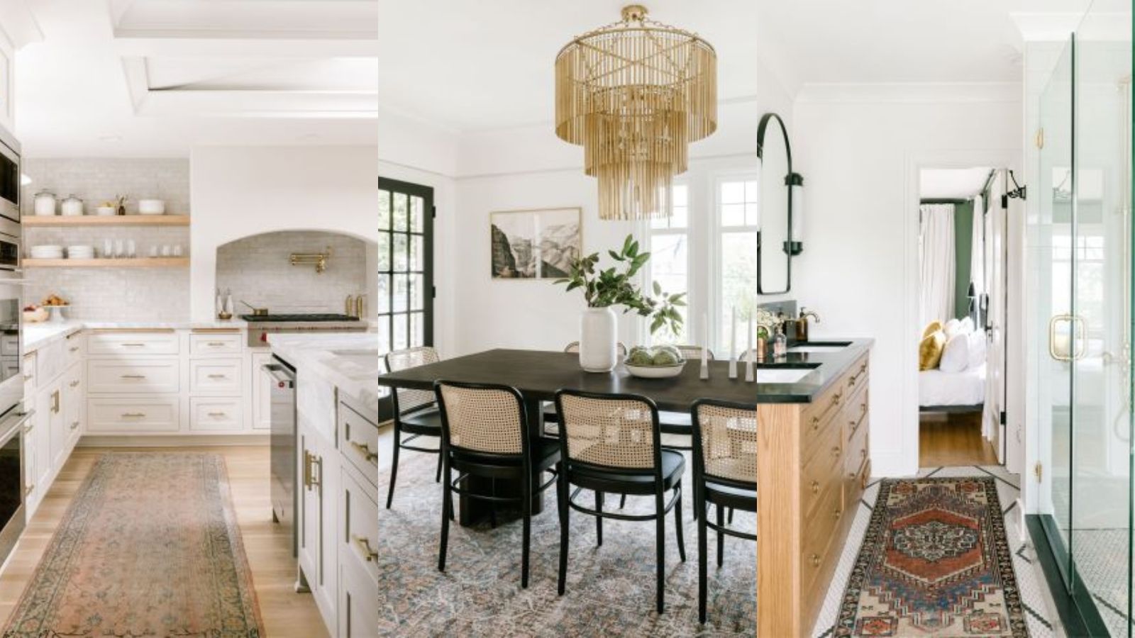

When Rhett and Kate Miles wanted to update their 1927 Brick Tudor home in the Montlake neighborhood of Seattle to create more functional spaces for their growing family, they called in interior designer Jessica Nelson.
Known for her ability to use pale colors alongside bolder shades to create light-filled spaces that feel warm and layered, Jessica set about reworking key layouts and bringing her decorative touch to this charming family home.
Here, she takes us on a tour and explains her home decor ideas.
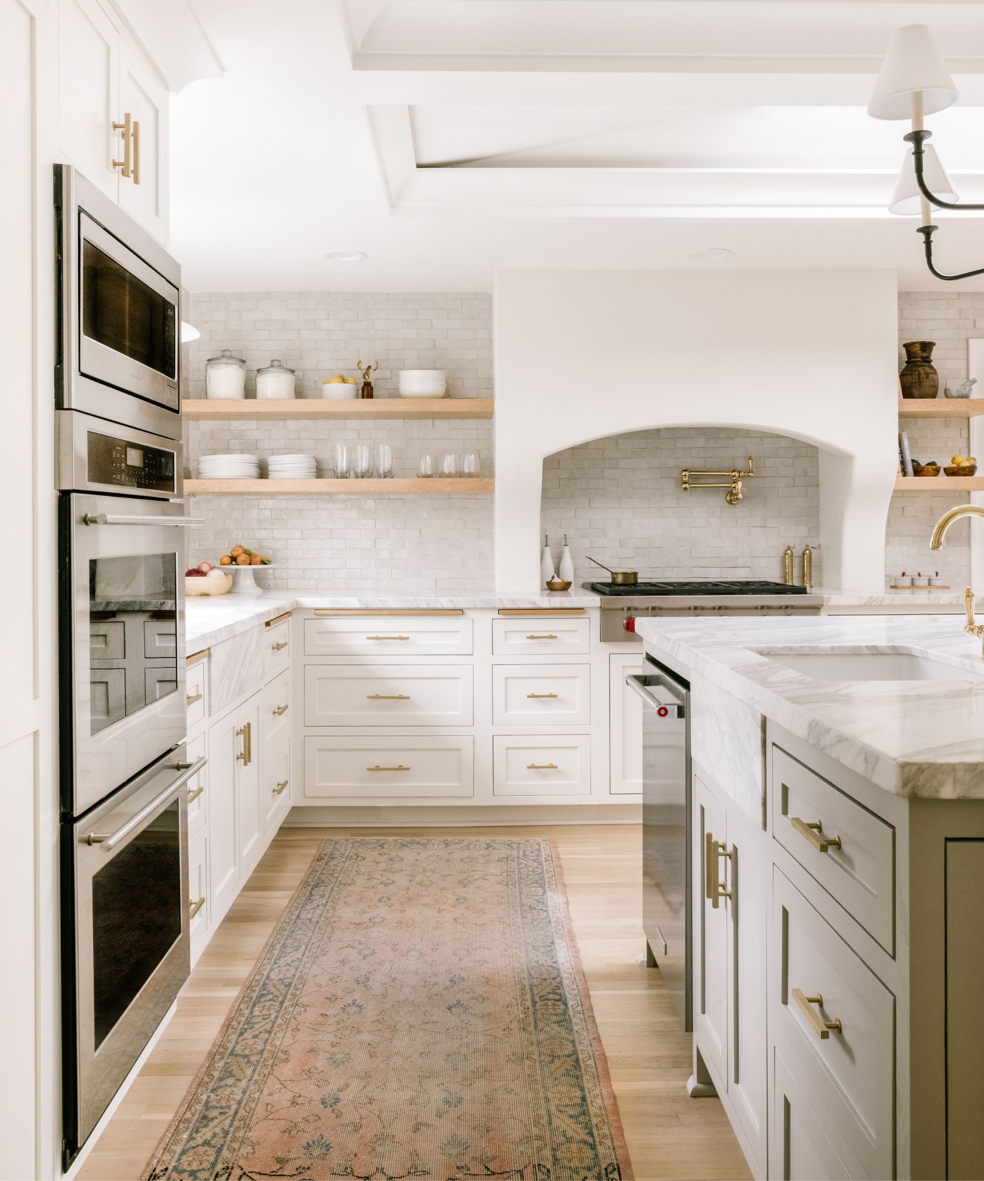
Kitchen cabinets in Revere Pewter Benjamin Moore; Faucets/pot filler: Rohl; Chandelier over island: Visual Comfort
'There were two main layout issues with this home,' explains Jessica. 'The kitchen was remodeled in the '90s and the island was very disproportionate to the room. We had so much great space that was going unused.'
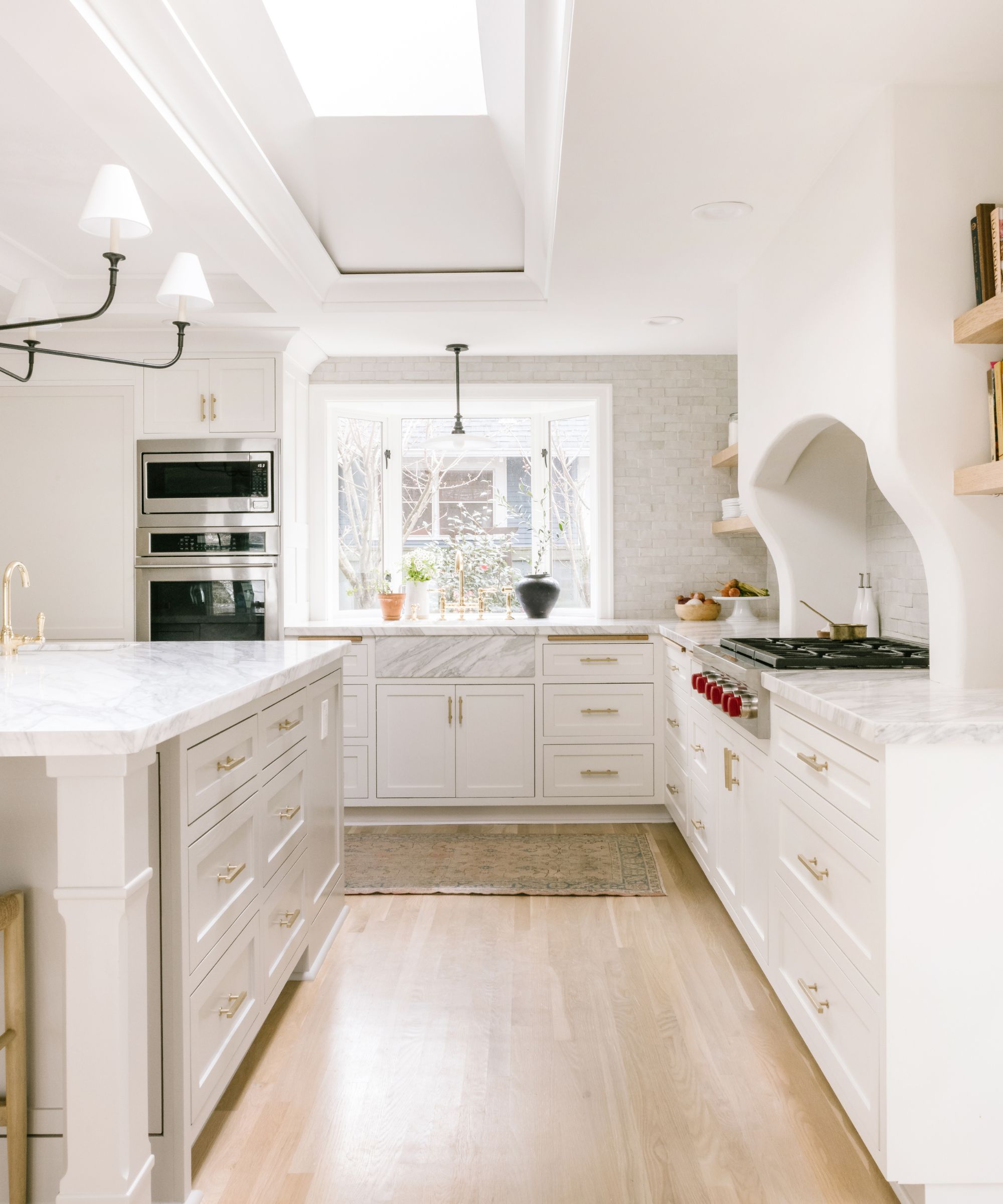
'We expanded the island to an appropriate size and also relocated the range and sink. We moved the sink to in front of the beautiful window overlooking the garden and created a statement hood that welcomes you into the space.
'The soft Benjamin Moore Revere Pewter island cabinetry is the perfect pairing for this Massive Calcutta marble slab. I love how the center chandelier accents the space as well as the custom Roman clay hood and zeolite tile backsplash.'
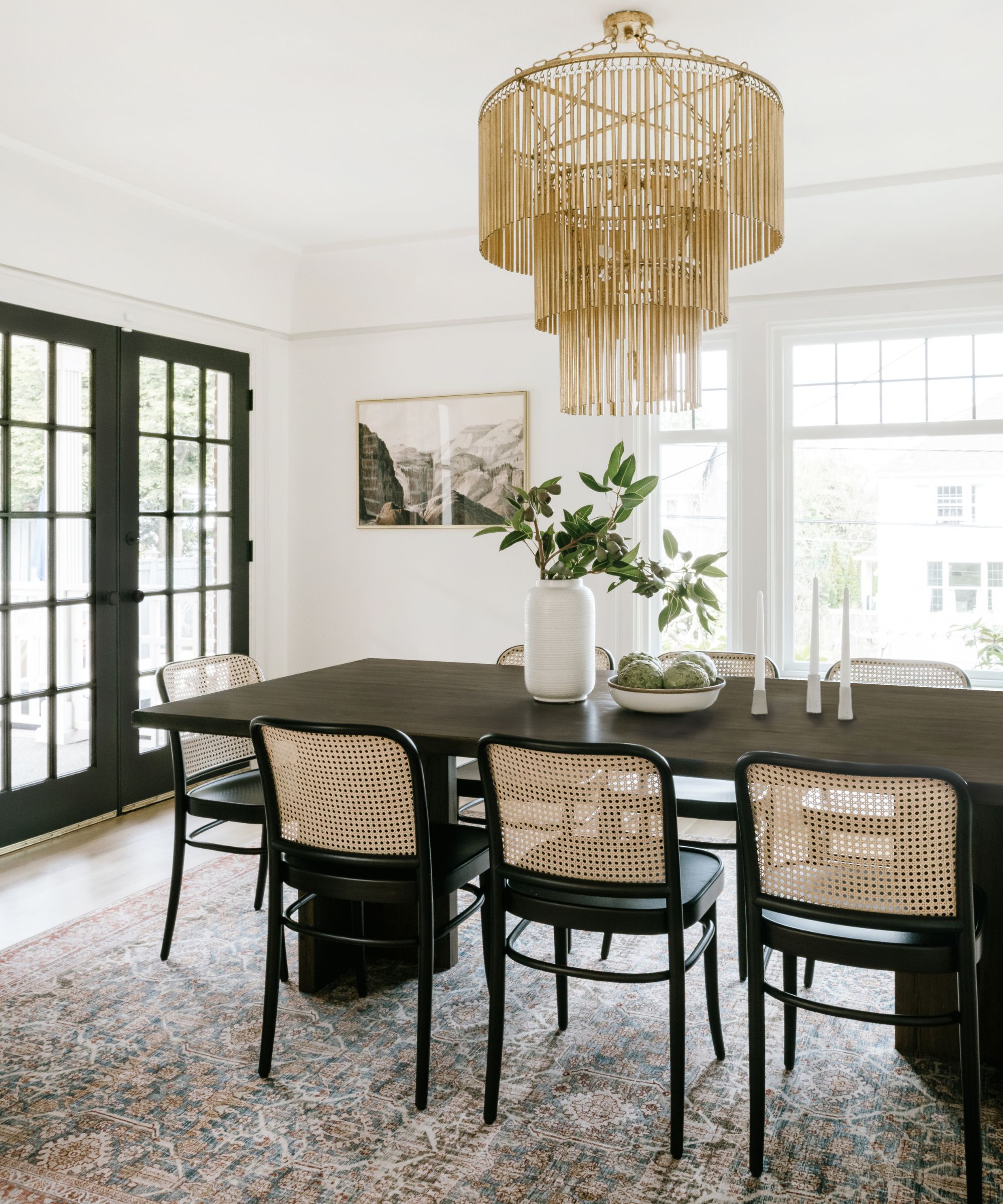
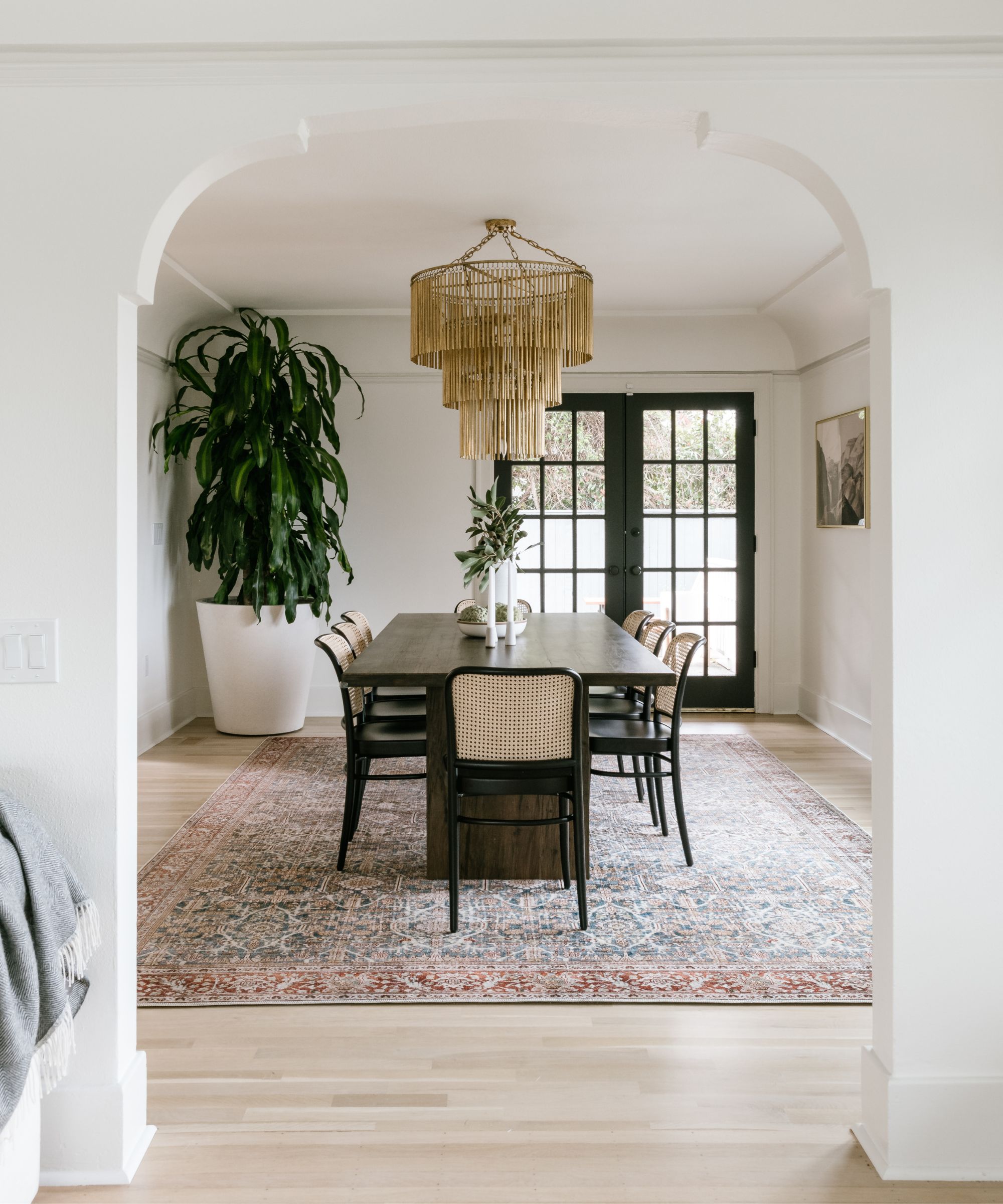
Dining room chairs: Rejuvenation; chandelier: Kathy Kuo Home; table: Burke Decor
'Along with the remodel we completely furnished the entry, dining room and living room as well.
'We love this oversized brass chandelier in the dining room (above). It makes the space! The timeless cane chairs also really tie the room together.'
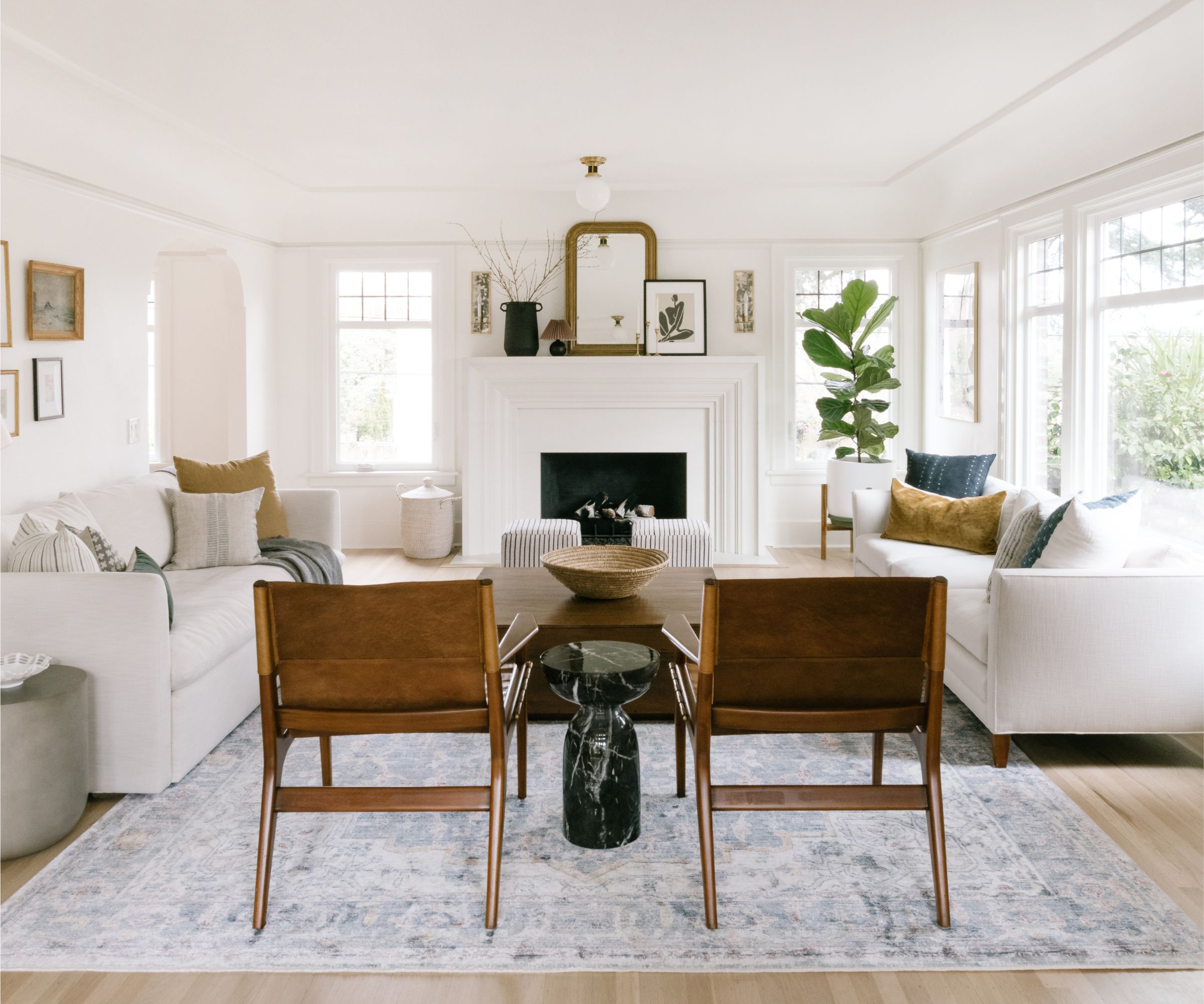
'We restored the white oak floors to their original color in the living room and it made all the difference. We also included one reupholstered vintage sofa and one new from Clad Home.'
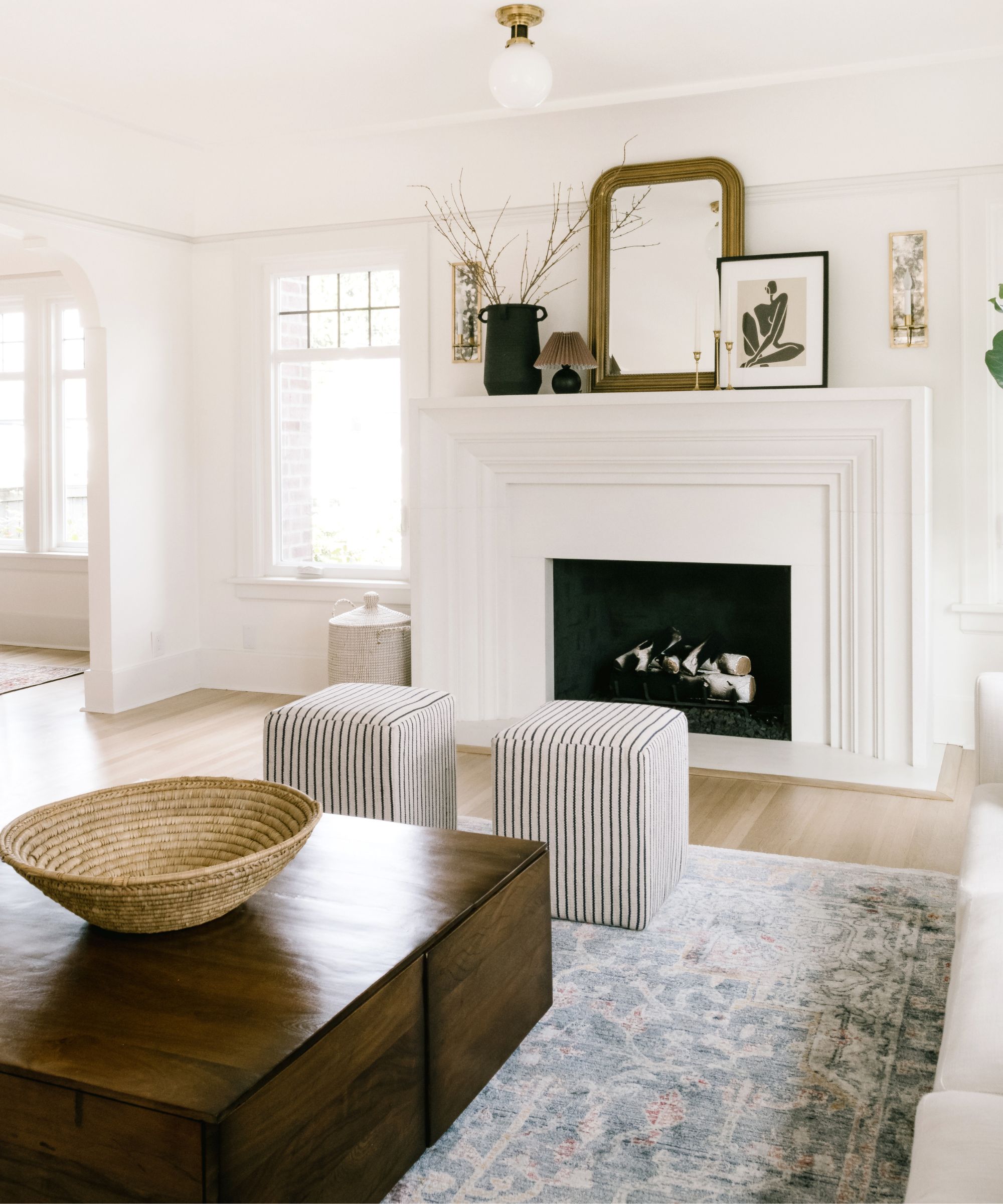
We also love the custom cast stone fireplace mantel we have made.
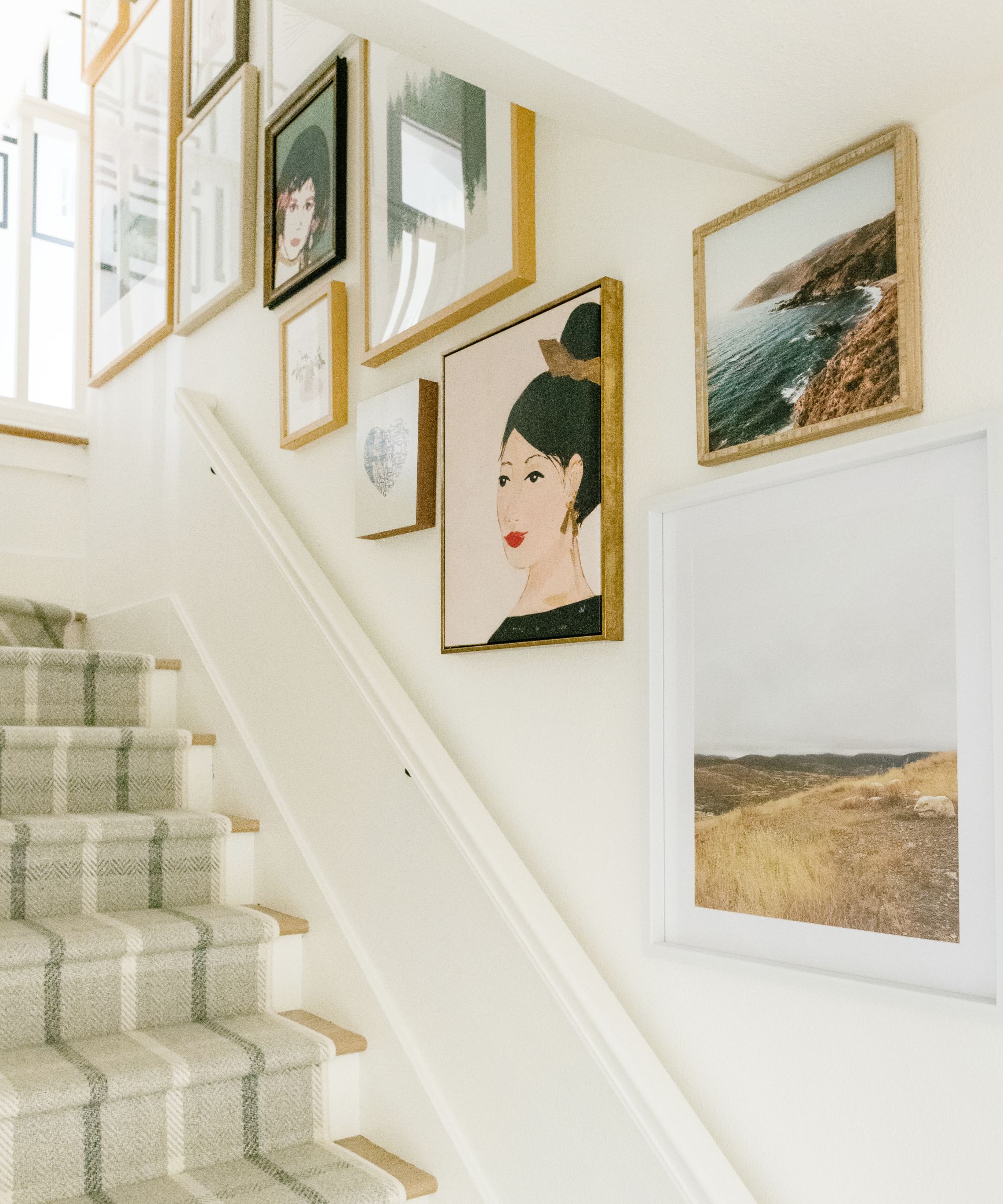
A smart stair runner and gallery wall idea lead the eye up to the upper story (below).
'We also updated the primary bath (below), removing all the '90s finishes and fixtures, and bringing a timeless feel back into the space with Calacatta marble and a spa like palette.
'We brought the softness of the kitchen into this space as well continuing the Revere pewter into this space and mixing it with the Calacatta marble. Bedrosian’s tile and a slab of the Calcutta behind the Rohl shower fixture is the perfect mix.'
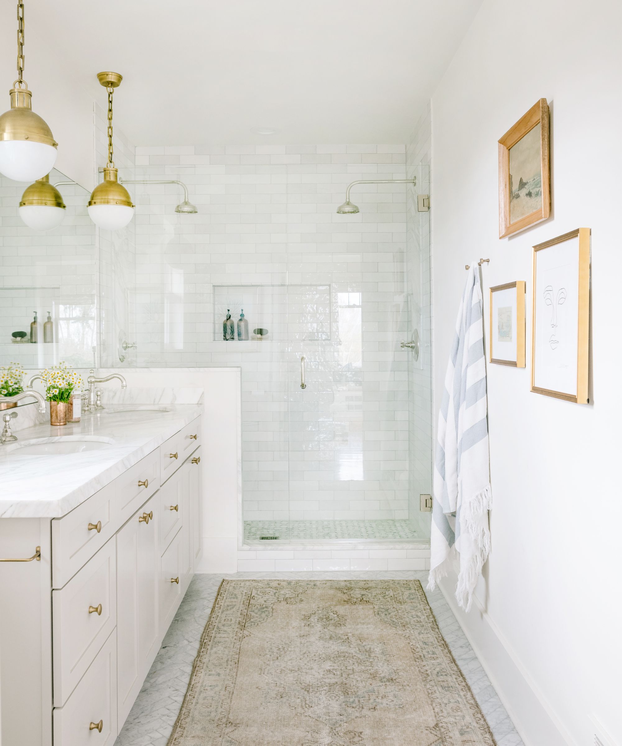
'For the kids' bath, we really needed to create a more functional space for this growing family. They have three kids, twins and a little girl. The kids bath was tiny and pretty much non-functional.'
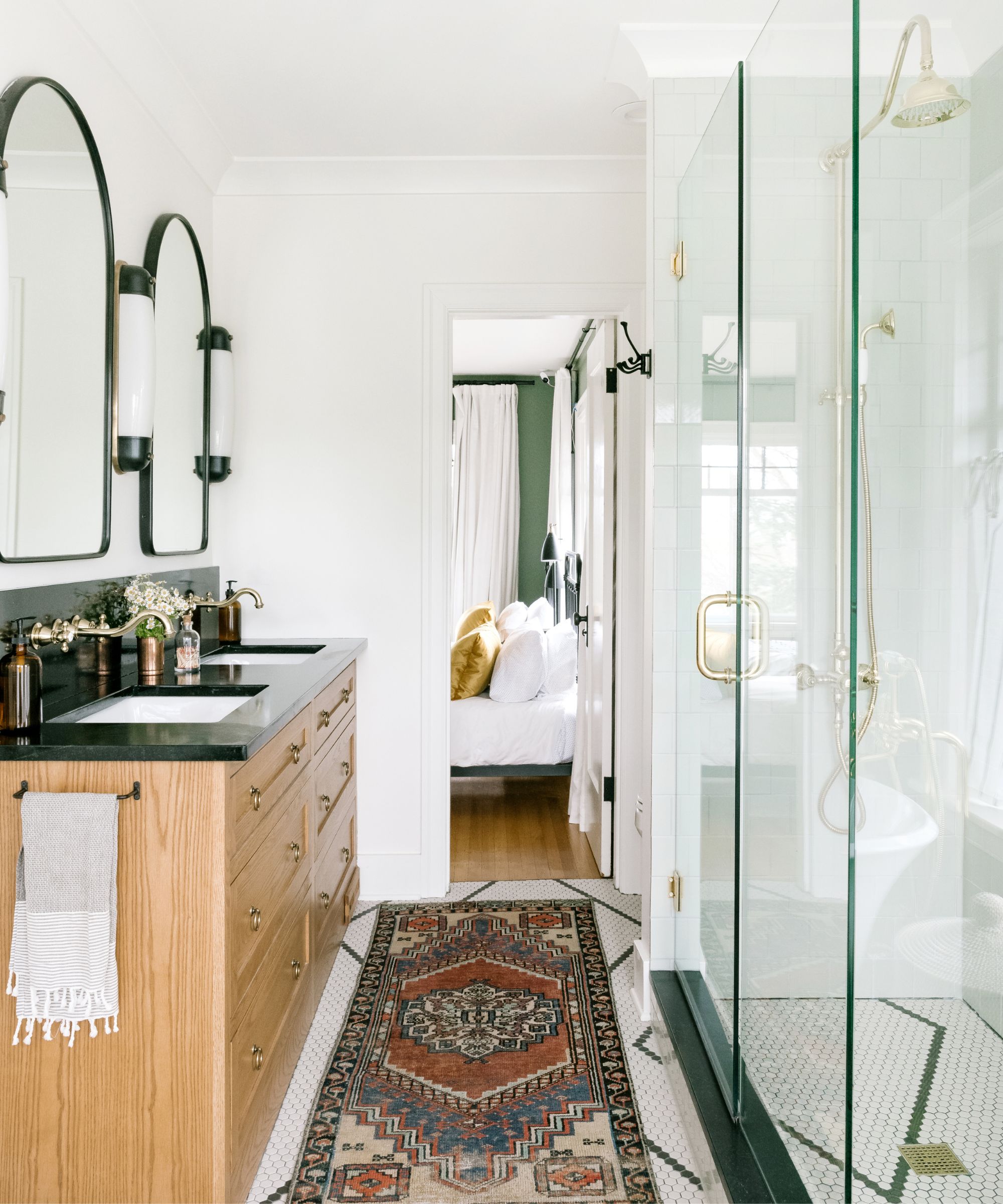
Kids' bath lighting: Circa Lighting; tile: Fireclay Tile
'We combined a tiny office and the current bathroom into one space creating a large bath for all three kids. We were able to incorporate a beautiful freestanding tub, double vanity and large shower.'
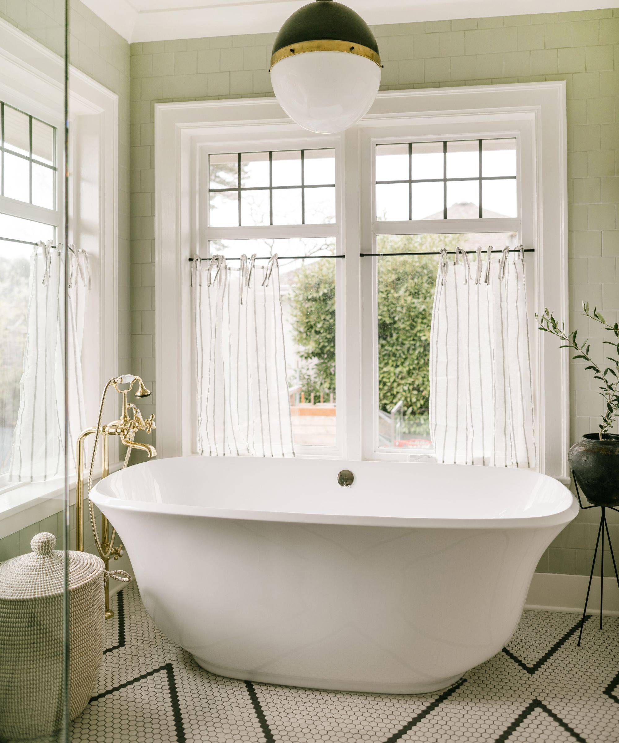
'My favorite elements are the patterned floor tile in the kids bath. The tile really steals the show in this room. I love the classic black and white floor hex and the soft green Fireclay wall tiles that wrap the entire room. We also love the elegant shape of the freestanding tub and the classic oak vanity with soapstone counters.'
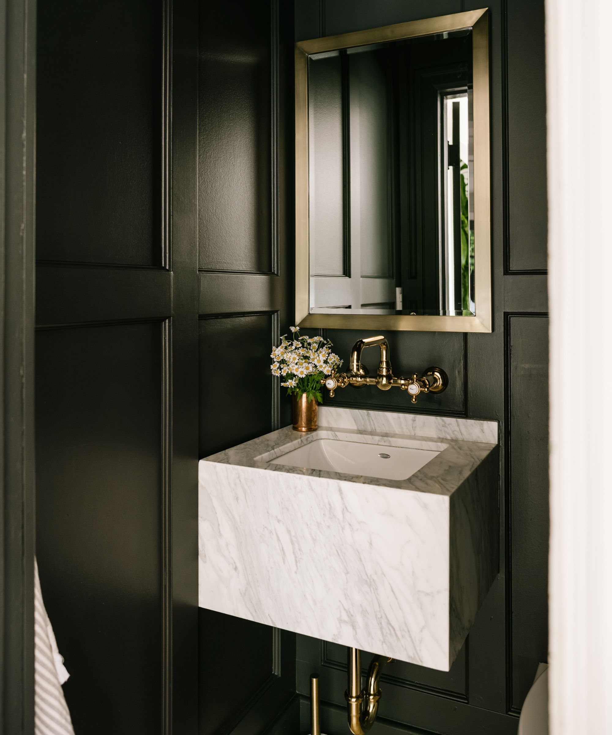
The powder room is a real contrast. 'This space is so moody and fun. The custom slab sink is quite the statement and I love how the brass faucet contrasts against the dark, BM onyx walls.'
Sconce: Hector Finch; Powder faucet: Rohl
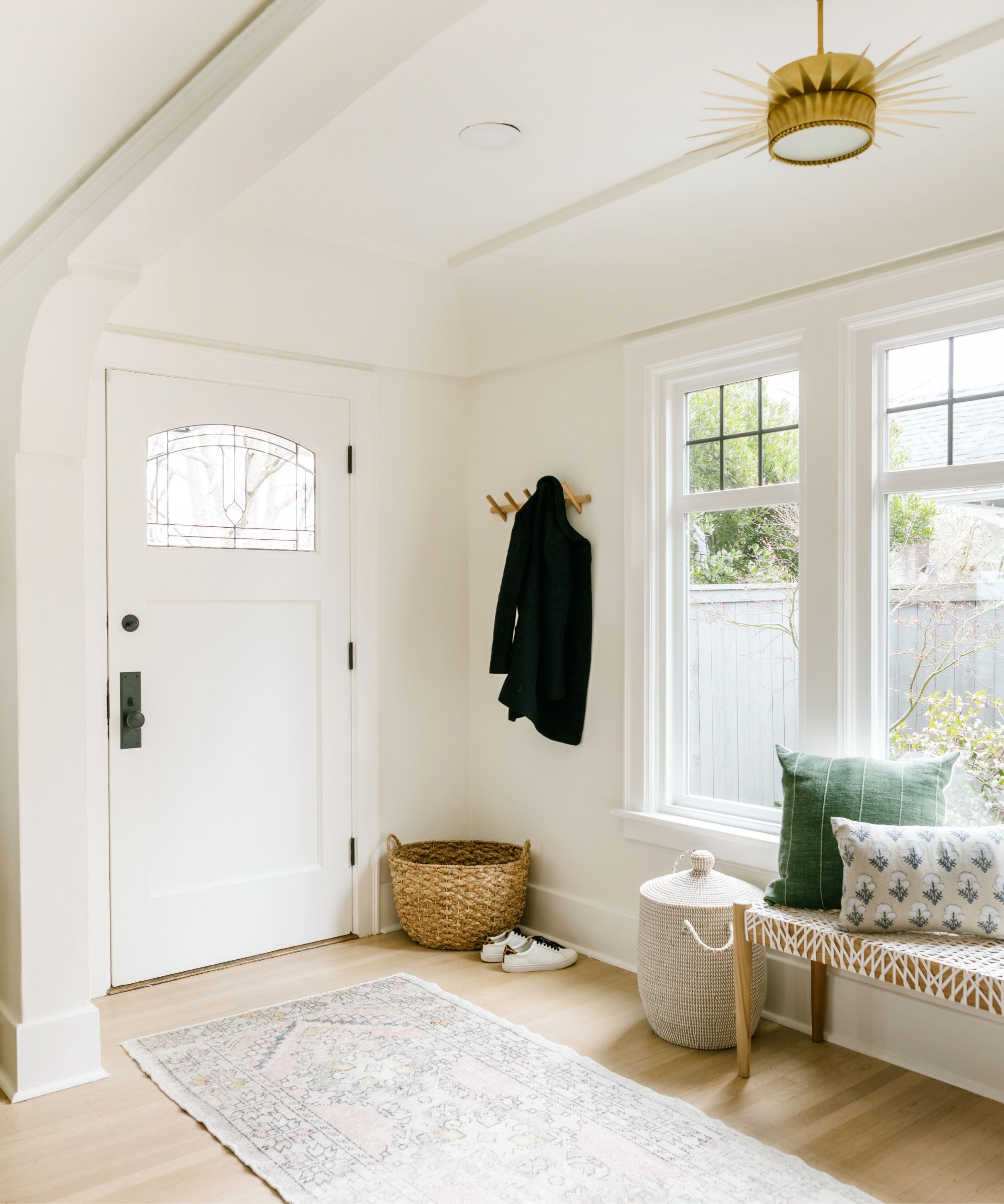
Entry lighting: Circa Lighting
Interior Design: Carina Skrobecki/Jessica Nelson Design
Sign up to the Homes & Gardens newsletter
Design expertise in your inbox – from inspiring decorating ideas and beautiful celebrity homes to practical gardening advice and shopping round-ups.

Lucy Searle has written about interiors, property and gardens since 1990, working her way around the interiors departments of women's magazines before switching to interiors-only titles in the mid-nineties. She was Associate Editor on Ideal Home, and Launch Editor of 4Homes magazine, before moving into digital in 2007, launching Channel 4's flagship website, Channel4.com/4homes. In 2018, Lucy took on the role of Global Editor in Chief for Realhomes.com, taking the site from a small magazine add-on to a global success. She was asked to repeat that success at Homes & Gardens, where she has also taken on the editorship of the magazine.
-
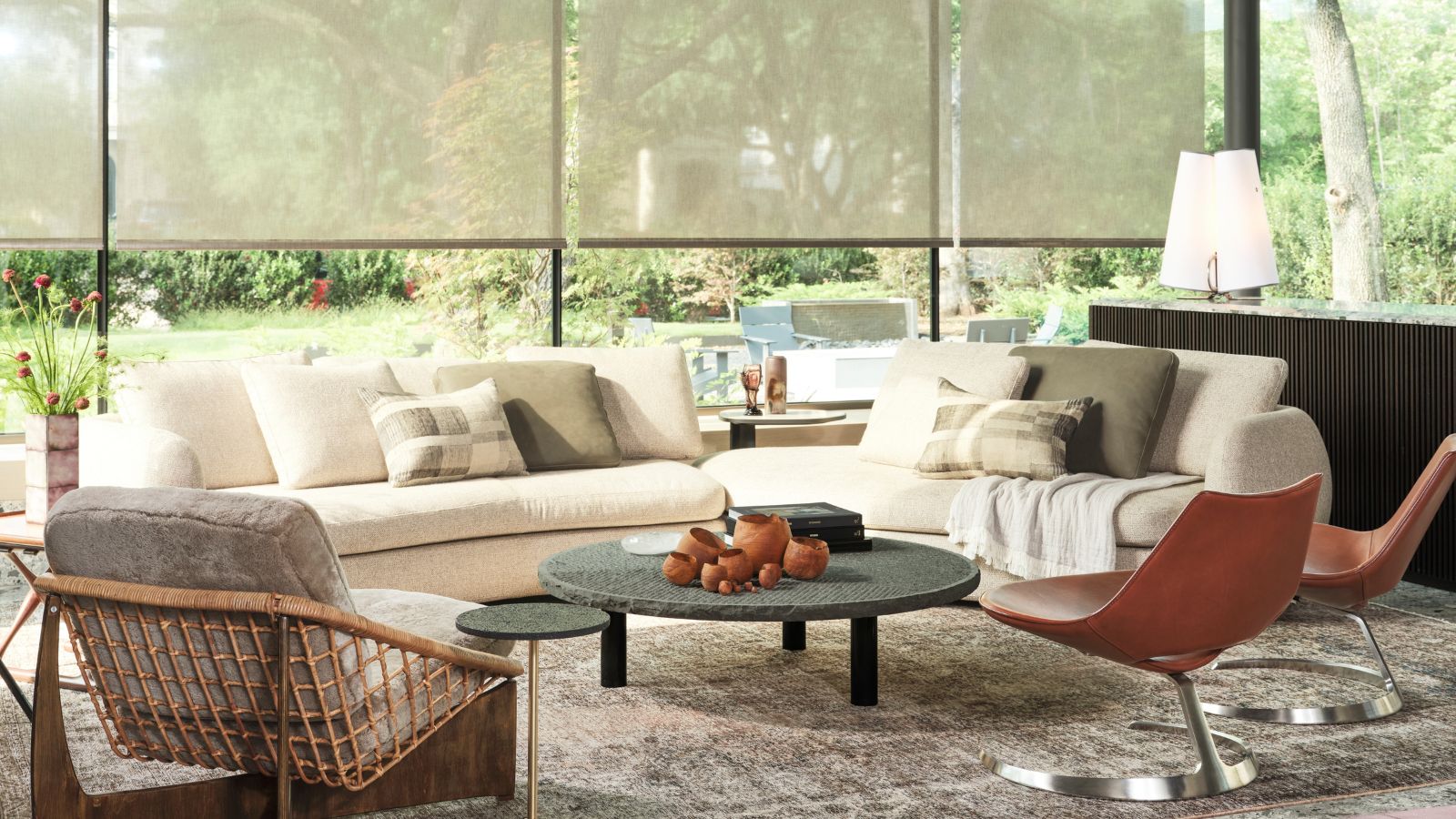 Thoughtful modernism – how one Dallas home makes bold contemporary design feel warm, welcoming, and comfortable
With its mix of textural finishes and carefully curated furnishings, this modernist home is a refreshing retreat
By Karen Darlow Published
-
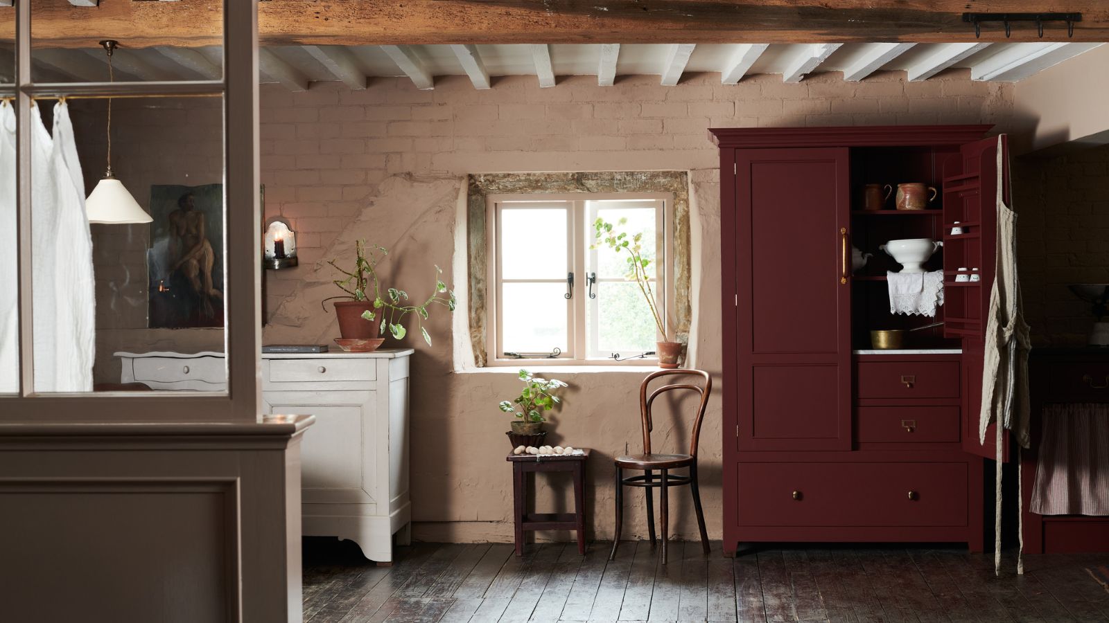 'Wick away the ick' – 6 things people with clean laundry rooms always do to make this hardworking space shine
These tips on how to clean your laundry room will banish grime
By Seraphina Di Mizzurati Published