Is this the most relaxing house in California? With calming yet warming colors and an effortless transitional style, we think it's a contender
This Californian dreamy home is a tranquil haven with a gentle mix of traditional, modern, East Coast and Far Eastern styles
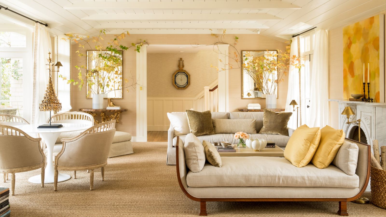
Some homes simply don't slot neatly into one category of house design. Instead they're the perfect sum of many parts, their interior design expertly blending the best qualities of different home décor ideas. This garden house in the prestigious town of Atherton, CA, is one such home.
The house belongs to a senior executive at Sony and, for someone in that line of work, is conveniently situated close to California's famous Silicon Valley.
Based nearby in San Francisco Bay Area, designer Benjamin Dhong recently carried out a full redesign of the 1930s-built home. 'As it was a garden house I wanted it to feel like one but with a romantic and dreamy quality,' he explains. His clients gave Benjamin free rein, and were delighted that he incorporated design influences from the Far East and their homeland of Japan, alongside East Coast style, European-style antiques, and contemporary pieces in what is essentially a showcase of transitional design.
Above all, however, there's an ethereal quality to this house design that eschews such labels. It's all down to that romantic, dreamy quality the designer created. And that's why we're saying it's the most relaxing home in California.
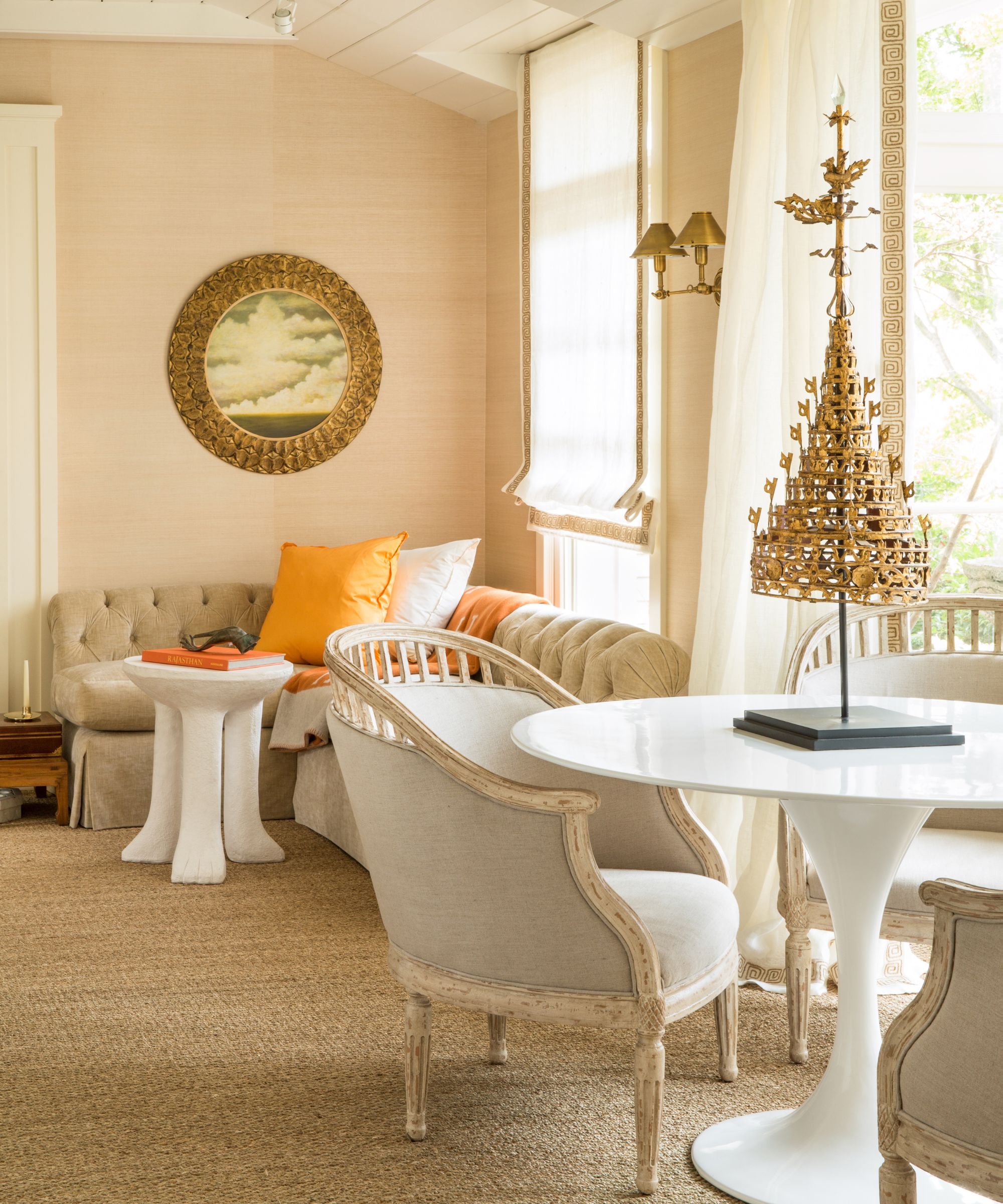
The living room is relaxation central with its calm cream color scheme and easy-on-the-eye furnishings. There's space for activities here, too, with a round table for games or snacks and a neat corner sectional for chatting. 'We wanted this to be both a showcase but also a functional space,' says the designer.
Even in this small cross-section of the room, the designer's trademark blend of old and new is very much in evidence, along with this home's unique mix of Far Eastern, European and East Coast US style influences. All of these transitional living room ideas are united through the warm cream and gold palette, which gives the room an uplifting glow. 'Lots of neutrals actually make the space quite elegant and rich,' says the designer, who placed a vintage Asian temple top as a dramatic statement on the center table to highlight the gold theme.
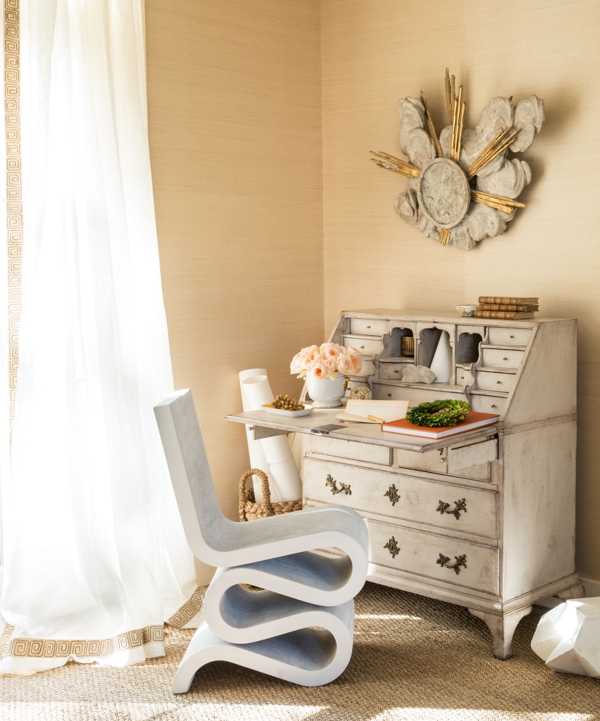
Home office ideas were incorporated into the living room plan with a chalk-painted Gustavian secretary sourced from Tyner & Co. keeping the European antique part of the deal and the classic Frank Gehry Wiggle Side Chair adding quirky mid-century modern style. The cloud and sunburst wall fragment is an antique, also from Tyner & Co.
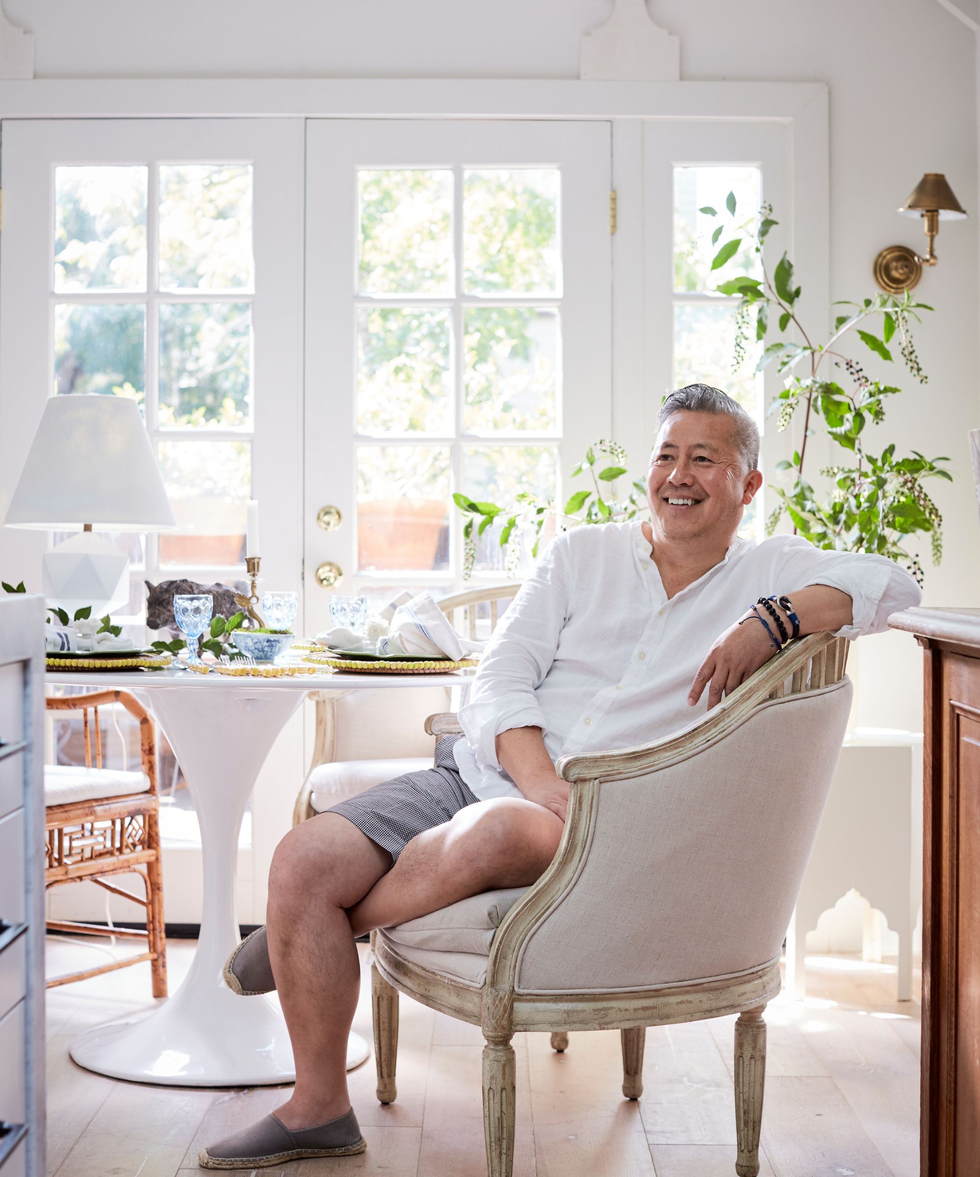
Benjamin Dhong's road to interior design started late in life and appropriately on a trip to Italy. After a long successful career in finance, a stay in a villa by Andrea Palladio outside of Vincenza shifted his career into design and he has never looked back. Benjamin's rooms are intelligent and balanced - a fresh mix of traditional and modern, striving for an effortless elegance. 'I like creating houses with narratives which slowly reveal themselves and a sense of happiness wherever one turns,' he says.
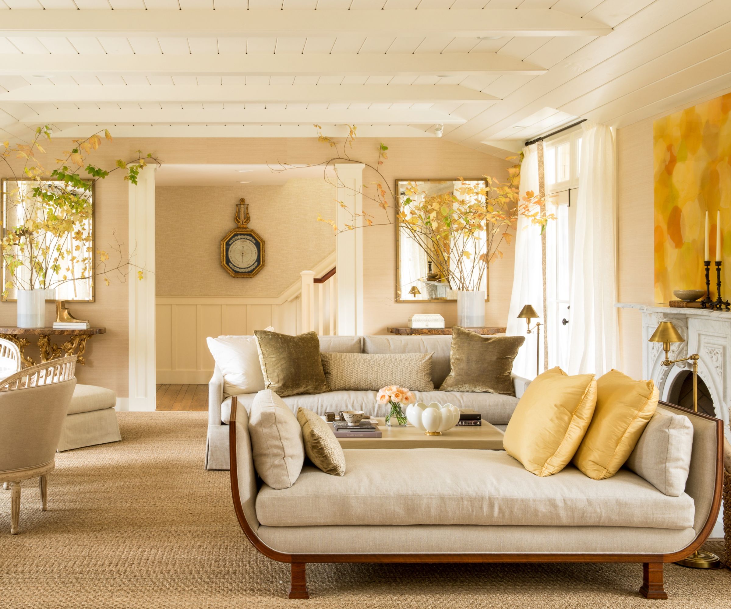
Anyone looking for living room layout ideas will find plenty to inspire them in this multi-function space.
'I like my rooms to have as much living space in all of the corners. We were able to carve out six areas here: sofa area, corner banquette, desk, lounge, and display. it is both open and cozy at the same time,' says designer Benjamin.
'I'm proud of this furniture plan which has a lot of cozy gathering places for the family,' he adds. 'Just a few antiques combined with comfortable upholstered seating was crucial.
'Linen sheers bring a light and airiness to the space, and seagrass throughout brings a natural relaxedness. The gilded Tree of Life consoles add a little drama and elegance at the back of the room and frame a key opening. While the antique daybed has no back so keeps the room open.'
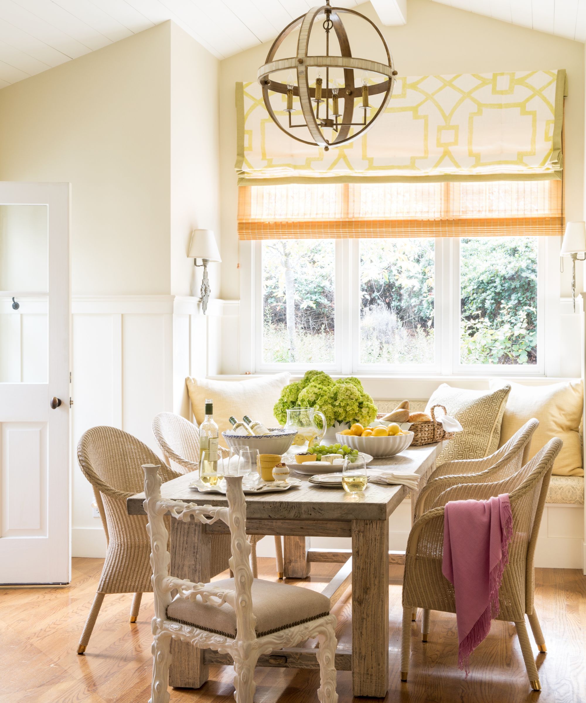
The main working area of the kitchen had recently been refurbished, so kitchen ideas were focused on the eat-in kitchen. 'Positioning the dining table perpendicular to the banquette greatly increased the seating in this room,' says the designer. 'Custom Romans in a block print add a quiet pattern, and a white faux bois desk chair from Myra Hoefer Design provides a bit of whimsy.'
Neutral colors and good natural light here in the kitchen continue the feeling of relaxation and well-being that we see throughout the home.
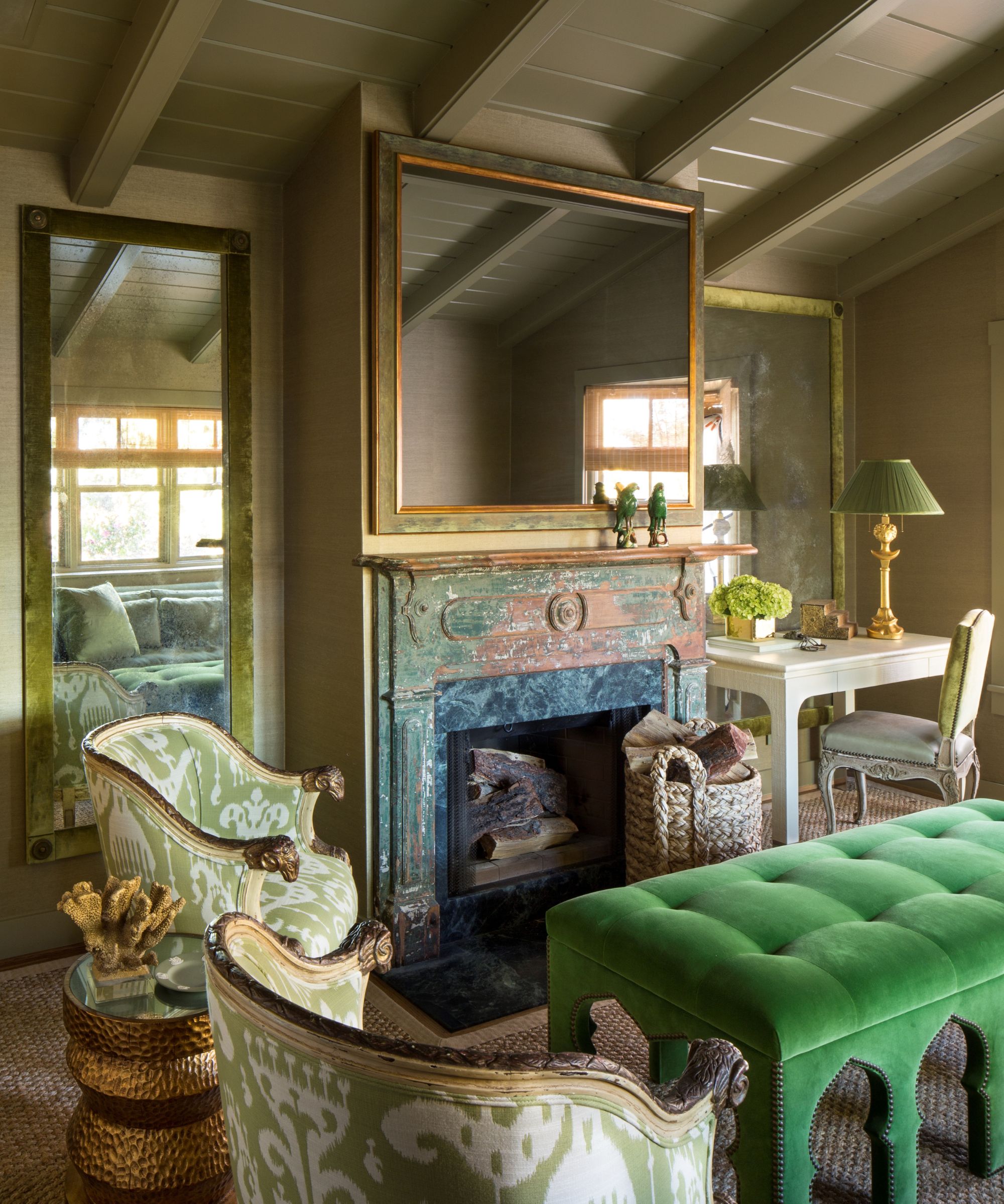
This magnificent space with olive green walls is the garden house's home library and is designer Benjamin's favorite room. The green room ideas reflect the wraparound garden, and create a sense of oasis at this side of the house.
'I love that we turned an all white room with a green fireplace mantel into this sumptuous space,' he says. 'Green is a relaxing neutral and we layered as many versions as possible: green grass cloth, fabrics, velvets, etc, together create a monochromatic cocoon. The room was still dark so we designed a pair of antiqued mirrors bordered in green velvet to bring in more light.
'We hid a TV behind a two-way mirror and the centerpiece is a bespoke Moroccan-inspired ottoman in bright green velvet to add more color and texture.' The grasscloth wallcovering is from Phillip Jeffries, and the distinctive ram's head armchairs are from Chairish.
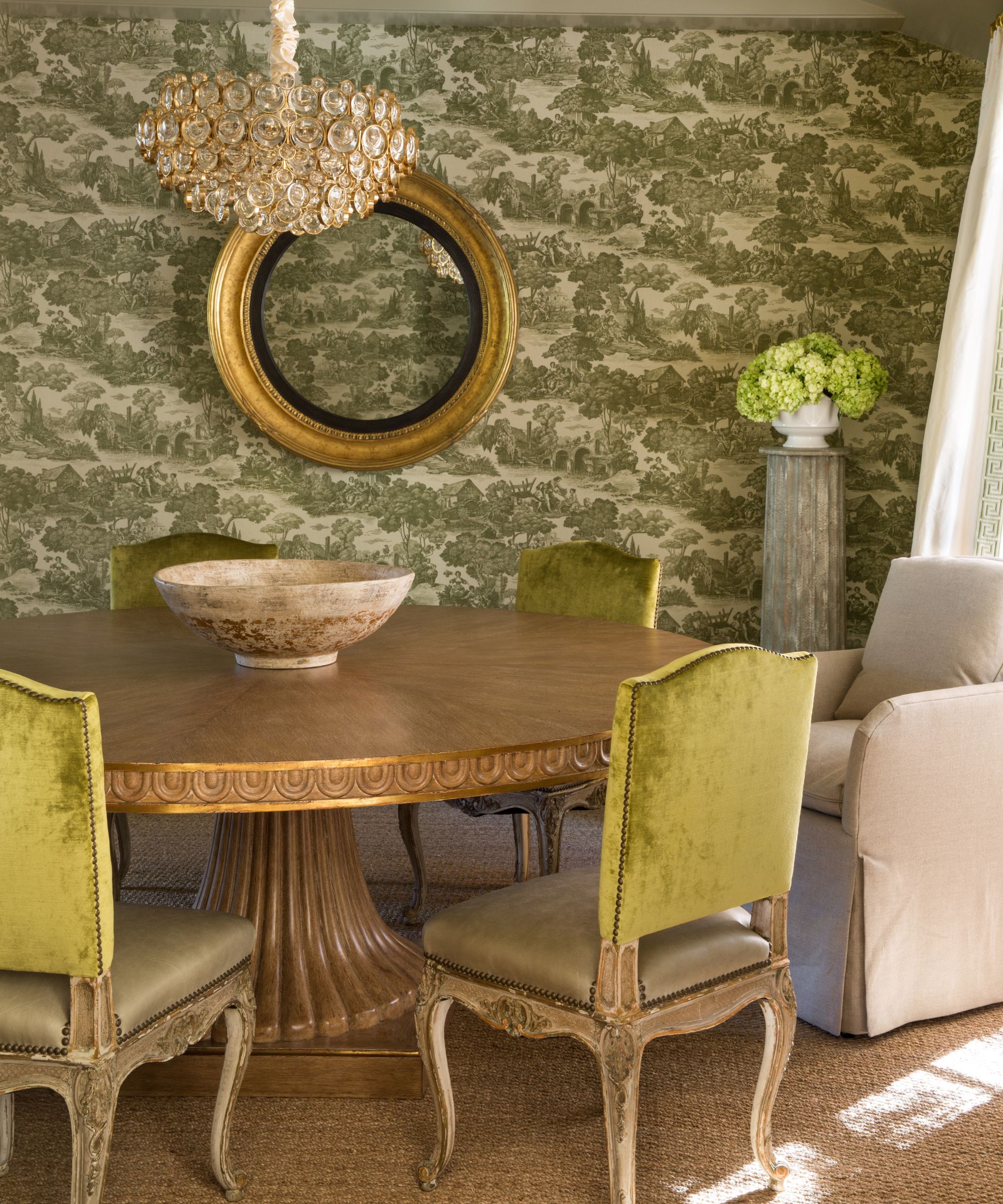
The dining room scheme encompasses traditional, European and Asian influences, with midcentury references too. It's a real melting pot of transitional decor tied together to create a fresh but classic look. The palette of greens, golds and neutrals is perfect for the garden house, but also perfect for relaxation.
'This pretty space looks out over the rose garden so we used a classic green toile, but we added a bit of midcentury modern with a vintage Italian pendant,' says Benjamin Dhong. 'We custom designed and made the dining table and paired it with French vintage chairs. A mix of green leather seats and velvet backs adds quiet opulence. Gold lion sconces and Chinese key drapery rods add an Asian flavor, while seagrass adds a more relaxed California feel.'
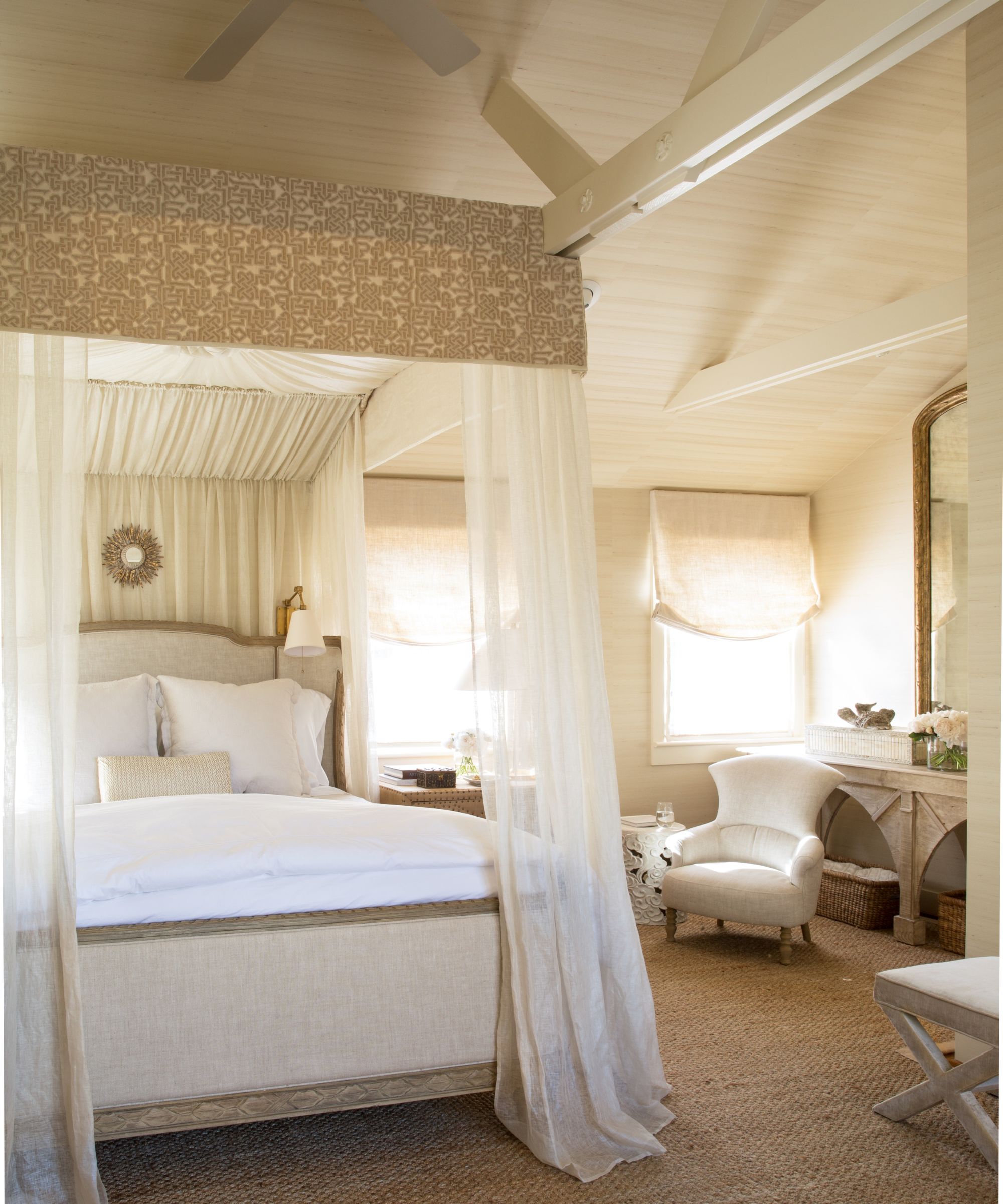
The primary bedroom is surely the ultimate sanctuary for relaxation in this all-round tranquil home. Bedroom ideas for a calm scheme include warm white paint, diaphanous fabrics, and soft light filtered through sheer drapes at the windows. It's the ideal setting for California dreaming.
'The room had low beams which I felt compromised the feeling of height in the room,' says Benjamin. 'So we incorporated the beams into the canopy which allowed for a taller canopy and directed one's eyes upwards. It's all very romantic in a subdued and tailored way.'
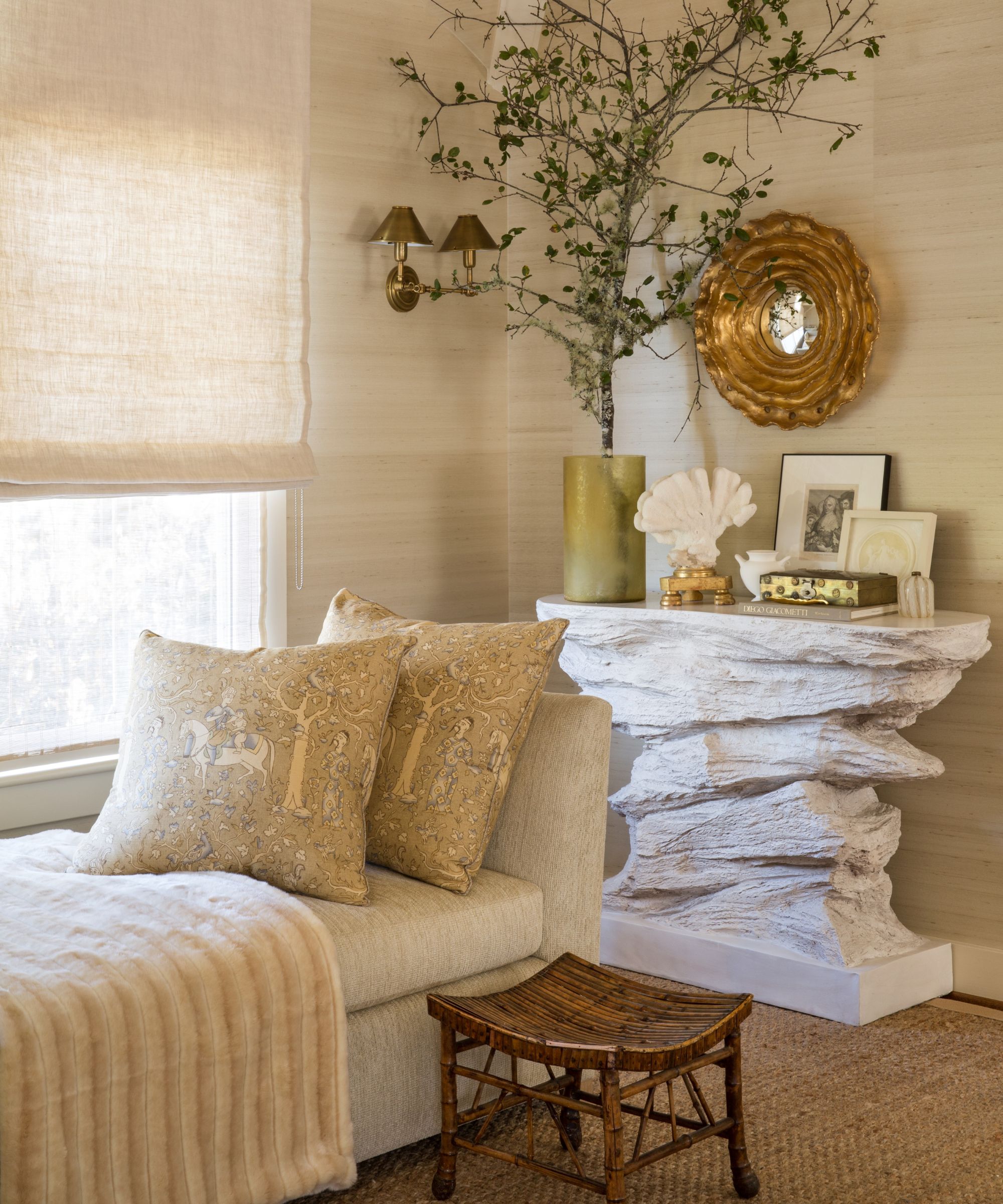
'I wanted the primary bedroom to be as dreamy as possible yet also functional with leisurely seating. It’s a lot of layers of neutrals and yummy textures,' says the designer.
No self-respecting garden house is complete without a pool, and when you've done relaxing in the main house, there's a spa-like pool house waiting for you in the backyard.
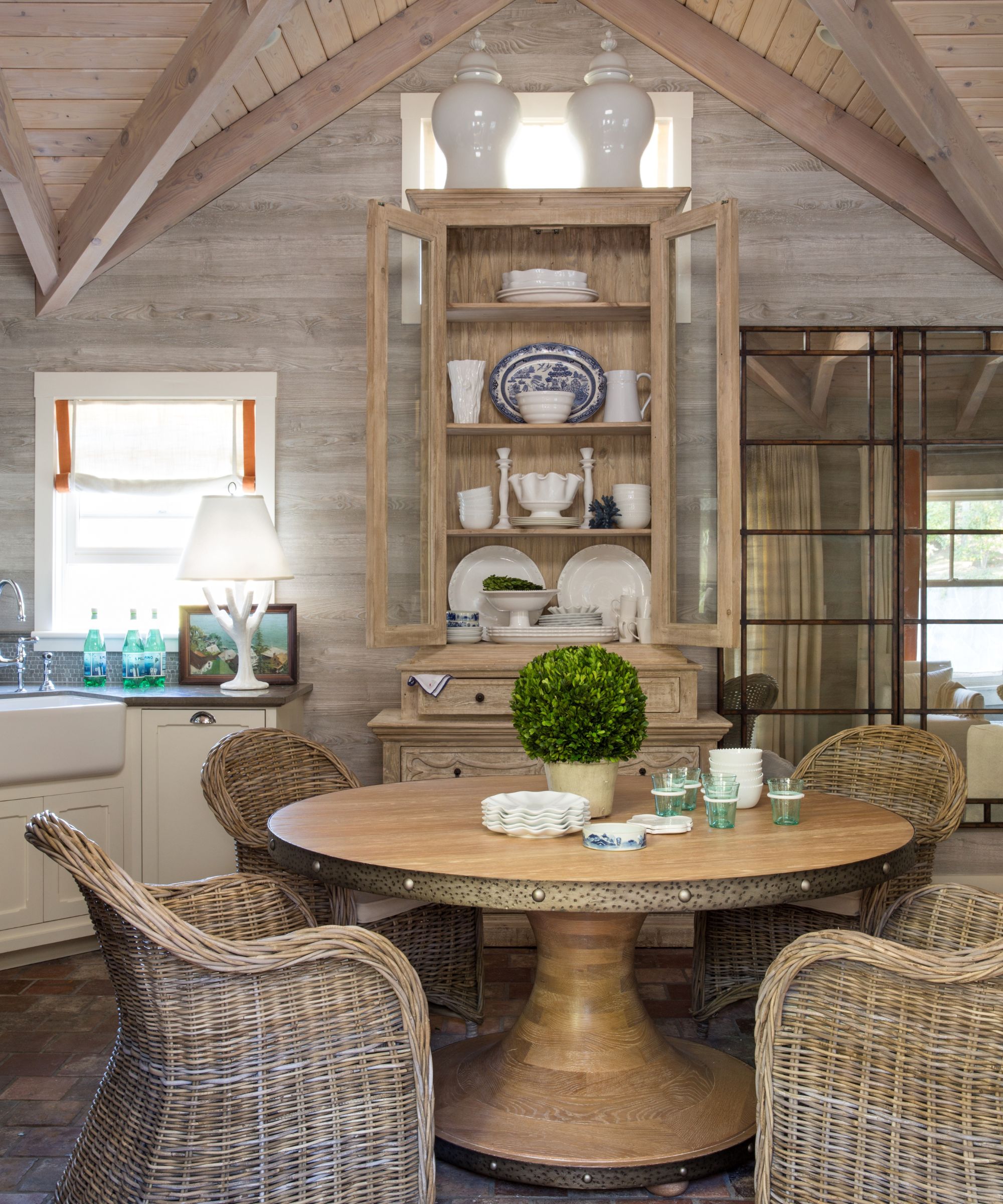
The pool house ideas required careful thought, as designer Benjamin Dhong explains: 'It was a great space but had little character. We covered the walls and ceiling in a faux bois wallpaper to give it a rustic country vibe and placed about seven mirrors together to reflect the pool. A super tall cabinet takes advantage of the tall ceiling. I hate when furniture is too small.'
Sign up to the Homes & Gardens newsletter
Design expertise in your inbox – from inspiring decorating ideas and beautiful celebrity homes to practical gardening advice and shopping round-ups.
Karen sources beautiful homes to feature on the Homes & Gardens website. She loves visiting historic houses in particular and working with photographers to capture all shapes and sizes of properties. Karen began her career as a sub-editor at Hi-Fi News and Record Review magazine. Her move to women’s magazines came soon after, in the shape of Living magazine, which covered cookery, fashion, beauty, homes and gardening. From Living Karen moved to Ideal Home magazine, where as deputy chief sub, then chief sub, she started to really take an interest in properties, architecture, interior design and gardening.
-
 How to clean a patio – 6 different methods, and when you must use a chemical cleaning agent
From manual scrubbing, natural solutions or calling in the pros, industry experts reveal the benefits and considerations of each method
By Andy van Terheyden Published
-
 Kris Jenner's favorite air fryer, the Ninja Crispi, is the perfect small kitchen solution – it deserves a place on the most compact of countertops
Kris approves of this compact yet powerful air fryer, and so do our own kitchen appliance experts, praising it for its multifunctionality
By Hannah Ziegler Published