Spacious living in a narrow plot? 10 space-saving lessons we learned from a stylish NYC townhouse
This smart Manhattan townhouse redesign defies its narrow plot with some clever space-saving ideas that are big on style
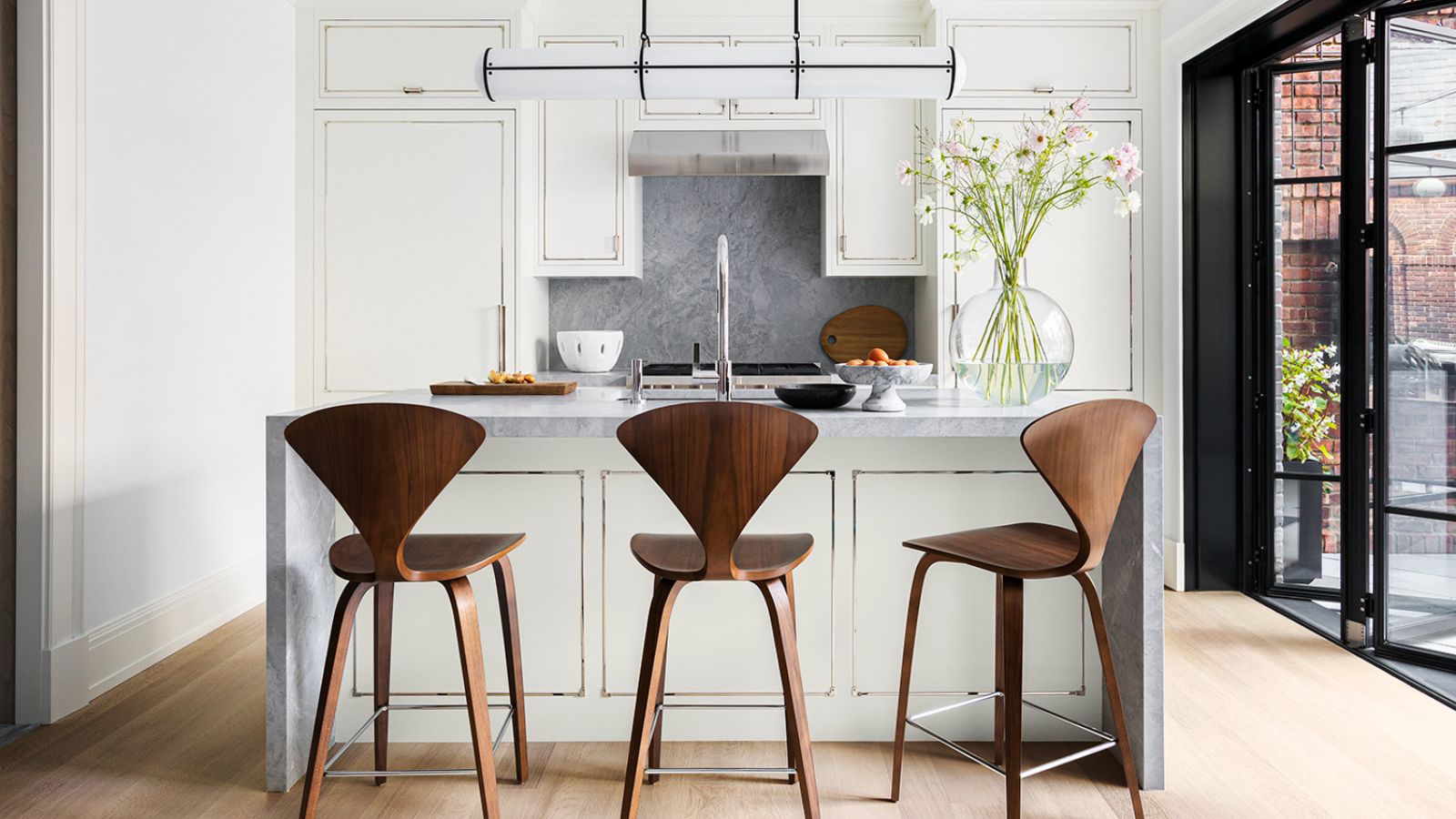
City living often means accepting compromises, and for the owners of this New York City home it seemed the compromise was space. The traditional Manhattan townhouse had many other things to recommend it, however.
Built in 1831, with many of its original features intact, this elegant brick home was constructed in Georgian Palladian style, with distinctive, Georgian-style tall windows and doors. But at just 22ft wide the size of their home was proving a challenge for the busy family of six, who needed help with some space-saving ideas.
Help came in the form of architect Kevin Lichten and interior designer Alicia Murphy who teamed up to turn the narrow house into a dream house.
Designer Alicia Murphy talks us through the home's dramatic shape-shifting transformation and shares 10 practical solutions that anyone can adopt to create more space.
1. Draw attention to the height of a room
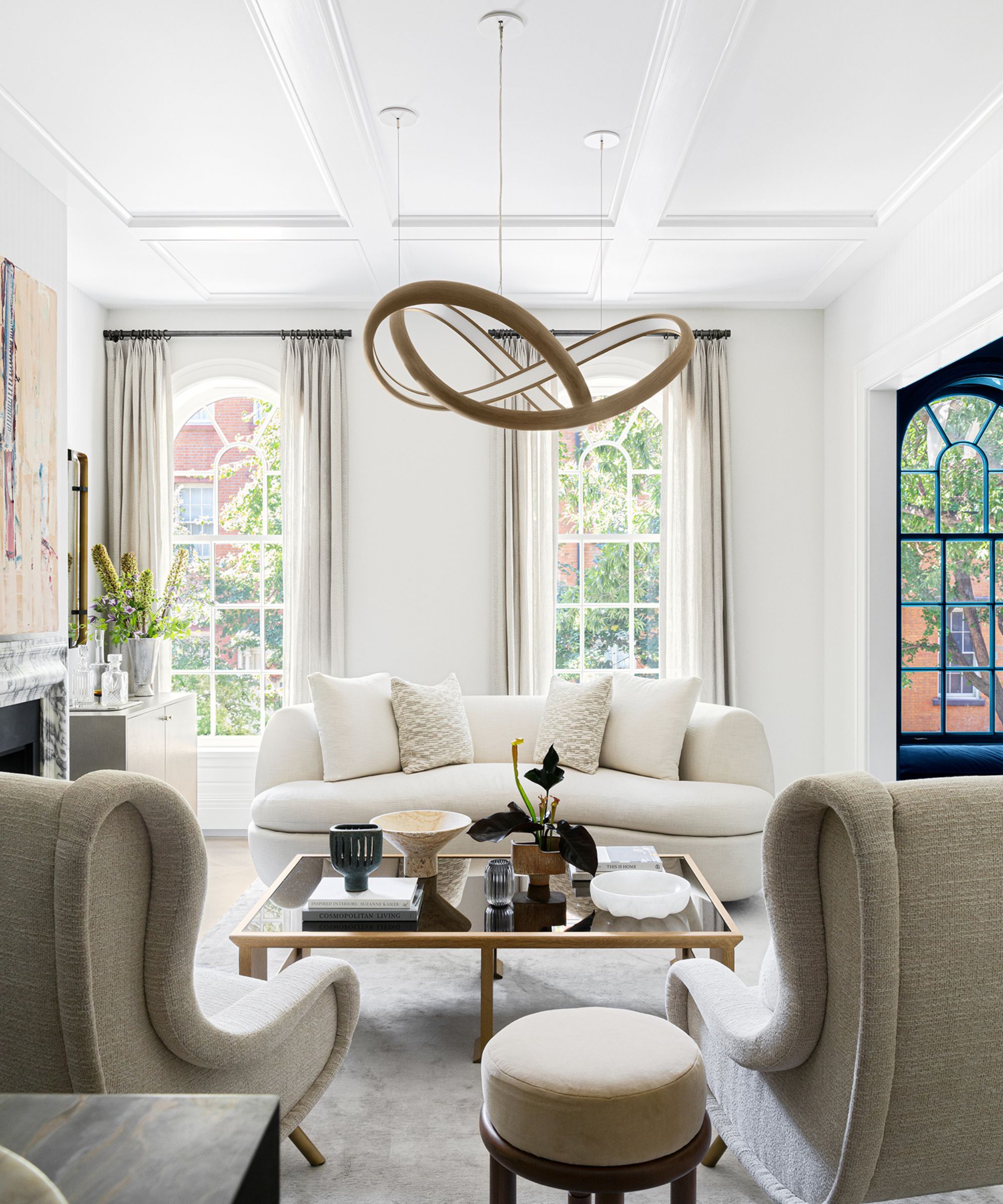
Putting the emphasis on the height of a room draws the attention away from any constraints in its width. The dramatic ceiling pendant can't help but draw the eye upwards, where period style paneling adds further high-level interest. The multi-paned arched windows also help to focus on height, since they almost span from floor to ceiling.
Living room ideas for the décor here are luxurious but also hardworking. 'The clients wanted glamour but needed livability – this is actually a TV room too. So indoor-outdoor performance fabric was important for this room and the chairs swivel for ease of viewing,' explains designer Alicia Murphy.
2. Position kitchen appliances to optimize space and don't skimp on dining table size
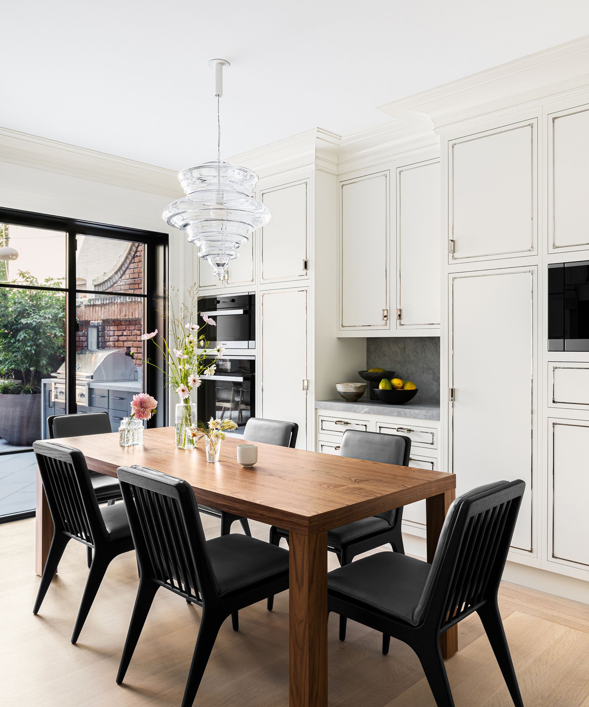
Kitchen ideas fit with the concept that this is a traditional chef’s kitchen made for a modern family. 'So that means storage and space,' says Alicia Murphy. Making room for a good-size family dining table is a good investment as it creates an illusion of generous space.
The kitchen appliances and coffee bar are placed here to maximize counter space. The table is Desiron and chairs are from Benchmark.
3. Bring the outside space indoors with bifold doors
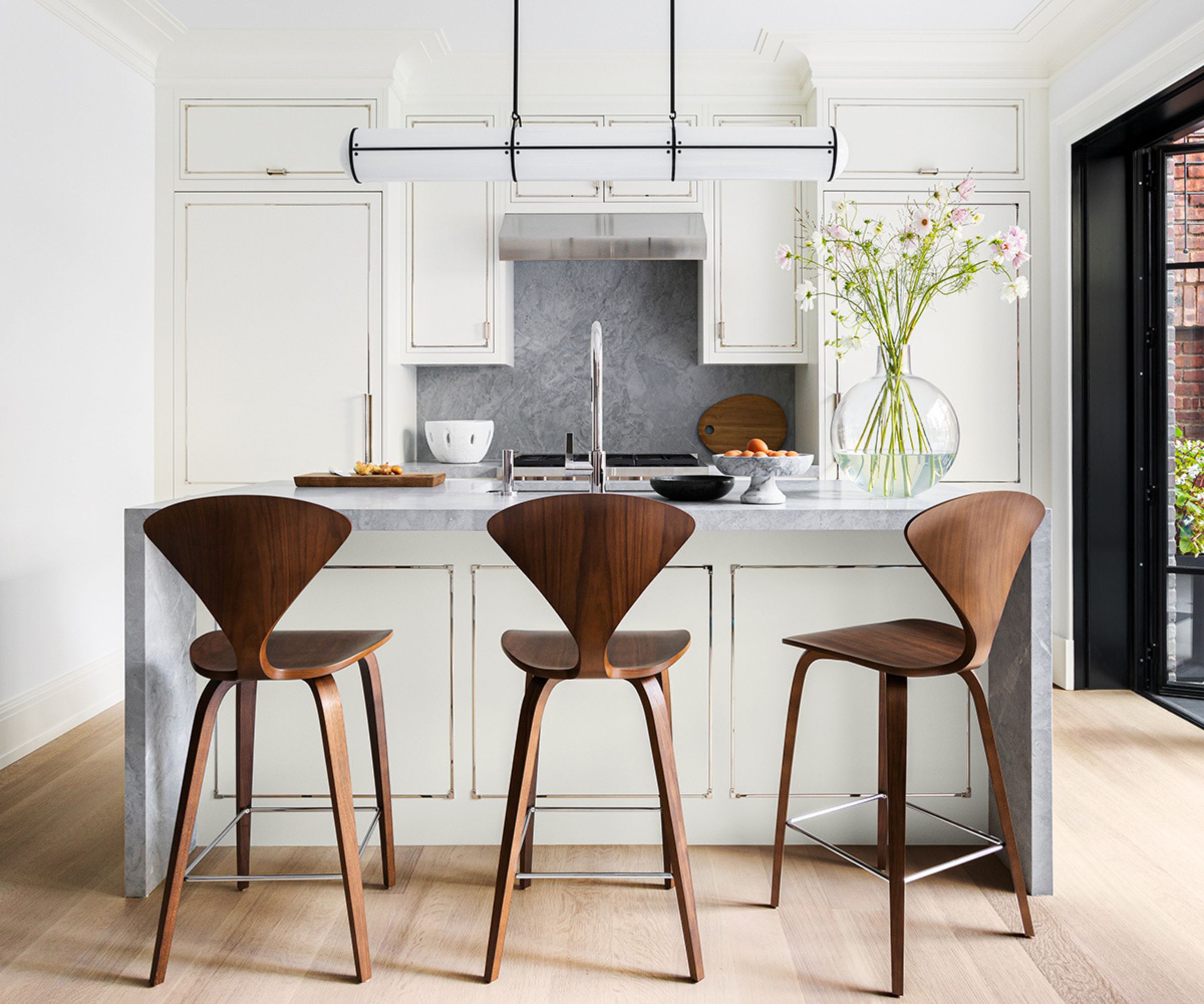
The kitchen cabinetry is all Waterworks, in the classic Pullman design. Chairs from DWR and pendant from Roll & Hill modernize the space, as do the bi-fold black steel doors. Open or closed, the doors increase the sense of spaciousness in the kitchen by offering a clear route or view to the backyard beyond the four walls of the home.
4. Use dark colors to add drama where space is limited
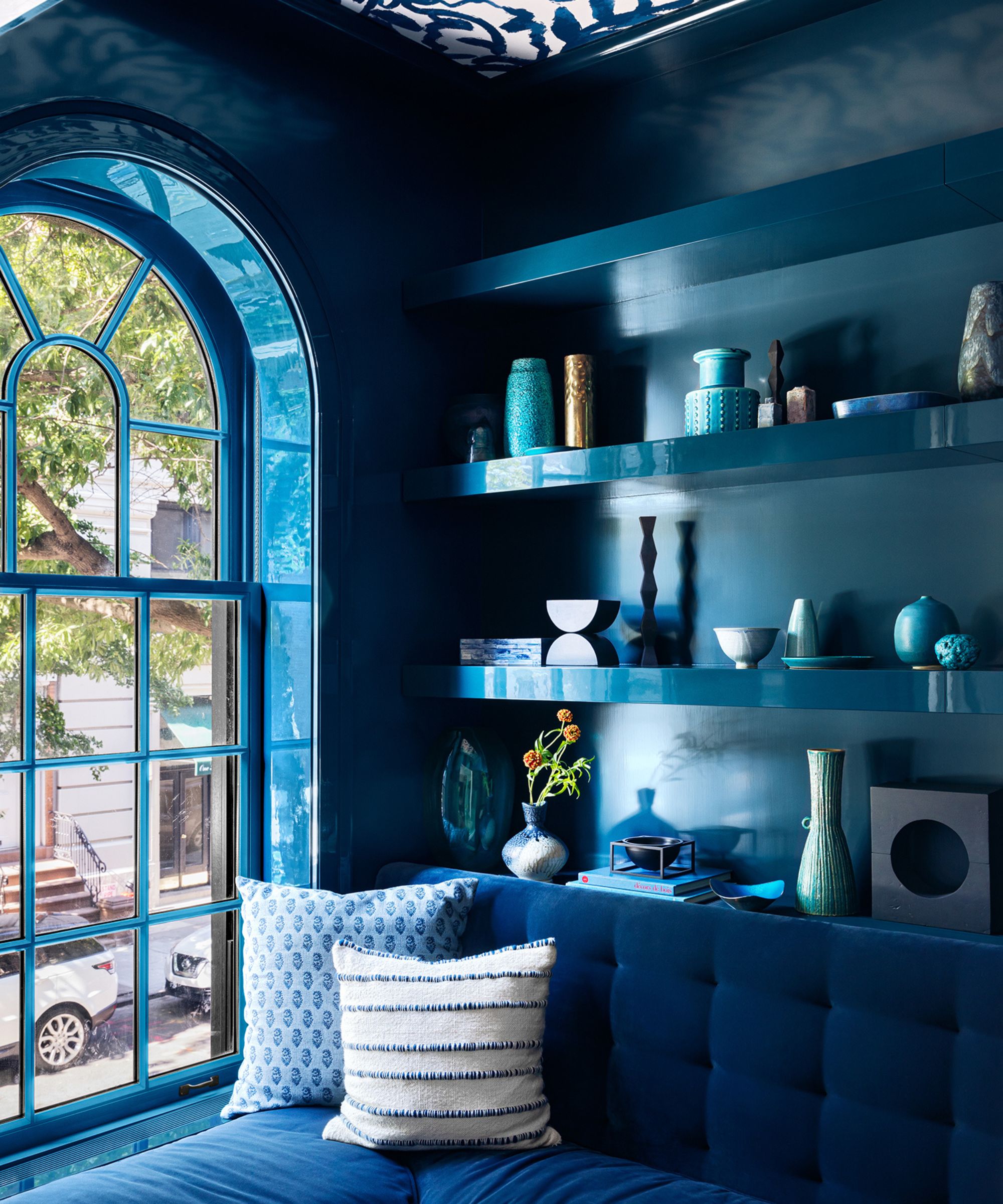
Space may be tight, but that doesn't mean you can't have some characterful and imaginative rooms in the mix. Designer Alicia Murphy agrees: 'Special nooks for reading, a drink, private conversations were also important. This jewel box of a room envelopes you. Farrow & Ball's Hague Blue sets the tone and Zak+Fox Sauvage wallpaper decorates the ceiling,' she adds. If you're looking for advice on what are the best dark colors for small rooms, Hague Blue is a good starting point.
5. Create a statement entrance and keep it clutter free
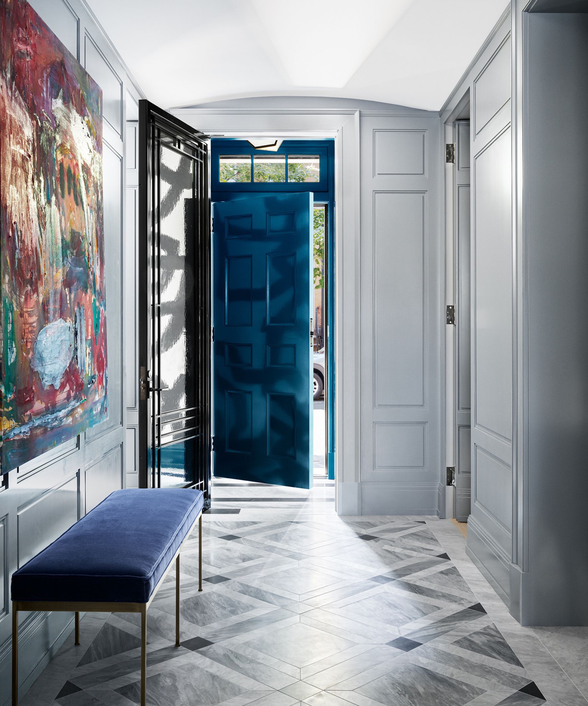
Among the hallway ideas that make this bright, welcoming space stand out, are the largescale modern artwork, upholstered bench (a slim, spacesaving design) and traditional period-style wainscoting. All these features add up to give the entrance a serious intention, and keeping it clutter-free can only add to the illusion of space.
6. Repurpose underused transition spaces
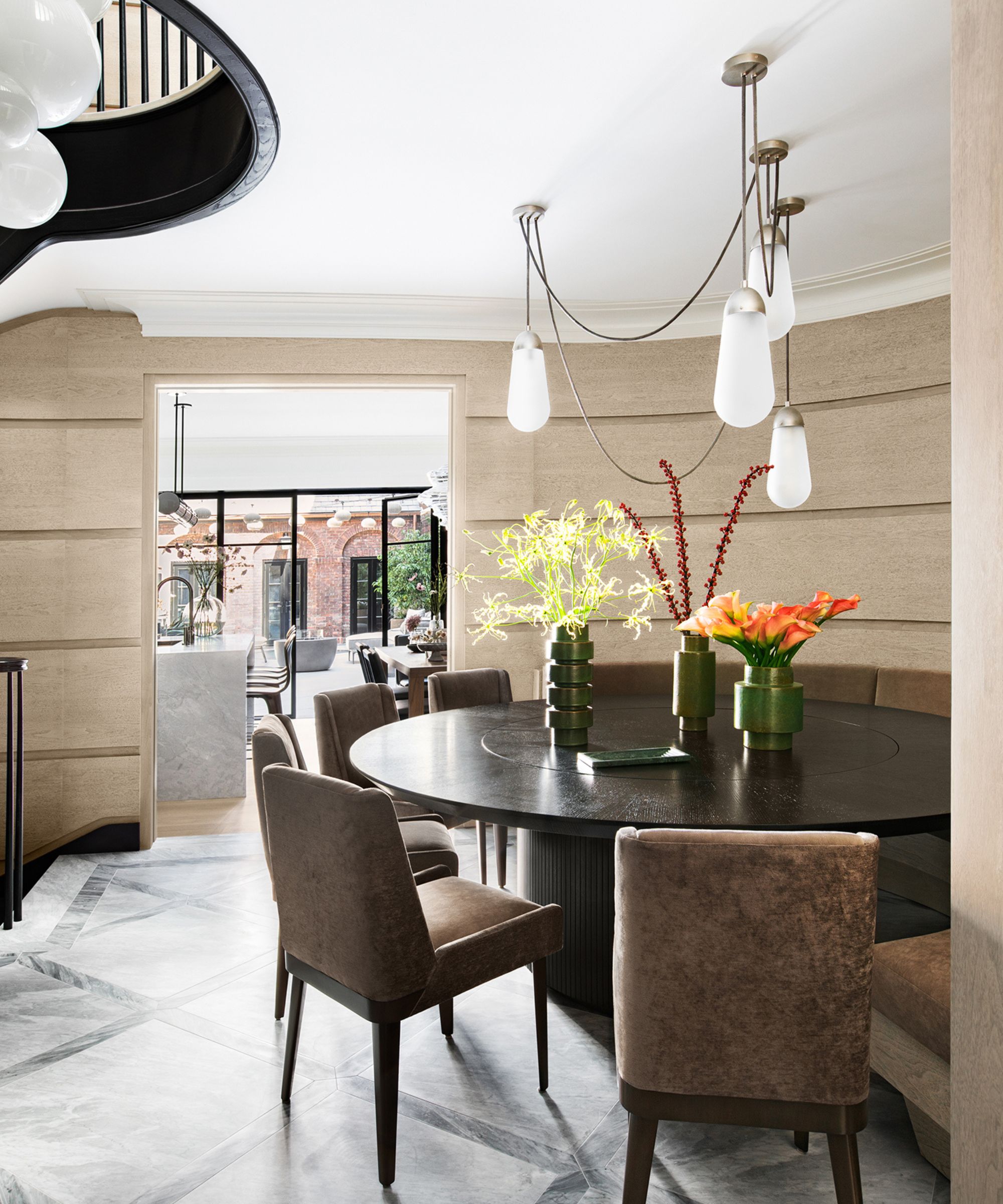
'One must-have was space to seat 14 for dinner both inside and outside. So the curved banquette on the main floor hallway was a bit of an engineering feat and works well,' says Alicia Murphy. On the face of it, it may seem a tad unconventional to seat your dinner guests in the foyer. But with the kitchen right next door, views onto the backyard through the steel-framed windows, and a close-up of the most amazing stairway light fixture as you eat, we don't think anyone's complaining about this imaginative redeployment of a transition space.
7. Choose a showstopping light to take things up a level
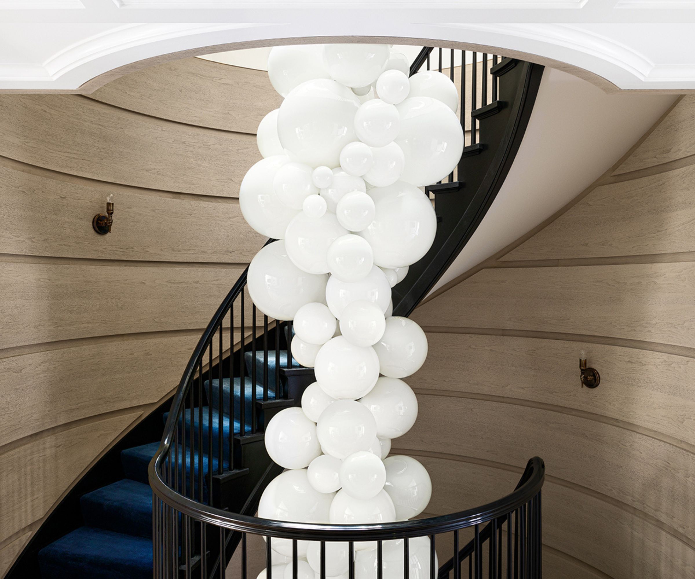
Looking for staircase ideas? They don't get much more dramatic than this. Designer Alicia Murphy says: 'The stairwell connecting all the floors and the light fixture are spectacular and a career highlight. The center light fixture spans four floors and I believe this was the first residential installation of this Cameron Design House light fixture.'
'The circular stairwell and bubble-like glass sphere chandelier were very intentional and necessitated much planning. The glass mimicked the shape of the stairwell and were spaced out to decorate the journey through the floors,' she adds.
8. Make a feature of a bijou bedroom
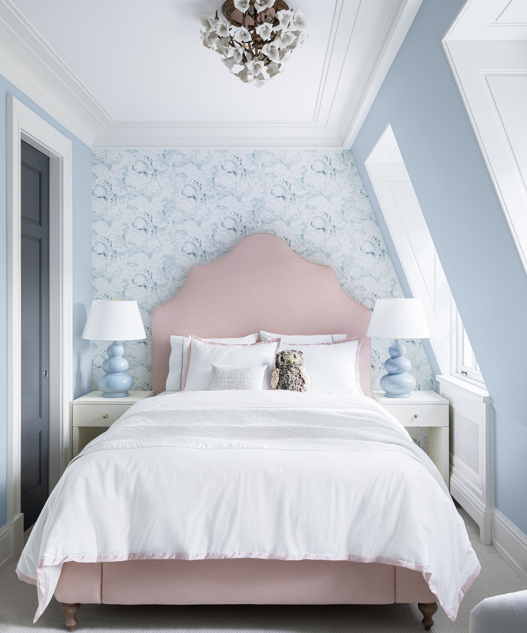
Anyone looking for bedroom ideas for a smaller space take note. Tucked into the roofline on the top floor, this calm room is a sanctuary, away from the busy shared family living spaces downstairs. The wallcovering is by Phillip Jeffries, and the soft beige-pink upholstered bedhead brings a touch of warmth to the scheme.
9. Be brave with a small bathroom layout
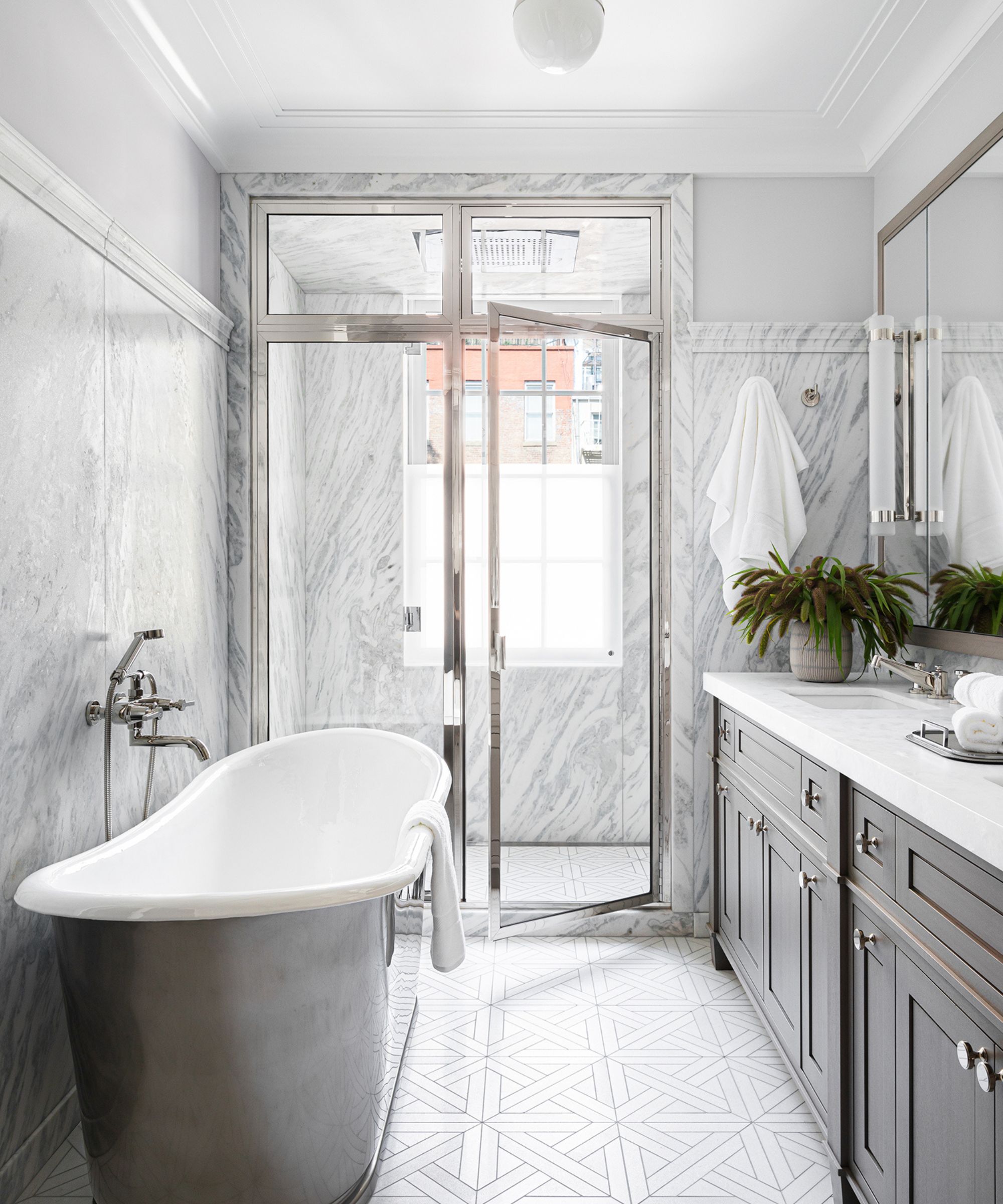
Don't be afraid to defy convention when planning the layout for a small bathroom: there are no rules. In this house bathroom ideas make luxury the focus with a freestanding bath and generously proportioned shower, even though the space was a bit of a challenge.
'Orienting the Waterworks tub in this way worked well and the bathroom is a true escape,' says designer Alicia Murphy. 'The showerhead is a rain shower and there are speakers as well.'
10. Make the most of extra space outside
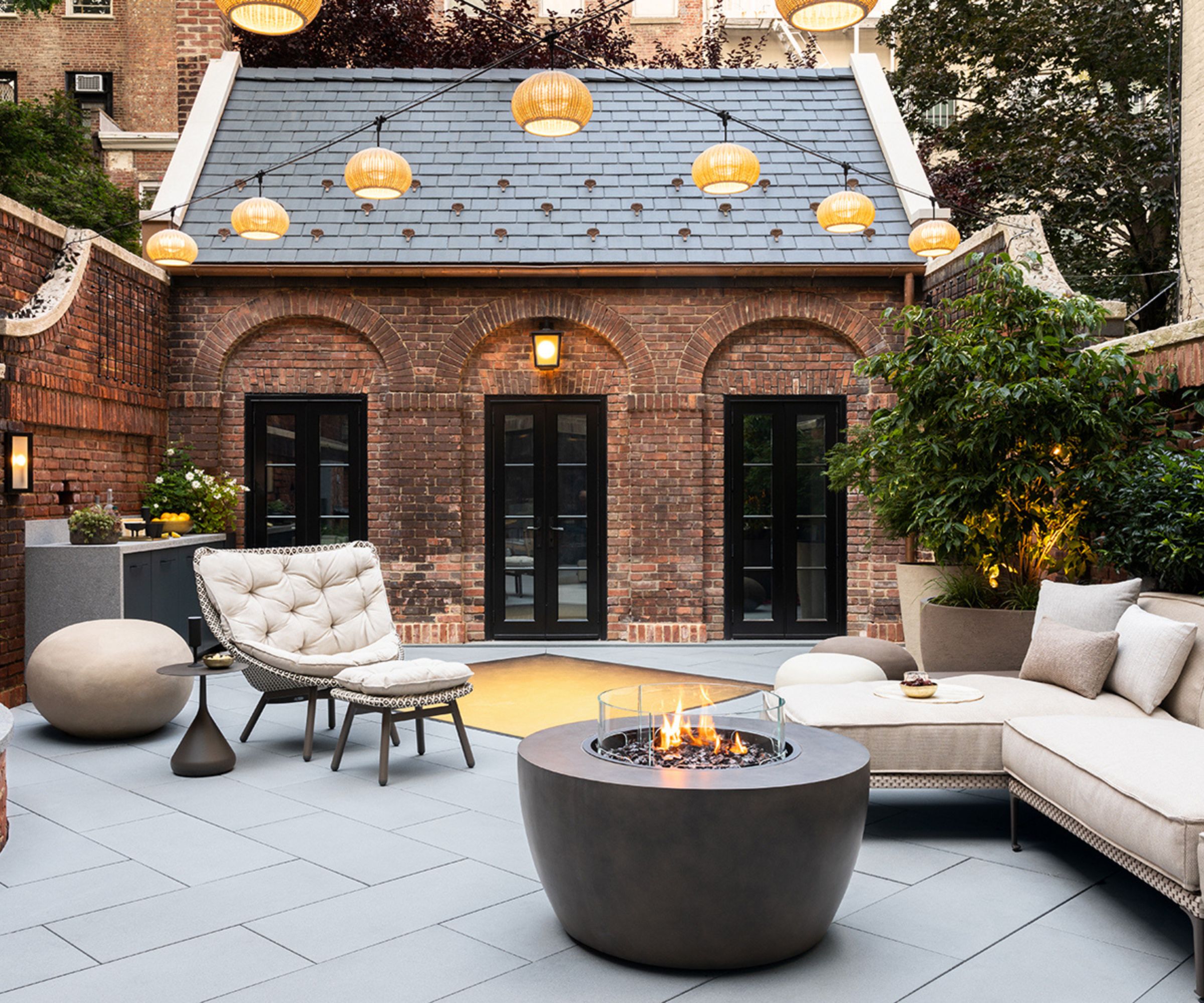
When space is tight inside, go outside. For this family that likes to embrace indoor-outdoor living, the redesigned backyard gets a lot of use. Landscape architect Robin Key created a water feature and outdoor kitchen for easy entertaining, and the back wall of the house fully opens up to the outside. The furniture is Dedon, comfortable as well as durable.
So the transformation is complete. Every inch of space maximized, from the front door right through to the backyard. We wondered how the owners feel about their new, improved and seemingly enlarged home. 'The clients were over the moon and it’s so rewarding to see them happy. My experience in designing and renovating a historical Manhattan townhouse design was a great and rewarding learning experience,' says Alicia Murphy.
Architect Kevin Lichten
Interior design Alicia Murphy
Photographs Brittany Ambridge
Sign up to the Homes & Gardens newsletter
Design expertise in your inbox – from inspiring decorating ideas and beautiful celebrity homes to practical gardening advice and shopping round-ups.
Karen sources beautiful homes to feature on the Homes & Gardens website. She loves visiting historic houses in particular and working with photographers to capture all shapes and sizes of properties. Karen began her career as a sub-editor at Hi-Fi News and Record Review magazine. Her move to women’s magazines came soon after, in the shape of Living magazine, which covered cookery, fashion, beauty, homes and gardening. From Living Karen moved to Ideal Home magazine, where as deputy chief sub, then chief sub, she started to really take an interest in properties, architecture, interior design and gardening.
-
 Kevin Bacon and Kyra Sedgwick's rustic kitchen island is stunning, but controversial – designers say you can get the look without the hassle
A popular material finds an unorthodox home in the couple's kitchen, but experts disagree on whether it should be used – here's how to do it instead
By Sophie Edwards
-
 How to grow grapefruit for homegrown sweet and tangy, highly nutritious harvests – a fruit tree expert shares their planting and care tips
From planting to harvesting, this is all you need to know about grapefruit trees
By Drew Swainston