This pied-à-terre is a fitting New Orleans home for interior designer Thomas Jayne
This townhouse in the French Quarter of New Orleans is a lesson is classically inspired décor
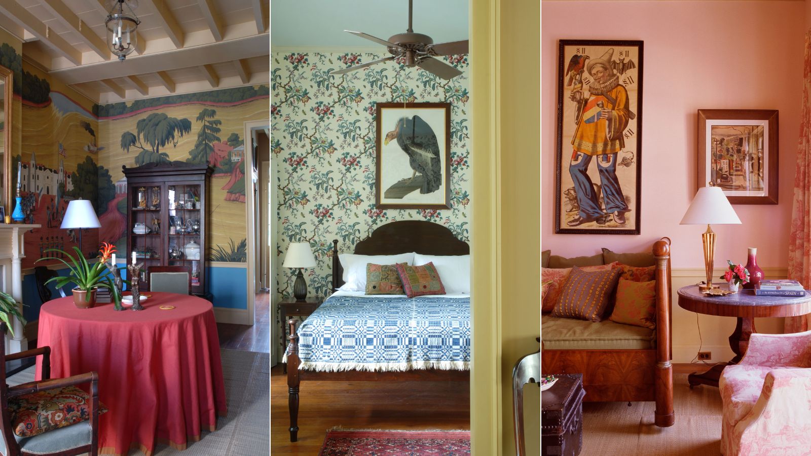

Rick Ellis and interior designer Thomas Jayne have long enjoyed participating in Mardi Gras celebrations in New Orleans, so a pied-à-terre to serve as a home base for their celebrations was inevitable.
They finally found just the right place in an 1836 Creole townhouse in the French Quarter and they have transformed it into one of the world's best homes.
The apartment is entered through a shared courtyard space with a fountain. The small entry foyer leads into the living room. A view out the rear entrance of the apartment toward the lushly planted courtyard and balcony, is a perfect place for alfresco dining.
The apartment is located on what was originally the parlor floor of the structure. The 1,200-square-foot space sadly lost much of its original detail in a 1960s renovation, but a sensitive makeover by the late architect Frank W. Masson restored some of its lost elegance. It features a balcony on the façade side as well as a rear balcony looking over a small courtyard with a fountain.
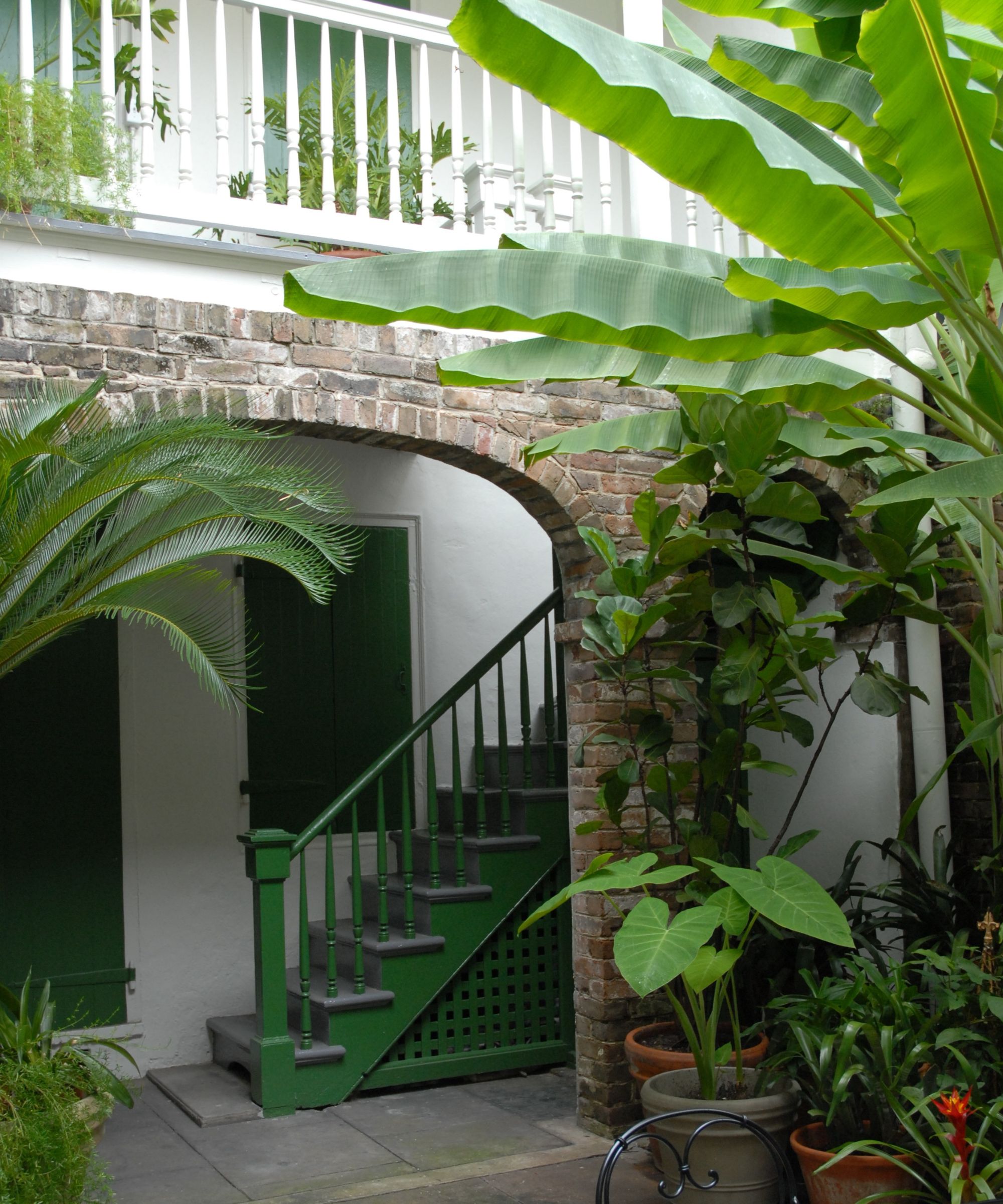
The inspiration for the decoration of the apartment derived from the early 19th century – particularly examples found in and around New Orleans. The goal was to incorporate these traditional decorating ideas into contemporary interior design.
Take the full tour below:

Founder of the Jayne Design Studio, Thomas Jayne's work includes contemporary dwellings and historically important houses, from a seaside cottage in Oyster Bay to an important 18th-century house in Charleston. His ability to marry historical sensitivity with a modern sensibility has been recognized with a plethora of interior design industry accolades.
Living room
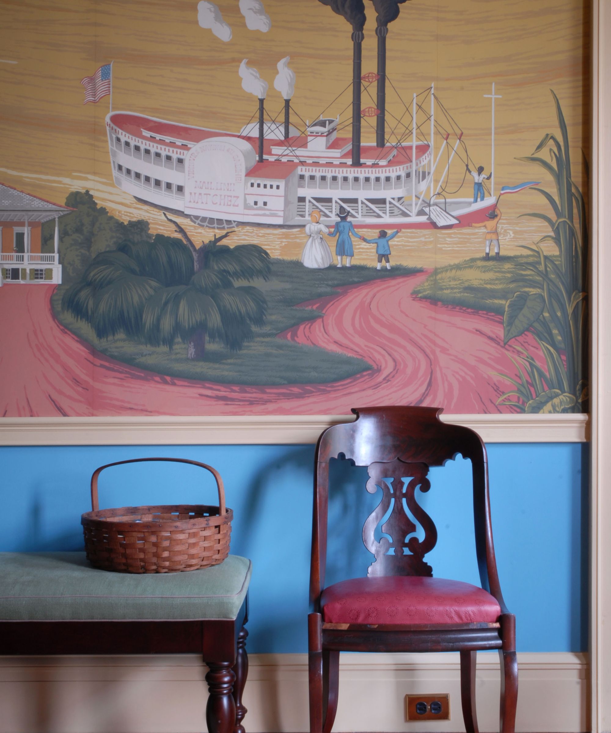
Jayne and Ellis' whole home is a lesson in wallpaper ideas. In the main rooms, Jayne indulged a fascination with scenic wallpapers found in New Orleans and throughout the South, an interest that began with his study of the decorative arts. Henry Francis DuPont’s use of murals at Winterthur (the Baltimore Alcove is a favorite) and the period rooms at the Metropolitan Museum made a great impression on him.
Formal antique papers, such as those made by Zuber, seemed inappropriate for a small room. Taking inspiration from one of his favorite childhood books, The Story of the Mississippi, with illustrations by C. H. DeWitt, and working with the wallpaper company DeGornay, a new scenic design more in keeping with the setting was created.
The living room is simply furnished with a draped center table and light seating. For entertaining, the furniture is pushed to the edges, a tradition from the 18th and early 19th centuries, when formal rooms were similarly organized.
Jayne's living room ideas are grounded firmly in the neoclassical style, with furniture dating to the original period of the house. These old styles are seemingly out of favor now, but their scale and materials suit the house. They achieve the balance of ancient and modern that Jayne and the work of the Studio strive for in their rooms. The mural also made reference to local flora and fauna in addition to the architecture of the region.
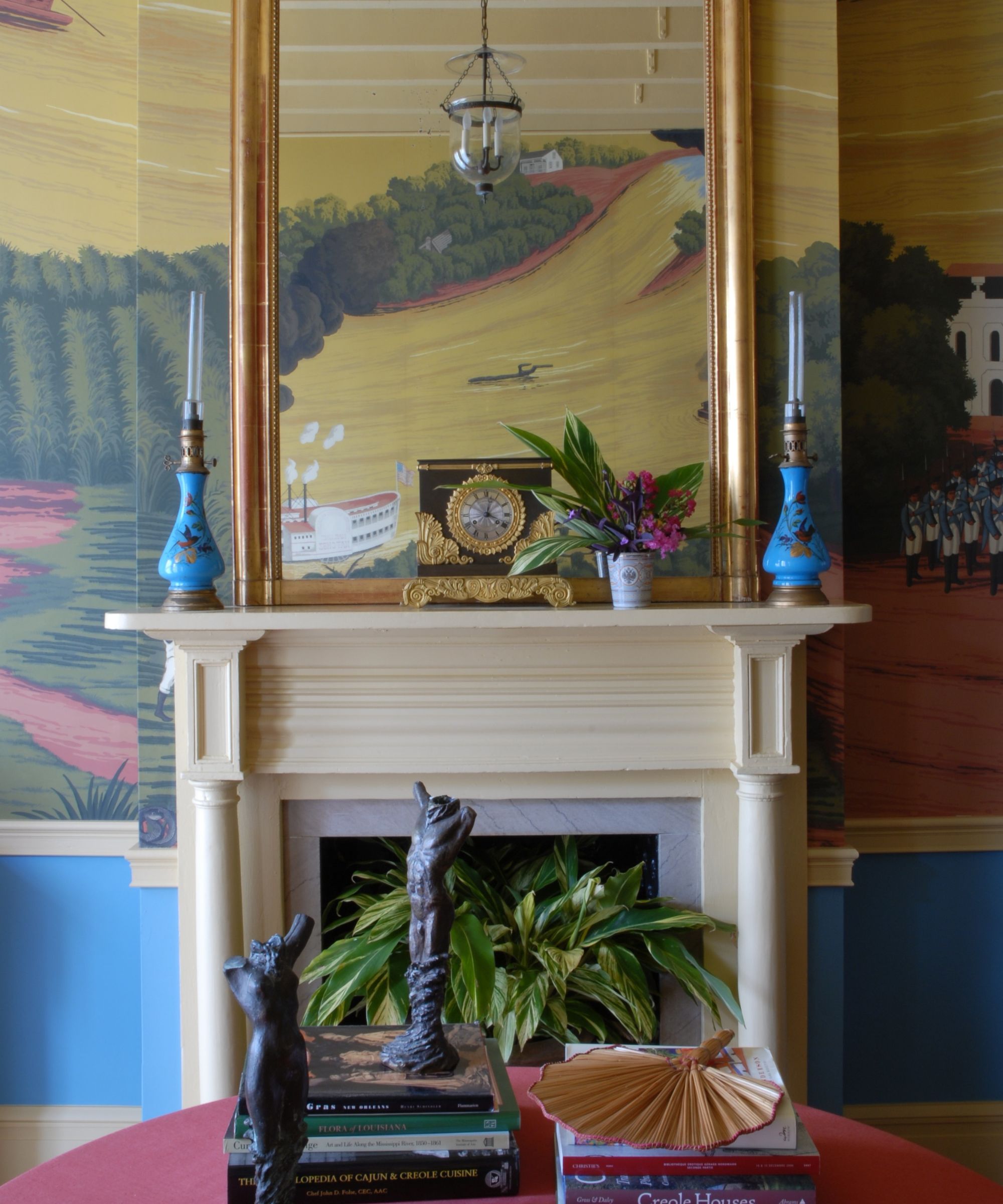
Another centerpiece of the room is the early Louisiana bookcase that houses part of Rick Ellis’s collection of books on American cookery, and Mardi Gras souvenirs such as the painted coconuts famously distributed during the Zulu parade. A cabinet of curiosities is a great device for displaying meaningful objects of a random nature.
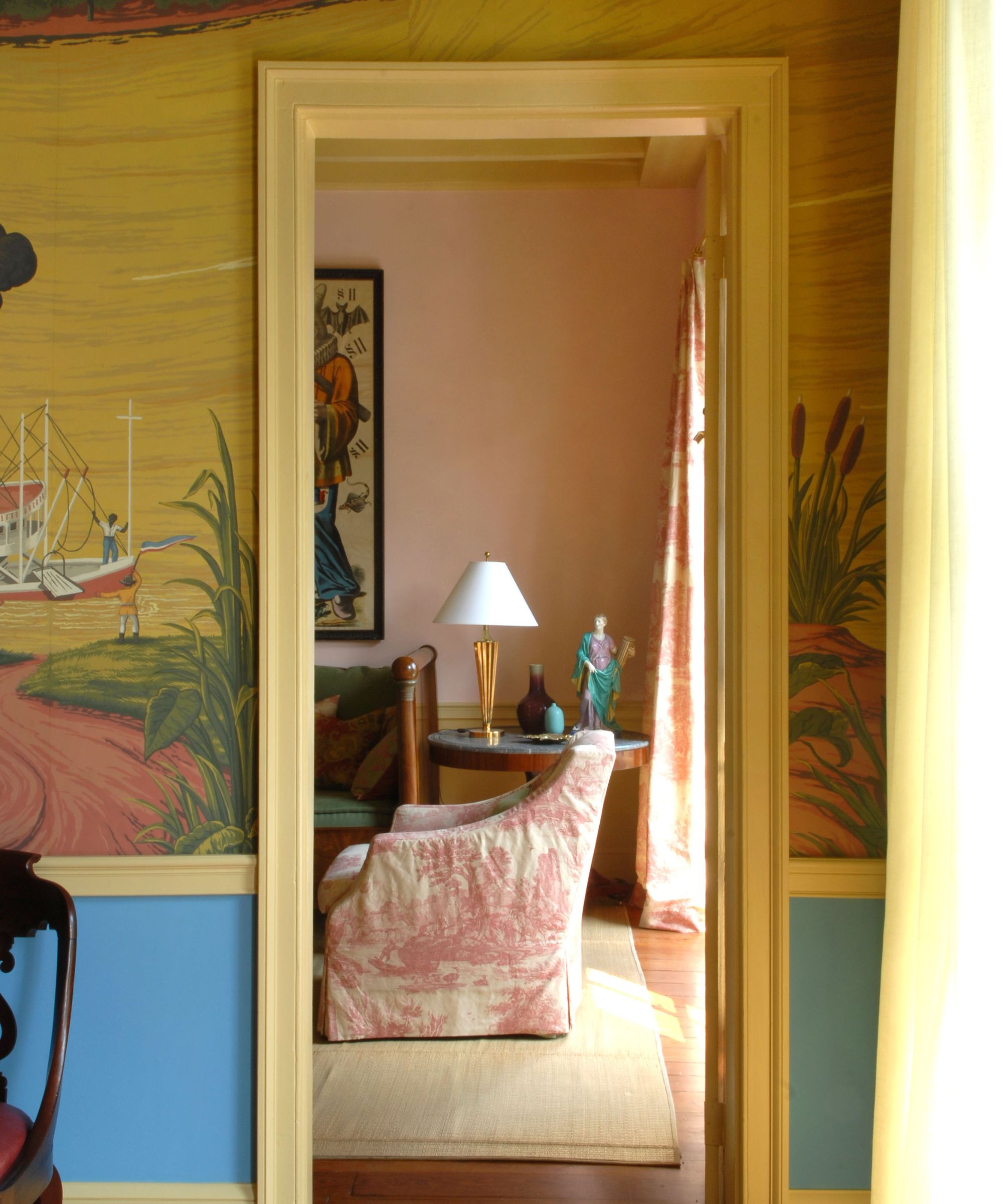
Historic examples of scenic papers are typically drawn with the horizon line at one level, so the scene easily continues around the walls of the room. This paper “forces” the perspective of the horizon so that it dramatically shifts around the room, capturing a variety of scenes from along the Mississippi. A vibrant Creole color palette was used in the mural and then framed with bright blue in the dado and yellow on the trim. These adjacent colors visually support the scenes and highlight the colors of the design.
Sitting room
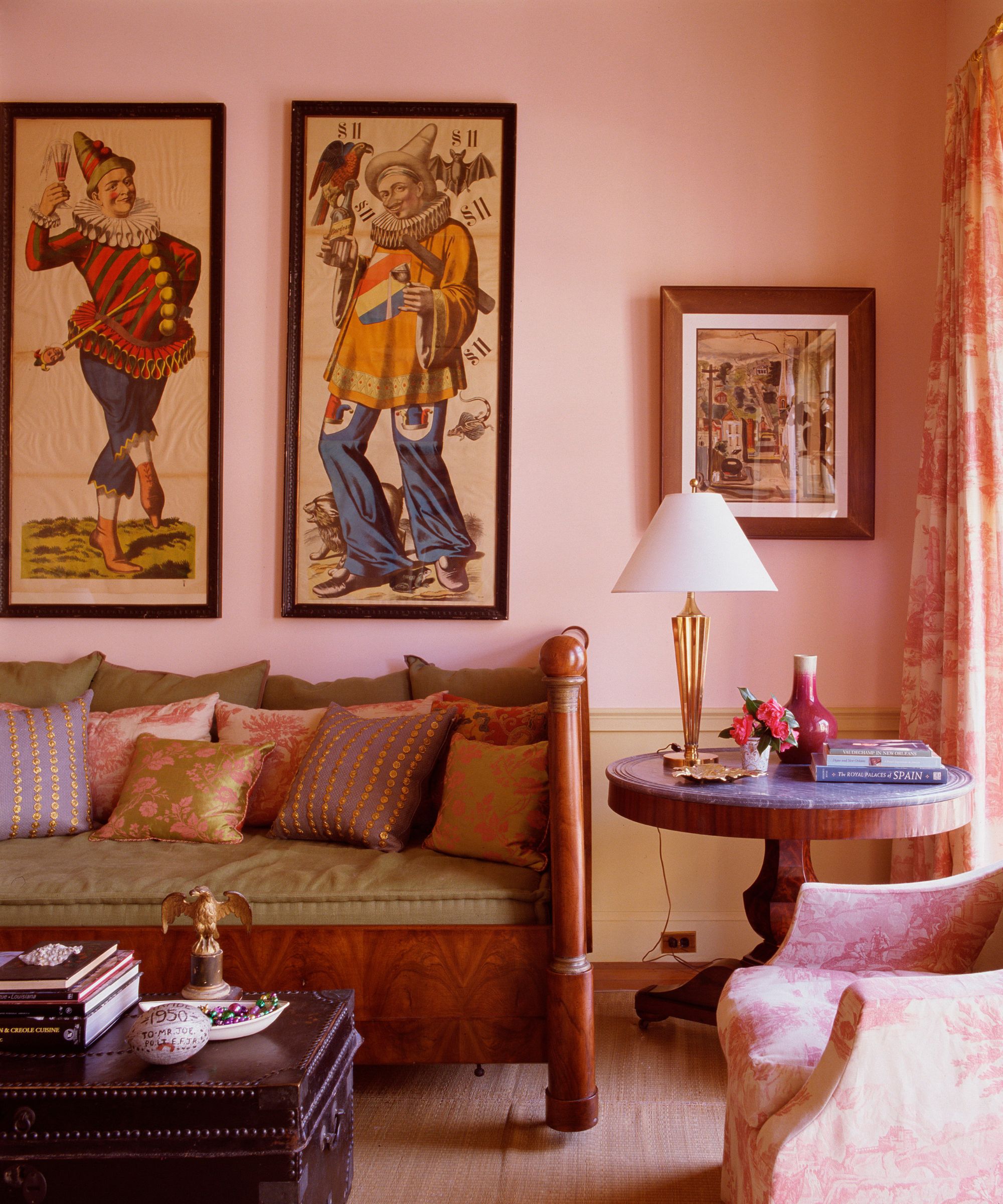
A sitting room beyond the mural room doubles as a guest room. It draws on pink living room ideas, as pink was the only color that looked right after the polychrome that portends it. The mantel has a contemporary mirror which is flanked by a set of Thomas Frye mezzotints. The large timepiece was used as part of a Father Time costume for Mardi Gras.
The sitting room has a great daybed, which was purchased from the Jane Engelhard sale at Christie's. It is used as both a sofa for pre-dinner drinks and a bed for overnight guests. Renowned decorator Albert Hadley once shared with Jayne that the bed was used by the Duke and Duchess of Windsor during a stay at the home of Engelhard, a client of Hadley’s. The bed is somewhat overscaled for the room, but the other furnishings balance the arrangement, particularly the large woodblock prints of German carnival characters.
Primary bedroom
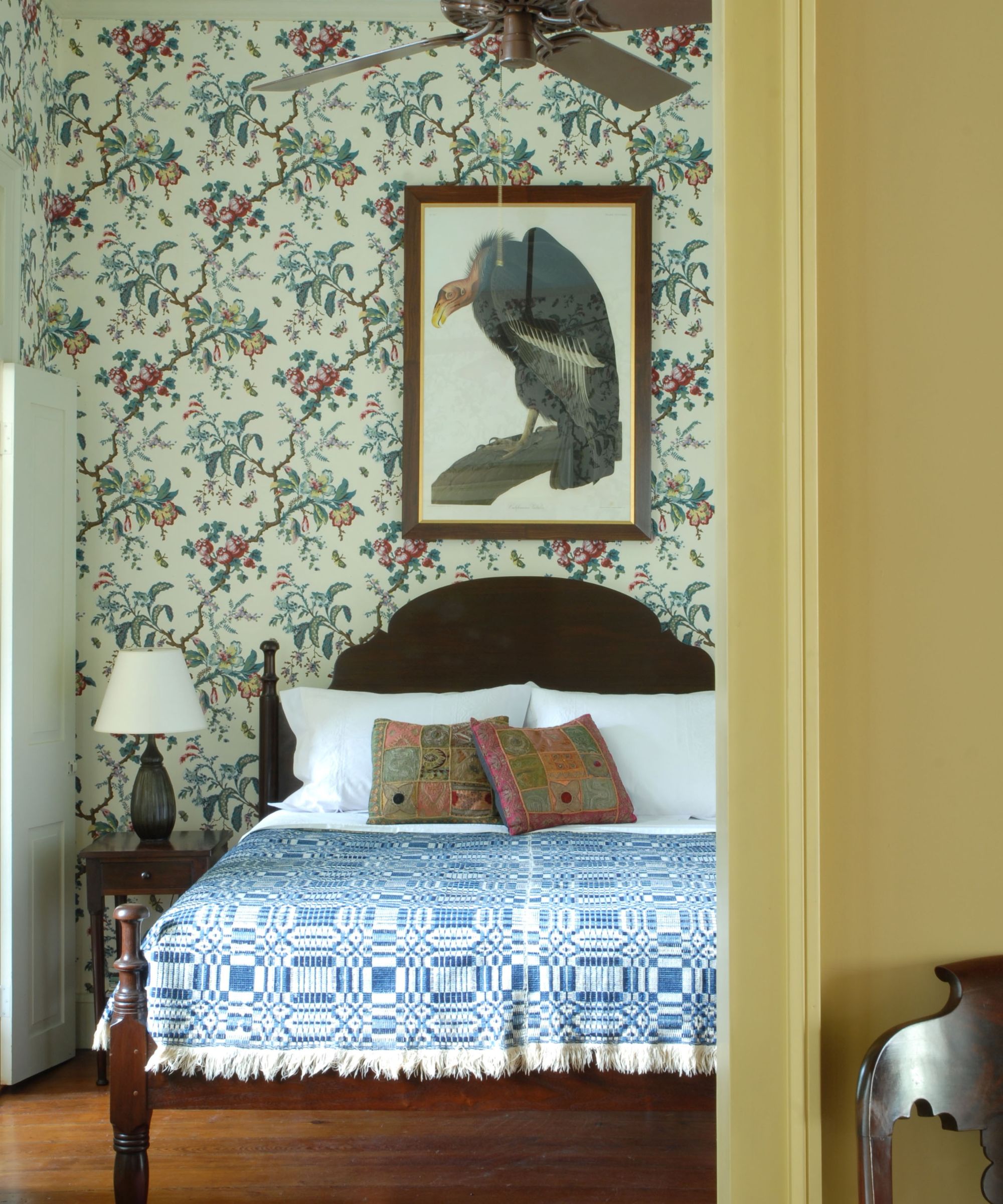
The bedroom is covered in a reproduction of an 18th-century French wallpaper pattern. The flowered wallpaper defines the bedroom ideas and suits the period of the apartment and has a graphic, contemporary quality. Another interesting juxtaposition is the placement of an Audubon print of a California condor (also known as the California vulture) on the feminine paper. Audubon worked just blocks from the apartment, so it is a fitting placement for the print.
The wallpaper is called Butterfly Chintz and is made from 21 separate wood blocks by the Adelphi Paperhanging Company.
Interior design/ Jayne Design Studio
Photographs/ Kerri McCaffety
Sign up to the Homes & Gardens newsletter
Design expertise in your inbox – from inspiring decorating ideas and beautiful celebrity homes to practical gardening advice and shopping round-ups.

Lucy Searle has written about interiors, property and gardens since 1990, working her way around the interiors departments of women's magazines before switching to interiors-only titles in the mid-nineties. She was Associate Editor on Ideal Home, and Launch Editor of 4Homes magazine, before moving into digital in 2007, launching Channel 4's flagship website, Channel4.com/4homes. In 2018, Lucy took on the role of Global Editor in Chief for Realhomes.com, taking the site from a small magazine add-on to a global success. She was asked to repeat that success at Homes & Gardens, where she has also taken on the editorship of the magazine.
-
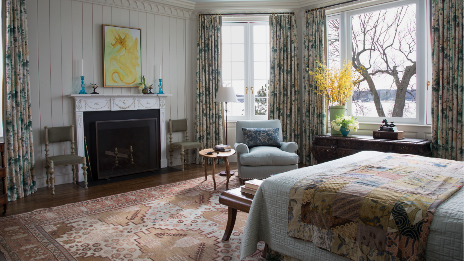 What is an estate sale? Everything you need to know about how they work and what to expect, whether you are holding one yourself or shopping second-hand gems
It pays to know exactly what you are getting into when shopping at estate sales
By Ciéra Cree
-
 How to grow lady's mantle – for a shade-tolerant ground cover plant that will thrive in challenging borders
With lush green foliage and luminous lime flowers, lady's mantle can add color and impact
By Thomas Rutter