Tour the contemporary and rule-defying home of a designer willing to experiment
As an industry professional full of ideas and ready to push boundaries, Irene Gunter created a joyful, one-of-a-kind dream home for her and her family
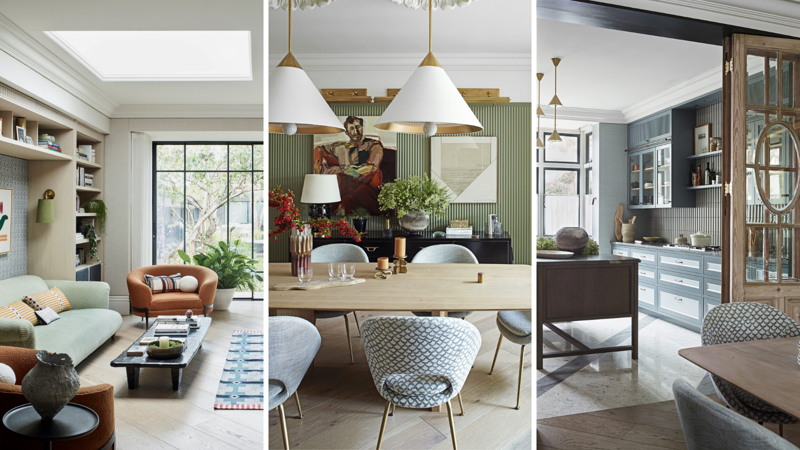
Irene Gunter is an interior designer who has always embraced a spirit of playfulness in her approach to house design. As a distillation of all the ideas her clients weren’t brave enough to try, her new home is remarkably unique. ‘In every room, there are elements of experimentation which have worked out really well,’ says the founder of interior design practice Gunter and Co.
The newly designed space is a result of a recent move, prompted by her and her husband Ian Hazard’s growing family – they now have two sons, aged six and one, so life in their second-floor apartment, lugging buggies, toys, and picnics up and down the stairs, had begun to seriously take its toll.

Michael Reeves Addison II armchairs in bouclé by Yarn Collective. Rug, A Rum Fellow. Vis-à-vis Seymour chaise, Minotti. Sofa in Gretta fabric, Holland & Sherry. Artwork, Kanica at Partnership Editions. Pulse wallcovering, Zimmer + Rohde.
‘We wanted more space and to be on the ground floor. We found this semi-detached property dating back to 1900 nearby and it had a great footprint. I didn’t want to be limited by a partially improved property and loved that the property hadn’t been touched for over 30 years,' says Irene.
'In all that time, the owners hadn’t even replaced the carpets’, she continues. It was this feeling of limitless potential opened up by the need for a complete overhaul that made Irene so excited about the property. As an interior design expert, she was bursting with ideas to try.
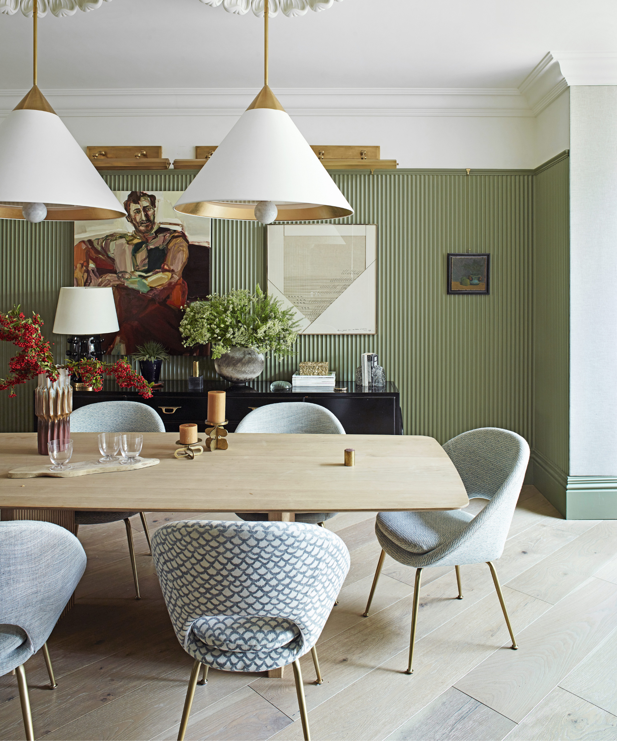
Panelling, Orac Decor. Ceiling roses, Stevensons of Norwich. Pendants, Visual Comfort & Co.
‘We could see where we could tweak the loft space and add an extension on the ground floor. The garden was also unusually deep, affording us the opportunity to build a garden office,’ Irene explains. She continues, ‘The neighbors have all been here for so long that the area feels much more settled than the transient nature of our previous apartment home’.

Units designed by Gunter & Co; painted in BTWN Dog & Wolf, Porcelain I and Porcelain IV, all Paint & Paper Library. Soap tiles, Kaufmann Keramik.
Irene and Ian had found a great architectural shell but they knew that the heartbeat of their hardworking home would only be unlocked once they had fine-tuned the floor plan. 'I like to engineer every centimeter out of a space. We spent an awful lot of time on the layout – it’s the foundation of the project – and if we hadn’t got that right, nothing would have worked,’ explains Irene.
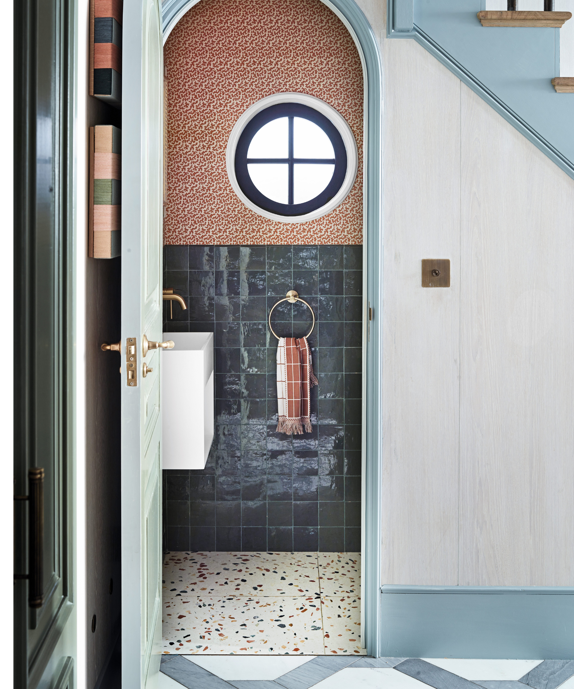
Squiggle wallpaper in Apricot, Sibyl Colefax & John Fowler. Zellige tiles, Mosaic Factory. Murano floor tiles, In Opera Group. Tap and towel holder, Lusso Stone.
Perhaps most striking was their decision to turn the traditional London terraced house plan on its head. Irene explains, ‘We flipped the kitchen and sitting room. The whole point of having a garden is that it is restorative and therapeutic so we wanted to sit, relax and look at it.'
It was this line of thinking that triggered their radical plan to move the central rooms around. 'The sitting room is now at the back of the house, the kitchen has been moved to the front, and in the middle is a dining room and an enclosed playroom hidden behind a jib door in the paneling,' she continues.

Stair runner, Hartley & Tissier. Art, Jo Elbourne. Bespoke walnut cupboard, by Gunter & Co; inset with Phillip Jeffries wallpaper.
Equally ambitious was the couple’s decision to lower floors and build a new stylish staircase. ‘I always tell my clients that as long as they have good windows and ceiling heights we can take care of the rest,’ Irene comments.
‘We rearranged the levels to give more height throughout. In the kitchen, this meant we could tuck the work surface under the window ledge and the bedrooms in the new loft conversion don’t feel limited by the architecture,’ she explains. As a playground for Irene’s roaming and boundless imagination, her home displays no end of ingenuity.

Chandelier, eBay. Adam’s Eden wallpaper, Lewis & Wood. Side tables, Tikamoon. Kiln flatweave rug, A Rum Fellow. Bed, Gunter & Co.
'For colors, I leaned on my gut instinct. I’ve spent hours thinking about what should go where and sometimes it’s far easier working for a client who gives you a few directions,’ she says.
‘There’s so much here that I’ve had in my mind for years but never had the opportunity to try, like the bobbin coving or townhouse cupboards in my son Oscar’s room, or the two-tone windows in the kitchen. It’s been a labor of love and I really want it to show my clients what’s possible if you take a leap of faith.

Wall light, J Adams & Co.
Meet the designer and owner
Irene Gunter shares her style inspiration...
Can you reveal your top spot for buying?
Lots Road Auctions in Chelsea for antiques or one-off bespoke pieces.
What part of the redesign was the biggest indulgence?
The fabric walling installed by Ian in our living room to add softer acoustics and hides a multitude of wall speakers.
Tell us your go-to color.
For neutrals, I love the Slate family from Paint & Paper Library; for greens, Sage Green by Little Greene is a firm favorite, and you can’t beat their Basalt for navy blue.
Describe your style in three words.
Fresh, uplifting, and detailed.
Who are your design heroes?
I love the work of Steven Gambrel for more classical interiors and Pierre Yovanovitch for more contemporary settings.
Favorite furniture designers?
I admire Scandinavian and Japanese designers, but my favorites are the great Italian designers such as Paolo Buffa, Gio Ponti, and Ico Parisi.
Sign up to the Homes & Gardens newsletter
Design expertise in your inbox – from inspiring decorating ideas and beautiful celebrity homes to practical gardening advice and shopping round-ups.
-
 Isabella Rossellini's European-designed chef's knives are currently $65 off – and these luxury cooking tools have been around for over 200 years
These stunning German-made knives have a rich history, including being used in the Conclave actress's kitchen – and they're now on sale at Wayfair
By Sophie Edwards
-
 This is one of the worst things you can do to your vacuum cleaner – experts warn it will slash its lifespan by years and damage the motor
Overfilling your vacuum can cause real, long-term damage and is best avoided
By Dan Fauzi