The airy interior of this elegant new-build benefits from a minimalist approach
Atelier AM used the monastic architecture of this Californian villa as a reference for schemes that are like a calming embrace
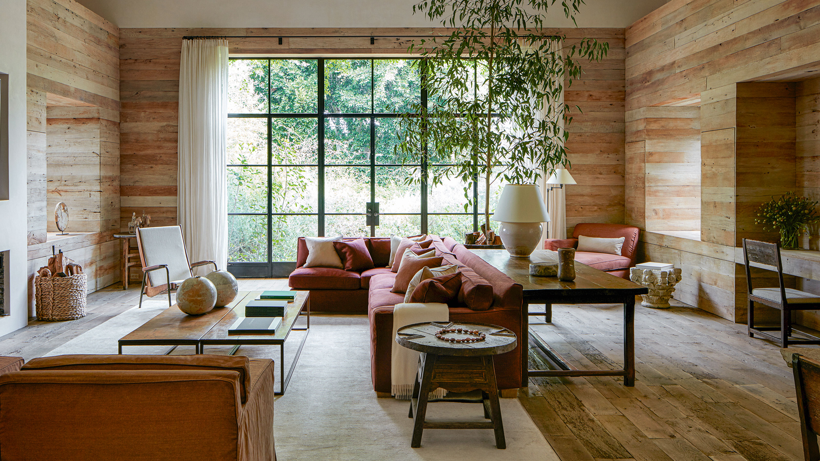

For architects and interior designers starting out, there is nothing quite so daunting as their first few projects. Yet when Michael and Alexandra Misczynski of Atelier AM met the owner of a villa in Rancho Santa Fe, California, a journey of trust, travel and discovery unfolded. It meant a seminal project for the fledgling firm (founded in 2002), and one that would dictate the shape of things to come. ‘Our client had no idea who we were but he put his faith in us,’ says Michael.
The client, an industrious businessman from Chicago, had bought the house rather on impulse. ‘He acquired the property really for its 30 acres of land,’ says Michael. ‘It’s in horse country and it has stables and an orange grove.’
The villa itself, now one of the world's best homes, was a spec house built in a Mediterranean style about 30 years ago and while the client had considered rebuilding it, Michael and Alexandra soon realised they should preserve its cavernous internal volumes.
‘We gutted the house, reconfiguring the plan to make the rooms larger,’ explains Michael.
Hallway
Eager to imbue the house with a sense of history that would belie its relatively short existence, Michael and Alexandra took their client on a buying trip to Europe. ‘Our original approach was to give the interior a very traditional design language so we bought lots of antique mantelpieces and doors in Paris, which we then shipped over,’ says Michael.
Yet soon after the completion of his Chicago apartment, the pair had a change of heart. ‘He’s a big collector of contemporary art and almost in the middle of the night we realized we had made a mistake and we were designing the wrong house for him,’ admits Michael. ‘We decided to strip it down and take a more minimalistic approach. But we kept some of the things we bought on that first trip because they seemed important and part of the journey.’
Michael and Alexandra’s friendship with the art dealer Axel Vervoordt also inspired the resulting tone of the villa. ‘We were clearly influenced by Axel and his wife May, and took our client to their house for several lunches and dinners,’ says Michael. Through its vast raw plaster walls and simple curved arches, the villa breathes as if in reverence for the landscape surrounding it.
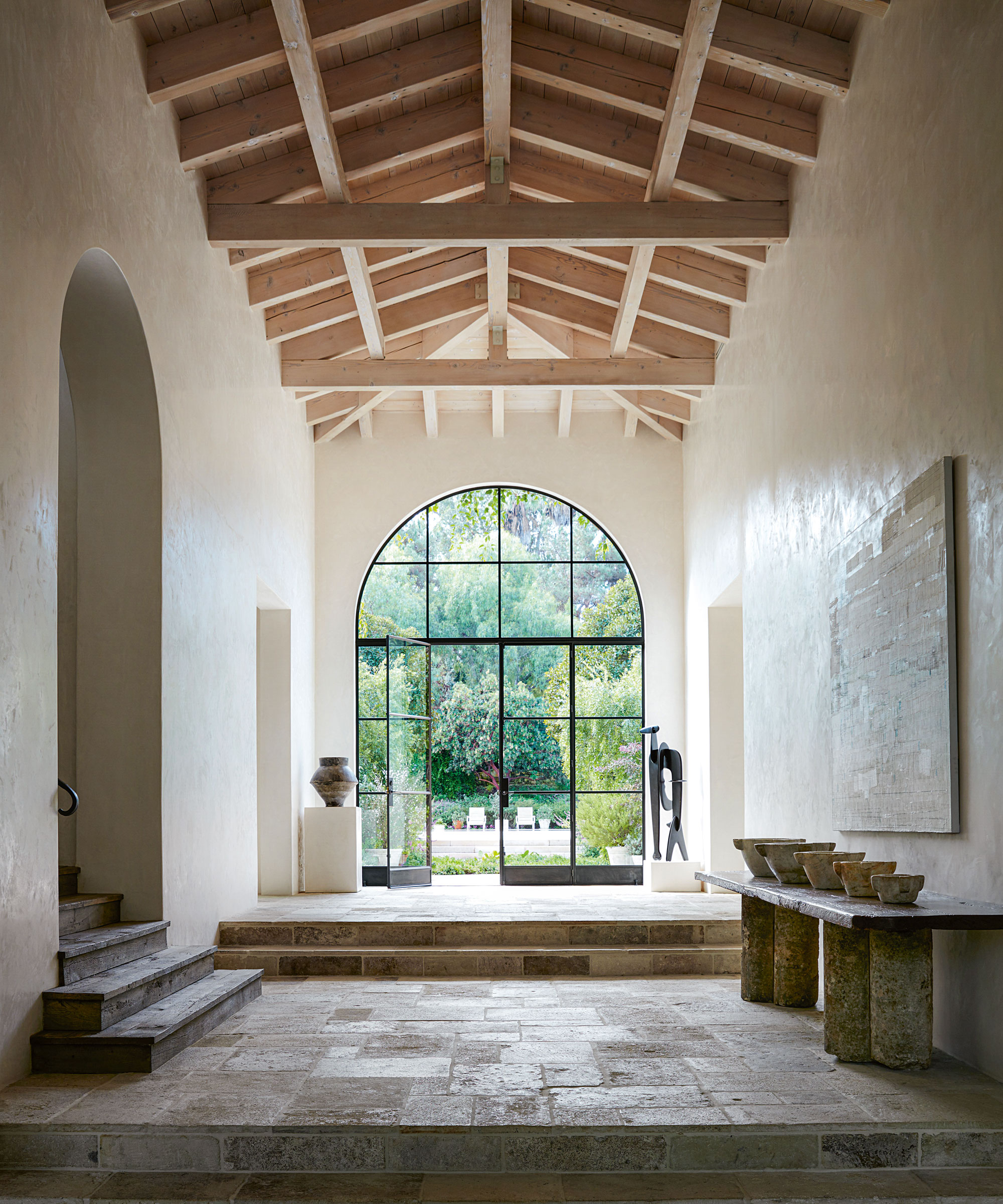
Acres of space surround each carefully chosen piece of art and furniture, the light from the huge steel-framed windows showing them to best advantage. Limestone flooring was among the hallway ideas that also add an antique character.
There’s a beautiful gallery-like feel in the hallway with every piece given space to breathe.
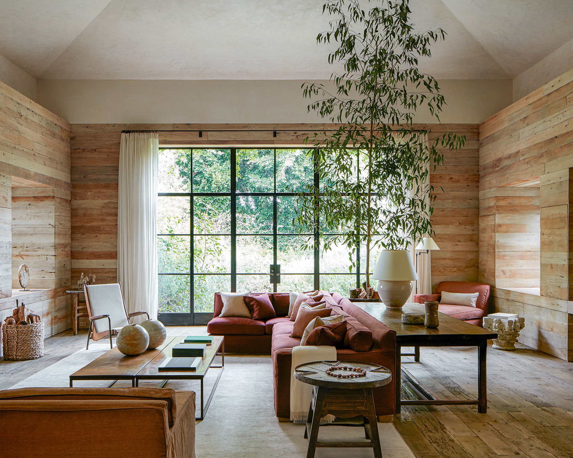
Living room
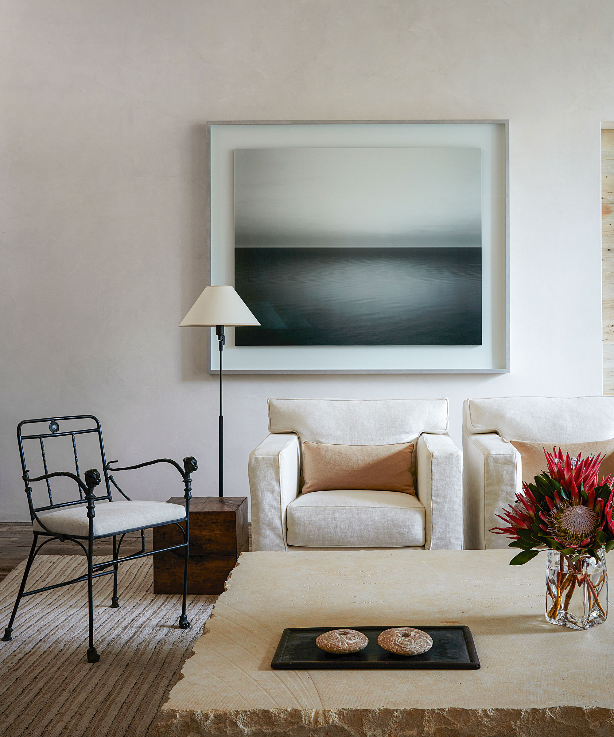
‘It’s meant to be a casual home so it was important for us to use fabrics and carpets that don’t feel too precious. We wanted guests to feel comfortable and relaxed, not like they’re in a museum. You’re surrounded by very special things here but you can touch them,’ Michael notes.
Practical linen seat covers are one of the living room ideas.

Raw plaster walls and ceiling strike a simple, mellow note.
Family room
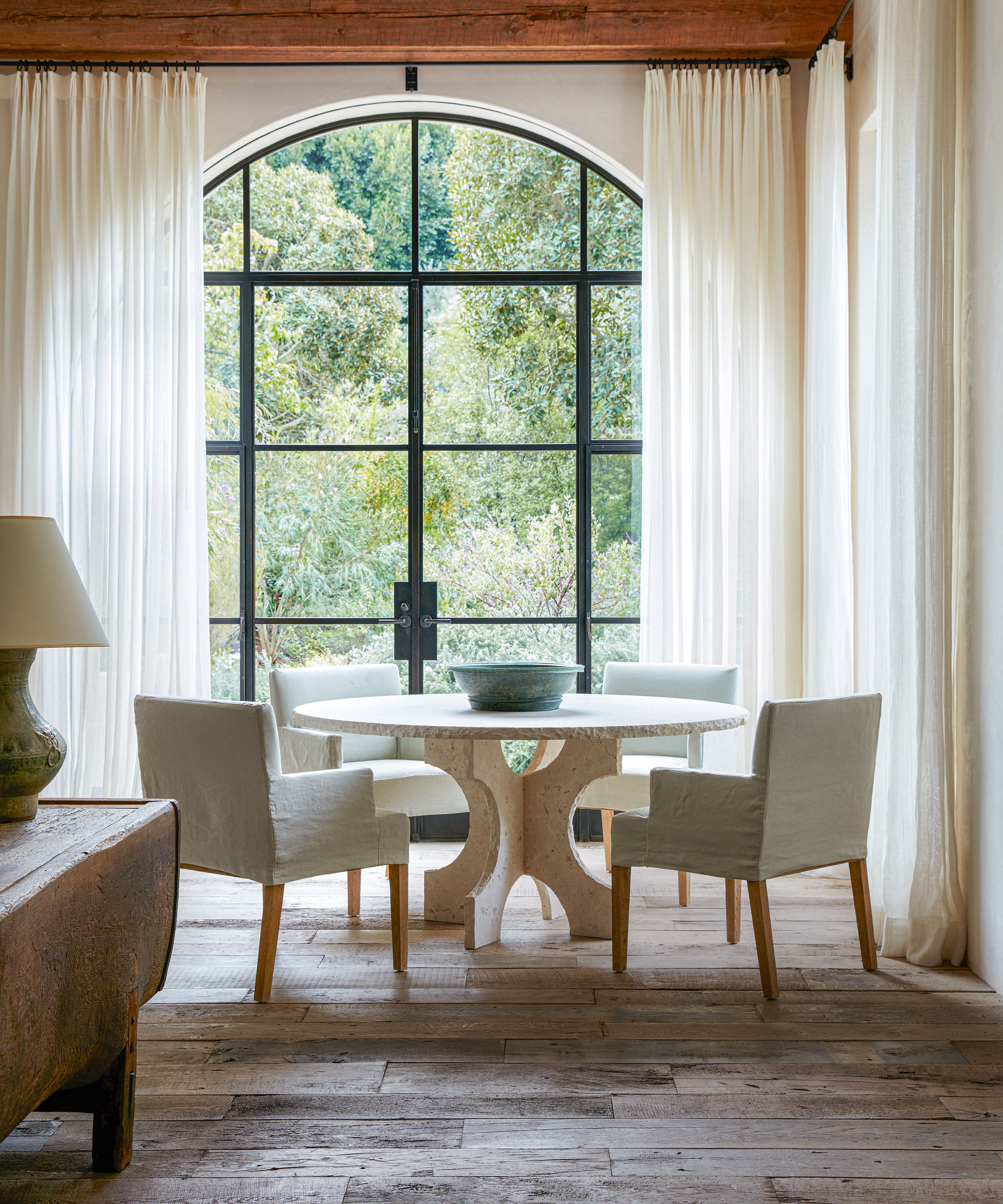
‘We pushed out the family/dining room, which had been dark due to the overshadowing of a loggia despite facing south, and gave it large new windows. The previous windows had been square or rectangular and smaller with wooden frames. The project was a study in how to bring in all that Southern Californian light,’ says Michael.
Among his dining room ideas to imbue the 30-year-old home with a sense of history was to put in reclaimed French oak flooring. Antique pieces were sourced for every space.
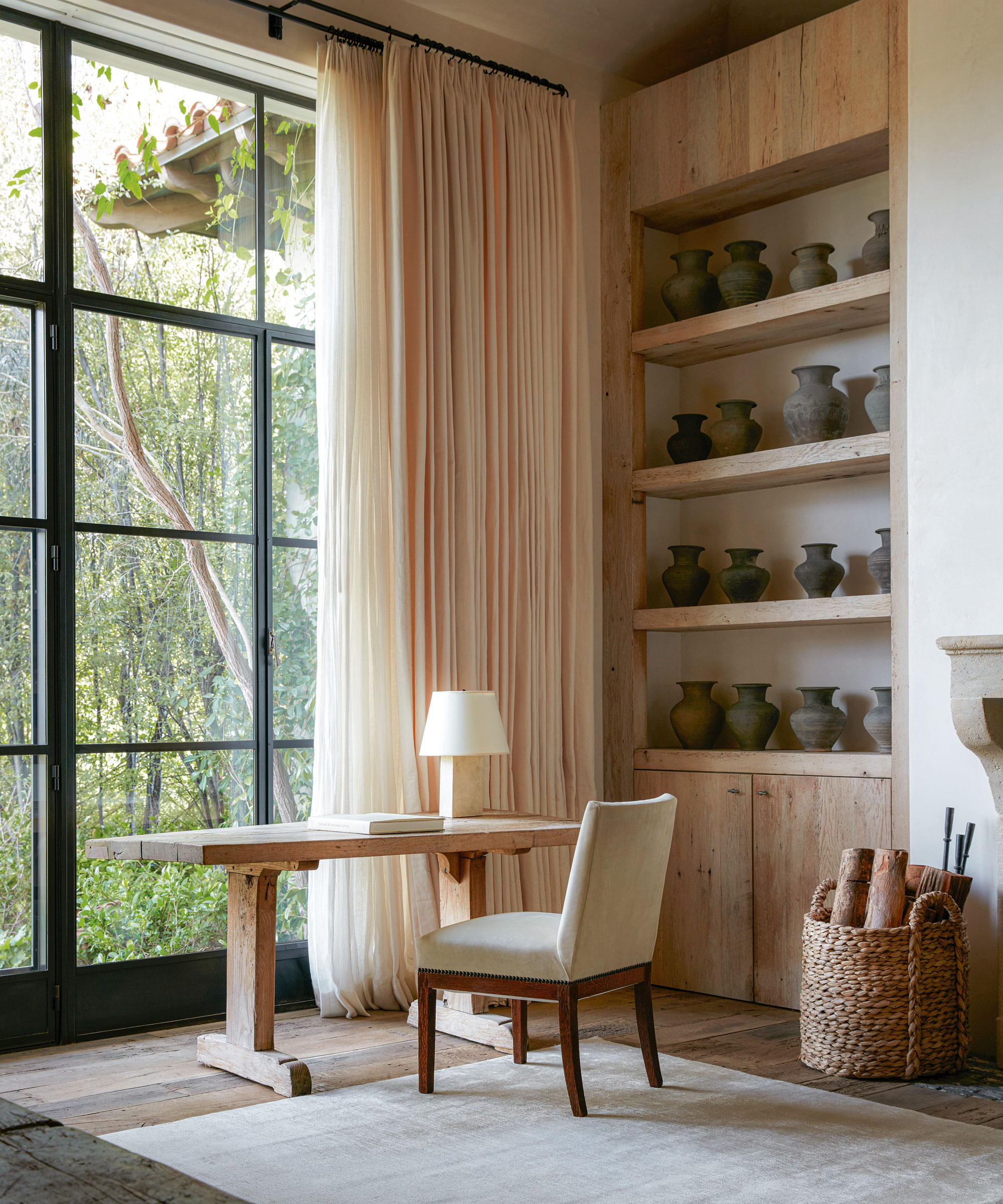
Library
Deep wood-clad walls bring warmth to the library. One of Michael's home office ideas was to create a recess for a work space.
Main bedroom
Bedroom ideas include using two thicknesses of curtains ensure light from the huge windows can be moderated.
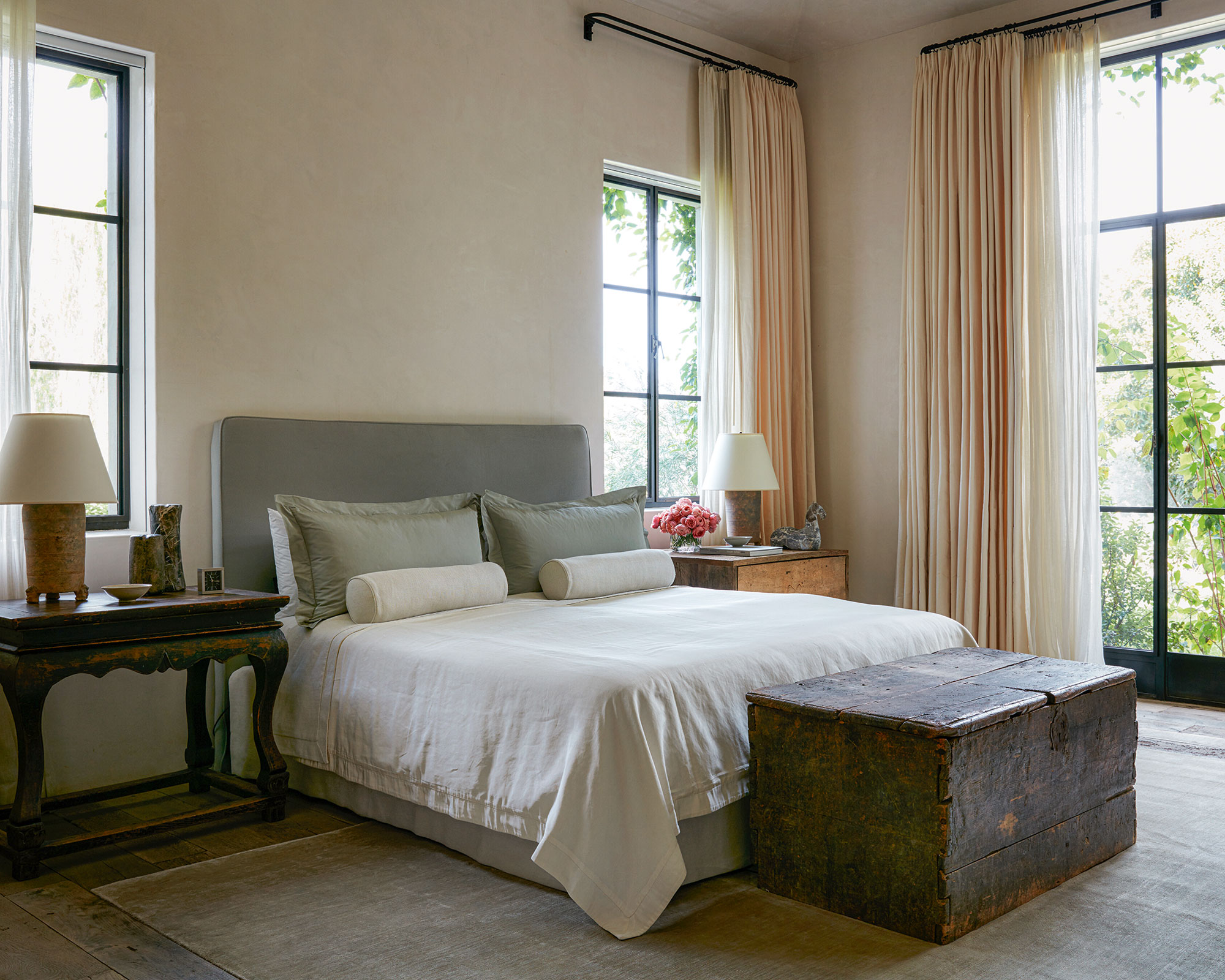
A minimalistic approach was taken throughout to ensure the outside landscape stars in every scheme.
Bathroom
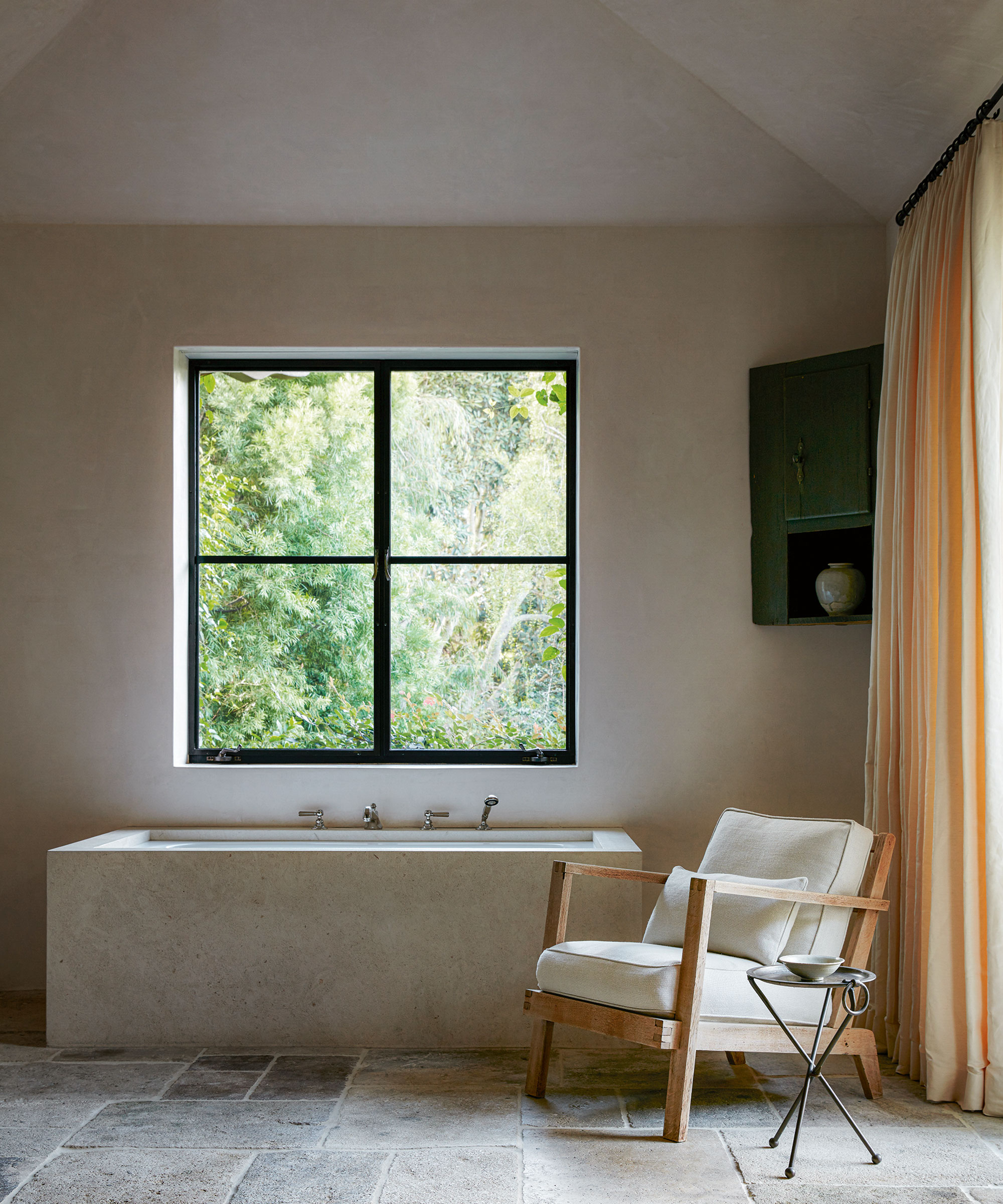
One of Michael's bathroom ideas was to introduce a limestone tub to bring a feeling of continuity to the floor slabs.
A house resilient enough to cope with plenty of grandchildren was another requisite of the client. ‘He sometimes just puts them on a plane and flies them out,’ adds Michael. A dreamlike world far from Chicago, the villa envelopes its guests in a calming embrace. ‘Our client told us the first thing he does when he walks in is just to exhale. That, for us, is the best reward.'
Interior designer/ Atelier AM
Photography/ Stephen Kent Johnson
Text/ Juliet Benning
Sign up to the Homes & Gardens newsletter
Design expertise in your inbox – from inspiring decorating ideas and beautiful celebrity homes to practical gardening advice and shopping round-ups.

Interiors have always been Vivienne's passion – from bold and bright to Scandi white. After studying at Leeds University, she worked at the Financial Times, before moving to Radio Times. She did an interior design course and then worked for Homes & Gardens, Country Living and House Beautiful. Vivienne’s always enjoyed reader homes and loves to spot a house she knows is perfect for a magazine (she has even knocked on the doors of houses with curb appeal!), so she became a houses editor, commissioning reader homes, writing features and styling and art directing photo shoots. She worked on Country Homes & Interiors for 15 years, before returning to Homes & Gardens as houses editor four years ago.
-
 How to grow impatiens – garden experts reveal the secrets to growing this shade-tolerant, sparkling summer plant
Both 'Busy Lizzie' and 'New Guinea' impatiens can thrive in shady yards
By Ellen Wells Published
-
 Charli XCX's dining room is a 'treasure-trove' of one-of-a-kind pieces – it's the most unique hosting space I've ever seen (and surprisingly replicable)
The singer's Tudor-style dining room features eclectic furnishings, a mix of patterns and bright colors that all work together beautifully
By Hannah Ziegler Published