This mid century gem's clever remodel maximizes views of the outdoor space
Perfectly preserved, this contemporary take on mid century style is masterful
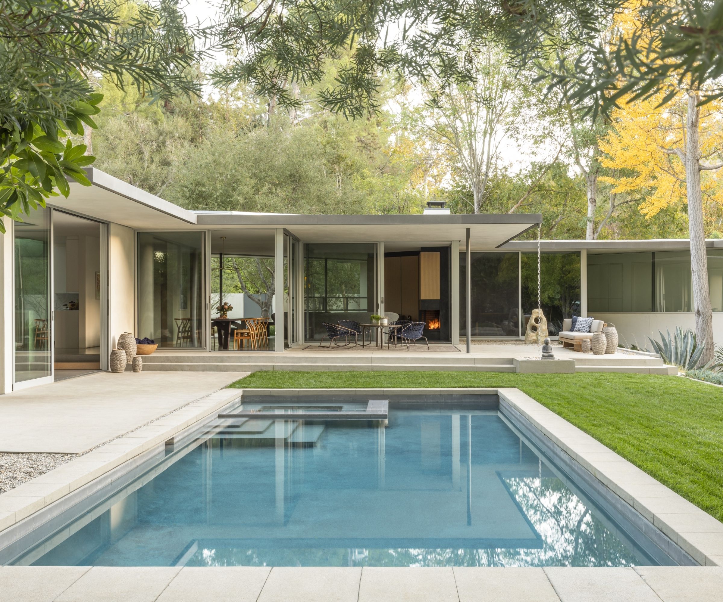

Nestled in the hills of the Fryman Canyon Estates area in Studio City, California, the Oakdell Residence is a remodel and addition to an existing 1960s mid-century home.
Originally built in 1957, the one-story, 3,900 square feet property is not only a wonderful example of mid century modern house style, it also remained a mid century time capsule until rejuvenated by Assembledge+.
Here, we take the tour of this fabulous remodel.
At the heart of the home's original design was a saw-tooth floor plan that offered views in multiple directions. However, beyond this core, the floor plan was congested and connectivity throughout the home and site was limited.
'The client’s wish was to create an airy and light space throughout maximizing views of the surrounding landscape while drawing on the home’s already existing strengths,' explains design principal David Thompson.
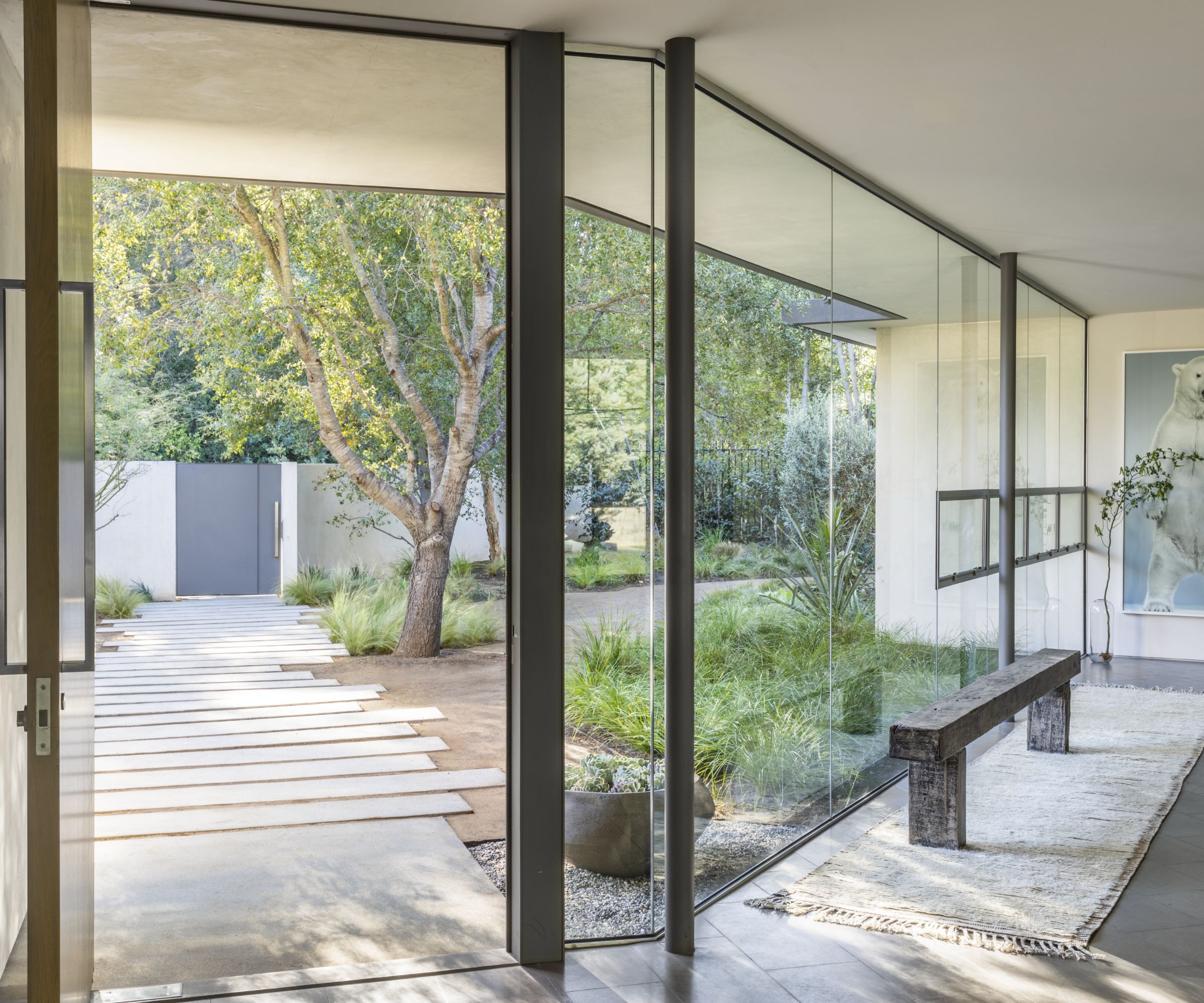
A meandering path of concrete panels, set amidst the landscaping and decomposed granite, leads to the entry foyer of the house (above), comprised of a frameless glass wall with floatable four windows.
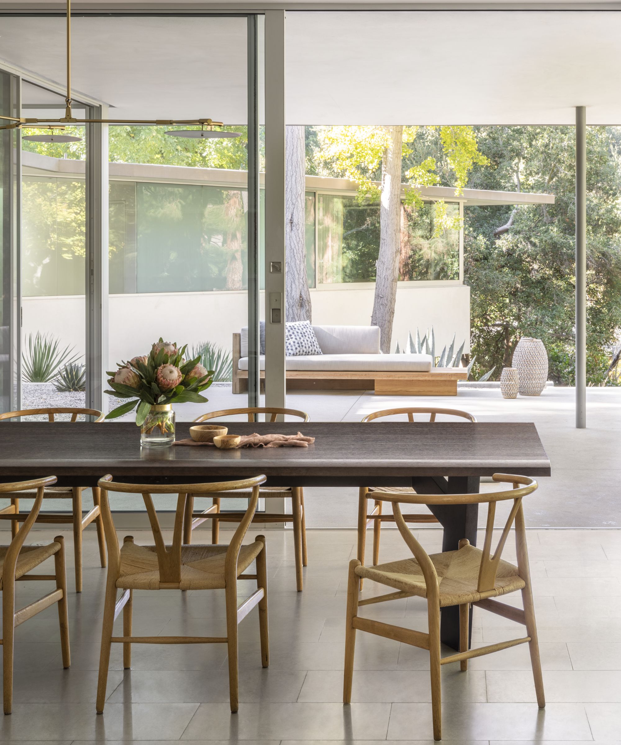
Together with the floor-to-ceiling windows and sliding glass doors on the other side of the house, the residence gives a sense of transparency, bringing in ample light and extending the living area outside, into the landscape.
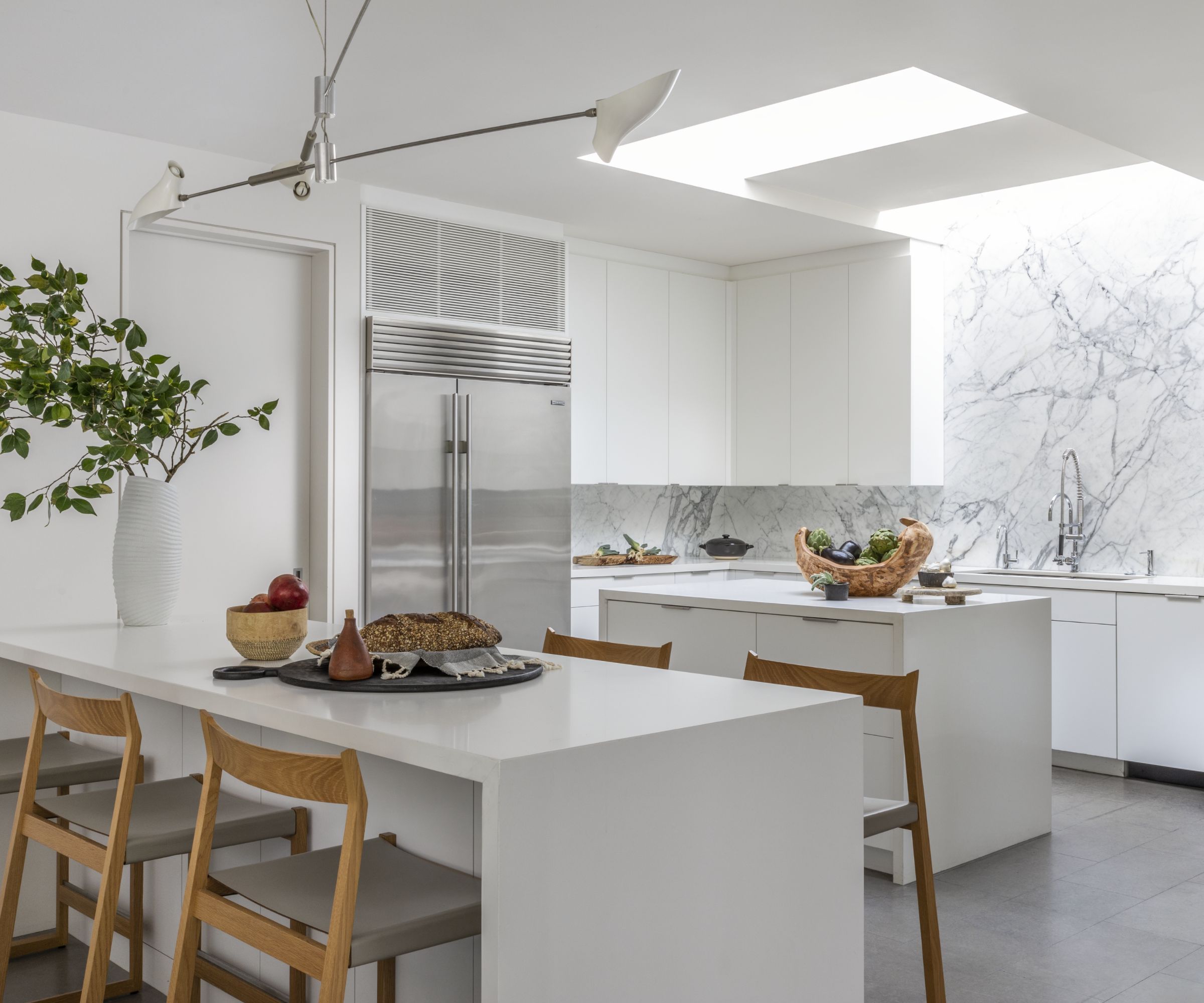
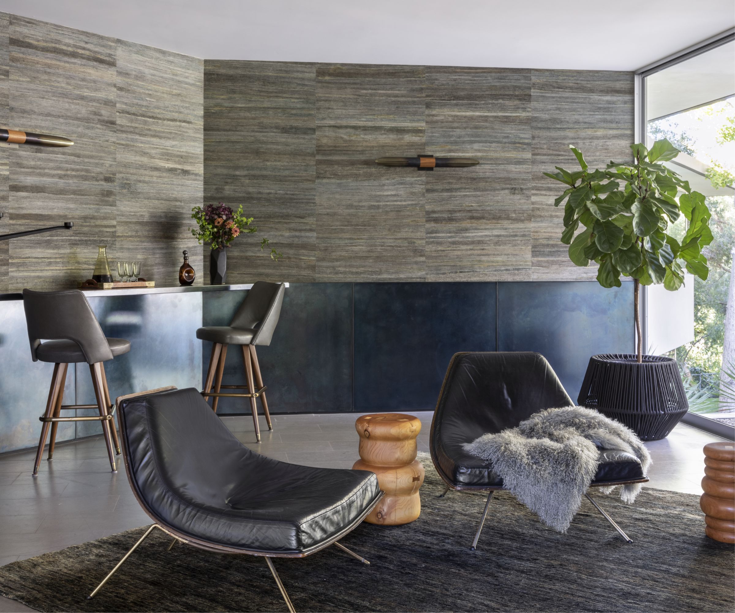
The main living areas include a living room, a bar/game room, a dining room with seating for eight and a kitchen (above); all visually connected by zig-zag-sliding doors that open to the garden.
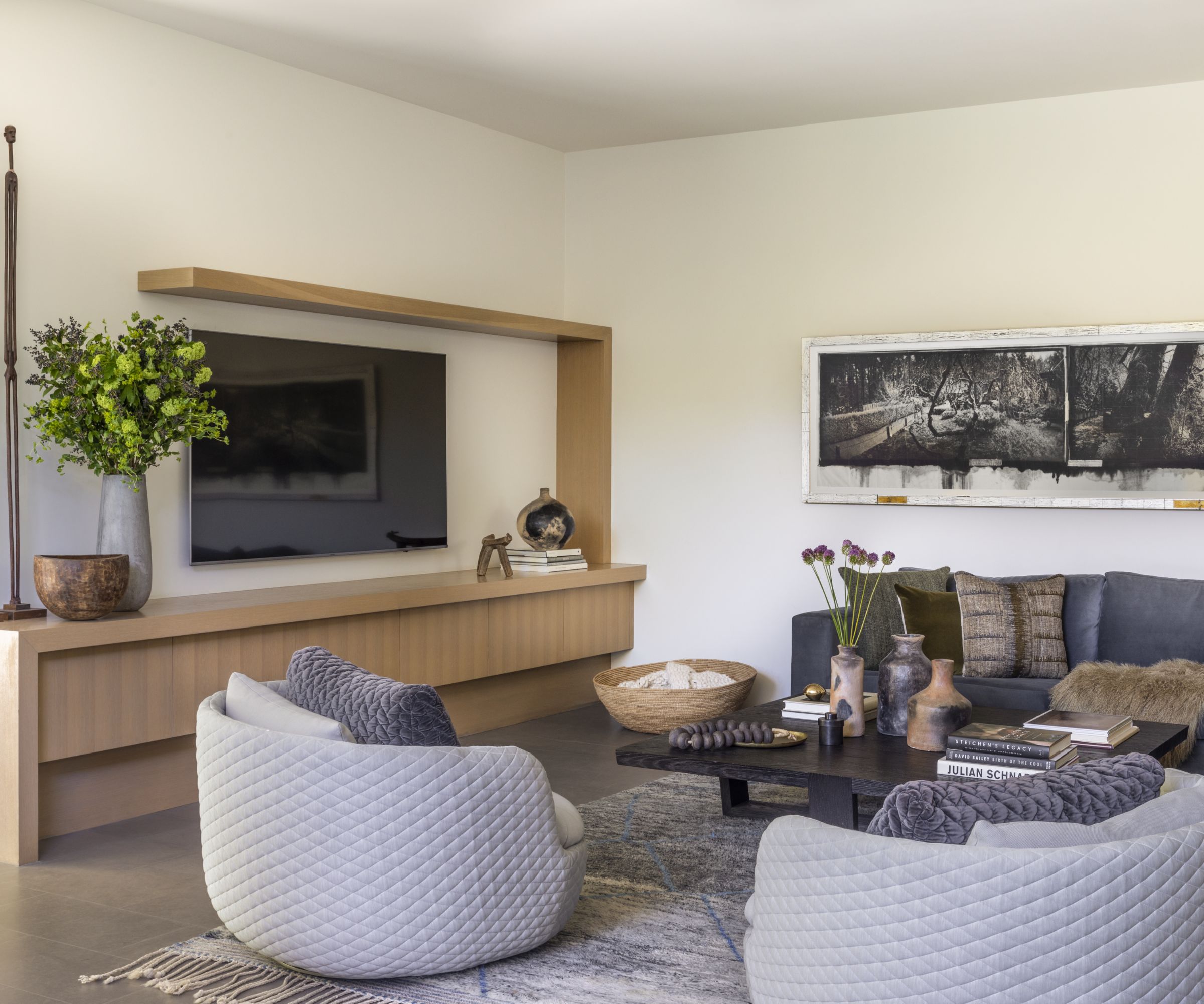
The sawtooth motif is repeated once more to produce a new family room that descends two steps below the main floor and extends into the rear of the site. The kitchen – moved towards the centre of the house – rises slightly above the family room, maintaining views across the site, and features two interconnected skylights across the center kitchen island and white marble walls.
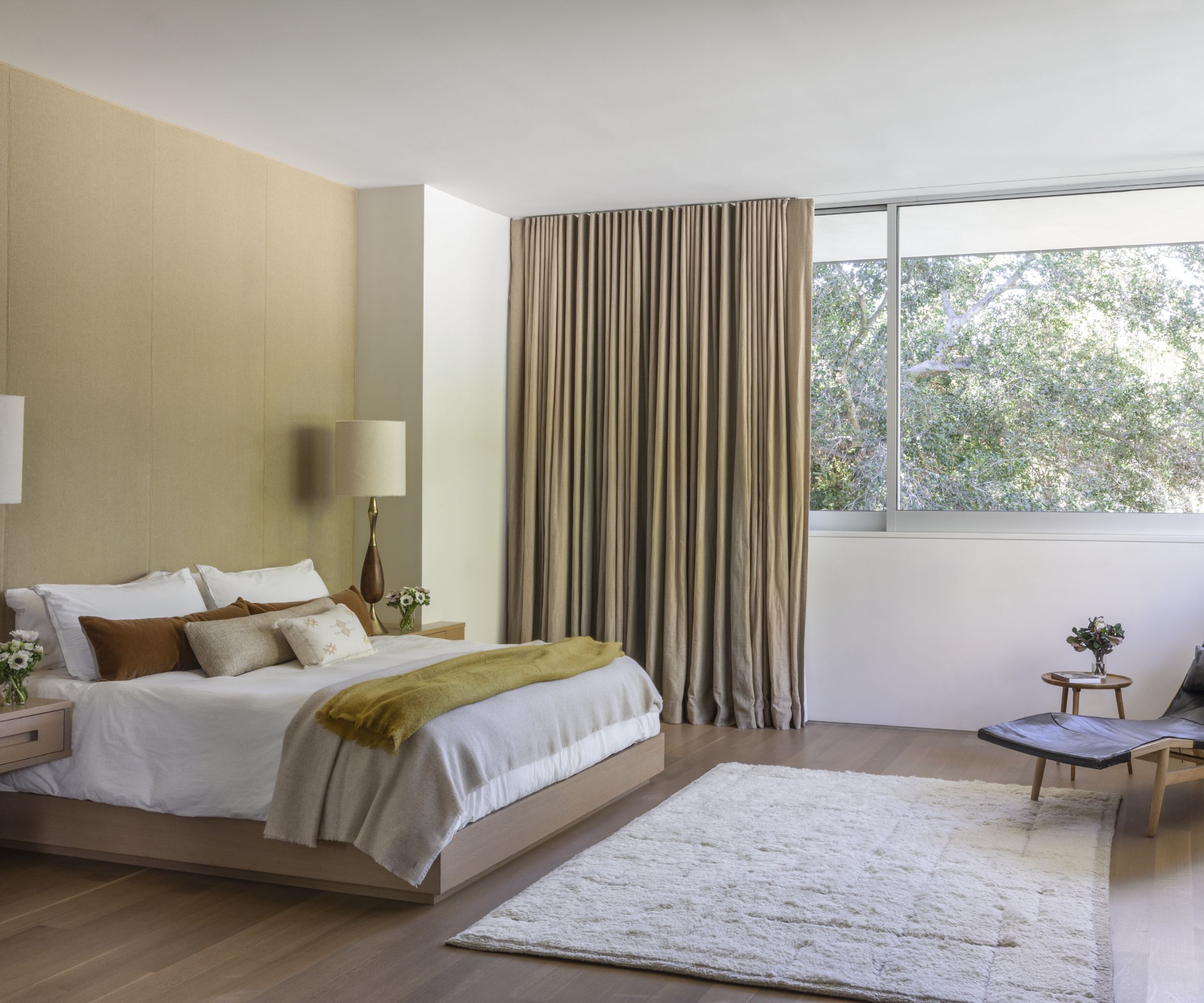
The two-story addition consists of a new bedroom wing, extended toward the rear of the site on the main level, and new office space on the lower level, tucked below. Both take the advantage of the descending lot and are fully integrated into the hillside.
A minimalist palette of stone, hardwood floor and while plaster echoes the qualities of the existing home and preserves its original spirit and character. Similarly, the thin roof plane maintains the mid-century horizontality while the broad overhangs protect the extensive full height windows and sliding doors from the sun.
Positioned in the flattening terrain of Fryman Canyon near its convergence with Laurel Canyon, the residence site is surrounded by trees and hills and, descending gently from the street, thereby at once visually engaging but also easily terraced and occupied.
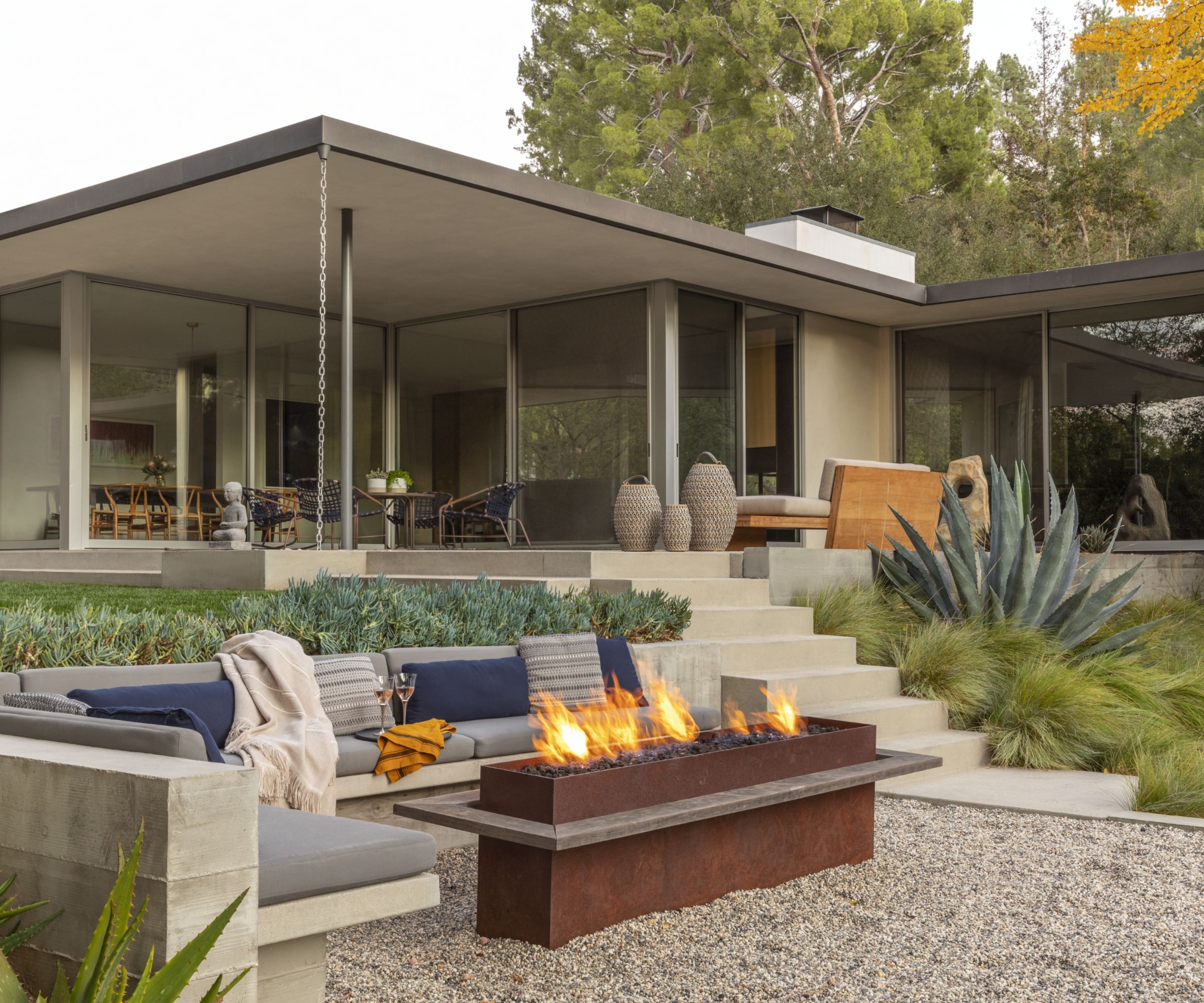
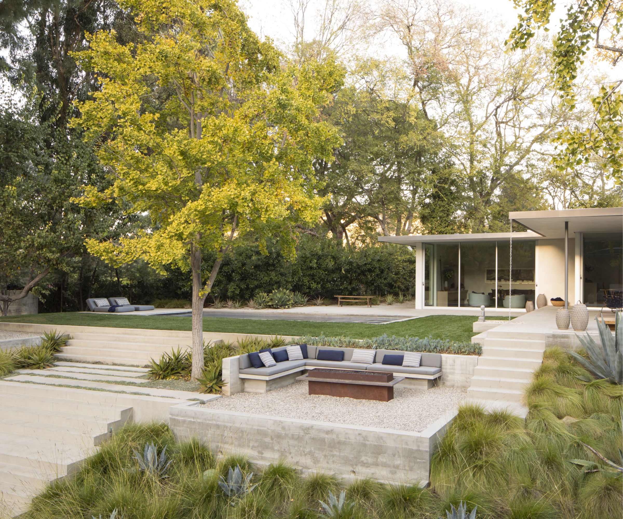
The sawtooth interior spaces and projecting wings of the home produce and interlock with equivalent exterior spaces so that the home is embedded – or woven – into a tiered landscape of drought-tolerant plants, decomposed granite, a pool, and board-formed concrete garden walls.
Architecture Design Team at Assembledge+: David Thompson (Principal in Charge), Gregory Marin
Interior Design: Lisa Strong Design | Susan Mitnick Design Studio
Landscape: Fiore Landscape Design
Sign up to the Homes & Gardens newsletter
Design expertise in your inbox – from inspiring decorating ideas and beautiful celebrity homes to practical gardening advice and shopping round-ups.

Chiana has been at Homes & Gardens for two years and is our resident 'queen' of non-toxic living. She spends most of her time producing content for the Solved section of the website, helping readers get the most out of their homes through clever decluttering, cleaning, and tidying tips. She was named one of Fixr's top home improvement journalists in 2024.
-
 I tried the Pomodoro Technique to blast through my spring cleaning to-do list – now I'll always rely on it to banish procrastination
25 minutes is more than enough to make a real difference
By Ottilie Blackhall
-
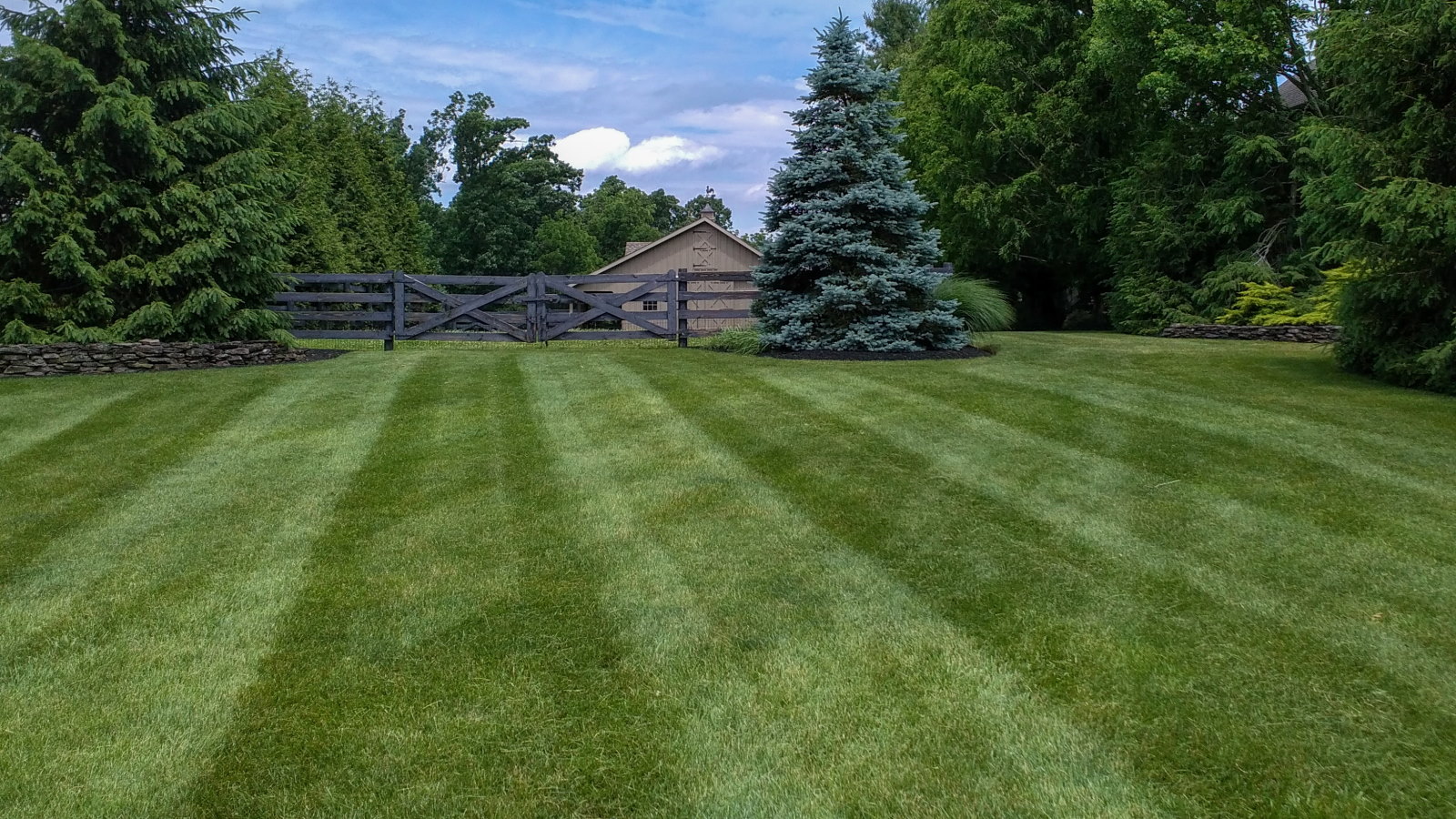 I put the Echo DPE-2100 lawn edger to the test, and was impressed with how it handled my tough grass and corner lot
This battery-powered edger was better than I expected at keeping my yard neatly trimmed
By Jason Cockerham
-
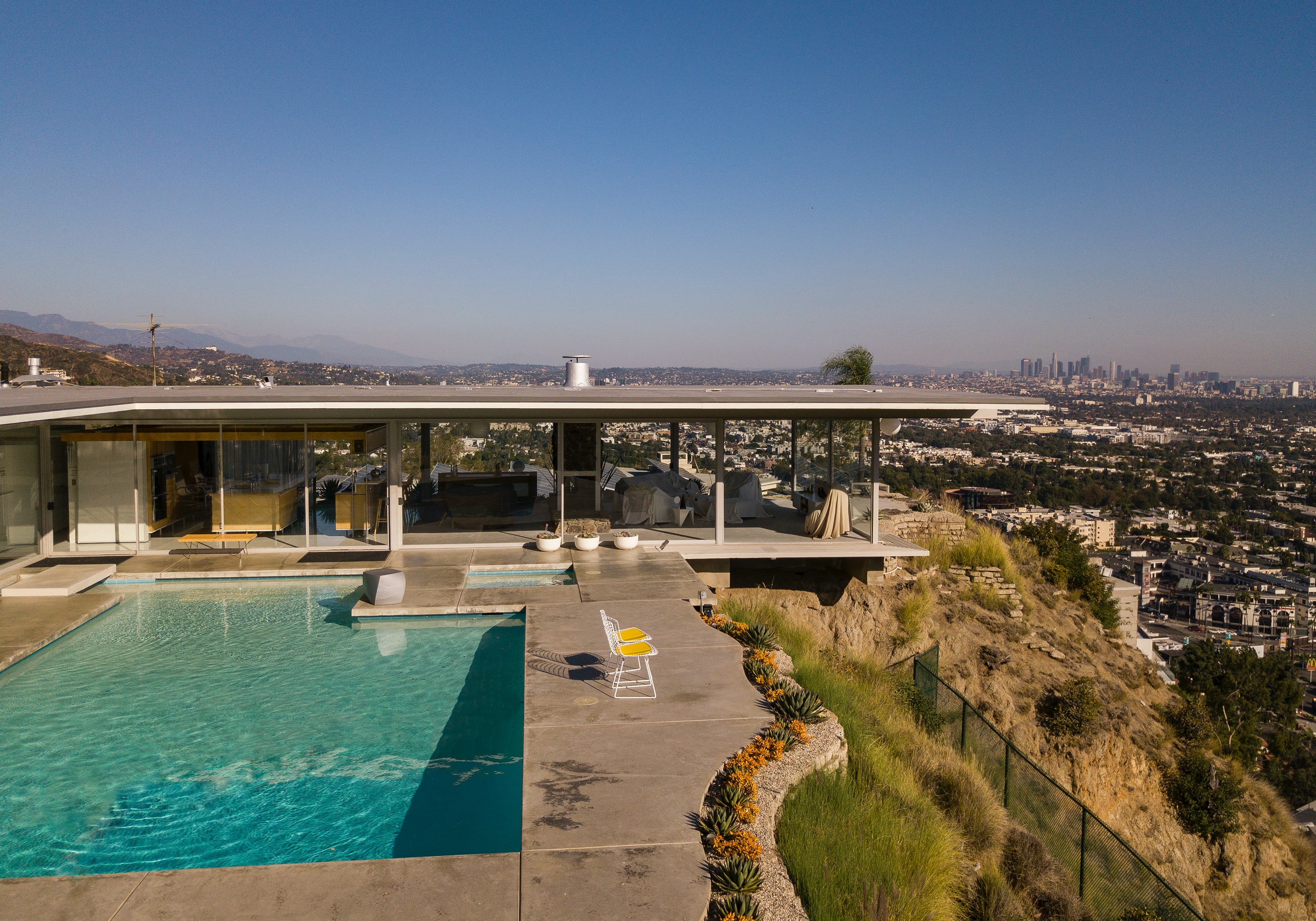 Mid century modern homes – the ultimate design guide
Everything you need to know about mid century modern homes, inside and out
By Timothy Latterner
-
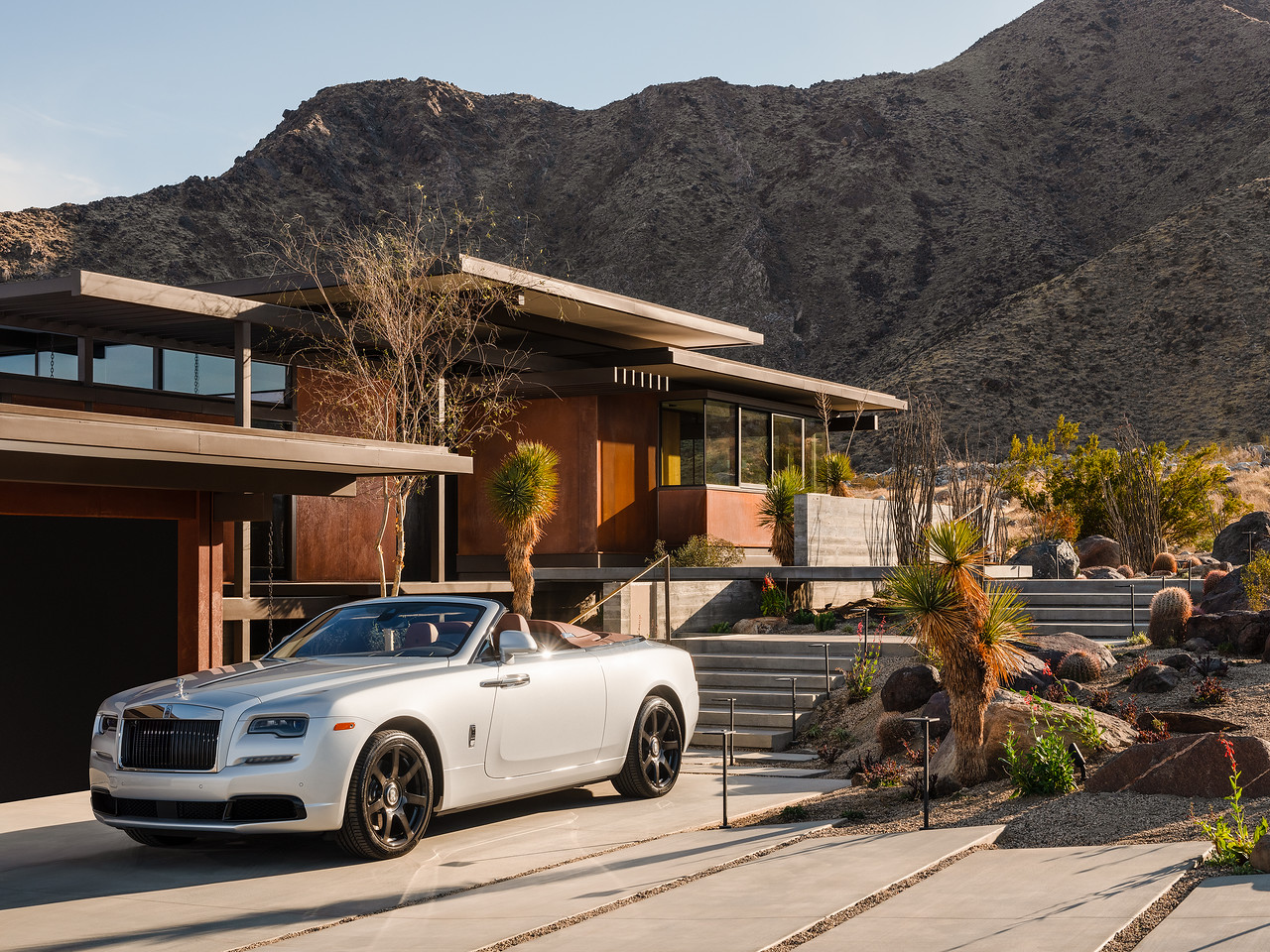 Explore this beautiful mid-century modern home in Palm Springs - the last design of renowned architect Ray Kappe
The views have to be seen to be believed...
By Ruth Doherty