This Manhattan apartment's midcentury modern makeover has extra wow factor
A busy New York exec asked her interior designer for a home office with a good zoom backdrop. Here's what happened
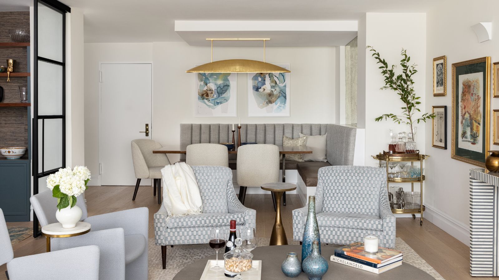
This one-bedroom apartment in a post-war block in Manhattan was crying out for a redesign when its new owner, a top executive in a medical research center, first set eyes on it. Spacious and well-situated, the 1960s-built apartment had plenty of advantages, but its new owner needed some help with apartment layout ideas.
That's where interior designer Chris McGovern, of the McGovern Project got involved. Chris was to provide a steer on design, color palette, and materials to help the owner create a versatile home, where she could work, entertain, enjoy hosting her nieces and nephews, and relax.
'Any renovation has its challenges. This style apartment served as a blank slate for adding various interior architectural details and injecting personality,' says designer Chris McGovern, who couldn't wait to get started on the project. Here's his designer's eye view of the new-look apartment.
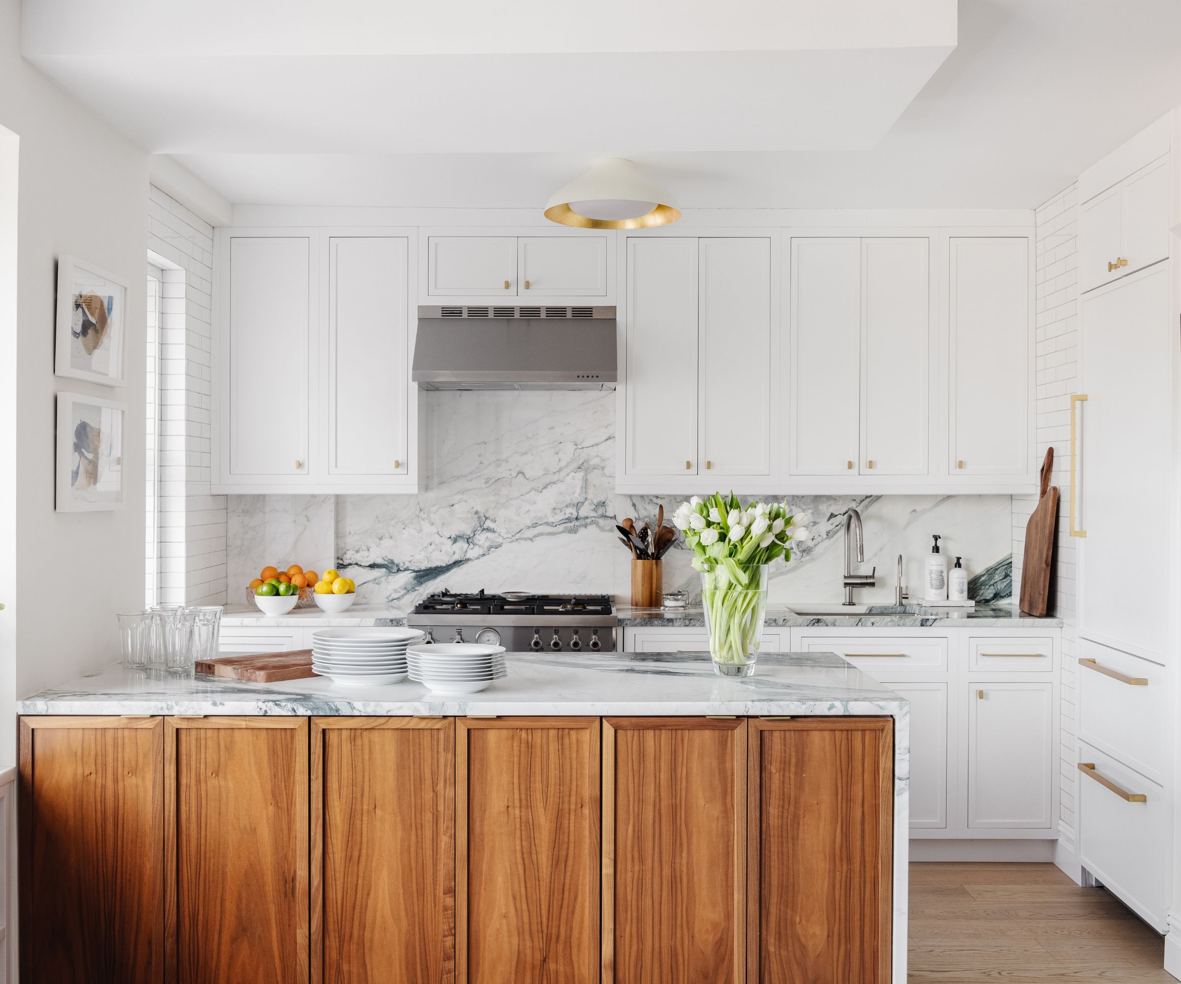
The kitchen and bathroom needed to remain in their existing footprint but kitchen ideas revolved around creating an openness to the flow from the kitchen into the main public area. McGovern removed the wall and created a peninsula with storage on both sides. The other main change to the existing, largely enclosed, galley kitchen was to move the refrigerator to the former galley entrance.
'An attraction to honest, clean lines and a midcentury modern sensibility à la Frank Lloyd Wright were expressed in the waterfall silhouette of the kitchen island, the custom walnut desk with another waterfall edge, the drama of the wood dining table and banquette surround, and the accent chairs in the living room,' says McGovern.
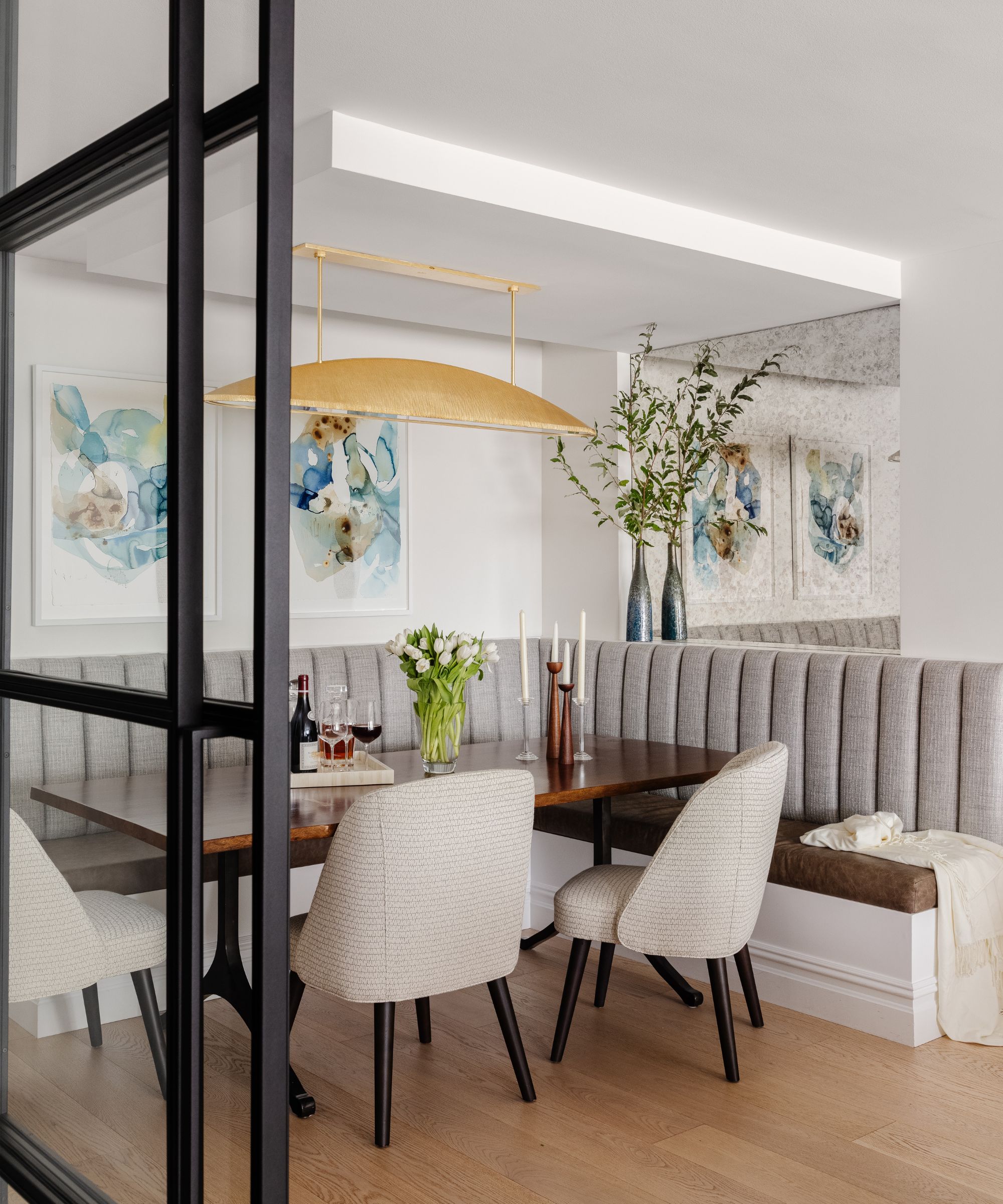
'A love of natural light guided our process on the layout of the living /dining area,' says McGovern. 'The long common space had room for both a large dining and living area. We considered placing the table near the windows, given the proximity to the kitchen. But ultimately placed the living area near the windows as natural light for reading was preferred,' says McGovern, and the dining nook was placed near the apartment entrance. 'Nothing is too far in apartment living and the extra few steps for the occasional dinner party was outweighed by the desire for the most natural light for everyday living,' adds McGovern.
The dining room ideas feature a nod-to-midcentury custom L-shaped banquette, and include more walnut wood to reference that in the kitchen. was placed on the far end near the apartment entrance.
The constraints of the apartment's original structure meant that McGovern had to get ingenious when it came to the overhead lights in the kitchen and dining nook. A dropped ceiling cantilevered over the dining area allowed for the Kelly Wearstler light to be fitted.
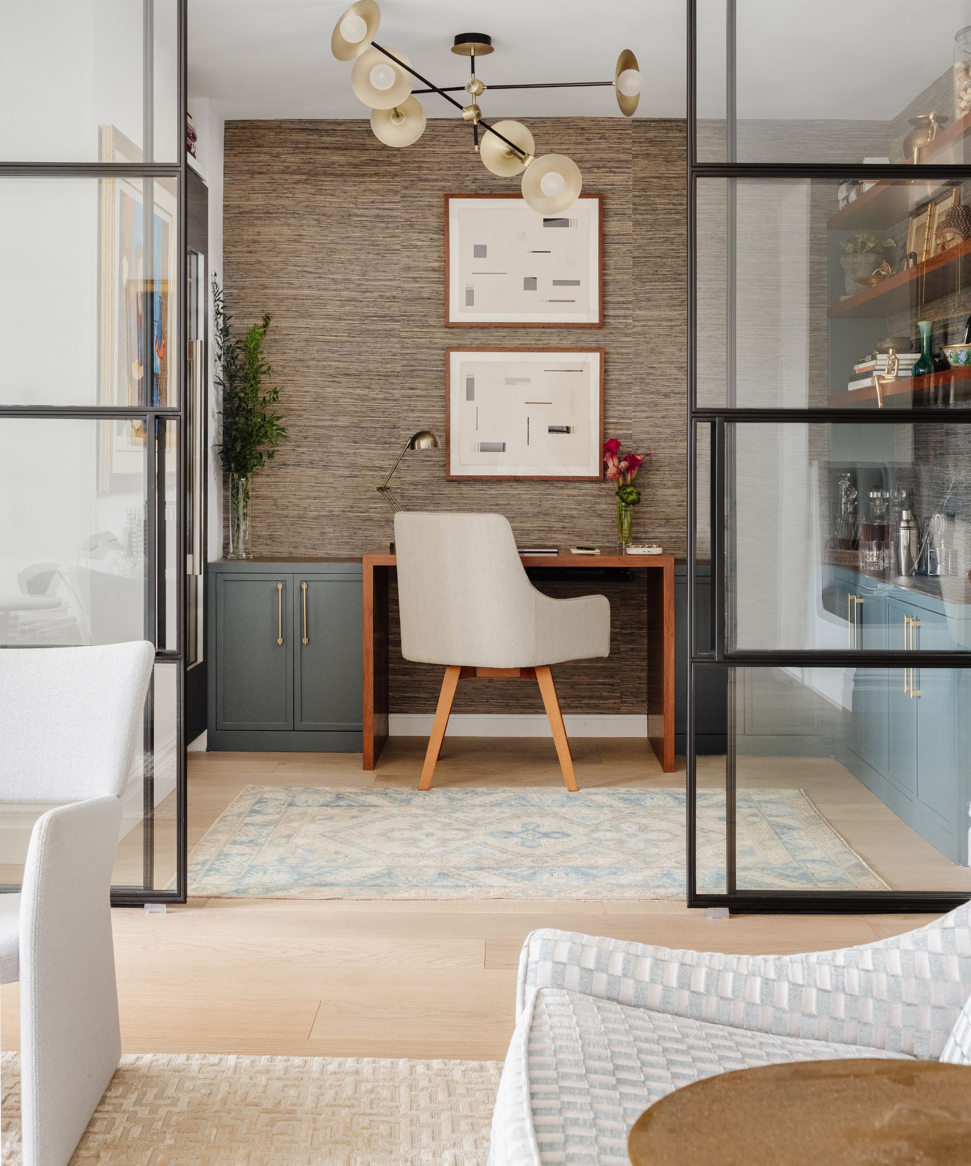
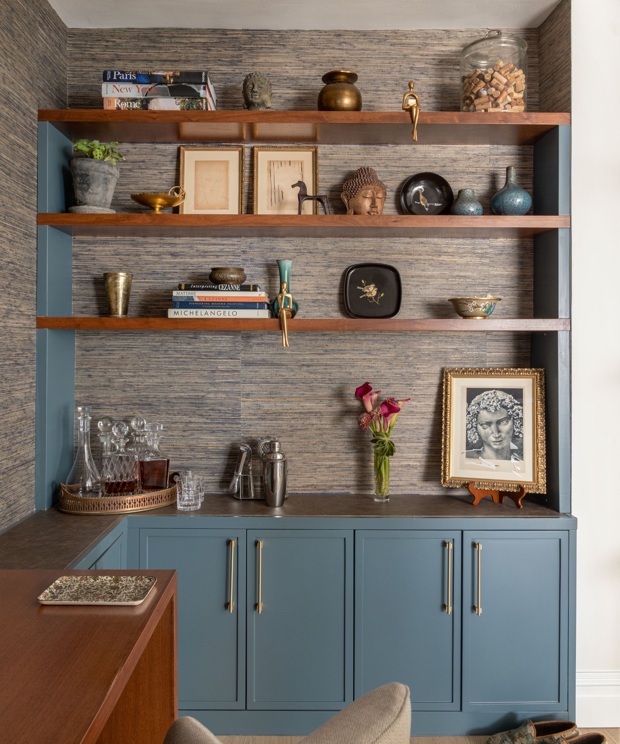
The niche off the living room was initially intended as a dining nook but would accommodate only a small table. McGovern turned this into a home office.
There was a lot to play for here, as one of the owner's key brief requests was to have a home office space 'with a good zoom backdrop'. We think McGovern has smashed that with his home office ideas, which include smart steel-framed doors, a view into the stylish living room and the Manhattan skyline beyond.
Custom millwork was designed to create a space for a desk, storage and shelving. A full-height 18” wide wine refrigerator was tucked into the space adjacent to the new kitchen refrigerator location to house some of the owner's wine collection - another brief requirement. The custom steel and glass casement partition wall with sliding doors allows for some sound control and also adds architectural interest.
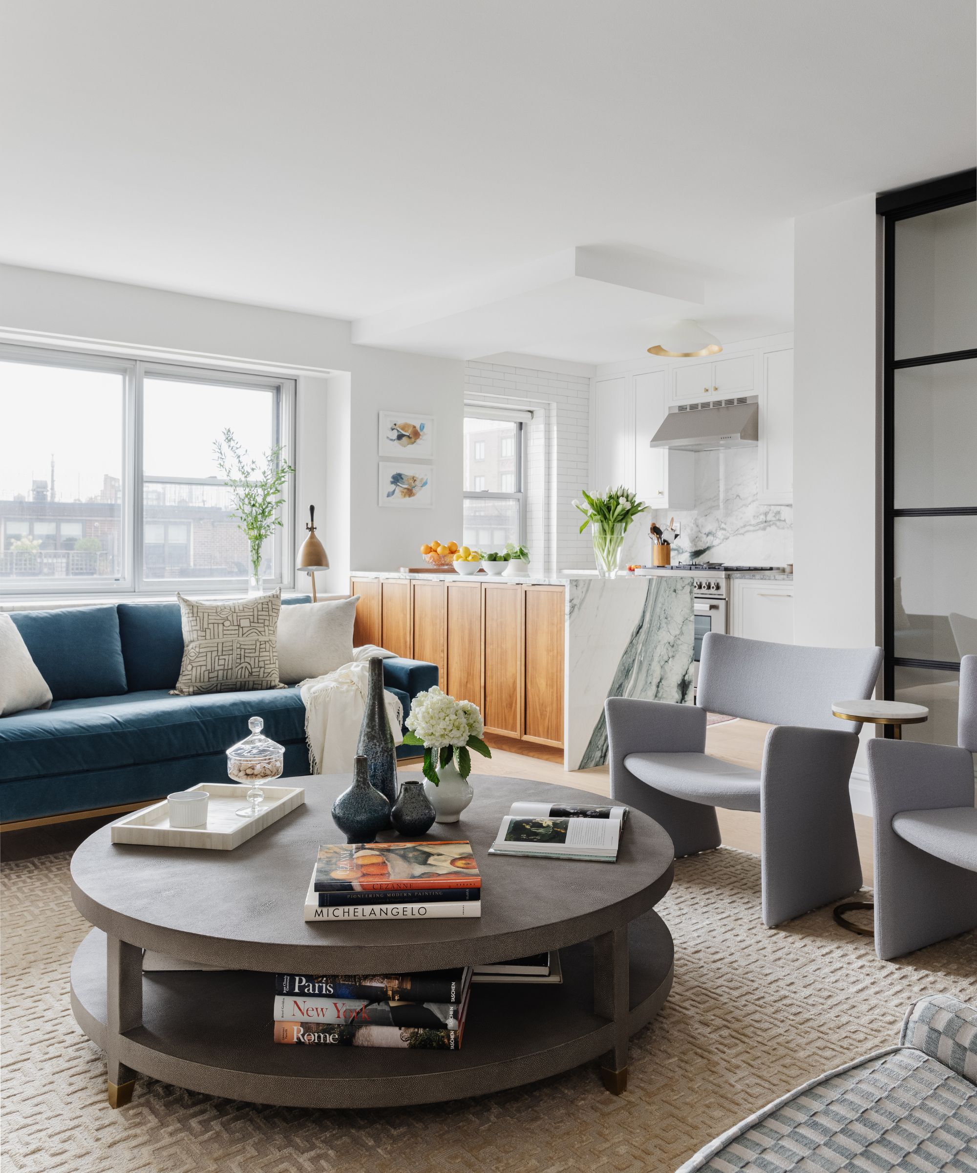
Living room ideas had to take into account the owner's wish to have a space to comfortably entertain with wine or cocktails in the living area. The furniture layout includes comfortable seating for guests. A pair of vintage midcentury chairs reupholstered in Scalamandre fabric were selected for comfort and low backs. A pair of new Danish chairs from FAIR round out the seating area.
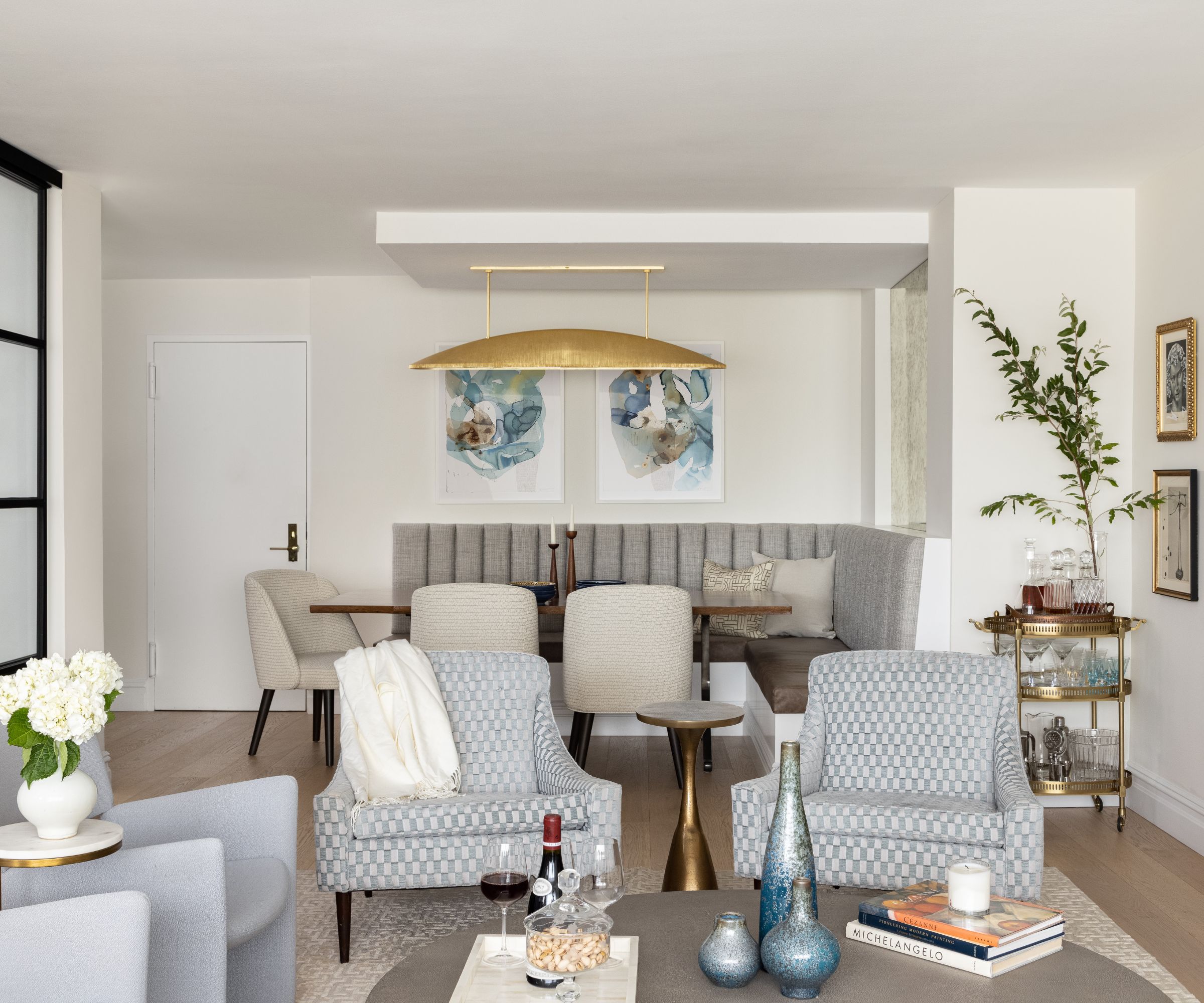
Even though the apartment's redesign has created defined zones, there's still scope when entertaining for the open-plan space to expand to incorporate a kitchen, dining nook and living room.
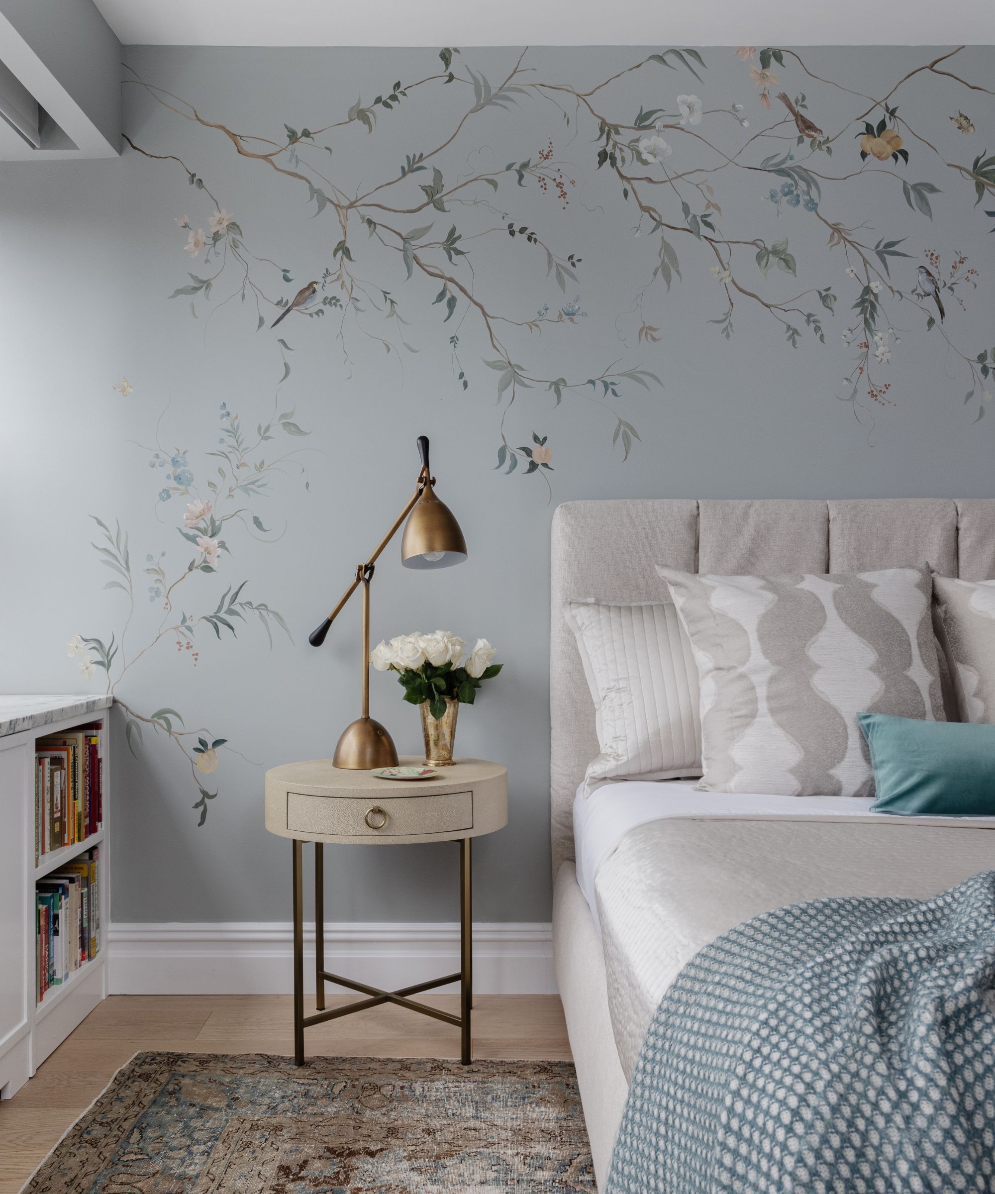
The bedroom is a true sanctuary. Anyone looking for bedroom ideas could take inspiration from the delightful handpainted floral wall mural by Canaan, NY-based artist Sue Leal, which adds a feminine touch to the bedroom along with the luxurious bedding by Ann Gish. A lift-storage bed by Flou provides added space for extra bedding and linens. A large vintage Tabriz rug grounds the space.
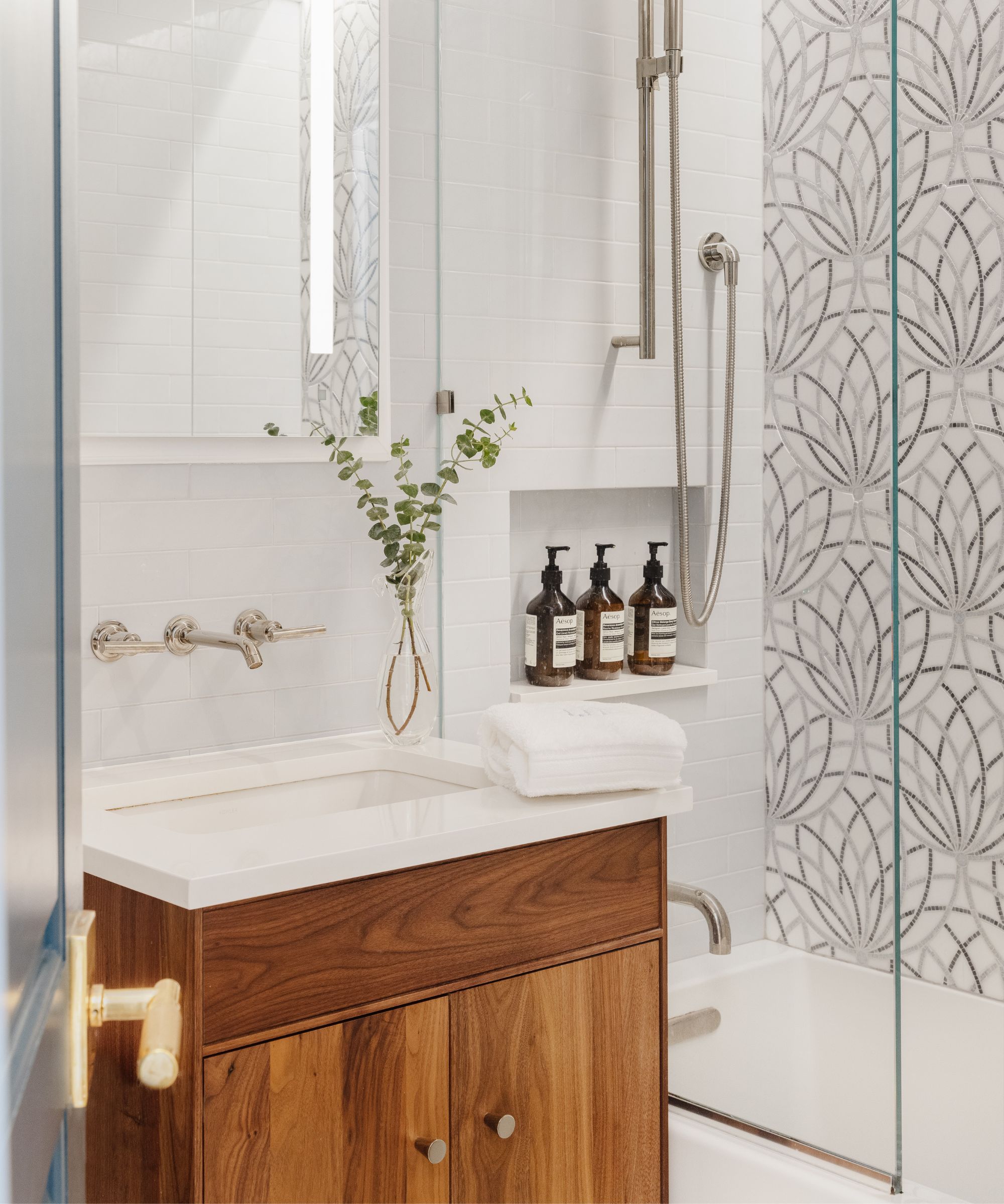
Designer Chris McGovern explains the inspiration behind the color palette. 'The idea of renewal was expressed through the color palette (greens, blues, teals) and symbols, such as the lotus flower design in the tiles of the bathroom feature wall and in the painted flower murals in the bedroom.
Bathroom ideas incorporate a marble mosaic lotus flower design, an ancient Egyptian symbol of rebirth, for the feature wall of the shower. The pattern is waterjet cut with Thassos, Azul Cielo and Bardiglio stones by Artistic Tile. Note the reappearance of midcentury modern-inspired walnut cabinetry once again, here in the bathroom.
Interior Design / McGovern Project LLC
Photographs / Kylie Fitts
Sign up to the Homes & Gardens newsletter
Design expertise in your inbox – from inspiring decorating ideas and beautiful celebrity homes to practical gardening advice and shopping round-ups.
Karen sources beautiful homes to feature on the Homes & Gardens website. She loves visiting historic houses in particular and working with photographers to capture all shapes and sizes of properties. Karen began her career as a sub-editor at Hi-Fi News and Record Review magazine. Her move to women’s magazines came soon after, in the shape of Living magazine, which covered cookery, fashion, beauty, homes and gardening. From Living Karen moved to Ideal Home magazine, where as deputy chief sub, then chief sub, she started to really take an interest in properties, architecture, interior design and gardening.
-
 Martha Stewart's intelligent cabinets 'take every inch into consideration' – their 'visually light' style will solve your small kitchen storage problems
'Every kitchen can be beautiful and functional, no matter what the size': 9 years since sharing her clever storage, Martha's cabinets are just as beautiful
By Megan Slack Published
-
 This once-dated kitchen is now a timeless space with the coziest details – and its the classic color palette that's made it a chic, welcoming space
Warming colors and natural materials combine to create this enduringly classic kitchen scheme
By Molly Malsom Published