This luxurious Los Angeles-area home exudes earthy elegance and family-friendly charm – here's a look inside
Designer Tanya Stone recently gave model Sarah Stage's family home a 'grandpa chic' refresh, incorporating warmth, antique pieces and an anti-trend mindset. Here, Tanya and Sarah share more about the stylish home
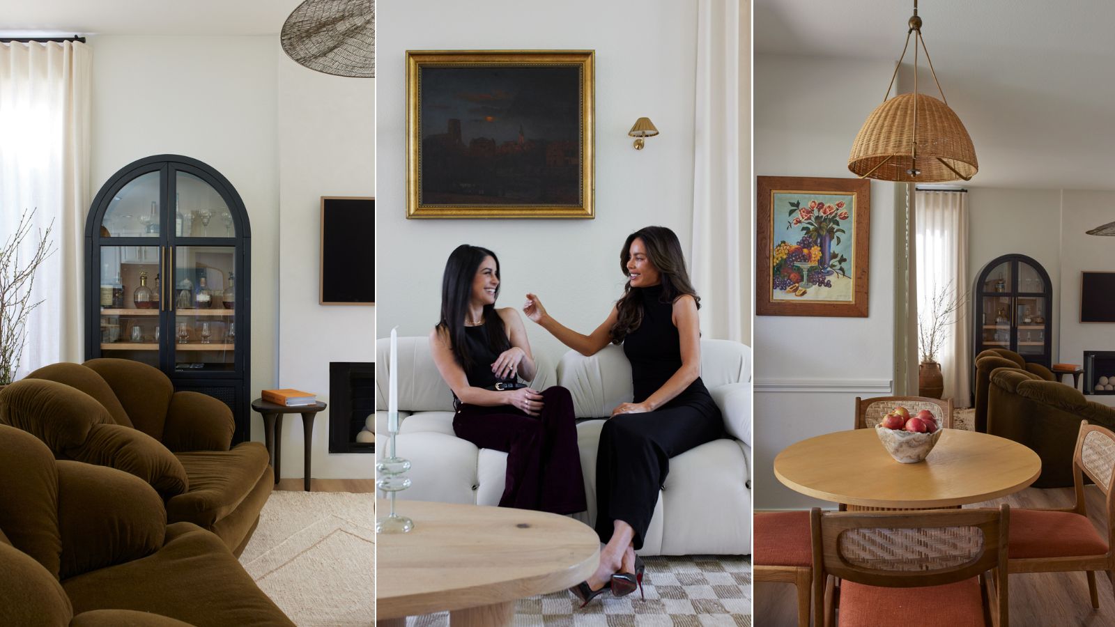

When designing a home that's fit for the whole family, striking the perfect balance between stylish and durable is no simple task. But for model Sarah Stage, mom to two little boys, it was a non-negotiable. Though she had some aesthetic ideas for the space going into her Los Angeles-area home renovation, first and foremost, the space had to be comfort-forward and meant to last. That's why she turned to Tanya Stone.
Tanya, founder and lead designer of LA-based Tanya Stone Interiors, had transformed one of Sarah's previous homes years before. And when she heard a bit more about the model's vision for a 'warm and earthy' design scheme, she was immediately on board. With a combination of vintage pieces, performance fabrics, and open minds all around, Tanya transformed this LA-area tract home into a cohesive, 'grandpa chic' home that the entire family loves.
In recent interviews with Homes & Gardens, Tanya and Sarah shared what went into renovating the house, and how the final product feels. Here's a closer look inside the luxurious space.
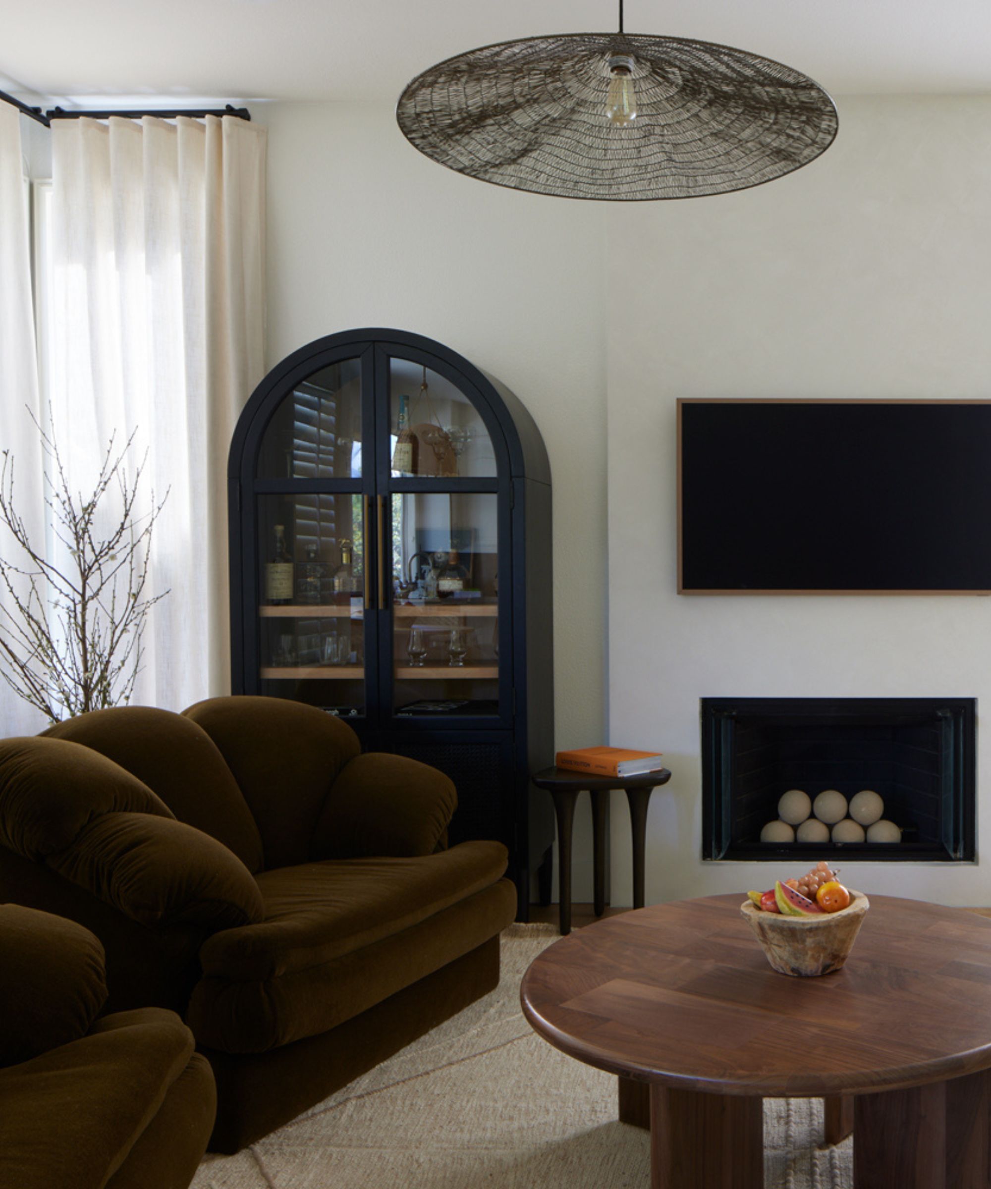
The home's design style blends lush texture with a deep, inviting color palette across a largely open-concept floor plan. Each area, whether the formal living room or the family dining table, has a character of its own, but the color story carries throughout with ease. When first embarking on the design process, Sarah told Tanya she was looking for 'more warmth and earthy elements' – above all, she wanted to bring the outdoors in. But while designing the space, the two agreed: no single design style seemed to match the aesthetic they were creating.
'Tanya's really talented, and she really understood what we needed for this space. It needed to be comfortable, and we wanted it to be functional, but still wanted to be able to show our personality and have a little bit of vintage, a little bit of modern, a little bit of nature. I think we created our own genre of what the space is,' Sarah tells H&G.
Because of the home's tasteful mix of old and new, upscale and down to earth, Tanya landed on 'Grandpa chic' to define the style. Starting with a set of vintage chairs, originally in white leather but reupholstered with alpaca fleece, the designer crafted a transitional style that'll stand the test of time. 'It was a really good starting point to layer around those chairs,' Tanya says.
'We just took it one step at a time She has two boys, and they love gaming, so she wanted the room with the alpaca chairs to be somewhere where they hang out all the time. They can game, and they can have family time, and I think we definitely achieved that. And that just transitioned into the other more formal spaces. It's not a huge house, so it all needed to tie together,' she adds.

Tanya Stone is the founder and principal designer of Tanya Stone Interiors, a Los Angeles-based firm that designs residential and commercial spaces, as well as bespoke furniture.
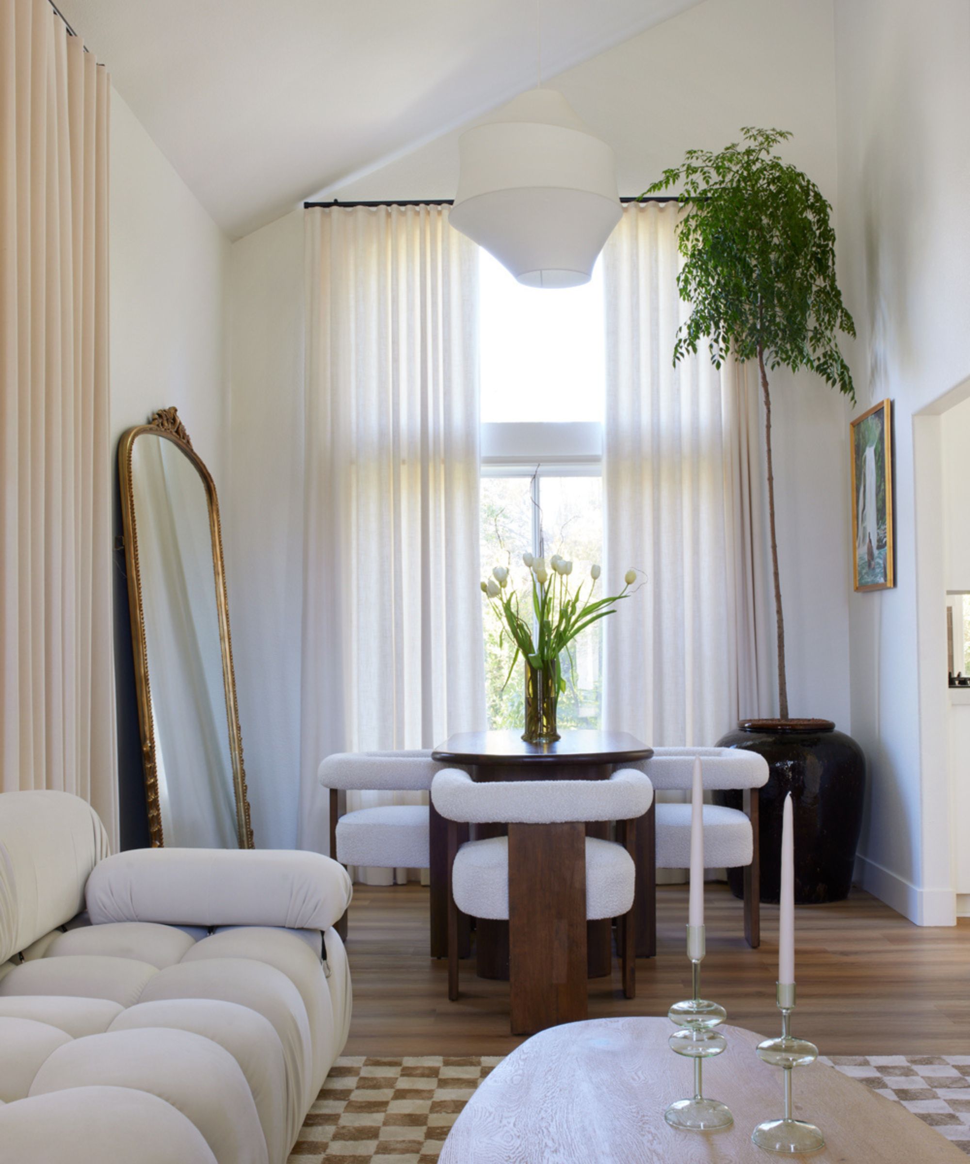
With two distinct dining areas and two living areas with completely different atmospheres, the space had to seamlessly flow together. But before the renovation, the tract home's architecture made that task nearly impossible. Unnecessary soffits and awkward ceiling angles were 'distracting to the eye,' Tanya says, so the first item on the reno checklist was to close up as much as possible. Despite that goal, some of the angles made it through to the final product – a difficult hurdle but an overall asset to the design scheme.
'With the unique angles, we just went with it. Putting that huge 10-foot China doll tree in the highest point of their ceiling – you wouldn't expect that massive of a tree in a house that's not so massive, but it works because of that insane angle. We worked with what we got and that's reality – not everybody can do whatever they want when they want, even the wealthiest people. I think that's the beauty of design – you get to be creative and when you have restrictions, you get to step outside the box a little bit and make something special,' Tanya tells H&G.
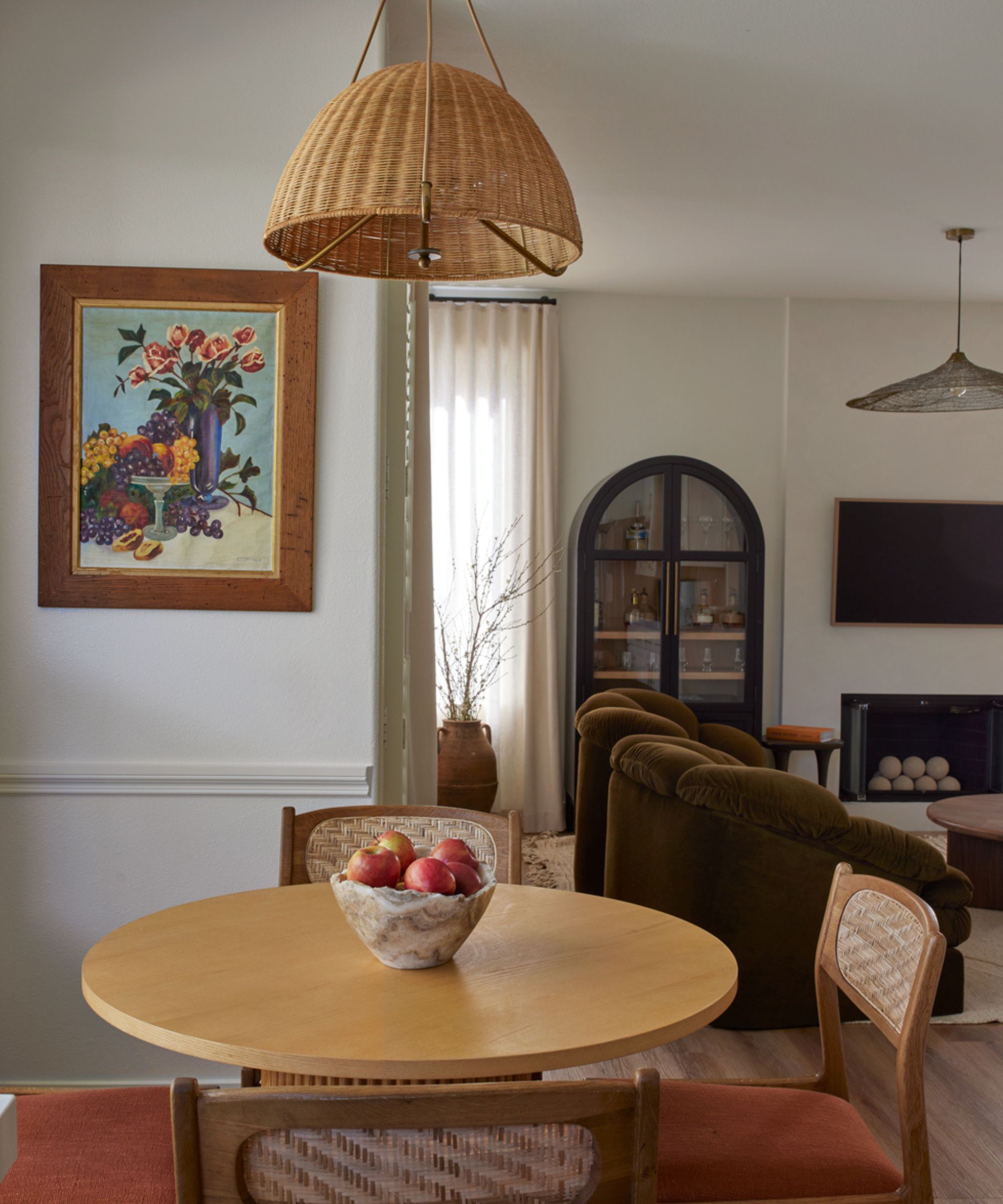
A thoughtful combination of vintage pieces, family heirlooms and brand-new buys makes for a collected, cozy look that's welcoming to all. With textured rattan light fixtures, gold antique frames and airy, custom drapery, each detail was selected to put a homey feel forward. A painting done decades ago by Sarah's grandmother has a starring role above the dining table, and its carved wooden frame blends beautifully into the overall design scheme. Many of the other picture frames scattered about the house are vintage as well.
'We got a lot from the Rose Bowl Flea Market, and Sarah’s mom used to sell at the Rose Bowl flea market so she was very familiar with that. I think what’s cool is how design changes all the time, and you change all the time – of course, there are going to be trends that come and go, but she had a history. For her first house that we did, everything was new, but this time, she went back to her roots,' says Tanya.
While some consideration was given to what's in or trendy when designing this space, Sarah shares that the pair decided to opt for furniture and decor that made her happy – not pieces that fit in with the ever-fleeting status quo.
'I love that we chose pieces that I genuinely am obsessed with. Some of them don't really make any sense, but they all work together. You really have to love every piece so you never get tired of your space,' says Sarah. 'If you go on only the purpose of trends, and not something you genuinely love, you're gonna get tired of it. And you're always gonna be feeling like you need to update your home... When you're living in your home, look around and enjoy all the pieces you have. With my family, we just have to do what works for us.'
For functionality's sake, too, the team went back and forth on what would work best for Sarah and her family's needs. And while 'wood floors would be ideal,' pets were part of the design equation as well.
'At the end of the day, she was like, “If I spend money on wood floors and they get super damaged, you can refinish them, but the reality is, who has the time and energy to refinish floors? It's a whole process." So we ended up going with the vinyl floors. And is that a faux pas in design? Maybe. But it worked for her, and it looks pretty, and the maintenance is easy. It’s just whatever makes sense for the homeowners, and that's so important to remember,' Tanya says.
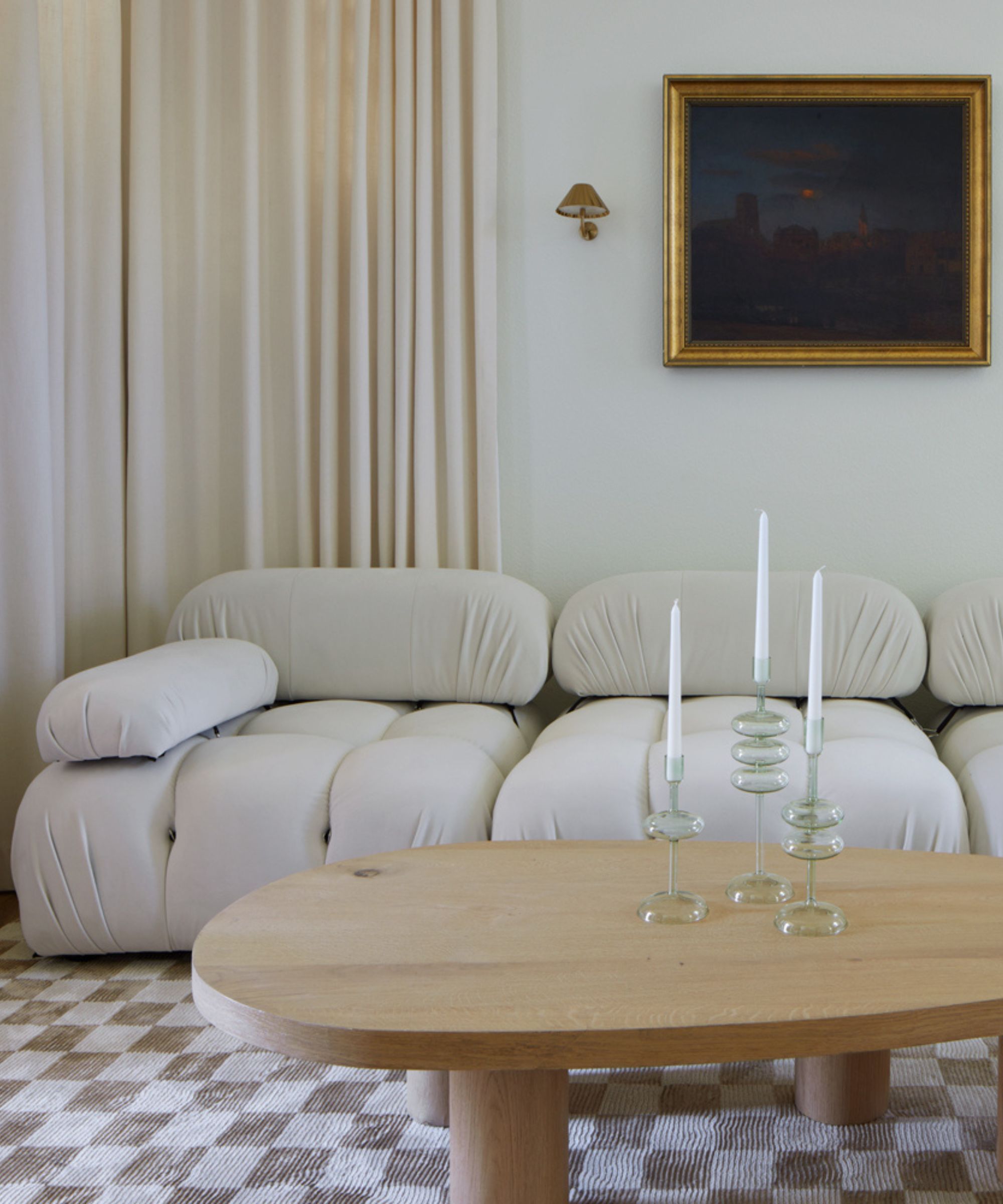
With function and practicality front of mind, the space's white Mario Bellini sofa remake from Haute Home might come as a surprise. But clad in a high-performance fabric, this piece was one of many across the home that had hidden features to prevent inevitable wear and tear. And aside from the white sofa, the dark, warm colors throughout make for a more welcoming space, says Tanya.
'We wanted colors that weren’t necessarily bold, but darker and warmer, with stuff that we brought from the outside in. We wanted it to look luxurious but also be very liveable, so there are olive greens – even though she has a white sofa in there. But it’s a high-performance fabric, so we felt very comfortable with that. And at the end of the day, we chose pieces that we’re okay with them having some wear and tear because that’s life. I think her lifestyle and the fact that she’s a mom really reflected into the colors,' Tanya adds.
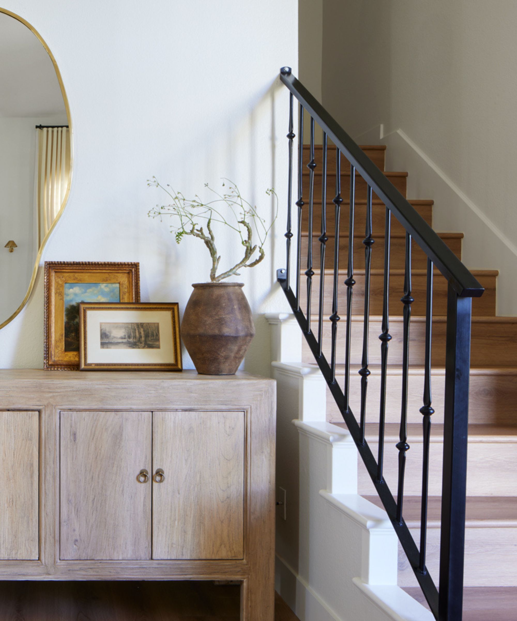
No stone was left unturned during this California home's renovation, and the staircase railing is a prime example. The banister was custom-made, featuring sculptural detailing that contrasts with the sleek, neutral stairs. Set next to an entryway console from Newport Beach-based Trouvaille Imports that houses a stylish vignette, the stairway acts as a vital part of the home's design scheme.
'That little fix made a huge change. When the light hits and the shadows it creates – it made such a big difference. I love the fact that somebody made that by hand. I worked with a lot of them and it just makes it more special. Of course we ordered from CB2 and Crate & Barrel and mainstream stores, but there was a lot of love and heart and compassion of all these small business owners helping me bring this space together. It just made it feel so special,' says Tanya.
Sarah's home was truly transformed, from a not-yet-perfected tract home to a calming, welcoming oasis. Though special attention was paid to comfort and function, the style didn't suffer in the slightest. The heartfelt touches and cozy feel make it the perfect escape for a busy, young family.
Sign up to the Homes & Gardens newsletter
Design expertise in your inbox – from inspiring decorating ideas and beautiful celebrity homes to practical gardening advice and shopping round-ups.

Abby was the Interior Design News Editor at Homes & Gardens and is now studying for her Master's degree in Journalism at City University, London. Prior to joining our team, she worked with Better Homes & Gardens, where she wrote and edited content about home decor, gardening tips, food news, and more. She studied Journalism and English Literature at New York University and moved to London to pursue her love of writing in 2023.
-
 Kelly Ripa and Mark Consuelos's dining room shelves combine unexpected elements for the ultimate storage solution – it's multi-functional and replicable
Green shelves in Kelly Ripa and Mark Consuelos' dining room cleverly combine storage to accomplish separate purposes in a pretty way
By Sophie Edwards Published
-
 I'm a Sleep Editor – these are the 7 mattress features I think are gimmicks and not worth the spend
In my search to find the world's best mattress, I've come across some duds − learn from my mistakes and avoid these mattress gimmicks
By Emilia Hitching Published
