Here's how to make a 1990s home individual – mix old and new, and fill it with eclectic and charming surprises
Inspired by some of the greats in art and design, this new-look Long Island home is a creative one-off, full of character
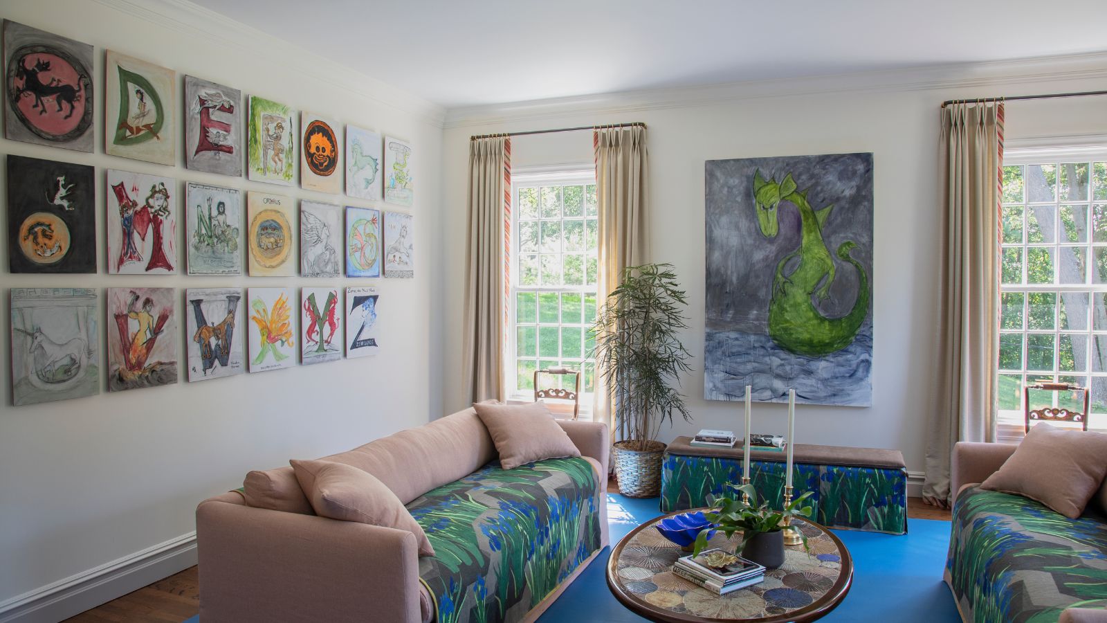
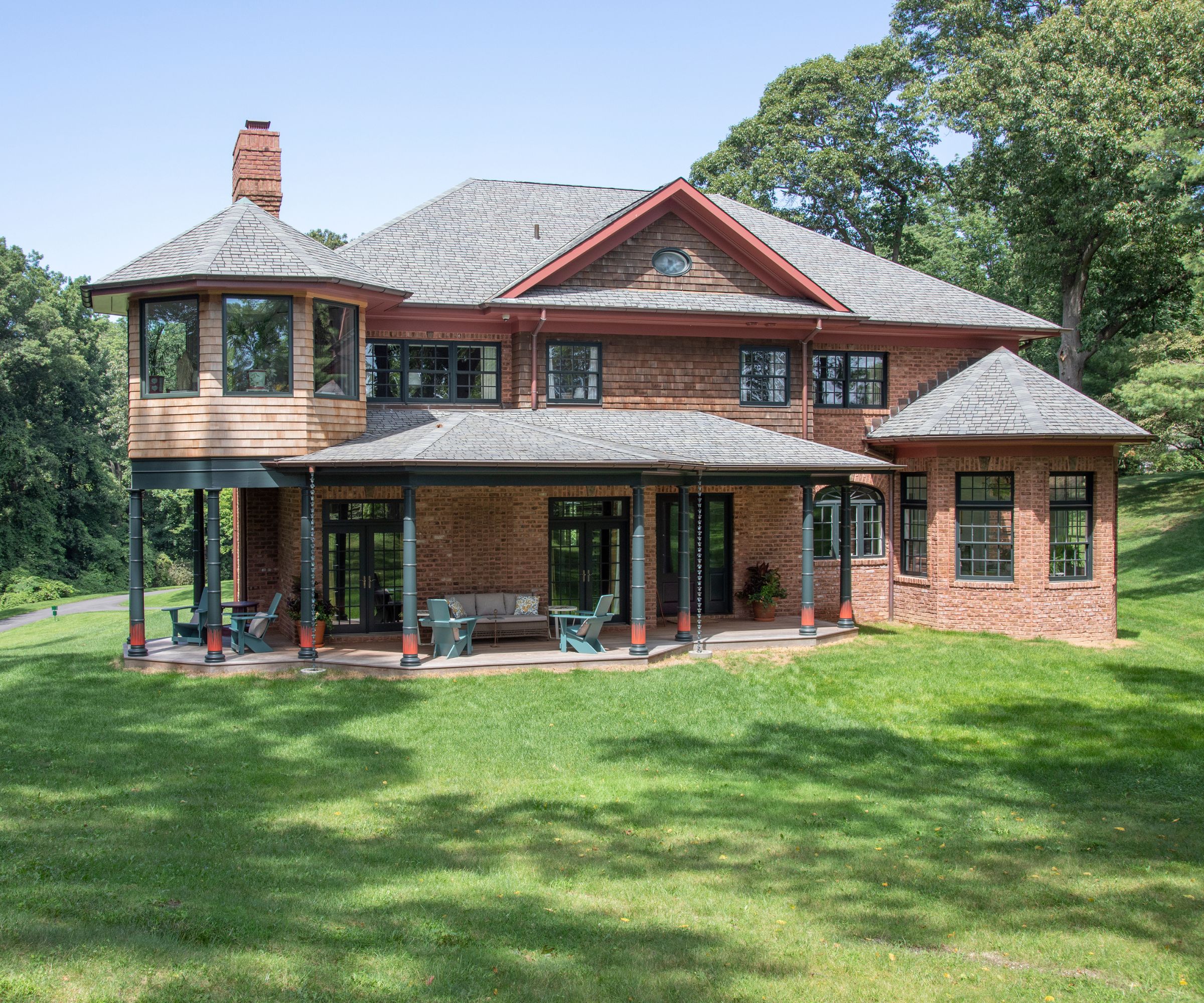
This house on Long Island, NY, is in an enviable location, with views of the ocean and harbor across a lushly planted backyard. The property itself, however, was nothing special. A 1990s build, of fairly modest proportions it was tired and dated when the new owners took it on. It was full of elaborate moldings and wallpaper and it felt cluttered.
A recent redesign has reinvented the space and the house is now much more comfortable in its skin, with eclectic and whimsical elements that really bring it to life. It serves as a backdrop to an impressive art collection, and its artist owner often uses it as a gallery space. Its transformation took inspiration from some of the great figures in art, design and literature, and the results put the Long Island house among the world's best homes. The designers responsible for the new look, Thomas Jayne and William Cullum of Jayne Design Studio, agreed to show us round and share some of their design surprises.
These were the designers' starting points: 'The house was built in a vaguely Queen Anne style – red brick with shingles, a few classical motifs, and the eyebrow dormer on the front façade and turret off the back are Victorian references. We really ran with that idea, infusing the interior of the house with many Victorian and Arts & Crafts elements,' says senior designer William Cullum.
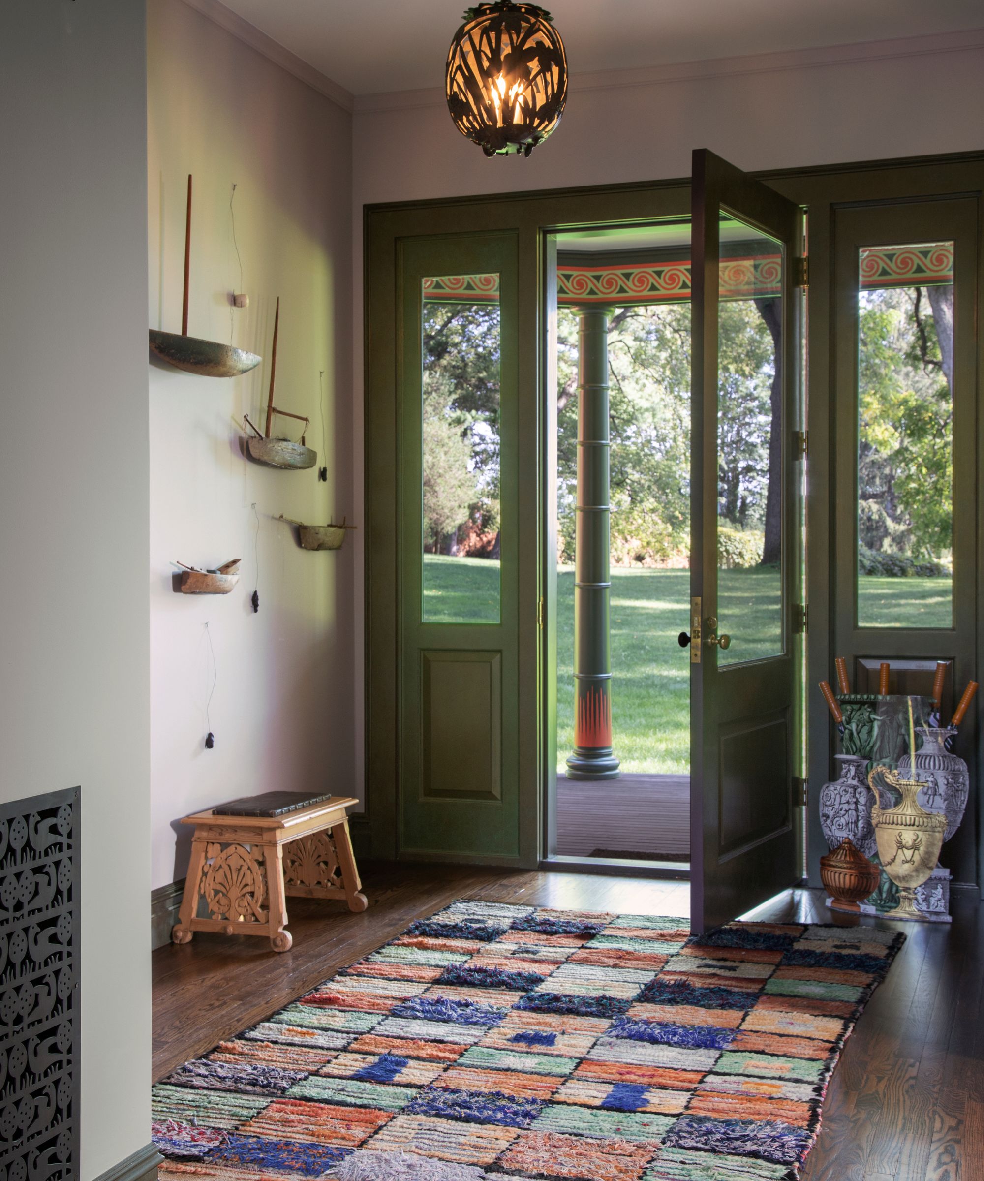
Among the hallway ideas are a pierced Japanese lantern, and a colorful rug that leads the way to the kaleidoscope of colors in the house beyond. The art installation is by Maurizio Pellegrin and references the boats in the nearby harbor.
'No one else has a room like this. That is what we often tell our clients. Here the combination of the Afghanistani rug, the Fornasetti umbrella stand and the gothic revival bench are a unique combination.' says Thomas Jayne, Jayne Design Studio's founder.
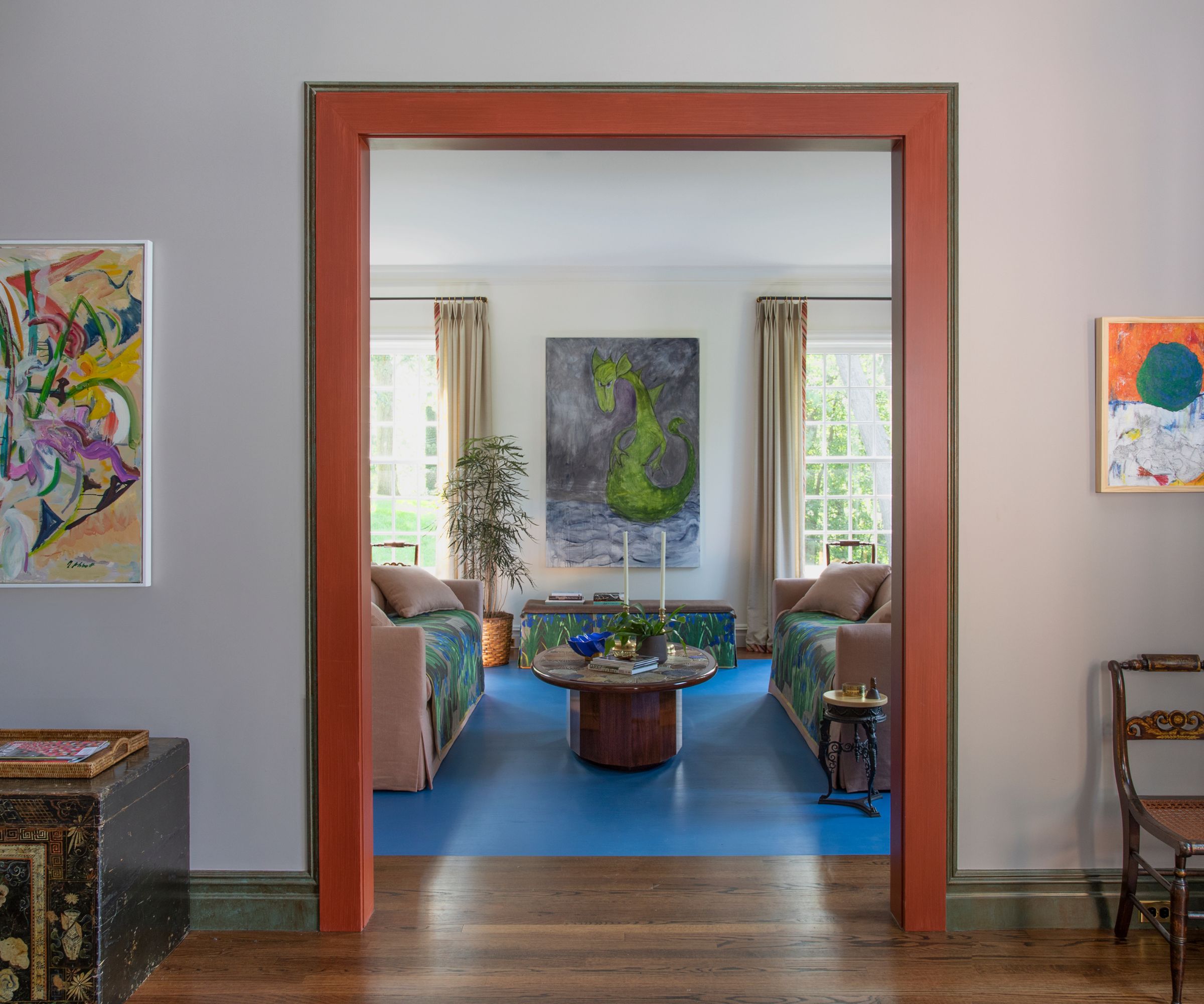
This inner hallway was designed to make an easy connection between the two gallery spaces. A Mary Abbott oil painting is seen to the left, while one by Peter Bonner sits to the right. The mythical beast on the window wall was painted by the homeowner. 'We raised the doorways into the living rooms and emphasized their grandeur with a red glaze; a nod to my mentor and friend the great decorator Albert Hadley who loved tall doorways and red,' says Thomas Jayne.
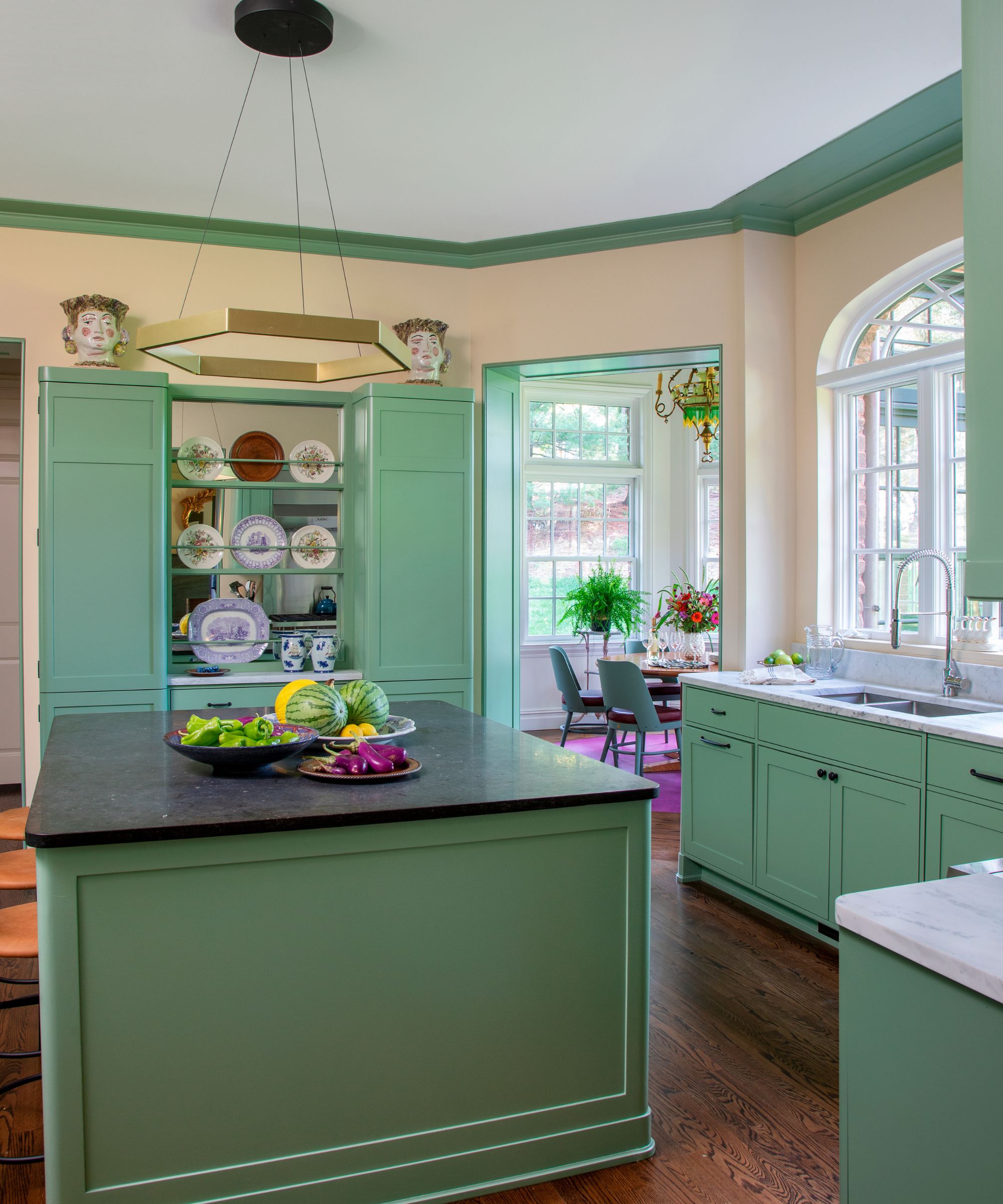
'The kitchen cabinets were inspired by those Charles Rennie Mackintosh designed for 78 Derngate – a house I visited in Northampton, UK. The grilles in the kitchen and stair hall were inspired by CFA Voysey,' says senior designer William Cullum, talking about the leading figures of the Arts and Crafts Movement who inspired the kitchen ideas here.
Just seen, through the doorway is the octagonal breakfast room, Thomas Jayne explains the thinking behind its unusual ceiling light: 'Our projects often feature vintage lighting. This crazy continental chandelier replete with beads is a memorable addition to the room.'

Thomas Jayne, founder of New York-based Jayne Design Studio, and senior designer William Cullum collaborated on the schemes for this Long Island home. Drawing on their knowledge, interest and experience of iconic designs from both the Victorian age and the Arts and Crafts movement, alongside contemporary touches, the pair introduced some truly unique moments to upscale the 1990s build. The result epitomizes the studio's motto 'Decoration: Ancient and Modern', with a perfect blend of old and new styles. As Thomas Jayne explains: 'I like old things, but I want them to look fresh.'
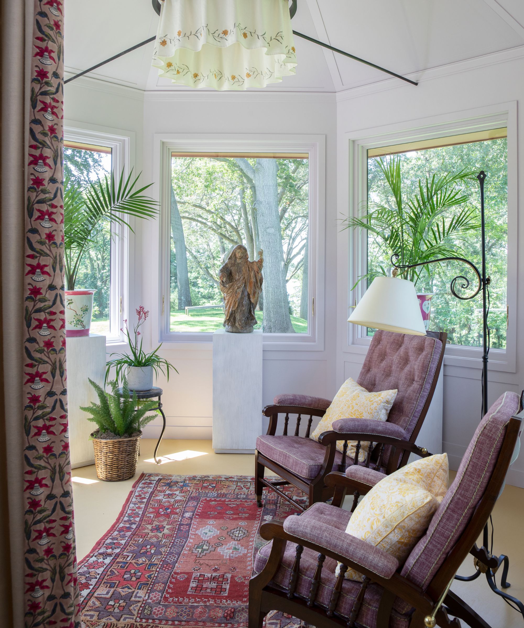
The house is full of individual details. Take this room, for example, in the turret at the side of the house. It required additional structural support and so the team added the steel brace, designing it to connect into a metal circle.
'We needed to add steel ties to secure the cupola and used the opportunity to make an integrated light fixture with a cloth valance much like late-19th century examples but very much a Jayne Design Studio invention,' says Thomas Jayne.
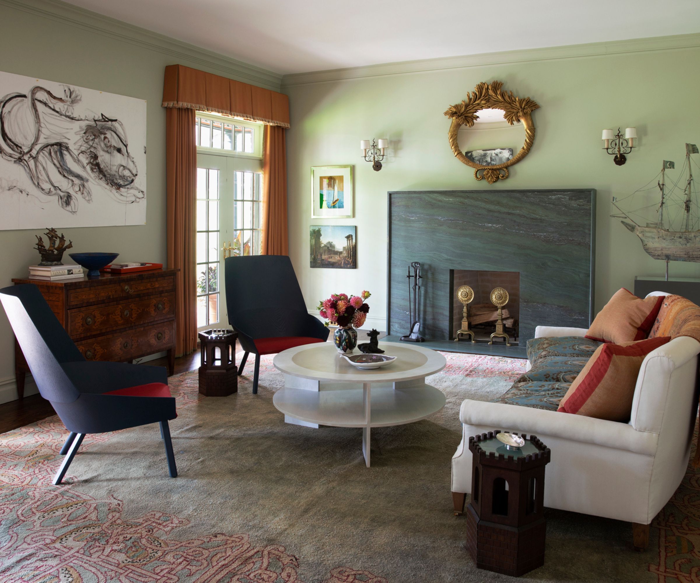
Living room ideas also include references to design greats. The green marble fireplace echoes similar models by architect Sir Edwin Lutyens. 'We found the Italian chest of drawers from dealer David Neligan, a giltwood mirror from Louis Bofferding and andirons sold by Nick Brock are the best examples of their type and mix well with the accompanying contemporary furnishings,' says William Cullum.
The lion drawing is by the homeowner.
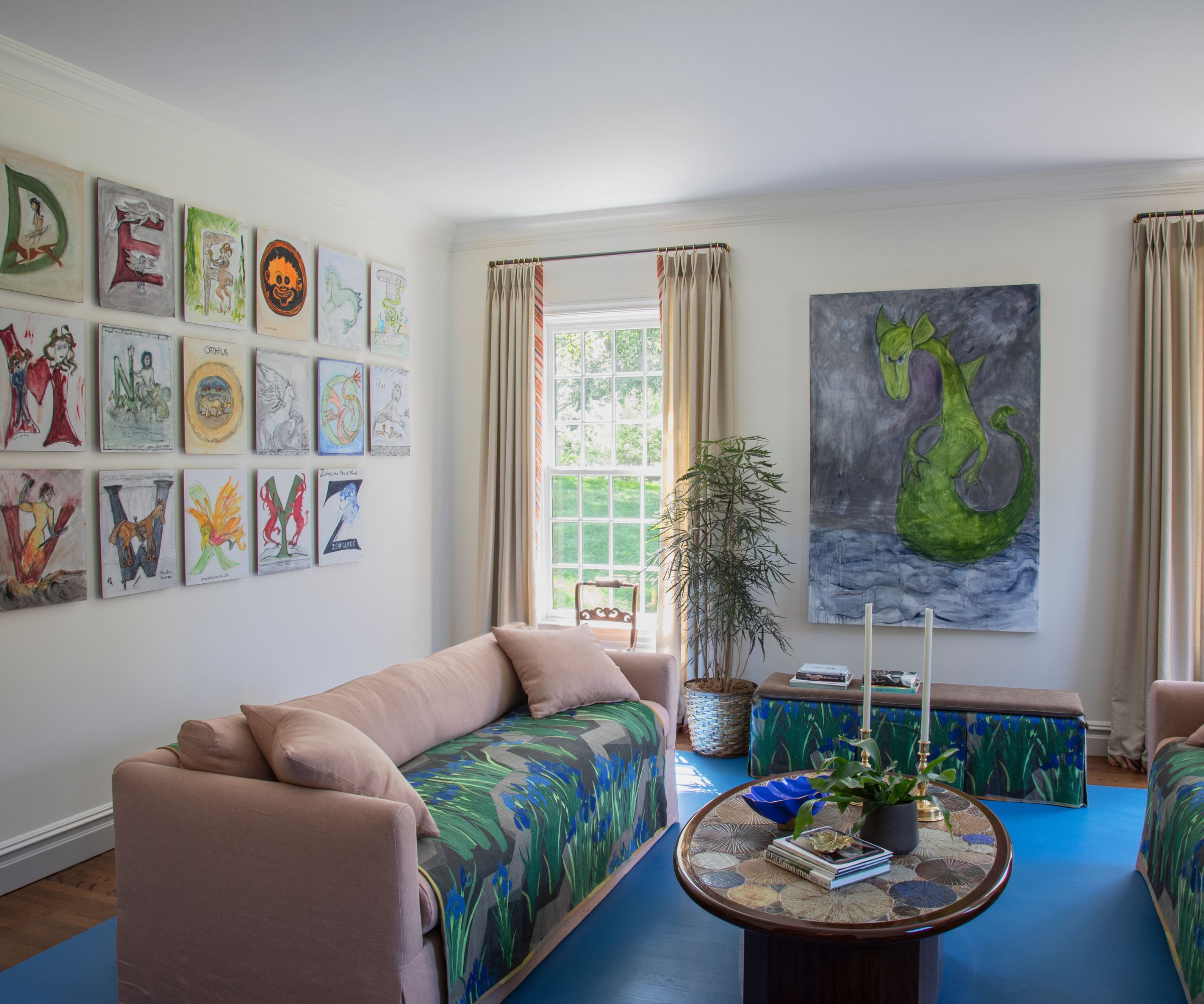
This gallery room was designed to be a flexible space for art shows and events. The design team suggested the painted blue panel on the floor instead of using carpet, and the two sofas are on wheels so they can be easily moved out to create a more flexible space for exhibitions.
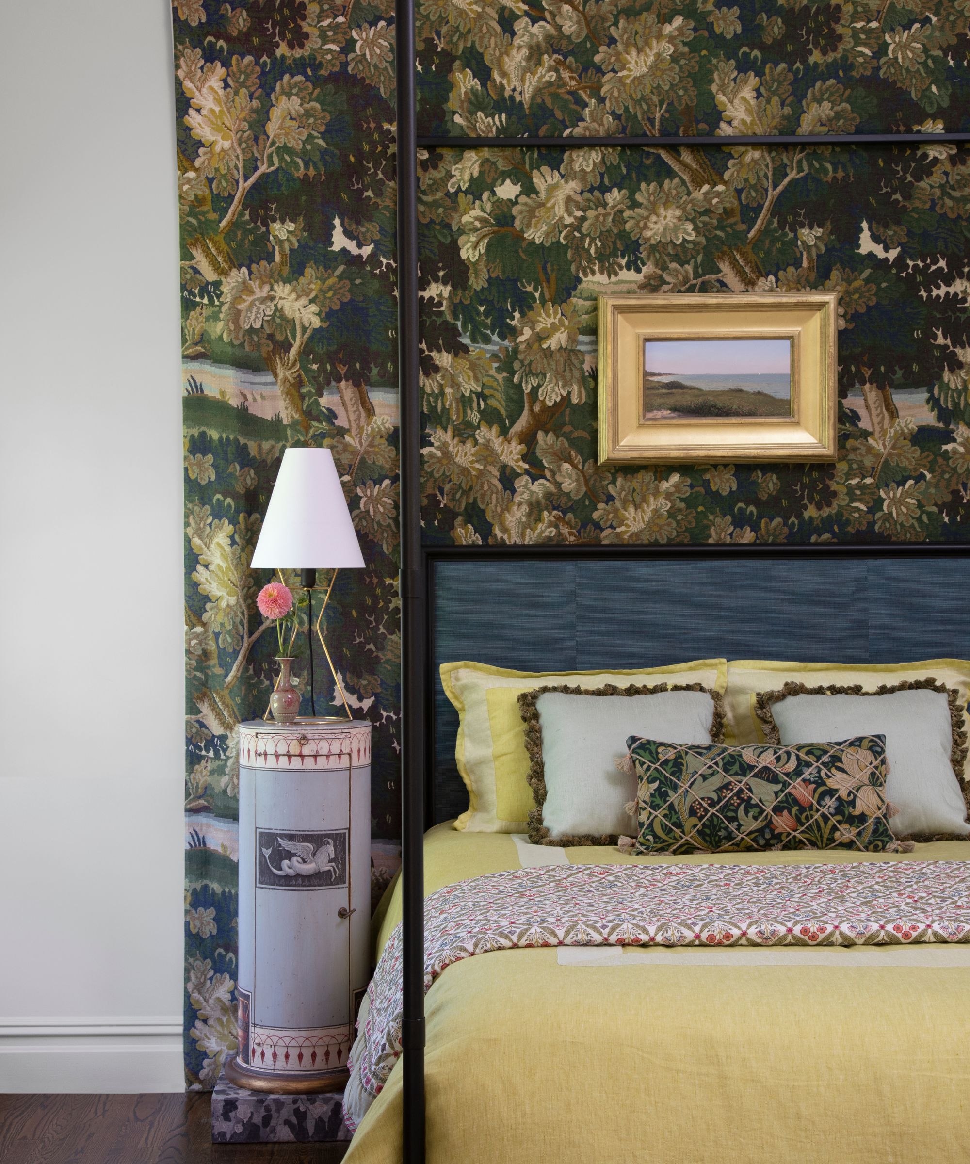
Anyone looking for bedroom ideas could take inspiration from this eclectic space. 'One of our missions was to add texture and patina to the house,' says William Cullum. 'You see this with the decorative paint used throughout the stair hall, the various antique light fixtures, but also here in the bedroom where we applied a panel of Cowtan & Tout printed linen tapestry to form a backdrop for the bed and antique Swedish bedside tables.' It's like being transported back to a different age.
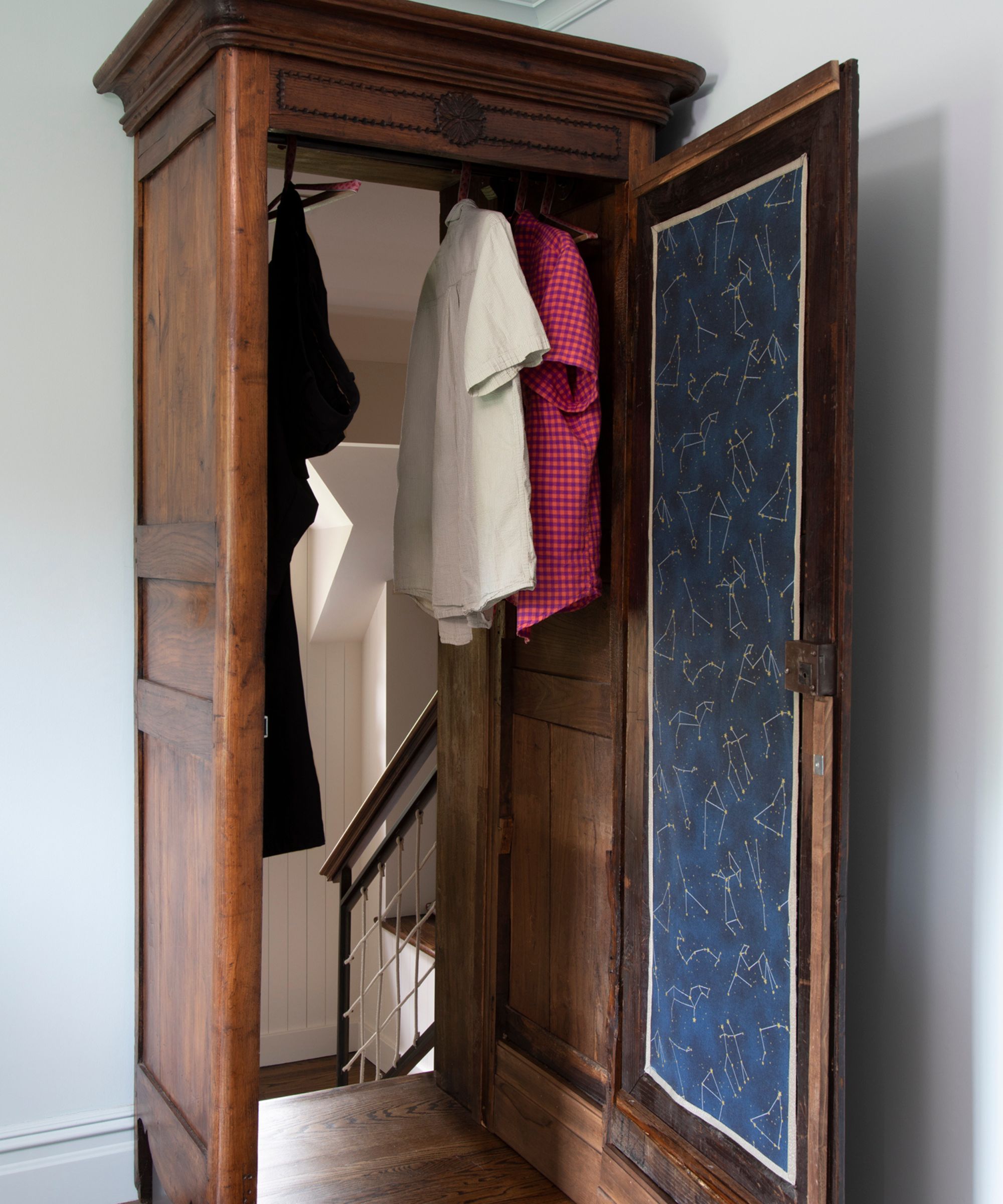
And talking of transporting, check out this charming feature in an upper floor bedroom built over the garage: a secret Narnia wardrobe in the Spare Oom!
'We forged a connection between the back hall and the upstairs rooms by cutting a hole in the exterior wall and disguising it with a wardrobe – an ode to the homeowner’s fascination with mythology and CS Lewis's The Chronicles of Narnia,' explains William Cullum.
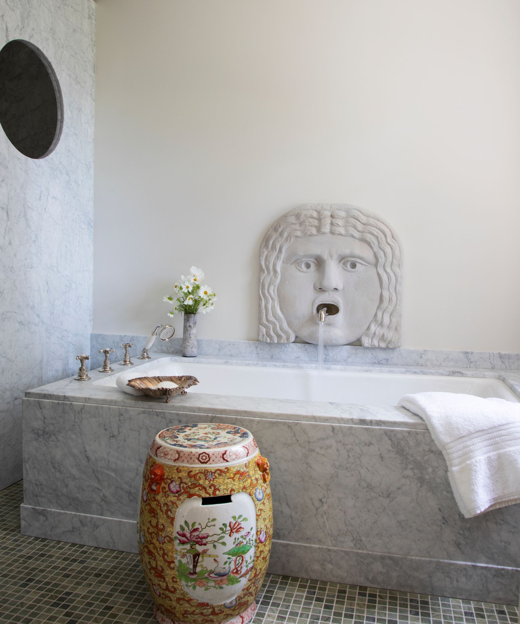
The Narnia wardrobe may take the prize for connecting with the homeowner's passion for CS Lewis's books, but the bathroom ideas are all about contrast. 'This bathroom epitomizes our catch phrase “ancient and modern”. The 'mask of truth’ in the bath is by Haddonstone, a copy of one owned by the great antiquary Sir John Soane, and now spits water with antiquity. A modern bit is the porthole in the shower partition that allows the harbor view. Usually, we don’t surprise clients with novel design elements. This time we did,' says Thomas Jayne.
How do you accessorize in a bathroom like this that encompasses old and new style? The decorative ceramic stool bridges the gap perfectly. 'The garden stool I found for the guest bath is a particularly nice example by Masons dating from the 1830s. They offer pattern and color – and their waterproof nature makes them perfect for almost any location,' adds William Cullum.
Sign up to the Homes & Gardens newsletter
Design expertise in your inbox – from inspiring decorating ideas and beautiful celebrity homes to practical gardening advice and shopping round-ups.
Karen sources beautiful homes to feature on the Homes & Gardens website. She loves visiting historic houses in particular and working with photographers to capture all shapes and sizes of properties. Karen began her career as a sub-editor at Hi-Fi News and Record Review magazine. Her move to women’s magazines came soon after, in the shape of Living magazine, which covered cookery, fashion, beauty, homes and gardening. From Living Karen moved to Ideal Home magazine, where as deputy chief sub, then chief sub, she started to really take an interest in properties, architecture, interior design and gardening.
-
 These 5 plant species will help to attract and nurture an underrated nighttime pollinator that's crucial to every yard
Discover the best plants for attracting moths to your yard
By Ciéra Cree
-
 I have been looking for a versatile backyard furniture color that will look just as good in summer 2026 – Stanley Tucci proposes gray
Stanley's gray and wood patio furniture is modern yet natural, making it a timeless color choice for backyard color palettes
By Hannah Ziegler