This historic Los Angeles home got the ultimate layout makeover – we take the before and after tour
Mollie Ranize of Dmar Interiors was tasked with restoring and remodeling this Southern California home, and the results are truly stunning. Here's a look inside

Designing an awe-inspiring yet functional family home is no easy feat. With two full-time careers to juggle, two young children running around, and the ordinary chaos of everyday life, there's quite a bit to consider when curating a space that will fulfill every family member's needs. Often, aesthetics take a backseat. But in this English Revival home, nestled within Los Angeles' historic Hancock Park neighborhood, beauty and practicality found perfect harmony. Here, we take a look at its transformative renovation, which delivered on timeless, transitional design.
To get the behind-the-scenes details and a peek at this home's stunning before and afters, we spoke with the interior designer who made it happen: Mollie Ranize, founder and principal of Los Angeles-based Dmar Interiors. And while each room got a timeless refresh and a dose of Mollie's impeccable attention to detail, getting the home's layout down drove much of the renovation process. Here's what Mollie had to share about the process, from start to finish.
'At some point, when it's time to look at the home as a whole and think about how to make sure it reflects the very best version of itself, you not only think about physical materials used in the updates, but how the space flows,' Mollie tells H&G.
Updating a historic home requires restraint – while it's easy to go all-out with modern materials, you don't want to miss out on a home's original architecture. Mollie shares that when she was first faced with this home renovation, she noticed many of the space's original features had been overlooked in favor of modernization. What's more, many of those smaller renovations or additions hadn't stood the test of time. She tells H&G that the home's '90s kitchen cabinets, bathroom countertops, and overall lighting scheme were due for a refresh.
'What little light sources that did exist had been replaced with various, inexpensive and purely functional light fixtures. Most rooms had just one of these. In terms of updating homes, lighting is one of the most important and impactful areas you can address ... With all of these previous updates, so much of the historic charm and grandeur of the home had been lost, which made the historic preservation of the space a priority,' says Mollie.
Loads of details, both small and more significant, contributed to remedying the home's previous updates. From introducing custom cabinetry with 'different colors and classic hardware' to 'elevating and highlighting all of the original molding, baseboards, interior doors and door casings' by giving them a coat of Sherwin-Williams' Agreeable Gray (one of Sherwin-Williams' best-selling paints), Mollie and her team left no stone unturned. Subtle, thoughtful touches make up some of the most impactful features of the final design scheme.

Mollie Ranize is the founder of Dmar Interiors, a nationally recognized design firm based in sunny Southern California. She has been known for her 3T Method for 20+ years: designing Tasteful, Tailored and Timeless interiors.
Much of the home's inherent charm comes from its historic significance. Because it was built in 1928, and is situated in Los Angeles' Hancock Park Historic Preservation Overlay Zone, each and every renovation made to the home's exterior had to be thoughtful and considered – and approved by a committee.
'The area is specifically interesting because it was a residential area developed in the 1920s and outstanding architects of the era developed the neighborhood for prominent residents. Every exterior decision had to be presented to and approved by the historic preservation committee, in addition to the standard building permitting process,' says Mollie.
Regardless of the home's historical nature, Mollie approaches all of her projects with architectural integrity in mind. Because she studied architecture, she says she 'learned about space and architectural integrity first and foremost.' Within her studies, learning about interior design styles came later, and she maintains that order of priorities to this day.
'I've always let architecture lead the way. I feel a house reads most natural if you try your best to make decisions based on what your train of thought may have been from day one had you been building the home. Considering modern-day lifestyles and conveniences is also important, but always right behind architectural language,' says Mollie.
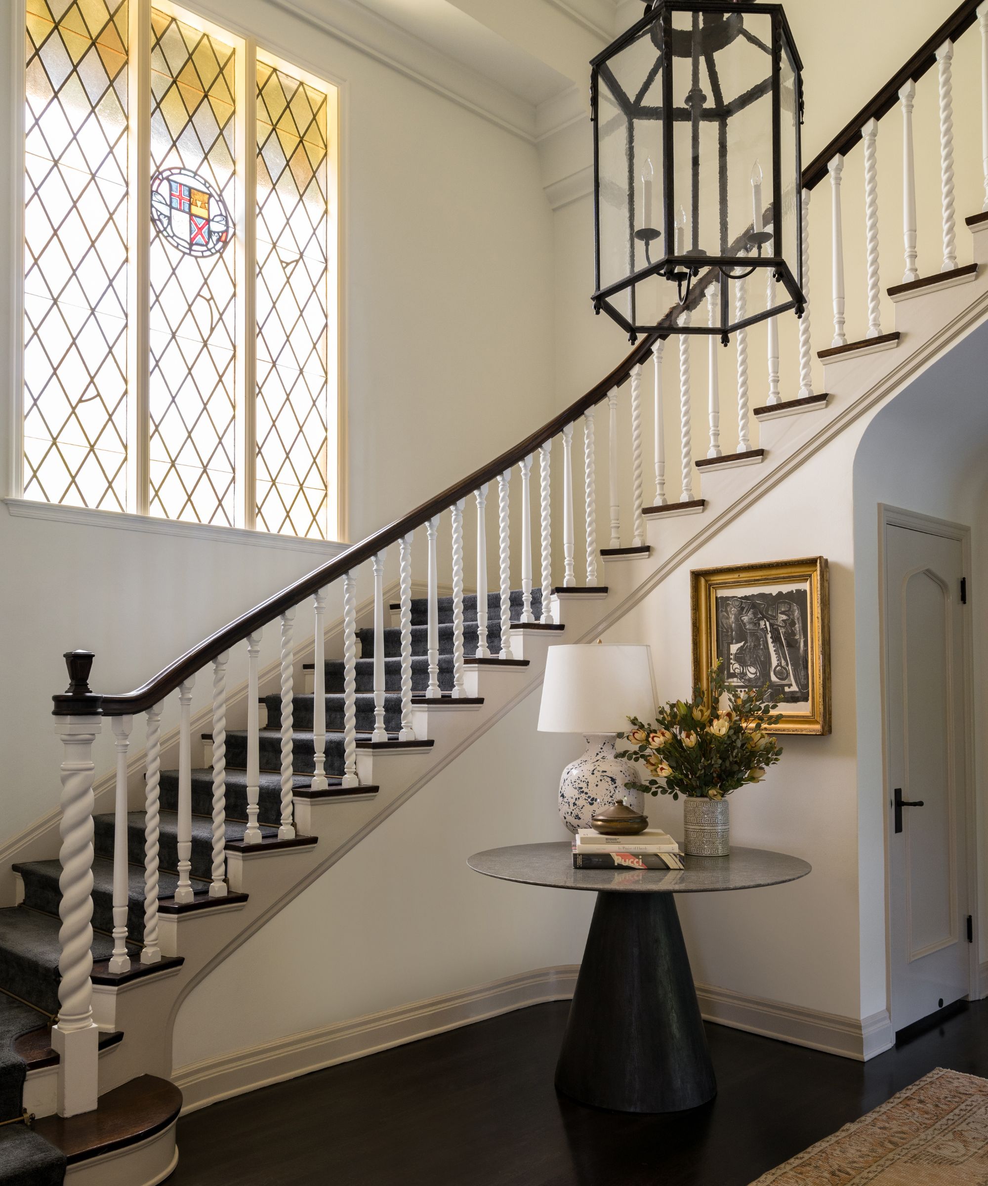
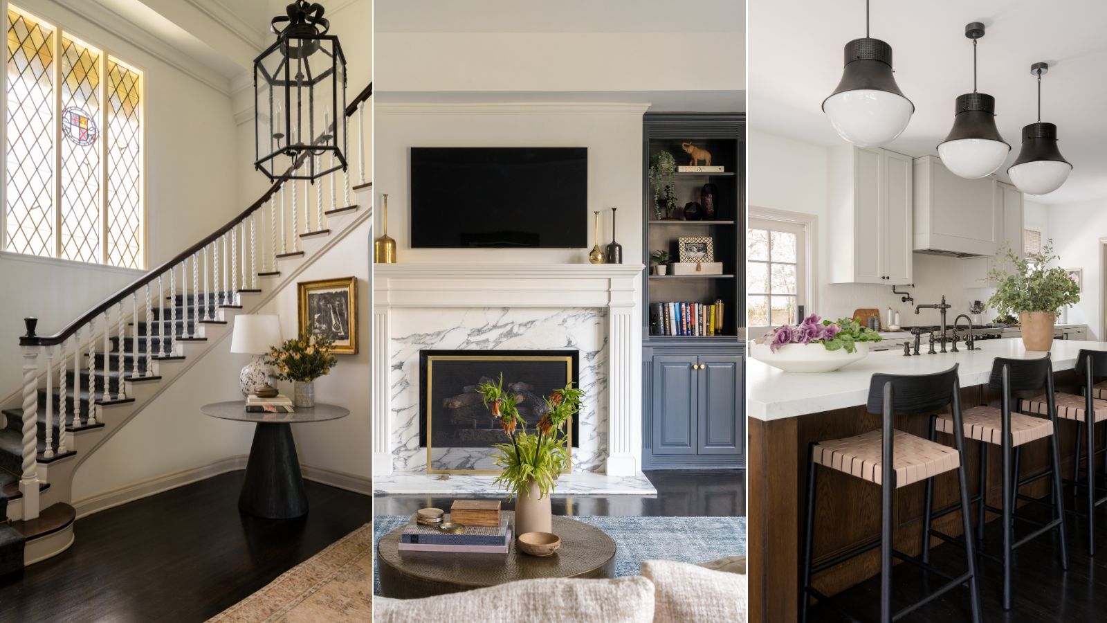
The home's entryway design delivers on historic grandeur from the moment you step inside, featuring a wrapped wooden staircase and an original stained-glass window. To accentuate the already-impressive layout of this area of the home, Mollie added a statement light fixture, a simple yet sculptural entryway table, and a piece of artwork in an ornate, golden frame. The taupe color bringing warmth to the staircase is, once again, Agreeable Gray from Sherwin-Williams.
'The stained glass was such a special part of making this foyer feel grand and original. The staircase, aside from the handrail, was all painted white by a previous owner (like every single thing in the house), so we were able to add some depth and charm back with a soft taupe color on the risers and stringer – making this space feel immediately more welcoming and classic,' says Mollie.
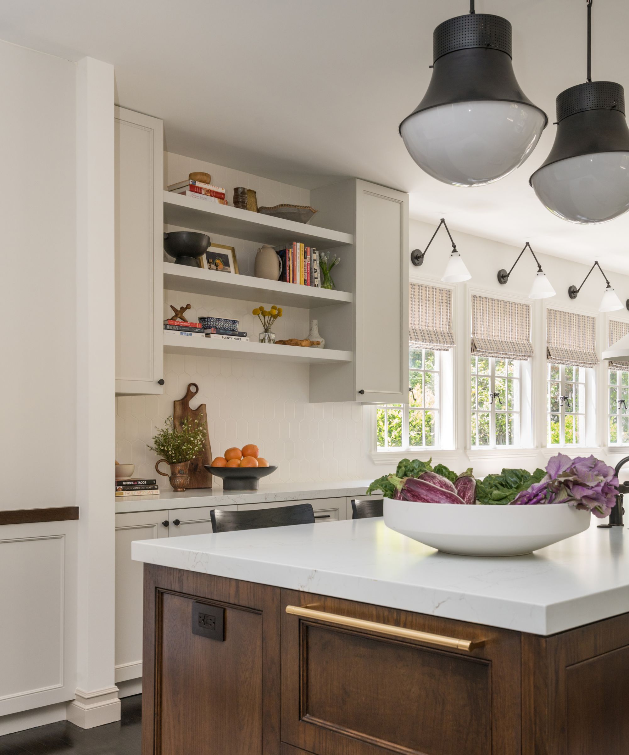
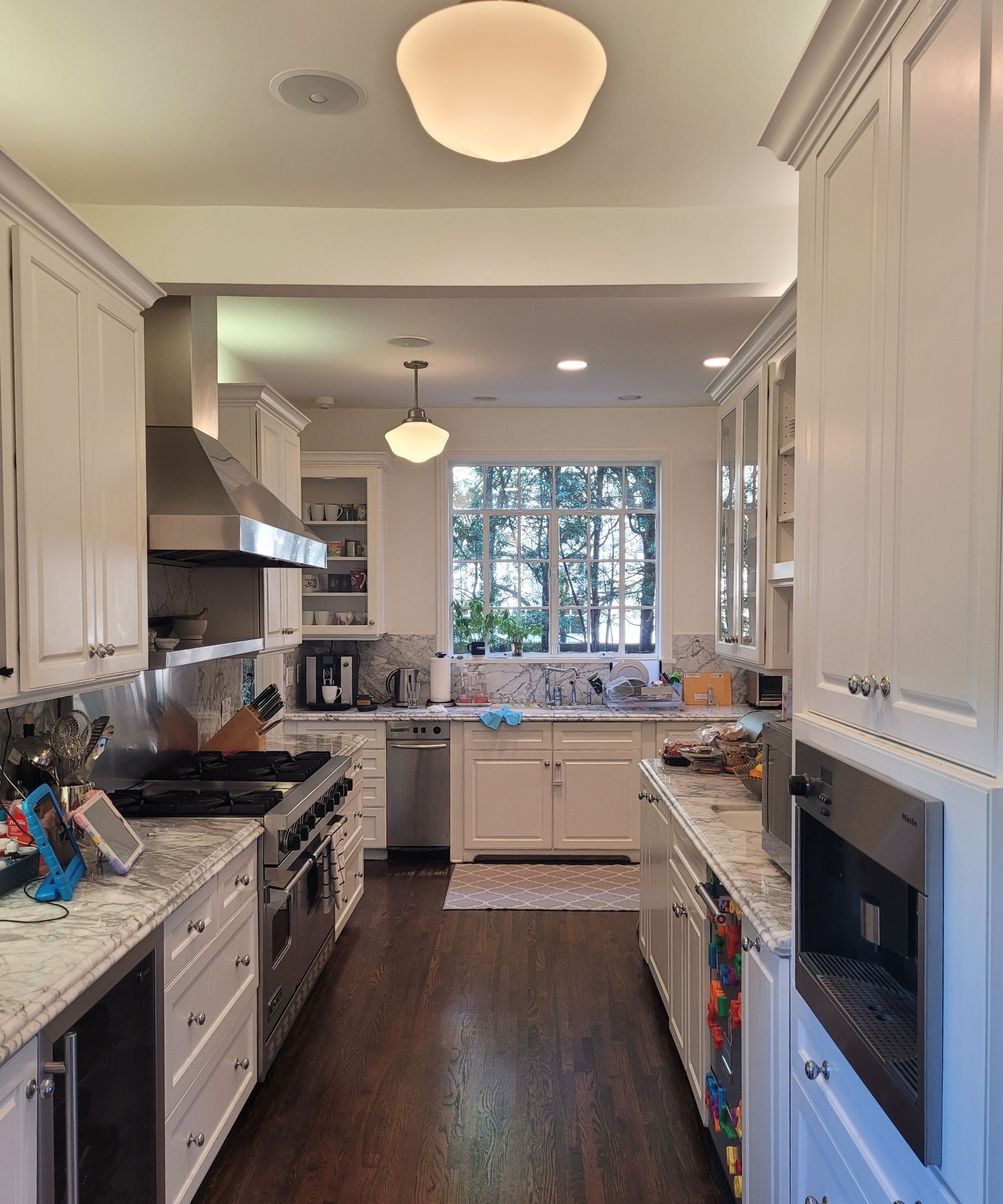
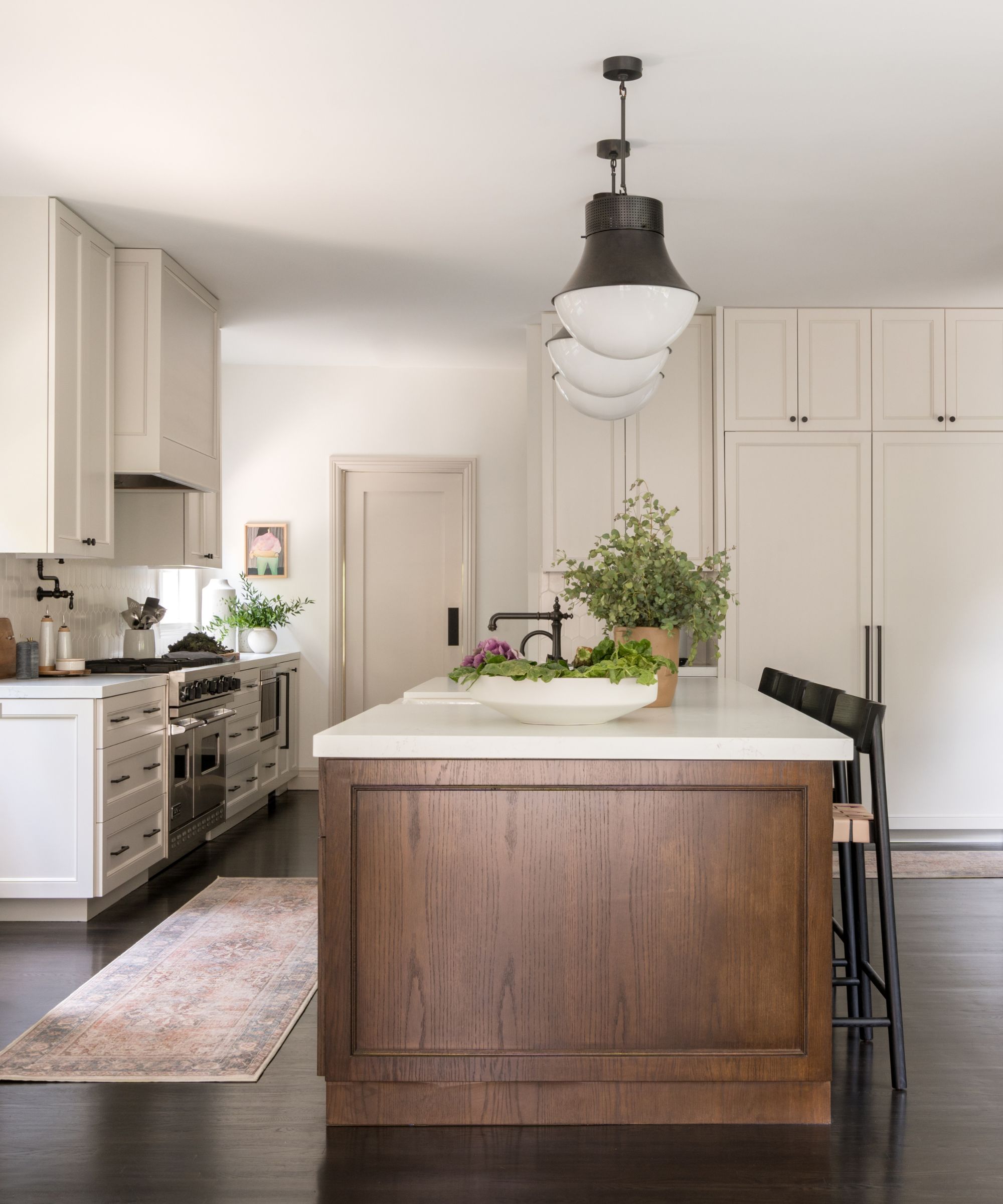
'The most impactful and transformative change in this renovation was to the kitchen. This area required the most significant changes and was certainly a labor of love. In order to create this large, open kitchen, we had to rearrange multiple spaces and expand the kitchen footprint into other areas of the home,' says Mollie.
The kitchen began as a 240-square-foot space, but became 590 square feet once the rest of the home was rearranged accordingly. With the space originally housing a galley design and hallway-like laundry space, Mollie and her team removed two small bedrooms, a bathroom and the original walk-in pantry to make way for this stunning end result.
'Now the space is bright and open, but it still feels like it could have been original to the home when it was built in 1928. And although we removed a bathroom downstairs, we were able to divide a large bathroom upstairs into two bathrooms, so there was no lost function,' she says.
The final result makes way for the family's busy, active home life, while also allowing for ample natural light and outdoor access. A vast kitchen island, floor-to-ceiling cabinetry, smart shelving, and near-endless cabinet space makes this a gorgeous yet practical space made for culinary endeavors and hosting galore.
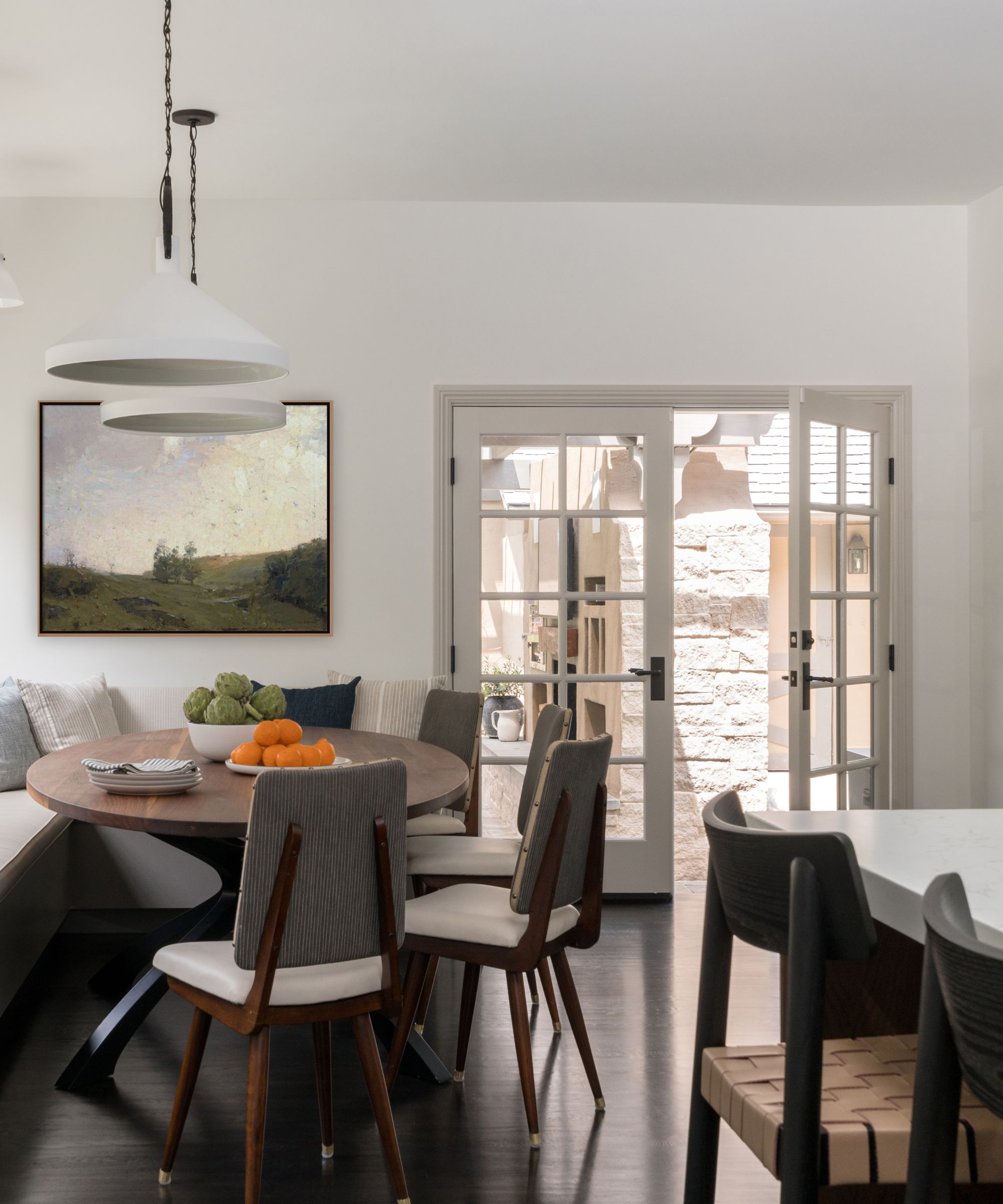
Although the outdoor space attached to this home was stunning from the start, Mollie says it had accessibility issues. With a pergola, wood-burning fireplace, full outdoor kitchen and pool, outdoor living was an integral part of owning this home. But previously, the only way to access the outdoor area required a bit of a trek, says Mollie. By removing the bedrooms and expanding the kitchen, Mollie and the team were able to connect the outdoors with the now bright and airy kitchen with a set of expansive French doors.
'Being in Southern California, nothing beats easy indoor-outdoor living. It's kind of what this area is made for. So being able to have such an expanded footprint in the hub of the home was a game changer in terms of day-to-day living. But then adding the ability to open the pair of French doors directly into the poolside outdoor kitchen – nothing beats that luxury,' says Mollie.
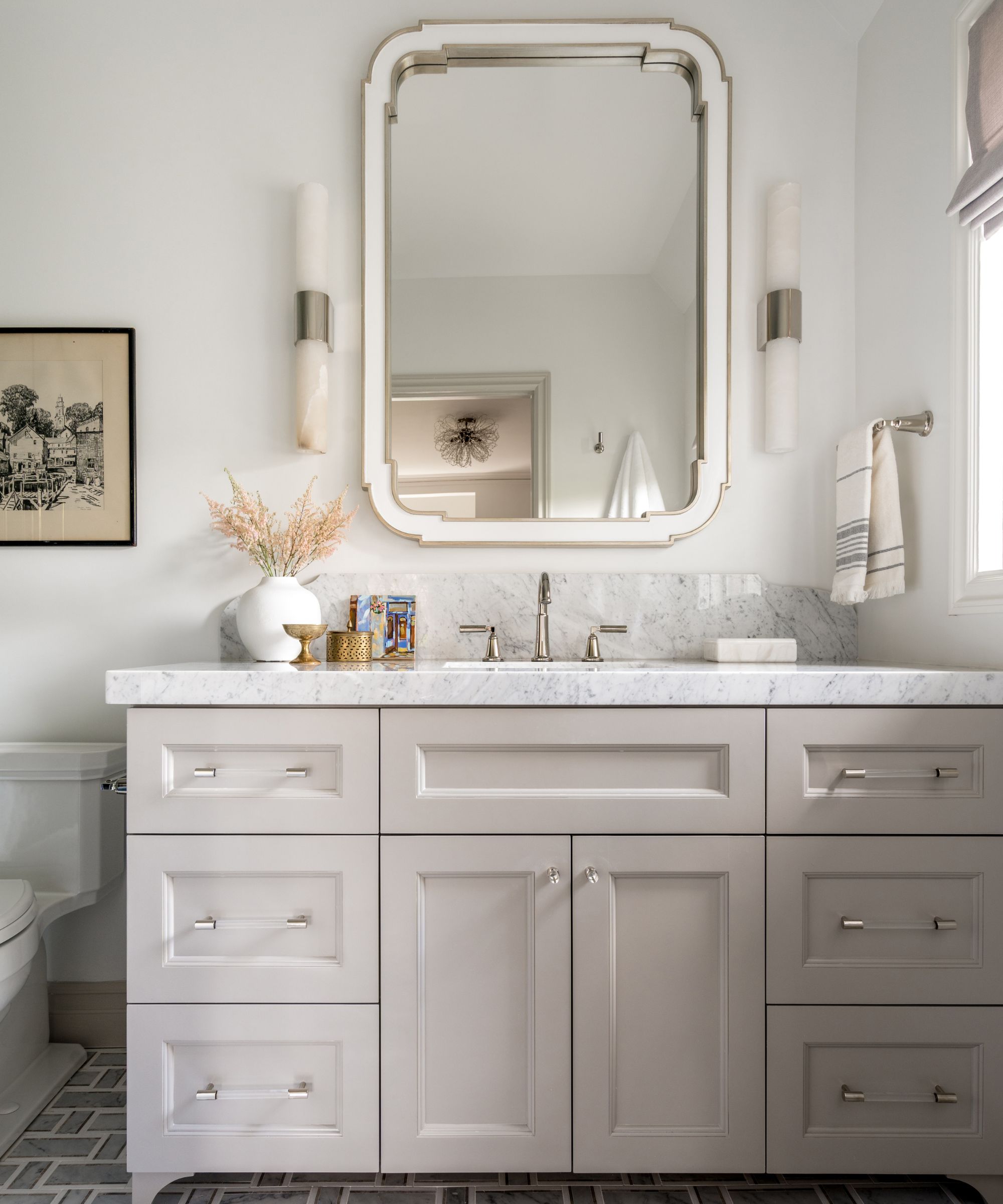
Perhaps the most stunning feature of this home's makeover is the abundance of natural light that was let in by new windows installed throughout the space. Mollie says 'Natural light is a game changer for any room,' and we can't help but agree. The lighting in this space further bridges the gap between indoors and outdoors, allowing for scenic views and fresh air.
'In addition to adding the French door at the end of the new kitchen, we were able to add three new windows at the kitchen banquette which allows so much new natural light into the expanded kitchen – and a view of the pool which you didn’t have before! In addition to these new windows, we were able to restore a number of the original windows to new condition and replace some that were no longer functioning – with the same original style and material of course,' says Mollie.
'Another key to proper natural light exposure in this house, we fabricated and installed all new window treatments throughout the home that let them control not only privacy, but help them take advantage of all of the lovely light during the day,' she continues.
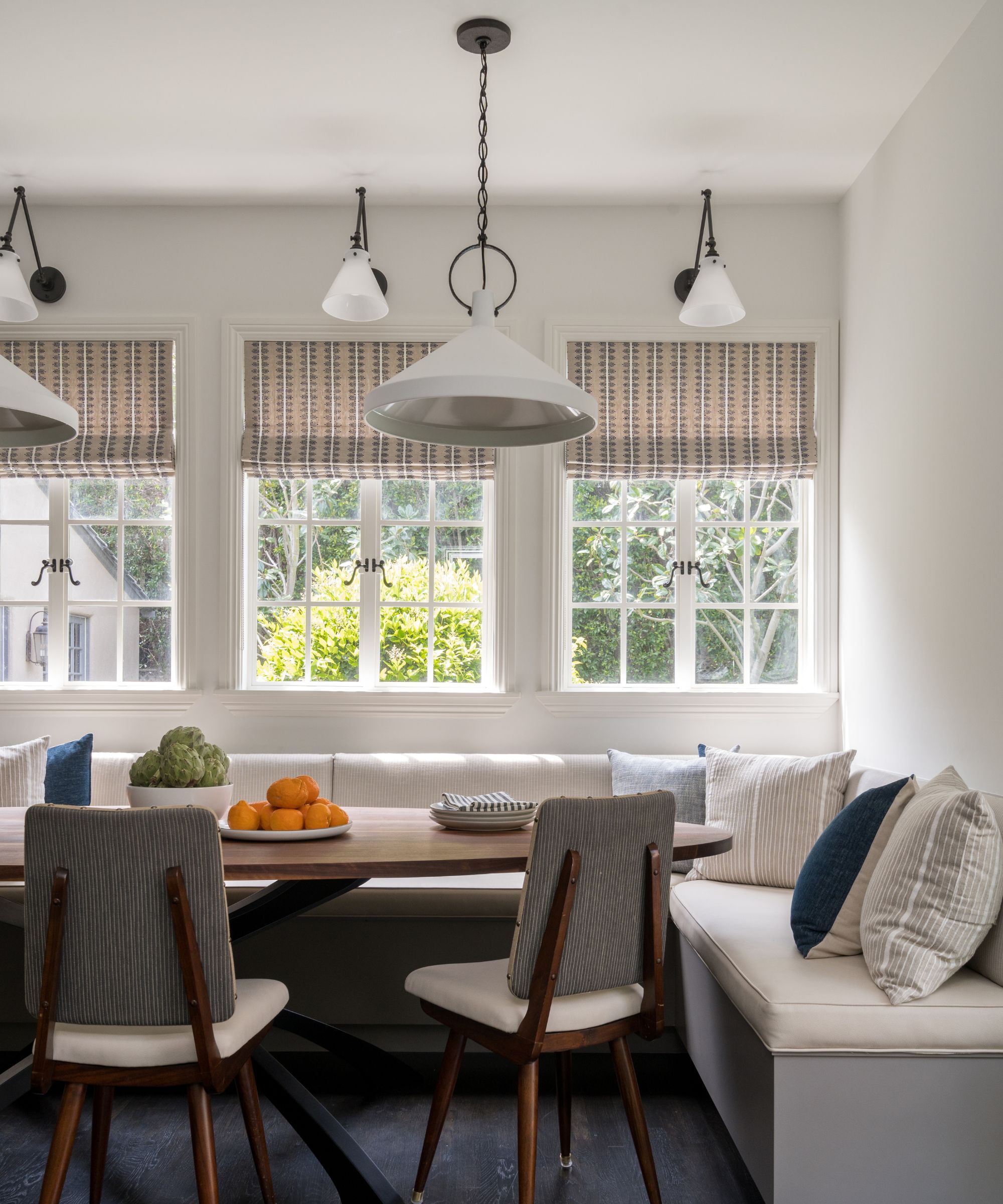
The spacious kitchen not only incorporates island seating, but also features a comfort-forward (and simultaneously stylish) dining nook, perfect for impromptu meals and the family's inherently on-the-go lifestyle. Mollie says that because 'time for formal meals is rare' for this household, creating this cozy space was a must.
'Being able to casually dine before or after events in the hub of the house is crucial. It gives everyone the chance to spend more time together, whether the kids are doing schoolwork or playing games at the table while someone is preparing meals or cleaning up, having a large dining area in the kitchen keeps everyone in one room,' she says.
The banquette seating allows enough space for lounging and guests, but doesn't block the French doors or access to the rest of the space. And part of the corner's appeal is the warmth and texture it brings to the otherwise quite streamlined area of the home.
'Banquettes also give the opportunity to bring in more fabrics, pillows and textures than would typically be offered with a standard dining table setup. And of course, we finished off this "nook" with various lighting options so it can truly flow from day to night depending on the mood,' says Mollie.
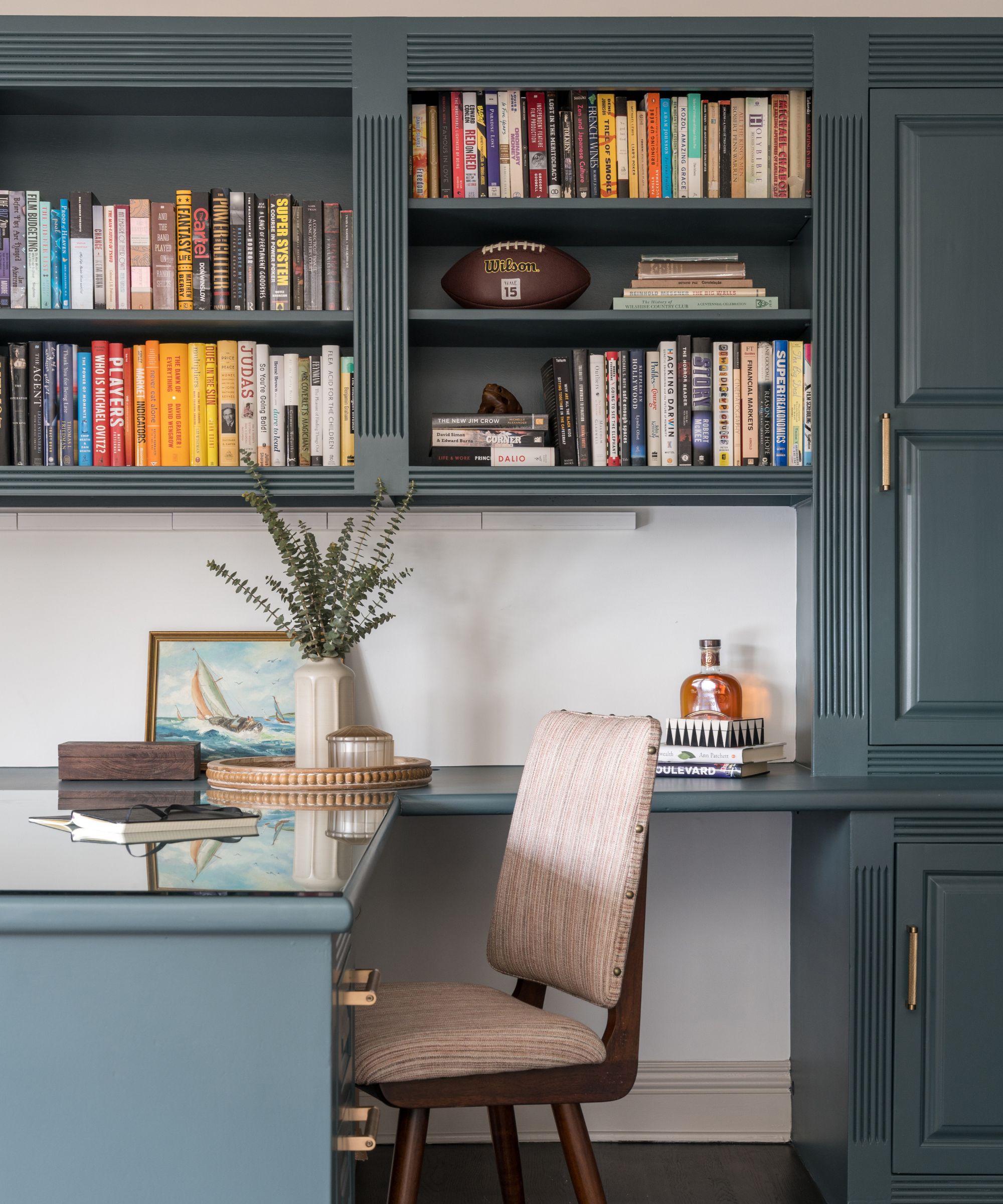
Choosing a whole-house color scheme makes an incredible impact on the overall atmosphere and feeling, and Mollie says she takes her clients' preferences into account heavily when making this decision. In this case, the color blue took center stage – a lovely choice for any historic home, Mollie adds.
'Being able to bring that into a few vanities in the new bathrooms, the wallpaper in the powder room, built-ins in the living room, the rug in the office, nightstands and bedding in the primary bedroom, and ultimately in a shade of blue-green in the other office, made the color story string that continues to flow in different ways throughout the home,' she says.
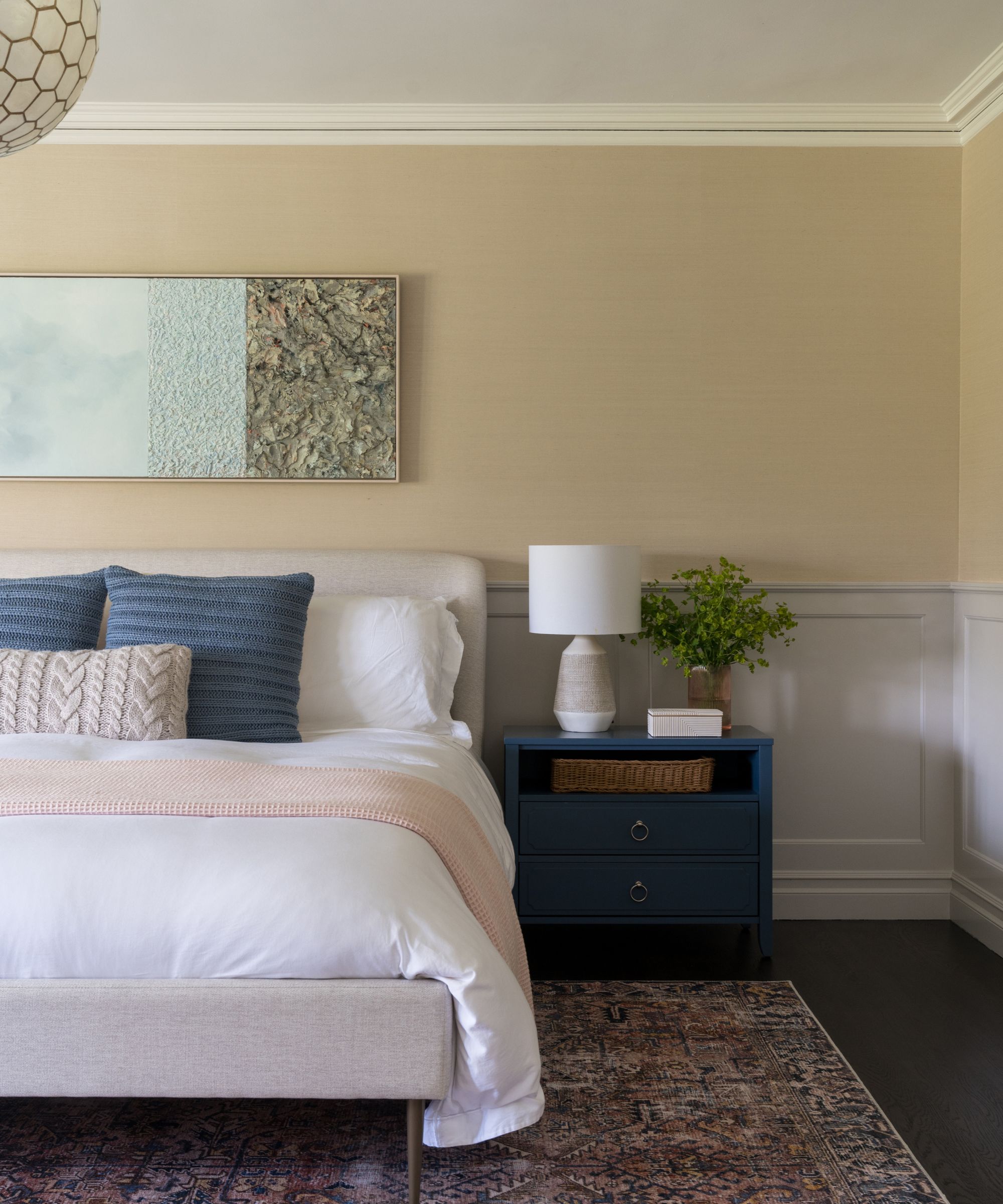
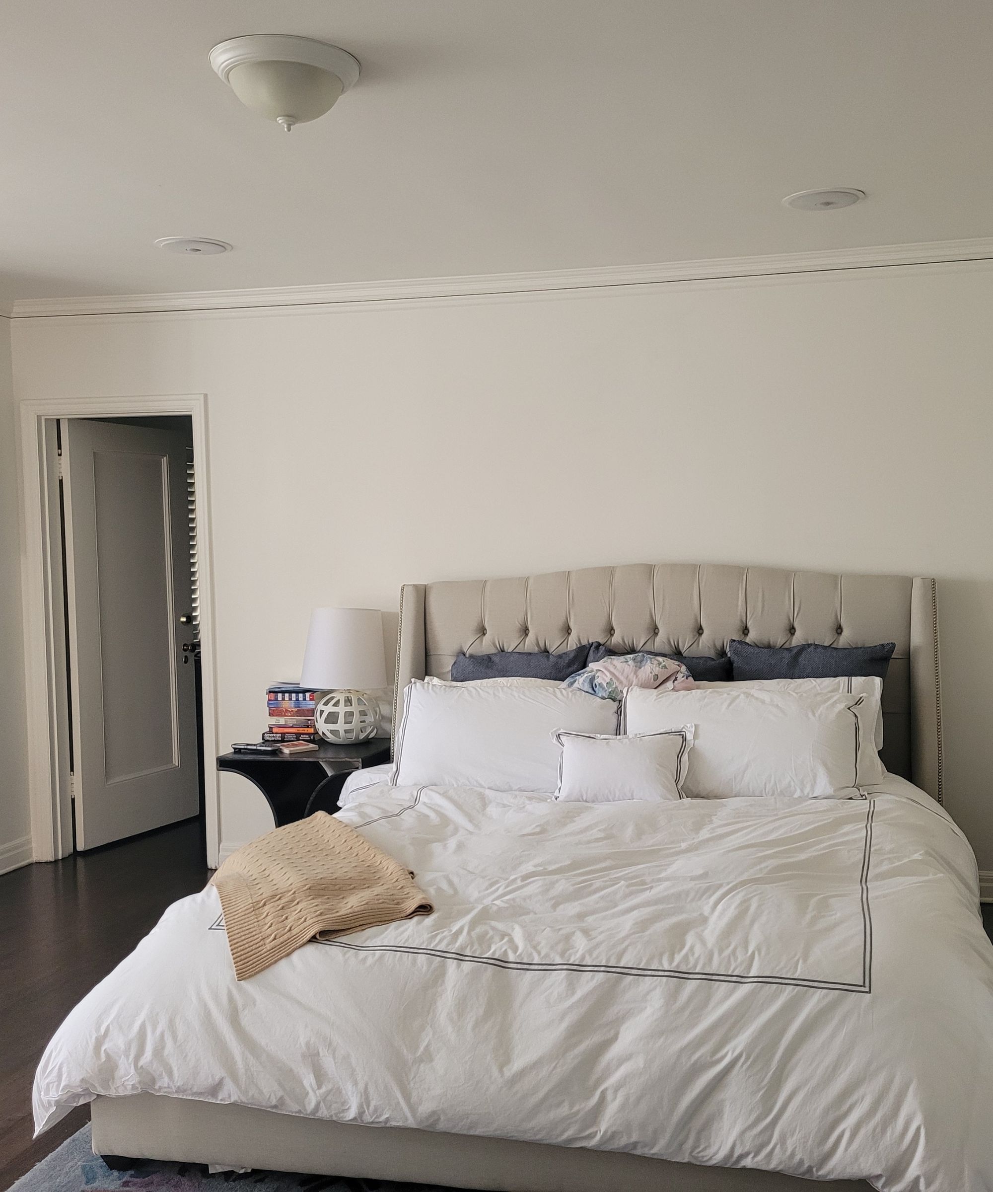
Aside from the coherent color scheme, each space also took on a pattern of some sort, which gave the home overall character, balance and charm: 'You may also notice a common design string that ties this home together, and it's having a pattern used somewhere specifically in each and every space. Sometimes it is graphic and bold and other times is subtle and a bit more silently sophisticated, like the backsplash in the kitchen, the patterns on the bathroom floors, or even the wallpaper in the office,' Mollie says.
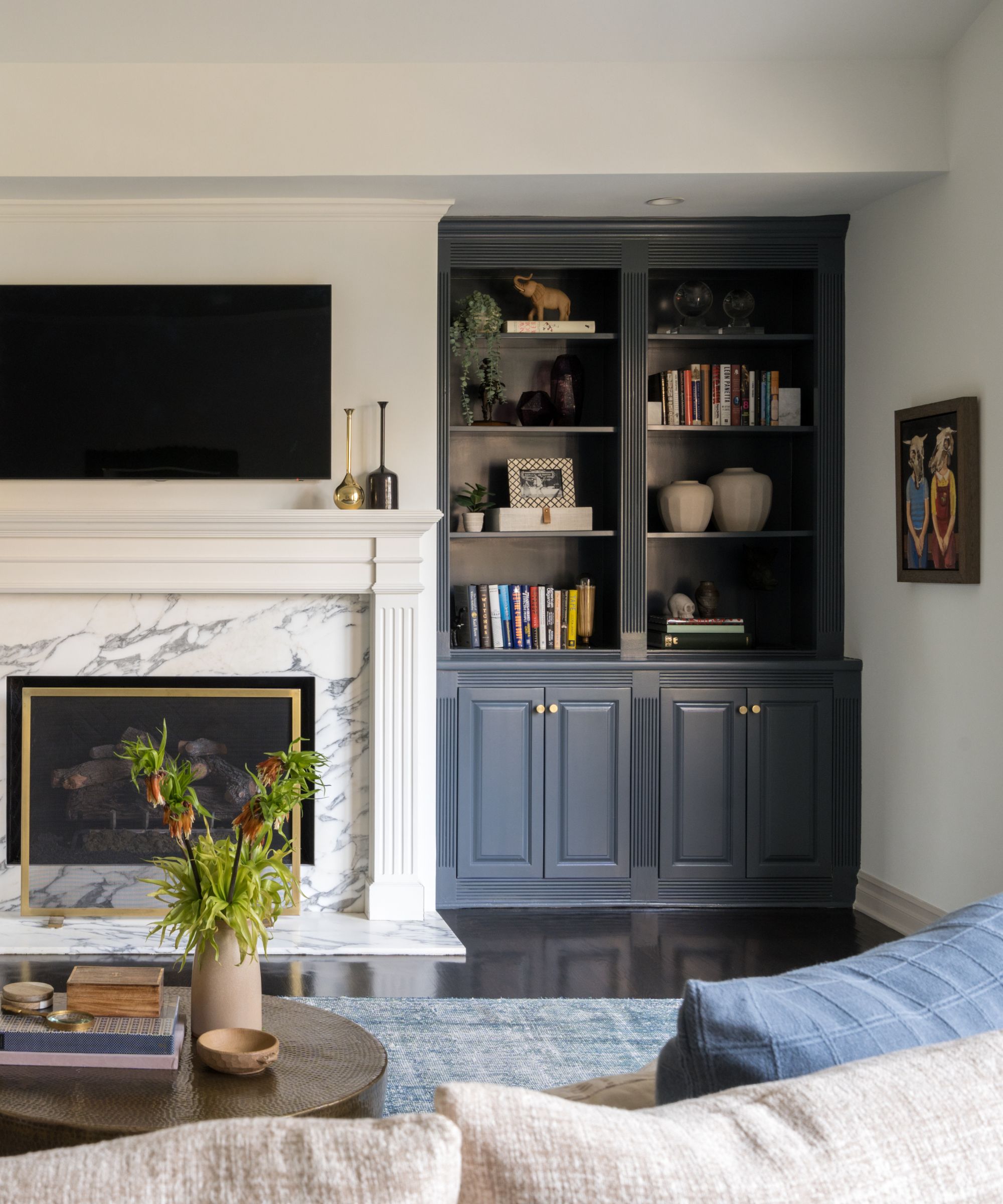
The home's living room is expansive and bright, yet slightly moody, with beautifully styled bookcases and an eye-catching marble fireplace. The dark blue bookcases draw upon the marble's veining and a lush blue rug to continue the color story throughout the home.
'The bookshelves in the living room were also existing, but they too blended in with everything else. This was the perfect space to add some depth of color, in this case, Sherwin-Williams' Outerspace, to create a stronger focal point and backdrop for the homeowner's collected and personal items. Symmetry naturally makes space feel more formal and pulled together, so highlighting this feature was naturally uplifting for the space,' says Mollie.
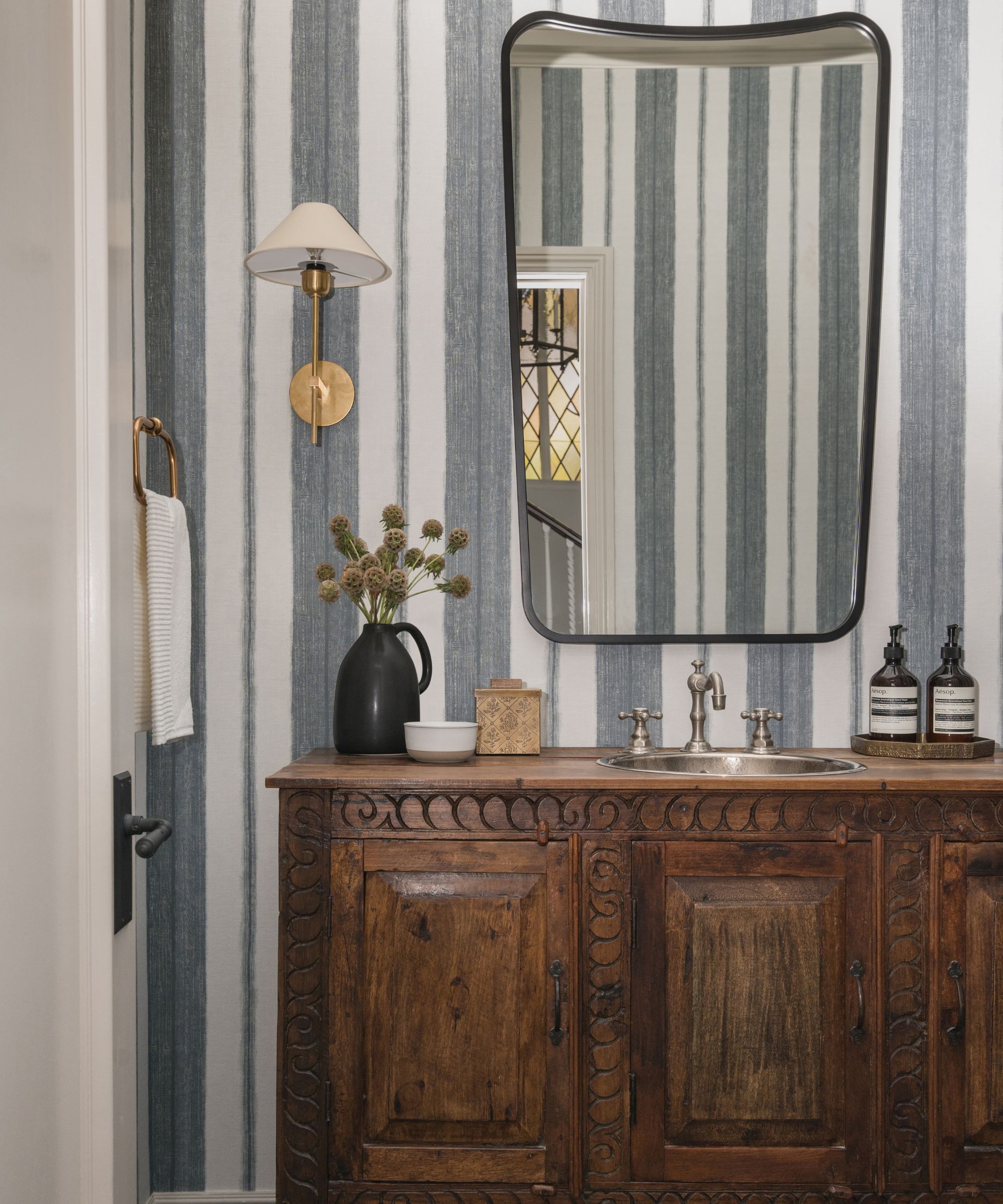
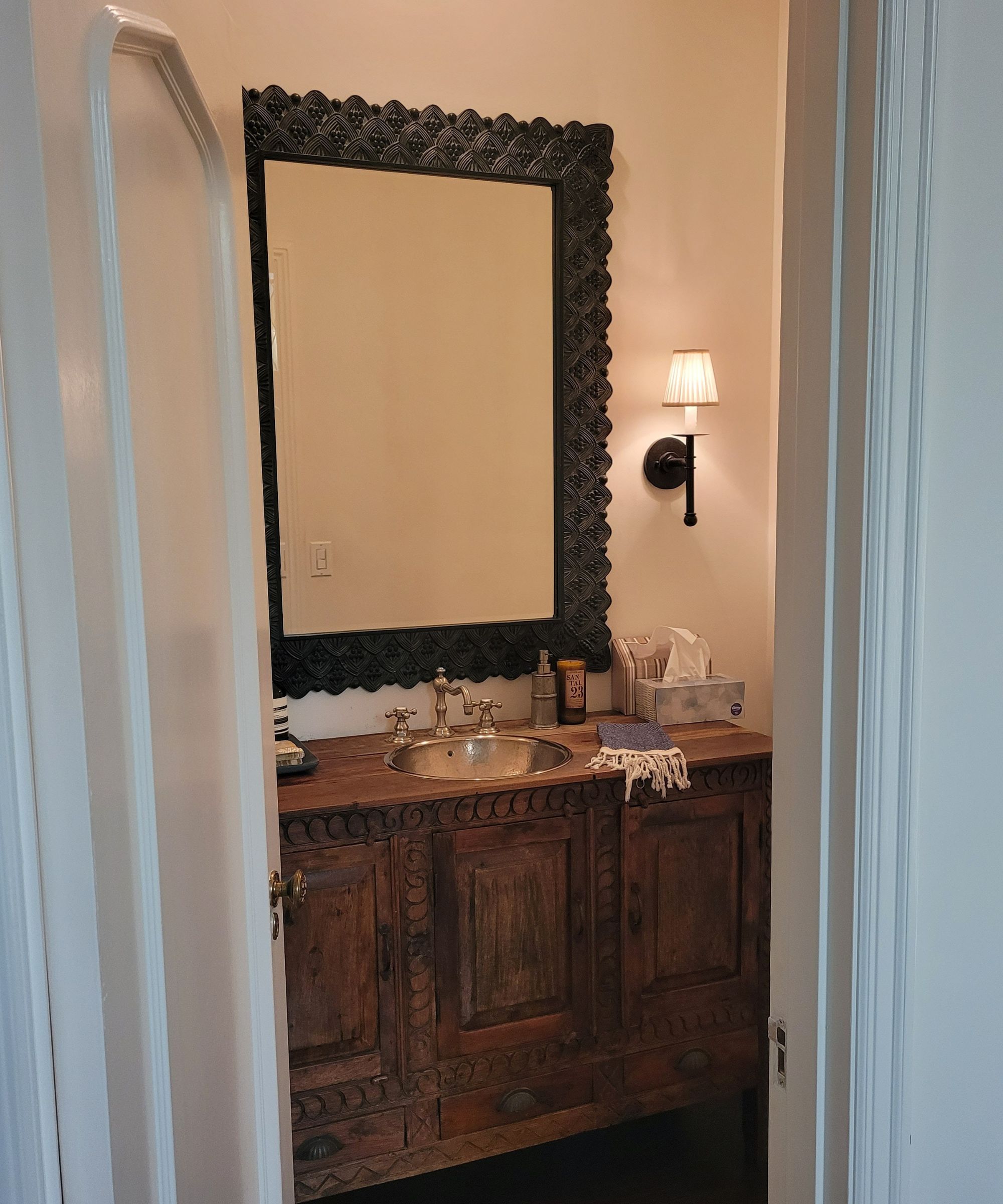
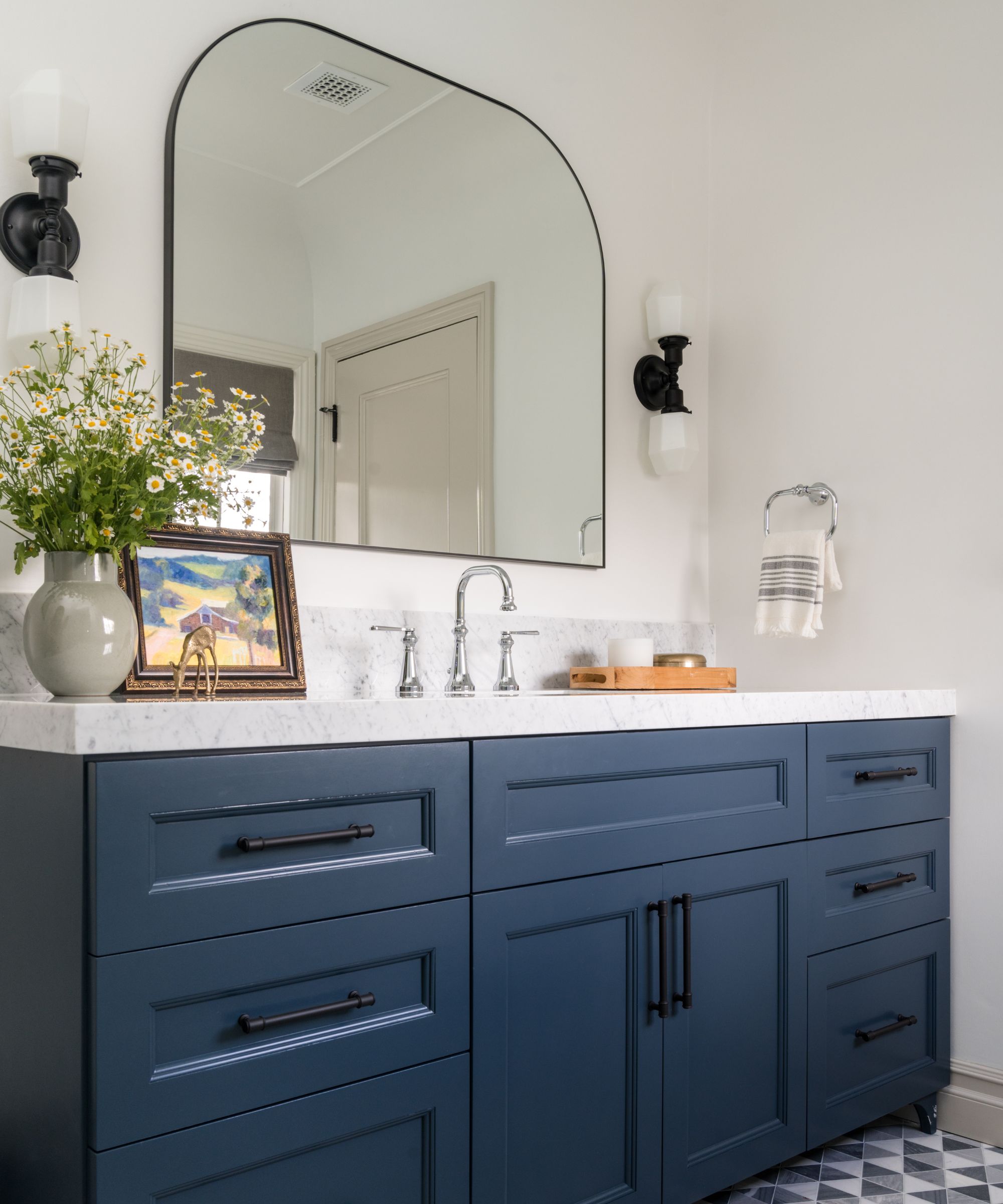
Each room of this Los Angeles home truly stands on its own, and the powder room is no exception. Featuring a streamlined, black-framed mirror, striped wallpaper, and an incredible antique-dresser-turned-sink-stand, this small space is hotel-like in the best sense of the word.
'I do wish we could take credit for the antique wooden cabinet, but that was there. And we loved it! We just didn’t think that everything going on around it let it shine. So, we installed a graphic striped wallpaper and changed the mirror and sconces to soft shapes with contrasting metals. The wallpaper, mirror and sconces were able to elevate the rustic nature of the cabinet to create the perfect blend of old and new,' says Mollie.
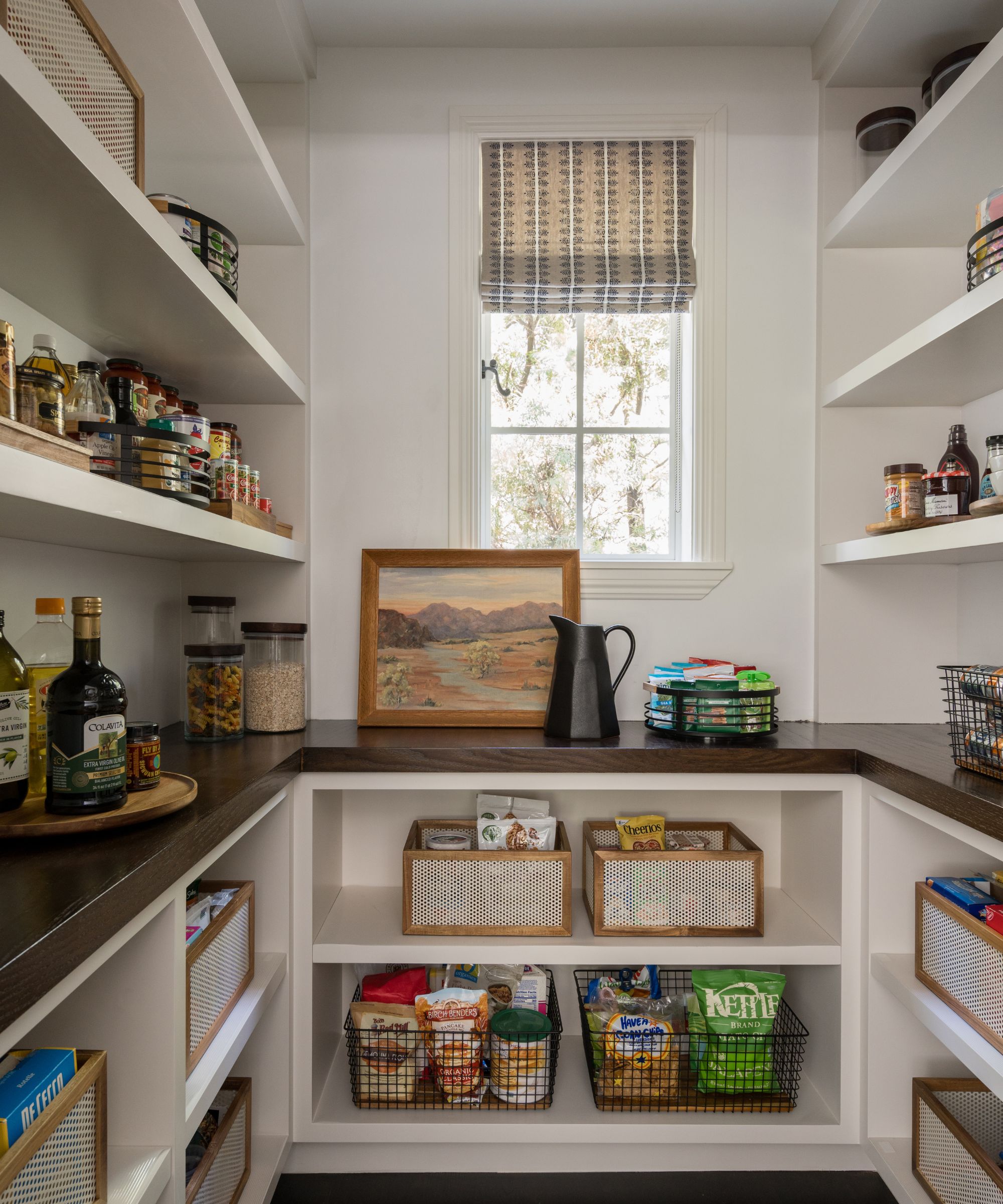
Mollie also made sure to add a considered walk-in pantry, equipped with all the shelving a young family needs and a small window to let in the natural light. And the family's impressive art collection even found its way into this hidden-away space, a testament to its presence throughout the entire home.
'I wish I could take credit for the incredible artwork in this home. These homeowners are avid art collectors and have been collecting for many years. Honestly, nothing beats a collection of art that evokes someone’s emotional response. It also makes a designer’s job so much easier because you know immediately what the homeowners are drawn to in terms of color, how open to taking chances they might be, how classic or traditional they may be,' says Mollie.
With attention to detail and original architecture in mind, Dmar Interiors made this well-loved space into a transitional, timeless oasis. Even though each room carries its own distinct personality, a cohesive design style ties the entire space together. Balancing historic and modern, outdoors and indoors, and bold color with pared-back style, this renovation has proved quite the success.
Sign up to the Homes & Gardens newsletter
Design expertise in your inbox – from inspiring decorating ideas and beautiful celebrity homes to practical gardening advice and shopping round-ups.

Abby was the Interior Design News Editor at Homes & Gardens and is now studying for her Master's degree in Journalism at City University, London. Prior to joining our team, she worked with Better Homes & Gardens, where she wrote and edited content about home decor, gardening tips, food news, and more. She studied Journalism and English Literature at New York University and moved to London to pursue her love of writing in 2023.
-
 I'm an expert vacuum tester, and no, you really don't need a mattress vacuum – here's what to use instead
Before investing in a new gadget, the tried-and-true methods still work
By Dan Fauzi
-
 Charli XCX's front door color 'feels deliberate, and almost calculated' – estate experts say it carries authority (but it comes with a warning)
The singer's sophisticated front door color gives a 'psychological head start' to sellers, but it has a potentially unlucky downside
By Megan Slack
