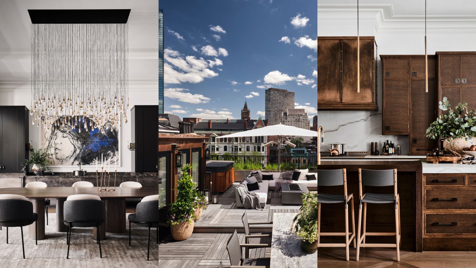
This historic Boston home has a dramatic but elegant interior and a roof terrace to die for
The Back Bay Brownstone shows that a family home can be incredibly stylish, too

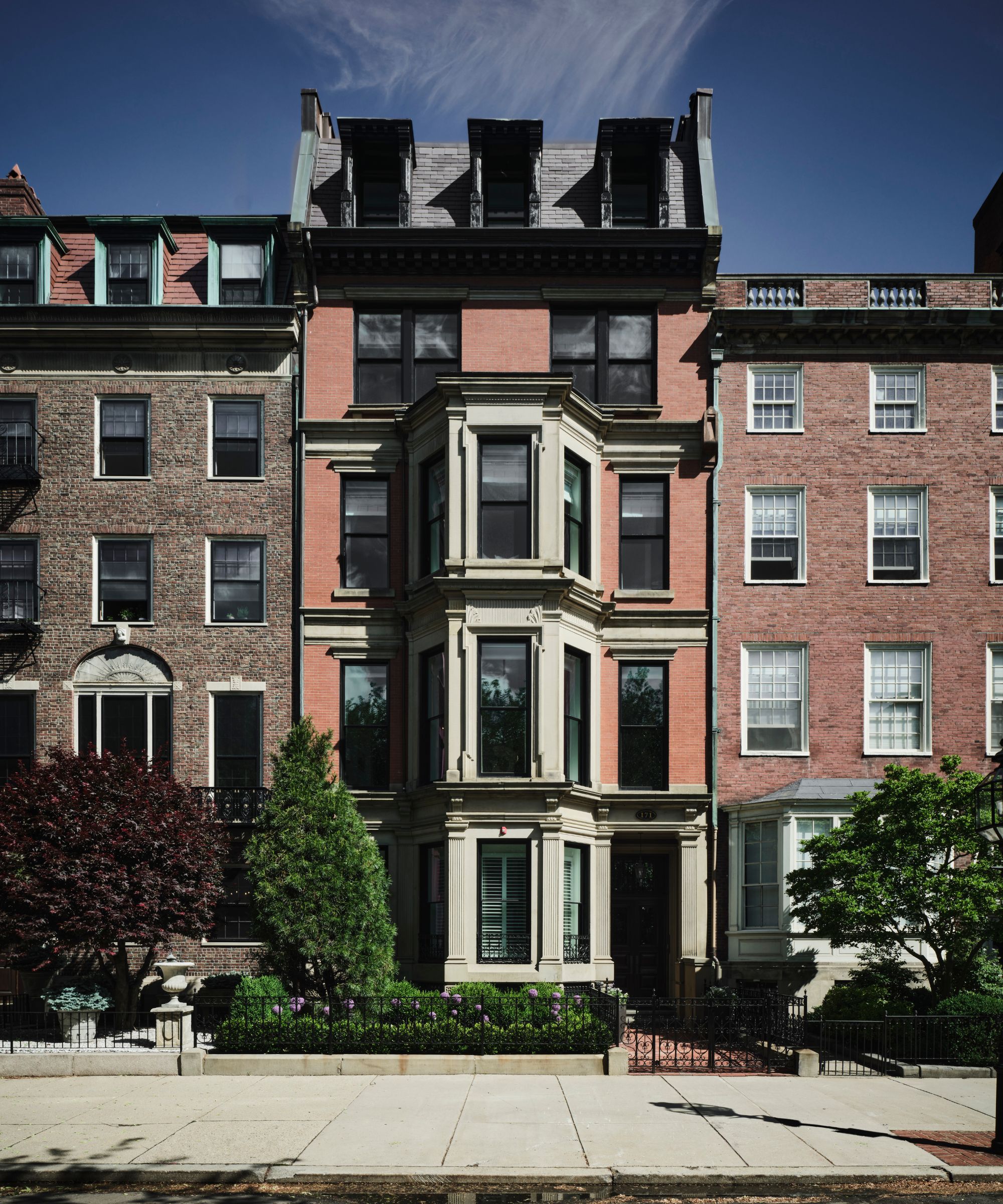
This Boston Back Bay Brownstone, built in 1879 by architects Snell and Gregerson, is a wonderful example of urban Victorian house style. Spread over six stories, it spans 14,000sq ft.
Owners Henry and Savannah Helgeson originally occupied the top two floors and roof deck. But in 2018, they purchased the rest of the structure when they decided to expand their family, and embarked on a whole-house remodel that has resulted in an elegant home.
Below, interior designer Nicole Hogarty takes us on a tour of the house and explains the design decisions.
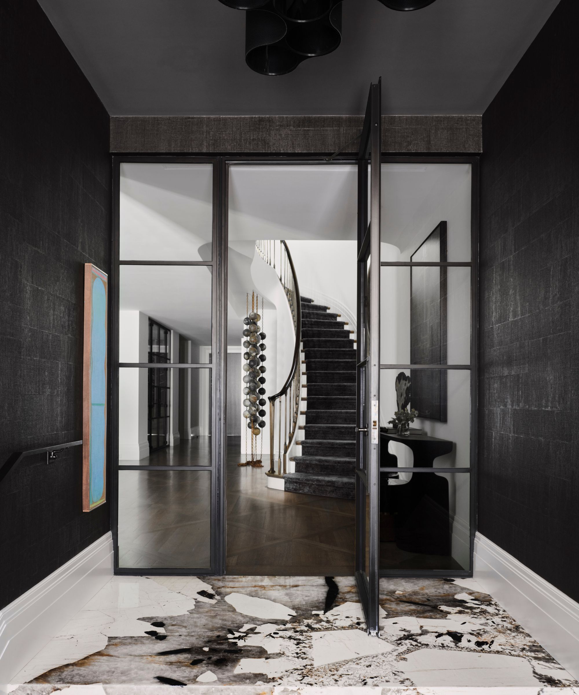
'From the start, we knew the stairs (below) would play an important role defining the identity of the property,' says Nicole. 'We worked with a handful of local artisans to capture the result. From stair designers, metal fabricators to a true artist that just happens to work with plaster. It was our greatest challenge and one of our most rewarding elements of the home.'
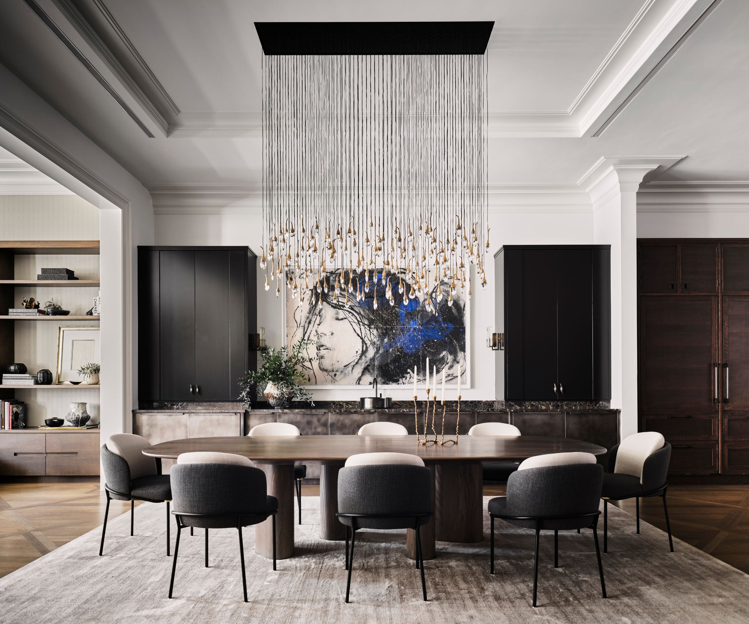
Chandelier: Mini Cumulus by Ted Abramczyk
'With each floor functioning independently, we felt strongly on using one common paint color throughout all open spaces. The result allowed us the opportunity to use color or texture as you transition into more private spaces. Additionally, the soft white walls created gallery like effect which beautifully accepted all art and accessories. We used Ben Moore Oxford White.'
'Designing a loft like space within a brownstone was another creative challenge,' says Nicole. 'Materials, furniture selections, scale and proportion were all elements that went into our process.'
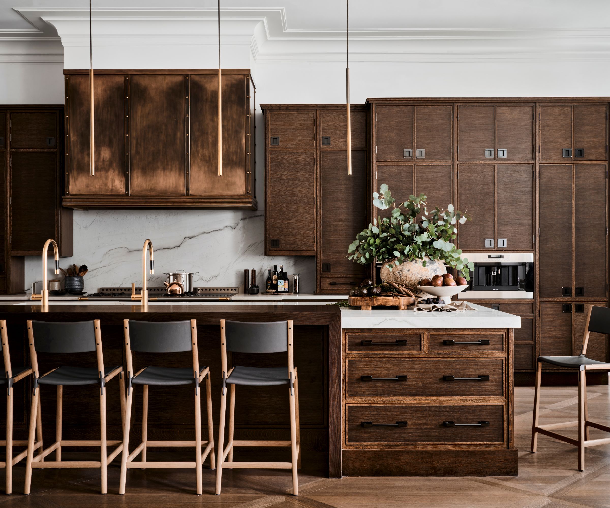
The kitchen needed to be able to transition between breakfast and cocktail hour
'Stained kitchen cabinetry vs paint grade, a custom window banquette that felt more like a furniture piece than a breakfast nook, a sculptural dining room table paired with soft, black and metal cabinetry to set the tone as you enter the floor and a living room that is chic yet inviting and family friendly.
'Lighting also played a role in the design. The dining room chandelier having the greatest visual impact as well as the living room fixtures and sconces vs the kitchen island with its simple cylinder shape illuminates the island yet allows the eye to travel around the room without interruption.'
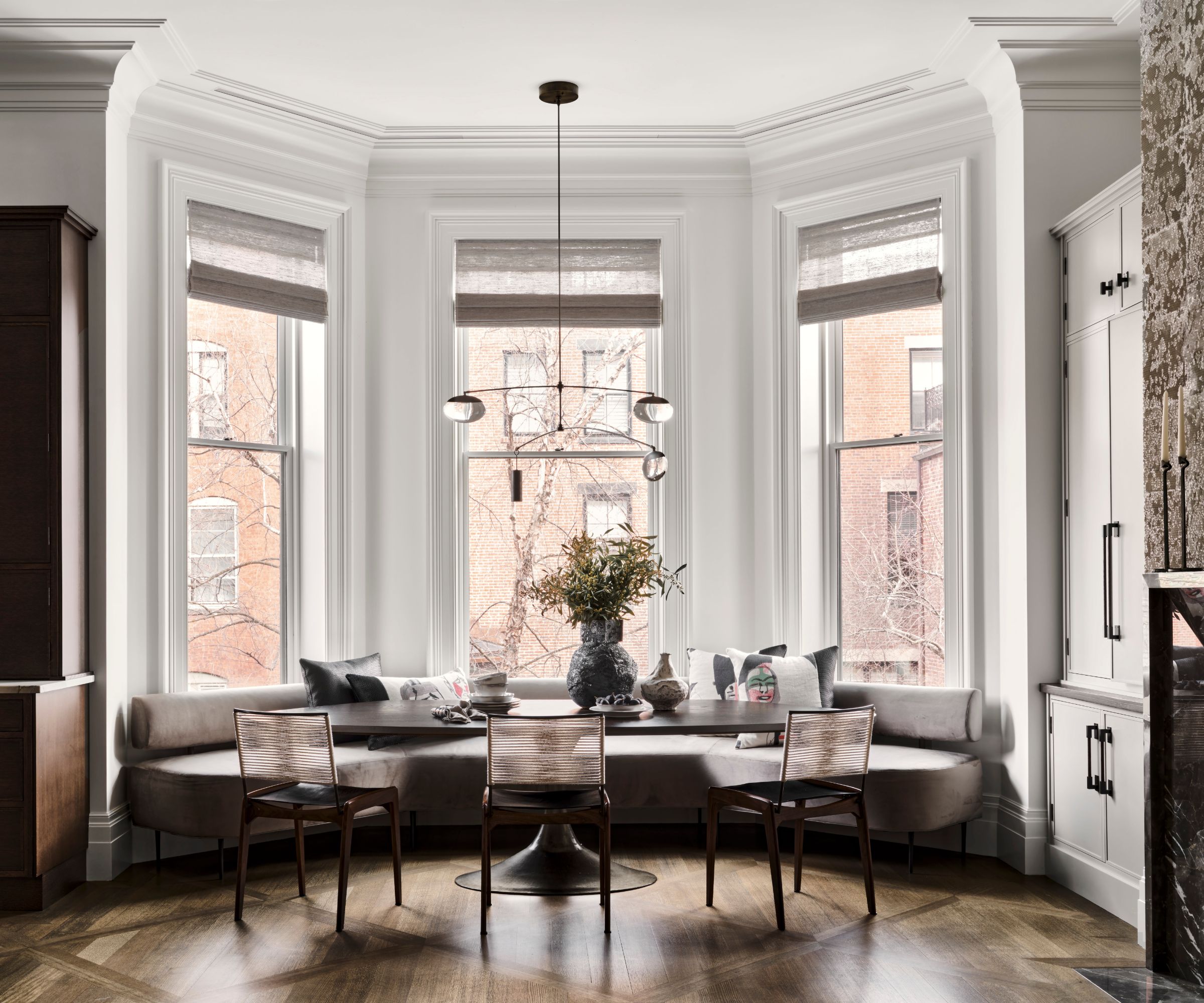
'The second level is considered the heart of the home. Henry and Savannah requested an open floor plan between the kitchen, dining and living rooms. The floor spans nearly 35ft wide x 75ft in length with 12ft 6in ceilings.
'Other requirements included one full level for their primary suite, the first level as you enter to feel a bit edgy to set the tone for the rest of the space. You enter the brownstone to a wine cellar, pool table (below) and sculptural elliptical staircase.'
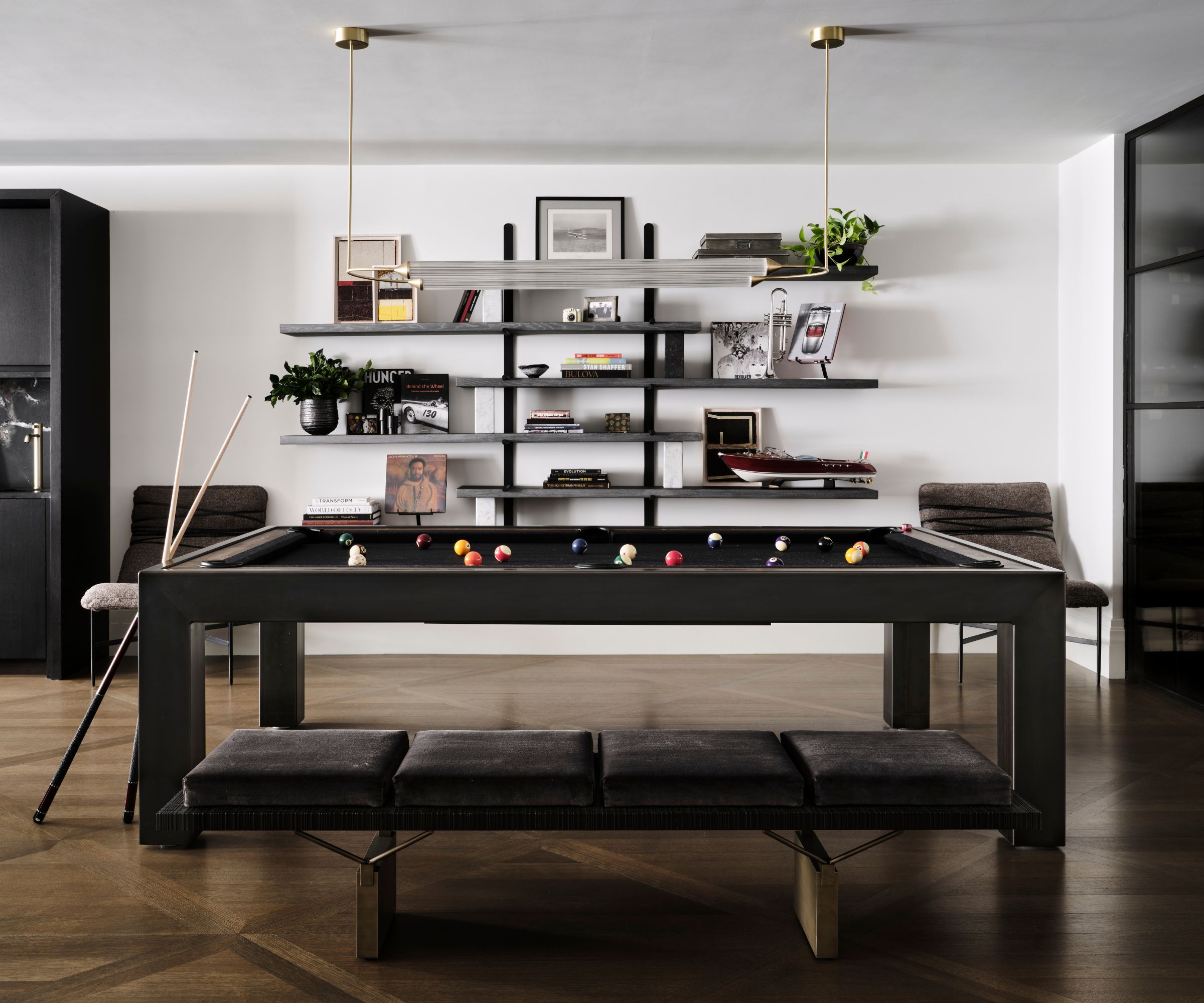
'Additionally, the Back Bay tends to be a bit more traditional, so they asked us to design a space that reflects their lifestyle as well as their sense of style. The ultimate design goal was for the clients to be able to host and live with ease all at once in a multi-functional home that has been truly customized down to the smallest of details to nurture their lifestyle and wellbeing.'
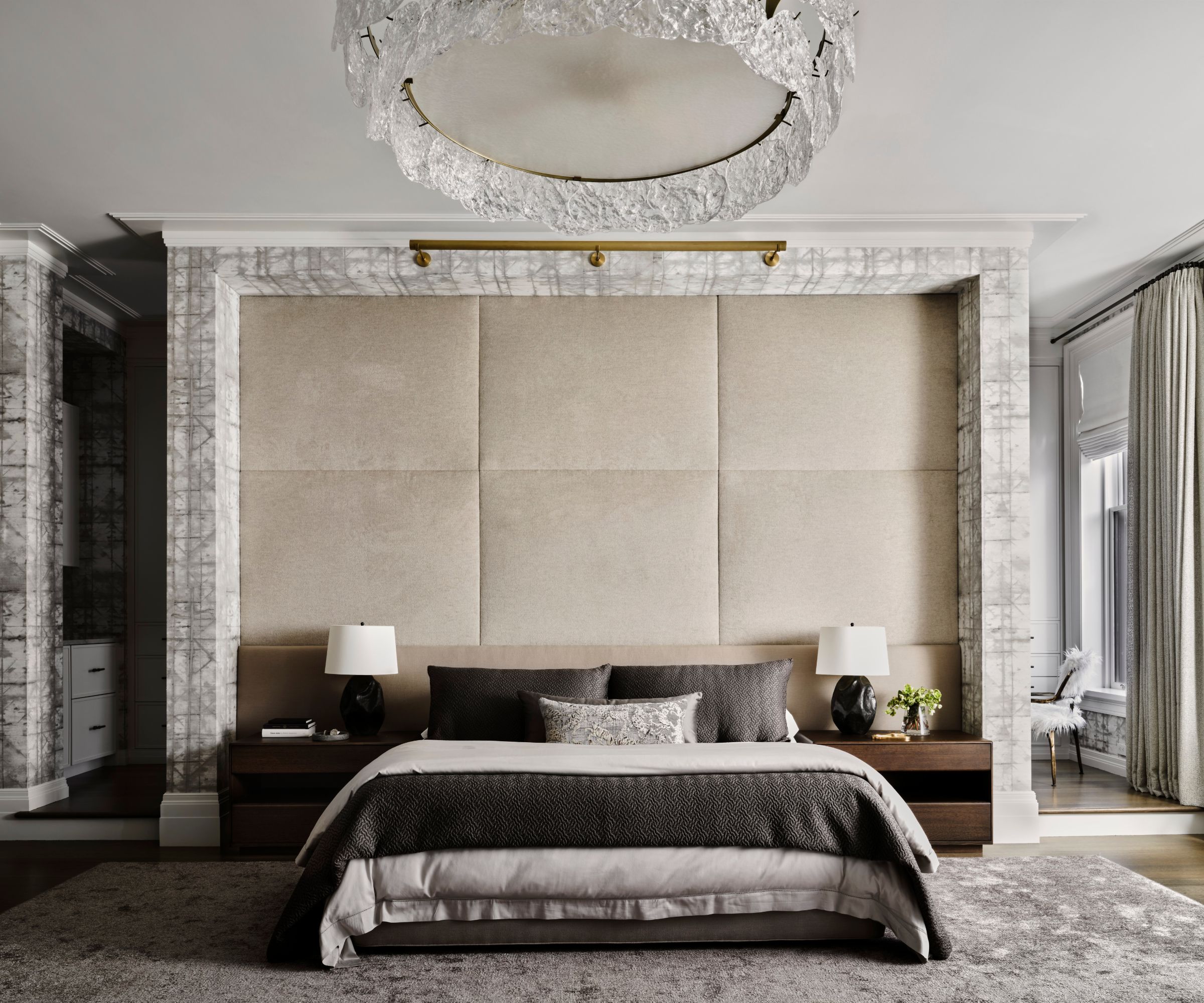
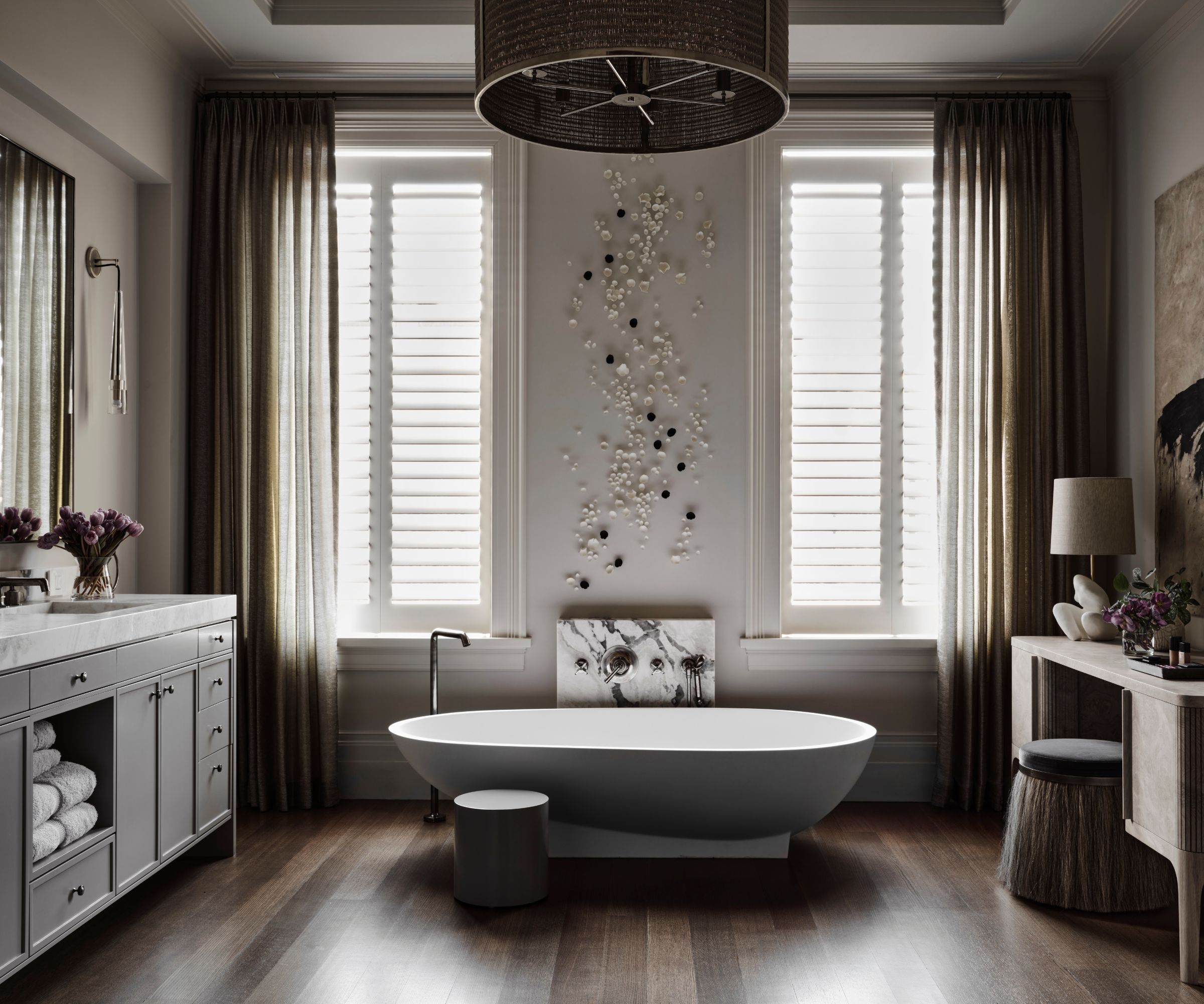
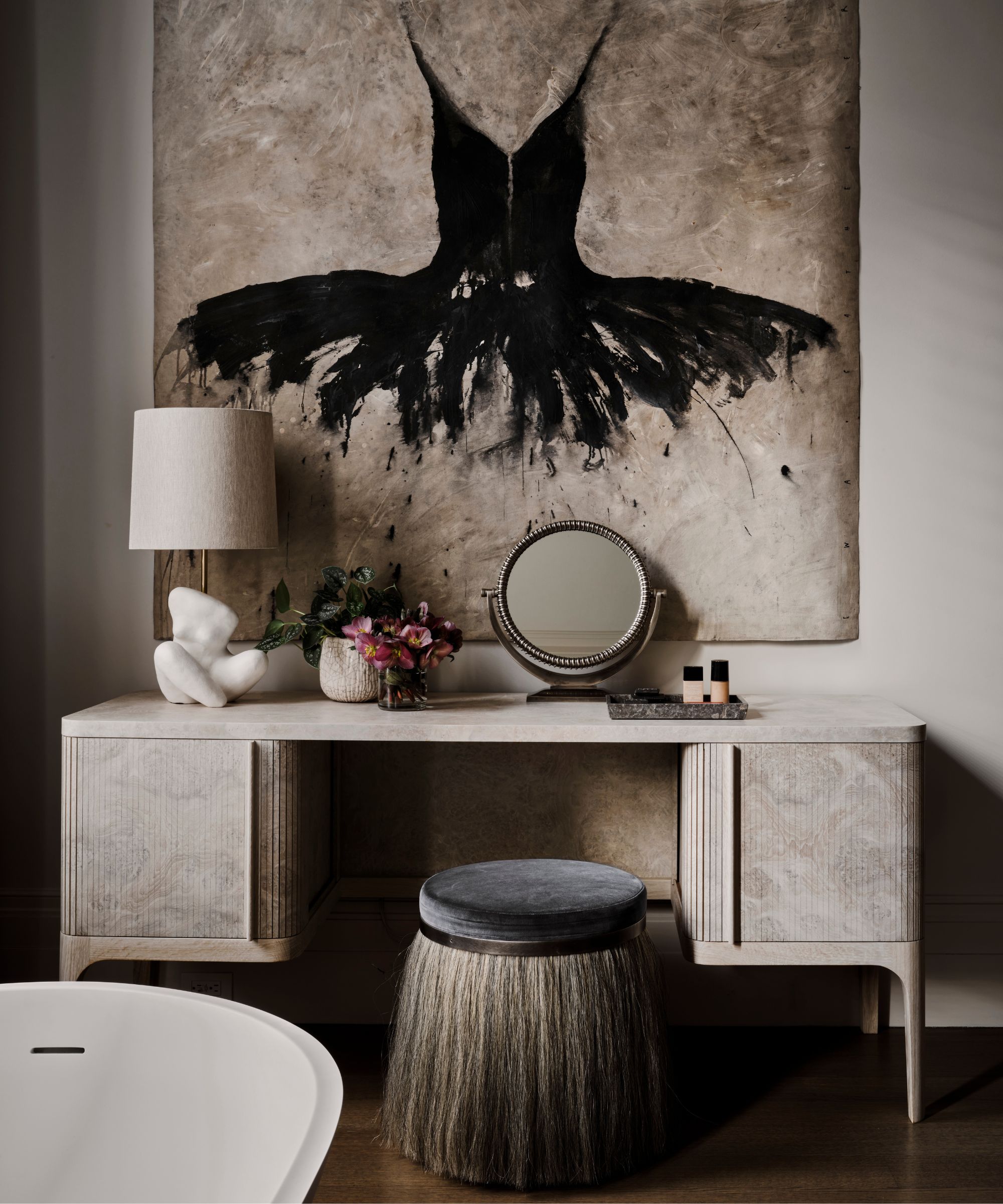
'The entire third floor is occupied by the master bedroom with bath. From the bedroom, the two dressing rooms to the bathroom, our client wanted a space to unwind with a few surprises. We set out to design the bathroom to transition seamlessly between the two dressing rooms.'
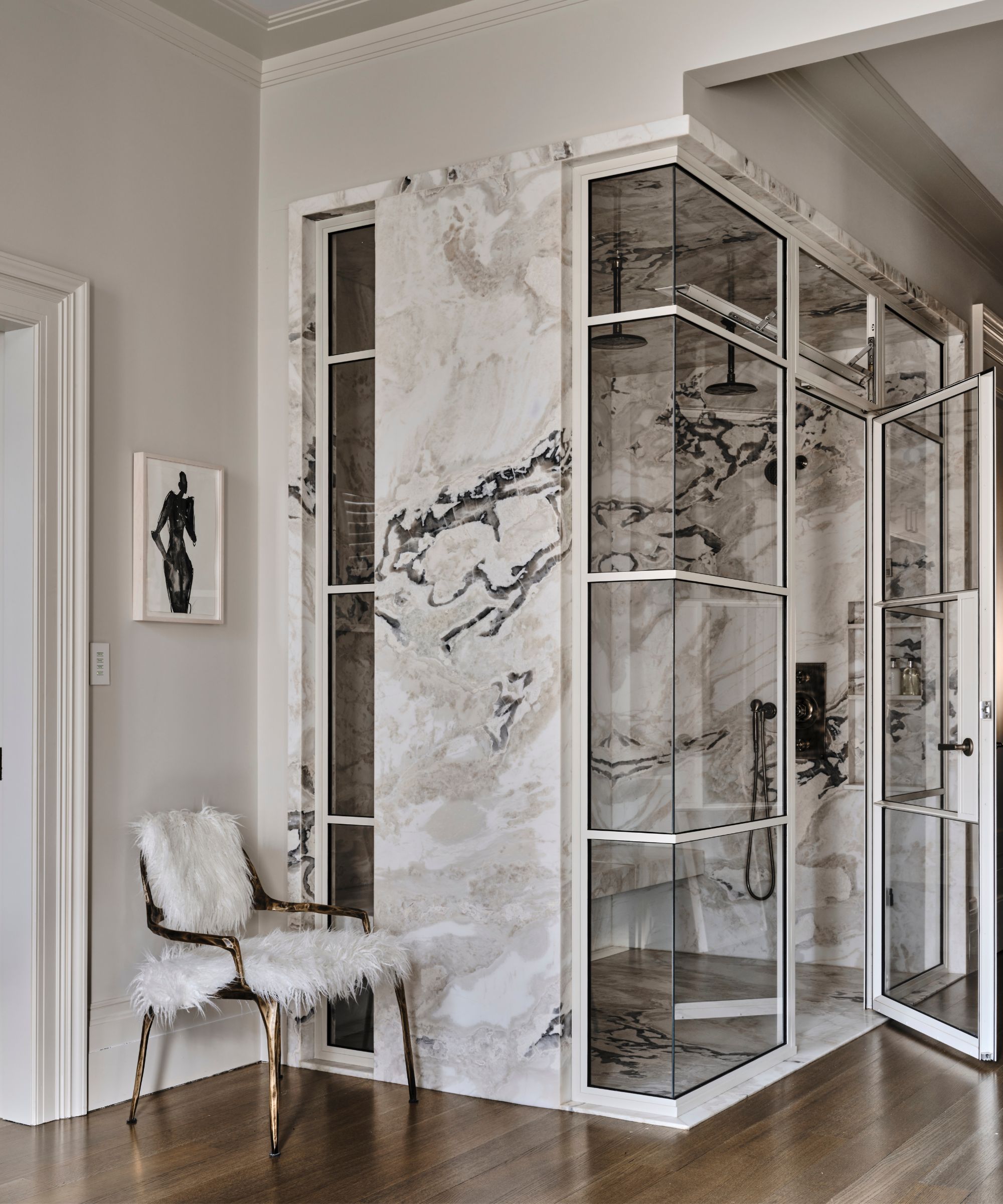
'The slab shower, wood flooring and artwork placed a major role within our approach. We centered the Grape tub in order to create a strong focal point upon entering the space.'
'We would describe the bedroom as quiet, or restful, with an edge. Each dressing has their own identity yet balance one another. Lighting and wood finishes played a major role in defining each space.'
The forth level is the kids' space.
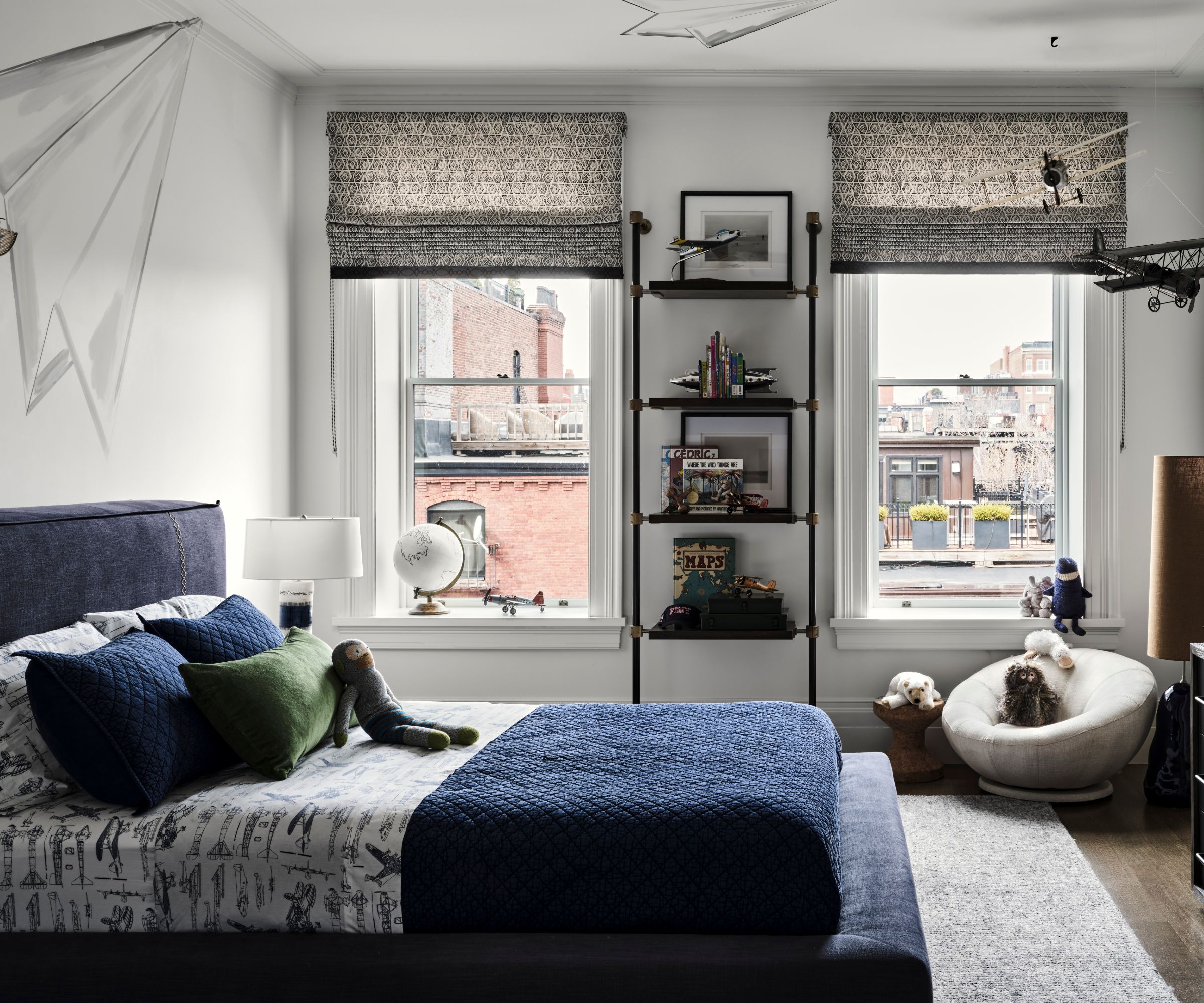
'Not unlike the primary suite, our client wanted a space for their two boys to feel at home with their own space that reflects their age and interests. From cars to planes and lots of toys, this floor is all about fun.
'It was also a great spot for an oversized laundry room. As with all of our kid’s spaces, the foundation of each bedroom will grow with the boys. Wall treatments and accents can easily transition as the boys get older.'
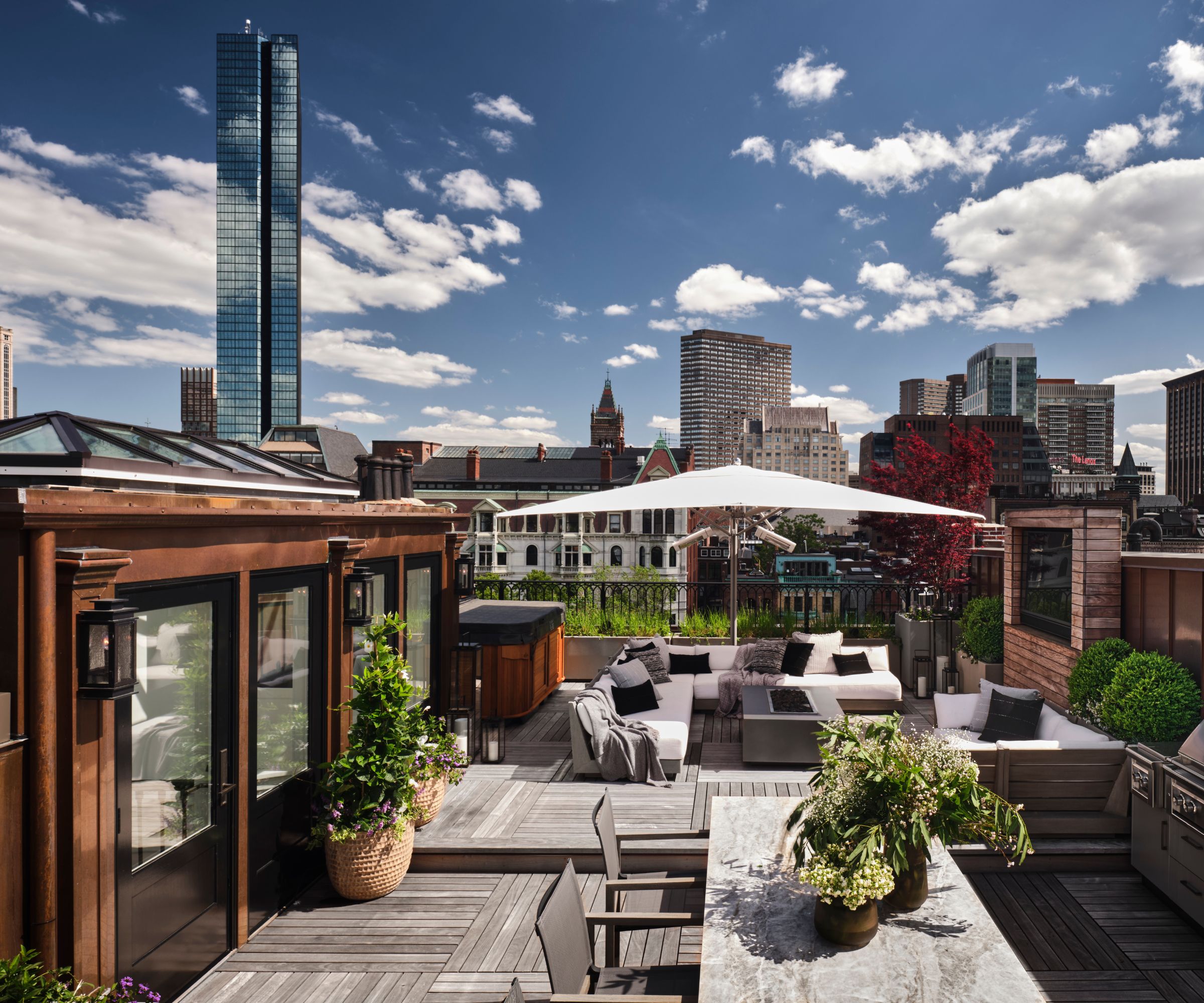
'Henry and Savannah extended their shared love of entertaining to the roof deck as well,' says Nicole. 'With a full working kitchen, dining space, spa, small herb garden and plenty of space to hang out. There's even a TV for capturing a football game.'
'From the street view, the home appears deceptively conventional with a trio of bow windows. But beyond the front door, it’s immediately obvious that the design is just the opposite,' says Nicole.
'It was clear from the beginning that this surprisingly contemporary home would start a new aesthetic conversation in the historic Back Bay. A juxtaposition between time-honored and organic-modern is repeated throughout the property with stained paneled interior doors, exaggerated proportion, a monochromatic palette, and edgy leather-wrapped hardware.
'We are all absolutely thrilled with the result.'
Sign up to the Homes & Gardens newsletter
Design expertise in your inbox – from inspiring decorating ideas and beautiful celebrity homes to practical gardening advice and shopping round-ups.

Lucy Searle has written about interiors, property and gardens since 1990, working her way around the interiors departments of women's magazines before switching to interiors-only titles in the mid-nineties. She was Associate Editor on Ideal Home, and Launch Editor of 4Homes magazine, before moving into digital in 2007, launching Channel 4's flagship website, Channel4.com/4homes. In 2018, Lucy took on the role of Global Editor in Chief for Realhomes.com, taking the site from a small magazine add-on to a global success. She was asked to repeat that success at Homes & Gardens, where she has also taken on the editorship of the magazine.
-
 Isabella Rossellini's European-designed chef's knives are currently $65 off – and these luxury cooking tools have been around for over 200 years
These stunning German-made knives have a rich history, including being used in the Conclave actress's kitchen – and they're now on sale at Wayfair
By Sophie Edwards
-
 This is one of the worst things you can do to your vacuum cleaner – experts warn it will slash its lifespan by years and damage the motor
Overfilling your vacuum can cause real, long-term damage and is best avoided
By Dan Fauzi